Charts in Pipeline Builder(Pipeline Builder 中的图表)
You can use charts in Pipeline Builder to seamlessly analyze and validate intermediate data without leaving your workspace. Charts can be added from any transform node. Bar charts, including histograms are currently supported.
Add a chart
-
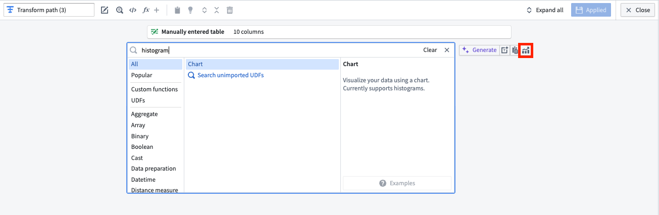
To add a chart to your graph, navigate to any transform node and select the Edit option below the node. Charts can be added by searching for "chart" in the transforms search bar, or by selecting the Visualize option to the right of the search bar, highlighted in red below.
-
In the Configure panel, choose the X-Axis and Y-Axis values. You can choose various aggregations for the Y-Axis values, including distinct count, max, min, median, mode, row count, sum, and more.

You can also add multiple aggregations to a single graph by selecting Add item at the bottom of the Configure panel.

-
In the Format panel, you can change the chart's title and the X-Axis and Y-Axis labels.

-
Select Apply when you are done.
You can collapse and expand the color legend using the Legend option in the lower left corner of the chart board. You can also page through results using arrows, or select a range of results from the Show results dropdown in the lower right side of the chart.
To view previously created charts, select a transform node and open the Transformations tab below the pipeline graph, or search for "chart" in the pipeline search to view nodes with associated charts.
中文翻译
Pipeline Builder 中的图表
您可以在 Pipeline Builder 中使用图表,无需离开工作区即可无缝分析和验证中间数据。可以从任何转换节点(transform node)添加图表。目前支持柱状图(包括直方图)。
添加图表
-
要将图表添加到您的图中,请导航到任意转换节点,然后选择节点下方的 Edit 选项。您可以通过在转换搜索栏中搜索“chart”来添加图表,或者选择搜索栏右侧的 Visualize 选项(下图中以红色高亮显示)。
-
在 Configure 面板中,选择 X-Axis 和 Y-Axis 值。您可以为 Y-Axis 值选择各种聚合(aggregations)方式,包括去重计数、最大值、最小值、中位数、众数、行数、总和等。
您还可以通过选择 Configure 面板底部的 Add item,将多个聚合添加到同一张图表中。
-
在 Format 面板中,您可以更改图表标题以及 X-Axis 和 Y-Axis 标签。
-
完成后,选择 Apply。
您可以使用图板左下角的 Legend 选项来折叠和展开颜色图例。您还可以使用箭头翻页浏览结果,或者从图表右下角的 Show results 下拉菜单中选择结果范围。
要查看之前创建的图表,请选择一个转换节点并打开数据流图下方的 Transformations 选项卡,或者在流水线搜索中搜索“chart”以查看包含关联图表的节点。