Getting started(入门指南)
In this tutorial, we will run through:
Creating a chart
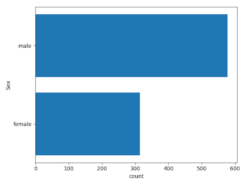
Since titanic_dataset contains rows (representing passengers) and columns (representing information about the passengers), we can visualize passenger count for a given passenger property (such as Sex or Pclass) using a bar chart. For example, here is a breakdown of passengers by sex:
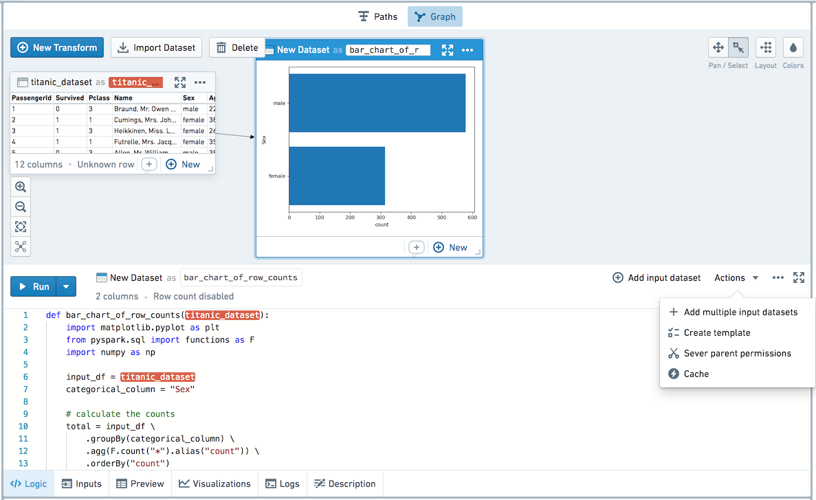
In this example, we’ll create a transform that creates the desired chart. Create a Python transform named bar_chart_of_row_counts and insert the following code:
def bar_chart_of_row_counts(titanic_dataset):
    import matplotlib.pyplot as plt
    from pyspark.sql import functions as F
    import numpy as np

    input_df = titanic_dataset
    categorical_column = "Sex"

    # calculate the counts
    total = input_df \
        .groupBy(categorical_column) \
        .agg(F.count("*").alias("count")) \
        .orderBy("count")

    # convert summarized dataset to pandas
    total_pdf = total.toPandas()

    # plotting code
    fig = plt.figure()
    ax = fig.add_subplot(111)

    y_pos = np.arange(len(total_pdf[categorical_column]))
    ax.set_yticks(y_pos)
    ax.barh(y_pos,total_pdf["count"])
    ax.set_yticklabels(total_pdf[categorical_column])
    plt.xlabel("count")
    plt.ylabel(categorical_column)

    plt.tight_layout()
    plt.show()

    # return the aggregated dataframe to save it as a dataset
    return total
When you run this transform, the chart shown above will appear in your Workbook in the transform node in the graph. You can also jump into a full screen image view by hovering over the chart in the transform node and selecting View Image. This image viewer can also be reached from the contents sidebar and the Visualization tab.
To create the chart as an SVG, use the following code before creating your plot:
set_output_image_type('svg')
Or use the decorator for better visibility:
@output_image_type('svg')
def bar_chart_of_row_counts(titanic_dataset):
    # ...
Creating a Template
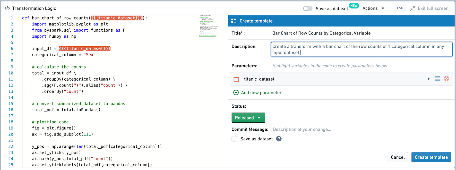
Next, we’ll convert this transform into a Template so it can be generalized and reused. Click on the Actions button in the top-right of your code editor and click Create template.
You will now be brought into a template creation view in the full screen editor.
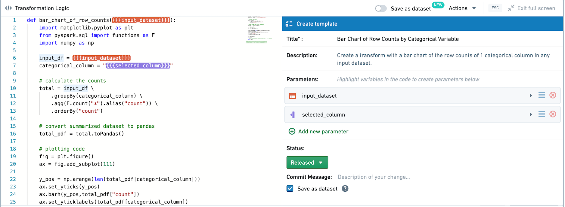
In the Template editor, you can edit the Template’s name, description, and parameters. Let’s name this Template Bar Chart of Row Counts by Categorical Variable, and give it a description as follows: Create a transform with a bar chart of the row counts of 1 categorical column in any input dataset.
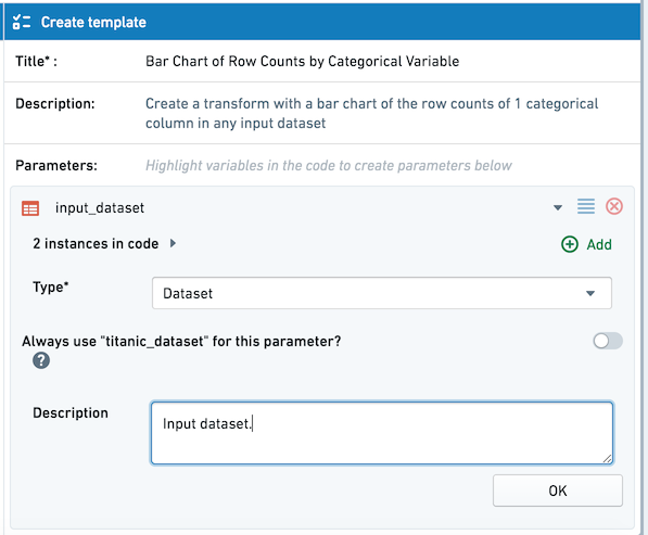
Any input datasets — in this case, just titanic_dataset — are automatically added as parameters of type dataset for the Template. Click on titanic_dataset in the Template editor to change it. Since we want this template to be generic, let’s change the parameter name from titanic_dataset to input_dataset and add a description.
Two instances of {{{input_dataset}}} will be highlighted in the transform code. Next, let’s parameterize the input column. To assign a variable in the code body as an input parameter for the template, click Add new parameter in the top-right of the transform and highlight the appropriate variables in the code. Highlight the string "Sex" as shown below:
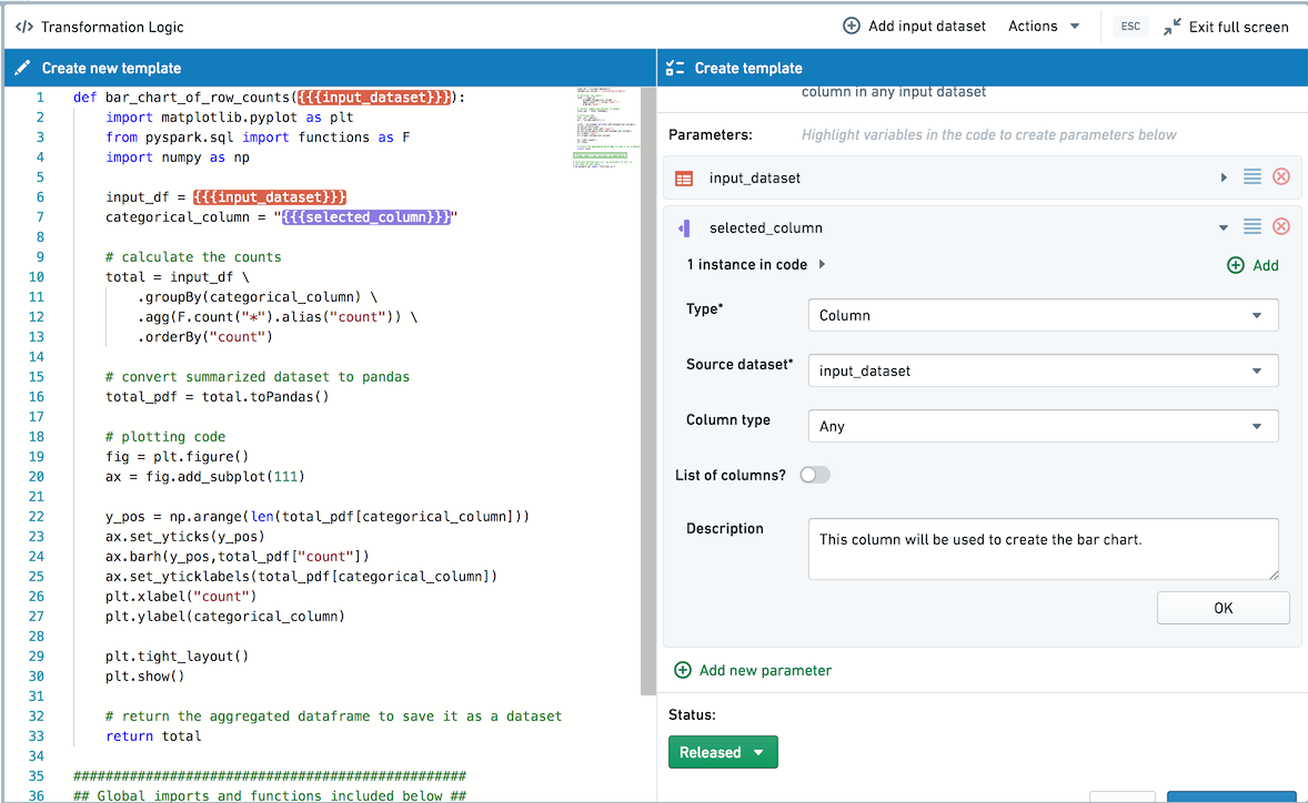
This adds this part of the code as a parameter of type column with the Source Dataset as input_dataset. In the Template editor, edit the param1 parameter name and rename it to selected_column.
In this example code, we defined the column name as a variable at the top of the transform so that we only need to parameterize it once. When you’re templatizing other transforms, you can use the Add button to add more instances of the same parameter.
Next, choose whether this template should be saved as a dataset by default. By checking the Save as dataset box, when added the template will be added as a persisted transform by default. If Save as dataset is left unchecked, the template will be applied as an unpersisted transform by default. In this case, let's choose to Save as Dataset by default as we want to use the output in other applications.
Finally, click the Create template button to create and save the Template. Whenever you create a new Template, you will have to choose a folder to save it in. For this example, you can save the Template in your home folder.
Templates can only be discovered and used by users who have access, so you can save a Template in your home folder while you are still working on it, and move it to a shared folder once you want to promote it for broader use. Templates can also be added to the Data Catalog.
Using Templates
After creating and saving a template, you can use the Template in a point-and-click manner.
To view available templates, click Browse all templates in the transform creation view.
Browse Templates supports searching for templates by name, description, and tags, or browsing based on Favorites, Recently used templates, or the Files structure. To apply a template, click its name and choose "Select". Let’s add the template we just created.
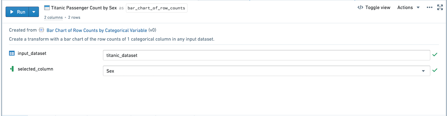
After adding the template to the graph, you can rename the transform and fill out the inputs. Assign the input_dataset parameter by clicking Click here to add dataset and clicking the titanic_dataset in the graph. Now you can select any column as the selected_column parameter to create charts based on that column.
Select Run to compute the transform. For transforms that output a visualization, graph view is the default in the Graph. You can right-click, choose Edit and then Show table view to view the node as a table.
Editing Templates
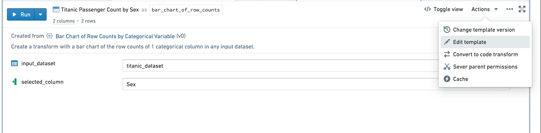
If you would like to update the code backing a template, click on Actions and then Edit Template to enter the code editor and edit the template.
中文翻译
入门指南
在本教程中,我们将逐步介绍:
创建图表
由于 titanic_dataset 包含行(代表乘客)和列(代表乘客信息),我们可以使用条形图来可视化给定乘客属性(如性别或舱位等级)的乘客数量。例如,以下是按性别划分的乘客分布情况:
在本示例中,我们将创建一个转换(transform)来生成所需的图表。创建一个名为 bar_chart_of_row_counts 的 Python 转换,并插入以下代码:
def bar_chart_of_row_counts(titanic_dataset):
    import matplotlib.pyplot as plt
    from pyspark.sql import functions as F
    import numpy as np

    input_df = titanic_dataset
    categorical_column = "Sex"

    # 计算计数
    total = input_df \
        .groupBy(categorical_column) \
        .agg(F.count("*").alias("count")) \
        .orderBy("count")

    # 将汇总数据集转换为 pandas
    total_pdf = total.toPandas()

    # 绘图代码
    fig = plt.figure()
    ax = fig.add_subplot(111)

    y_pos = np.arange(len(total_pdf[categorical_column]))
    ax.set_yticks(y_pos)
    ax.barh(y_pos,total_pdf["count"])
    ax.set_yticklabels(total_pdf[categorical_column])
    plt.xlabel("count")
    plt.ylabel(categorical_column)

    plt.tight_layout()
    plt.show()

    # 返回聚合后的数据框以保存为数据集
    return total
运行此转换时,上述图表将出现在工作簿(Workbook)的转换节点图中。您还可以通过悬停在转换节点上的图表并选择 查看图像(View Image) 进入全屏图像视图。此图像查看器也可以通过内容侧边栏和可视化(Visualization)选项卡访问。
要创建 SVG 格式的图表,请在创建绘图之前使用以下代码:
set_output_image_type('svg')
或者使用装饰器以获得更好的可读性:
@output_image_type('svg')
def bar_chart_of_row_counts(titanic_dataset):
    # ...
创建模板
接下来,我们将把这个转换转换为模板(Template),以便进行泛化和复用。点击代码编辑器右上角的 操作(Actions) 按钮,然后点击 创建模板(Create template)。
现在您将进入全屏编辑器中的模板创建视图。
在模板编辑器中,您可以编辑模板的名称、描述和参数。让我们将此模板命名为 按分类变量统计行数的条形图(Bar Chart of Row Counts by Categorical Variable),并添加如下描述:为任何输入数据集中一个分类列的行数创建带有条形图的转换。
任何输入数据集——在本例中仅为 titanic_dataset——都会自动作为 dataset 类型的参数添加到模板中。点击模板编辑器中的 titanic_dataset 进行修改。由于我们希望此模板具有通用性,让我们将参数名称从 titanic_dataset 改为 input_dataset,并添加描述。
转换代码中将高亮显示两个 {{{input_dataset}}} 实例。接下来,让我们将输入列参数化。要将代码体中的变量指定为模板的输入参数,请点击转换右上角的 添加新参数(Add new parameter),并在代码中高亮显示相应的变量。如下所示高亮显示字符串 "Sex":
这将代码的这一部分添加为 column 类型的参数,其源数据集(Source Dataset)为 input_dataset。在模板编辑器中,编辑 param1 参数名称,将其重命名为 selected_column。
在此示例代码中,我们在转换顶部将列名定义为一个变量,这样只需参数化一次。当您对其他转换进行模板化时,可以使用 添加(Add) 按钮添加更多相同参数的实例。
接下来,选择此模板默认是否保存为数据集。通过勾选 保存为数据集(Save as dataset) 复选框,添加模板时将默认将其添加为持久化转换(persisted transform)。如果 保存为数据集 保持未选中状态,则模板将默认作为非持久化转换(unpersisted transform)应用。在本例中,我们选择默认保存为数据集,因为我们希望在其他应用程序中使用输出结果。
最后,点击 创建模板(Create template) 按钮来创建并保存模板。每当您创建新模板时,都需要选择一个文件夹来保存。在本示例中,您可以将模板保存在您的主文件夹中。
模板只能被有访问权限的用户发现和使用,因此您可以在仍在编辑时将模板保存在主文件夹中,并在希望推广供更广泛使用时将其移动到共享文件夹。模板也可以添加到数据目录(Data Catalog)。
使用模板
创建并保存模板后,您可以通过点击方式使用该模板。
要查看可用模板,请点击转换创建视图中的 浏览所有模板(Browse all templates)。
浏览模板(Browse Templates)支持按名称、描述和标签搜索模板,或基于收藏夹、最近使用的模板或文件结构进行浏览。要应用模板,请点击其名称并选择"选择(Select)"。让我们添加刚刚创建的模板。
将模板添加到图中后,您可以重命名转换并填写输入。通过点击 点击此处添加数据集(Click here to add dataset) 并点击图中的 titanic_dataset 来分配 input_dataset 参数。现在您可以选择任何列作为 selected_column 参数,以基于该列创建图表。
选择 运行(Run) 来计算转换。对于输出可视化的转换,图视图(Graph view)是图中的默认视图。您可以右键单击,选择 编辑(Edit),然后选择 显示表格视图(Show table view) 以表格形式查看节点。
编辑模板
如果您想更新模板的后台代码,请点击 操作(Actions),然后点击 编辑模板(Edit Template) 进入代码编辑器并编辑模板。