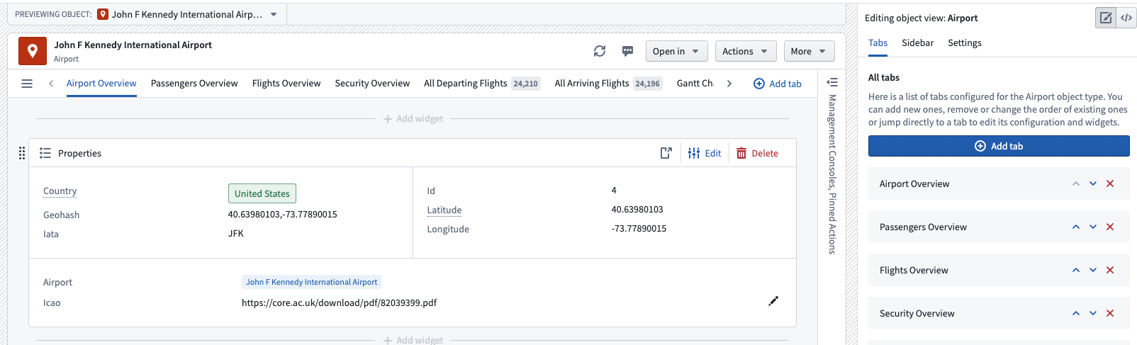
Configure tabs(配置标签页)
A tab is the main method of navigation and grouping content within Object View. Each tab contains a Workshop module and has customization options for conditional visibility, filtering settings, and layout settings.
There are two types of tabs available to add to your Object View: Managed Workshop, and Standalone Workshop modules.
- Managed Workshop modules: We recommend using Workshop to build a new tab within Object View. This option allows you to develop more sophisticated views that can leverage the full power of Foundry's application building capabilities. Learn more about Workshop-backed tabs. Managed modules have their permissions automatically kept in sync with the Object View, and cannot be reused.
- Existing Workshop modules: You can embed modules that have already been built in Workshop directly into Object View tabs. You can use the same module in multiple Object Views.
Some tabs were built with the Legacy builder, which allowed you to create simple tabs with limited flexibility for layouts, widgets, and data options. New tabs using this builder can no longer be added, but existing tabs are still supported.
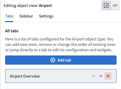
Manage Tabs
Add a new tab
You can add a tab from two places within the editor: the Tabs section of the Object View editor sidebar, or the Add tab button in the tab list on the Object View preview itself. Either option will allow you to select the tab type of your choice.
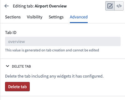
Delete a tab
You can delete a tab from the list of tabs within the Object View editor sidebar. You can also click into the tab in the editor sidebar, navigate to Advanced , and click Delete tab.
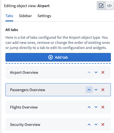
Move a tab
Move a tab using the Object View editor sidebar list of tabs. Click the up or down arrows to rearrange their order in the Object View preview.
Configure tab settings
Tab visibility
A tab can be conditionally shown to viewing users in several ways. One method is through the use of configured Object Views and profiles. You can also configure a tab to be conditionally visible based on two other factors:
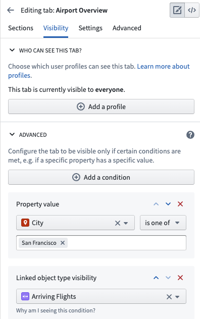
- Property values: This condition is fulfilled if the value of a property on the currently viewed object is equal or unequal to a given value. Property value conditions are useful when a tab shows content that is only relevant to an object whose value for a given property matches an expected value.
- For example, you may want to add a Regional View tab to an Airport object that only applies to Airports in a specific region. You may have a different Regional View tab with conditional visibility for other regions. Each tab could have different visual components.
- Link visibility: This condition is fulfilled if the user viewing the tab has permission to see the object type to which the currently viewed object may be linked. Link visibility conditions are useful when a tab shows content based on an object’s links, but the viewing user may not have permission to see the objects on the other side of those links.
Here is an example of how these conditions may appear:
Tab settings
Other general tab settings that you may configure include:
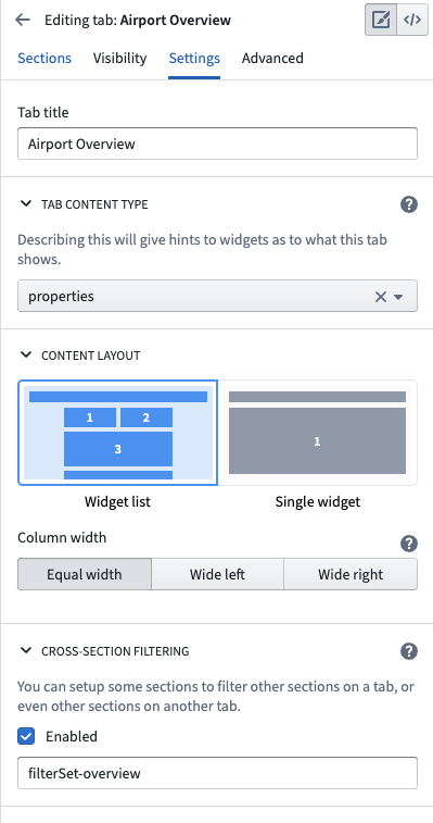
- Title: The title setting controls the label shown in the tab list within the Object View. The tab title should be short and descriptive of the content.
- Content type: You can use this configuration to specify a link type or link that appears within the tab, if relevant. If you select the Link option, you will see a badge next to the tab title in the Object View which shows how many objects are linked to the currently viewed object.
- Content layout: All legacy tabs support a two column widget list layout which is activated when widgets specify that they should be aligned to a specific column. Use this configuration option to control whether or not the tab level columns should be equal width or have different sizes.
- Cross-section filtering: Enable this setting to allow widgets within this tab to publish and consume filters controlled by interactions with the widget. For example, you may want to select an entry within a chart and filter all other charts to only show related data. You can also customize the ID of the filter set and then use this same ID on other tabs in order to consume and persist filter across multiple tabs.
Here is an example of configured tab settings:
中文翻译
配置标签页
标签页 是对象视图中导航和内容分组的主要方式。每个标签页包含一个 Workshop 模块,并具有条件可见性、筛选设置和布局设置等自定义选项。
可添加到对象视图的标签页有两种类型:托管 Workshop 模块和独立 Workshop 模块。
- 托管 Workshop 模块: 我们建议使用 Workshop 在对象视图中构建新标签页。此选项允许您开发更复杂的视图,充分利用 Foundry 应用构建功能的全部能力。了解更多关于 Workshop 支持的标签页。 托管模块的权限会自动与对象视图保持同步,且不可重复使用。
- 现有 Workshop 模块: 您可以将已在 Workshop 中构建的模块直接嵌入到对象视图标签页中。同一模块可在多个对象视图中使用。
部分标签页是使用旧版构建器创建的,该构建器允许您创建简单的标签页,但布局、组件和数据选项的灵活性有限。现已无法添加使用此构建器的新标签页,但现有标签页仍受支持。
管理标签页
添加新标签页
您可以从编辑器中的两个位置添加标签页:对象视图编辑器侧边栏的标签页部分,或对象视图预览中标签页列表内的添加标签页按钮。两种方式均可让您选择所需的标签页类型。
删除标签页
您可以从对象视图编辑器侧边栏的标签页列表中删除标签页。也可以点击编辑器侧边栏中的标签页,导航至高级,然后点击删除标签页。
移动标签页
使用对象视图编辑器侧边栏的标签页列表移动标签页。点击向上或向下箭头可重新调整其在对象视图预览中的顺序。
配置标签页设置
标签页可见性
标签页可以通过多种方式有条件地向查看用户显示。一种方法是使用已配置的对象视图和配置文件。您还可以基于以下两个因素配置标签页的条件可见性:
- 属性值: 如果当前查看对象的某个属性值等于或不等于给定值,则满足此条件。当标签页显示的内容仅与特定属性值匹配的对象相关时,属性值条件非常有用。
- 例如,您可能希望为机场对象添加一个区域视图标签页,该标签页仅适用于特定区域的机场。您可以为其他区域设置另一个具有条件可见性的区域视图标签页。每个标签页可以包含不同的可视化组件。
- 链接可见性: 如果查看标签页的用户有权查看当前对象可能链接到的对象类型,则满足此条件。当标签页基于对象的链接显示内容,但查看用户可能无权查看这些链接另一端的对象时,链接可见性条件非常有用。
以下是这些条件可能呈现的示例:
标签页设置
您可以配置的其他通用标签页设置包括:
- 标题: 标题设置控制对象视图中标签页列表内显示的标签。标签页标题应简短且能描述内容。
- 内容类型: 您可以使用此配置指定标签页中出现的链接类型或链接(如适用)。如果选择链接选项,对象视图中标签页标题旁将显示一个徽章,显示当前查看对象所链接的对象数量。
- 内容布局: 所有旧版标签页均支持两列组件列表布局,当组件指定应对齐到特定列时,该布局会被激活。使用此配置选项可控制标签页级别的列是等宽还是具有不同尺寸。
- 跨区段筛选: 启用此设置可允许标签页内的组件发布和消费由组件交互控制的筛选器。例如,您可能希望选择图表中的某个条目,并筛选所有其他图表仅显示相关数据。您还可以自定义筛选集的 ID,然后在其他标签页中使用相同的 ID,以便跨多个标签页消费和持久化筛选器。
以下是已配置标签页设置的示例: