Layout(布局)
Layout widgets are used to organize and structure the layout of an Object View page within a certain tab, by arranging the view into different containers.
Each Object View can have three levels of Layout control:
- Tabs, with a set of functionalities described on Configuring Tabs
- Layout Widgets within a tab (also called Containers), enabling you to organize the Object View within boxes of content.
- All content widgets (visualization, properties and links, filters, etc.), which are the building blocks of the Object View.
These are the types of Layout containers:
- Visual design of the page - Horizontal Distribution and Vertical Stack Container.
- Add another level of content nested within a tab - Tabbed Container.
- Enable displaying/hiding content according to filters that the user interacts with - Conditional Container.
- Display text, enriched with object values - Markdown widget.
Horizontal Distribution
This widget enables you to organize the layout of your Object View visually by displaying widgets distributed horizontally within a container, one next to the other. It is just a container of other widgets, and has no other functionality by itself.
Configuration
Once you add the Horizontal Distribution widget, the configuration enables you to add different widgets within this container, by clicking on “Add Item”, which would open up the widget selector.
There are two options to determine how much width would be allocated to each widget within the container:
- Relative - choose an integer number for each widget within the container. Widgets are distributed according to their relative number. Example: 3 widgets of sizes A=1, B=3, C=2; Widget A would take 1/6 of the length and widget B would take 3/6 of the length.
- Pixel - choose an absolute number of pixels to allocate to each widget. If the sum of pixels exceeds Object View limits (about 1150 pixels), widgets will “spill out” of the page.
Common Issues and Notes:
- Make sure to add a title to the Horizontal Distribution widget, which is mandatory to be able to add it. The title will be displayed on the widget header.
Vertical Stack Container
This widget enables you to organize the layout of your Object View visually by displaying widgets distributed vertically within a container, stacked one on top of the other. It is just a container of other widgets, and has no stand-alone functionality by itself.
Configuration
Once you add the Vertical Stack Container widget, the configuration enables you to add different widgets within this container, by clicking on “Add Item”, which would open up the widget selector.
Common Issues and Notes:
- Make sure to add a title to the Vertical Stack Container widget, which is mandatory to be able to add it.
- To align the Vertical Stack Container next to other widgets, go to “Format” tab in the configuration and select a Left/Right alignment, instead of the default “Full Width”.
- Choose the order of the tabs by using the up/down arrows next to each tab under “Settings” in the configuration. This also allows you to delete tabs or replace the widget within each tab.

Tabbed Container
Add another layer of tabs to your Object View, by creating a container of tabs within the current tab. Users can browse between these tabs, each one containing a single widget (which can also be a container of a number of widgets).
The Tabbed Container is just a container of other widgets, and has no stand-alone functionality by itself.
Configuration
- Once you add the Tabbed Container widget, the configuration enables you to add different tabs of widgets within this container, by clicking on “Add Tab”, which would open up the widget selector.
- The name of each tab is the title of the widget on that tab, which appears under “Format” in the configuration.
- Choose the order of the tabs by using the up/down arrows next to each tab under “Settings” in the configuration. This also allows you to delete tabs or replace the widget within each tab.

Common Issues and Notes:
- Using this tab is sometimes necessary in central objects in the ontology. However, be mindful that it adds complexity to the user experience, with “tabs within a tab”.
- Make sure to add a title to the Tabbed Container widget, which is mandatory to be able to add it. The title will be displayed on the widget header.
Conditional Container
A conditional container enables content to be displayed or hidden according to a condition. This condition can be based on:
- Filters that the user applies on the Object View
- Property values of the object or a linked object
- The existence of linked objects of a certain type
Configuration
This widget supports adding one or several conditional sections. Each one of these sections includes a condition and one or more widgets that are conditionally displayed according to that condition. To set up a conditional section, you follow these three steps:
Step 1 – Set the condition
The first step is to define the condition according to which the contents of the container should be displayed or hidden. There are three different types of conditions:
Condition 1 – Filters
The Filters condition displays or hides the contents of the container based on whether or not filters are applied to the Object View. This condition can be configured in three different ways:
- Specific Filter – The contents of the container are displayed only when there is a filter applied on a specific property. That property can either be a property of the current object in view or of a linked object. This means that in order to use this condition, there must be another Filter Widget which filters specifically on the same object and property as defined in this condition.
- Example: Configuring an Object View of an Airport, there is a filter to keep only Flights that were cancelled (Status = “Cancelled”). A Conditional Container, showing details on cancelled flights, is configured to be displayed only when such a specific filter is applied.
- Note: In order for this condition type to work, the same object type needs to be selected in the dropdowns for "Filter linked object" and "Filter property".
- No Filter – The container is displayed only when no filter is applied within the current tab or any tab sharing cross-filters with this tab. This can be any type of filter, e.g. a date filter, a dropdown filter, a button filter, etc.
- Any Filter – The container is displayed only when at least one filter is applied within the current tab or any tab sharing cross-filters with this tab. Just as for No Filter, this can be any type of filter, e.g. a date filter, a dropdown filter, a button filter, etc.
Condition 2 – Properties
The Properties condition displays or hides the content of the container based on the value of a property of an object. The object in question can either be the current object in view or a linked object. In the case of a linked object, the relationship to the current object needs to be either 1-to-1 or many-to-1, in which case the current object needs to be on the "many" side of the relationship.
To use this condition type, you first select the property you want to use. Next, you define when the contents of the conditional container should be shown based on that property. There are four options for this:
- Is defined – The value of the property is not
null. - Is not defined – The value of the property is
null. - Is one of – The value of the property matches one of the values that you define.
- Is not one of – The value of the property does not match one of the values that you define.
For is one of and is not one of, the values you define are translated to match the property type (if it’s integer, double, date or boolean). See below for more details on how this property comparison is done.
Condition 3 – Linked Objects
The Linked Objects condition displays or hides the contents of the container based on the existence of linked objects of a certain type. To set up this condition, you first select a link path. Then, you decide if the contents of the conditional container should be shown if linked objects of the selected path exist or do not exist.
The logic of this condition can be reasoned about by comparing it to a Linked Objects View. The contents of a container with this condition should only be shown if a Linked Objects View with the same link path would show at least one object (if linked objects should exist), or no objects (if linked objects should not exist).
Step 2 – Add Widgets
Once a condition has been defined, the second step is to configure the actual content to be displayed within the container. Click on the “Add Section” button and add as many widgets as needed. Note that you can order the widgets displayed within the Conditional Container by using the up/down arrows.
Step 3 – Choose a Layout
Finally, the third and final step is to choose the layout of the container. The layout can be either:
- Horizontal – Widgets are displayed from left to right, like the Horizontal Distribution Container widget
- Vertical – Widgets are displayed from top to bottom, like the Vertical Stack Container widget
After completing these three steps, your Conditional Container should be set up and good to go!
Common Issues and Notes:
- How is the property value comparison done?
- String values are matched normally
- For numeric properties, all input values in the widget are turned into numbers and compared to the numeric property (e.g. enter the string 3.1415 and it would turn to a double)
- For boolean properties, if you use “true”, “yes” and “1” in the widget, they are all considered truth input values, all the rest is false.
- Date and timestamp values are matched after string conversion
- Arrays are currently not supported
- If several conditions are added, conditions are evaluated from top to bottom - the sections of the first condition met will be rendered, and the others ignored.
- The conditional container by property value option works on either a 1-to-1 or many-to-1 relationship, where the current object in display is on the related side (the “many”).
- It does not allow conditions of many-to-many or 1-to-many where the current objet is on the primary side, and it does not allow conditional visibility by aggregations of values in Linked objects.
- Example: looking at an aircraft object, I could add a condition dependent on what airline it belongs to (assuming it belongs to only one airline), but I can’t add a condition dependent on “does it have a linked flight object with property X?”
- This widget is an extension of the tab-level optional “Visibility” configuration, but at the widget level. However, it is not a complete equivalent:
- “Visibility” enables you to define conditional tabs according to users profiles.
- This widget allows you to set conditional views (1) within a single tab; (2) option of conditional visibility by applied filters (dependent on user’s interaction); (3) does not include conditional view per users profiles.
- In order to enable the conditional section option to display/hide by filters applied, make sure to mark the checkbox of “cross-filtering” on the right-bar configuration editor, under “Settings”.
- The Conditional Container is only a container of other widgets, distributed either horizontally or vertically.
Markdown
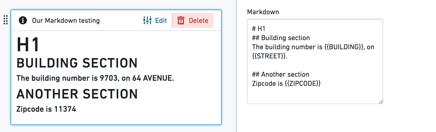
This widget enables adding rich text as a part of an Object View layout. It provides a plain text editor, based on the Markdown lightweight rich text formatting syntax (markdown-it library). As an addition, this widget allows templating of object properties values as part of the text.
Configuration
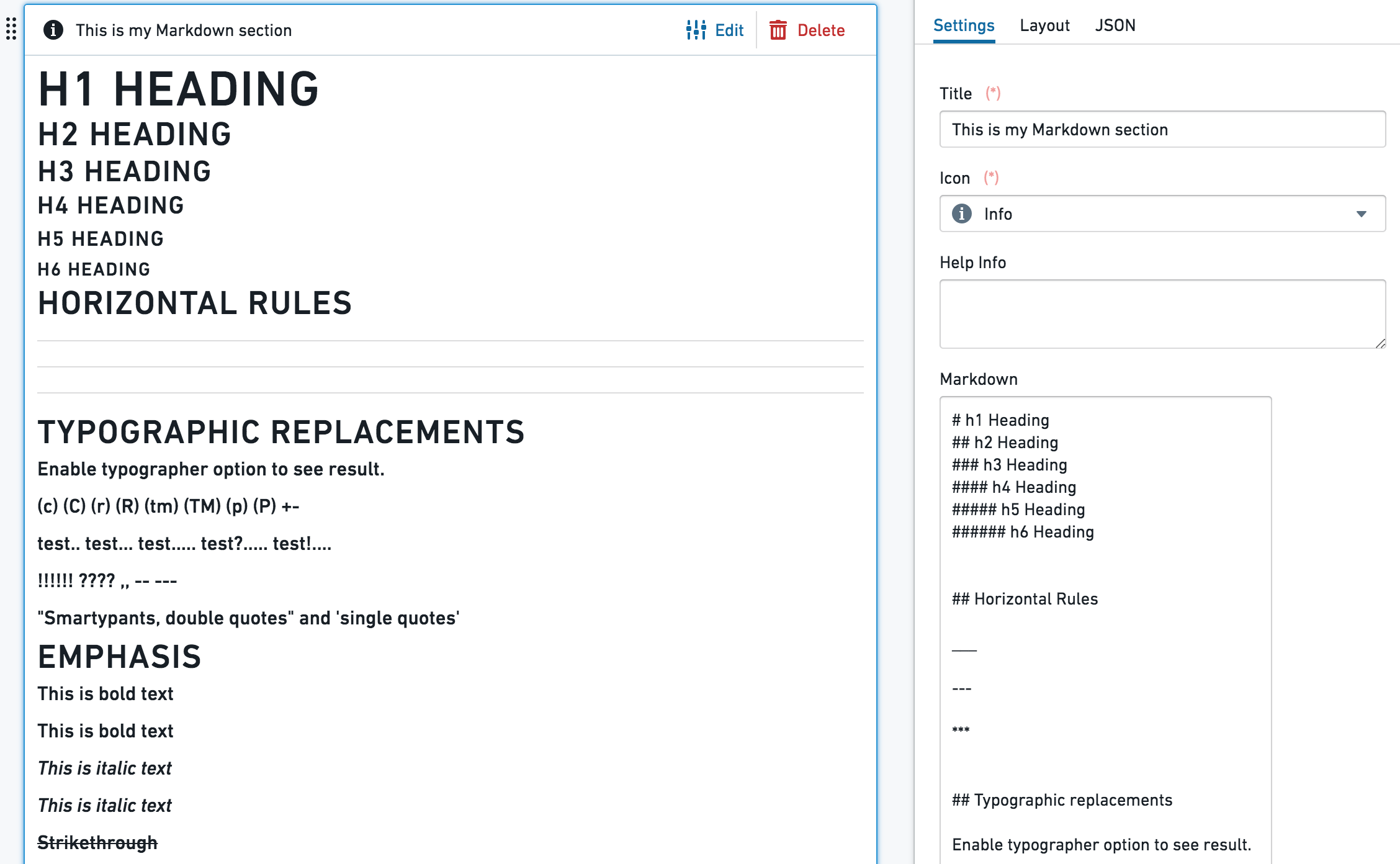
- The text box is a simple text editor, and supports the standard
markdown-itlibrary. - Object properties templating - use the {{propertyName}} format, with double curly brackets, to template your Markdown content with the current object properties values. propertyName is the exact case-sensitive name of the property in Ontology. The values {{objectId}}, {{objectTypeId}} and {{objectTypeRid}} are also supported.
Additional configurations:
- Line breaks, with 2 options:
- Enable line breaks - when on (default), a single line breaks in the editor works as an actual line break; when off, line break in the editor doesn’t affect the result. Using headers formats would still serve.
- Convert "\n" to line breaks - shows
\nas a line-break (requires the "Enable line breaks" to be on). - Enable sanitized HTML rendering - Safe HTML rendering with markdown-it. Embedding HTML from object properties are disabled; all property values are escaped for security.
Common Issues and Notes:
- Currently, long texts and arrays included using the {{propertyName}} format might spill out of the text box and are not rendered by default.
中文翻译
布局
布局组件(Layout widgets) 用于在特定标签页内组织和构建对象视图(Object View)页面的布局,通过将视图划分为不同的容器来实现。
每个对象视图可包含三个层级的布局控制:
- 标签页(Tabs),其功能集详见配置标签页
- 标签页内的布局组件(也称容器),用于将对象视图组织到内容框中
- 所有内容组件(可视化、属性与链接、筛选器等),它们是对象视图的构建模块
以下是布局容器的类型:
水平分布(Horizontal Distribution)
此组件允许您通过将组件水平分布在容器内(一个接一个排列)来直观地组织对象视图的布局。它仅作为其他组件的容器,本身不具备其他功能。
配置
添加水平分布组件后,您可以通过点击"添加项目"来在此容器内添加不同组件,这将打开组件选择器。
有两种方式可确定容器内每个组件分配的宽度:
- 相对值(Relative)- 为容器内每个组件选择一个整数。组件根据其相对数值进行分布。示例:3个组件的大小分别为 A=1、B=3、C=2;组件A将占据1/6的长度,组件B将占据3/6的长度。
- 像素值(Pixel)- 为每个组件选择分配的绝对像素数。如果像素总和超过对象视图限制(约1150像素),组件将"溢出"页面。
常见问题与注意事项:
- 请务必为水平分布组件添加标题,这是添加该组件的必要条件。标题将显示在组件标题栏中。
垂直堆叠容器(Vertical Stack Container)
此组件允许您通过将组件垂直分布在容器内(上下堆叠排列)来直观地组织对象视图的布局。它仅作为其他组件的容器,本身不具备独立功能。
配置
添加垂直堆叠容器组件后,您可以通过点击"添加项目"来在此容器内添加不同组件,这将打开组件选择器。
常见问题与注意事项:
- 请务必为垂直堆叠容器组件添加标题,这是添加该组件的必要条件。
- 若要将垂直堆叠容器与其他组件并排对齐,请进入配置中的"格式"选项卡,选择左/右对齐,而非默认的"全宽"。
- 通过配置中"设置"下每个标签页旁的上下箭头选择标签页顺序。此操作也可用于删除标签页或替换每个标签页内的组件。
标签页容器(Tabbed Container)
通过在当前标签页内创建标签页容器,为对象视图添加另一层标签页。用户可在这些标签页之间浏览,每个标签页包含一个组件(也可以是多个组件的容器)。
标签页容器仅作为其他组件的容器,本身不具备独立功能。
配置
- 添加标签页容器组件后,您可以通过点击"添加标签页"来在此容器内添加不同的标签页组件,这将打开组件选择器。
- 每个标签页的名称即为该标签页上组件的标题,显示在配置的"格式"下。
- 通过配置中"设置"下每个标签页旁的上下箭头选择标签页顺序。此操作也可用于删除标签页或替换每个标签页内的组件。
常见问题与注意事项:
- 在本体(ontology)中的核心对象上有时需要使用此标签页。但请注意,这会增加用户体验的复杂性,形成"标签页中的标签页"。
- 请务必为标签页容器组件添加标题,这是添加该组件的必要条件。标题将显示在组件标题栏中。
条件容器(Conditional Container)
条件容器允许根据条件显示或隐藏内容。该条件可基于:
- 用户在对象视图上应用的筛选器
- 对象或链接对象的属性值
- 是否存在特定类型的链接对象
配置
此组件支持添加一个或多个条件部分。每个条件部分包含一个条件以及根据该条件有条件地显示的一个或多个组件。设置条件部分需遵循以下三个步骤:
步骤 1 – 设置条件
第一步是定义容器内容应显示或隐藏的条件。共有三种不同类型的条件:
条件 1 – 筛选器(Filters)
筛选器条件根据对象视图是否应用了筛选器来显示或隐藏容器内容。此条件可通过三种方式配置:
- 特定筛选器(Specific Filter) – 仅当对特定属性应用了筛选器时,才显示容器内容。该属性可以是当前视图对象的属性,也可以是链接对象的属性。这意味着要使用此条件,必须存在另一个筛选器组件,该组件专门筛选与此条件中定义的相同对象和属性。
- 示例:配置机场的对象视图时,设置一个筛选器仅保留已取消的航班(状态 = "已取消")。一个显示已取消航班详细信息的条件容器被配置为仅当应用此类特定筛选器时才显示。
- 注意:要使此条件类型生效,需要在"筛选链接对象"和"筛选属性"的下拉菜单中选择相同的对象类型。
- 无筛选器(No Filter) – 仅当当前标签页或任何与此标签页共享交叉筛选器的标签页未应用筛选器时,才显示容器。这可以是任何类型的筛选器,例如日期筛选器、下拉筛选器、按钮筛选器等。
- 任意筛选器(Any Filter) – 仅当当前标签页或任何与此标签页共享交叉筛选器的标签页至少应用了一个筛选器时,才显示容器。与无筛选器一样,这可以是任何类型的筛选器。
条件 2 – 属性(Properties)
属性条件根据对象属性的值来显示或隐藏容器内容。相关对象可以是当前视图对象,也可以是链接对象。对于链接对象,与当前对象的关系必须是1对1或多对1,且当前对象必须位于关系的"多"方。
要使用此条件类型,首先选择要使用的属性。然后,定义基于该属性何时显示条件容器的内容。有四个选项:
- 已定义(Is defined) – 属性值不为
null。 - 未定义(Is not defined) – 属性值为
null。 - 等于其中之一(Is one of) – 属性值与您定义的某个值匹配。
- 不等于其中之一(Is not one of) – 属性值不与您定义的某个值匹配。
对于等于其中之一和不等于其中之一,您定义的值会转换为匹配属性类型(如果是整数、双精度浮点数、日期或布尔值)。有关此属性比较方式的更多详情,请参见下文。
条件 3 – 链接对象(Linked Objects)
链接对象条件根据是否存在特定类型的链接对象来显示或隐藏容器内容。要设置此条件,首先选择一个链接路径。然后,决定如果所选路径的链接对象存在或不存在时,是否应显示条件容器的内容。
此条件的逻辑可类比于链接对象视图。具有此条件的容器内容仅应在以下情况下显示:如果具有相同链接路径的链接对象视图会显示至少一个对象(如果链接对象应存在),或不显示任何对象(如果链接对象应不存在)。
步骤 2 – 添加组件
定义条件后,第二步是配置容器内实际显示的内容。点击"添加部分"按钮,并根据需要添加任意数量的组件。请注意,您可以通过使用上下箭头来排列条件容器内显示的组件顺序。
步骤 3 – 选择布局
最后,第三步是选择容器的布局。布局可以是:
- 水平(Horizontal) – 组件从左到右显示,类似于水平分布容器组件
- 垂直(Vertical) – 组件从上到下显示,类似于垂直堆叠容器组件
完成这三个步骤后,您的条件容器即设置完成,可以投入使用!
常见问题与注意事项:
- 属性值比较是如何进行的?
- 字符串值按常规方式匹配
- 对于数值属性,组件中的所有输入值都会转换为数字,并与数值属性进行比较(例如,输入字符串 3.1415 会转换为双精度浮点数)
- 对于布尔属性,如果在组件中使用"true"、"yes"和"1",它们均被视为真值输入,其余均为假值
- 日期和时间戳值在字符串转换后进行匹配
- 目前不支持数组
- 如果添加了多个条件,条件将从上到下进行评估 - 将渲染第一个满足条件的部分,其余部分将被忽略。
- 基于属性值的条件容器选项适用于1对1或多对1关系,其中当前显示对象位于相关方("多"方)。
- 它不允许当前对象位于主方的多对多或1对多关系条件,也不允许通过链接对象中的聚合值进行条件可见性设置。
- 示例:查看飞机对象时,我可以添加一个依赖于其所属航空公司的条件(假设它只属于一家航空公司),但我不能添加一个依赖于"它是否有属性X的链接航班对象?"的条件。
- 此组件是标签页级别可选"可见性"配置的扩展,但位于组件级别。然而,它并非完全等同:
- "可见性"允许您根据用户配置文件定义条件标签页。
- 此组件允许您设置条件视图:(1) 在单个标签页内;(2) 根据应用的筛选器(依赖于用户交互)的条件可见性选项;(3) 不包括按用户配置文件的条件视图。
- 为了启用条件部分根据应用的筛选器显示/隐藏的选项,请确保在右侧栏配置编辑器的"设置"下勾选"交叉筛选"复选框。
- 条件容器仅是其他组件的容器,以水平或垂直方式分布。
Markdown
此组件允许在对象视图布局中添加富文本。它提供了一个基于 Markdown 轻量级富文本格式化语法(markdown-it 库)的纯文本编辑器。此外,此组件允许将对象属性值作为模板嵌入到文本中。
配置
- 文本框是一个简单的文本编辑器,支持标准的
markdown-it库。 - 对象属性模板化 - 使用 {{propertyName}} 格式(双花括号),将当前对象属性值作为模板嵌入到 Markdown 内容中。propertyName 是本体中的属性的精确区分大小写的名称。还支持值 {{objectId}}、{{objectTypeId}} 和 {{objectTypeRid}}。
其他配置:
- 换行符,有2个选项:
- 启用换行符(Enable line breaks)- 开启时(默认),编辑器中的单个换行符作为实际换行符;关闭时,编辑器中的换行符不影响结果。使用标题格式仍然有效。
- 将"\n"转换为换行符(Convert "\n" to line breaks)- 将
\n显示为换行符(需要"启用换行符"处于开启状态)。 - 启用经过净化的 HTML 渲染(Enable sanitized HTML rendering)- 使用 markdown-it 进行安全的 HTML 渲染。禁止从对象属性嵌入 HTML;所有属性值均已转义以确保安全。
常见问题与注意事项:
- 目前,使用 {{propertyName}} 格式包含的长文本和数组可能会溢出文本框,默认情况下不会渲染。