Properties and links(属性与链接)
This page discusses all widgets displaying simple tabular views of an object’s data model and ontology, highlighting the properties of the current object, and the links that the object has to other objects.
This category also includes widgets to present statistics, metrics or KPIs that are either pre-calculated in the object’s pipeline and available as a property of the object, or that require aggregations over Linked Objects to the current object.
Properties widget
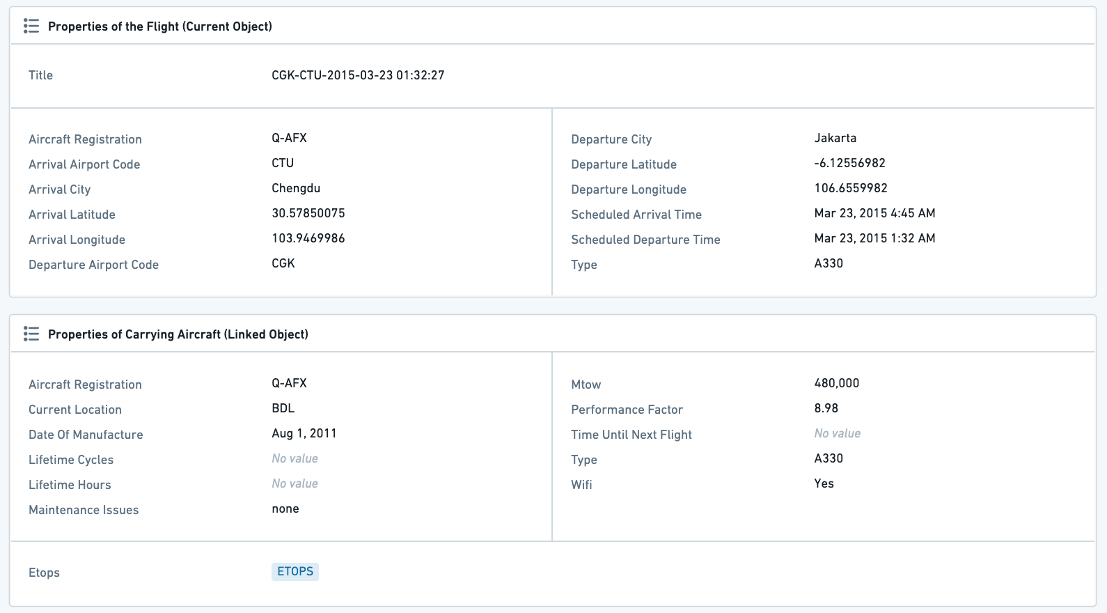
The Properties widget displays properties of an object or a linked object. A tab containing this widget is created as the default Object View for any newly defined object type.
Properties widget configuration
Properties definition in the Ontology Manager
The Properties widget configuration is closely related to the properties definition in the Ontology Manager. As you “Edit Properties and Backing Dataset”, each Property has a separate settings panel, which allows you to define how it will be displayed in the Object View.
There are several settings that affect the display in the Properties Widget:
- Property visibility
- Prominent: The property will be displayed in the Properties widget, and there is a configuration option in the widget to only display prominent properties. This option is used for the most important core properties of an object.
- Normal: The property will be displayed in the Properties widget. This option is used for most properties.
- Hidden: The property will not be displayed in the Properties widget (or anywhere in the Object View or Object Explorer). This option is used for properties such as internal IDs, relation-columns for links to other objects, and so on.
- Render Hints
- Long text: This option, marking a property as a long text (usually for long strings, such as descriptions, comments, etc.), enables displaying texts in a separate section of the Properties widget.
- Keywords: Render a property as a keyword, which changes the way it is viewed in the Properties widget, and also allows to display it in a separate section within the widget.
- Type classes: This allows you to define type classes to properties, which would affect their functionality.
- Make a property editable: If you wish to make a property editable, set up an action type or an inline action.

Configuration of the Properties widget itself
In the widget configuration, first select if you wish to display properties of the Current Object, or properties of a Linked Object:
- In case of displaying a Linked Object, first select the link that you wish to display.
- Displaying properties of a Linked Object is possible only if the Current Object is linked to only one object, which is possible either (1) in a one-to-one relationship; (2) in a many-to-one relationship, with the Current Object defined as the “many”.
- Example: Configuring a Flight object, it is possible to display the properties of the Aircraft linked to this flight (Flights to Aircraft has a many-to-one relationship). However, looking at the Aircraft object, it would not be possible to display properties of the linked Flight, as there are many Flight objects linked to any single Aircraft.
After choosing Current Object / Linked Object, there are 3 components to configure: Data, Sections, View Options.
Data
- Select what properties you wish to display:
- All Properties: Display all properties that are defined as Prominent or Normal, but no Hidden properties. Allows exclusion of a specific set of properties using the
Properties to Excludeselector (see below). - Prominent Properties: Display only the properties defined as Prominent in the Ontology Manager. Allows exclusion of a specific set of properties using the
properties to excludeselector (see below). - Specific Properties: Opens a multi-select dropdown with all properties of that Linked Object, to select between.
- No Properties: Do not display any property.
- Properties to Exclude: Select which properties you wish to exclude from display - only available for the first two options - of All Properties and Prominent Properties.
Sections
By default, there are three sections of properties, which are:
- Normal properties: All Normal and prominent;
- Long text properties: Only long text properties, which are defined as such in the Ontology Manager (see details above);
- Keyword properties: Displays keyword properties of object as tags. Only properties that were marked as keywords in the Ontology Manager, under “Edit Properties and Backing Dataset” would be displayed here.
You can remove or change the order of these sections. There are no additional types of sections to these three.
View options
- User Editable: Whether to allow users to edit properties. This requires two settings in the Ontology Manager in advance (see more details above):
- Dataset level: Edits must be enabled on the object type.
- Property level: There must be an inline edit action attached to the property.
- Hide Undefined Values: Hide all properties with undefined (null) values. If this toggle is off, the property will be displayed with “no value” text greyed out.
- Include link to 'More properties': This option will render a View all button that takes the user to a Properties tab within the same object view.
Common issues and notes
- The order in which properties are displayed is alphabetical. The main way to order properties in a different way is by using the "Sections" mentioned above, under the widget configuration.
- For more details on how to setup properties as Prominent, set properties as a Long Text or a Keyword, or making them user editable, see the documentation on editing properties.
Property Cards
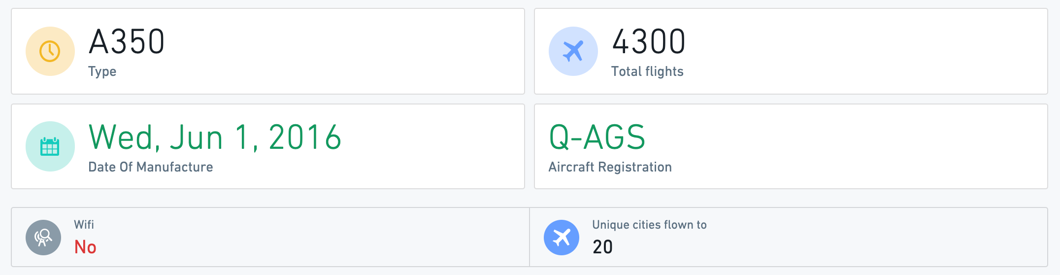
The Property Cards widget lets you visualize cards with properties and aggregations over linked objects.
Use the Property Cards widget to display important properties (numeric, timestamps, dates, strings, etc.), aggregations, statistics, metrics, KPIs, and any other key information for the current object or for objects linked to it.
- This widget is affected by filters, which apply to any aggregations of linked objects.
- The Property Cards widget supports a rich UI for conditional formatting and value formatting, including both global (based on ontology-level configurations in the ontology editor) and local override options.
Property Card configuration
Start by adding a new card for each visualization of a property / linked object aggregation. Then, configure the overall layout of all cards within the widget.
Configuration per card
- Property cards can either display a property or an aggregation of linked properties.
- When displaying a property, a card can show both properties of the current object, as well as properties of a linked object with a one-to-one relation or a many-to-one (e.g. if the current object is Flight, with a many-to-one relation to Aircraft, it would be possible to show the properties of the Aircraft object).
- When displaying a linked object, the card can show aggregations of any object linked to the current object in a one-to-many or many-to-many relation.
- In case of an aggregations, select the type of aggregation - count, unique count / cardinality, average, min, max, sum.
- Add a label which will be displayed on the card, as well as an icon and icon color.
- Conditional formatting and value formatting: By default, the widget uses the global ontology formatting rules defined at the ontology level for that specific object and property.
- This widget supports conditional formatting (e.g. color value to red/green according to predefined rules). Supported options are global formatting (as configured in Ontology Manager (see conditional formatting documentation) and an optional local override. Note that this applies only for properties, not for aggregations.
- The Property Cards widget supports value formatting (e.g.
$3.6Minstead of3,625,329). Supported options are global value formatting (as configured in Ontology Manager; see value formatting documentation) and a local override. Note that this applies to properties and to aggregations of linked properties. - For local overrides, both value and conditional formatting use the same UI as the ontology level formatting, check the ontology documentation (linked above) for further details.
Configuration for all cards on a Property Cards widget
- Once all property and aggregation cards are configured, use the layout configuration to determine styling of background, size, style, alignment and icon style of cards in display.
- If you wish to use different types of visual configurations for different cards, consider adding a new widget instance for each different configuration.

Common issues and notes
- Property Cards is the supported widget for visualizing prominent properties, aggregations, statistics, metrics, KPIs and any other key information for the current object and linked objects.
- This widget is the preferred solution over any other widget for purposes of visualizing single key properties and aggregations. Consider using the Property Cards widget instead of the following widgets: Statistics, Context Stat Section, Linked Statistics, Advanced Statistics, or Property Plus.
- The Property Cards widget does not support Functions on Objects. If this support is required, consider using Workshop or Quiver and embedding it in the Object View using the dedicated widgets.
Links
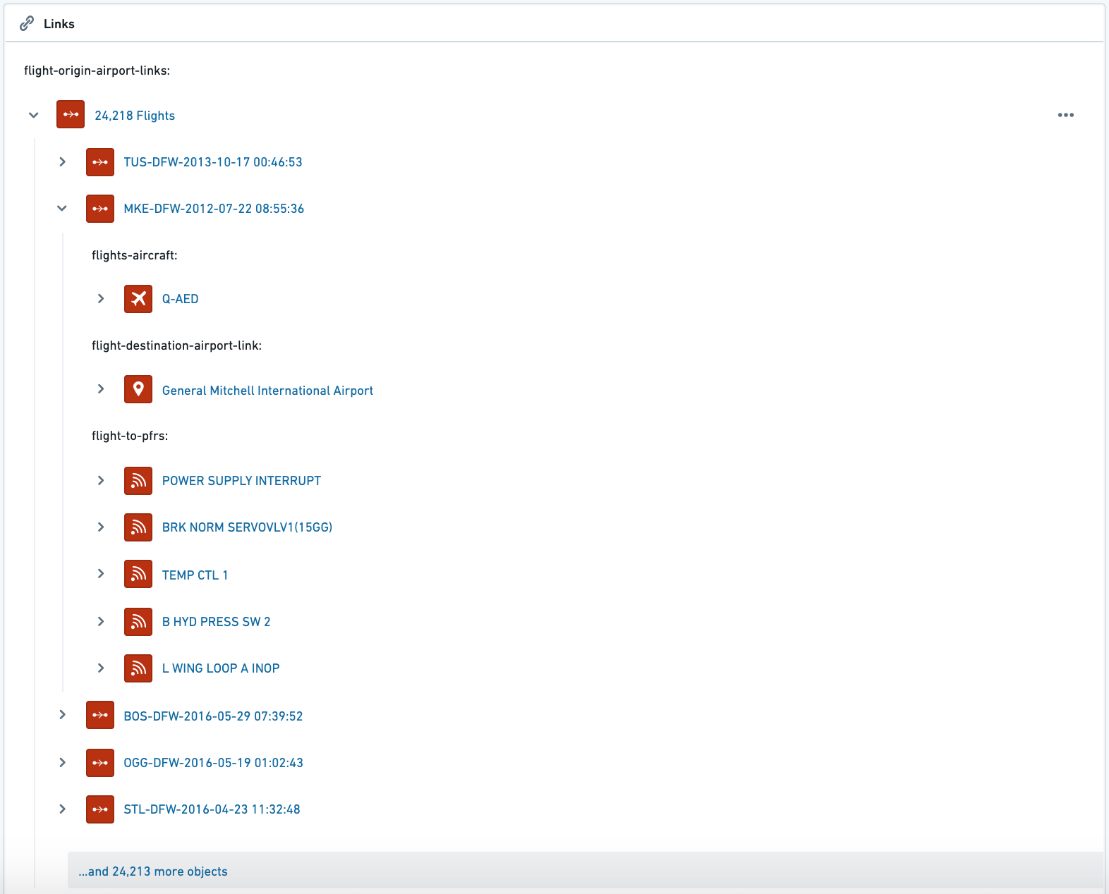
The Links widget displays an object's links in a tree view, with the ability to traverse through Links and navigate to Linked Objects. This includes:
- Display a tree of all Linked Objects, with the ability to expand the view for each Linked Objects, to display all Objects Linked to it, and continue hopping through Links (“nested links”);
- Hover over any Object to see a tooltip with all prominent properties of that Object;
- Click on any object to jump to its Object View.
See an example below, which includes 3 steps:
- Starting with an Airport object;
- Moving to all Linked Flights;
- Moving to all Linked Objects of one of these Flights: Aircraft, Destination Airport, all related Post-Flight Reviews.
Links widget configuration
- Link types (first links only) - allows you to determine which types of links will be displayed on the widget. Users can traverse through links and hop to other linked objects (e.g. from an Airport → to all Flights → to the Aircraft carrying these Flights → to the Airlines owning these Aircraft, etc.)
- Filter Nested Links by Type - this setting allows you to only display Linked Objects that are chosen under the “Link types (first links only)”.
Common issues and notes
- It is currently not possible to sort or determine the order of
- The list of values of Linked Objects (e.g. show all Linked Flights alphabetically).
- The types of Linked Objects under this widget (e.g. show Linked Flights first and Linked Aircraft second).
- This widget is currently not affected by filters. Links displayed are always all Objects linked to the current Object.
Edit History
The Edit History widget displays a list view with the history of all edits made for the current object in view. If the object has never been edited or the subset of selected columns (more below) has no edits, this widget will display a No Edits message.

Edit History configuration
| Option | Description |
|---|---|
| All Properties | Displays edits for all properties on the given object type. |
| Specific Properties | Specific Properties, Only displays edits for properties selected in the Properties to Include selector in the widget config. |
Common issues and notes
- Only changes made via Actions to the object will be shown in Edit History. Changes made in the backing dataset or in the pipeline upstream will not be reflected on this widget.
- Edit History will only reflect the changes made to objects indexed into Object Storage V2 after the Track user edit history toggle is enabled within Ontology Manager.
- Tracking user edits for object types with marking properties is not supported at this time.
- Each submitted value is logged as an edit, even if it is coming from a default value configured in an action parameter.
中文翻译
属性与链接
本页面介绍所有用于展示对象数据模型和本体简单表格视图的组件,重点显示当前对象的属性以及该对象与其他对象之间的链接。
此类别还包括用于呈现统计数据、指标或关键绩效指标(KPI)的组件,这些数据既可以是对象管道中预先计算并作为对象属性提供的,也可以是通过对链接到当前对象的对象进行聚合计算得出的。
属性组件
属性组件用于显示对象或链接对象的属性。包含此组件的标签页会作为任何新定义对象类型的默认对象视图创建。
属性组件配置
本体管理器中的属性定义
属性组件的配置与本体系管理器中的属性定义密切相关。当您"编辑属性和支持数据集"时,每个属性都有独立的设置面板,允许您定义其在对象视图中的显示方式。
有多个设置会影响属性组件中的显示效果:
- 属性可见性
- 突出显示:该属性将显示在属性组件中,并且组件内有一个配置选项,可以仅显示突出显示的属性。此选项用于对象最重要的核心属性。
- 普通:该属性将显示在属性组件中。此选项用于大多数属性。
- 隐藏:该属性不会显示在属性组件中(也不会显示在对象视图或对象资源管理器中的任何位置)。此选项用于内部ID、指向其他对象的链接关系列等属性。
- 渲染提示
- 长文本:此选项将属性标记为长文本(通常用于长字符串,如描述、评论等),允许在属性组件的单独区域中显示文本。
- 关键词:将属性渲染为关键词,这会改变其在属性组件中的查看方式,并允许在组件内的单独区域中显示。
- 类型类:这允许您为属性定义类型类,从而影响其功能。
- 使属性可编辑:如果您希望使属性可编辑,请设置一个操作类型或一个内联操作。
属性组件本身的配置
在组件配置中,首先选择是要显示当前对象的属性,还是链接对象的属性:
- 如果要显示链接对象,请先选择要显示的链接。
- 仅当当前对象仅链接到一个对象时,才能显示链接对象的属性,这可以通过以下两种方式实现:(1) 一对一关系;(2) 多对一关系,且当前对象被定义为"多"的一方。
- 示例:配置一个航班对象,可以显示链接到此航班的飞机的属性(航班到飞机是多对一关系)。但是,查看飞机对象时,无法显示链接航班的属性,因为任何一架飞机都链接了多个航班对象。
选择当前对象/链接对象后,需要配置三个部分:数据、分区、视图选项。
数据
- 选择要显示的属性:
- 所有属性:显示所有定义为"突出显示"或"普通"的属性,但不显示隐藏属性。允许使用"排除属性"选择器排除特定属性集(见下文)。
- 突出显示的属性:仅显示在本体管理器中定义为"突出显示"的属性。允许使用"排除属性"选择器排除特定属性集(见下文)。
- 特定属性:打开一个多选下拉菜单,其中包含该链接对象的所有属性,供您选择。
- 无属性:不显示任何属性。
- 排除属性:选择要从显示中排除的属性——仅适用于前两个选项:"所有属性"和"突出显示的属性"。
分区
默认情况下,有三个属性分区,分别是:
- 普通属性:所有普通和突出显示的属性;
- 长文本属性:仅限长文本属性,这些属性在本体管理器中被定义为长文本(详见上文);
- 关键词属性:将对象的关键词属性显示为标签。只有在本体管理器的"编辑属性和支持数据集"中被标记为关键词的属性才会在此处显示。
您可以删除或更改这些分区的顺序。除了这三个分区外,没有其他类型的分区。
视图选项
- 用户可编辑: 是否允许用户编辑属性。这需要提前在本体管理器中进行两项设置(详见上文):
- 数据集级别:必须对对象类型启用编辑。
- 属性级别:必须有一个内联编辑操作附加到该属性。
- 隐藏未定义值: 隐藏所有值为未定义(null)的属性。如果关闭此开关,属性将显示为灰色的"无值"文本。
- 包含指向'更多属性'的链接: 此选项将渲染一个查看全部按钮,用户点击后将跳转到同一对象视图中的属性标签页。
常见问题与说明
- 属性的显示顺序是按字母顺序排列的。改变属性顺序的主要方法是使用上述组件配置中的"分区"功能。
- 有关如何将属性设置为"突出显示"、设置为"长文本"或"关键词",或使其可编辑的更多详细信息,请参阅编辑属性文档。
属性卡片
属性卡片组件允许您可视化显示属性和对链接对象的聚合结果。
使用属性卡片组件可以显示重要属性(数值、时间戳、日期、字符串等)、聚合结果、统计数据、指标、关键绩效指标(KPI)以及当前对象或其链接对象的任何其他关键信息。
属性卡片配置
首先,为每个属性/链接对象聚合的可视化添加一张新卡片。然后,配置组件内所有卡片的整体布局。
每张卡片的配置
- 属性卡片可以显示一个属性或链接属性的聚合结果。
- 显示属性时,一张卡片可以显示当前对象的属性,也可以显示具有一对一或多对一关系的链接对象的属性(例如,如果当前对象是航班,与飞机有多对一关系,则可以显示飞机对象的属性)。
- 显示链接对象时,卡片可以显示与当前对象具有一对多或多对多关系的任何链接对象的聚合结果。
- 如果是聚合结果,请选择聚合类型——计数、唯一计数/基数、平均值、最小值、最大值、总和。
- 添加将在卡片上显示的标签,以及图标和图标颜色。
- 条件格式和值格式: 默认情况下,组件使用在本体级别为该特定对象和属性定义的全局本体格式化规则。
- 此组件支持条件格式(例如,根据预定义规则将值颜色设置为红色/绿色)。支持的选项包括全局格式化(如在本体管理器中配置,请参阅条件格式文档)和可选的本地覆盖。请注意,这仅适用于属性,不适用于聚合。
- 属性卡片组件支持值格式(例如,显示
$3.6M而不是3,625,329)。支持的选项包括全局值格式化(如在本体管理器中配置,请参阅值格式文档)和本地覆盖。请注意,这适用于属性和链接属性的聚合结果。 - 对于本地覆盖,值和条件格式都使用与本体系级别格式化相同的用户界面,有关详细信息,请查看本体文档(上面已链接)。
属性卡片组件中所有卡片的配置
- 配置完所有属性和聚合卡片后,使用布局配置来确定卡片在显示时的背景、大小、样式、对齐方式和图标样式。
- 如果您希望对不同的卡片使用不同类型的视觉配置,请考虑为每种不同的配置添加一个新的组件实例。
常见问题与说明
- 属性卡片是用于可视化显示当前对象和链接对象的突出属性、聚合结果、统计数据、指标、关键绩效指标(KPI)以及任何其他关键信息的推荐组件。
- 对于可视化单个关键属性和聚合结果的目的,此组件是优于任何其他组件的首选解决方案。请考虑使用属性卡片组件代替以下组件:统计数据、上下文统计部分、链接统计数据、高级统计数据或属性增强。
- 属性卡片组件不支持对象函数。如果需要此支持,请考虑使用 Workshop 或 Quiver,并通过专用组件将其嵌入到对象视图中。
链接
链接组件以树状视图显示对象的链接,并能够遍历链接并导航到链接对象。这包括:
- 显示所有链接对象的树状结构,能够展开每个链接对象的视图,以显示其链接的所有对象,并继续在链接之间跳转("嵌套链接");
- 悬停在任何对象上,可以查看包含该对象所有突出显示属性的工具提示;
- 点击任何对象,可以跳转到其对象视图。
请参见下面的示例,其中包含3个步骤:
- 从一个机场对象开始;
- 转到所有链接的航班;
- 转到其中一个航班的所有链接对象:飞机、目的地机场、所有相关的飞行后审查。
链接组件配置
- 链接类型(仅限一级链接)——允许您确定哪些类型的链接将显示在组件上。用户可以遍历链接并跳转到其他链接对象(例如,从机场 → 到所有航班 → 到执飞这些航班的飞机 → 到拥有这些飞机的航空公司等)。
- 按类型过滤嵌套链接——此设置允许您仅显示在"链接类型(仅限一级链接)"下选择的链接对象。
常见问题与说明
- 目前无法排序或确定以下内容的顺序:
- 链接对象的值列表(例如,按字母顺序显示所有链接的航班)。
- 此组件下链接对象的类型(例如,先显示链接的航班,再显示链接的飞机)。
- 此组件目前不受过滤器影响。显示的链接始终是链接到当前对象的所有对象。
编辑历史
编辑历史组件以列表视图显示对当前对象进行的所有编辑的历史记录。如果对象从未被编辑过,或者所选列的子集(见下文)没有编辑记录,此组件将显示"无编辑"消息。
编辑历史配置
| 选项 | 描述 |
|---|---|
| 所有属性 | 显示对给定对象类型上所有属性的编辑。 |
| 特定属性 | 仅显示在组件配置的"包含属性"选择器中选择的属性的编辑。 |
常见问题与说明
- 只有通过操作对对象进行的更改才会显示在编辑历史中。在支持数据集或上游管道中进行的更改不会反映在此组件上。
- 编辑历史仅反映在跟踪用户编辑历史开关在本体管理器中启用后,索引到对象存储 V2 的对象所做的更改。
- 目前不支持跟踪具有标记属性的对象类型的用户编辑。
- 每个提交的值都会被记录为一次编辑,即使它来自操作参数中配置的默认值。