Visualization(可视化)
Visualization widgets display data related to the current object in charts, pivot tables, timelines, maps, and other visualizations, including simple text and metrics. Visualizations created in other Foundry apps can be embedded as well - see the Apps and Files category to learn more about embedding Slate applications, Contour boards, Foundry reports, Fusion spreadsheets, and Quiver time series or charts.
Linked Object View
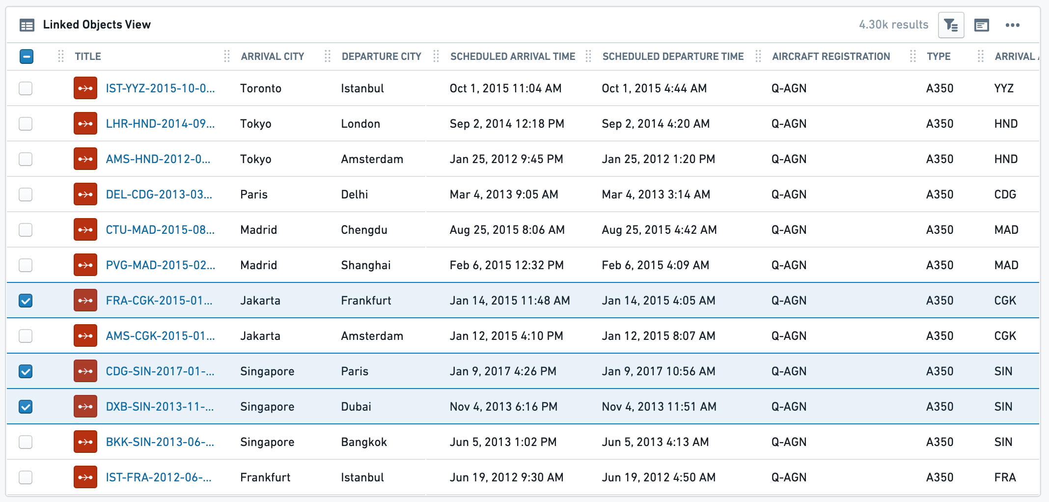
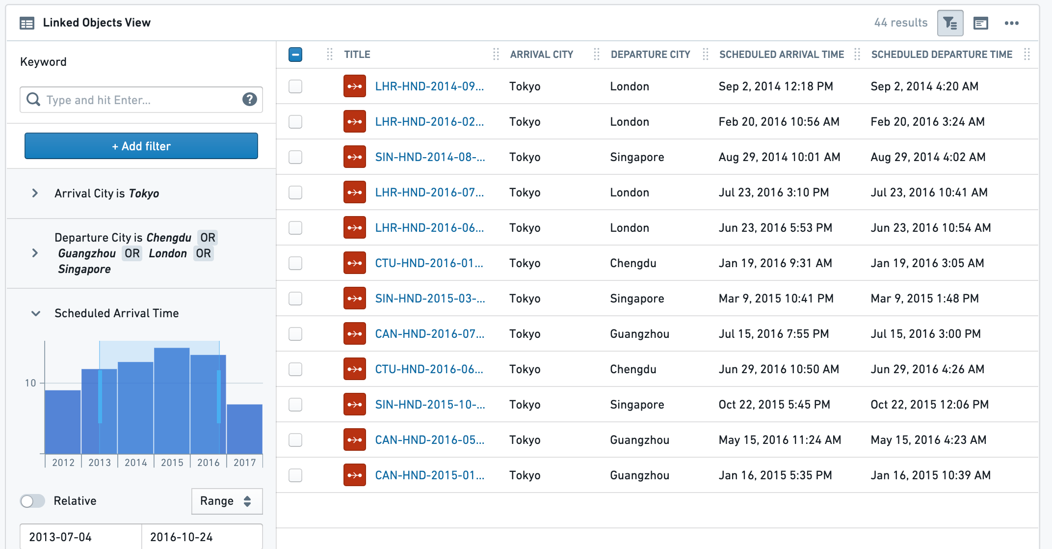
This widget is mainly used to display a table view of all Linked Objects of a certain type along with their relevant properties. The table also supports selection of subset of linked objects to open in other Foundry apps or perform configured Object Actions. In addition to a table view, a simple list view and a card view are also available.
Example for Linked Object View (Table) without a Filter Sidebar, and with a Filter Sidebar:
Configuration
Settings tab
The configuration has 3 parts:
- Data
- Linked Object to display: Select the Linked Object you wish to display. The widget configuration offers objects that are linked to the current object as defined in the Ontology configuration. Choose either an object type either via a direct link or through a transitive link using an intermediate object type.
- Properties to display:
- All Properties - display all properties that are defined as Prominent or Normal, but no Hidden properties. Allows excluding a specific set of properties using the
Properties to Excludeselector (see below). - Prominent Properties - display only the properties defined as Prominent in the Ontology Manager. Allows exclusion of a specific set of properties using the
properties to excludeselector (see below). - Specific Properties - opens a multi-select dropdown with all properties of that Linked Object, to select between.
- No Properties - do not display any property.
- All Properties - display all properties that are defined as Prominent or Normal, but no Hidden properties. Allows excluding a specific set of properties using the
- Properties to Exclude: select which properties you wish to exclude from display. Available for All Properties and Prominent Properties options.
- View Options - choose which view type will be displayed to the end-user by default. The end-user can still change to the other 2 views in the UI (on the widget header).
- Table view - the most commonly used view, displays a table of all values, with quick filter search.
- Card view - a condensed cards view of each Linked Object, with properties (as selected on 1b). This option does not have the full functionality of the table view. For example, it does not support selection or Object Actions.
- Note: For the Card display option, there is a secondary configuration called “Card Width” which determines the visual density of these cards. It has no effect for the Table or List view options.
- List view - a simple list view of all instances of the chosen Linked Object, without any option of selection or any display of linked properties.
- Search and Filtering - add search and filtering capabilities to the table view
- Results limit - limit the maximum number of results to be shown. The more results you wish to display, the longer it would take the view to load. This, together with the minimum/maximum height configuration (see below on the Format tab) determine how much of the entire view this widget would take.
- Enable search and filtering - toggle on to have search and filtering functionality on the widget. This includes either basic or advanced search functionality:
- Basic - have a simple search bar for free text searches at widget header.
- Advanced - have a full filter sidebar with detailed filtering options, including a toggle to expand or collapse the sidebar by default to end-users. Unlike the basic free-text search, this search allows more complex filtering based on property type (free-text and multi-select for strings, date range for timestamps, numeric for double/integer). This search bar is based on the legacy Object Explorer functionality and UI.
Format tab:
Under the format tab within the widget configuration, aside from defaults of Title, Icon, Info and Layout, you can control the minimum and maximum height of the section (optional).
Common Issues and Notes:
- This widget is affected by filters from other widgets - if the toggle is on - but does not publish filters to other widgets sharing cross-filtering with it, even if the filter sidebar is open. In effect, internal filters are limited to the context of the object table widget.
- Conditional Formatting and Value Renderers - Values in the table can be rendered with conditional formatting and value renderers.
Timeline
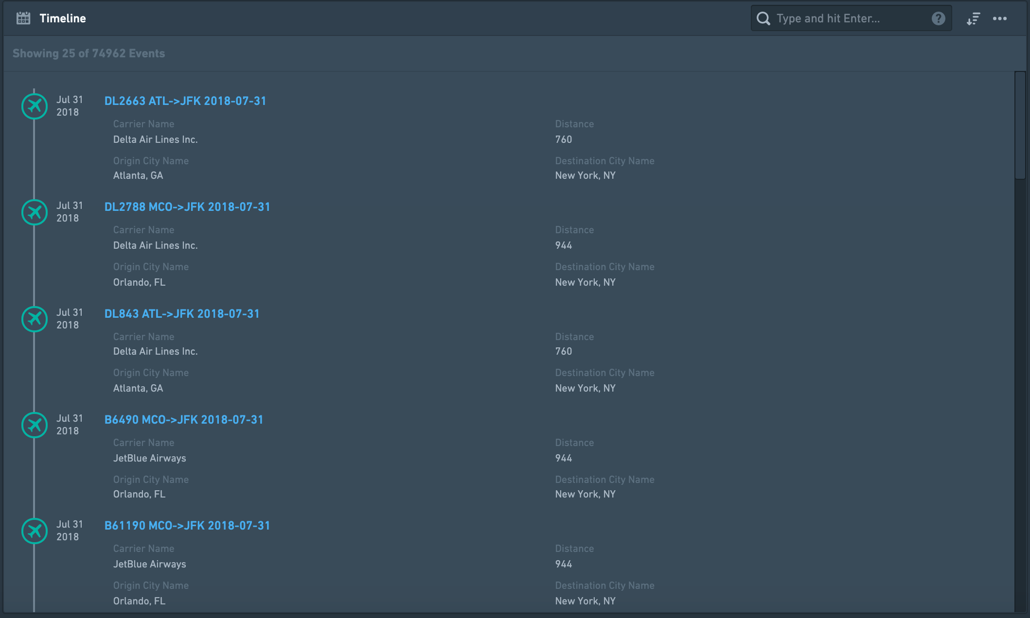
Create a chronological list of events, displayed top-down, sorted by date and time. This timeline is built of linked objects that must have at least one timestamp, and are usually events, that is an object with a start and end timestamp that define some duration. This widget can include one or more types of objects linked to the current object directly, or through a linked object. It can also display the same event by different date properties as in the examples below.
For a graph timeline, use the Grouped Events Timeline and Table widget.
Configuration
Settings tab
- Add one or more Linked Objects (event) - First, add at least one Linked object type that you wish to display on the timeline by clicking on “Add Event Type”. You can add many types of Linked Objects:
- Display different object types on the timeline, that are completely different events. Example: Linked Objects to an Aircraft that are both Flights events and Aircraft Maintenance events.
- Display events of the same Linked Object type, but by different date properties, or with different types of Links defined. Examples:
- Flight events linked to an Airport object displayed on the same timeline by different date properties: (1) “Planned Arrival Time”, (2) “Actual Arrival Time”, (3) “Expected Departure Time”. The timeline will display a chronological list of all flights, and each flight will appear up to 3 times in this case.
- An Airport object can have both Arriving Flights as well as Departing Flights that are linked to it displayed on the same timeline.
- Select the type of event object you wish to add - for each event object you wish to add, configure the details of that object type:
- Select a linked object type - either directly Linked Object or an Extended Link.
- Example of a directly Linked Object: current object is an Airport and you want to display a timeline of Arriving Flights and Departing Flights.
- Example of an Extended object (2nd degree): current object is an Airport, and you want to display a timeline with all Aircraft objects that are linked to Arriving Flights linked to the Airport.
- Define the date property used to sort events on the timeline - select the property of the Linked Object you wish to sort the events on your timeline by. This property has to be a timestamp / date, so the configuration only suggests such properties.
- Select which properties to display from the Linked Object.
- Select what properties you wish to display:
- All Properties - not recommended if the Linked Object has many properties, as it would be crowded and hard to navigate through the timeline.
- Prominent Properties - only the properties defined as Prominent in the Ontology Manager.
- Specific Properties - opens a multi-select dropdown with all properties of that Linked Object, to select between.
- No Properties - only the title of the Linked Object would be displayed on the timeline.
- Select which properties you wish to exclude - only available for the first two options of All Properties and Prominent Properties.
- Select which title would be displayed for each event on your timeline. There are three options:
- Object Name as title (e.g. name of the event) - this is the most commonly used option and the default.
- Date Property name as title - this is useful if you wish to display events from a Linked Object using more than one property (e.g. “Planned Arrival Time”, “Actual Arrival Time”, “Expected Departure Time”, etc.). Reminder: in such a case, each link based on a different property, should be configured separately within the Timeline widget - see bullet 1 above).
- Custom Name - an option to add a free-text description for all Linked Objects of that type. E.g. if you link both Arriving Flights and Departing Flights under the same timeline, you may want to describe all Arriving Flights with the title “Arrival” and all Departing Flights with “Departure”.
Format tab
Under the format tab within the widget configuration, aside from defaults of Title, Icon, Info and Layout, you can control the minimum and maximum height of the section (optional).
Common issues and notes
- This widget is searchable and sortable (oldest first, newest first). However, it doesn't support filtering, so it is not affected by filters. For filtering functionality, consider using the Grouped Events Timeline and Table widget.
- If you wish to display events on a graphic timeline (and not just be a chronological list), consider using the Grouped Events Timeline and Table widget.
- If you wish to display a Gantt chart style timeline, there is a “Linked Objects Gantt Chart” widget. If this is not available, contact your Palantir representative for more details. This is relevant for displaying a smaller number of events, with distinct start and end dates, such as a project timeline.
- For Timeseries visualizations, contact your Palantir team for more details about Quiver, which can be embedded in an Object View. You can also use Charts widgets (or embed charts from Contour or Quiver charts), with a date/time property on the X-axis.
- Events with missing dates will not be displayed on the events list. There will be a message alerting the user about missing events.
- For performance reasons, only 50 Linked Objects are displayed by default. As the user scrolls down through the list, additional objects will appear, 100 at a time.
Grouped Events Timeline and Table
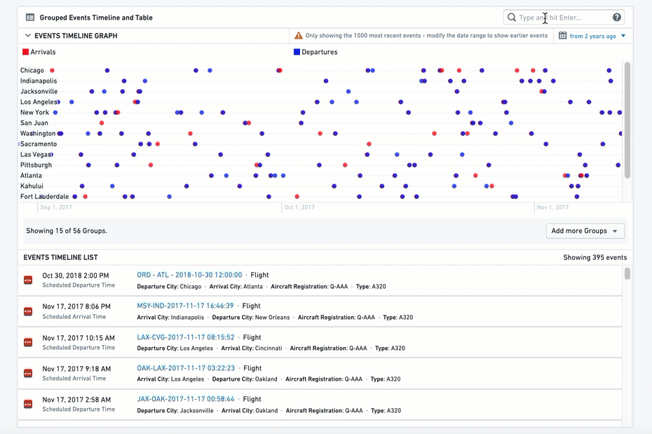
This widget includes two components: (1) a timeline of Linked Objects, and (2) a table listing the Linked Objects underneath. Linked objects can be grouped by properties and filtered by text, date range and external filters.
Grouped events are plotted on separate parallel lines, with each line including only events that have a property with a certain value, similar to a pivot table. In the example below, each city has a different line, with all flights that are arriving (red) or departing (blue) from that city on that line.
This widget can include one or more types of objects linked to the current object directly, or through a linked object. It can also display the same event by different date properties (examples below).
Configuration
Settings
- Add one or more Linked Objects (event) - First, add at least one Linked Object Type that you wish to display on the timeline by clicking on “Add Item”. You can add many types of Linked Object:
- Display different object types on the timeline, that are completely different events. Example: Linked Objects to an Aircraft that are both Flights events and Maintenance events.
- Display events of the same Linked Object type, but by different date properties, or with different types of Links defined. Examples:
- Flights events linked to an Airport object displayed on the same timeline by different date properties: (1) “Planned Arrival Time”, (2) “Actual Arrival Time”, (3) “Expected Departure Time”. Each flight will appear up to 3 times in this case.
- An Airport object can have both Arriving Flights as well as Departing Flights that are linked to it displayed on the same timeline.
- Select the type of event object you wish to add - for each event object you wish to add, configure the details of that object type:
- Select Linked Object - either directly Linked Object or an Extended Link.
- Example of a directly Linked Object: current object is an Airport and you want to display a timeline of Arriving Flights and Departing Flights.
- Example of an Extended object (2nd degree): current object is an Airport, and you want to display a timeline of all Aircraft objects that are linked to Arriving Flights linked to the Airport.
- Configure visual format options
- Max Number of Events - this option is currently not functional.
- Color - select the color for the all events under this item’s configuration. Use the Blueprint standard colors ↗ or basic color names - “Blue”, “Red”, “Yellow”, etc.
- Series Name - the description of all events under this timeline, which will be displayed on the legend of the graphic timeline.
- Define the date property used to sort events on the timeline - select by which property of the Linked Object you wish to use to display the events on your timeline. This property has to be a timestamp / date, so the configuration only suggests such properties.
- Group Events By - select how to group the events on the graphic timeline. Each group would be displayed as a separate horizontal line of events in the graphic timeline, stacked one on top of the other. There are two options:
- Constant - current item would be grouped on a single timeline, with a title defined as a free-text value. In this case, if you wish to add other timelines as separate lines, you must define additional items.
- Property - split the events to a number of separate timelines, with events grouped on each timeline according to the different values of that property.
- Example: displaying a timeline of all Arriving Flights of an Airport object, one could select the “Airline Name” property and have a separate timeline for each Airline with all flights of that Airline on its dedicated timeline. The list below would include a chronological list of all Flights events from all Airlines.
- Properties Displayed in List - select the properties you wish to display on the second part of the widget, the List:
- Select what properties you wish to display:
- All Properties - not recommended if the Linked Object has many properties, as it would be crowded and hard to navigate through the timeline.
- Prominent Properties - only the properties defined as Prominent in the Ontology Manager.
- Specific Properties - opens a multi-select dropdown with all properties of that Linked Object. Choose specific properties to display.
- No Properties - only the title of the Linked Object is displayed on the timeline.
- Property Filter - an optional toggle to add a filter based on a single property, to include only specific values. These values must be explicitly typed as case-sensitive free-text strings.
- Additional configurations for the graphic timeline (these only apply to the timeline component and have no effect on the table component)
- Groups Displayed by Default - how many timelines, or which ones exactly, should be displayed as separate lines in the timeline. In both cases, the user would have a multi-select helper with all other groups on it.
- Max Number - the maximal number of different groups and different timelines would be displayed in the graphic timeline, as a number (Value).
- Explicit List - write the exact list of values of the groups you wish to display (text, case sensitive).
- Sort Groups By - the timeline can have multiple horizontal lines, and this allows you to sort these lines by 1 of 3 ways:
- Configuration Order - the order in which you configured the different items
- Name - alphabetical order of all groups, from A at the top - to Z at the bottom
- Most Recent Event - the group with the most recent event at the top
- Max Graph Height - set the maximum height of the graphic timeline in the widget (in pixels). To set the height of the entire widget, see the Sizing options under the Format tab in the configuration.
Format
Under the format tab, aside from defaults of Title, Icon, Info and Layout, you can control the minimum and maximum height of the section. Setting either is optional.
Common Issues and Notes
- The end use can filter the timeline using a free-text filter or a date range. Note that these filters are not published and do not affect other widgets.
- This widget is affected by other filtering widgets, if cross-section filtering is enabled.
中文翻译
可视化
可视化组件(Visualization widgets) 以图表、透视表、时间线、地图及其他可视化形式(包括纯文本和指标)展示与当前对象相关的数据。在其他 Foundry 应用中创建的可视化内容也可以嵌入——请参阅应用与文件类别,了解更多关于嵌入 Slate 应用、Contour 看板、Foundry 报告、Fusion 电子表格以及 Quiver 时间序列或图表的信息。
链接对象视图(Linked Object View)
此组件主要用于以表格形式展示某一特定类型的所有链接对象(Linked Objects)及其相关属性。该表格还支持选择部分链接对象,以便在其他 Foundry 应用中打开或执行已配置的对象操作(Object Actions)。 除表格视图外,还提供简单的列表视图和卡片视图。
无筛选侧边栏和有筛选侧边栏的链接对象视图(表格)示例:
配置
设置(Settings)选项卡
配置包含 3 个部分:
- 数据(Data)
- 要显示的链接对象(Linked Object to display):选择您希望显示的链接对象。组件配置会提供根据本体配置定义的、与当前对象存在链接的对象。您可以选择通过直接链接或通过中间对象类型的传递链接(transitive link)来选择对象类型。
- 要显示的属性(Properties to display):
- 所有属性(All Properties)——显示所有被定义为“重要(Prominent)”或“普通(Normal)”的属性,但不显示“隐藏(Hidden)”属性。允许使用“要排除的属性(Properties to Exclude)”选择器(见下文)排除特定属性集。
- 重要属性(Prominent Properties)——仅显示在本体管理器(Ontology Manager)中定义为“重要”的属性。允许使用“要排除的属性”选择器(见下文)排除特定属性集。
- 特定属性(Specific Properties)——打开一个多选下拉菜单,列出该链接对象的所有属性,供您选择。
- 无属性(No Properties)——不显示任何属性。
- 要排除的属性(Properties to Exclude):选择您希望从显示中排除的属性。此选项适用于所有属性和重要属性选项。
- 视图选项(View Options)——选择默认向最终用户显示的视图类型。最终用户仍可在用户界面(组件标题处)切换到其他两种视图。
- 表格视图(Table view)——最常用的视图,显示所有值的表格,并带有快速筛选搜索功能。
- 卡片视图(Card view)——每个链接对象的紧凑卡片视图,显示所选属性(根据 1b 选择)。此选项不具备表格视图的全部功能。例如,它不支持选择或对象操作。
- 注意:对于卡片显示选项,有一个名为“卡片宽度(Card Width)”的次要配置,用于确定这些卡片的视觉密度。它对表格或列表视图选项没有影响。
- 列表视图(List view)——所选链接对象所有实例的简单列表视图,没有任何选择选项或链接属性显示。
- 搜索与筛选(Search and Filtering)——为表格视图添加搜索和筛选功能
- 结果限制(Results limit)——限制显示的最大结果数量。您希望显示的结果越多,视图加载所需的时间就越长。此设置与最小/最大高度配置(见下文“格式”选项卡)共同决定该组件在整个视图中占据的空间大小。
- 启用搜索和筛选(Enable search and filtering)——开启后,组件将具备搜索和筛选功能。这包括基本或高级搜索功能:
- 基本(Basic)——在组件标题处提供一个简单的搜索栏,用于自由文本搜索。
- 高级(Advanced)——提供一个完整的筛选侧边栏,包含详细的筛选选项,并可选择默认对最终用户展开或折叠侧边栏。与基本的自由文本搜索不同,此搜索允许基于属性类型进行更复杂的筛选(字符串的自由文本和多选、时间戳的日期范围、双精度/整数的数值)。此搜索栏基于旧版对象浏览器(Object Explorer)功能和用户界面。
格式(Format)选项卡:
在组件配置的格式选项卡下,除了标题(Title)、图标(Icon)、信息(Info)和布局(Layout)的默认设置外,您可以控制该部分的最小和最大高度(可选)。
常见问题与说明:
- 如果切换开关已打开,此组件会受到来自其他组件的筛选器影响,但不会发布筛选器给与其共享交叉筛选的其他组件,即使筛选侧边栏已打开。实际上,内部筛选器仅限于对象表格组件的上下文。
- 条件格式(Conditional Formatting)和值渲染器(Value Renderers)——表格中的值可以使用条件格式和值渲染器进行渲染。
时间线(Timeline)
创建一个按日期和时间排序、自上而下显示的事件时间顺序列表。此时间线由必须至少有一个时间戳的链接对象构建,通常是事件,即具有定义某个持续时间的开始和结束时间戳的对象。 此组件可以包含一种或多种与当前对象直接链接或通过链接对象间接链接的对象类型。它还可以通过不同的日期属性显示同一事件,如下例所示。
如需图形时间线,请使用分组事件时间线与表格组件。
配置
设置(Settings)选项卡
- 添加一个或多个链接对象(事件) - 首先,点击“添加事件类型(Add Event Type)”添加至少一个您希望显示在时间线上的链接对象类型。您可以添加多种类型的链接对象:
- 在时间线上显示完全不同的对象类型。例如:与某架飞机(Aircraft)链接的飞行事件(Flights)和飞机维护事件(Aircraft Maintenance)。
- 显示同一链接对象类型的事件,但使用不同的日期属性或不同类型的已定义链接。例如:
- 与机场(Airport)对象链接的飞行事件,通过不同的日期属性显示在同一时间线上:(1) “计划到达时间(Planned Arrival Time)”,(2) “实际到达时间(Actual Arrival Time)”,(3) “预计起飞时间(Expected Departure Time)”。在这种情况下,时间线将按时间顺序列出所有航班,每个航班最多会出现 3 次。
- 一个机场对象可以同时显示与其链接的到达航班(Arriving Flights)和出发航班(Departing Flights)在同一时间线上。
- 选择您希望添加的事件对象类型 - 对于您希望添加的每个事件对象,配置该对象类型的详细信息:
- 选择一个链接对象类型——可以是直接链接对象或扩展链接(Extended Link)。
- 直接链接对象示例:当前对象是机场,您希望显示到达航班和出发航班的时间线。
- 扩展对象(二级)示例:当前对象是机场,您希望显示所有与链接到该机场的到达航班相关联的飞机对象的时间线。
- 定义用于对时间线上事件进行排序的日期属性 - 选择您希望用于在时间线上对事件进行排序的链接对象的属性。此属性必须是时间戳/日期类型,因此配置仅建议此类属性。
- 选择要从链接对象显示的属性。
- 选择您希望显示的属性:
- 所有属性(All Properties)——如果链接对象有很多属性,不建议使用,因为会显得拥挤且难以在时间线中导航。
- 重要属性(Prominent Properties)——仅显示在本体管理器中定义为“重要”的属性。
- 特定属性(Specific Properties)——打开一个多选下拉菜单,列出该链接对象的所有属性,供您选择。
- 无属性(No Properties)——时间线上仅显示链接对象的标题。
- 选择您希望排除的属性——仅适用于前两个选项(所有属性和重要属性)。
- 选择时间线上每个事件显示的标题。有三个选项:
- 对象名称(Object Name) 作为标题(例如事件的名称)——这是最常用的选项,也是默认选项。
- 日期属性名称(Date Property name) 作为标题——如果您希望使用多个属性(例如“计划到达时间”、“实际到达时间”、“预计起飞时间”等)显示来自链接对象的事件,此选项非常有用。提醒:在这种情况下,基于不同属性的每个链接应在时间线组件内单独配置——请参见上文第 1 点。
- 自定义名称(Custom Name)——为所有该类型的链接对象添加自由文本描述的选项。例如,如果您在同一时间线下链接了到达航班和出发航班,您可能希望将所有到达航班描述为标题“到达(Arrival)”,将所有出发航班描述为“出发(Departure)”。
格式(Format)选项卡
在组件配置的格式选项卡下,除了标题、图标、信息和布局的默认设置外,您可以控制该部分的最小和最大高度(可选)。
常见问题与说明
- 此组件支持搜索和排序(最早优先、最新优先)。但是,它不支持筛选,因此不受筛选器影响。如需筛选功能,请考虑使用分组事件时间线与表格组件。
- 如果您希望在图形时间线上显示事件(而不仅仅是时间顺序列表),请考虑使用分组事件时间线与表格组件。
- 如果您希望显示甘特图(Gantt chart)风格的时间线,有一个“链接对象甘特图(Linked Objects Gantt Chart)”组件。如果不可用,请联系您的 Palantir 代表了解更多详情。这适用于显示数量较少、具有明确开始和结束日期的事件,例如项目时间线。
- 对于时间序列(Timeseries)可视化,请联系您的 Palantir 团队了解更多关于 Quiver 的详细信息,Quiver 可以嵌入到对象视图中。您也可以使用图表组件(或嵌入来自 Contour 或 Quiver 图表的图表),并在 X 轴上使用日期/时间属性。
- 缺少日期的事件将不会显示在事件列表中。会有消息提醒用户存在缺失事件。
- 出于性能考虑,默认仅显示 50 个链接对象。当用户向下滚动列表时,会以每次 100 个的方式加载更多对象。
分组事件时间线与表格(Grouped Events Timeline and Table)
此组件包含两个部分:(1) 链接对象的时间线,以及 (2) 下方列出链接对象的表格。链接对象可以按属性分组,并可以通过文本、日期范围和外部筛选器进行筛选。
分组事件绘制在单独的平行线上,每条线仅包含具有特定属性值的事件,类似于透视表。在下面的示例中,每个城市有一条不同的线,该线上包含所有到达(红色)或离开(蓝色)该城市的航班。
此组件可以包含一种或多种与当前对象直接链接或通过链接对象间接链接的对象类型。它还可以通过不同的日期属性显示同一事件(示例如下)。
配置
设置(Settings)
- 添加一个或多个链接对象(事件) - 首先,点击“添加项目(Add Item)”添加至少一个您希望显示在时间线上的链接对象类型。您可以添加多种类型的链接对象:
- 在时间线上显示完全不同的对象类型。例如:与某架飞机链接的飞行事件和维护事件。
- 显示同一链接对象类型的事件,但使用不同的日期属性或不同类型的已定义链接。例如:
- 与机场对象链接的飞行事件,通过不同的日期属性显示在同一时间线上:(1) “计划到达时间”,(2) “实际到达时间”,(3) “预计起飞时间”。在这种情况下,每个航班最多会出现 3 次。
- 一个机场对象可以同时显示与其链接的到达航班和出发航班在同一时间线上。
- 选择您希望添加的事件对象类型 - 对于您希望添加的每个事件对象,配置该对象类型的详细信息:
- 选择链接对象——可以是直接链接对象或扩展链接。
- 直接链接对象示例:当前对象是机场,您希望显示到达航班和出发航班的时间线。
- 扩展对象(二级)示例:当前对象是机场,您希望显示所有与链接到该机场的到达航班相关联的飞机对象的时间线。
- 配置视觉格式选项
- 最大事件数(Max Number of Events)——此选项当前不可用。
- 颜色(Color)——为此项目配置下的所有事件选择颜色。使用 Blueprint 标准颜色 ↗ 或基本颜色名称——“蓝色(Blue)”、“红色(Red)”、“黄色(Yellow)”等。
- 系列名称(Series Name)——此时间线下所有事件的描述,将显示在图形时间线的图例上。
- 定义用于对时间线上事件进行排序的日期属性 - 选择您希望用于在时间线上显示事件的链接对象的属性。此属性必须是时间戳/日期类型,因此配置仅建议此类属性。
- 按...分组事件(Group Events By) - 选择如何在图形时间线上对事件进行分组。每个组将作为图形时间线中一条独立的事件水平线显示,上下堆叠。有两个选项:
- 常量(Constant)——当前项目将分组在单条时间线上,标题定义为自由文本值。在这种情况下,如果您希望将其他时间线添加为单独的线条,则必须定义额外的项目。
- 属性(Property)——将事件拆分为多条独立的时间线,每条时间线上的事件根据该属性的不同值进行分组。
- 示例:显示机场对象的所有到达航班时间线,可以选择“航空公司名称(Airline Name)”属性,并为每个航空公司创建一条独立的时间线,该航空公司的所有航班都显示在其专属时间线上。下方的列表将包含来自所有航空公司的所有飞行事件的时间顺序列表。
- 列表中显示的属性(Properties Displayed in List) - 选择您希望在组件第二部分(列表)中显示的属性:
- 选择您希望显示的属性:
- 所有属性——如果链接对象有很多属性,不建议使用,因为会显得拥挤且难以在时间线中导航。
- 重要属性——仅显示在本体管理器中定义为“重要”的属性。
- 特定属性——打开一个多选下拉菜单,列出该链接对象的所有属性。选择要显示的特定属性。
- 无属性——时间线上仅显示链接对象的标题。
- 属性筛选器(Property Filter)——一个可选的切换开关,用于添加基于单个属性的筛选器,以仅包含特定值。这些值必须明确输入为区分大小写的自由文本字符串。
- 图形时间线的其他配置(仅适用于时间线组件,对表格组件无影响)
- 默认显示的组(Groups Displayed by Default) - 应作为时间线中独立线条显示的时间线数量或具体哪些时间线。在这两种情况下,用户都会看到一个包含所有其他组的多选辅助工具。
- 最大数量(Max Number)——在图形时间线中显示的不同组和不同时间线的最大数量,以数字(值)表示。
- 显式列表(Explicit List)——写出您希望显示的组的精确值列表(文本,区分大小写)。
- 组排序方式(Sort Groups By) - 时间线可以有多个水平线条,此选项允许您按以下 3 种方式之一对这些线条进行排序:
- 配置顺序(Configuration Order)——您配置不同项目的顺序
- 名称(Name)——所有组的字母顺序,从顶部的 A 到底部的 Z
- 最近事件(Most Recent Event)——具有最近事件的组位于顶部
- 最大图形高度(Max Graph Height) - 设置组件中图形时间线的最大高度(以像素为单位)。要设置整个组件的高度,请参阅配置中“格式”选项卡下的“大小(Sizing)”选项。
格式(Format)
在格式选项卡下,除了标题、图标、信息和布局的默认设置外,您可以控制该部分的最小和最大高度。两者均为可选设置。
常见问题与说明
- 最终用户可以使用自由文本筛选器或日期范围来筛选时间线。请注意,这些筛选器不会被发布,并且不会影响其他组件。
- 如果启用了交叉筛选,此组件会受到其他筛选组件的影响。