Application design best practices(应用设计最佳实践)
A well-designed Workshop application interface guides a user's actions and maintains their attention, ensuring they can execute workflows in an efficient, effective, and logical manner. Review the design best practices below as you create an application to ensure its visual layout and organization are intuitive for all users.
Core design principles
- To ensure your application is intuitive to use, you should prioritize component clarity over complexity. Learn how to build user-friendly interfaces to improve application adoption.
- To ensure product unification and consistency, you should create a cohesive experience across all applications so users feel they are working within a unified suite of tools. Learn how to build unified Workshop applications.
Create intuitive user interfaces
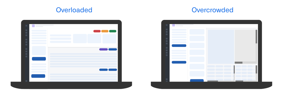
Your Workshop application's visual hierarchy should organize interface components to draw attention to the right user areas of interaction, guiding their workflows in an effective and efficient manner. Application designs that lack a clear and logical visual hierarchy and are either overloaded or overcrowded can confuse users, blocking their application adoption and limiting its utility in support of their workflows.
To avoid overload, limit the amount of total actionable items, such as tasks, notifications, or choices, per screen. Additionally, you should avoid showing more than five primary actions in your application's top-level navigation.
To avoid overcrowding, maintain sufficient whitespace - ideally, this will comprise 30 to 40 percent of your screen. You should also limit the number of visible components to no more than ten in a single view, which includes buttons, panels, and widgets.
Follow the guidance in the sections below to ensure your application's visual hierarchy and layout are easy to understand and use.
Configure a logical layout structure
Your application's layout should support natural eye tracking patterns and clearly distinguish between configuration and content sections by following an F-shaped hierarchical design pattern. In the context of application design, the F-shaped hierarchy supports common reading patterns where a user will scan content following an "F" shape, marked by horizontal scanning from the top and left corner of an application and vertical scanning down the left side of a section.
In general, your applications should leverage the layout patterns below to facilitate natural reading patterns and linear eye tracking.
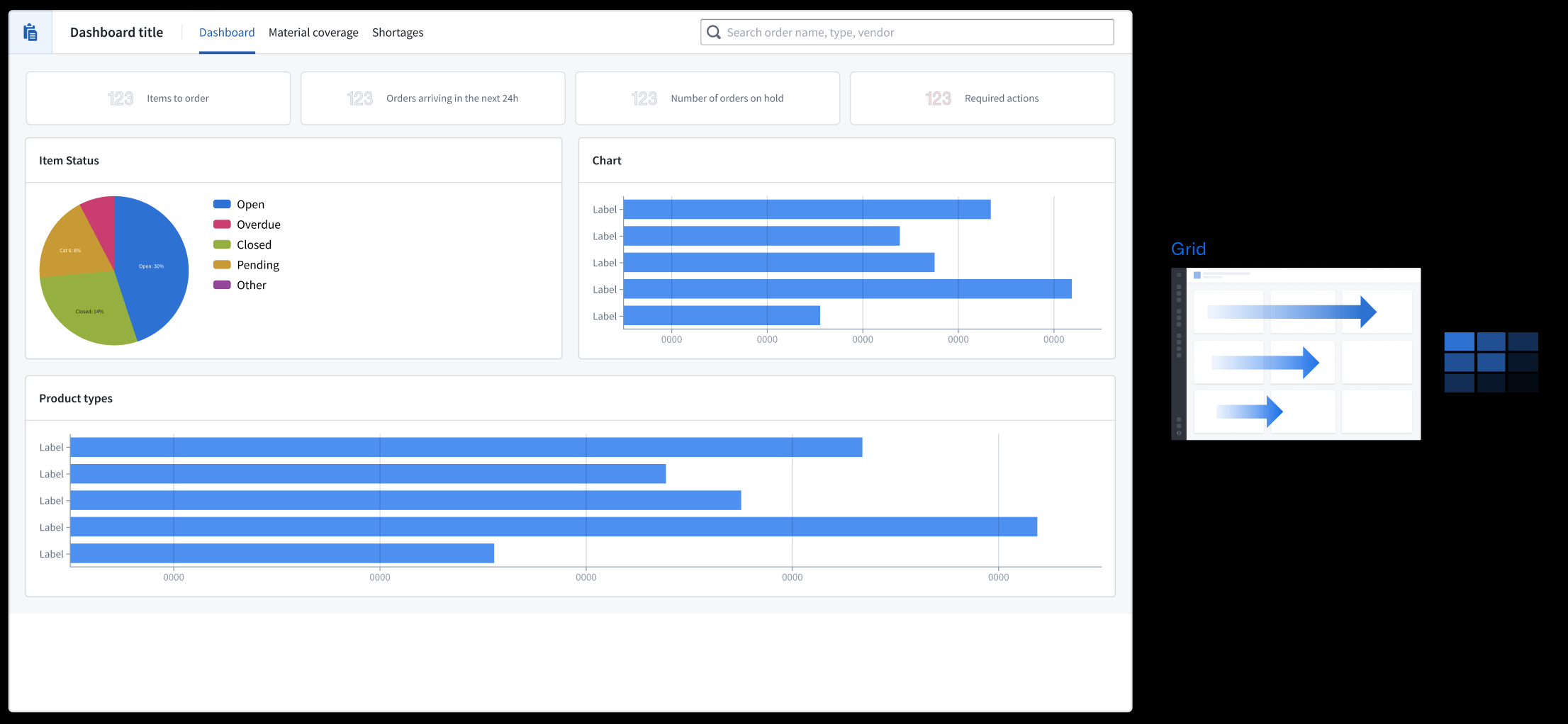
- Grid format: Information flows horizontally from left to right.
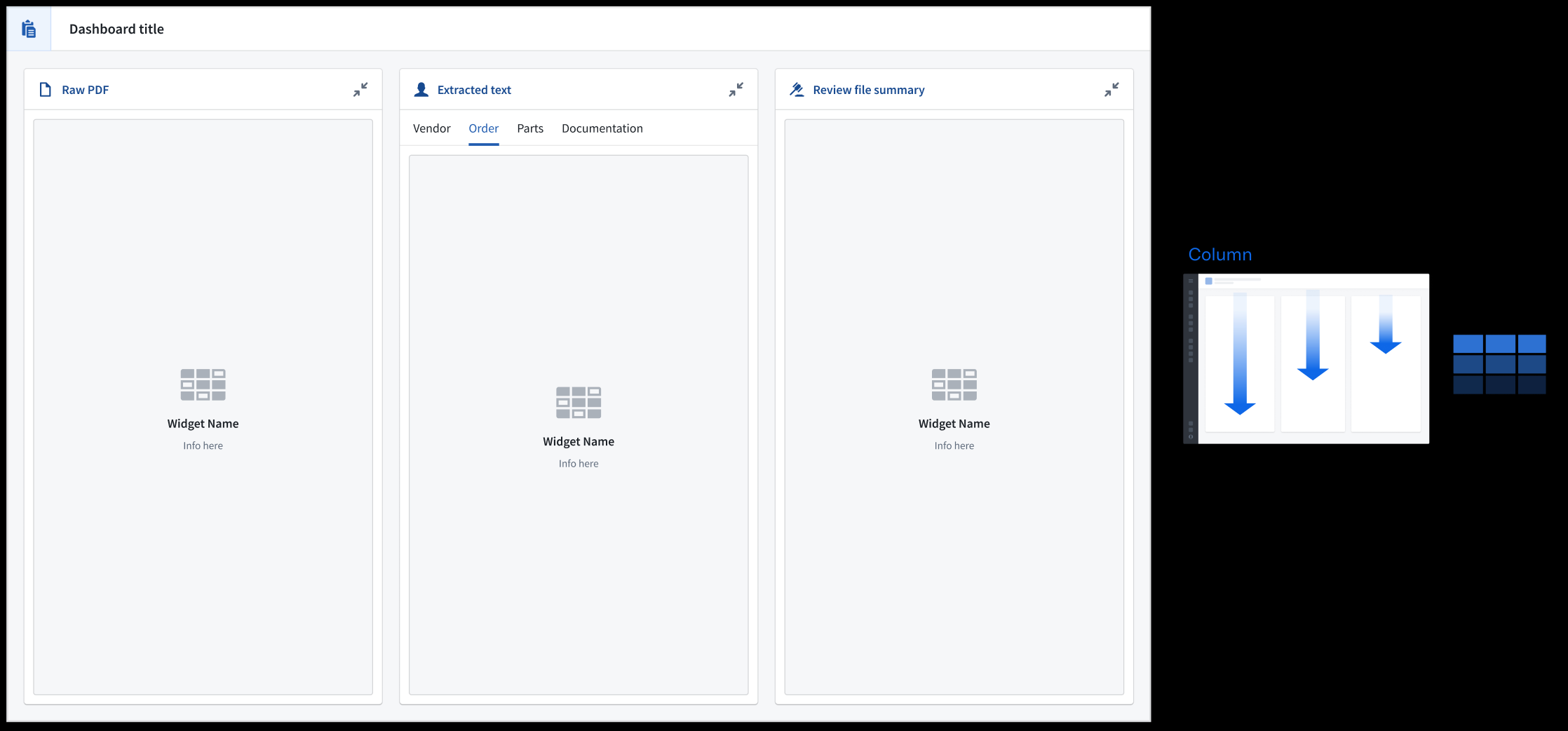
- Column format: Information flows vertically with important navigation elements resident at the top of each panel.
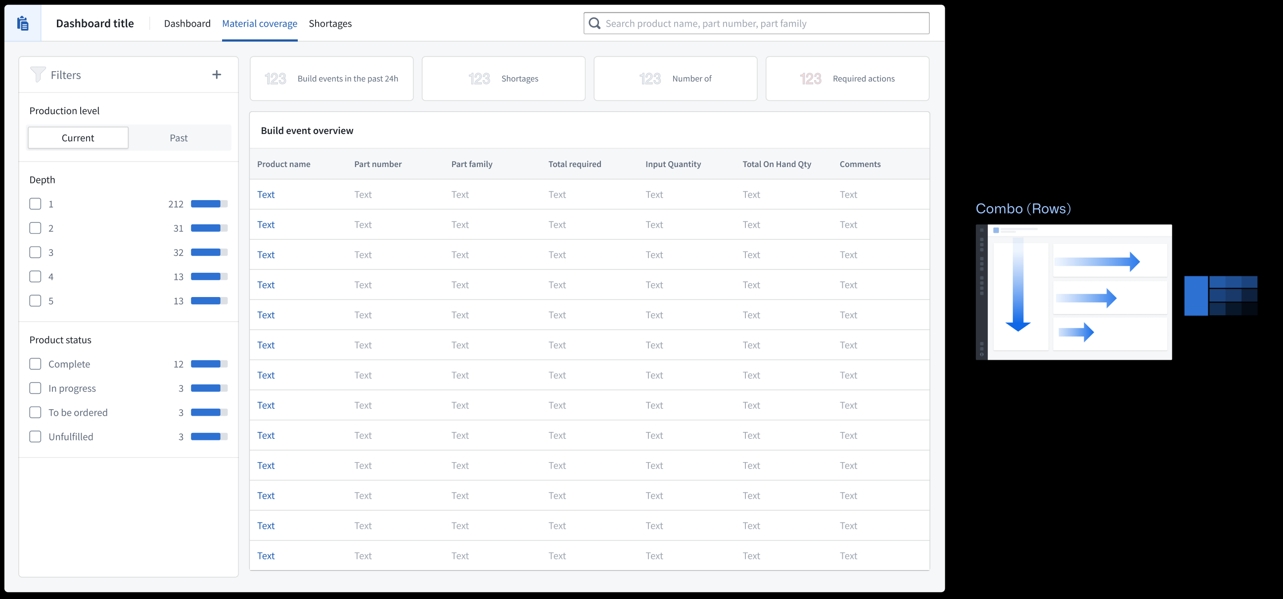
- Row and column combination: Anchor filters in the left-most section so the application's content flows to the right. Use the Metric Card widget to provide a holistic view of key data in your application.
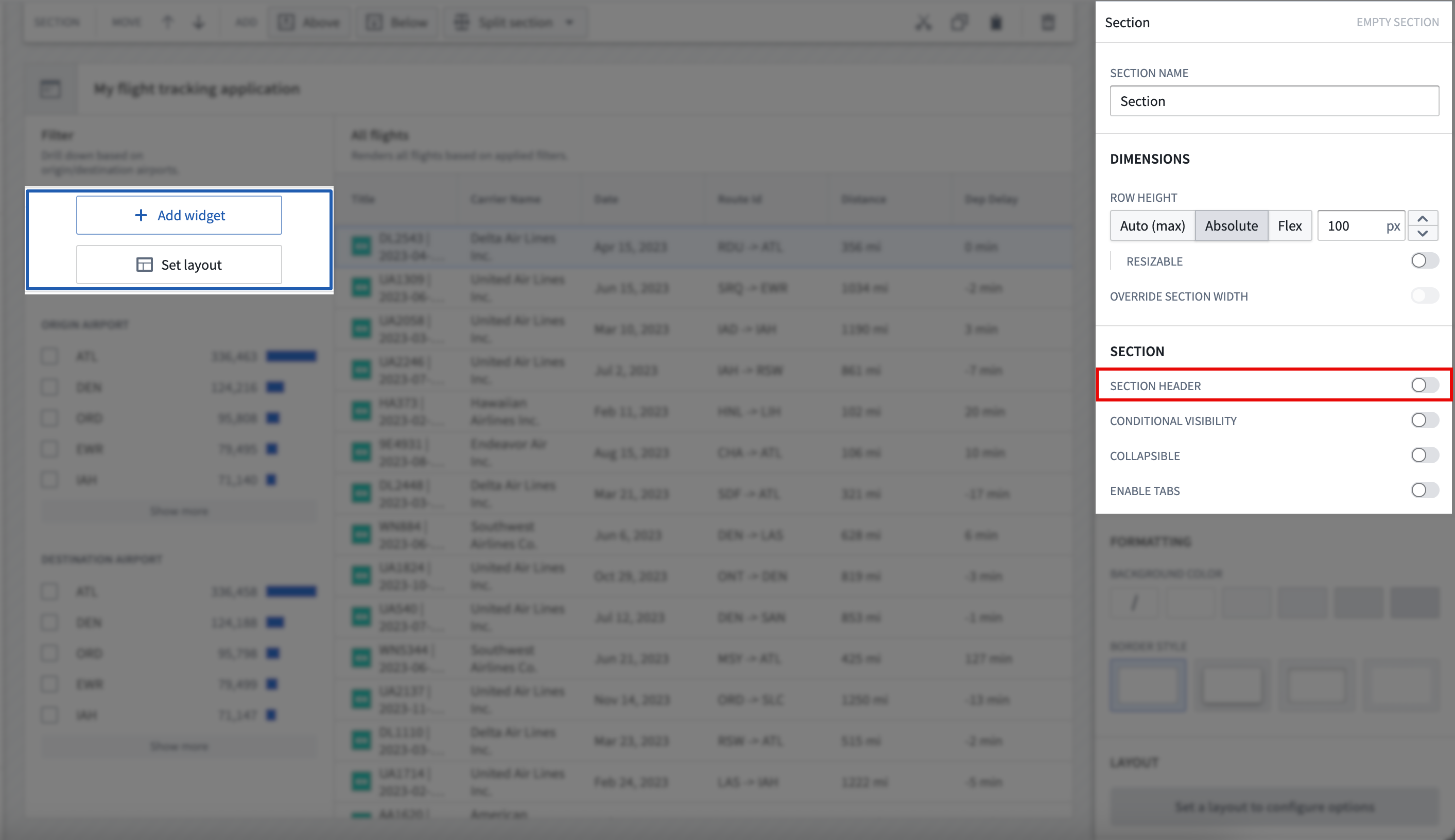
In Workshop, select Set layout after adding a new widget to your application. To edit the layout of an existing application, select its section on your application's canvas and scroll to the Layout section of the right panel. Learn more about layouts in Workshop.
Write descriptive headers
- Use a page header to establish your application's overarching purpose or context. All other content should relate to this primary heading, as this will be the largest text displayed.
- Use section headers to group and organize nested content within the page, which displays as the second largest text.
- Use subheadings to provide context for section headers as a rendered Description, as necessary.
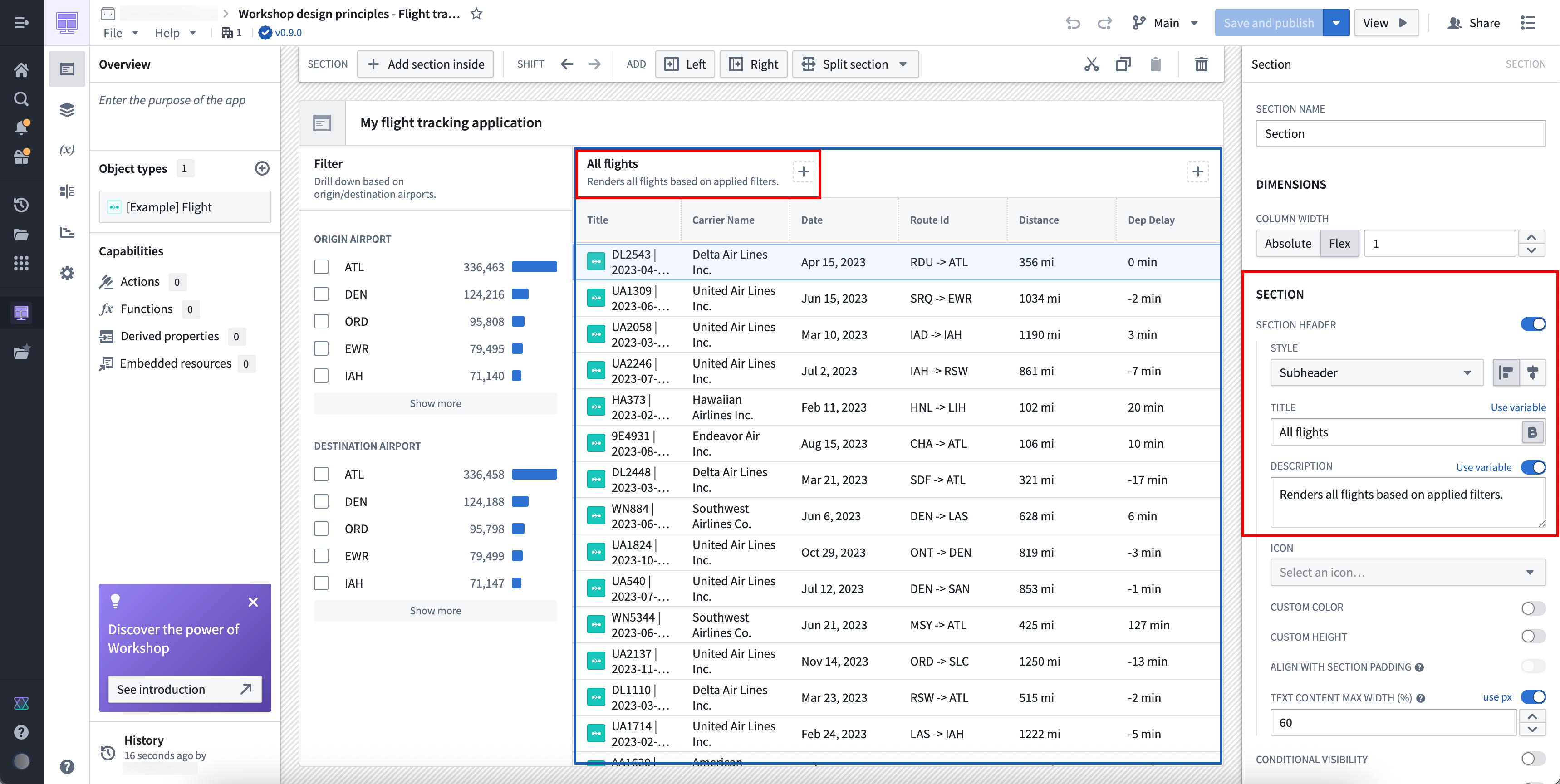
Write heading descriptions that are succinct and help a new user understand the purpose of the section within the application. To add a new header to a section, toggle on Section header in the Section panel.
Set section spacing and alignment
Sections properly spaced and aligned enhance user readability, reduce cognitive load, and create logical visual connections between related application elements to guide a user's eye through complex information.
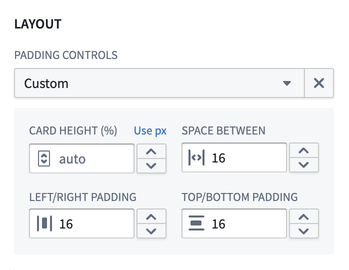
In most cases, you should use Compact padding; however, Workshop allows you to customize padding controls. A reliable customization across application layout types is padding with 80 percent height or width and 16px spacing. Learn more about padding controls available in Workshop.
:::callout{theme="neutral"} You should only apply shaded padding styles once per page to help maintain visual hierarchy, ensuring users can distinguish the most important elements of your application. As an example, using an outer drop shadow border style only for the main content or primary modal in which users take action draws their attention to that area of your application. :::
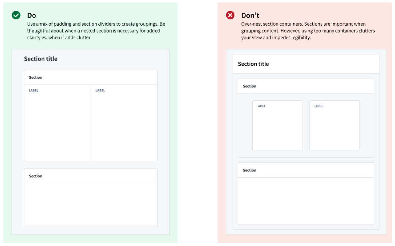
To help organize sections on your application, you should use containers to separate distinct content groups across sections and dividers to separate related content within a section. Add padding between groups to help a user understand this separation.

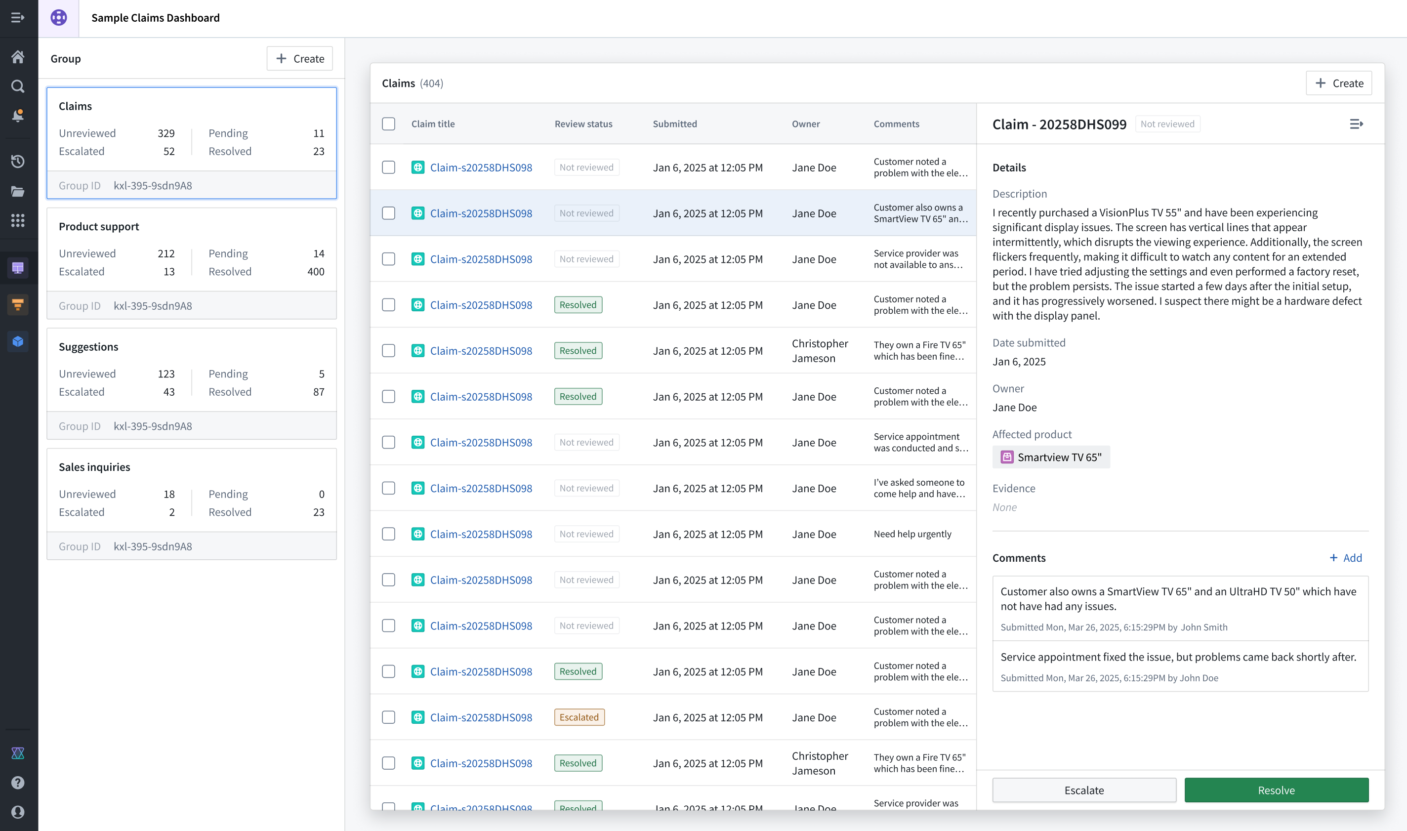
Use a combination of padding and dividers to create groupings within sections.
In the example application below, the Claims section is highlighted through padding and background color configuration, while the Group section distinguishes different Object Lists a user can render upon selection.
Apply border and elevation styles
Use borders and configure their elevation levels to highlight important sections and create spatial separation. When you set a border style, you should use a drop shadow to provide an elevated appearance and signal to the user that its content is important. Use inner shadowing to denote lesser importance. When setting a background, use lighter colors to signify importance and darker colors to indicate less critical items, such as filters or collapsible panels.
Build unified applications
A unified application follows three architectural design principles:
- The landing or homepage centralizes all navigation activity and provides an overview of the application's embedded modules with custom thumbnails, ensuring users can take quick action to access specifically what they need.
- A primary header maintains consistent logo design and global settings control across its embedded modules, most often located in the top-left and top-right corners of the page, respectively.
- Standardized layout elements ensure high-touch user components follow a consistent layout, such as positioning filtering widgets on the left side of a page and applying the same styles to other interface components, such as tabs, Metric Cards, headers, and buttons.
You should also consider the following best practices related to page scrolling and overlays.
Scrolling best practices
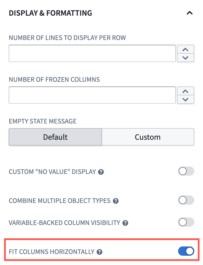
- Avoid horizontal scrolling whenever possible, except in cases where page-wide scrolling is necessary. Instead, toggle Fit columns horizontally when you configure an Object Table widget.
- Ensure your navigation bars and tabs are part of your primary header so that only sections that contain content in your application are sections that users can scroll. This acts as a pinning mechanism to persist navigation and tabs in a user's view.

- When you enable scrolling in a section, ensure all touch targets (such as buttons), are at least 30px.
Overlay usage best practices
- Use overlays for temporary and secondary interactions, such as completing questionnaires.
- Avoid overlays for analytical sections where users need to view multiple information layers simultaneously.
- Design your overlay workflows to account for users selecting objects before performing one or multiple actions.
Learn more about overlays in Workshop.
Validate your design
As you add sections and widgets to your application, we recommend practicing the following validation methods:
- Periodically squint at your interface to help identify the most important elements based on their intended use. This helps you determine the effectiveness of your hierarchy.
- Stay closely aligned with actual user workflows so you maintain an understanding of what users want to accomplish in each section of your interface.
- Validate whether or not every element must be visible from its current location. If it does not, then you should only surface the element when a user will need to interact with and take action from the element.
Learn more about component-specific design best practices in Workshop.
中文翻译
应用设计最佳实践
设计优良的Workshop应用界面能够引导用户操作、保持用户注意力,确保用户可以高效、顺畅且符合逻辑地执行工作流。在创建应用时,请参考以下设计最佳实践,确保其视觉布局和组织方式对所有用户都直观易用。
核心设计原则
- 要确保应用使用起来直观易用,你应当优先保证组件清晰而非复杂。了解如何构建用户友好的界面以提升应用使用率。
- 要确保产品统一且一致,你应当在所有应用中打造连贯统一的使用体验,让用户感觉自己在使用一套完整的工具矩阵。了解如何构建统一的Workshop应用。
打造直观的用户界面
你的Workshop应用的视觉层级应当合理组织界面组件,将用户注意力引导到正确的交互区域,从而高效地引导其完成工作流。如果应用设计缺乏清晰合理的视觉层级,出现内容过载或界面拥挤的问题,就会让用户感到困惑,阻碍用户接受应用,也会限制应用对工作流的支撑价值。
为了避免内容过载,请限制每个页面的可操作项总数,比如任务、通知或选项。此外,应用顶层导航中的主要操作按钮不应超过5个。
为了避免界面拥挤,请保留足够的留白——理想情况下,留白应占屏幕面积的30%到40%。你还应当限制单个视图内的可见组件不超过10个,包括按钮、面板和小部件(widget)。
请遵循以下章节的指引,确保应用的视觉层级和布局易于理解和使用。
配置逻辑清晰的布局结构
应用的布局应当符合自然的视线移动规律,采用F型层级设计模式,明确区分配置区和内容区。在应用设计场景下,F型层级符合用户的常规阅读模式:用户会按照“F”型扫读内容,从应用的左上角开始横向扫读,再沿着板块左侧向下纵向扫读。
一般来说,你应当使用以下布局模式来适配自然的阅读习惯和线性视线移动规律:
- 网格格式: 信息按照从左到右的水平方向排布。
- 分栏格式: 信息按照垂直方向排布,重要导航元素放置在每个面板的顶部。
- 行列组合格式: 将筛选器固定在最左侧区域,让应用内容向右延伸排布。使用Metric Card widget为应用提供关键数据的全局概览。
在Workshop中,向应用添加新小部件后选择Set layout即可设置布局。如果要编辑现有应用的布局,请在应用画布上选中对应板块,然后滚动到右侧面板的Layout区域。了解更多Workshop布局相关内容。
编写描述清晰的标题
- 使用页面标题(page header) 明确应用的核心用途或上下文。所有其他内容都应当和这个主标题相关,它会是页面上字号最大的文本。
- 使用板块标题(section header) 来分组和组织页面内的嵌套内容,其字号为页面第二大。
- 必要时使用副标题(subheading) 作为渲染后的Description,为板块标题提供上下文说明。
标题描述要简洁,帮助新用户理解应用内对应板块的用途。要为板块添加新标题,请在Section面板中开启Section header开关。
设置板块间距与对齐
合理的板块间距与对齐方式可以提升可读性,降低认知负荷,还能在相关的应用元素之间建立逻辑视觉关联,引导用户视线浏览复杂信息。
大多数情况下你应当使用Compact内边距;不过Workshop也支持自定义内边距控件。适用于各类应用布局的通用自定义方案是:设置80%的高度/宽度占比,搭配16px的间距。了解更多Workshop支持的内边距控件。
:::callout{theme="neutral"} 每个页面最多使用一次阴影内边距样式,以维持视觉层级,确保用户可以区分应用中最重要的元素。例如,仅为主内容区或用户执行操作的主模态框(modal)添加外投影边框样式(border style),可以将用户的注意力吸引到应用的对应区域。 :::
要组织应用内的板块,你应当使用容器(container) 来分隔不同板块中的独立内容组,使用分隔线(divider) 分隔同一板块内的相关内容。在内容组之间添加内边距,帮助用户理解这种区隔。
组合使用内边距和分隔线来在板块内创建内容分组。
在下方的示例应用中,Claims板块通过内边距和背景色配置高亮显示,而Group板块区分了用户选中后可渲染的不同对象列表(Object List)。
应用边框与层级样式
使用边框(border)并配置其层级,可以高亮重要板块、创建空间区隔。设置边框样式时,你可以使用外投影营造悬浮效果,向用户表明其内容很重要;使用内投影则表示重要性较低。设置背景时,使用较浅的颜色表示重要性高,较深的颜色表示重要性较低的元素,比如筛选器或可折叠面板。
构建统一的应用
统一的应用遵循以下三个架构设计原则:
- 着陆页/首页集中所有导航操作,通过自定义缩略图展示应用内嵌模块的概览,确保用户可以快速操作,直接访问所需内容。
- 主标题栏在所有内嵌模块中保持一致的logo设计和全局设置控件,通常分别位于页面左上角和右上角。
- 标准化布局元素确保高频使用的用户组件遵循一致的布局,比如将筛选小部件(filtering widget)放在页面左侧,其他界面组件也使用相同样式,比如标签页、Metric Cards、标题(header)和按钮(button)。
你还需要考虑以下和页面滚动、浮层相关的最佳实践。
滚动最佳实践
- 尽可能避免横向滚动,除非确实需要全页面滚动。配置对象表格(Object Table widget)时,请开启Fit columns horizontally选项。
- 确保导航栏和标签页属于主标题栏的一部分,这样用户只能滚动应用中包含内容的区域。这相当于一种固定机制,让导航和标签页始终保留在用户视图中。
- 为板块启用滚动时,请确保所有可点击目标(比如按钮)的尺寸至少为30px。
浮层使用最佳实践
- 浮层(overlay)适用于临时的次要交互,比如填写问卷。
- 不要在用户需要同时查看多个信息层的分析板块使用浮层。
- 设计浮层内的工作流时,要考虑用户执行一个或多个操作前选中对象的场景。
验证你的设计
在向应用添加板块和小部件时,我们建议采用以下验证方法:
- 定期眯眼查看界面,根据元素的预期用途识别最重要的元素,这可以帮你判断视觉层级的有效性。
- 始终和实际用户工作流保持高度对齐,这样你才能了解用户希望在界面的每个板块完成什么操作。
- 验证每个元素是否必须在当前位置可见,如果不需要,就只在用户需要和该元素交互、执行操作的时候再展示它。