Component-specific best practices(特定组件最佳实践)
Review the guidance below to ensure your application's table displays, button groups, and search functionality follow Workshop design best practices.
Tables and lists
When adding Object Tables, Object Lists, or Pivot Tables to your application, you should practice the following:
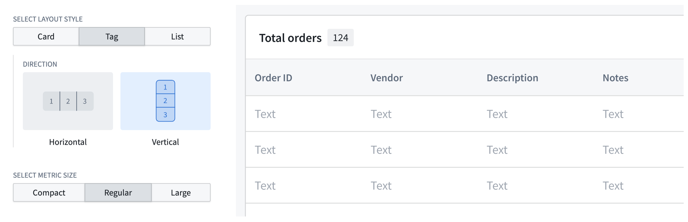
- Always include counts to indicate the length of tables and lists by configuring a Metric Card widget in the table's section header. Choose Tag as your layout style.
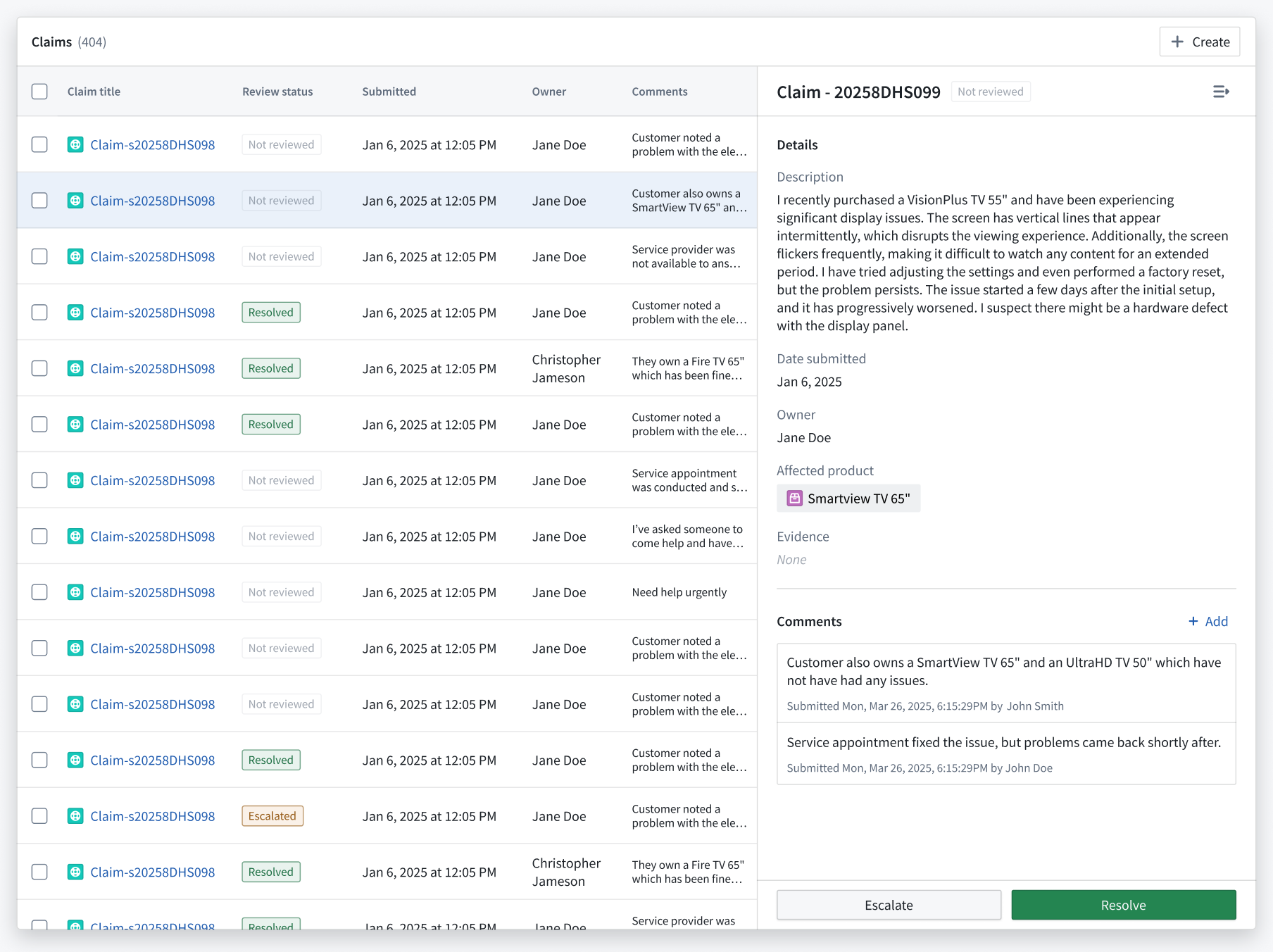
- Ensure each section renders enough information for row selection; use collapsible detail panels for additional data instead of overlays, which can obstruct the base layer of information.
- Validate that your table or list adheres to Workshop's scrolling best practices.
- Use the Display & formatting section of the Widget setup panel to customize your table's display.
Button groups
When adding a Button Group to your application, you should practice the following:
- Ensure each button clearly guides user actions by matching its color to the user's mental model of the accompanying action's outcome or risk. Review the available button color options and apply the appropriate color based on the button's Intent.
- None: Renders a gray hue; best used for secondary actions.
- Examples:
Back,Skip, orCancel.
- Examples:
- Primary: Renders a blue hue; best used as the main call to action or to advance the user's journey in your application.
- Examples:
Create,Add new,Next, orContinue.
- Examples:
- Success: Renders a green hue; best used for completion actions or those denoting a positive outcome.
- Examples:
Submit,Save,Complete,Approve, orEnable.
- Examples:
- Warning: Renders an amber hue; best used for actions that require a user's attention or awareness but are not destructive. The actions may also denote moderate risk.
- Examples:
Review required,Pending approval,Archive, orSuspend.
- Examples:
-
Danger: Renders a red hue; best used for destructive actions that cannot be easily undone. You can also use Danger for error states or critical alerts.
- Examples:
DeleteorRemove.
- Examples:
-
Add icons to buttons to help users understand their backing actions. Additionally, you should organize buttons from left to right based on their importance and visual load, with each button group containing a primary action. Refer to the table below for specific examples.
| Button purpose | Best practice |
|---|---|
| Use the first button in a group to denote the primary action. De-emphasize other actions with a menu to reduce visual clutter. | 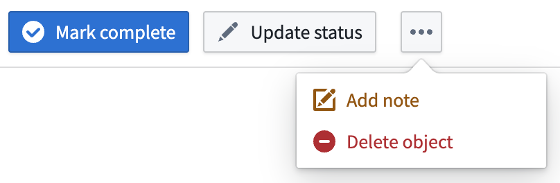 |
| Use icons to inform a user of the button's action and what will occur after selection. | 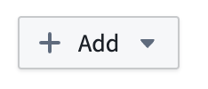 |
| Apply arrow icons to show navigation to a new page/section within the module (horizontal arrow) or a new tab outside the module (angled arrow). | 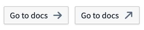 |
| Group buttons to indicate if there are other actions related to a button (+) or other independent actions accessible from a menu. | 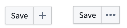 |
- Label your buttons using natural, user-friendly language in sentence case. Avoid repetitive copy when adding a Button Group to a section header where the context is clear.

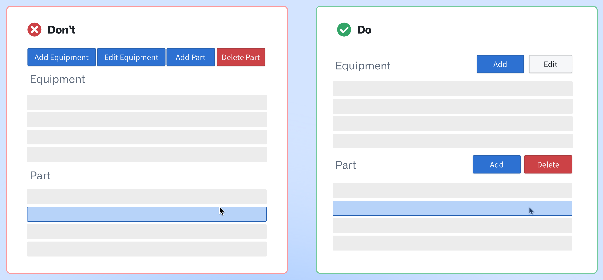
- Add buttons in close proximity to their related section or widget. As an example, if you configure two Object Table widgets which render
EquipmentandPartobjects, then you should add buttons with their relevant actions to each Object Table's specific header.
-
Organize buttons hierarchically by adjusting their size, border, and color intensity in the Display & formatting section of the Widget setup panel.
-
Do not apply distinct colors to every button, as this can create visual clutter and distract users. Instead, you should identify the primary action within a button group and assign the corresponding color.
| 🔴 Avoid multiple colors in one group | 🟢 Best practice |
|---|---|
 |
 |
Learn more about the Button Group widget.
Searching and filtering
When adding one of Workshop's filtering widgets to your application, such as Filter List or Exploration Filter Pills, practice the following:
- Use a Filter List's Vertical filter layout if the object list requires users to apply multiple filters simultaneously. This layout is also best used for complex filtering scenarios and provides a clear overview of available filtering options.
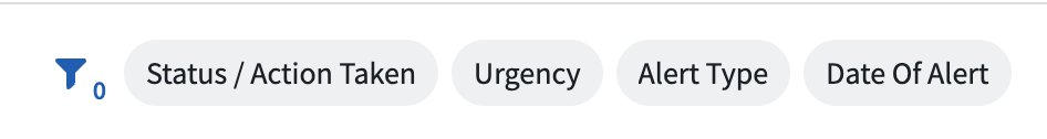
- Use a Filter List's Pills filter layout for compact, beginner-friendly visual filtering. The Pills layout is ideal for limited screen space or frequent filter changes. You can also use the Exploration Filter Pills widget for this same purpose.
- Add an Exploration Search Bar to enable comprehensive searches with complex filtering capabilities. This is best suited for experienced users requiring detailed, precise querying functionality. The Exploration Search Bar supports keyword searches, property filtering, and complex queries.
中文翻译
特定组件最佳实践
请参考以下指南,确保你的应用中的表格展示(table displays)、按钮组(button groups)和搜索功能(search functionality)符合Workshop设计最佳实践。
表格与列表(Tables and lists)
向应用中添加Object Table、Object List或Pivot Table时,应遵循以下规范: * 始终在表格的区块头部配置Metric Card部件展示计数,以明确表格和列表的条目长度,布局样式选择Tag即可。
- 确保每个区块展示的信息足够支撑行选择操作;额外数据请使用可折叠详情面板(collapsible detail panels)展示,不要使用浮层,避免遮挡基础信息层。
- 确认你的表格或列表符合Workshop的滚动最佳实践(scrolling best practices)。
- 通过Widget setup面板的Display & formatting区块自定义表格的展示效果。
按钮组(Button groups)
向应用中添加Button Group时,应遵循以下规范:
* 按钮颜色要匹配用户对对应操作的结果、风险的普遍认知,确保每个按钮都能清晰引导用户操作。请参考官方提供的按钮颜色选项(button color options),根据按钮的Intent选择合适的颜色。
* None:显示灰色调,最适合用于次要操作。
* 示例:Back、Skip、Cancel
* Primary:显示蓝色调,最适合作为主要行动号召,或是引导用户在应用中推进操作流程。
* 示例:Create、Add new、Next、Continue
* Success:显示绿色调,最适合用于完成类操作,或是代表正向结果的操作。
* 示例:Submit、Save、Complete、Approve、Enable
* Warning:显示琥珀色调,最适合用于需要用户留意、但不会造成破坏性结果的操作,这类操作通常带有中等风险。
* 示例:Review required、Pending approval、Archive、Suspend
* Danger:显示红色调,最适合用于难以撤销的破坏性操作,也可用于错误状态或 critical 级别的提醒。
* 示例:Delete、Remove
- 为按钮添加图标,帮助用户快速理解按钮对应的操作。此外请按照按钮的重要程度和视觉权重从左到右排列,每个按钮组中都应包含一个主操作按钮。具体示例参考下表:
| 按钮用途 | 最佳实践 |
|---|---|
| 用组内第一个按钮代表主操作,将其他次要操作收纳到菜单中以减少视觉杂乱。 | |
| 使用图标让用户了解按钮的作用,以及点击后会触发的行为。 | |
| 使用箭头图标区分导航类型:水平箭头代表跳转到模块内的新页面/区块,斜角箭头代表跳转到模块外的新标签页。 | |
| 对按钮进行分组:用+标识按钮存在关联操作,用省略号标识菜单下还有其他独立操作。 | |
- 使用自然友好、采用句子首字母大写(sentence case)的文本作为按钮标签。如果按钮组放在上下文明确的区块头部,避免使用重复冗余的文案。
- 按钮要放在与其关联的区块或部件附近。例如如果你配置了两个分别展示
Equipment和Part对象的Object Table部件,应该为每个Object Table的专属头部添加对应操作的按钮。
-
通过Widget setup面板的Display & formatting区块调整按钮的尺寸、边框、颜色深浅,实现按钮的层级排列。
-
不要为每个按钮都设置不同的颜色,否则会造成视觉杂乱,分散用户注意力。正确的做法是找出按钮组内的主操作,为其设置对应标识色即可。
| 🔴 避免在一个组内使用多种颜色 | 🟢 最佳实践 |
|---|---|
|
|
搜索与筛选(Searching and filtering)
向应用中添加Workshop的筛选部件(filtering widgets)(例如Filter List或Exploration Filter Pills)时,应遵循以下规范: * 如果对象列表需要用户同时应用多个筛选条件,请使用Filter List的Vertical筛选布局。该布局也适用于复杂筛选场景,可清晰展示所有可用的筛选选项。
- 如果你需要紧凑、对新手友好的可视化筛选能力,请使用Filter List的Pills筛选布局。该布局适合屏幕空间有限、需要频繁调整筛选条件的场景,你也可以使用Exploration Filter Pills部件实现同样的效果。