Layouts(布局(Layouts))
Workshop layouts allow builders to configure how the user interface of a module is organized. The main layout components of a Workshop module (the header, pages, sections, and overlays) are described in detail in the sections below. Layout elements may be edited by selecting the Layout sidebar panel and selecting the element to configure, or by selecting the element in the main module view.
Header
The header in a Workshop module serves as a persistent toolbar for module-wide titles, tabs, and buttons. When creating a new module, the module header will be visible at the top of the screen:

When the header is selected, the plus (+) signs allow widgets such as tabs and button groups to be added to the header, making them easily accessible across all pages of a Workshop module. If the module header is hidden, it may be selected with the Header option that appears at the top of the list found in the Layout sidebar panel.
Configuration options
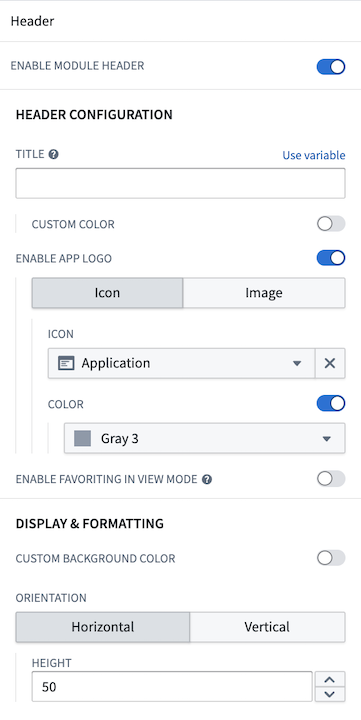
Configuration options provided for a module header include:
- Toggle header visibility.
- Set a title for the header. This title will also be used to set the browser tab or Carbon workspace tab name. If a title is not set, the Workshop module resource name will be used instead.
- Choose a custom color for the title text.
- Enable an application logo by choosing an icon or uploading an image.
- Icon: Choose an icon and an icon color.
- Image: Select an image from your Palantir resources or upload one from your computer.
- Customize the image height.
- Position the image: Choose left, center, or right for horizontal headers; choose top or bottom for vertical headers.
- Toggle the ability for users to favorite the module in view mode.
- Select a background color for the header.
- Choose the header's orientation: horizontal (at the top) or vertical (on the left) of the module.
- Set the header height for horizontal headers.
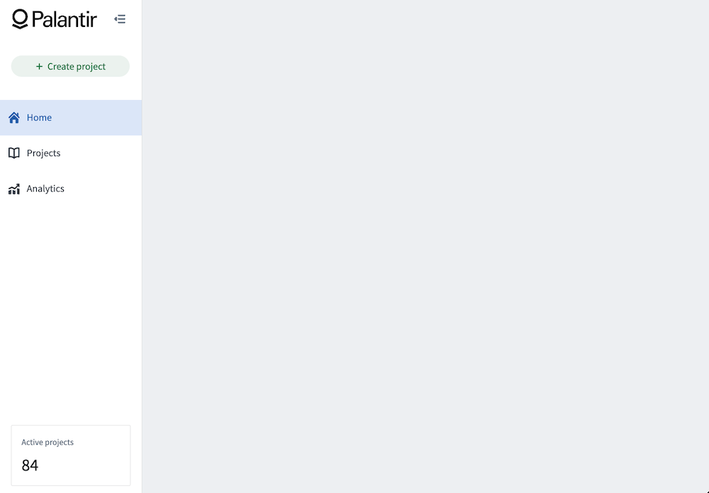
When configured, a horizontal header with a custom image can look like the following example:

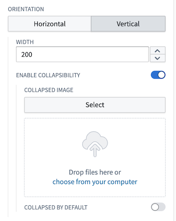
You also have the option to configure a vertical header, which will be displayed on the left side of your module. Once you enable the vertical orientation, several additional settings will become available for customization:
- Set the width of the vertical header.
- Enable collapsibility, with the option to set it as collapsed by default.
- Add a custom image for the collapsed state, either by selecting from your Palantir resources or uploading from your computer.
- To display a collapsed image, you must first set up a header image as outlined above. If you opt for an icon instead, the chosen icon will appear in the collapsed state.
When enabling collapsed headers, the Button Group and Tabs widgets will also have collapsed states that will only show the icons; the text will be dropped in this state. All other widgets will be hidden when a module header is collapsed.
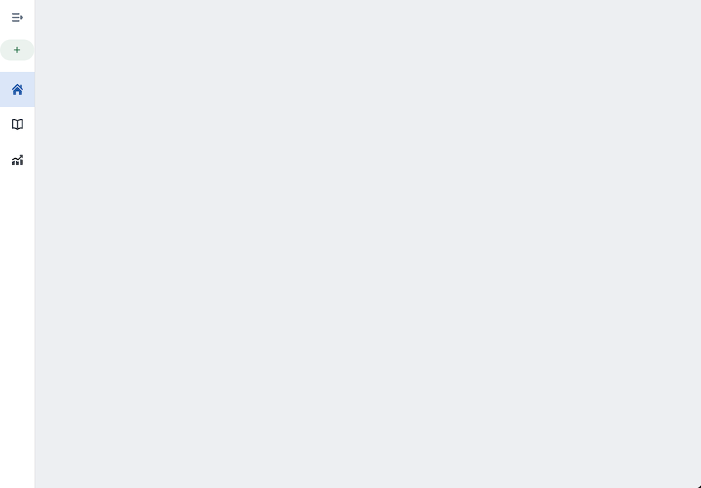
The example below shows a configured vertical module header:
And its collapsed state:
Pages
Pages allow module builders to construct complex, multi-screen applications in Workshop. Each page is a blank canvas on which a module builder can configure a unique set of widgets to support the targeted workflow. Only the module header will persist between pages to provide an overarching toolbar for a given module.
In the example module header shown above, each tab in the Tabs widget could be configured to select a page, with each page configured with a different user workflow.
Add a page
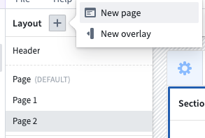
Pages can be added from within the Layout panel on the left side of the screen. To add a page, open the Layout panel, then select the plus (+) sign on the top. Next, select the New page option, as shown below:
Once added, the new page will be auto-selected within the Layout panel and you can begin configuring its contents. The below screenshot showcases the default, unconfigured page that is initialized with two vertically divided sections beneath the module-wide header:

You can also explore other layout templates using the layout template picker at the bottom of the page. You can preview what each layout would look like by hovering over its icon. If you would like to use a template, you can select that icon; the page layout will update to the one you selected.

When editing your application, pages are listed in the order in which they are created. Page order as seen in edit view has no impact on module behavior.
For more detail on how to add content to pages by adding and configuring sections, review the sections documentation below.
Switching pages with Layout events
To navigate users between the pages of a module, a builder can use a Layout event. This can be triggered from within widgets such as the Button Group or Tabs.
Sections
Sections are the components of each page and overlay that allow module builders to subdivide the user interface. Each section is configured to contain one or more widgets, or a layout, which itself may contain one or more sections.
Section layouts
In edit mode, the Add widget and Set layout options appear when you hover over sections in your module layouts. To access available layout options for a section, choose Set layout on any empty section in your module and examine the Layout options as shown below:
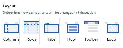
The currently supported Layout options include:
- Columns: Enables sections to be split vertically to effectively create a new column in a module.
- Rows: Enables sections to be split horizontally to effectively create a new row in a module. The Enable scrolling option is available in the Rows layout.
- Tabs: Adds tabs to the top of a section and allows module builders to configure different configurations of widgets within each tab of a section.
- Flow: Turns the current section in a vertically scrolling container to allow module building to configure widgets that stretch beyond the displayed interface of a module.
- Toolbar: Configures sections to function as a horizontal toolbar optimized for smaller widgets like Button Groups or Metric Cards, along with single input widgets.
- Loop: Loop layouts allow a builder to loop over an object set or array, displaying an embedded module for each object in the set or each entry in the array. Learn more in the loop layouts documentation.
Section drop zones
Sections can be configured as drop zones to receive drag payloads from other Workshop components or external applications. This enables cross-application interactivity workflows where users can drag objects onto a section to populate variables or trigger events.
To configure a section as a drop zone, select the section and toggle Drop Handling in the configuration panel. For detailed configuration instructions and information about compatible drag zones, refer to the drag and drop in Workshop documentation.
Conditional visibility indicators
Sections can be configured with conditional visibility to show or hide based on variable values. The layout panel displays icons and tooltips to indicate which sections have conditional visibility enabled, making it easier to identify and manage conditionally visible sections even when they are currently hidden in the module view.
Duplicating sections
Cut, copy, and paste options are available for whole sections and individual widgets within a module, providing tools for a faster module building experience.
When pasting sections or widgets, builders have two options for managing the new section’s or widget’s input variables:
- Paste with same input variable: Paste a new section or widget that reuses the copied section’s or widget’s input variables.
- Paste with duplicate input variables: Pastes a new section or widget that uses newly created input variables that match the copied section’s or widget’s input variables.

Overlays
Overlays may be used when certain sections should only appear when contextually relevant in a workflow. Overlays will appear as a layer on top of the selected page.
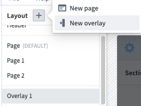
Similarly to pages, you can add overlays rom within the Layout panel on the left side of the screen. To add an overlay, select the (+) sign on the top. Next, select the New overlay option, as shown below:
Configuration options
- Overlay name: This setting determines the name used to refer to this overlay throughout the Workshop editor. Notably, this is relevant in Overlay events.
- Show overlay header: This setting determines if the default overlay header should be shown. The overlay header comes with a default close button and provides the additional configuration options:
- Title: This setting allows a title to be configured that will be shown in the header of the overlay.
- Icon: This setting allows an icon to be selected that will be shown to the left of the title in the header of the overlay.
- Variable based visibility: This setting allows a Boolean variable to be selected which will determine if the overlay should be visible. This setting allows for overlays that are in an initially visible state when the module loads, as well as enabling advanced control over the overlay visibility state. This setting may also be useful when using overlays in combination with embedded modules, as this allows the overlay state to be shared and set between a parent and child module through Set Variable Value events. Layout events which change the overlay visibility state, will update the value of this variable.
- On close: This option allows a Workshop Event to optionally be configured run when the overlay is closed. If Variable based visibility is configured with a Boolean variable that comes from an object property or variable transformation, this event can be used to reset the condition that lead to the overlay being in the open state.
- Close overlay on backdrop click: This toggle determines if the overlay should close as a result of a user selecting the area outside of the overlay.
- Add background behind overlay: This toggle determines if an opque background should be added behind the overlay. This is enabled by default and helps to bring a user's focus to the open overlay.
Overlay types
Currently, Workshop supports two overlay types: drawers and modals. These types are explained in detail below.
Drawers
Drawers are overlays that slide out from the side of the screen. Available configuration options for drawer overlays include the following:
- Position: Choose the right or left position to determine from which side of the screen the drawer will appear.
- Size: Set the width of the drawer.
Modals
Modals are overlays that appear in the center of the screen. Size is the only available configuration option specific to modal overlays.
Style formatting
Workshop offers control over various style formatting settings to give application builders more customizability to the design and feel of their modules. Configuration options include header formatting, background colors, border styles, and more. These options are available at the page, section, and widget levels.
Header formatting
Header formatting options can be added when the header is enabled on a section. There are three available:
- Block: The section header is in its own container above the body.
- Contained: The section header appears to be contained within the body area.
- Floating: The section header appears above the body area and is visually on the background of the parent section.

Background colors
Background colors can be added to pages, sections, and widgets to help visually segment parts of a module. There are five preset shades for both light mode and dark mode, Blueprint colors ↗, and a transparent option available.


In addition to preset shades, you can apply a custom hex color to section and page backgrounds. Select the custom color tile to open the color picker to enter a hex code or choose from Blueprint color ↗ shortcuts. Saved colors defined at the module level are also available as background color options for sections and pages.
When a custom background color is applied to a section, widgets within that section automatically switch between light and dark mode based on the brightness of the background, ensuring text and controls remain legible.

Border styles
Border styles can be configured on sections and widgets, giving the appearance of different elevation levels within a module. There are four options available:
- Bordered: The standard single outline around the section or widget.
- Outer drop shadow: A shadow outside the border to give the section or widget an elevated appearance.
- Inner shadow: A shadow inside the border to give the section or widget a depressed appearance.
- Borderless: No outline around the section or widget so it blends into the background.


Padding controls
Padding can be configured for pages and sections to set a consistent amount of padding or space around all child components within. Padding adds space between components to provide separation and breathability to the module. There are five options available:
- No padding: The standard option with no padding added around child components.
- Compact: Adds 16 pixels of padding around child components.
- Regular: Adds 24 pixels of top/bottom padding and 48 pixels of left/right padding around child components.
- Large: Adds 40 pixels of top/bottom padding and 62 pixels of left/right padding around child components.
- Custom: Allows custom definitions of padding levels to be set around child components.
Inner section style: Optionally select one of various pre-defined section styles to be applied to all children sections:

中文翻译
布局(Layouts)
Workshop的布局(layouts)允许构建者配置模块用户界面的组织方式。Workshop模块的主要布局组件(头部、页面、区块、浮层)将在下文各小节中详细说明。你可以通过选择侧边栏的布局(Layout)面板并点击要配置的元素,或直接在主模块视图中选中对应元素,来编辑布局项。
头部(Header)
Workshop模块的头部是一个固定展示的工具栏,用于放置全模块通用的标题、标签页和按钮。创建新模块时,模块头部会默认显示在屏幕顶部:
选中头部后,点击加号(+)可将标签页、按钮组等组件(widget)添加到头部,这些组件在Workshop模块的所有页面都可便捷访问。如果模块头部被隐藏,你可以在布局(Layout)侧边栏面板的列表顶部选择头部(Header)选项来选中它。
配置选项
模块头部支持的配置选项包括: * 切换头部可见性 * 设置头部标题。该标题同时会作为浏览器标签页或Carbon工作区标签页的名称使用。如果未设置标题,将默认使用Workshop模块的资源名称。 * 自定义标题文本颜色 * 启用应用logo,可选择图标或上传图片: * 图标:选择图标并设置图标颜色 * 图片:从你的Palantir资源中选择图片,或从本地设备上传 * 自定义图片高度 * 图片位置:水平头部可选择左、中、右对齐;垂直头部可选择顶部、底部对齐 * 切换是否允许用户在查看模式下收藏该模块 * 设置头部背景色 * 选择头部方向:水平(位于模块顶部)或垂直(位于模块左侧) * 为水平头部设置头部高度
配置完成后,带自定义图片的水平头部效果示例如下:
你也可以选择配置垂直头部,它将显示在模块的左侧。启用垂直方向后,会额外开放以下可自定义设置: * 设置垂直头部的宽度 * 启用收起功能,可设置默认处于收起状态 * 为收起状态添加自定义图片,可从Palantir资源中选择或从本地上传 * 要展示收起状态的图片,你必须先按上述步骤设置好头部图片。如果你选择使用图标而非图片,收起状态将显示你选定的图标。
启用头部收起功能后,按钮组(Button Group)和标签页(Tabs)组件也会进入收起状态,仅展示图标,隐藏文本。模块头部收起时,所有其他组件都会被隐藏。
下方示例为配置完成的垂直模块头部:
其收起状态如下:
页面(Pages)
页面允许模块构建者在Workshop中搭建复杂的多屏应用。每个页面都是一块空白画布,构建者可在其上配置一组独特的组件,以支撑目标工作流。只有模块头部会在不同页面间保留,为整个模块提供统一的工具栏。
在上文展示的模块头部示例中,标签页组件的每个标签都可配置为跳转至对应页面,每个页面可配置不同的用户工作流。
添加页面
你可以在屏幕左侧的布局(Layout)面板中添加页面。添加页面的操作步骤为:打开布局(Layout)面板,点击顶部的加号(+),然后选择新建页面(New page)选项,如下所示:
添加完成后,新页面会在布局(Layout)面板中自动选中,你可以开始配置其内容。下方截图展示了默认生成的未配置页面,初始化状态下模块全局头部下方有两个垂直划分的区块:
你也可以通过页面底部的布局模板选择器探索其他布局模板。将鼠标悬停在模板图标上即可预览对应布局效果。如果要使用某款模板,点击对应图标即可,页面布局会自动更新为你选择的样式。
编辑应用时,页面会按创建顺序排列。编辑视图下的页面顺序不会影响模块的实际运行效果。
如需了解如何通过添加和配置区块向页面中添加内容的更多详情,请参考下文的区块(Sections)文档。
通过布局事件切换页面
要实现模块内页面间的用户导航,构建者可以使用布局事件(Layout event)。该事件可通过按钮组、标签页等组件触发。
区块(Sections)
区块是每个页面和浮层的组成单元,允许模块构建者对用户界面进行拆分。每个区块可配置为包含一个或多个组件,或者包含另一个布局(该布局内部可再包含一个或多个区块)。
区块布局
在编辑模式下,将鼠标悬停在模块布局的区块上时,会出现添加组件(Add widget)和设置布局(Set layout)选项。要查看区块的可用布局选项,点击模块中任意空白区块的设置布局(Set layout),即可查看如下所示的布局(Layout)选项:
当前支持的布局选项包括: * 分栏(Columns):将区块垂直拆分,在模块中新建一列 * 分行(Rows):将区块水平拆分,在模块中新建一行。分行布局支持启用滚动(Enable scrolling)选项 * 标签页(Tabs):在区块顶部添加标签页,构建者可在每个标签页内配置不同的组件组合 * 流式布局(Flow):将当前区块转为垂直滚动容器,允许构建者配置超出模块显示界面高度的组件 * 工具栏(Toolbar):将区块配置为水平工具栏,适合放置按钮组、指标卡片这类小尺寸组件,以及单个输入组件 * 循环(Loop):循环布局允许构建者遍历对象集(object set)或数组(array),为集合中的每个对象或数组中的每个条目展示一个嵌入式模块。了解更多请查看循环布局文档。
区块放置区
区块可配置为放置区,以接收来自其他Workshop组件或外部应用的拖拽负载。这支撑了跨应用交互工作流,用户可将对象拖拽到区块上以填充变量或触发事件。
要将区块配置为放置区,选中该区块并在配置面板中开启放置处理(Drop Handling)即可。如需详细的配置指南以及兼容拖拽区的相关信息,请参考Workshop拖拽功能文档。
条件可见性指示器
区块可配置条件可见性,根据变量值显示或隐藏。布局面板会显示图标和提示,标注哪些区块启用了条件可见性,即便这些区块当前在模块视图中处于隐藏状态,也能更轻松地识别和管理。
复制区块
模块内的完整区块和单个组件都支持剪切、复制和粘贴操作,可提升模块构建效率。
粘贴区块或组件时,构建者可选择两种方式管理新区块/组件的输入变量: * 使用相同输入变量粘贴:粘贴生成的新区块/组件复用被复制对象的输入变量 * 使用重复输入变量粘贴:粘贴生成的新区块/组件使用新创建的输入变量,变量配置与被复制对象的输入变量一致
浮层(Overlays)
当部分区块仅在工作流的特定上下文场景下需要展示时,可使用浮层。浮层会作为层级展示在当前页面的上方。
和页面类似,你可以在屏幕左侧的布局(Layout)面板中添加浮层。添加浮层的操作步骤为:点击顶部的加号(+),然后选择新建浮层(New overlay)选项,如下所示:
配置选项
- 浮层名称:该设置为浮层在整个Workshop编辑器中的标识名称,在浮层事件(Overlay events)中会用到该名称。
- 显示浮层头部:该设置决定是否显示默认的浮层头部。浮层头部自带默认关闭按钮,并支持以下额外配置项:
- 标题:配置浮层头部显示的标题
- 图标:选择显示在浮层头部标题左侧的图标
- 基于变量的可见性:可选择一个布尔变量(Boolean variable)来控制浮层的可见性。该设置支持模块加载时浮层默认可见,也可实现对浮层可见状态的高级控制。该设置在嵌入式模块场景下也非常实用,可通过设置变量值事件在父模块和子模块之间共享和设置浮层状态。修改浮层可见状态的布局事件会同步更新该变量的值。
- 关闭时触发:可选择配置一个Workshop事件(Event),在浮层关闭时触发。如果基于变量的可见性使用的布尔变量来自对象属性或变量转换,可通过该事件重置导致浮层打开的触发条件。
- 点击背景关闭浮层:该开关控制用户点击浮层外区域时是否关闭浮层。
- 添加浮层背景:该开关控制是否在浮层后方添加不透明背景。该选项默认开启,可帮助用户将注意力集中在打开的浮层上。
浮层类型
当前Workshop支持两种浮层类型:抽屉和模态框,详情如下:
抽屉(Drawers)
抽屉是从屏幕侧边滑出的浮层,支持以下配置选项: * 位置:选择从屏幕左侧或右侧滑出 * 尺寸:设置抽屉的宽度
模态框(Modals)
模态框是展示在屏幕中心的浮层,模态框专属的配置项仅有尺寸。
样式格式化
Workshop支持多种样式格式化设置,让应用构建者可以更灵活地自定义模块的设计和观感。配置选项包括头部格式化、背景色、边框样式等,可在页面、区块和组件三个层级进行设置。
头部格式化
为区块启用头部后,可配置三种头部格式化选项: * 块式(Block):区块头部作为独立容器展示在内容主体上方 * 内嵌式(Contained):区块头部内嵌在内容主体区域内 * 悬浮式(Floating):区块头部展示在内容主体上方,视觉上位于父区块的背景层之上
背景色
你可以为页面、区块和组件设置背景色,以视觉上划分模块的不同部分。浅色模式和深色模式各提供5种预设色阶、Blueprint颜色 ↗以及透明选项。
除预设色阶外,你还可以为区块和页面背景设置自定义十六进制颜色。点击自定义颜色色块打开取色器,输入十六进制代码或从Blueprint颜色 ↗快捷选项中选择即可。模块层级定义的已保存颜色也可作为区块和页面的背景色选项使用。
为区块设置自定义背景色后,区块内的组件会根据背景亮度自动切换浅色/深色模式,确保文本和控件始终清晰可读。
边框样式
你可以为区块和组件配置边框样式,在模块内呈现出不同的层级效果,共支持四种选项: * 带边框(Bordered):区块/组件外有标准单线条外边框 * 外阴影(Outer drop shadow):边框外添加阴影,让区块/组件呈现上浮效果 * 内阴影(Inner shadow):边框内添加阴影,让区块/组件呈现下凹效果 * 无边框(Borderless):区块/组件无外边框,可融入背景
内边距控制
你可以为页面和区块配置内边距,为其内部所有子组件设置统一的间距。内边距可在组件之间留出空白,让模块布局更宽松透气,共支持五种选项: * 无内边距:默认选项,子组件周围无额外内边距 * 紧凑(Compact):子组件周围添加16像素内边距 * 常规(Regular):子组件上下添加24像素内边距,左右添加48像素内边距 * 大(Large):子组件上下添加40像素内边距,左右添加62像素内边距 * 自定义(Custom):可自定义子组件周围的内边距数值
内部区块样式:可选择多种预设区块样式,应用到所有子区块: