Button Group(按钮组)
The Button Group widget allows application builders to add buttons to a Workshop module that can trigger Actions and Workshop events, open URLs, or start an export. Builders configuring a Button Group widget can do the following:
- Choose between the following three button types:
- Inline buttons that provide a single option
- Menu buttons that provide multiple options
- Two-part buttons that contain a primary button alongside an additional menu of options.
- Configure On click for each button to trigger an action, trigger a set of events, open a URL, or begin an export.
- Adjust styling by setting the color, icon, size, and fill options of each button.
- Configure a conditional disabled state or conditional visibility based on the value of a Boolean variable.
The screenshot below shows an example of two rows of configured Button Group widgets and highlights the different button type and display options provided:

Widget configuration options
The screenshot below shows the configuration options available for the Button Group widget:
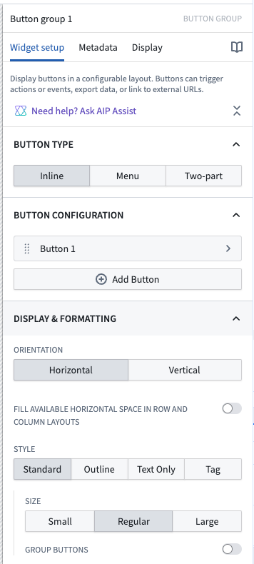
For the Button Group widget, the core configuration options are the following:
- Button type
- This three-way option controls the type of button displayed, with the following choices:
- Inline buttons that provide a single option
- Menu buttons that provide multiple options
- Two-part buttons that contain a primary button alongside an additional menu of options
Button configuration options
The screenshot below shows the configuration options available for a button within the Button Group widget:

- Add button: Selecting this option adds another button / menu item to this button group.
- Duplicate button: Selecting this option creates a copy of an existing button's configuration, allowing builders to quickly replicate button settings.
- Button text: This parameter sets the display text for a given button or menu item.
- Button color: This configuration controls the coloring of a given button or menu item. You can choose either a preset "intent" with an associated color, or specify a custom color. Intent options and their associated colors include none, primary (blue), success (green), warning (amber), and danger (red). You can use the custom option to pick from a wider variety of color options, including setting a color using a hex code.
- Left icon: This parameter controls the icon displayed to the left of a button / menu item's display text. Set to Blank to not show an icon.
- Right icon: This parameter controls the icon displayed to the right of a button / menu item's display text. Set to Blank to not show an icon.
- Description: This parameter will show up to the user as a tooltip when hovering over the button.
- Conditional visibility: If conditional visibility is toggled on, the following options will be available:
- Boolean variable: This is the variable that will be used to determine the conditional state of the button.
- State if false: This option controls if the button should be disabled or hidden when the selected variable value is false.
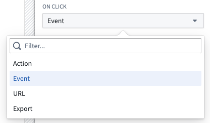
- On click: This option controls what is triggered when a user interacts with a button or menu item. Options include triggering Actions, one or more Workshop events, opening URLs, or starting an export. If multiple Workshop events are configured, updates to variable state may not be complete before the rest of the events run. A full list of On click options can be found below.
- Display & formatting
- Minimal style: If enabled, this option removes the border from a button. If a color has been applied, the background color and text color of the button / menu item will be reversed (for example, a primary-intent button could flip from having a blue background and white text to having a white background and blue text).
- Tag style: If enabled, this option adjusts a given button to have a more narrow tag styling.
- Large style: If enabled, this increases the overall size of a button.
- Fill available horizontal space in row and column layouts: If enabled, this button group will fill the horizontal space of its containing section.
- Scenarios
- When using the button group to create an action, you can choose whether to apply the action to a Scenario or to the Ontology.
- Apply to Scenario: Enable this toggle to apply this action to a Scenario instead of the main Ontology.
- Select Scenario variable: Select the Scenario variable to apply this action to.
- See the Scenarios documentation for more information on Scenarios.
On click
Buttons can trigger actions, layout events, URLs, and different types of exports. Each option is described in detail below.
Actions
Actions allow users to easily create, edit, delete, and link objects in pre-defined ways and can be triggered by Workshop events. As an example, an application builder could configure a Button Group widget within a module to trigger a "Modify Flight Destination" action that allows the user to edit the Destination property on a select Flight object.
Learn more about configuring and exposing Actions within a Workshop module.
For more details on Actions in general, review our action type documentation.
Chaining an event with an action
When configuring a button to trigger an action, you can also configure a Workshop event to occur at a specific point in the action's lifecycle. At the bottom of the widget configuration, select one of the following event trigger options:
- On start of action submission: The configured event occurs when the action submission begins.
- On successful completion of action submission: The configured event occurs after the action has been successfully submitted.
This allows you to chain an action and an event on a single button, enabling workflows such as refreshing data, navigating to another page, or updating variables after an action completes.
Event
Review our events documentation for full details on using events in Workshop.
URL
URL events trigger the opening of specified URLs from within a Workshop module. For example, an application builder could use a URL event to navigate within Foundry and open the Object Explorer application, or designate an external website to open when a user selects a given Button Group widget.
The screenshot below shows an example definition of an external URL event from within a Button Group widget:
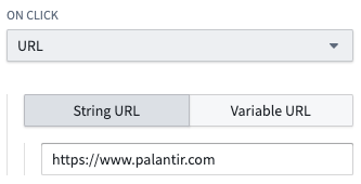
:::callout{theme="neutral"}
When defining an external URL, include the prefix https://.
:::
Export
Export events take an object set variable as an input and trigger the export of the objects in the object set to either Excel or the user’s clipboard. An application builder may optionally configure a file name and select the set of properties that should be included in the export.
The screenshot below shows an example definition of an Export event from within a Button Group widget:
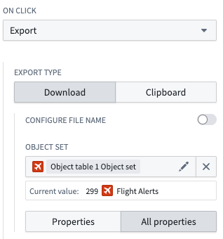
Note that if function-backed columns or linked object columns are included, the export file format will be CSV and not Excel.
Function-backed export
Function-backed exports take a Function and its inputs, and download the output into a specified file type. Supported file types are CSV, TXT, JSON, XML, PDF, DOCX, and XLSX. Below is a sample Function-backed export definition from within a Button Group widget:
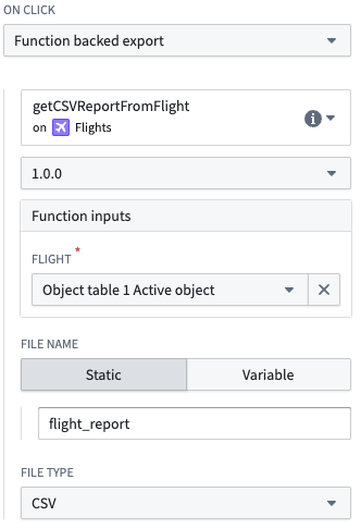
The Function output must be a string, with encoding determined by the export file type:
- Text-based formats (CSV, TXT, JSON, XML): The Function should return a plain string representing the file content.
- Binary formats (PDF, DOCX, XLSX): The Function should return a base64-encoded string of the file bytes. In Python, you can return
bytesdirectly. Do not include a MIME type prefix (for example,data:application/pdf;base64,) in the returned string, or the export will fail to download. Workshop infers the MIME type from the file type selected in the export configuration.
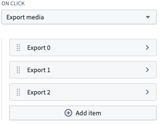
Export media
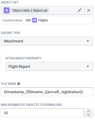
Export media events take a list of exported items and trigger the download of all media associated with those items. To configure an export item, select the object set, type of media, media property, and max number of objects to download. You can configure a custom file name for downloaded media, with substitutions available for the current timestamp, original file name, and non-primary key object property values. If no custom file name is provided, the original file name will be used.
Below is a sample export media event definition from within a Button Group widget:
A sample export item definition is shown below:
中文翻译
按钮组
按钮组(Button Group) 组件允许应用构建者为 Workshop 模块添加按钮,这些按钮可以触发操作(Actions)和Workshop 事件(Workshop events)、打开 URL 或启动导出。配置按钮组组件的构建者可以执行以下操作:
- 在以下三种按钮类型中选择:
- 内联(Inline) 按钮:提供单个选项
- 菜单(Menu) 按钮:提供多个选项
- 双部分(Two-part) 按钮:包含一个主按钮以及一个额外的菜单选项。
- 为每个按钮配置点击时(On click),以触发操作、触发一组事件、打开 URL 或开始导出。
- 通过设置每个按钮的颜色、图标、大小和填充选项来调整样式。
- 基于布尔变量的值配置条件禁用状态或条件可见性。
下面的截图展示了两行已配置的按钮组组件示例,并突出显示了不同的按钮类型和显示选项:
组件配置选项
下面的截图展示了按钮组组件可用的配置选项:
对于按钮组组件,核心配置选项如下:
- 按钮类型(Button type)
- 这个三路选项控制显示的按钮类型,有以下选择:
- 内联(Inline) 按钮:提供单个选项
- 菜单(Menu) 按钮:提供多个选项
- 双部分(Two-part) 按钮:包含一个主按钮以及一个额外的菜单选项
按钮配置选项
下面的截图展示了按钮组组件中某个按钮可用的配置选项:
- 添加按钮(Add button): 选择此选项将向此按钮组添加另一个按钮/菜单项。
- 复制按钮(Duplicate button): 选择此选项将创建现有按钮配置的副本,使构建者能够快速复制按钮设置。
- 按钮文本(Button text): 此参数设置给定按钮或菜单项的显示文本。
- 按钮颜色(Button color): 此配置控制给定按钮或菜单项的颜色。您可以选择预设的"意图(intent)"及其关联颜色,或指定自定义颜色。意图选项及其关联颜色包括无(none)、主要(primary)(蓝色)、成功(success)(绿色)、警告(warning)(琥珀色)和危险(danger)(红色)。您可以使用自定义选项从更广泛的颜色选项中选择,包括使用十六进制代码设置颜色。
- 左侧图标(Left icon): 此参数控制显示在按钮/菜单项显示文本左侧的图标。设置为空白(Blank) 则不显示图标。
- 右侧图标(Right icon): 此参数控制显示在按钮/菜单项显示文本右侧的图标。设置为空白(Blank) 则不显示图标。
- 描述(Description): 当用户悬停在按钮上时,此参数将作为工具提示显示给用户。
- 条件可见性(Conditional visibility): 如果启用了条件可见性,将提供以下选项:
- 布尔变量(Boolean variable): 这是用于确定按钮条件状态的变量。
- 为假时的状态(State if false): 此选项控制当所选变量值为假时,按钮应被禁用还是隐藏。
- 点击时(On click): 此选项控制用户与按钮或菜单项交互时触发的内容。选项包括触发操作(Actions)、一个或多个Workshop 事件(Workshop events)、打开 URL 或开始导出。如果配置了多个 Workshop 事件,变量状态的更新可能不会在其余事件运行之前完成。点击时选项的完整列表可在下方找到。
- 显示与格式(Display & formatting)
- 简约样式(Minimal style): 如果启用,此选项将移除按钮的边框。如果已应用颜色,按钮/菜单项的背景色和文本颜色将互换(例如,主要意图按钮可能从蓝色背景白色文本变为白色背景蓝色文本)。
- 标签样式(Tag style): 如果启用,此选项将调整给定按钮为更窄的标签样式。
- 大号样式(Large style): 如果启用,这将增加按钮的整体尺寸。
- 填充行和列布局中的可用水平空间(Fill available horizontal space in row and column layouts): 如果启用,此按钮组将填充其所在部分的水平空间。
- 场景(Scenarios)
- 使用按钮组创建操作时,您可以选择将操作应用于场景(Scenario)还是本体论(Ontology)。
- 应用于场景(Apply to Scenario): 启用此开关可将此操作应用于场景而非主本体论。
- 选择场景变量(Select Scenario variable): 选择要应用此操作的场景变量。
- 有关场景的更多信息,请参阅场景文档。
点击时(On click)
按钮可以触发操作、布局事件、URL 和不同类型的导出。每个选项的详细说明如下。
操作(Actions)
操作允许用户以预定义的方式轻松创建、编辑、删除和链接对象,并且可以由 Workshop 事件触发。例如,应用构建者可以在模块中配置一个按钮组组件,以触发"修改航班目的地(Modify Flight Destination)"操作,允许用户编辑选定Flight对象上的Destination属性。
了解更多关于在 Workshop 模块中配置和公开操作的信息。
有关操作的更多详细信息,请查看我们的操作类型文档。
将事件与操作链接(Chaining an event with an action)
在配置按钮以触发操作时,您还可以配置一个 Workshop 事件在操作生命周期的特定时间点发生。在组件配置底部,选择以下事件触发选项之一:
- 操作提交开始时(On start of action submission): 配置的事件在操作提交开始时发生。
- 操作提交成功完成时(On successful completion of action submission): 配置的事件在操作成功提交后发生。
这允许您将操作和事件链接到单个按钮上,从而实现诸如在操作完成后刷新数据、导航到另一个页面或更新变量等工作流。
事件(Event)
请查看我们的事件文档以获取在 Workshop 中使用事件的完整详细信息。
URL
URL 事件触发从 Workshop 模块内打开指定的 URL。例如,应用构建者可以使用 URL 事件在 Foundry 内导航并打开对象浏览器(Object Explorer)应用程序,或者指定当用户选择给定按钮组组件时打开的外部网站。
下面的截图展示了从按钮组组件内定义外部 URL 事件的示例:
:::callout{theme="neutral"}
定义外部 URL 时,请包含前缀 https://。
:::
导出(Export)
导出事件将对象集变量作为输入,并触发将对象集中的对象导出到 Excel 或用户剪贴板。应用构建者可以选择配置文件名,并选择应包含在导出中的属性集。
下面的截图展示了从按钮组组件内定义导出事件的示例:
请注意,如果包含函数支持的列(function-backed columns)或链接对象列,导出文件格式将为 CSV 而非 Excel。
函数支持的导出(Function-backed export)
函数支持的导出接受一个函数(Function)及其输入,并将输出下载为指定的文件类型。支持的文件类型为 CSV、TXT、JSON、XML、PDF、DOCX 和 XLSX。以下是来自按钮组组件内的函数支持导出定义示例:
函数输出必须是字符串,编码由导出文件类型决定:
- 基于文本的格式(CSV、TXT、JSON、XML): 函数应返回表示文件内容的纯字符串。
- 二进制格式(PDF、DOCX、XLSX): 函数应返回文件字节的 base64 编码字符串。在 Python 中,您可以直接返回
bytes。不要在返回的字符串中包含 MIME 类型前缀(例如data:application/pdf;base64,),否则导出将无法下载。Workshop 根据导出配置中选择的文件类型推断 MIME 类型。
导出媒体(Export media)
导出媒体事件接受导出的项目列表,并触发下载与这些项目关联的所有媒体。要配置导出项目,请选择对象集、媒体类型、媒体属性和要下载的最大对象数量。您可以为下载的媒体配置自定义文件名,并可使用当前时间戳、原始文件名和非主键对象属性值进行替换。如果未提供自定义文件名,将使用原始文件名。
以下是来自按钮组组件内的导出媒体事件定义示例:
导出项目定义示例如下所示: