Chart XY(XY图表(Chart XY))
:::callout{theme="neutral"} Consider using the Vega Chart widget if the Chart XY widget does not enable desired functionality or formatting. :::
The Chart XY widget is used to visualize Objects as interactive charts. Module builders configuring a Chart XY widget can:
- Display data as bar, line, and scatter charts.
- Choose which properties are visualized, how these properties are aggregated (e.g. count, sum, average), and whether/how the properties are segmented.
- Use Function-backed layers to display more advanced aggregation types and charts.
- Set display options for chart titles, axes, legends, and numerical formatting.
- Enable selection and downstream filtering on a chart.
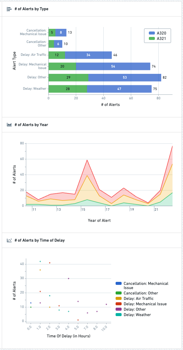
The below screenshot shows an example of three configured Chart XY widgets displaying Flight Alerts data:
Configuration options
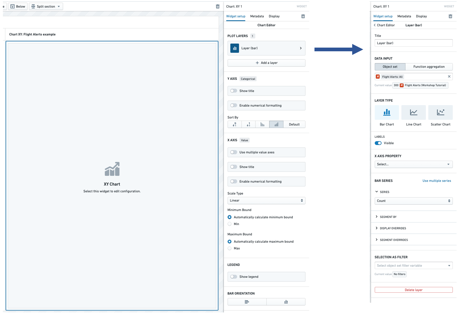
In the image below, to the left of the blue arrow you can see a newly added (but not yet configured) Chart XY widget, alongside its initial configuration panel. To the right of the blue arrow in the image below, you can see an individual Layer configuration panel with the backing object set of Flight Alerts already populated:
Layer configuration options
Configuring a Layer is required to add data to the Chart XY widget. The following configuration options are available for a Layer:
- Title
- Sets a title for the current Layer within your configuration panel.
- Note: This title is not visible to module users, but is intended to help builders organize and manage complex Chart XY configurations that use multiple Layers.
- Data input
- Controls the input data for this Layer.
- The Object set option allows a Workshop object set variable to be used as input.
- The Function aggregation option allows a function that returns a 2D Aggregation or 3D Aggregation to be used as input.
- Note: Function aggregation layers will only have a subset of the below Layer configuration options available.
- The Time series set option allows a Workshop time series set variable to be used as input. See Variables for more information on time series set variables. This configures a time series chart, with the time range on the X axis, and the time series values of the variable on the Y axis.
- Layer type
- Selects the type of chart displayed. Current options include Bar Chart, Line Chart, and Scatter Chart. If the data input is a time series set, only the Line Chart option is supported. See Variables for more information on time series set variables.
- Area options
- Provides three visualization options for line charts:
- "Line" (which display a simple line chart),
- "Area" (which plots a line chart and shades the area beneath each line), and
- "Stacked" (which is similar to the "Area" option but stacks segmented chart values on top of each other).
- Area options are only available for line charts.
- Labels
- Toggles the display of value labels on the chart.
- This option is currently available for Bar Charts and Line Charts.
- X axis property
- Determines the property type plotted on the chart.
- Bar / line / chart series
- Use single / multiple series
- Allows either one or more chart series to be plotted for the selected X axis property.
- For instance, if "Alert Type" was selected as the X axis property, multiple series would allow the plotting of both the count of each "Alert Type" and also the sum of the "# of Hours Delayed" for each "Alert Type".
- Series aggregation
- Determines the aggregation method used to produce each value plotted on the chart.
- By default, this is set to "Count."
- Other options include: "Average," "Min," "Max," "Sum," and "Approximate Unique Count."
- Segment by
- Optional.
- Enables each plotted value to be segmented by a secondary property type.
- As an example, if "Alert Type" was selected as the X axis property and then "Aircraft Type" was selected as the Segment by option on a bar chart, each bar would show the count of objects of each "Alert Type" segmented by each "Aircraft Type".
- Display of null/missing values
- Only available for Line chart.
- Controls how null or missing values are displayed on a Line chart.
- Options are "Gap" (where a missing value is displayed as an empty gap in a plotted line), "Ignored" (where a missing value is ignored and a plotted line instead connects the previous and next available values), or "Zeroes" (where a missing value is treated as equivalent to value of "0).
- Display override
- Optional.
- Overrides the legend display name of the current series.
- For segmented charts, overrides the legend display name of a single segment.
- Segment overrides
- Only available for Bar chart.
- Modifies how each bar chart value is displayed.
- Options include: "Stacked," "Percentage," and "Grouped."
- Selection as filter
- Optional and only available for Object set-backed charts.
- When set, allows for selection and downstream widget filtering for this chart layer via the output Object set filter variable.
- Delete layer
- Allows the current chart layer to be deleted.
- Scenarios
- Compare against Scenarios
- Enable this toggle to select the Scenario array variable to compare data from. This will compare the data in the table to values from the Scenarios in the array using the "segment by" axis of the chart.
- If this option is enabled, you cannot segment by other properties.
- See the Scenarios documentation for more information on Scenarios.
Chart-wide configuration options
In addition to the configuration options for a layer described above, the main Chart XY configuration panel contains a number of chart-wide configuration options:
- Categorical axis
- Show title
- If enabled, displays the title of the categorical axis and also allows this title to be override.
- By default, this title will display the property type(s) plotted within the chart's series.
- Enable numerical formatting
- If enabled, provides configuration options for numerical values displayed in the categorical axis keys.
- Configuration options include numerical grouping, min / max decimals shown, scientific notation, and others.
- Sort by
- Controls sorting logic for how each charted value is displayed.
- By default, sorts categorical keys alphabetically from A to Z.
- Value axis
- Use multiple value axes
- Only available if multiple chart series have been configured and allows value axes to be configured on a per series basis. This can be helpful when different series on a chart have substantially different value scales.
- Show title
- If enabled, displays the title of the value axis and also allows this title to be override.
- By default, this title will display the aggregation type(s) used within the chart's series.
- Enable numerical formatting
- If enabled, provides configuration options for numerical values displayed in the values axis.
- Configuration options include numerical grouping, min / max decimals shown, scientific notation, and others.
- Scale type
- Allows the value axis scale to be set to either "Linear" (the default) or "Logarithmic."
- Minimum bound
- By default, set to "Automatically calculate minimum bound" based on the displayed chart values.
- If switched to "Min," the module builder can control the minimum value display on the value axis.
- Maximum bound
- By default, set to "Automatically calculate maximum bound" based on the displayed chart values.
- If switched to "Max," the module builder can control the maximum value display on the value axis.
- Legend
- Show legend
- Toggles display of a legend of chart series' titles and series' colors.
- Positioning options
- When "Show legend" is enabled, controls the positioning of the legend within the chart.
- Bar orientation
- Horizontal / vertical toggle
- Controls the orientation of the chart.
- For a Bar chart, "Horizontal" is the default.
- For a Line chart or Scatter chart, only "Vertical" is allowed.
Function aggregations (Function-backed layers)
Configuring a function-backed layer requires writing a function that returns either a TwoDimensionalAggregation or ThreeDimensionalAggregation.
Below is a full example that returns a TwoDimensionalAggregation in order to chart one time series divided by another time series:
import { Function, TwoDimensionalAggregation, ThreeDimensionalAggregation,
         IRange, Timestamp } from "@foundry/functions-api";
import { ObjectSet, MyObjectType } from "@foundry/ontology-api"

export class TimeseriesAggregations {

    @Function()
    public async percentOfTotal(objects:ObjectSet<MyObjectType>):
                                Promise<TwoDimensionalAggregation<IRange<Timestamp>>> {
        const numerators = await objects.groupBy(e => e.date.byDays())
                                        .sum(e => e.value);
        const denominators = await objects.groupBy(e => e.date.byDays())
                                          .sum(e => e.total);

        return this.divide(numerators, denominators);
    }

    private divide(numerators:TwoDimensionalAggregation<IRange<Timestamp>>,
                              denominators: TwoDimensionalAggregation<IRange<Timestamp>>):
                              TwoDimensionalAggregation<IRange<Timestamp>> {

        const percentage = numerators.buckets.map((bucket, i) => {
           const numerator = bucket.value;
           const denominator = denominators.buckets[i].value;
            if (denominator == 0) {
                return { key: bucket.key, value: 0 };
            }
            return { key: bucket.key, value: numerator / denominator }
        });

        return { buckets: percentage };
    }
}
Below is a full example that returns a ThreeDimensionalAggregation which will chart a separate series for each value returned by segmentBy():
import { Function, TwoDimensionalAggregation, ThreeDimensionalAggregation,
         IRange, Timestamp } from "@foundry/functions-api";
import { ObjectSet, MyObjectType } from "@foundry/ontology-api"

export class TimeseriesAggregations {

    @Function()
    public async percentOfTotalSegmented(objects:ObjectSet<MyObjectType>):
                                         Promise<ThreeDimensionalAggregation<IRange<Timestamp>, string>> {
        const numerators = await objects.groupBy(e => e.date.byDays())
                                        .segmentBy(e => e.groupId.topValues())
                                        .sum(e => e.value);
        const denominators = await objects.groupBy(e => e.date.byDays())
                                          .segmentBy(e => e.groupId.topValues())
                                          .sum(e => e.total);

        return this.divideThreeDimensional(numerators, denominators);
    }

    private divideThreeDimensional(numerators:ThreeDimensionalAggregation<IRange<Timestamp>, string>,
                             denominators: ThreeDimensionalAggregation<IRange<Timestamp>, string>):
                             ThreeDimensionalAggregation<IRange<Timestamp>, string> {

        var percentage = numerators.buckets; //copy
        for (let i = 0; i < numerators.buckets.length; i++) {
            for (let j = 0; j < numerators.buckets[i].value.length; j++) {
                percentage[i].value[j].value = numerators.buckets[i].value[j].value /
                                               denominators.buckets[i].value[j].value;
            }
        }

        return { buckets: percentage };
    }
}
For more examples, see the Functions documentation on object set aggregations and creating custom aggregations.
中文翻译
XY图表(Chart XY)
:::callout{theme="neutral"} 如果XY图表组件(Widget)无法实现您需要的功能或格式,请考虑使用Vega图表(Vega Chart)组件。 :::
XY图表(Chart XY) 组件用于将对象(Object)可视化为交互式图表。配置XY图表组件的模块构建者(Module builder)可以实现以下操作:
- 以条形图、折线图和散点图的形式展示数据。
- 选择要可视化的属性、属性的聚合(Aggregation)方式(如计数、求和、平均值),以及是否对属性进行拆分、如何拆分。
- 使用函数(Function)支持的图层展示更高级的聚合类型和图表。
- 配置图表标题、坐标轴、图例、数值格式的展示选项。
- 启用图表的选择功能和下游筛选能力。
下方截图展示了三个已配置的XY图表组件的示例,展示的是Flight Alerts数据:
配置选项
在下图中,蓝色箭头左侧是新添加(尚未配置)的XY图表组件,旁边是其初始配置面板。蓝色箭头右侧是单独的图层(Layer) 配置面板,其中已填充了Flight Alerts作为支撑对象集(Object set):
图层配置选项
要向XY图表组件中添加数据,必须先配置图层。图层支持以下配置项:
- 标题
- 为配置面板内的当前图层设置标题。
- 注意:该标题对模块用户不可见,仅用于帮助构建者组织和管理使用多图层的复杂XY图表配置。
- 数据输入
- 控制当前图层的输入数据。
- 对象集选项允许使用工作坊(Workshop)的对象集变量作为输入。
- 函数聚合选项允许使用返回二维聚合或三维聚合的函数作为输入。
- 注意:函数聚合图层仅支持下方列出的部分图层配置项。
- 时间序列集(Time series set) 选项允许使用工作坊的时间序列集变量作为输入。有关时间序列集变量的更多信息,请参见变量。该配置会生成时间序列图表,X轴为时间范围,Y轴为变量的时间序列值。
- 图层类型
- 选择展示的图表类型。当前支持的选项包括条形图(Bar Chart)、折线图(Line Chart)和散点图(Scatter Chart)。如果数据输入为时间序列集,则仅支持折线图选项。有关时间序列集变量的更多信息,请参见变量。
- 区域选项
- 为折线图提供三种可视化选项:
- "折线":展示基础折线图,
- "区域":绘制折线图并为每条线下方的区域填充颜色,
- "堆叠":与"区域"选项类似,但会将拆分后的图表值互相堆叠。
- 区域选项仅对折线图生效。
- 标签
- 切换是否在图表上展示数值标签。
- 该选项当前仅支持条形图和折线图。
- X轴属性
- 决定图表绘制的属性类型。
- 条形/折线/图表系列
- 使用单/多系列
- 允许为选中的X轴属性绘制一个或多个图表系列。
- 例如,如果选择"告警类型"作为X轴属性,多系列可以同时绘制每种"告警类型"的计数,以及每种"告警类型"对应的"延误时长"总和。
- 系列聚合
- 决定生成图表每个绘制值的聚合方式。
- 默认设置为"计数"。
- 其他选项包括:"平均值"、"最小值"、"最大值"、"求和"和"近似唯一计数"。
- 按...拆分(Segment by)
- 可选配置。
- 支持按二级属性类型拆分每个绘制值。
- 举例来说,如果在条形图中选择"告警类型"作为X轴属性,然后选择"飞机型号"作为"按...拆分"选项,那么每个条形都会展示每种"告警类型"按"飞机型号"拆分后的对象计数。
- 空值/缺失值展示
- 仅对折线图生效。
- 控制折线图中空值或缺失值的展示方式。
- 可选值包括"断开"(缺失值位置的折线会出现空白缺口)、"忽略"(忽略缺失值,折线直接连接前后的可用值)或"视为零"(缺失值等价于数值"0")。
- 展示覆写
- 可选配置。
- 覆写当前系列在图例中的展示名称。
- 对于拆分后的图表,可覆写单个拆分项在图例中的展示名称。
- 拆分项覆写
- 仅对条形图生效。
- 修改每个条形图值的展示方式。
- 可选值包括:"堆叠"、"百分比"和"分组"。
- 选择作为筛选条件
- 可选配置,仅对基于对象集的图表生效。
- 开启后,可通过输出的对象集筛选器变量实现对该图表图层的选择和下游组件筛选。
- 删除图层
- 允许删除当前图表图层。
- 场景(Scenario)
- 与场景对比
- 开启该开关可选择场景数组变量来对比数据。该功能会使用图表的"按...拆分"轴,将表格中的数据与数组中场景的数值进行对比。
- 如果开启该选项,则无法按其他属性进行拆分。
- 有关场景的更多信息,请参见场景文档。
全图表配置选项
除了上述的图层配置项之外,XY图表的主配置面板还包含多个全图表范围的配置项:
- 分类轴
- 显示标题
- 开启后会展示分类轴的标题,同时支持覆写该标题。
- 默认情况下,标题会展示图表系列中绘制的属性类型。
- 启用数值格式化
- 开启后,可对分类轴键中展示的数值进行格式配置。
- 配置项包括数值分组、展示的最小/最大小数位数、科学计数法等。
- 排序依据
- 控制每个图表值的展示排序逻辑。
- 默认情况下,分类按键的字母顺序A到Z排序。
- 数值轴
- 使用多数值轴
- 仅在配置了多个图表系列时可用,支持为每个系列单独配置数值轴。当图表上不同系列的数值尺度差异极大时,该功能非常实用。
- 显示标题
- 开启后会展示数值轴的标题,同时支持覆写该标题。
- 默认情况下,标题会展示图表系列中使用的聚合类型。
- 启用数值格式化
- 开启后,可对数值轴上展示的数值进行格式配置。
- 配置项包括数值分组、展示的最小/最大小数位数、科学计数法等。
- 刻度类型
- 可将数值轴刻度设置为"线性"(默认)或"对数"。
- 最小值边界
- 默认设置为"根据展示的图表值自动计算最小边界"。
- 如果切换为"自定义最小值",模块构建者可控制数值轴展示的最小值。
- 最大值边界
- 默认设置为"根据展示的图表值自动计算最大边界"。
- 如果切换为"自定义最大值",模块构建者可控制数值轴展示的最大值。
- 图例
- 显示图例
- 切换是否展示图表系列标题和系列颜色对应的图例。
- 位置选项
- 开启"显示图例"后,可控制图例在图表中的位置。
- 条形方向
- 水平/垂直切换
- 控制图表的方向。
- 对于条形图,默认方向为"水平"。
- 对于折线图或散点图,仅支持"垂直"方向。
函数聚合(函数支撑图层)
配置函数支撑的图层需要编写返回TwoDimensionalAggregation或ThreeDimensionalAggregation的函数。
以下是返回TwoDimensionalAggregation的完整示例,用于将一个时间序列除以另一个时间序列绘制成图表:
import { Function, TwoDimensionalAggregation, ThreeDimensionalAggregation,
         IRange, Timestamp } from "@foundry/functions-api";
import { ObjectSet, MyObjectType } from "@foundry/ontology-api"

export class TimeseriesAggregations {

    @Function()
    public async percentOfTotal(objects:ObjectSet<MyObjectType>):
                                Promise<TwoDimensionalAggregation<IRange<Timestamp>>> {
        const numerators = await objects.groupBy(e => e.date.byDays())
                                        .sum(e => e.value);
        const denominators = await objects.groupBy(e => e.date.byDays())
                                          .sum(e => e.total);

        return this.divide(numerators, denominators);
    }

    private divide(numerators:TwoDimensionalAggregation<IRange<Timestamp>>,
                              denominators: TwoDimensionalAggregation<IRange<Timestamp>>):
                              TwoDimensionalAggregation<IRange<Timestamp>> {

        const percentage = numerators.buckets.map((bucket, i) => {
           const numerator = bucket.value;
           const denominator = denominators.buckets[i].value;
            if (denominator == 0) {
                return { key: bucket.key, value: 0 };
            }
            return { key: bucket.key, value: numerator / denominator }
        });

        return { buckets: percentage };
    }
}
以下是返回ThreeDimensionalAggregation的完整示例,会为segmentBy()返回的每个值绘制单独的系列:
import { Function, TwoDimensionalAggregation, ThreeDimensionalAggregation,
         IRange, Timestamp } from "@foundry/functions-api";
import { ObjectSet, MyObjectType } from "@foundry/ontology-api"

export class TimeseriesAggregations {

    @Function()
    public async percentOfTotalSegmented(objects:ObjectSet<MyObjectType>):
                                         Promise<ThreeDimensionalAggregation<IRange<Timestamp>, string>> {
        const numerators = await objects.groupBy(e => e.date.byDays())
                                        .segmentBy(e => e.groupId.topValues())
                                        .sum(e => e.value);
        const denominators = await objects.groupBy(e => e.date.byDays())
                                          .segmentBy(e => e.groupId.topValues())
                                          .sum(e => e.total);

        return this.divideThreeDimensional(numerators, denominators);
    }

    private divideThreeDimensional(numerators:ThreeDimensionalAggregation<IRange<Timestamp>, string>,
                             denominators: ThreeDimensionalAggregation<IRange<Timestamp>, string>):
                             ThreeDimensionalAggregation<IRange<Timestamp>, string> {

        var percentage = numerators.buckets; //copy
        for (let i = 0; i < numerators.buckets.length; i++) {
            for (let j = 0; j < numerators.buckets[i].value.length; j++) {
                percentage[i].value[j].value = numerators.buckets[i].value[j].value /
                                               denominators.buckets[i].value[j].value;
            }
        }

        return { buckets: percentage };
    }
}