Markdown
The Markdown widget supports rendering text with Markdown formatting. Advanced functionality within the widget can be used to enable additional workflows such as attribution, citation, and user tagging on text.
Module builders configuring a Markdown widget can use the following features:
- Basic Markdown text formatting such as bold, italic, strikethrough, and highlighting
- More advanced Markdown formatting such as headers, tables, block styling, code styling, and URLs
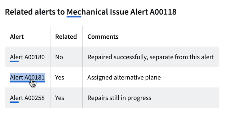
The below screenshot shows an example of a configured Markdown widget including object references, where text anchors that have attached Ontology object references are shown underlined and are selectable:
- Embedded references from specific highlighted anchor text to Ontology objects
- Triggering on-click Workshop events from specific highlighted anchor text
The example below shows a configured Markdown widget displaying annotation objects with the following user interactions configured on the embedded objects:
- Display annotation objects on specific portions of text
- Trigger on-click Workshop actions and events from displayed annotation objects
- Create new annotation objects on specific portions of text

Configuration options
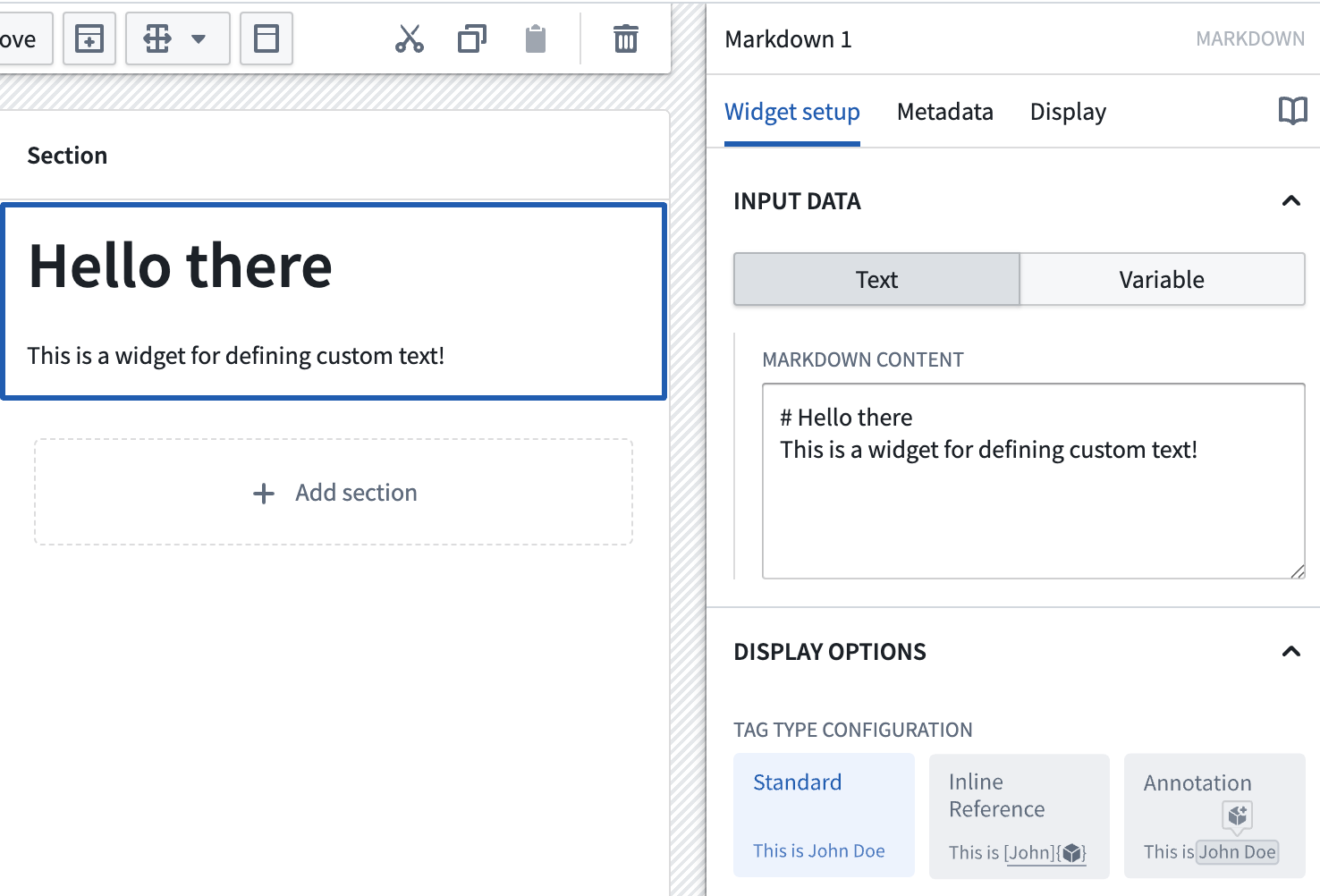
The screenshot below shows the initial state of an unconfigured Markdown widget alongside its initial configuration panel.
For the Markdown widget, the core configuration options are the following:
- Input data: Text/Variable
- Text: If the text option is chosen, a builder can directly enter the input Markdown text they'd like to display into the configuration panel.
-
Variable: If the variable option is chosen, a string variable can be chosen as the input Markdown text to be displayed.
-
Display options:
- Tag type configuration
- Standard: By default this option is enabled and displays the input with standard Markdown formatting.
- Inline reference: If enabled, allows references to Ontology objects and on-click Workshop events to be embedded in the text. This is a custom extension of the Markdown syntax; see the inline references section below for more information.
- Annotation: If enabled, allows display of annotation objects embedded in the text, user interactions on existing annotation objects, and creation of new annotation objects using the widget. See the annotations section below for more information.
- Enable monospace font: Toggle to enable/disable displaying text in the widget in monospace font.
- Enable scrolling: Toggle to enable/disable scrolling for the widget.
- Allow long word wrap: Toggle to enable/disable wrapping of long, unbroken strings (such as long URLs) that exceed the width of the widget. When enabled, which is the default for new widgets, such strings break onto the next line instead of overflowing the widget.
- Break on newlines: Toggle to control how single line breaks in the Markdown source are rendered. When enabled, which is the default for new widgets, a single newline in the source begins a new line in the rendered output. When disabled, single newlines are collapsed into spaces, following standard Markdown rendering.
-
Text alignment: Sets the alignment of the rendered Markdown content within the widget. Choose Left (the default), Center, or Right.
:::callout{theme="neutral"} Explicit per-column alignment defined in Markdown table syntax (for example,
| :---: |) takes precedence over the widget-level text alignment setting. Code blocks remain left-aligned and full-width regardless of the selected alignment. ::: -
User text selection:
- Output user selected raw text: Outputs the user selected text as a raw Markdown string.
- Selected text: Outputted string variable containing user selected text as raw Markdown.
- Output user selected indices: Outputs the starting and ending indices of the user selected text as numeric variables.
- Selection start index: Numeric output variable containing the starting index of the user selected text.
- Selection end index: Numeric output variable containing the ending index of the user selected text.
Syntax examples
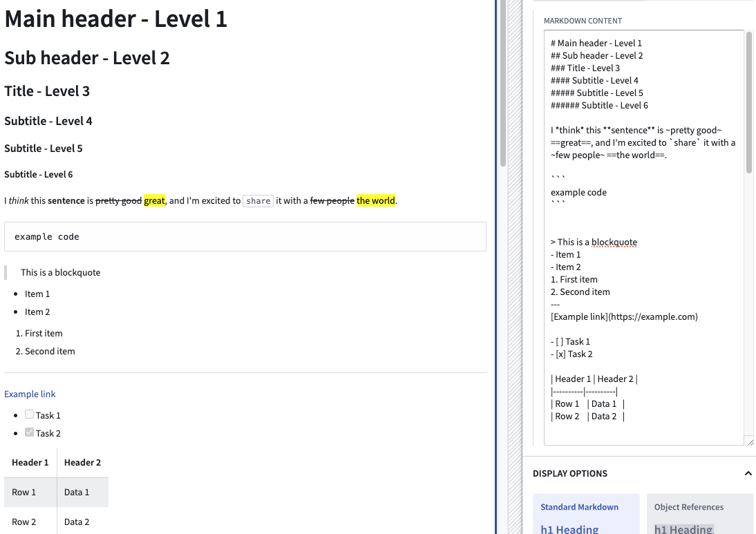
The following are some examples of supported Markdown syntax. Note that the highlight syntax ==text== and tasklist are supported despite not being standard in typical Markdown implementations. A table showing supported Markdown syntaxes and their corresponding examples follows below.
Markdown supports subheaders ranging from level 1 to level 6.
| Syntax type | Markdown syntax |
|---|---|
| Main Header | # Main header |
| Subheader | ### sub header |
| Italics | I *think* this |
| Bold | **sentence** is |
| Strikethrough | ~pretty good~ |
| Highlight | ==great== |
| Inline Code | `share` |
| Code Block | ``` \n example code \n ``` |
| Blockquote | > This is a blockquote |
| Unordered List | - Item 1- Item 2 |
| Ordered List | 1. First item2. Second item |
| Horizontal Rule | --- or *** |
| Link | [title](https://palantir.com) |
| Image |  |
| Task List | - [ ] Task 1- [x] Task 2 |
| Table | See below for syntax |
Table Syntax Example
| Header 1 | Header 2 |
|----------|----------|
| Row 1    | Data 1   |
| Row 2    | Data 2   |
Object references in the Markdown widget
Inline references
As an advanced feature, the Markdown widget allows builders to tag subsets of Markdown text ("anchors") and then use these anchors to link to specific Ontology objects and trigger Workshop on-click events.
The format for creating one of these anchors is as follows:
:objectreference[$text_to_display]{objectType="$object_type_id" primaryKey="$object_primary_key"}
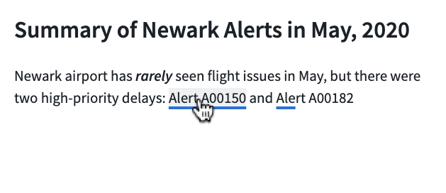
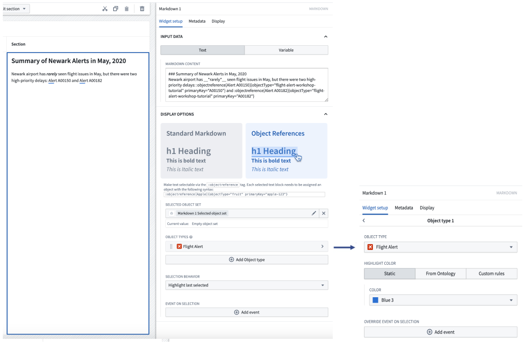
Let's walk through an example where we're attempting to reference two Flight Alerts objects within a sentence. First, let's look at the desired end-state we'd like to appear on-screen for users. Note: each of the Flight Alert objects reference below is individually selectable by a user and will then become the output selected object set of the Markdown widget.
To achieve the above, the backing Markdown input is the following:
Newark airport has __*rarely*__ seen flight issues in May, but there were two high-priority delays: :objectreference[Alert A00150]{objectType="flight-alert" primaryKey="A00150"} and :objectreference[Alert A00182]{objectType="flight-alert" primaryKey="A00182"}
Beyond the syntax describe above for the Markdown input, builders can also configure the following options for object references:
- Selected object set: Required for using object references. This is the output object set of the Markdown widget. When a user selects an object reference within the Markdown widget, that object will be output into this object set variable.
- Object types: Required for using object references. Builder should select all object types which will be referenced within the Markdown widget. Once an object type is added, builders can additional configured conditional formatting rules within the inner configuration panel. If an object type is referenced in the Markdown widget but not configured in this list, the object reference will not appear in the Markdown widget.
- Object type: Specify the object type to configure further color and event options.
- Highlight color: Select a static color, inherit colors from a property with Ontology formatting, or define custom rules to determine color.
- Override event on selection: Configure Workshop events to trigger for the specified object type. These will override any other event on selection.
- Selection behavior: Controls the selection behavior within the Markdown widget.
- If No highlight is chosen, selecting an object reference within the Markdown widget will not result in a selection state.
- If Highlight last selected is chosen, selecting an object reference within the Markdown widget will result in the most recently selected anchor text being highlighted.
- If Highlight selected reference is chosen, highlighting within the Markdown widget is based on the contents of the selected object set. This option works best when object references in the Markdown are 1:1 with the objects from another widget, and the selected object set of both widgets are the same.
- Event on selection: This option enables module builders to configure Workshop events to trigger when an object reference is selected in the Markdown widget (for example, causing a drawer with a more detailed object view to appear).
Object references in Markdown can also have standard Markdown formatting applied. The screenshot below contains a variety of examples of Markdown formatting, such as headings and tables embedded with objects.
Annotations
The Annotation option can be used to display annotation objects on text using the Markdown widget. This option also allows users to interact with text within the widget by creating new annotation objects on selected portions of text, or running actions and events on the displayed annotation objects.

Annotation objects capture selected text using zero-indexed numeric indices, with an inclusive start index and an exclusive end index, to represent the text selection's start and end positions. Markdown widget annotations currently do not support negative indices.
Upon selection of the Annotation option, the following configuration will be available:
- Display existing annotations Configure separate annotation object layers to display various annotations within the widget.
- Annotation inputs
- Name: Set the name for the annotation layer in the widget configuration.
- Annotation object set: Specify the object set containing annotation object types to be displayed.
- Start index: Set the numeric object property representing the inclusive starting index for an annotation.
- End index: Set the numeric object property representing the exclusive ending index for an annotation.
- Existing annotation interaction
- Selected annotation: Object set containing the currently selected annotation object.
- On select event: Set event(s) to be triggered on selection of an annotation object.
- Properties to display in tooltip: Specify object properties to be displayed in the on-hover tooltip of an annotation object.
- On hover interactions: Configure on-hover interactions such as actions and events, which will be displayed in the on-hover tooltip of an annotation object.
- Icon: Set the icon displayed for an on-hover interaction.
- Title: Set the title displayed for an on-hover interaction. The title appears when hovering over the interaction icon.
- Interaction: Configure an action or event that can be triggered on the annotation object.
- Hovered object: A special action parameter value that can be used to reference the hovered annotation object.
- Annotation display options
- Highlight color: Set the color used to display the annotation. A custom color may be statically defined or conditional formatting rules may be set.
- Annotation formatting: Set how annotations are displayed. Options include colored highlighting, underlining using a solid or dashed line, or both highlighting and underlining for an annotation.
- Create annotations via actions or events: Configure actions or events to create new annotation objects when text is highlighted within the widget.
- Icon: Set the icon displayed on text highlighting.
- Title: Set the title displayed on text highlighting. The title appears on hover over the icon.
- Interaction: Configure an action or event which can be triggered on the highlighted text.
- Highlighted text: A special action parameter value that can be used to reference text highlighted within the widget.
Limitations
The Markdown widget does not support rendering HTML. HTML provided to the Markdown widget will be rendered as text.
中文翻译
Markdown
Markdown 微件支持使用 Markdown 格式渲染文本。微件内的高级功能可用于启用额外的工作流,例如文本的归因、引用和用户标记。
配置 Markdown 微件的模块构建者可以使用以下功能:
- 基本 Markdown 文本格式,如粗体、斜体、删除线和高亮
- 更高级的 Markdown 格式,如标题、表格、块样式、代码样式和 URL
下方截图展示了一个已配置的 Markdown 微件示例,其中包含对象引用,附有本体(Ontology)对象引用的文本锚点会显示下划线并可供选择:
- 从特定高亮锚文本到本体(Ontology)对象的嵌入式引用
- 从特定高亮锚文本触发点击时的 Workshop 事件
以下示例展示了一个已配置的 Markdown 微件,该微件显示标注(Annotation)对象,并对嵌入式对象配置了以下用户交互:
- 在文本的特定部分显示标注对象
- 从显示的标注对象触发点击时的 Workshop 操作和事件
- 在文本的特定部分创建新的标注对象
配置选项
下方截图展示了未配置的 Markdown 微件的初始状态及其初始配置面板。
对于 Markdown 微件,核心配置选项如下:
- 输入数据:文本/变量
- 文本: 如果选择文本选项,构建者可以直接在配置面板中输入他们希望显示的 Markdown 文本。
-
变量: 如果选择变量选项,可以选择一个字符串变量作为要显示的输入 Markdown 文本。
-
显示选项:
- 标签类型配置
- 启用等宽字体: 切换以启用/禁用微件中等宽字体的文本显示。
- 启用滚动: 切换以启用/禁用微件的滚动功能。
- 允许长词换行: 切换以启用/禁用超出微件宽度的长且不间断的字符串(如长 URL)的换行。启用后(新微件的默认设置),此类字符串将换到下一行,而不会溢出微件。
- 遇换行符断行: 切换以控制 Markdown 源文本中的单个换行符的渲染方式。启用后(新微件的默认设置),源文本中的单个换行符会在渲染输出中开始新的一行。禁用时,单个换行符会折叠为空格,遵循标准 Markdown 渲染规则。
-
文本对齐: 设置微件内渲染的 Markdown 内容的对齐方式。选择左对齐(默认)、居中或右对齐。
:::callout{theme="neutral"} 在 Markdown 表格语法中定义的显式逐列对齐(例如
| :---: |)优先于微件级别的文本对齐设置。无论选择何种对齐方式,代码块始终保持左对齐并占满全宽。 ::: -
用户文本选择:
- 输出用户选择的原始文本: 将用户选择的文本作为原始 Markdown 字符串输出。
- 所选文本: 输出的字符串变量,包含作为原始 Markdown 的用户所选文本。
- 输出用户选择的索引: 将用户所选文本的起始和结束索引作为数值变量输出。
- 选择起始索引: 数值输出变量,包含用户所选文本的起始索引。
- 选择结束索引: 数值输出变量,包含用户所选文本的结束索引。
语法示例
以下是一些受支持的 Markdown 语法示例。请注意,尽管高亮语法 ==text== 和任务列表在典型的 Markdown 实现中并非标准语法,但此处均受支持。下方表格展示了受支持的 Markdown 语法及其对应示例。
Markdown 支持 1 到 6 级的子标题。
| 语法类型 | Markdown 语法 |
|---|---|
| 主标题 | # Main header |
| 子标题 | ### sub header |
| 斜体 | I *think* this |
| 粗体 | **sentence** is |
| 删除线 | ~pretty good~ |
| 高亮 | ==great== |
| 内联代码 | `share` |
| 代码块 | ``` \n example code \n ``` |
| 引用块 | > This is a blockquote |
| 无序列表 | - Item 1- Item 2 |
| 有序列表 | 1. First item2. Second item |
| 水平线 | --- 或 *** |
| 链接 | [title](https://palantir.com) |
| 图片 |  |
| 任务列表 | - [ ] Task 1- [x] Task 2 |
| 表格 | 语法见下文 |
表格语法示例
| Header 1 | Header 2 |
|----------|----------|
| Row 1    | Data 1   |
| Row 2    | Data 2   |
Markdown 微件中的对象引用
内联引用
作为一项高级功能,Markdown 微件允许构建者标记 Markdown 文本的子集(“锚点”),然后使用这些锚点链接到特定的本体(Ontology)对象并触发 Workshop 点击事件。
创建此类锚点的格式如下:
:objectreference[$text_to_display]{objectType="$object_type_id" primaryKey="$object_primary_key"}
让我们通过一个示例来了解如何在句子中引用两个航班警报对象。首先,看看我们希望为用户在屏幕上呈现的最终状态。注意:下方引用的每个航班警报对象均可由用户单独选择,然后将成为 Markdown 微件输出的所选对象集。
为实现上述效果,底层的 Markdown 输入如下:
Newark airport has __*rarely*__ seen flight issues in May, but there were two high-priority delays: :objectreference[Alert A00150]{objectType="flight-alert" primaryKey="A00150"} and :objectreference[Alert A00182]{objectType="flight-alert" primaryKey="A00182"}
除了上述 Markdown 输入的语法外,构建者还可以为对象引用配置以下选项:
- 所选对象集: 使用对象引用所必需。这是 Markdown 微件的输出对象集。当用户在 Markdown 微件中选择对象引用时,该对象将输出到此对象集变量中。
- 对象类型: 使用对象引用所必需。构建者应选择将在 Markdown 微件中引用的所有对象类型。添加对象类型后,构建者可以在内部配置面板中进一步配置条件格式规则。如果在 Markdown 微件中引用了某个对象类型但未在此列表中配置,则该对象引用不会显示在 Markdown 微件中。
- 对象类型: 指定对象类型以进一步配置颜色和事件选项。
- 高亮颜色: 选择静态颜色、从具有本体格式的属性继承颜色,或定义自定义规则来确定颜色。
- 覆盖选择时事件: 配置针对指定对象类型触发的 Workshop 事件。这些事件将覆盖任何其他选择时事件。
- 选择行为: 控制 Markdown 微件内的选择行为。
- 如果选择无高亮,在 Markdown 微件中选择对象引用不会产生选择状态。
- 如果选择高亮最后选择项,在 Markdown 微件中选择对象引用将导致最近选择的锚文本被高亮显示。
- 如果选择高亮所选引用,Markdown 微件内的高亮基于所选对象集的内容。当 Markdown 中的对象引用与来自另一个微件的对象一一对应,且两个微件的所选对象集相同时,此选项效果最佳。
- 选择时事件: 此选项允许模块构建者配置在 Markdown 微件中选择对象引用时触发的 Workshop 事件(例如,使包含更详细对象视图的抽屉出现)。
Markdown 中的对象引用还可以应用标准 Markdown 格式。下方截图包含各种 Markdown 格式示例,例如嵌入了对象的标题和表格。
标注
标注选项可用于使用 Markdown 微件在文本上显示标注对象。此选项还允许用户通过与微件内的文本交互来创建新的标注对象,或对显示的标注对象执行操作和事件。
标注对象使用从零开始的数值索引捕获所选文本,包含起始索引(含)和结束索引(不含),以表示文本选择的起始和结束位置。Markdown 微件标注目前不支持负索引。
选择标注选项后,将提供以下配置:
- 显示现有标注 配置单独的标注对象层,以在微件内显示各种标注。
- 标注输入
- 名称: 在微件配置中设置标注层的名称。
- 标注对象集: 指定包含要显示的标注对象类型的对象集。
- 起始索引: 设置表示标注起始索引(含)的数值对象属性。
- 结束索引: 设置表示标注结束索引(不含)的数值对象属性。
- 现有标注交互
- 所选标注: 包含当前所选标注对象的对象集。
- 选择时事件: 设置在选择标注对象时触发的事件。
- 工具提示中显示的属性: 指定在标注对象的悬停工具提示中显示的对象属性。
- 悬停时交互: 配置悬停时交互(如操作和事件),这些交互将显示在标注对象的悬停工具提示中。
- 图标: 设置悬停时交互显示的图标。
- 标题: 设置悬停时交互显示的标题。将鼠标悬停在交互图标上时会显示该标题。
- 交互: 配置可在标注对象上触发的操作或事件。
- 悬停对象: 一个特殊的操作参数值,可用于引用悬停的标注对象。
- 标注显示选项
- 高亮颜色: 设置用于显示标注的颜色。可以静态定义自定义颜色,也可以设置条件格式规则。
- 标注格式: 设置标注的显示方式。选项包括彩色高亮、使用实线或虚线添加下划线,或同时使用高亮和下划线。
- 通过操作或事件创建标注: 配置操作或事件,以便在微件内高亮显示文本时创建新的标注对象。
- 图标: 设置文本高亮时显示的图标。
- 标题: 设置文本高亮时显示的标题。将鼠标悬停在图标上时会显示该标题。
- 交互: 配置可在高亮文本上触发的操作或事件。
- 高亮文本: 一个特殊的操作参数值,可用于引用微件内高亮显示的文本。
限制
Markdown 微件不支持渲染 HTML。提供给 Markdown 微件的 HTML 将被渲染为纯文本。