Metric Card(指标卡片)
The Metric Card widget displays Workshop variable values in a configurable card-like interface. Typically, metric cards are used to highlight key figures in a Workshop module. Module builders configuring a Metric Card widget can:
- Display groups of metrics together.
- Use conditional formatting to call attention to metrics, and help users interpret metric values.
- Style the layout of metrics, so they are displayed as Cards, Tags, or in a List.
- Display time series data, including sparklines showing the history of the time series.
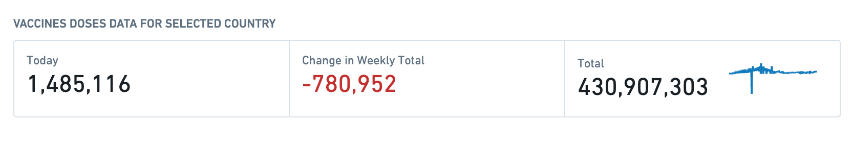
The screenshot below shows how the Metric Card widget can be used in a Workshop module to display statistics on the COVID-19 vaccine rollout for different countries. The examples that follow will also use this example context.
Configuration options
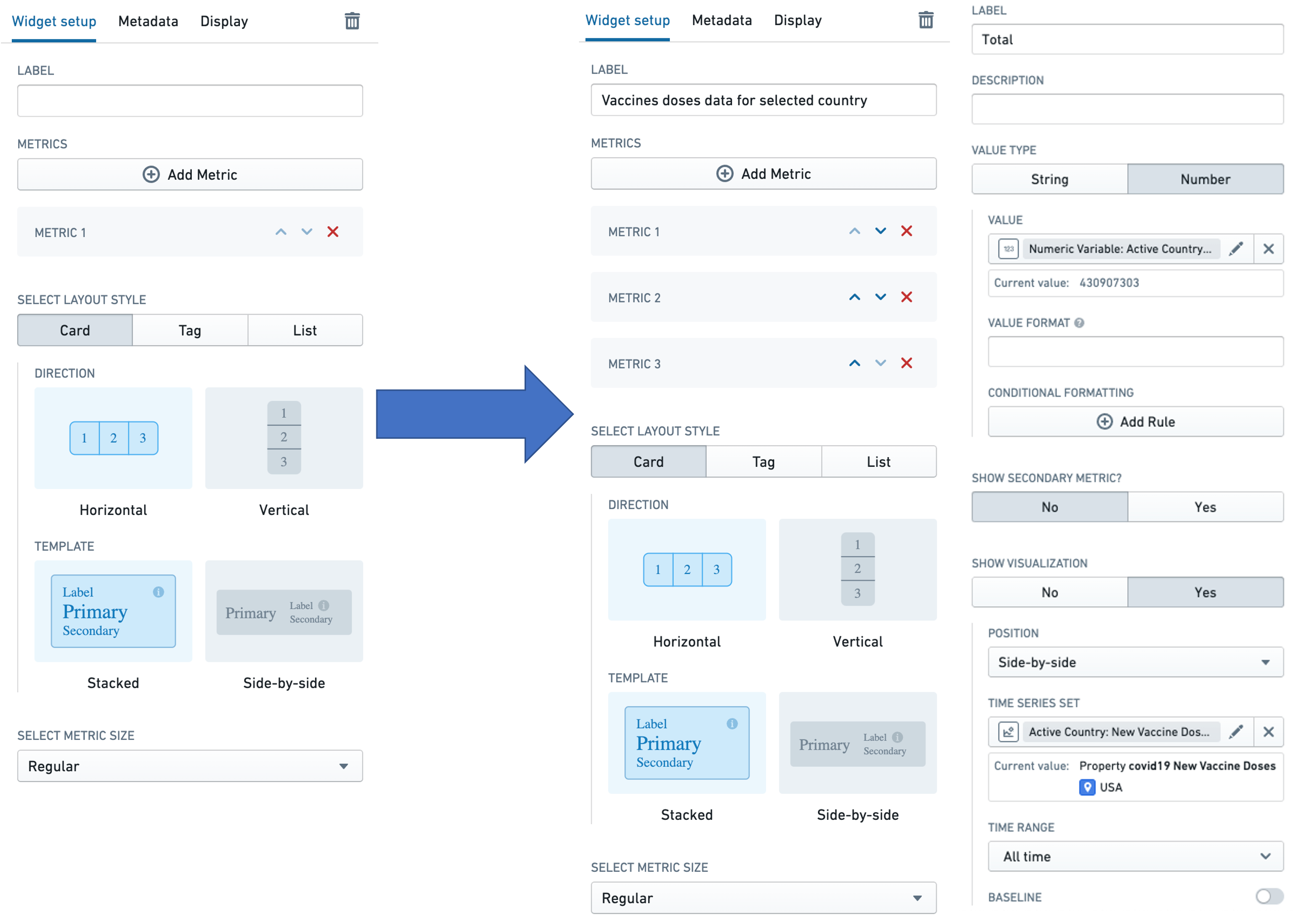
The image below shows the initial state of an unconfigured Metric Card widget, followed by the state of a widget that has been configured to display COVID-19 vaccine rollout metrics.
First, we will walk through the configuration options for the widget, which comprises a group of metrics, as depicted in the first screen to the right of the arrow. Then we will describe the configuration options available for each individual metric, as depicted in the second screen to the right of the arrow.
Widget configuration
For the Metric Card widget, the core configuration options are the following:
- Label
-
Sets an optional label for the Metric card widget. This text is displayed across the top of the widget.
-
Metrics
- The Add Metric button adds a new metric to the Metric card widget.
-
The Up and Down direction arrows on the metrics in the list change the order in which the individual metrics are displayed in the widget.
-
Select layout style
-
Card
-
Displays the metrics in the widget as cards, as in the example above and the screenshot below. Note that time series visualizations are only supported in this layout style.
-
The Card layout style also lets the user choose the:
- Direction in which the cards are arranged: either horizontal or vertical.
- Template used to arrange data in every card: either stacked or side-by-side.
- Tag
-
Displays the metrics in the widget as tags, as in the screenshot below.

-
The Tag layout style lets the user choose the Direction in which the cards are arranged: either horizontal or vertical.
- List
-
Displays the metrics in the widget as a list, as in the screenshot below.

-
The List layout style lets the user choose the Template used to arrange data in every card: either stacked or side-by-side.
-
-
Select metric size
-
Sets the display size for every metric in the widget. The options here are Compact, Regular, and Large.
-
Conditional visibility
- Allows you to show or hide the Metric Card widget based on variable values or other conditions. This enables dynamic control over which metrics are displayed to users depending on the current application state.
- Configure conditional visibility by specifying a condition that evaluates to true or false. When the condition evaluates to false, the entire Metric Card widget is hidden from view.
Metric configuration
Each individual metric can be configured using the following options:
- Label
- Sets an optional label for the metric. This text is displayed across the top of the individual metric.
- Description
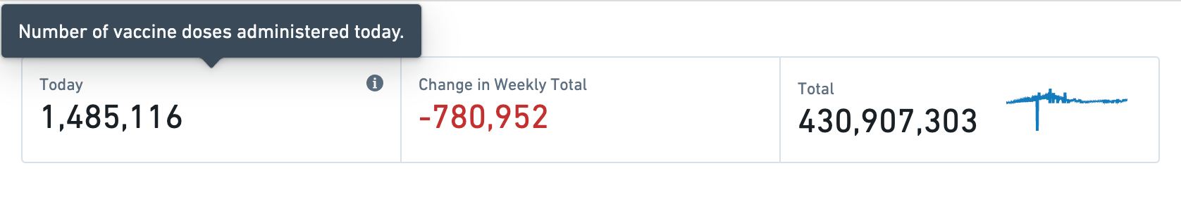
- Sets optional description text for the metric. This description text is displayed as a tooltip when a user hovers over the i tooltip, as illustrated in the screenshot below.
- Value type
- Specifies whether the value to be displayed is a String or a Number.
-
This section also configures the following options:
- Value: The value used to populate the metric must be backed by a Workshop variable of the corresponding type. So, if the value type is set to String, the user will have to select a string variable to populate the metric. Similarly, if the value type is set to Number, the user will have to select a numeric variable. See Variables for more information on Workshop variables.
- Numeric formatting: This optional configuration is only available for the Number value type. The user can specify a value formatting scheme to display the numeric value of the variable. See Formatting in Workshop for more information on value formatting.
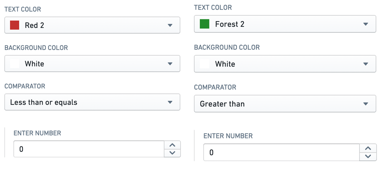
- Conditional formatting: This optional configuration allows the user to apply rule-based formatting to the metric value displayed, as in the example below that displays the metric in red if its value is less than or equal to zero, and in green otherwise. See Formatting in Workshop for more information.
-
Show secondary metric? An optional configuration to display a second metric within the same metric display, under the primary metric. Setting this toggle to
Yesopens a value type configuration for the secondary metric, which mimics the configuration for the primary metric. -
Show visualization? An optional configuration to display a sparkline depicting the history of a time series with the metric. Setting this toggle to
Yesopens a configuration screen with the following options: -
Position: Specifies whether the sparkline should be displayed
Side-by-side(alongside) orStacked(under) with the metric value. -
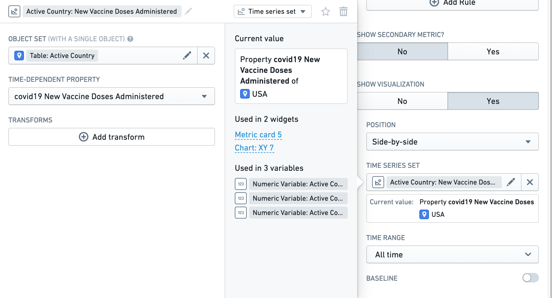
Time series set: The time series that is to be visualized. This is specified using a
Time series setvariable, as shown in the screenshot below. See Variables for more information on Workshop variables, including time series set variables.
-
Time range: Specifies the time range for which data should be displayed. Preset options include
All time,Last hour,Last day, andLast week, but selectingCustom rangeopens a detailed range selector, where you can specify anExactor aRelativerange. See Time series properties in Workshop for more information on specifying time ranges. -
Baseline: When this parameter is toggled on, a baseline is rendered along with the sparkline to aid with visual interpretation of the trend. See Time series properties in Workshop for more information on specifying baselines.
-
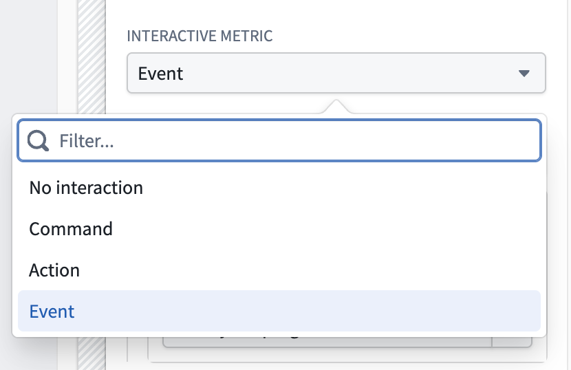
Interactive metric: An optional configuration to trigger a command, action, or event upon card selection. Defaults to No interaction.
中文翻译
指标卡片
指标卡片(Metric Card)组件以可配置的卡片式界面展示 Workshop 变量值。通常,指标卡片用于突出显示 Workshop 模块中的关键数据。配置指标卡片组件的模块构建者可以:
- 将多组指标组合显示。
- 使用条件格式突出显示指标,帮助用户解读指标值。
- 设置指标布局样式,使其以卡片(Card)、标签(Tag)或列表(List)形式呈现。
- 展示时间序列数据,包括显示时间序列历史趋势的迷你图(sparkline)。
以下截图展示了如何在 Workshop 模块中使用指标卡片组件来显示不同国家的新冠疫苗推广统计数据。后续示例也将沿用这一背景。
配置选项
下图展示了未配置的指标卡片组件的初始状态,以及配置了新冠疫苗推广指标后的组件状态。
首先,我们将介绍组件的配置选项,该组件包含一组指标,如箭头右侧第一个屏幕所示。然后,我们将介绍每个单独指标的配置选项,如箭头右侧第二个屏幕所示。
组件配置
指标卡片组件的核心配置选项如下:
- 标签(Label)
-
为指标卡片组件设置可选标签。此文本显示在组件顶部。
-
指标(Metrics)
- 添加指标(Add Metric)按钮用于向指标卡片组件添加新指标。
-
列表中指标旁的上下方向箭头用于调整各指标在组件中的显示顺序。
-
选择布局样式(Select layout style)
-
卡片(Card)
-
将组件中的指标以卡片形式显示,如上例及下方截图所示。请注意,时间序列可视化仅支持此布局样式。
-
卡片布局样式还允许用户选择:
- 方向(Direction):卡片排列方向,可选水平或垂直。
- 模板(Template):每张卡片内数据的排列方式,可选堆叠(stacked)或并排(side-by-side)。
- 标签(Tag)
-
将组件中的指标以标签形式显示,如下方截图所示。
-
标签布局样式允许用户选择方向(Direction):卡片排列方向,可选水平或垂直。
- 列表(List)
-
将组件中的指标以列表形式显示,如下方截图所示。
-
列表布局样式允许用户选择模板(Template):每张卡片内数据的排列方式,可选堆叠或并排。
-
-
选择指标大小(Select metric size)
-
设置组件中每个指标的显示大小。可选选项包括紧凑(Compact)、常规(Regular)和大号(Large)。
-
条件可见性(Conditional visibility)
- 允许根据变量值或其他条件显示或隐藏指标卡片组件。这实现了对用户所见指标的动态控制,具体取决于当前应用状态。
- 通过指定一个评估为真或假的条件来配置条件可见性。当条件评估为假时,整个指标卡片组件将被隐藏。
指标配置
每个单独指标可使用以下选项进行配置:
- 标签(Label)
- 为指标设置可选标签。此文本显示在单个指标顶部。
- 描述(Description)
- 为指标设置可选的描述文本。当用户将鼠标悬停在 i 工具提示上时,此描述文本会作为工具提示显示,如下方截图所示。
- 值类型(Value type)
- 指定要显示的值是字符串(String)还是数字(Number)。
-
此部分还配置以下选项:
- 值(Value):用于填充指标的值必须由相应类型的 Workshop 变量支持。因此,如果值类型设置为字符串,用户必须选择一个字符串变量来填充指标。类似地,如果值类型设置为数字,用户必须选择一个数值变量。有关 Workshop 变量的更多信息,请参阅变量。
- 数字格式(Numeric formatting):此可选配置仅适用于数字值类型。用户可以指定值格式方案来显示变量的数值。有关值格式的更多信息,请参阅Workshop 中的格式设置。
- 条件格式(Conditional formatting):此可选配置允许用户对显示的指标值应用基于规则的格式,如下例所示,当指标值小于或等于零时显示为红色,否则显示为绿色。有关更多信息,请参阅Workshop 中的格式设置。
-
显示辅助指标?(Show secondary metric?)一个可选配置,用于在同一指标显示区域的主指标下方显示第二个指标。将此开关设置为
Yes会打开辅助指标的值类型配置,其配置方式与主指标类似。 -
显示可视化?(Show visualization?)一个可选配置,用于显示描绘指标时间序列历史趋势的迷你图。将此开关设置为
Yes会打开一个包含以下选项的配置界面: -
位置(Position):指定迷你图应并排(Side-by-side)(与指标值并列)还是堆叠(Stacked)(在指标值下方)显示。
-
时间序列集(Time series set):要可视化的时间序列。这通过一个
时间序列集(Time series set)变量指定,如下方截图所示。有关 Workshop 变量(包括时间序列集变量)的更多信息,请参阅变量。
-
时间范围(Time range):指定应显示数据的时间范围。预设选项包括
所有时间(All time)、最近一小时(Last hour)、最近一天(Last day)和最近一周(Last week),但选择自定义范围(Custom range)会打开详细的范围选择器,您可以在其中指定精确(Exact)或相对(Relative)范围。有关指定时间范围的更多信息,请参阅Workshop 中的时间序列属性。 -
基线(Baseline):当此参数开启时,会随迷你图一起渲染一条基线,以帮助直观解读趋势。有关指定基线的更多信息,请参阅Workshop 中的时间序列属性。
-
交互式指标(Interactive metric):一个可选配置,用于在卡片被选中时触发命令、操作或事件。默认为无交互(No interaction)。