Widget: Mobile Navigation Bar(组件:移动导航栏)
The Mobile Navigation Bar widget allows your users to navigate between a few top-level pages on a touch-enabled device. This navigation bar appears at the bottom of a mobile Workshop application for ease of use on a phone. Up to four items can be shown in the navigation bar, and submenus can be configured to surface additional items.
The design and behavior of the Mobile navigation bar is informed by the design guidelines for iOS (Tab Bars ↗) and Android's Material Design (Bottom navigation ↗).

Navigation bar setup
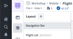
To enable and configure the navigation bar, ensure your module is configured to have a Mobile device type, then select Layout and Navigation Bar on the left side while editing a Workshop module:
Enable the navigation bar using the Module Navigation Bar Visible switch in the top-right, then add navigation items. Each navigation item includes a label and icon.
Typically, you should configure navigation items to navigate to a page in your application. Select + Add event and select the event to switch to your page.

Behavior
Below, we describe some of the characteristics of how the navigation bar functions in mobile Workshop applications:
-
Always visible. When enabled, the navigation bar is always shown at the bottom of the screen in a mobile application as users navigate between pages. To create focused interfaces that hide the navigation bar, you should use a drawer, which can be configured to cover the whole screen.
-
Stack navigation. When you configure a navigation item to navigate to a specific page, the item will be highlighted in the navigation bar whenever that page is active. Additionally, if a user navigates to another page, the highlight remains active so users have a sense of where they navigated from.
For example, suppose your first navigation item is called Flights and is configured to open a page called Flight list which contains a list of flights. Suppose that when a flight is selected in the list, your application navigates users to another page, called Flight 360, which shows details about the selected flight.
In this case, when users navigate to the Flight 360 page from the Flight list page, the Flights navigation item will still be highlighted in the navigation bar. This helps keep users oriented in your application, and lets users exit the Flight 360 page by selecting Flights in the navigation bar.
Configuration options
Below are the core configuration options for the navigation bar:
- Icon: The icon is shown when this mobile application is embedded in other parts of Foundry, such as in Foundry Carbon.
- Title: The title that should be shown in the browser tab when this application is opened.
- Height: The height of the navigation bar in pixels.
- Hide menu text: Hide text and only show icons for items in the navigation bar.
- Navigation items: Up to four items that should be shown across the bottom in the navigation bar. For each item, you can configure:
- Type: A single item shows a label and icon and executes a Workshop event. A submenu item has a label and icon and shows a list of nested single items when selected.
- Label: The text label shown for the navigation item. Because screen real estate is limited, we recommend labels be a single word or short phrase.
- Icon: The icon shown for the navigation item.
- Event: The Workshop events that are run when the item is selected. Typically, navigation items are configured to navigate to a page in the Workshop module.
中文翻译
组件:移动导航栏
移动导航栏(Mobile Navigation Bar)组件允许用户在触控设备上切换几个顶层页面。该导航栏显示在移动端 Workshop 应用的底部,便于在手机上操作。导航栏最多可显示四个项目,并可通过配置子菜单展示更多选项。
移动导航栏的设计与行为遵循 iOS 的界面设计指南(标签栏 ↗)和 Android 的 Material Design(底部导航 ↗)。
导航栏设置
要启用并配置导航栏,请确保您的模块已设置为移动设备类型,然后在编辑 Workshop 模块时,选择左侧的布局(Layout)和导航栏(Navigation Bar):
通过右上角的模块导航栏可见(Module Navigation Bar Visible)开关启用导航栏,然后添加导航项目。每个导航项目包含一个标签(label)和图标(icon)。
通常,您应将导航项目配置为跳转到应用中的页面。选择+ 添加事件(+ Add event),然后选择切换至目标页面的事件。
行为说明
以下描述移动端 Workshop 应用中导航栏的一些功能特性:
-
始终可见。启用后,导航栏在移动应用中始终显示在屏幕底部,方便用户在页面间切换。如需创建隐藏导航栏的专注界面,应使用抽屉(drawer),并可将其配置为覆盖整个屏幕。
-
堆栈导航(Stack navigation)。当您将导航项目配置为跳转到特定页面时,该页面激活时导航栏中的对应项目会高亮显示。此外,即使用户导航到其他页面,高亮状态仍会保持,以便用户感知导航来源。
例如,假设第一个导航项目名为航班(Flights),配置为打开名为航班列表(Flight list)的页面,其中包含航班列表。当用户在列表中选择某个航班时,应用会导航至另一个名为航班360(Flight 360)的页面,显示所选航班的详细信息。
在这种情况下,当用户从航班列表页面导航至航班360页面时,导航栏中的航班项目仍会保持高亮。这有助于用户在应用中保持方向感,并允许用户通过选择导航栏中的航班退出航班360页面。
配置选项
以下是导航栏的核心配置选项:
- 图标(Icon):当此移动应用嵌入 Foundry 其他部分(如 Foundry Carbon)时显示的图标。
- 标题(Title):应用打开时浏览器标签页中显示的标题。
- 高度(Height):导航栏的高度(以像素为单位)。
- 隐藏菜单文本(Hide menu text):隐藏文本,仅显示导航栏项目的图标。
- 导航项目(Navigation items):导航栏底部最多可显示四个项目。每个项目可配置以下内容:
- 类型(Type):单个(single)项目显示标签和图标,并执行一个 Workshop 事件(event)。子菜单(submenu)项目包含标签和图标,选中后会显示嵌套的单个项目列表。
- 标签(Label):导航项目显示的文本标签。由于屏幕空间有限,建议标签使用单个单词或简短短语。
- 图标(Icon):导航项目显示的图标。
- 事件(Event):选中项目时运行的 Workshop 事件。通常,导航项目配置为跳转到 Workshop 模块中的某个页面。