Object Dropdown(对象下拉菜单(Object Dropdown))
The Object Dropdown widget is used to select a single object from a list of objects. Module builders can use the Object Dropdown widget to do the following:
- Display data on one or multiple object types.
- Choose which property types are displayed.
- Set the sorting criteria.
- Display conditional formatting and numerical formatting options configured in Ontology Manager.
- Hide null properties on a per object basis to produce a more compact display.
- Set which properties can be searched on.
- Allow no selection from the list.
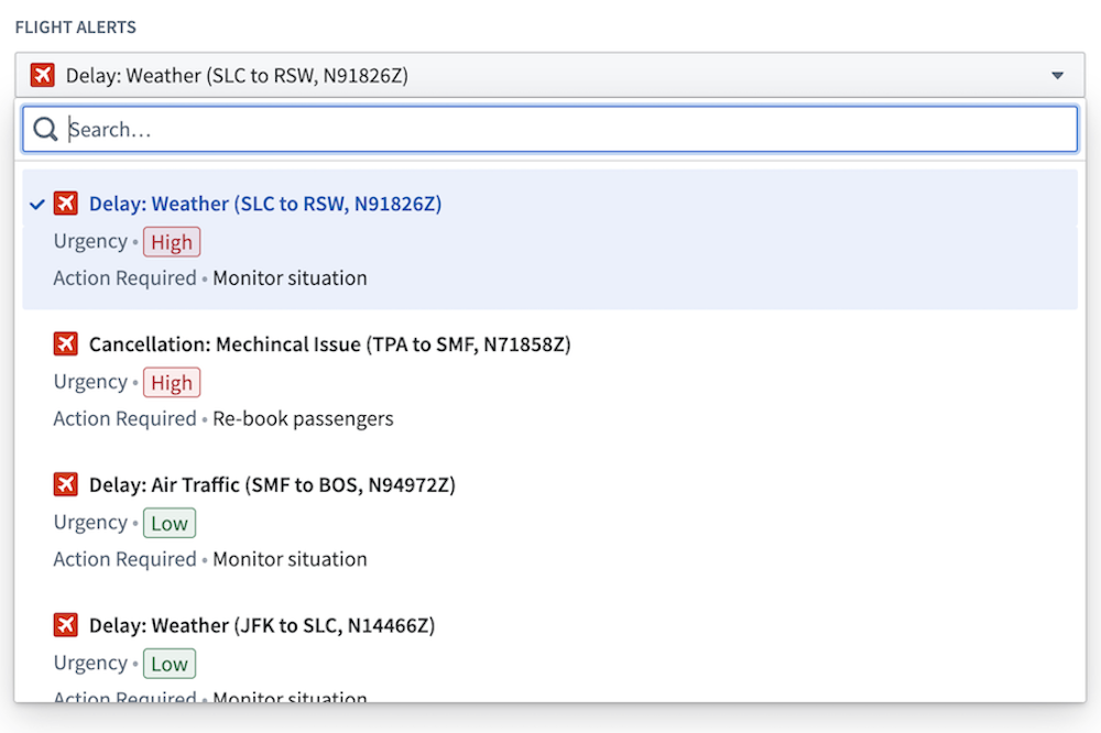
The screenshot below shows an example of a configured Object Dropdown widget displaying Flight Alert objects:
Configuration options
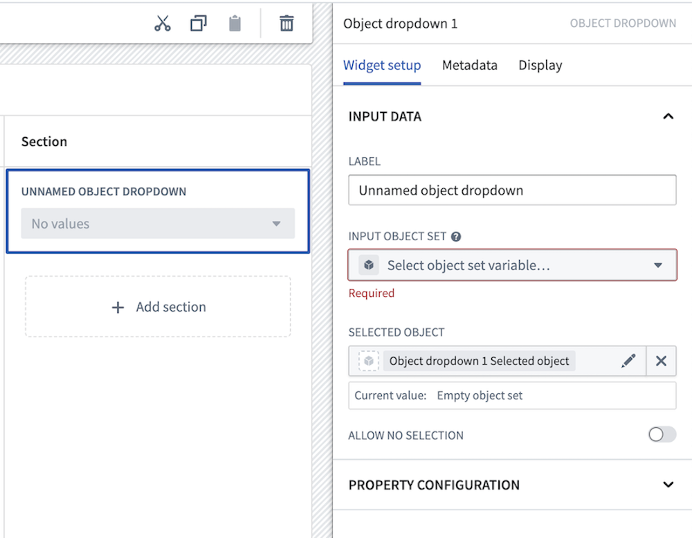
The example below shows the initial state of a newly added Object Dropdown widget next to the configuration panel:
The following core configuration options are available for the Object Dropdown widget:
- Input data
- Label: Set an optional label for the Object Dropdown widget. This text is displayed across the top of the widget.
- Input object set: This input variable determines the data that will be displayed in the widget. A module builder can either reuse an existing object set variable created elsewhere in the module or define a new object set variable inline. Many of the other configuration options shown below will only be configurable once this object set parameter has been populated.
- Selected object: This is an output variable for the widget that outputs a single object set of the currently selected object. This object set can be used in downstream widgets within the current module.
- Allow no selection: If enabled, the widget will be allowed to have no object selected.
- Property configuration
- Add property: Select a property to display beneath the object title.
- Hide null properties: If enabled, null properties will be hidden on a per object basis within the list.
- Sort items by: Specify the order in which objects are sorted in the dropdown widget. If multiple object types exist in the object set, only shared properties can be sorted on.
- Search items by: Specify which object properties search is performed on.
- On-screen properties: If enabled, search will be performed on all string properties that are displayed in the dropdown widget.
- Specific properties: If enabled, search will be performed on the specified string properties.
- All searchable properties: If enabled, search will be performed on all searchable properties in the object set.
中文翻译
对象下拉菜单(Object Dropdown)
对象下拉菜单(Object Dropdown) 小组件用于从对象列表中选择一个对象。模块构建者可以使用对象下拉菜单小组件执行以下操作:
- 显示单个或多个对象类型(Object types)的数据。
- 选择要显示的属性类型(Property types)。
- 设置排序条件。
- 显示在 Ontology Manager 中配置的条件格式和数值格式选项。
- 按对象隐藏空属性,使显示更加紧凑。
- 设置可搜索的属性。
- 允许不选择任何项。
下方截图展示了配置后的对象下拉菜单小组件显示 Flight Alert 对象的示例:
配置选项
下方示例展示了新添加的对象下拉菜单小组件及其配置面板的初始状态:
对象下拉菜单小组件提供以下核心配置选项:
- 输入数据
- 标签: 为对象下拉菜单小组件设置可选标签。该文本将显示在小组件顶部。
- 输入对象集(Input object set): 此输入变量决定小组件中显示的数据。模块构建者可以复用模块其他位置已创建的对象集变量,也可以内联定义新的对象集变量。只有在填充此对象集参数后,才能配置下方显示的许多其他配置选项。
- 已选对象(Selected object): 这是小组件的输出变量,输出包含当前所选对象的单一对象集。该对象集可用于当前模块中的下游小组件。
- 允许不选择: 启用后,小组件将允许不选择任何对象。
- 属性配置
- 添加属性: 选择要在对象标题下方显示的属性。
- 隐藏空属性: 启用后,列表中将按对象隐藏空属性。
- 排序依据: 指定下拉菜单小组件中对象的排序顺序。如果对象集中存在多种对象类型,则只能按共有属性进行排序。
- 搜索依据: 指定对哪些对象属性执行搜索。
- 屏幕显示属性: 启用后,将对下拉菜单小组件中显示的所有字符串属性执行搜索。
- 特定属性: 启用后,将对指定的字符串属性执行搜索。
- 所有可搜索属性: 启用后,将对对象集中的所有可搜索属性执行搜索。