Object List(对象列表(Object List))
The Object List widget is used to display object data in either a list or grid. Module builders configuring an Object List widget can:
- Display data on one or multiple object types.
- Choose which property types and linked objects are displayed and in what format.
- Optionally choose a media property to display an image or icon for each object.
- Set initial sorting criteria.
- Display conditional formatting and numerical formatting options configured in the Ontology Manager.
- Hide null properties on a per object basis to produce a more compact display.
- Allow single- or multi-selection within the list.
- Trigger Workshop events upon object selection within the list.
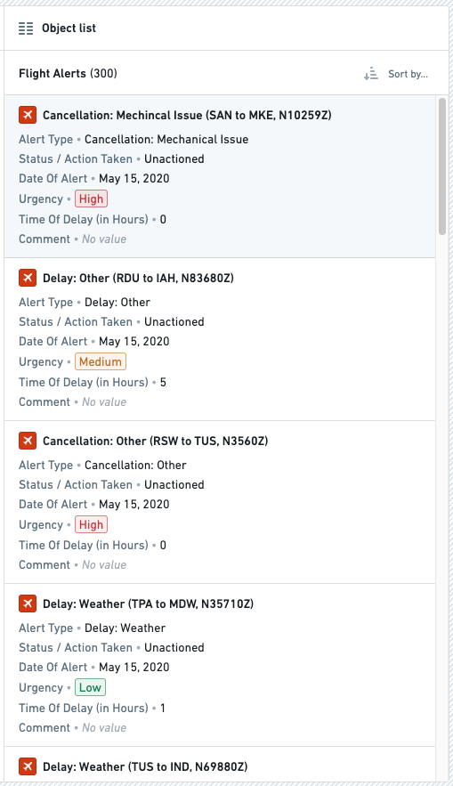
The screenshot below shows an example of a configured Object list widget displaying Flight Alert objects:
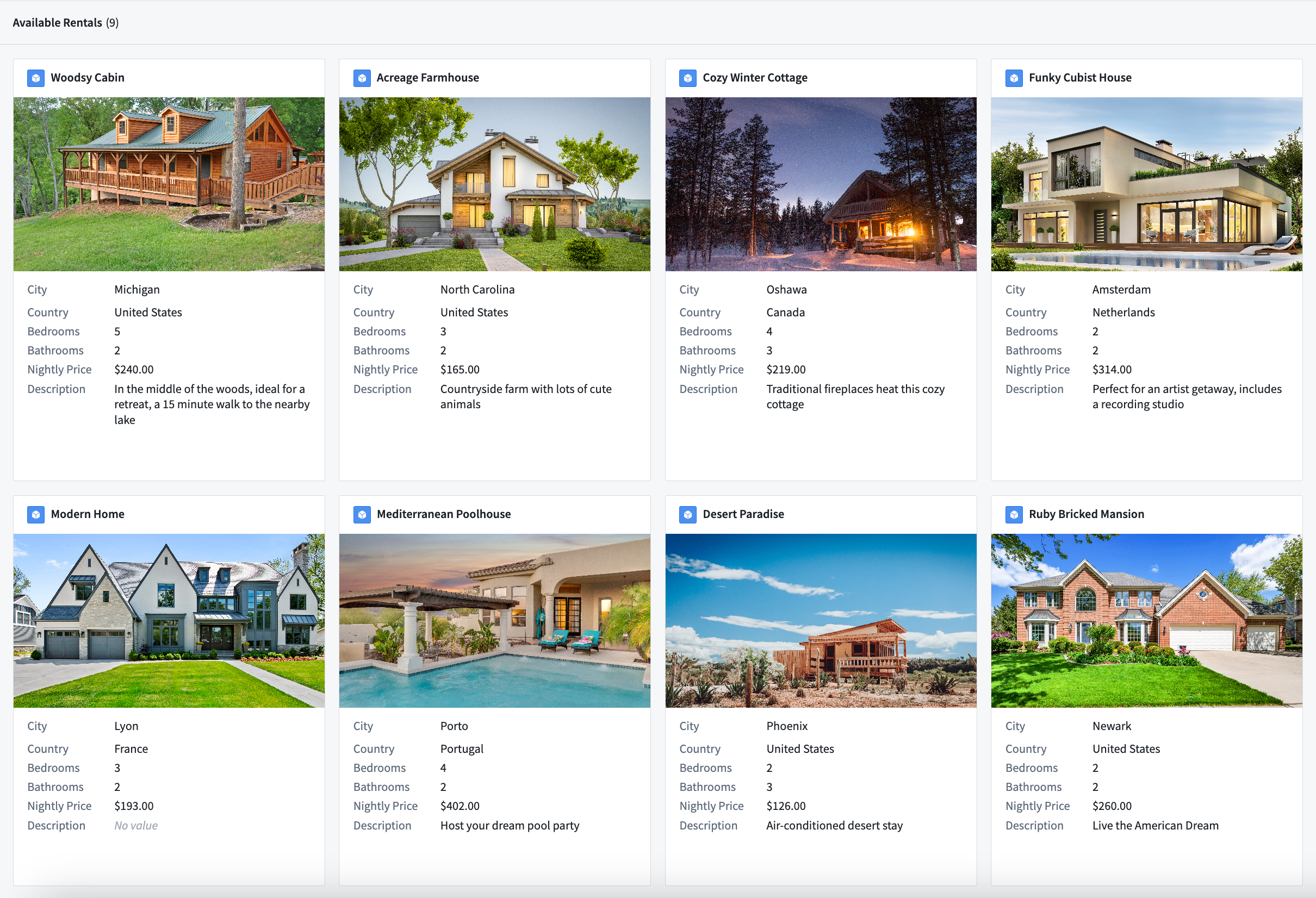
The screenshot below shows an example of an Object list widget displaying objects configured in a grid display with images:
The screenshot below shows an example of an Object list widget displaying objects configured in a list display with icons:
Configuration options
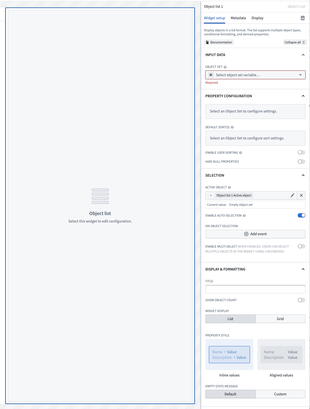
Here is a screenshot of the initial state of a newly added Object List widget alongside its initial configuration panel:
For the Object List widget, the core configuration options are the following:
- Input data
- Object set: This input variable determines the data that will be displayed within the widget. A module builder can either reuse an existing object set variable created elsewhere in this module or define a new object set variable inline. Many of the other configuration options shown below will only be configurable once this object set parameter has been populated.
- Property configuration
- Add media: You can optionally display images alongside object information. More information about media configuration can be found below.
- Add property: Selecting a property here will result in that property being displayed within the list.
- Default sort(s): This setting allows up to one default sort to be applied within the list. Module builders can sort on both visible property types shown within the list or hidden property types not displayed.
- Enable user sorting: If enabled, a subheader will be displayed above the list in which users can change the sorting criteria of the list. User can sort on both visible property types shown within the list or hidden property types not displayed.
- Enable reordering: If enabled and configured, allows users to drag and drop items within the widget to reorder them. Items will only be draggable using the drag handle appearing on the right side of the object card. More information about reordering configuration can be found below.
- Hide null properties: If enabled, null properties will be hidden on a per object basis within the list.
- Selection
- Active object: This is the first of two output variables for this widget and outputs a singleton object set of the currently active / highlighted row. This object set can then be used in downstream widgets within the current module.
- Enable active object auto-selection: By default, the first row in the list is automatically set as the active object at load time. Disabling this setting prevents this and results in an empty Active object at load time.
- Selected objects: This is the second of two output variables for this widget and outputs an object set of the currently checked / selected rows. This object set can the be used in downstream widgets within the current module. Note that this output variable will only be in use and populated if the Enable multi-select toggle is set to true.
- On active object selection: This option enables module builders to configure Workshop events to trigger when a row is selected in the list, such as causing a drawer with a more detailed object view to appear.
- Enable multi-select: If enabled, this toggle allows multiple objects to be checked / selected by users in the list. This selected object set is then output via the Selected objects object set for use in downstream widgets within the current module.
- Display & formatting
- Title: If populated, a sub-header will be displayed above the list with the string title entered here.
- Show security markings: If enabled, property security markings render as a condensed gray pill with an expanded window view on selection.
- Show object count: If enabled, a sub-header will be displayed above the list with the count of objects contained with the input object set variable displayed.
- Widget display: By default, displays objects in a list, but can also display objects in a grid where the number of rows, size of each object card in the grid, and space between cards in the grid can be specified.
- Property style: By default, properties are displayed inline with their values, but can also be displayed with their values aligned.
- Empty state message: Customize an empty state message when there are no objects for this widget to display.
Media configuration
Configuration options
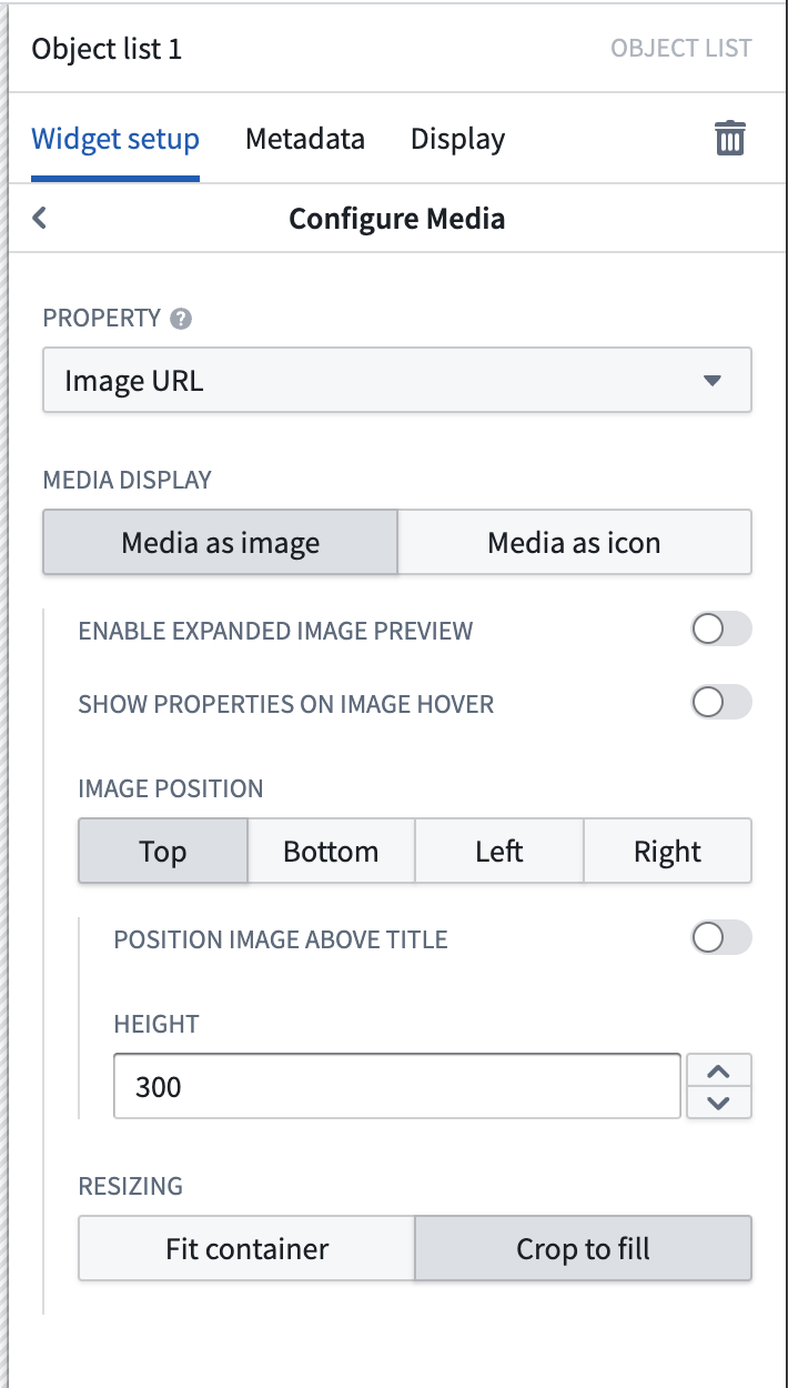
For the Object List widget, the media configuration options are the following:
- Property: This is the property of the object set that contains the images to be displayed. Currently, image URLs, image attachments, and media reference properties are supported.
- Media display: The media chosen can be displayed as a large image, or as an icon to replace the Ontology icon next to the object title.
- Enable expanded image preview: If enabled, the image can be expanded and viewed in full inside of a modal.
- Show properties on image hover: If enabled, hovering will reveal additional properties to be displayed in an overlay on top of the image.
- Image position: Images can be displayed in a variety of locations, and have their height or width controlled to a fixed size.
- Resizing: Images can either be cropped to fill the space, or fit the container in order to show the full complete image without cropping.
Reordering configuration
Builders may configure items within the Object List to be re-orderable by allowing users to drag-and-drop object cards in the widget.

Limitations
- Reordering is currently only supported within a single Object List widget.
- Reordering items in a grid layout is not currently supported.
- When reordering is enabled, the Object List widget will only display the first 500 objects.
Configuration options

- Conditionally enabled: Set a Boolean variable to determine whether reordering is enabled within the widget.
- Primary key array: Set a string array containing the primary keys of the displayed objects. The ordering of the primary keys in the array will determine the order these objects will be displayed in the sorted section of the widget. Any objects with primary keys not in the array will be displayed in the Unsorted list section in the widget below the sorted objects, either in an unsorted fashion or with the default sort applied if configured in the widget.
- If an item is drag-and-dropped from the Unsorted list section, that object's primary key will be added to the primary key array. Similarly, if an item is drag and dropped into the Unsorted list section of the widget, that item's primary key will be removed from the primary key array.
- If the primary key array is empty or if there is no overlap between the displayed objects' primary keys and the contents of the array, a callout will be displayed at the top of the widget prompting users to "Drag and drop unsorted items above to sort".
- If the primary key array contains primary keys of objects that are not currently shown in the widget, for example if filtered out of view, their orders will still be maintained. For example, if your array is ordered
[A, B, C, D]butBis currently filtered out of view from the widget, the visible list will show[A, C, D]. If a user reordersDbetweenAandC, the updated array will be[A, B, D, C]. The only exception is when a user drags an item below the last visible object. In this case, that item will be placed directly after that last visible object. - On reorder: Builders may choose for either the primary key array to be updated or for an action to be run on reorder of items in the widget.
- Update array variable: When a user reorders an item within the widget, the primary key array will be updated to match.
- Note that updates to the primary key array will not be automatically saved or stored meaning that if a user refreshes or navigates away from the module, any changes to the primary key array will be lost. Builders will need to configure an action that stores the primary key array's new values in order to save updates to the array. Using the Update array variable option in conjunction with a separately configured action, for example in a Button Group widget elsewhere in the module, is a good option if you do not want to trigger an action each time an item is reordered within the widget.
- Submit an action: Configure a Reorder action which will be triggered each time a user reorders an item within the widget.
- A special Reordered array parameter representing the updated primary key array on reorder may be used as an action parameter to save updates to the array.
中文翻译
对象列表(Object List)
对象列表(Object List) 组件用于以列表或网格形式展示对象数据。配置对象列表组件的模块构建者可以:
- 展示一个或多个对象类型的数据。
- 选择要展示的属性类型和链接对象及其展示格式。
- 可选地选择媒体属性来为每个对象展示图片或图标。
- 设置初始排序条件。
- 展示在对象管理器(Ontology Manager)中配置的条件格式和数字格式选项。
- 按对象隐藏空值属性,以实现更紧凑的展示效果。
- 允许在列表中进行单选或多选。
- 在列表中选择对象时触发工作坊(Workshop)事件。
下方截图展示了一个配置好的对象列表(Object list)组件,展示了Flight Alert对象:
下方截图展示了一个对象列表(Object list)组件,以网格形式展示配置了图片的对象:
下方截图展示了一个对象列表(Object list)组件,以列表形式展示配置了图标的对象:
配置选项(Configuration options)
以下是新添加的对象列表组件初始状态及其初始配置面板的截图:
对象列表组件的核心配置选项如下:
- 输入数据(Input data)
- 对象集(Object set): 此输入变量决定组件内展示的数据。模块构建者可以复用本模块中其他地方已创建的对象集变量,也可以内联定义新的对象集变量。下方展示的许多其他配置选项只有在填充此对象集参数后才可配置。
- 属性配置(Property configuration)
- 添加媒体(Add media): 可选地在对象信息旁展示图片。更多关于媒体配置的信息请参见下文。
- 添加属性(Add property): 在此处选择属性后,该属性将展示在列表中。
- 默认排序(Default sort(s)): 此设置允许在列表中应用最多一个默认排序。模块构建者可以对列表中展示的可见属性类型或未展示的隐藏属性类型进行排序。
- 启用用户排序(Enable user sorting): 如果启用,列表上方将显示一个副标题,用户可在其中更改列表的排序条件。用户可以对列表中展示的可见属性类型或未展示的隐藏属性类型进行排序。
- 启用重新排序(Enable reordering): 如果启用并配置,允许用户通过拖放组件内的项目来重新排序。项目只能通过出现在对象卡片右侧的拖动手柄进行拖动。更多关于重新排序配置的信息请参见下文。
- 隐藏空值属性(Hide null properties): 如果启用,列表中将按对象隐藏空值属性。
- 选择(Selection)
- 活动对象(Active object): 这是此组件的两个输出变量中的第一个,输出当前活动/高亮行的单例对象集。此对象集可在当前模块的下游组件中使用。
- 启用活动对象自动选择(Enable active object auto-selection): 默认情况下,列表中的第一行在加载时自动设置为活动对象。禁用此设置可阻止此行为,导致加载时活动对象(Active object)为空。
- 已选对象(Selected objects): 这是此组件的两个输出变量中的第二个,输出当前已勾选/选中的行的对象集。此对象集可在当前模块的下游组件中使用。请注意,仅当启用多选(Enable multi-select)开关设置为true时,此输出变量才会被使用和填充。
- 活动对象选择时(On active object selection): 此选项使模块构建者能够配置在列表中选择一行时触发的工作坊事件,例如打开一个显示更详细对象视图的抽屉。
- 启用多选(Enable multi-select): 如果启用,此开关允许用户在列表中勾选/选择多个对象。此选中的对象集通过已选对象(Selected objects)对象集输出,供当前模块的下游组件使用。
- 显示与格式(Display & formatting)
- 标题(Title): 如果填充,列表上方将显示一个副标题,其中包含在此输入的字符串标题。
- 显示安全标记(Show security markings): 如果启用,属性安全标记将渲染为紧凑的灰色药丸形状,选中后可展开窗口视图。
- 显示对象计数(Show object count): 如果启用,列表上方将显示一个副标题,其中包含输入对象集变量中的对象数量。
- 组件显示(Widget display): 默认以列表形式展示对象,但也可以以网格形式展示,其中可以指定行数、网格中每个对象卡片的大小以及卡片之间的间距。
- 属性样式(Property style): 默认情况下,属性与其值内联显示,但也可以设置为值对齐显示。
- 空状态消息(Empty state message): 当此组件没有对象可展示时,自定义空状态消息。
媒体配置(Media configuration)
配置选项(Configuration options)
对象列表组件的媒体配置选项如下:
- 属性(Property): 这是对象集中包含要展示图片的属性。目前支持图片URL、图片附件和媒体引用属性。
- 媒体显示(Media display): 所选媒体可以显示为大图片,或作为图标替换对象标题旁的本体论(Ontology)图标。
- 启用展开图片预览(Enable expanded image preview): 如果启用,图片可以在模态框中展开并完整查看。
- 鼠标悬停时显示属性(Show properties on image hover): 如果启用,鼠标悬停时将显示额外属性,以覆盖层形式展示在图片上方。
- 图片位置(Image position): 图片可以显示在多种位置,并且可以控制其高度或宽度为固定尺寸。
- 调整大小(Resizing): 图片可以裁剪以填充空间,或适应容器以显示完整图片而不裁剪。
重新排序配置(Reordering configuration)
构建者可以通过允许用户在组件中拖放对象卡片,将对象列表中的项目配置为可重新排序。
限制(Limitations)
- 目前仅支持在单个对象列表组件内进行重新排序。
- 目前不支持在网格布局中重新排序项目。
- 启用重新排序时,对象列表组件仅显示前500个对象。
配置选项(Configuration options)
- 条件启用(Conditionally enabled): 设置一个布尔变量,以确定组件内是否启用重新排序。
- 主键数组(Primary key array): 设置一个包含所展示对象主键的字符串数组。数组中主键的顺序将决定这些对象在组件排序部分中的显示顺序。主键不在数组中的对象将显示在组件中排序对象下方的未排序列表(Unsorted list)部分,可以无序显示,或者如果组件中配置了默认排序(default sort)则按该排序显示。
- 如果某个项目从未排序列表(Unsorted list)部分拖放,该对象的主键将被添加到主键数组中。同样,如果某个项目被拖放到组件的未排序列表(Unsorted list)部分,该项目的主键将从主键数组中移除。
- 如果主键数组为空,或者所展示对象的主键与数组内容没有重叠,组件顶部将显示一个提示框,提示用户"将上方未排序的项目拖放以排序"。
- 如果主键数组包含当前未在组件中显示的对象的主键(例如因过滤而不可见),它们的顺序仍将保持不变。例如,如果数组顺序为
[A, B, C, D],但B当前因过滤在组件中不可见,则可见列表将显示[A, C, D]。如果用户将D重新排序到A和C之间,更新后的数组将为[A, B, D, C]。唯一的例外是当用户将项目拖到最后一个可见对象下方时。在这种情况下,该项目将被放置在该最后一个可见对象之后。 - 重新排序时(On reorder): 构建者可以选择更新主键数组,或者在组件中项目重新排序时运行一个操作。
- 更新数组变量(Update array variable): 当用户在组件内重新排序项目时,主键数组将被更新以匹配。
- 请注意,对主键数组的更新不会自动保存或存储,这意味着如果用户刷新或离开模块,对主键数组的任何更改都将丢失。构建者需要配置一个操作来存储主键数组的新值,以保存对数组的更新。如果您不希望每次在组件内重新排序项目时都触发操作,那么将更新数组变量(Update array variable)选项与单独配置的操作(例如在模块其他位置的按钮组组件中)结合使用是一个不错的选择。
- 提交操作(Submit an action): 配置一个重新排序操作(Reorder action),该操作将在用户每次在组件内重新排序项目时触发。
- 一个特殊的重新排序数组(Reordered array)参数,表示重新排序后更新后的主键数组,可用作操作参数来保存对数组的更新。