Pivot Table(数据透视表(Pivot Table))
The Pivot Table widget enables the dynamic grouping and aggregation of object data and then displays this aggregated data in tabular form. Module builders configuring a Pivot Table widget can use features including:
- Row-level grouping of data by one or more property types.
- Column-level grouping of data by up to one property type.
- Dynamic grouping of date and timestamp property types by date, week, month, and year.
- Sorting by both row-level and column-level groupings.
- Aggregations by count, cardinality, average, max, min, and sum.
- Cell, row, and column-level selection to enable downstream filtering on selected group-by buckets.
The example below shows a configured Pivot Table widget displaying Flight Alerts data and filtering a downstream Object list widget:

Configuration options
When configuring a pivot table, builders can either derive data from objects or function output.
Object-backed pivot tables
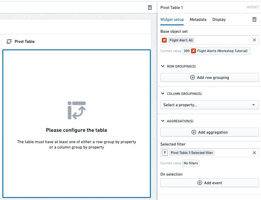
The example below shows the initial state of an object-backed pivot table before configuration. The widget's configuration panel shows the initial input Base object set set to Flight Alert: All.
The Pivot Table widget has the following core configuration options:
- Base object set: This parameter determines the Objects data passed into the Pivot Table and accepts an object set variable as input. Note that the Pivot Table only supports object set variables of a single object type.
- Row grouping(s): The following options allow one or more row-level groupings to be added.
- Add row grouping: Adds a row grouping by the selected property type.
- Column width: Within each row grouping, adjusts the default column width for the grouping property type. Dashboard viewers can also resize row grouping columns at runtime by dragging the column borders.
- Time interval: Within each row grouping for a date or timestamp property type, configures the bucketing time interval (such as exact date/time, week, month).
- Show totals: Adds a Total row grouping to the bottom of the table. When multiple aggregations are used to calculate the column value, the Total value is the result of applying the same aggregations on the sum of original values of the property.
- Disclaimer: The value that will appear in the
Totalrow will be the result of performing the multi-step aggregation on all the raw values of the objects before each aggregation.
- Disclaimer: The value that will appear in the
- Sort rows: Enables sorting on one or more of the configured row grouping properties.
- Column grouping: The following options allow up to one column-level grouping to be added.
- Select a property: Adds a column grouping by the selected property type.
- Time interval: Within each column grouping for a date or timestamp property type, configures the bucketing time interval (such as exact date/time, week, month).
- Show totals?: Adds a Total column grouping to the right side of the table.
- Sort values: Toggles sorting of column grouping values by ascending or descending order.
- Aggregations: The following options control the aggregations displayed with the cells of the table.
- Add aggregation: Allows a new aggregation on a property type or overall object count to be added.
- Aggregation placement: Toggles whether aggregations are placed on columns or rows. The default behavior places aggregations on columns.
- Aggregation title: Clicking into an aggregation's title allows that title to be edited. The title chosen for each metric will appear on the table as a column header.
- Aggregation metric: Controls how a given aggregation is calculated. Options include average, max, min, sum, count, or cardinality.
- Column width: Adjusts the column width for a given aggregation.
- Selected filter: This output object set filter variable captures the grouping criteria of user-selected cells and can be used to filter downstream widgets and object set variables. Users can select individual cells, groups of cells, or entire rows or columns.
- On selection: Allows Workshop events (e.g. opening a drawer within the current module) to be triggered when a user selects something within the table. For more details, see the Workshop events documentation.
Function-backed pivot tables
A function-backed pivot table derives its data from the output of a function.
This approach is useful for the following use cases:
- Transforming or apply custom aggregations to your data before displaying it.
- Combining data from multiple sources.
- Applying complex business logic to your data.
Prerequisites
- Your function must output an array of structs.
- Each struct must include a field named
values, which holds the pivot table values.
Basic structure
Below is an example of a TypeScript interface that can be used for a function-backed pivot table.
In this interface:
region,productType,productName, andyearare fields used for grouping.totalSalesandestimatedSalesare the values displayed in the pivot table cells.
interface SalesData {
    region?: string;
    year?: string;
    productType?: string;
    productName?: string;

    // Values object containing the metrics
    values: {
        totalSales: Integer;
        estimatedSales: Integer;
    }
};

@Function()
public sales_function_backed_pivot_table(): SalesData[] {
    // Your implementation here
    ...
};
Configuration
After selecting a function in the dropdown, builders can choose:
- Group-by fields: These determine how the data is organized in rows and columns.
- Value fields: These determine what metrics are displayed in the cells.
- Expandable rows: Fields that can be expanded to show more detailed data.

Once configured, the pivot table will render with the data returned from your function:

Totals
Function-backed pivot tables support displaying totals. To render a total, return a struct in your list that follows the guidelines below. For the examples below, assume that region and productType are the row grouping fields and year is the column grouping field.
Row totals: To represent a sum of all rows (row total), omit the row grouping fields in the data point.
Example: A data point representing the total for 2021:
{
    year: "2021";
    values: {
        totalSales: 622000;
        estimatedSales: 57000;
    }
};
Column totals: To represent a sum of all columns (column total), omit the column grouping fields in the data point.
Example: A data point representing the total for EU and Clothing:
{
    region: "EU";
    productType: "Clothing";
    values: {
        totalSales: 57000;
        estimatedSales: 57000;
    }
}
Grand totals: To represent a grand total, omit all grouping fields.
{
    values: {
        totalSales: 3147000;
        estimatedSales: 3160000;
    }
}
Null buckets
Null buckets are useful for representing missing or undefined data.
To create a null bucket:
- Return
undefinedfor the bucket's value. - Ensure that your interface supports undefined fields.
Below is an example:
interface SiteData {
    site?: string;
    part?: string | undefined;  // Note the explicit undefined type
    values: {
        quantity: Double;
    }
}
{
    "part": undefined,
    "source": "SourceA",
    "values": {
        "quantity": 100
    }
}

:::callout{theme="neutral"}
Omitting a field is different from passing undefined. Omitting a field creates a total, while undefined creates a null bucket.
:::
Expandable rows
Expandable rows allow users to drill down into more detailed data.
To implement expandable rows:
- Add row fields to the Expandable rows section in the configuration options.
- Structure your data to support different levels of expansion.
Considering the following interface, we would select productName and productType as our expandable rows in the configuration options:
interface SalesData {
    region: string;
    year: string;
    productType?: string;
    productName?: string;
    values: {
        totalSales: Integer;
        estimatedSales: Integer;
    }
};
Below are examples of three levels of expansion:
- No expansion:
regionlevel only.
[
    {
        "region": "NA",
        "year": "2021",
        "values": {
            "totalSales": 30000
        }
    }
]
- First-level expansion:
regionandproductType.
[
    {
        "region": "NA",
        "year": "2021",
        "productType": "Clothing",
        "values": {
            "totalSales": 90000
        }
    },
    {
        "region": "NA",
        "year": "2021",
        "productType": "Electronics",
        "values": {
            "totalSales": 150000
        }
    },
    {
        "region": "NA",
        "year": "2021",
        "productType": "Furniture",
        "values": {
            "totalSales": 60000
        }
    }
]

- Second-level expansion:
region,productType, andproductName.
[
    {
        "region": "NA",
        "year": "2021",
        "productType": "Electronics",
        "productName": "ProductA",
        "values": {
            "totalSales": 5000
        }
    },
    {
        "region": "NA",
        "year": "2021",
        "productType": "Electronics",
        "productName": "ProductB",
        "values": {
            "totalSales": 5000
        }
    },
    {
        "region": "NA",
        "year": "2021",
        "productType": "Electronics",
        "productName": "ProductC",
        "values": {
            "totalSales": 5000
        }
    }
]

Selection
The output selection of a function-backed pivot table can be written to a struct variable. The struct fields are derived from the function's output.

Display and styling

The Pivot Table widget has the following display and styling options:
- Layout: Configures the pivot table's view based on a user's preference.
- Tabular: Default pivot table view.
- Stacked: Provides a more compact view by merging all row groupings into a single column.
- Customize stacked groupby label: Enable to rename the groupby column.
- Fill Width: When enabled, the pivot table expands to fill the available space within its parent container, automatically adjusting when container dimensions change.
- Table style: Provides three options for pivot table cell and border styles.
- Basic: Default pivot table styling.
- Outlined: Adds a darker outline above and below each top-level row grouping.
- Banded rows: Adds a darker outline above and below each top-level row grouping and additionally adds a light grey background to each alternating row in the table.
- Color: Customizes the color of the pivot table header. If the Basic table style is selected, a lighter shade of the selected color will be applied to the background of the row grouping column.
- Minimal: Displays a lighter shade of selected color in the pivot table header.
- Prominent: Displays the selected color as is in the pivot table header.
中文翻译
数据透视表(Pivot Table)
数据透视表(Pivot Table)微件(Widget)支持对对象(Object)数据进行动态分组和聚合,然后以表格形式显示这些聚合数据。配置数据透视表微件的模块构建者可以使用以下功能:
- 按一个或多个属性类型(Property type)对数据进行行级分组。
- 按最多一个属性类型对数据进行列级分组。
- 按日期、周、月和年对日期和时间戳属性类型进行动态分组。
- 按行级和列级分组进行排序。
- 按计数、基数、平均值、最大值、最小值和求和进行聚合(Aggregation)。
- 单元格、行和列级选择,以对选定的分组分桶(Bucket)启用下游过滤。
以下示例显示了一个已配置的数据透视表微件,该微件显示 Flight Alerts 数据并过滤下游的对象列表(Object list)微件:
配置选项
配置数据透视表时,构建者可以从对象或函数输出中派生数据。
基于对象的数据透视表
以下示例显示了基于对象的数据透视表在配置前的初始状态。微件的配置面板显示初始输入基础对象集(Base object set)设置为 Flight Alert: All。
数据透视表微件具有以下核心配置选项:
- 基础对象集(Base object set):此参数决定传入数据透视表的对象数据,并接受对象集变量作为输入。请注意,数据透视表仅支持单一对象类型的对象集变量。
- 行分组(Row grouping):以下选项允许添加一个或多个行级分组。
- 添加行分组:按选定的属性类型添加行分组。
- 列宽:在每个行分组内,调整分组属性类型的默认列宽。仪表板查看者还可以在运行时通过拖动列边框来调整行分组列的大小。
- 时间间隔:在日期或时间戳属性类型的每个行分组内,配置分桶时间间隔(如精确日期/时间、周、月)。
- 显示总计:在表格底部添加总计(Total)行分组。当使用多个聚合来计算列值时,总计值是对该属性原始值之和应用相同聚合的结果。
- 免责声明:
Total行中显示的值将是在每次聚合之前对对象的所有原始值执行多步聚合的结果。
- 免责声明:
- 行排序:启用对一个或多个已配置的行分组属性进行排序。
- 列分组(Column grouping):以下选项允许添加最多一个列级分组。
- 选择属性:按选定的属性类型添加列分组。
- 时间间隔:在日期或时间戳属性类型的每个列分组内,配置分桶时间间隔(如精确日期/时间、周、月)。
- 显示总计?:在表格右侧添加总计列分组。
- 值排序:切换列分组值按升序或降序排序。
- 聚合(Aggregations):以下选项控制表格单元格显示的聚合。
- 添加聚合:允许添加针对属性类型或整体对象计数的新聚合。
- 聚合位置:切换聚合是放置在列上还是行上。默认行为是将聚合放置在列上。
- 聚合标题:点击聚合标题可编辑该标题。为每个指标选择的标题将作为列标题显示在表格中。
- 聚合指标:控制给定聚合的计算方式。选项包括平均值、最大值、最小值、求和、计数或基数。
- 列宽:调整给定聚合的列宽。
- 选定过滤器(Selected filter):此输出对象集过滤器变量捕获用户选定单元格的分组条件,可用于过滤下游微件和对象集变量。用户可以选择单个单元格、单元格组或整行/整列。
- 选择时(On selection):允许在用户选择表格中的内容时触发 Workshop 事件(Workshop events)(例如,在当前模块中打开抽屉)。有关更多详细信息,请参阅 Workshop 事件文档。
基于函数的数据透视表
基于函数的数据透视表从函数(Function)的输出中派生其数据。
此方法适用于以下用例:
- 在显示数据之前对其进行转换或应用自定义聚合。
- 合并来自多个来源的数据。
- 对数据应用复杂的业务逻辑。
先决条件
- 您的函数必须输出结构体(Struct)数组。
- 每个结构体必须包含一个名为
values的字段,该字段保存数据透视表的值。
基本结构
以下是可用于基于函数的数据透视表的 TypeScript 接口示例。
在此接口中:
region、productType、productName和year是用于分组的字段。totalSales和estimatedSales是显示在数据透视表单元格中的值。
interface SalesData {
    region?: string;
    year?: string;
    productType?: string;
    productName?: string;

    // Values object containing the metrics
    values: {
        totalSales: Integer;
        estimatedSales: Integer;
    }
};

@Function()
public sales_function_backed_pivot_table(): SalesData[] {
    // Your implementation here
    ...
};
配置
在下拉列表中选择函数后,构建者可以选择:
- 分组字段(Group-by fields):这些字段决定数据在行和列中的组织方式。
- 值字段(Value fields):这些字段决定单元格中显示的指标。
- 可展开行(Expandable rows):可以展开以显示更详细数据的字段。
配置完成后,数据透视表将使用函数返回的数据进行渲染:
总计
基于函数的数据透视表支持显示总计。要渲染总计,请在列表中返回一个遵循以下指南的结构体。对于以下示例,假设 region 和 productType 是行分组字段,year 是列分组字段。
行总计:要表示所有行的总和(行总计),请省略数据点中的行分组字段。
示例:表示 2021 年总计的数据点:
{
    year: "2021";
    values: {
        totalSales: 622000;
        estimatedSales: 57000;
    }
};
列总计:要表示所有列的总和(列总计),请省略数据点中的列分组字段。
示例:表示 EU 和 Clothing 总计的数据点:
{
    region: "EU";
    productType: "Clothing";
    values: {
        totalSales: 57000;
        estimatedSales: 57000;
    }
}
总总计:要表示总总计,请省略所有分组字段。
{
    values: {
        totalSales: 3147000;
        estimatedSales: 3160000;
    }
}
空分桶(Null buckets)
空分桶对于表示缺失或未定义的数据非常有用。
要创建空分桶:
- 为该分桶的值返回
undefined。 - 确保您的接口支持未定义的字段。
以下是一个示例:
interface SiteData {
    site?: string;
    part?: string | undefined;  // Note the explicit undefined type
    values: {
        quantity: Double;
    }
}
{
    "part": undefined,
    "source": "SourceA",
    "values": {
        "quantity": 100
    }
}
:::callout{theme="neutral"}
省略字段与传递 undefined 不同。省略字段会创建总计,而 undefined 会创建空分桶。
:::
可展开行
可展开行允许用户向下钻取以查看更详细的数据。
要实现可展开行:
- 在配置选项的可展开行部分添加行字段。
- 构建您的数据以支持不同级别的展开。
考虑以下接口,我们将在配置选项中选择 productName 和 productType 作为可展开行:
interface SalesData {
    region: string;
    year: string;
    productType?: string;
    productName?: string;
    values: {
        totalSales: Integer;
        estimatedSales: Integer;
    }
};
以下是三个展开级别的示例:
- 无展开:仅
region级别。
[
    {
        "region": "NA",
        "year": "2021",
        "values": {
            "totalSales": 30000
        }
    }
]
- 第一级展开:
region和productType。
[
    {
        "region": "NA",
        "year": "2021",
        "productType": "Clothing",
        "values": {
            "totalSales": 90000
        }
    },
    {
        "region": "NA",
        "year": "2021",
        "productType": "Electronics",
        "values": {
            "totalSales": 150000
        }
    },
    {
        "region": "NA",
        "year": "2021",
        "productType": "Furniture",
        "values": {
            "totalSales": 60000
        }
    }
]
- 第二级展开:
region、productType和productName。
[
    {
        "region": "NA",
        "year": "2021",
        "productType": "Electronics",
        "productName": "ProductA",
        "values": {
            "totalSales": 5000
        }
    },
    {
        "region": "NA",
        "year": "2021",
        "productType": "Electronics",
        "productName": "ProductB",
        "values": {
            "totalSales": 5000
        }
    },
    {
        "region": "NA",
        "year": "2021",
        "productType": "Electronics",
        "productName": "ProductC",
        "values": {
            "totalSales": 5000
        }
    }
]
选择
基于函数的数据透视表的输出选择可以写入结构体变量(Struct variable)。结构体字段派生自函数的输出。
显示和样式
数据透视表微件具有以下显示和样式选项:
- 布局(Layout):根据用户偏好配置数据透视表的视图。
- 表格(Tabular):默认数据透视表视图。
- 堆叠(Stacked):通过将所有行分组合并到单列中来提供更紧凑的视图。
- 自定义堆叠分组标签:启用以重命名分组列。
- 填充宽度(Fill Width):启用后,数据透视表会扩展以填充其父容器内的可用空间,并在容器尺寸变化时自动调整。
- 表格样式(Table style):为数据透视表单元格和边框样式提供三个选项。
- 基础(Basic):默认数据透视表样式。
- 轮廓(Outlined):在每个顶级行分组的上方和下方添加较深的轮廓。
- 斑马线行(Banded rows):在每个顶级行分组的上方和下方添加较深的轮廓,并额外为表格中的每个交替行添加浅灰色背景。
- 颜色(Color):自定义数据透视表表头的颜色。如果选择了基础表格样式,所选颜色的较浅色调将应用于行分组列的背景。
- 简约(Minimal):在数据透视表表头中显示所选颜色的较浅色调。
- 醒目(Prominent):在数据透视表表头中按原样显示所选颜色。