Text Input(文本输入(Text Input))
The Text Input widget allows users to enter text values into a form field.
Configuration Options
- Label
- Sets an optional label for the widget. This text is displayed across the top of the widget.
- String value
- Output variable of the widget, storing the user's entered text.
- Placeholder
- Define placeholder text to be displayed in the input field when no text has been inputted by the user.
- Format
- Set the format of the input field to a single line, a multi-line text area, or a Markdown editor.
- Single line
- Event on enter: set event(s) to be triggered when the enter key is pressed
- Text area
- Initial height: set the initial height of the text input area
- Markdown
- Enable a rich text editing experience with a formatting toolbar. Users can compose and format text using Markdown syntax or the toolbar controls. The editor supports toggling between a rich text view and a raw Markdown view. See Markdown mode below for details.
Markdown mode
When the format field is set to Markdown, the Text Input widget provides a rich text editing experience powered by the same editor used in Notepad. This mode is suited for fields where users need to enter formatted text, such as descriptions, notes, or comments.
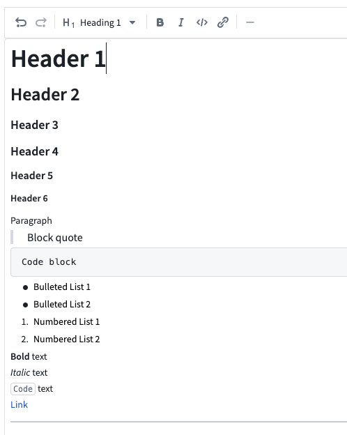
Features
- Formatting toolbar: Apply bold, italic, code, and other formatting using toolbar controls without needing to know Markdown syntax.
- Rich text and raw Markdown views: Toggle between a rich text view (formatted preview with inline editing) and a raw Markdown view (plain text with Markdown syntax).
- Placeholder text: Configure placeholder text that appears when the editor is empty.
- Auto-sizing: Enable the editor to expand automatically based on content length.
- Variable binding: The output string variable stores the content as a Markdown string, which can be consumed by other widgets such as the Markdown widget for display.
Considerations
- Markdown mode does not support event-on-enter triggers (available only in single line mode).
- Content is stored as a Markdown-formatted string in the bound string variable. Other widgets consuming this value should be able to interpret Markdown formatting.
中文翻译
文本输入(Text Input)
文本输入(Text Input) 组件允许用户在表单字段中输入文本值。
配置选项(Configuration Options)
- 标签(Label)
- 为组件设置可选标签。此文本将显示在组件顶部。
- 字符串值(String value)
- 组件的输出变量,用于存储用户输入的文本。
- 占位符(Placeholder)
- 定义在用户未输入任何文本时,输入字段中显示的占位提示文字。
- 格式(Format)
- 将输入字段设置为单行、多行文本区域或Markdown编辑器。
- 单行(Single line)
- 回车事件(Event on enter): 设置按下回车键时触发的事件
- 文本区域(Text area)
- 初始高度(Initial height): 设置文本输入区域的初始高度
- Markdown
- 启用带有格式工具栏的富文本编辑体验。用户可以使用Markdown语法或工具栏控件编写和格式化文本。编辑器支持在富文本视图和原始Markdown视图之间切换。详情请参见下文Markdown模式(Markdown mode)。
Markdown模式(Markdown mode)
当格式(format)字段设置为Markdown时,文本输入(Text Input)组件将提供由记事本(Notepad)中使用的同一编辑器驱动的富文本编辑体验。此模式适用于用户需要输入格式化文本的字段,例如描述、备注或评论。
功能特性(Features)
- 格式工具栏(Formatting toolbar): 使用工具栏控件应用粗体、斜体、代码及其他格式,无需了解Markdown语法。
- 富文本和原始Markdown视图(Rich text and raw Markdown views): 在富文本视图(带内联编辑的格式化预览)和原始Markdown视图(带Markdown语法的纯文本)之间切换。
- 占位符文本(Placeholder text): 配置编辑器为空时显示的占位文本。
- 自动调整大小(Auto-sizing): 启用编辑器根据内容长度自动扩展。
- 变量绑定(Variable binding): 输出字符串变量将内容存储为Markdown字符串,可被其他组件(如Markdown组件)用于显示。
注意事项(Considerations)
- Markdown模式不支持回车触发事件(该功能仅适用于单行模式)。
- 内容以Markdown格式的字符串存储在绑定的字符串变量中。使用此值的其他组件应能够解析Markdown格式。