Simple fields(简单字段)
:::callout{theme="warning"} Foundry Forms is no longer the recommended approach for data entry or writeback workflows on Foundry. Instead, build user input workflows with the Foundry Ontology, representing the relevant data structures as object types and configuring the writeback interaction with Actions. Learn more in the Forms overview documentation. :::
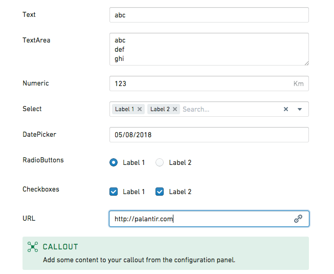
In a form, simple fields ask for basic input from the respondent. This page discusses the different types of simple fields available in Foundry Forms, excluding Attachments fields.
Callout
The callout field highlights important content to the respondent and supports Markdown formatting. Users can configure the following options:
- Create content that references the value of other fields.
- Set a title, background color, and icon.
- Add an image that has been uploaded to Foundry or other sites accessible from Foundry.
The value of a callout field will never write to the backing object type or spreadsheet. If you need to template some text with the value written in a different field, you can use the template field.
Checkboxes
The checkboxes field displays a set of options as checkboxes. Users can configure the following options:
- Provide a list of possible
Valuesalong with their displayedLabels. - Set
Default values. - Display the checkboxes either horizontally or vertically.
Date picker
The date picker field allows respondents to enter a date or timestamp. Users can configure the following options:
- Set a
Time Precision(day, minute, second, or millisecond). - Set a
Recorded formt(the default isYYYY-MM-DDfor dates andYYYY-MM-DDTHH:mm:ss.SSSZZfor timestamps). - Enforce a minimum/maximum date.
- Disable past/future dates.
- Prefill the field with the date of filling.
The default minimum and maximum dates are 25 years from the current date but can be set further in the past or future by changing their configured values. For example, you could enable choosing a date of birth more than 25 years in the past by setting a minimum date in 1900.
:::callout{theme="neutral"} In the date picker field, dates are always picked by and displayed to the user according to their timezone. However, when date values are written to the backing spreadsheet or object type, they are always written in UTC to be compatible across timezones. :::
Dropdown
The dropdown field displays a set of options as a dropdown. Users can configure the following options:
- Provide a list of possible
Valuesalong with their displayedLabels. - Set
Default values. - Allow multiple selections.
- Prefill the field if only one value is available.
- Allow the creation of values other than the ones given.
- Set a
Placeholder. - Use the Code Editor to set
noResultsText: string.
Geocode picker
The geocode picker field allows respondents to enter an address. Using the Code Editor, users can set placeholder: string.
Map picker
The map picker field allows respondents to enter coordinates. Using the Code Editor, users can configure the following options:
- Set
placeholder: string. - Set
location: [double, double]. - Set
initialZoom: double. - Set
displayFormat: "latlng" | "mgrs". - Set
mapboxAccessToken: string. - Set
mapboxStyles: list<string>(view Mapbox documentation ↗).
Numeric
The numeric field allows respondents to enter a number. Users can configure the following options:
- Set a
Default value. - Set a
Unit label(for example,kgorlbs). - Set a
Placeholder. - Show increment/decrement buttons and specify their position.
- Using the Code Editor:
- Set
clampValueOnBlur: boolean. - Set
min: double. - Set
max: double. - Set
stepSize: double. - Set
minorStepSize: double. - Set
majorStepSize: double.
Radio buttons
The radio buttons field displays a set of options as radio buttons. Users can configure the following options:
- Provide a list of possible
Valuesalong with their displayedLabels. - Set a
Default value. - Display the radio buttons either horizontally or vertically.
Resource picker
The resource picker field allows respondents to select a resource from within Foundry. Users can specify whether respondents are allowed to select folders, datasets, or any resource type.
Slider
The slider field allows respondents to select a number. Users can configure the following options:
- Enforce a minimum/maximum value.
- Set a
Step sizeandLabel step size. - Set a
Unit label(for example,kgorlbs). - Specify how the selected value is labeled.
- Using the Code Editor:
- Set
initialValue: double. - Set
labelPrecision: double. - Set
showTrackFill: boolean.
Text
The text field allows respondents to enter a single line of text. Users can configure the following options:
- Set a
Default value. - Set a
Placeholder.
Text area
The text area field allows respondents to enter multiple lines of text. Users can configure the following options:
- Set a
Default value. - Set a
Placeholder. - Set the default and maximum number of rows.
URL
The URL field allows respondents to enter hyperlinks. Users can configure the following options:
- Set a
Default value. - Set a
Placeholder. - Display a warning when the format is invalid, and customize the message shown.
中文翻译
简单字段
:::callout{theme="warning"} Foundry Forms 已不再是 Foundry 中数据录入或回写工作流的推荐方案。请改用 Foundry 本体论(Ontology)构建用户输入工作流,将相关数据结构表示为对象类型(Object Type),并通过操作(Actions)配置回写交互。更多信息请参阅 Forms 概述文档。 :::
在表单中,简单字段用于向填写者收集基本信息。本页介绍 Foundry Forms 中可用的各类简单字段,但不包括附件字段。
提示框(Callout)
提示框字段用于向填写者突出显示重要内容,并支持 Markdown 格式。用户可以配置以下选项:
- 创建引用其他字段值的内容。
- 设置标题、背景颜色和图标。
- 添加已上传至 Foundry 或可从 Foundry 访问的其他站点的图片。
提示框字段的值永远不会写入后端对象类型(Object Type)或电子表格。如果需要使用其他字段写入的值来生成模板文本,可以使用模板字段。
复选框(Checkboxes)
复选框字段以复选框形式显示一组选项。用户可以配置以下选项:
- 提供可能的
值(Values)列表及其显示的标签(Labels)。 - 设置
默认值(Default values)。 - 选择水平或垂直显示复选框。
日期选择器(Date picker)
日期选择器字段允许填写者输入日期或时间戳。用户可以配置以下选项:
- 设置
时间精度(Time Precision)(天、分钟、秒或毫秒)。 - 设置
记录格式(Recorded format)(日期默认为YYYY-MM-DD,时间戳默认为YYYY-MM-DDTHH:mm:ss.SSSZZ)。 - 强制设置最小/最大日期。
- 禁用过去/未来日期。
- 预填当前填写日期。
默认的最小和最大日期为当前日期前后25年,但可以通过更改配置值设置为更早或更晚的日期。例如,您可以将最小日期设置为1900年,从而允许选择25年之前的出生日期。
:::callout{theme="neutral"} 在日期选择器字段中,日期始终根据用户的时区进行选择和显示。但是,当日期值写入后端电子表格或对象类型(Object Type)时,始终以 UTC 格式写入,以确保跨时区兼容。 :::
下拉菜单(Dropdown)
下拉菜单字段以下拉列表形式显示一组选项。用户可以配置以下选项:
- 提供可能的
值(Values)列表及其显示的标签(Labels)。 - 设置
默认值(Default values)。 - 允许多选。
- 当只有一个可用值时预填该字段。
- 允许创建给定值以外的其他值。
- 设置
占位符(Placeholder)。 - 使用代码编辑器(Code Editor)设置
noResultsText: string。
地理编码选择器(Geocode picker)
地理编码选择器字段允许填写者输入地址。使用代码编辑器(Code Editor),用户可以设置placeholder: string。
地图选择器(Map picker)
地图选择器字段允许填写者输入坐标。使用代码编辑器(Code Editor),用户可以配置以下选项:
- 设置
placeholder: string。 - 设置
location: [double, double]。 - 设置
initialZoom: double。 - 设置
displayFormat: "latlng" | "mgrs"。 - 设置
mapboxAccessToken: string。 - 设置
mapboxStyles: list<string>(查看 Mapbox 文档 ↗)。
数字(Numeric)
数字字段允许填写者输入数字。用户可以配置以下选项:
- 设置
默认值(Default value)。 - 设置
单位标签(Unit label)(例如kg或lbs)。 - 设置
占位符(Placeholder)。 - 显示增减按钮并指定其位置。
- 使用代码编辑器(Code Editor):
- 设置
clampValueOnBlur: boolean。 - 设置
min: double。 - 设置
max: double。 - 设置
stepSize: double。 - 设置
minorStepSize: double。 - 设置
majorStepSize: double。
单选按钮(Radio buttons)
单选按钮字段以单选按钮形式显示一组选项。用户可以配置以下选项:
- 提供可能的
值(Values)列表及其显示的标签(Labels)。 - 设置
默认值(Default value)。 - 选择水平或垂直显示单选按钮。
资源选择器(Resource picker)
资源选择器字段允许填写者从 Foundry 中选择资源。用户可以指定填写者是否可以选择文件夹、数据集或任何资源类型。
滑块(Slider)
滑块字段允许填写者选择一个数字。用户可以配置以下选项:
- 强制设置最小/最大值。
- 设置
步长(Step size)和标签步长(Label step size)。 - 设置
单位标签(Unit label)(例如kg或lbs)。 - 指定所选值的标签显示方式。
- 使用代码编辑器(Code Editor):
- 设置
initialValue: double。 - 设置
labelPrecision: double。 - 设置
showTrackFill: boolean。
文本(Text)
文本字段允许填写者输入单行文本。用户可以配置以下选项:
- 设置
默认值(Default value)。 - 设置
占位符(Placeholder)。
文本区域(Text area)
文本区域字段允许填写者输入多行文本。用户可以配置以下选项:
- 设置
默认值(Default value)。 - 设置
占位符(Placeholder)。 - 设置默认行数和最大行数。
URL
URL 字段允许填写者输入超链接。用户可以配置以下选项:
- 设置
默认值(Default value)。 - 设置
占位符(Placeholder)。 - 在格式无效时显示警告,并自定义提示信息。