Custom styles on widgets(微件自定义样式)
Custom styles on widgets allow users to apply custom CSS on individual widgets. The styles are not shared with other widgets in the application. Custom styles are accessed from the right sidebar when selecting a widget. Navigate to the Styles tab in the sidebar and find the custom styles section at the bottom of the panel.
Custom styles on widgets are a great way to test and develop styles. Set background colors, font sizes, border radius, and more in a quick and easy way. Make changes on a single widget and preview the result in the canvas, without risking to change other parts of the application.
Custom styles can collide with styles from the stylesheets, which can lead to unexpected results. This happens when both try to change the same CSS properties of the same class (for example, stylesheets and custom styles changing the background color of a widget). To avoid these collisions, custom styles should only be used for development and iterations, while the stylesheet is ideal for managing complex styles.
This guide walks you through styling a text widget.
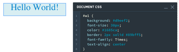
- Add a text widget and enter
Hello World. - Common things to change in a text widget are color, font, alignment and border.
#w1 {
  background: #d9eef2;
  font-size: 30px;
  color: #1685ca;
  border: 2px solid #89bff5;
  font-family: Times;
  text-align: center
}
-
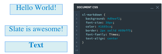
Add another text widget and enter
Slate is awesome. -
Notice that the styling does not apply to this new text widget because we used the selector
#w1to specify that we only wanted these changes to apply to that first widget. We could simply change the CSS to#w1,#w2to have our styling apply to both text widgets. However, what happens when we add another text widget and want the same styling? -
Change the following in the Styles editor:
sl-markdown {
  background: #d9eef2;
  font-size: 30px;
  color: #1685ca;
  border: 2px solid #89bff5;
  font-family: Times;
  text-align: center
}
sl-markdown is the element tag, and the code is saying use this styling for all markdown widgets.
-
Add a third text widget. Notice that it styles automatically.
-
Finally, keep the current CSS and add CSS for #w1.
sl-markdown {
  background: #d9eef2;
  font-size: 30px;
  color: #1685ca;
  border: 2px solid #89bff5;
  font-family: Times;
  text-align: center
}
#w1 {
  background: #f1cbd5;
  font-size: 30px;
  color: #ca1629;
  border: 2px solid #eb5c81;
  font-family: Helvetica;
  text-align: center
}
Notice that this correctly styles w1 differently from the other two widgets.

中文翻译
微件自定义样式
微件自定义样式允许用户在单个微件上应用自定义CSS。这些样式不会与应用中的其他微件共享。选中微件后,可从右侧边栏访问自定义样式。导航至边栏中的样式选项卡,在面板底部找到自定义样式区域。
微件自定义样式是测试和开发样式的绝佳方式。可快速便捷地设置背景颜色、字体大小、边框圆角等属性。在单个微件上修改后,即可在画布中预览效果,无需担心影响应用的其他部分。
自定义样式可能与样式表中的样式发生冲突,导致意外结果。当两者试图修改同一类的相同CSS属性时(例如样式表和自定义样式同时修改微件的背景颜色),就会发生冲突。为避免此类冲突,自定义样式应仅用于开发和迭代,而样式表更适合管理复杂样式。
本指南将带您完成文本微件的样式设置。
- 添加一个文本微件,输入
Hello World。 - 文本微件中常见的修改项包括颜色、字体、对齐方式和边框。
#w1 {
  background: #d9eef2;
  font-size: 30px;
  color: #1685ca;
  border: 2px solid #89bff5;
  font-family: Times;
  text-align: center
}
-
再添加一个文本微件,输入
Slate is awesome。 -
注意该样式不会应用于这个新文本微件,因为我们使用了选择器
#w1来指定仅将修改应用于第一个微件。我们可以简单地将CSS改为#w1, #w2,使样式同时应用于两个文本微件。但若再添加一个文本微件并希望应用相同样式时,又该如何处理? -
在样式编辑器中进行如下修改:
sl-markdown {
  background: #d9eef2;
  font-size: 30px;
  color: #1685ca;
  border: 2px solid #89bff5;
  font-family: Times;
  text-align: center
}
sl-markdown 是元素标签,这段代码表示对所有markdown微件应用此样式。
-
添加第三个文本微件。注意它会自动应用样式。
-
最后,保留当前CSS,并为#w1添加CSS。
sl-markdown {
  background: #d9eef2;
  font-size: 30px;
  color: #1685ca;
  border: 2px solid #89bff5;
  font-family: Times;
  text-align: center
}
#w1 {
  background: #f1cbd5;
  font-size: 30px;
  color: #ca1629;
  border: 2px solid #eb5c81;
  font-family: Helvetica;
  text-align: center
}
注意,这样正确地将w1与其他两个微件区分开来。