Configure and apply styles(配置与应用样式)
Slate is built on top of the Palantir open source Blueprint framework and, like any other website, styles the DOM using CSS. This provides a consistent look and feel to widgets and a built-in toggle to “Dark Mode”. These are not “skins” or “templates”, but rather built in to each Slate widget.
This means if your application design calls for a specific UI, your development effort will focus on providing a set of style overrides that provide new rules. This adds a level of complexity because you must understand where the Slate default styles are applied and then generate a CSS selector with the correct level of specificity to override it.
Your best friend when developing styles in your app will be the Chrome Developer Tools - specifically the “Inspector” - which lets you view the rendered HTML and CSS for any element in a web page. Right-click → “Inspect” will open the Inspector with the clicked-on element highlighted. This is key for identifying which classes are applied to which element, and therefore which classes need to be extended or over-written.
:::callout{title="A note on LESS"} Technically the CSS you write inside of a Slate app is pre-compiler dialect called Less ↗. Less provides syntax for streamlining verbose CSS and is a powerful tool for writing complex styles while maintaining legibility. On page load, all LESS is compiled to CSS, so when you inspect the rendered page, you may see differences if you've been leveraging LESS functionality. Read the LESS docs for more information on common patterns and helpful functionality. :::
Widget styles
In the Styles input area on the Display configuration for each individual widget, you can define different styles and classes on the widget level. These styles are only available on the selected widget. If the widget is a container, the styles will also be available by all of its nested children.
Styles written in widgets may be difficult to manage or keep track of, versus storing styles in a central location. For larger projects, you should avoid putting styles into individual widgets and instead manage styles through the styles panel.
Stylesheets
The cleanest pattern is to define new classes in the Styles panel and apply them to individual widgets using the Additional Classes configuration. There are two different types on stylesheets available to support more complex styles.
Local stylesheets
Local stylesheets define styles and classes on the application level. Each Slate application has exactly one local stylesheet which can be referenced from across the application.
Blueprint styles
Slate uses style provided by Blueprint ↗, which is a Palantir-created open source framework.
You can use many Blueprint classes and icons in your application to build common UI elements in HTML and help your application more seamlessly match the rest of the platform and achieve a professional, production look and feel.
Colors
Blueprint provides a range of core and extended color names ↗ that have been chosen with WCAG 2.0 compliance in mind (for accessible application design).
These can be referenced directly in Slate styles using LESS variables.
Components
There are many components in Blueprint that are useful for creating dynamic user interaction elements or bringing a level of polish to your application, from Buttons ↗ to Progress Bars ↗ to Tags ↗.
To use these in Slate, pay attention to the CSS API (rather than the JavaScript API) section for each component to understand if you can use the relevant pt-x class and HTML elements to create a similar component in Slate.
Icons
Blueprint also includes a comprehensive set of icons ↗ that are easy to integrate into your application as badges or even as small UI elements.
The method for referencing Blueprint icons varies by version. To reference Blueprint icons, follow the Icon CSS API instructions for your specific version.
For example, the following is how you would reference an icon in Blueprint v6:
<span class="bp6-icon-standard bp6-icon-clean"></span>
Patterns for dynamic styles
Since Slate's styling needs to be determined at page load, all CSS styles must be static. This means, for example, that you can't put a Handlebars statement into your CSS class to attempt to make a widget change color or change any other property. There are, however, several different patterns available to achieve dynamic styling.
Dynamic "Additional Classes"
Though you can't generate or modify classes on the fly, you can use Handlebars to template the Additional Classes configuration for each widget. The common pattern is to pre-define a number of different classes and then use a function to determine which classes should be applied in a certain circumstance. If you're building a large, stateful application - see section above - then you might want to have a central function that determines all the correct classes to apply to all the different widgets for any given condition and then return a more complex map between a widget and the correct classes to apply.
In this manner, you can easily build an app that responds by changing colors, icons, or other display properties, or even resizes itself by showing and hiding entire widgets. See: Responsive Layouts section above for more on this specific pattern.
Style attribute
While the CSS for your application must be pre-compiled, the style property on an HTML widget can be templated using Handlebars. This only applies for HTML widgets or tables where you provide the HTML to be displayed in a cell; in these circumstances, you can dynamically generate CSS and put it in the style attribute ↗ for that element.
Dark mode loading screen
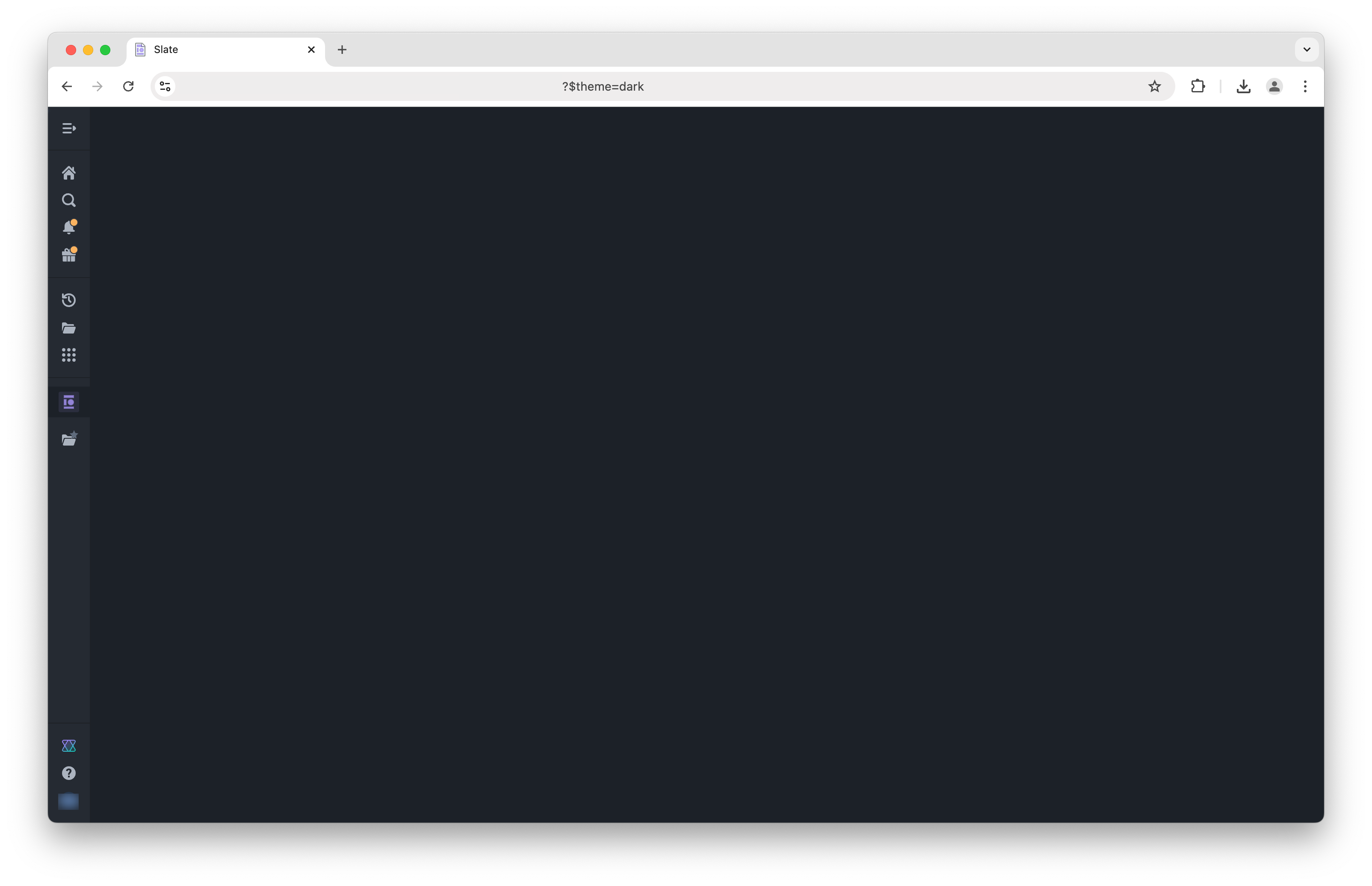
During the initial page load, you will typically see a dark sidebar loading a white screen. To load a fully dark screen, you can use the query parameter ?$theme=dark to load the entire page in a dark theme aligned with the sidebar.
Note that this is a one-time load and will not persist across page refreshes without the query parameter added. Also note that this is only applicable once the Slate application starts to load, not while the browser is still routing to the application.
Custom fonts
Slate supports the use of custom fonts to further tailor the appearence of applications to your organization. To use a custom font, the font must first be uploaded to Foundry as an otf file. Once uploaded, fonts can now be imported via the Styles sheet and assigned to a family using the font file's rid.
@font-face {
    font-family: alliance1;
    src: url("https://developer.palantir.com/blobster/api/salt/ri.blobster.main.blob.a3dd73c4-d300-4194-b977-fc176410cdf6")
        format("opentype");
}
中文翻译
配置与应用样式
Slate 构建于 Palantir 开源框架 Blueprint 之上,与其他网站一样,通过 CSS 对 DOM 进行样式设置。这为组件提供了统一的外观与体验,并内置了"深色模式"切换功能。这些并非"皮肤"或"模板",而是内置于每个 Slate 组件中的特性。
这意味着,如果你的应用设计需要特定的用户界面,你的开发工作将主要集中于提供一套覆盖默认样式的规则。这会增加一定的复杂性,因为你必须了解 Slate 默认样式的应用位置,然后生成具有正确特异性的 CSS 选择器来覆盖它。
在开发应用样式时,你最好的工具是 Chrome 开发者工具——特别是"检查器"——它可以让你查看网页中任意元素的渲染 HTML 和 CSS。右键点击 → "检查" 即可打开检查器,并高亮显示被点击的元素。这对于识别哪些类应用于哪些元素,以及因此需要扩展或覆盖哪些类至关重要。
:::callout{title="关于 LESS 的说明"} 从技术上讲,你在 Slate 应用中编写的 CSS 是一种名为 Less ↗ 的预编译器方言。Less 提供了简化冗长 CSS 的语法,是编写复杂样式同时保持可读性的强大工具。在页面加载时,所有 LESS 都会被编译为 CSS,因此当你检查渲染后的页面时,如果使用了 LESS 功能,可能会看到差异。请阅读 LESS 文档以获取关于常见模式和有用功能的更多信息。 :::
组件样式
在每个单独组件的显示配置中的样式输入区域,你可以在组件级别定义不同的样式和类。这些样式仅适用于所选组件。如果该组件是一个容器,其所有嵌套子组件也将可以使用这些样式。
与将样式集中存储相比,在组件中编写样式可能难以管理或追踪。对于较大的项目,应避免将样式放入单个组件中,而是通过样式面板来管理样式。
样式表
最清晰的做法是在样式面板中定义新的类,然后通过附加类配置将其应用于单个组件。有两种不同类型的样式表可用于支持更复杂的样式。
本地样式表
本地样式表在应用级别定义样式和类。每个 Slate 应用恰好有一个本地样式表,可以在整个应用中引用。
Blueprint 样式
Slate 使用了 Blueprint ↗ 提供的样式,这是一个由 Palantir 创建的开源框架。
你可以在应用中使用许多 Blueprint 类和图标,通过 HTML 构建常见的用户界面元素,帮助你的应用更无缝地匹配平台的其他部分,并实现专业、生产级的外观与体验。
颜色
Blueprint 提供了一系列核心和扩展颜色名称 ↗,这些颜色在选择时已考虑 WCAG 2.0 合规性(以实现无障碍应用设计)。
在 Slate 样式中,可以通过 LESS 变量直接引用这些颜色。
组件
Blueprint 中有许多组件可用于创建动态用户交互元素或为应用增添精致感,从按钮 ↗到进度条 ↗再到标签 ↗。
要在 Slate 中使用这些组件,请关注每个组件的 CSS API(而非 JavaScript API)部分,以了解是否可以使用相关的 pt-x 类和 HTML 元素在 Slate 中创建类似的组件。
图标
Blueprint 还包含一套全面的图标 ↗,可以轻松集成到你的应用中,作为徽章甚至小型用户界面元素使用。
引用 Blueprint 图标的方法因版本而异。要引用 Blueprint 图标,请按照你特定版本的图标 CSS API 说明进行操作。
例如,以下是在 Blueprint v6 中引用图标的方式:
<span class="bp6-icon-standard bp6-icon-clean"></span>
动态样式模式
由于 Slate 的样式需要在页面加载时确定,所有 CSS 样式必须是静态的。这意味着,例如,你不能在 CSS 类中放入 Handlebars 语句来尝试让组件改变颜色或更改任何其他属性。不过,有几种不同的模式可以实现动态样式。
动态"附加类"
虽然你无法即时生成或修改类,但你可以使用 Handlebars 为每个组件的附加类配置创建模板。常见的模式是预先定义多个不同的类,然后使用函数来确定在特定情况下应应用哪些类。如果你正在构建一个大型、有状态的应用——请参见上文——你可能希望有一个中心函数,用于确定在任何给定条件下应应用于所有不同组件的正确类,然后返回一个更复杂的映射,将组件与应应用的正确类关联起来。
通过这种方式,你可以轻松构建一个能够通过改变颜色、图标或其他显示属性来响应的应用,甚至可以通过显示和隐藏整个组件来调整自身大小。有关此特定模式的更多信息,请参见上文中的"响应式布局"部分。
Style 属性
虽然应用的 CSS 必须预编译,但 HTML 组件上的 style 属性可以使用 Handlebars 进行模板化。这仅适用于 HTML 组件或表格(你在其中提供要在单元格中显示的 HTML);在这些情况下,你可以动态生成 CSS 并将其放入该元素的 style 属性 ↗ 中。
深色模式加载屏幕
在初始页面加载期间,你通常会看到深色侧边栏加载白色屏幕。要加载全深色屏幕,你可以使用查询参数 ?$theme=dark 来加载整个页面,使其与侧边栏的深色主题保持一致。
请注意,这是一次性加载,如果没有添加查询参数,在页面刷新后不会持续。另请注意,这仅适用于 Slate 应用开始加载之后,而不适用于浏览器仍在路由到应用的过程中。
自定义字体
Slate 支持使用自定义字体,以进一步调整应用的外观以适应你的组织。要使用自定义字体,必须先将字体以 otf 文件格式上传到 Foundry。上传后,可以通过样式表导入字体,并使用字体文件的 rid 将其分配给一个字体族。
@font-face {
    font-family: alliance1;
    src: url("https://developer.palantir.com/blobster/api/salt/ri.blobster.main.blob.a3dd73c4-d300-4194-b977-fc176410cdf6")
        format("opentype");
}