Chart(图表)
The Chart Widget category comprises the following widgets:
- Bar chart
- Bar chart with legend
- Stacked bar chart
- Horizontal bar chart
- Multiple series chart
- Gantt chart
- Heat grid
- Line Chart
- Pie chart
- Scatter plot
- Tree map
This page contains information on the properties available to Chart widgets, as well as examples of widgets and common CSS.
Chart widget properties
The following tables offer usage details about the properties available to Chart widgets.
| Attribute | Description | Type | Required | Changed By |
|---|---|---|---|---|
| dataSelectionEnabled | Specifies whether the user can select bars and scatter points. Legend selection is also available in “Multiple” mode. Selected data is exposed through the chart’s selection.data property.(Disabled if Pan/Zoom is enabled) | boolean | Yes | Direct Edit |
| dataSelectionMode | Specifies data selection behavior. “Single” mode allows only single click interactions. “Multiple” mode allows rectangular box selection and cmd/ctrl+click interactions.(Disabled if Pan/Zoom is enabled) | string | No | Direct Edit |
| animate | Specifies whether the chart data will animate upon load, change, and refresh. | boolean | Yes | Direct Edit |
| areaSelectionEnabled | Specifies whether the user can draw an area selection on the chart. (Disabled if axis type is ‘Category’, Data Selection is ‘Multiple’, there are multiple axes, or if Pan/Zoom is enabled) | boolean | Yes | Direct Edit |
| autorangePanZoomEnabled | When Pan and Zoom is enabled for a single axis, autorange can be applied to dynamically scale the second axis to fit the data. | boolean | Yes | Direct Edit |
| datasets | See IDatasetModel and its subtypes below. | IDatasetModel[] | Yes | Direct Edit |
| zeroBoundYAxisEnabled | Allows quantitative charts with datasets that do not span across a Y-value of 0 to have a Y-axis bound by 0. Warning: disabling this option could lead to visually misleading charts. | boolean | Yes | Direct Edit |
| hover | When tooltipsEnabled = true, this property determines the value you are hovering over. In order to link to this variable elsewhere, you must first declare it through the template “hover”: { “xValue”: null, “yValue”: null }. For more information, see IHover. Note that hover works for all charts except stackedArea. Also note that hover defaults to the yValue. | IHover | No | User Interaction |
| labelsEnabled | Enables static labels. Available for bar charts only. Options include “start”, “middle”, “end”, or “outside”. | boolean | Yes | Direct Edit |
| labelsPosition | Specifies the position of the bar chart labels. Options include “start”, “middle”, “end”, or “outside”. | string | No | Direct Edit |
| legendEnabled | Enables displaying a legend. Available options for the position include “top”, “bottom”, “left”, or “right”. | boolean | Yes | Direct Edit |
| legendPosition | Position of the legend. Available options include “top”, “bottom”, “left”, or “right”. | string | No | Direct Edit |
| panZoomEnabled | Specifies whether the chart should allow panning and zooming. Available for numerical axes only. Disabling this option will reset the scales. Scales are not persistent across saves. (Disabled if Data Selection is enabled, Area Selection is enabled, or if all axes types are ‘Category’) | boolean | Yes | Direct Edit |
| panZoomAxes | The axes for which panning and zooming are enabled. Available options are “X and Y”, “X Only”, or “Y Only”. | string | No | Direct Edit |
| selection.area | The current area selection. This is relevant only if Area Selection is enabled. See IAreaSelection below. | IAreaSelection | No | User Interaction |
| selection.data | The currently selected chart data. This is relevant only if Data Selection is enabled. See IDataSelection below. | IDataSelection | No | User Interaction |
| tooltipsEnabled | Specifies whether tooltips are enabled. Tooltips will display the data value set by hover (with the y-value as the default). | boolean | Yes | Direct Edit |
| tooltipText | The text displayed in tooltips (tooltipsEnabled must be true). This is commonly used to display hover values. If tooltipText is omitted or an empty string, then the tooltip will display the yValue in all charts except horizontal bar charts (where it will show the xValue). | string | No | Direct Edit |
| xAxes | Array of x-axes. | IAxis[] | Yes | Direct Edit |
| yAxes | Array of y-axes. | IAxis[] | Yes | Direct Edit |
| title | The title of the chart. | string | No | Direct Edit |
IAxis
| Attribute | Description | Type | Required | Changed By |
|---|---|---|---|---|
| formatter | Format axis ticks. Format string depends on the type of axis: For linear/log see the Numeral.js documentation ↗; For time series see the moment.js documentation ↗; Not available for category; decimal precision is limited to 20 digits. | string | No | Direct Edit |
| gridlinesEnabled | Specifies whether gridlines should be shown for an axis. Currently available for non-category axes only | boolean | Yes | Direct Edit |
| betweenTicks | Specifies whether the alignment of the gridlines for the axis is between the ticks and defaults to false and renders the gridlines on the ticks | boolean | Yes | Direct Edit |
| name | Name of the axis, referred to by xAxisName and yAxisName in ISeries. | string | Yes | Direct Edit |
| position | Position of the axis. For x-axes, position can be top or bottom. For y-axes, left or right. | string | Yes | Direct Edit |
| label | Label associated with the axis. | string | No | Direct Edit |
| scale | Axis type. For y-axes (position left and right), scale can be linear, modifiedlog, or category. For x-axes (position top and bottom), scale can also be timeseries. Note: Currently timeseries scale expects dates as integers representing ms after the epoch. SQL date format often arrives in Slate as a string, so if a time chart isn’t working try casting as an integer as follows: MySQL: SELECT UNIX_TIMESTAMP(date_column)*1000 AS date_number or Postgres: SELECT EXTRACT(epoch FROM date_column)*1000 AS date_number. Remember to update xValues to the newly created number column in the above examples, “{{query1.date_number}}}” |
string | No | Direct Edit |
| scaleMax | Maximum value for axis (if unspecified, the axis will autorange). | number | No | Direct Edit |
| scaleMin | Minimum value for axis (if unspecified, the axis will autorange). | number | No | Direct Edit |
| tickInterval | Interval between tick values. Available for axes with a linear scale only. | number | No | Direct Edit |
| tickLabelAngle | Rotates the tick label for Category Axis: 90, 0 and 90. Available for axes with a category scale only. | number | No | Direct Edit |
| visible | Specifies whether the axis should be shown. | boolean | Yes | Direct Edit |
| maxZoomSpan | Maximum span of values the axis will display when zooming out. Zoom-out not possible beyond this value. | number | No | Direct Edit |
| minZoomSpan | Minimum span of values the axis will display when zooming in. Zoom-in not possible beyond this value. | number | No | Direct Edit |
IAreaSelection
| Attribute | Description | Type | Required | Changed By |
|---|---|---|---|---|
| selected | Whether or not area is selected. | boolean | Yes | User Interaction |
| xMax | The maximum x-value of area selection. | number | Yes | User Interaction |
| xMin | The minimum x-value of area selection. | number | Yes | User Interaction |
| yMax | The maximum y-value of area selection. | number | Yes | User Interaction |
| yMin | The minimum y-value of area selection. | number | Yes | User Interaction |
IDatasetModel
| Attribute | Description | Type | Required | Changed By |
|---|---|---|---|---|
| name | The name of the dataset. Used as a legend label if no series values are specified. Plot visuals are CSS-classed with this name. | string | Yes | Direct Edit |
| renderer | The renderer used to draw the dataset. | string | Yes | Direct Edit |
| seriesColors | An array of color values which maps to the array of series names specified in the “Series Names” field. Colors can be specified either as hex (e.g. “#FF0000”) or as CSS color names (e.g. “red”).If no series names are specified in the “Series Names” array, the first color specified in the color array will color the entire chart. If no color values are specified the chart will use the default Blueprint color scheme | string[] | No | Direct Edit |
| seriesNames | An array of unique series names which the array of colors specified in the “Colors” field maps onto. | any[] | No | Direct Edit |
| seriesValues | An array of labels (numbers or strings) that group data into “series.”A stacked bar dataset with x = [1, 1], y = [1, 2], and series = [“series1”, “series2”] will generate one stack at x=1 with the “series2” bar on top of the “series1” bar.A line dataset with multiple series will generate multiple lines. | any[] | No | Direct Edit |
ILabelsModel
| Attribute | Description | Type | Required | Changed By |
|---|---|---|---|---|
| labels | An array of labels that correspond to the chart values. | any[] | Yes | Direct Edit |
IRangeDatasetModel
| Attribute | Description | Type | Required | Changed By |
|---|---|---|---|---|
| endValues | The data that is used for the end values. | any[] | Yes | Direct Edit |
| startValues | The data that is used for the start values. | any[] | Yes | Direct Edit |
IXYDatasetModel
| Attribute | Description | Type | Required | Changed By |
|---|---|---|---|---|
| radiusValues | For scatter renderer, the data that determines the radius of the scatter point. | number[] | No | Direct Edit |
| xAxisName | The name of the x-axis associated with this series. Defaults to first x-axis if not specified. | string | No | Direct Edit |
| xValues | The data that is used for the x-values. | any[] | Yes | Direct Edit |
| yAxisName | The name of the y-axis associated with this series. Defaults to the first y-axis if not specified. | string | No | Direct Edit |
| yValues | The data that is used for the y-values. | any[] | Yes | Direct Edit |
| symbolValues | For scatter renderer, the shape of each scatter point. Valid values are “circle”, “square”, “diamond”, “cross”, “triangle”, “wye” and “star”. If using a legend, the last symbol of a series will be used as the symbol of the legend. If the last symbol is not valid or undefined, then the legend will default to a circle. | string[] | No | Direct Edit |
IHover
| Attribute | Description | Type | Required | Changed By |
|---|---|---|---|---|
| index | The index in the associated dataset currently hovered over in a chart. | number | Yes | User Interaction |
| xValue | The x-value currently hovered over in a chart. | any | Yes | User Interaction |
| yValue | The y-value currently hovered over in a chart. | any | Yes | User Interaction |
IDataSelection
| Attribute | Description | Type | Required | Changed By |
|---|---|---|---|---|
| indices | The indices of values selected in the data provided. | number[] | Yes | User Interaction |
| xValues | The discrete x-values selected by clicking. | any[] | Yes | User Interaction |
| yValues | The discrete y-values selected by clicking. | any[] | Yes | User Interaction |
Actions
| Action Name | Description |
|---|---|
| redraw | Triggering this action causes the chart to redraw |
Chart Widget Examples
Defaults
{
  "animate": true,
  "areaSelectionEnabled": false,
  "dataSelectionEnabled": false,
  "datasets": [
    {
      "name": "dataset1",
      "renderer": "line",
      "xValues": [],
      "yValues": []
    }
  ],
  "labelsEnabled": false,
  "panZoomEnabled": false,
  "tooltipsEnabled": false,
  "xAxes": [
    {
      "gridlinesEnabled": false,
      "name": "x1",
      "position": "bottom",
      "scale": "linear"
    }
  ],
  "yAxes": [
    {
      "gridlinesEnabled": false,
      "name": "y1",
      "scale": "linear",
      "position": "left"
    }
  ]
}
Bar Chart with Legend
{
  "animate": true,
  "areaSelectionEnabled": false,
  "dataSelectionEnabled": false,
  "datasets": [
    {
      "name": "dataset1",
      "renderer": "bar",
      "xValues": "{{query1.state}}",
      "yValues": "{{query1.avgIncome}}"
    }
  ],
  "labelsEnabled": false,
  "legendPosition": "top",
  "panZoomEnabled": false,
  "tooltipsEnabled": false,
  "xAxes": [
    {
      "gridlinesEnabled": false,
      "name": "x1",
      "position": "bottom",
      "label": "State",
      "scale": "category"
    }
  ],
  "yAxes": [
    {
      "gridlinesEnabled": false,
      "name": "y1",
      "formatter": "$0,0.00",
      "position": "left",
      "label": "Average Income ($)",
      "scale": "linear",
      "scaleMax": 1000000,
      "scaleMin": 10000
    }
  ]
}
Stacked Bar Chart
{
  "animate": true,
  "areaSelectionEnabled": false,
  "dataSelectionEnabled": false,
  "datasets": [
    {
      "name": "dataset1",
      "renderer": "stackedBar",
      "seriesValues": "{{query1.gender}}",
      "xValues": "{{query1.state}}",
      "yValues": "{{query1.avgIncome}}"
    }
  ],
  "labelsEnabled": false,
  "panZoomEnabled": false,
  "tooltipsEnabled": false,
  "xAxes": [
    {
      "gridlinesEnabled": false,
      "name": "x1",
      "position": "bottom",
      "label": "State",
      "scale": "category"
    }
  ],
  "yAxes": [
    {
      "gridlinesEnabled": false,
      "name": "y1",
      "formatter": "$0,0.00",
      "position": "left",
      "label": "Average Income ($)",
      "scale": "linear",
      "scaleMax": 1000000,
      "scaleMin": 10000
    }
  ]
}
Horizontal Bar Chart
{
  "animate": true,
  "areaSelectionEnabled": false,
  "dataSelectionEnabled": false,
  "datasets": [
    {
      "name": "dataset1",
      "renderer": "horizontalBar",
      "xValues": "{{query1.avgIncome}}",
      "yValues": "{{query1.state}}"
    }
  ],
  "labelsEnabled": false,
  "panZoomEnabled": false,
  "tooltipsEnabled": false,
  "xAxes": [
    {
      "gridlinesEnabled": false,
      "name": "x1",
      "position": "bottom",
      "label": "Average Income ($)",
      "scale": "linear",
    }
  ],
  "yAxes": [
    {
      "gridlinesEnabled": false,
      "name": "y1",
      "position": "left",
      "label": "State",
      "scale": "category"
    }
  ]
}
Multiple Series Chart
{
  "areaSelectionEnabled": false,
  "dataSelectionEnabled": false,
  "datasets": [
    {
      "name": "dataset1",
      "renderer": "line",
      "seriesValues": "{{query1.series}}",
      "xValues": "{{query1.key}}",
      "yValues": "{{query1.doc_count}}"
    }
  ],
  "labelsEnabled": false,
  "panZoomEnabled": false,
  "tooltipsEnabled": false,
  "xAxes": [
    {
      "gridlinesEnabled": false,
      "name": "x1",
      "position": "bottom",
      "scale": "linear"
    }
  ],
  "yAxes": [
    {
      "gridlinesEnabled": false,
      "name": "y1",
      "scale": "linear",
      "position": "left"
    }
  ]
}
Scatter Plot
{
  "animate": true,
  "areaSelectionEnabled": false,
  "dataSelectionEnabled": false,
  "datasets": [
    {
      "name": "dataset1",
      "radiusValues": "{{query1.pop}}",
      "renderer": "scatter",
      "xValues": "{{query1.gdp}}",
      "yValues": "{{query1.cpi}}"
    }
  ],
  "labelsEnabled": false,
  "panZoomEnabled": false,
  "tooltipsEnabled": false,
  "xAxes": [
    {
      "gridlinesEnabled": false,
      "name": "x1",
      "position": "bottom",
      "scale": "linear"
    }
  ],
  "yAxes": [
    {
      "gridlinesEnabled": false,
      "name": "y1",
      "scale": "linear",
      "position": "left"
    }
  ]
}
Tutorial: Add a scatter plot widget
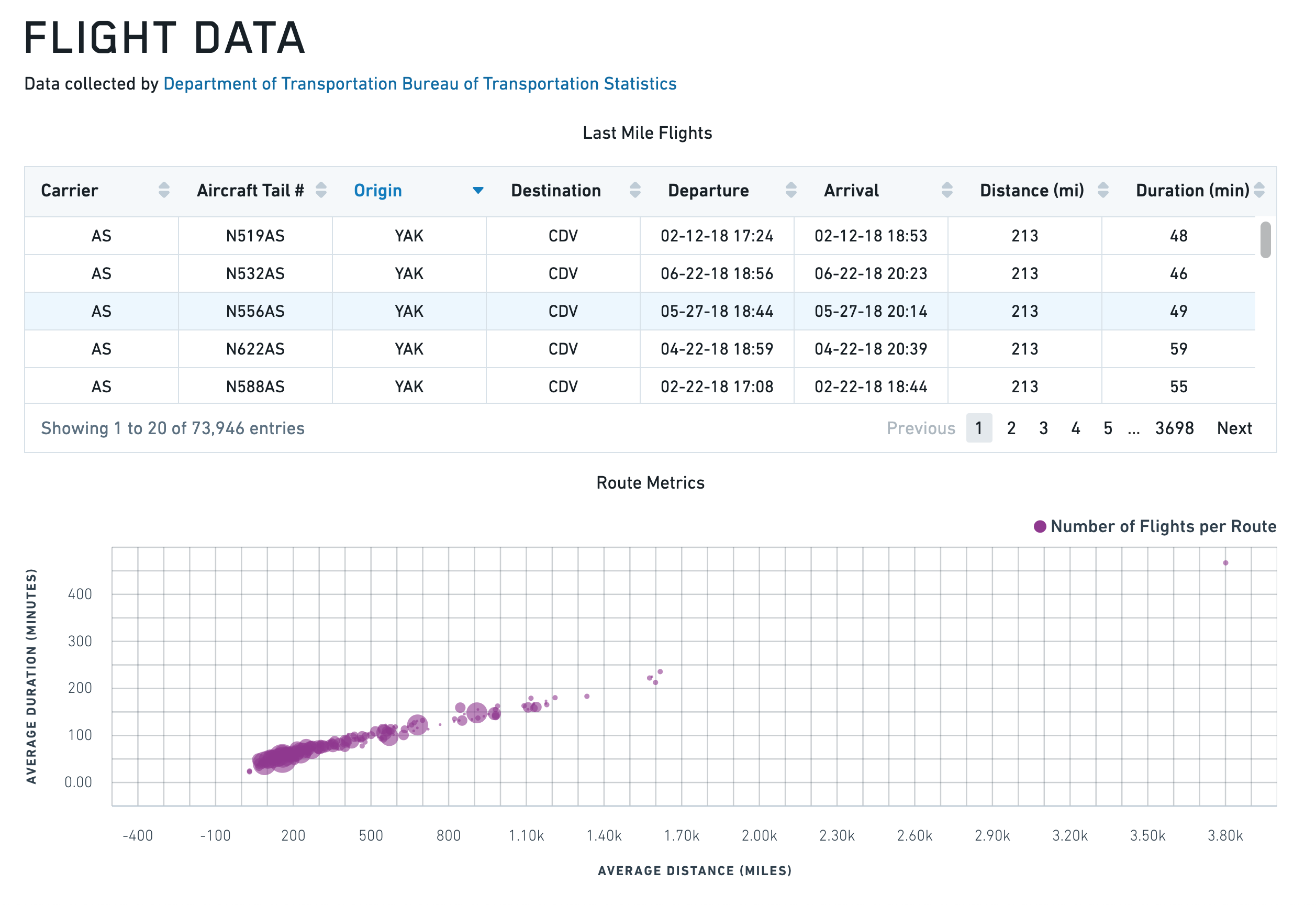
Say that you want to create a scatter plot widget to display route metrics that show distance and time values. Select the Widget button in the upper left corner, then choose Chart > Scatter Plot to add a Scatter Plot widget to your application. It will be pre-populated with some example data that you can clear from the right editor panel before continuing.
First, rename the Chart widget to something easy to identify, like w_routeMetrics.
We want to plot the average distance of the routes along the x-axis. This means that you must set X Values to "{{q_routeMetrics.avg_distance}}".
Next, plot the routes duration along the y-axis. Set Y Values to "{{q_routeMetrics.avg_time}}" in the Data tab.
To make the scatter plot easier to read, add labels to your axes. Select the Axes tab and change the Name of the first X Axes object from x1 to Distance, and add a label such as Distance (miles) to describe the plotted information. You can also turn on gridlines to help identify where each point lies on the chart.
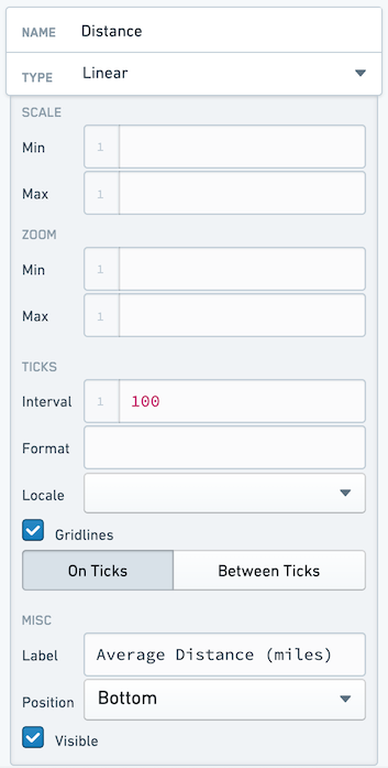
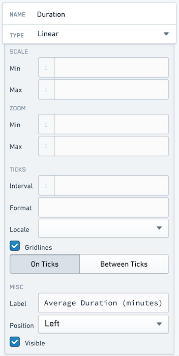
Name your Y Axis Duration, and configure it as follows:
Finally, give your points different sizes. We want the points to vary by how busy the route is. To do this, switch back to the Data tab and set Radius to "{{q_routeMetrics.num_flights}}".
Exame the chart again. Something seems wrong, since the chart is now filled. This is because the Radius value is drawing 1:1 between the value provided and the number of pixels for the radius, and some of our routes have over 150 flights. You must scale your radius values. You can do this by calculating a "display" value in you query. You could hardcode this, but using a Variable allows you easy to make later changes without editing the query.
Select the Variables tab across the top bar to open the Variables window. Create a new variable in the bottom right. Name the new variable v_routeCountDisplayScale and set a value of 100.
Return to the q_routeMetrics widget and add a new column:
COUNT(flight_id)/{{v_routeCountDisplayScale}} as num_flights_disp
While here, generate a display label for each row:
CONCAT(origin, ' -> ', dest) as route_name
Your entire query now looks like:
SELECT
    origin,
    dest,
    AVG(distance) as avg_distance,
    AVG(actual_elapsed_time) as avg_time,
    COUNT(flight_id) as num_flights,
    COUNT(flight_id)/{{v_routeCountDisplayScale}} as num_flights_disp,
    CONCAT(origin, ' -> ', dest) as route_name
FROM "foundry_sync"."{{v_flightTable}}"
GROUP BY
    origin,
    dest
ORDER BY
    COUNT(flight_id) DESC
LIMIT 50
Return to the w_routeMetrics widget and adjust the Radius configuration to reference the num_flights_disp column instead of num_flights.
To finalize the chart, add the title Route Metrics to the Title input at the top of the w_routeMetrics configuration panel.
You should end with an application that looks like the following:
Line Chart with X and Y Range
{
  "animate": true,
  "areaSelectionEnabled": false,
  "dataSelectionEnabled": false,
  "datasets": [
    {
      "name": "dataset1",
      "renderer": "line",
      "xValues": [1,2,3,4,5,6,7,8,9],
      "yValues": [3,4,1,4,5,4,2,4,1],
      "seriesValues": null,
      "xAxisName": "x1",
      "yAxisName": "y1"
    },
    {
      "endValues": [3],
      "name": "dataset2",
      "renderer": "yRange",
      "startValues": [2]
    },
    {
      "endValues": [3.5,8],
      "name": "dataset3",
      "renderer": "xRange",
      "startValues": [2.5,6],
      "seriesValues": ["Range A","Range B"]
    }
  ],
  "labelsEnabled": false,
  "panZoomEnabled": false,
  "tooltipsEnabled": false,
  "xAxes": [
    {
      "gridlinesEnabled": true,
      "name": "x1",
      "position": "bottom",
      "scale": "linear",
      "label": "",
      "formatter": "\"0\""
    }
  ],
  "yAxes": [
    {
      "gridlinesEnabled": false,
      "name": "y1",
      "position": "left",
      "scale": "linear",
      "formatter": "\"0\""
    }
  ]
}
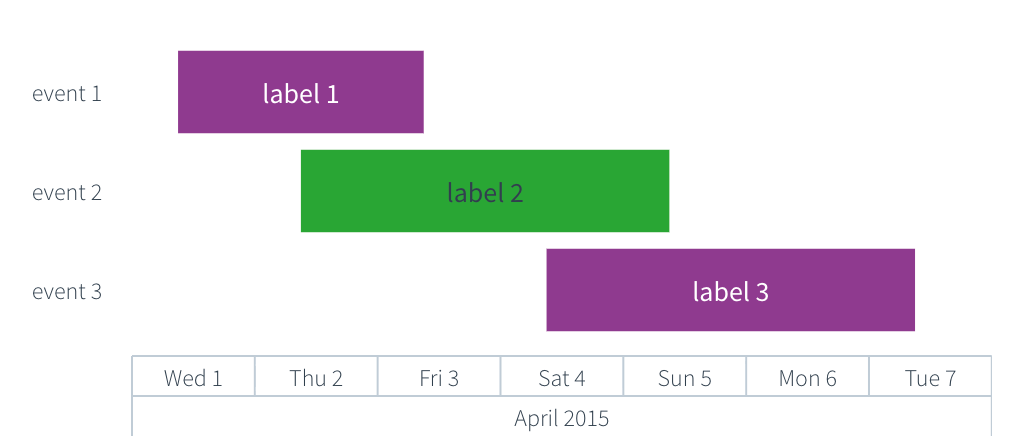
Gantt chart
Gantt charts display time-based data as horizontal bars along a categorical y-axis. You can use Gantt charts to visualize schedules, project timelines, event durations, and any dataset where items span a start and end time. Gantt charts share the chart widget properties documented above.
Properties
IGanttDatasetModel
The Gantt dataset model extends IRangeDatasetModel and ILabelsModel. The startValues, endValues, and labels properties are documented in the IRangeDatasetModel and ILabelsModel tables above. The shared name, renderer, seriesColors, seriesNames, and seriesValues properties are documented in the IDatasetModel table.
| Attribute | Description | Type | Required | Changed By |
|---|---|---|---|---|
| yValues | An array of categorical values that determine the y-position of each bar. Each value corresponds to a row on the y-axis. The length of this array must match the length of startValues and endValues. |
any[] | Yes | Direct edit |
The x-axis must use the timeseries scale, the y-axis must use the category scale, and the dataset renderer must be set to "gantt". The startValues, endValues, and yValues arrays must all be the same length. If labels is provided, its length must also match yValues.
Actions
| Action Name | Description |
|---|---|
| redraw | Triggering this actions causes chart to redraw |
Defaults
{
  "animate": true,
  "areaSelectionEnabled": false,
  "autorangePanZoomEnabled": false,
  "dataSelectionEnabled": false,
  "datasets": [
    {
      "endValues": ["4/3/2015 9:00", "4/5/2015 9:00", "4/7/2015 9:00"],
      "labels": ["Label 1", "Label 2", "Label 3"],
      "name": "dataset1",
      "renderer": "gantt",
      "seriesValues": ["a", "b", "a"],
      "startValues": ["4/1/2015 9:00", "4/2/2015 9:00", "4/4/2015 9:00"],
      "yValues": ["Event 1", "Event 2", "Event 3"]
    }
  ],
  "labelsEnabled": false,
  "legendEnabled": false,
  "panZoomEnabled": false,
  "tooltipsEnabled": false,
  "xAxes": [
    {
      "betweenTicks": false,
      "gridlinesEnabled": false,
      "name": "x1",
      "position": "bottom",
      "scale": "timeseries",
      "visible": true
    }
  ],
  "yAxes": [
    {
      "betweenTicks": false,
      "gridlinesEnabled": false,
      "name": "y1",
      "position": "left",
      "scale": "category",
      "visible": true
    }
  ],
  "zeroBoundYAxisEnabled": true
}
Examples
Basic Gantt chart
{
  "animate": true,
  "areaSelectionEnabled": false,
  "dataSelectionEnabled": false,
  "datasets": [
    {
      "endValues": "{{query1.endDate}}",
      "labels": "{{query1.taskName}}",
      "name": "dataset1",
      "renderer": "gantt",
      "seriesValues": "{{query1.phase}}",
      "startValues": "{{query1.startDate}}",
      "yValues": "{{query1.taskName}}"
    }
  ],
  "labelsEnabled": false,
  "legendEnabled": true,
  "legendPosition": "top",
  "panZoomEnabled": false,
  "tooltipsEnabled": true,
  "tooltipText": "{{w_ganttChart.hover.yValue}}",
  "xAxes": [
    {
      "gridlinesEnabled": true,
      "name": "x1",
      "position": "bottom",
      "scale": "timeseries",
      "label": "Date"
    }
  ],
  "yAxes": [
    {
      "gridlinesEnabled": false,
      "name": "y1",
      "position": "left",
      "scale": "category",
      "label": "Task"
    }
  ]
}
Gantt chart with series colors
{
  "animate": true,
  "areaSelectionEnabled": false,
  "dataSelectionEnabled": false,
  "datasets": [
    {
      "endValues": ["4/5/2015 9:00", "4/8/2015 9:00", "4/12/2015 9:00", "4/15/2015 9:00"],
      "labels": ["Design", "Develop", "Test", "Deploy"],
      "name": "dataset1",
      "renderer": "gantt",
      "seriesColors": ["#2965CC", "#29A634", "#D99E0B", "#D13913"],
      "seriesNames": ["Planning", "Engineering", "QA", "Operations"],
      "seriesValues": ["Planning", "Engineering", "QA", "Operations"],
      "startValues": ["4/1/2015 9:00", "4/4/2015 9:00", "4/8/2015 9:00", "4/11/2015 9:00"],
      "yValues": ["Design", "Develop", "Test", "Deploy"]
    }
  ],
  "labelsEnabled": false,
  "legendEnabled": true,
  "legendPosition": "right",
  "panZoomEnabled": false,
  "tooltipsEnabled": true,
  "tooltipText": "{{w_ganttChart.hover.yValue}}",
  "xAxes": [
    {
      "gridlinesEnabled": true,
      "name": "x1",
      "position": "bottom",
      "scale": "timeseries",
      "label": "Timeline"
    }
  ],
  "yAxes": [
    {
      "gridlinesEnabled": false,
      "name": "y1",
      "position": "left",
      "scale": "category",
      "label": "Phase"
    }
  ]
}
Heat Grid
The following tables offer usage details about the properties available to Heat Grid chart widgets. Several examples follow the tables.
Properties
IAxis
| Attribute | Description | Type | Required | Changed By |
|---|---|---|---|---|
| label | Label associated with the axis. | string | No | Direct Edit |
| position | Position of the axis. For x-axes, position can be top or bottom. For y-axes, left or right. | string | Yes | Direct Edit |
| visible | Specifies whether the axis should be shown. | boolean | Yes | Direct Edit |
IHeatGridModel
| Attribute | Description | Type | Required | Changed By |
|---|---|---|---|---|
| cellValues | The data that is used to determine the value of each cell | number[] | Yes | Direct Edit |
| colorScale | An array of two or more colors used to create a linear gradient to color the heat grid cells. Example: with cellValues = [0, 5, 10] and a color array of [“red”, “blue”] the resulting colors will be: red, purple, blue. Colors can be specified either as hex (e.g. “#FF0000”) or as CSS color names (e.g. “red”). If unspecified or less than two colors, the default color range used is 50% opacity of Blueprint’s @blue5 (#B9D7EA) to @blue1 (#1f6b9a) | string[] | Yes | Direct Edit |
| labelFormat | Label format on heat grid cells. Uses the Numeral.js ↗ format string. Ex. $0.00 will format 1000.23 as $1000.23. Decimal precision is limited to 20 digits. | string | No | Direct Edit |
| labelsEnabled | Enables static labels using the value of each cell as the default text. | boolean | Yes | Direct Edit |
| legendLabel | Text to use in legend label | string | No | Direct Edit |
| legendPosition | Position of the legend. Available options include “top”, “bottom”, “left”, or “right”. If not specified, the legend will not display. | string | No | Direct Edit |
| selection | The values for the selected heat grid cells. This is relevant only if selection is enabled and the user has made a selection. See IHeatGridSelection below. | IHeatGridSelection | No | User Interaction |
| selectionEnabled | Specifies whether the user can select cells on the heat grid. | boolean | Yes | Direct Edit |
| selectionMode | Specifies selection behavior. “Single” mode allows only single click interactions. “Multiple” mode allows cmd/ctrl+click interactions. | string | No | Direct Edit |
| xAxis | Category scale x-axis (see IAxis) | IAxis | Yes | Direct Edit |
| xValues | The data associated with the x-coordinate of each cell. | any[] | Yes | Direct Edit |
| yAxis | Category scale y-axis (see IAxis). | IAxis | Yes | Direct Edit |
| yValues | The data associated with the y-coordinate of each cell. | any[] | Yes | Direct Edit |
| title | The title of the chart. | string | No | Direct Edit |
IHeatGridSelection
| Attribute | Description | Type | Required | Changed By |
|---|---|---|---|---|
| cellValues | The discrete cellValues selected by clicking. | number[] | Yes | User Interaction |
| indices | The indices of values selected in the data provided. | number[] | Yes | User Interaction |
| xValues | The discrete x-values selected by clicking. | any[] | Yes | User Interaction |
| yValues | The discrete y-values selected by clicking. | any[] | Yes | User Interaction |
Actions
| Action Name | Description |
|---|---|
| redraw | Triggering this actions causes chart to redraw |
Defaults
{
    "cellValues": [],
    "colorScale": ["#B9D7EA", "#1F6B9A"],
    "labelsEnabled": false,
    "xAxis": {
        "gridlinesEnabled": false,
        "name": "x1",
        "position": "bottom",
        "scale": "category",
        "visible": true
    },
    "xValues": [],
    "yAxis": {
        "gridlinesEnabled": false,
        "name": "y1",
        "position": "bottom",
        "scale": "category",
        "visible": true
    },
    "yValues": []
}
Pie Chart
The following tables offer usage details about the properties available to Pie Chart widgets. Several examples follow the tables.
Properties
| Attribute | Description | Type | Required | Changed By |
|---|---|---|---|---|
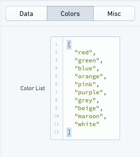
| colors | An array of color values which maps to the array of key values specified in the “Keys” field. Colors can be specified either as hex (e.g. “#FF0000”) or as CSS color names (e.g. “red”). If no color values are specified the chart will use the default Blueprint color scheme | string[] | No | Direct Edit |
| hover | When tooltipsEnabled = true, this property contains data associated with the pie slice being hovered over. For more information, see IPieHover. | IPieHover | No | User Interaction |
| innerPadding | The fraction of the radius used to create a doughnut hole. | number | No | Direct Edit |
| keys | The keys displayed in the legend. | any[] | Yes | Direct Edit |
| labelFormat | Label format on pie chart slices. Uses the Numeral.js ↗ format string. Ex. $0.00 will format 1000.23 as $1000.23. Decimal precision is limited to 20 digits. | string | No | Direct Edit |
| labelsEnabled | Enables static labels on pie slices | boolean | Yes | Direct Edit |
| legendPosition | The position of the legend. | string | Yes | Direct Edit |
| selection | The values for the selected pie slices. This is relevant only if selection is enabled and the user has made a selection. See IPieSelection below. | IPieSelection | No | User Interaction |
| selectionEnabled | Specifies whether the user can select pie slices and legend entries. | boolean | Yes | Direct Edit |
| selectionMode | Specifies selection behavior. “Single” mode allows only single click interactions. “Multiple” mode allows cmd/ctrl+click interactions. | string | No | Direct Edit |
| tooltipsEnabled | Specifies whether tooltips are enabled. By default, the text of the tooltip will be the value of the pie slice being hovered on | boolean | Yes | Direct Edit |
| tooltipText | The text displayed in tooltips (tooltipsEnabled must be true). This is commonly used to display hover values. If tooltipText is omitted or an empty string, then the tooltip will display the valueassociated with the pie slice | string | No | Direct Edit |
| values | The values that determine the size of each slice. | number[] | Yes | Direct Edit |
| title | The title of the chart. | string | No | Direct Edit |
IPieHover
| Attribute | Description | Type | Required | Changed By |
|---|---|---|---|---|
| index | The index of the pie slice being hovered over. | number | Yes | User Interaction |
| key | The key of the pie slice being hovered over. | any | Yes | User Interaction |
| value | The value of the pie slice being hovered over. | number | Yes | User Interaction |
IPieSelection
| Attribute | Description | Type | Required | Changed By |
|---|---|---|---|---|
| indices | The indices of values selected in the data provided. | number[] | Yes | User Interaction |
| keys | The associated keys selected by clicking. | any[] | Yes | User Interaction |
| values | The discrete values selected by clicking. | number[] | Yes | User Interaction |
Actions
| Action Name | Description |
|---|---|
| redraw | Triggering this actions causes chart to redraw |
Examples
Pie Plot
{
  "keys": "{{query1.teamName}}",
  "labelsEnabled": false,
  "legendPosition": "right",
  "selectionEnabled": false,
  "tooltipsEnabled": false,
  "values": "{{query1.headCount}}"
}
Doughnut Plot
{
  "innerPadding": 0.6,
  "keys": "{{query1.teamName}}",
  "labelsEnabled": false,
  "legendPosition": "right",
  "selectionEnabled": false,
  "tooltipsEnabled": false,
  "values": "{{query1.headCount}}"
}
Defaults
{
  "keys": [],
  "labelsEnabled": false,
  "legendPosition": "right",
  "selectionEnabled": false,
  "tooltipsEnabled": false,
  "values": []
}
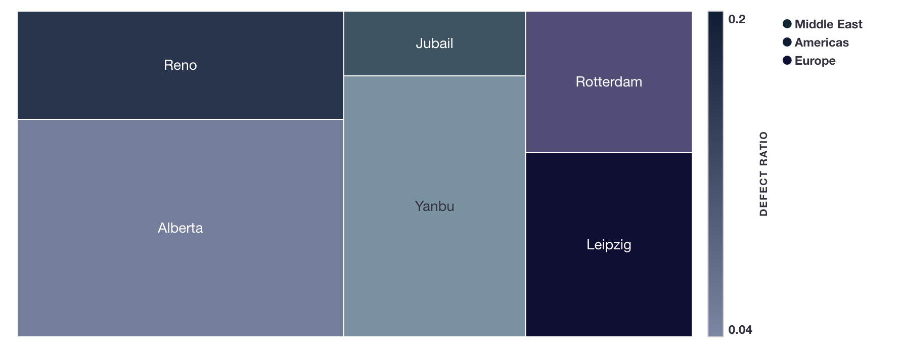
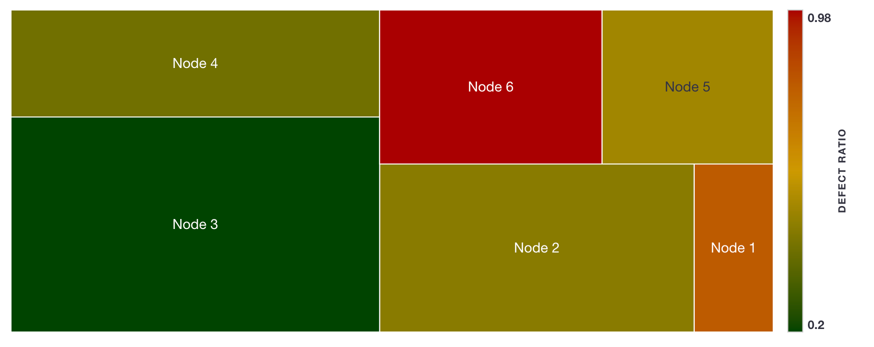
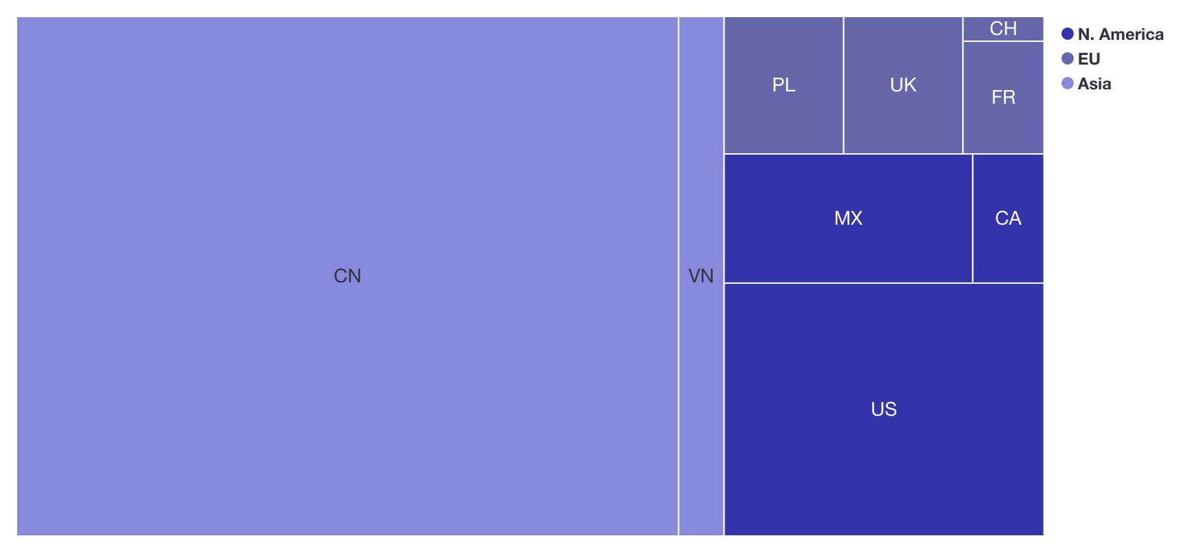
Tree map
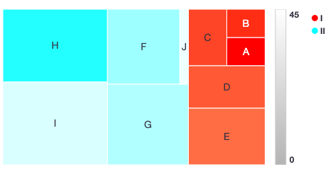
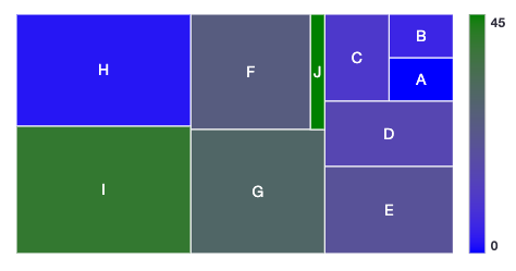
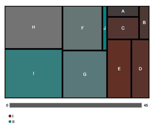
The tree map widget provides a flexible way to visualize hierarchical data in a set of nested rectangles. It is useful for spotting patterns otherwise hard to uncover in other visualizations.
A tree map is used to visualize an absolute quantity (size) for a given entity (label), which may be part of some (optional) category with some (optional) relative quantity (density).
Each cell’s rectangle has: an area proportional to the size; a color defined by the density and category; and a name given by label.
Some examples of datasets which could be visualized with this chart:
- Stocks (
label) part of an industry (category) that have some share of the market (size) and have had some percentage price change (density)
- Factory locations (
label) by region (category) that produce some quantity of goods (size) with a false positive ratio (density)
- Nodes of a cluster (
label) with storage space (size) and some percentage storage space utilization (density)
- Population sizes (
size) of countries (label) belonging to some world region (category)
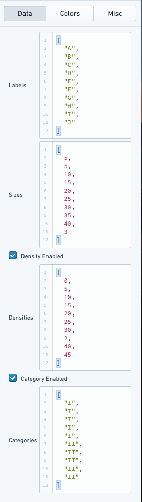
Data Configuration
label(optional): the name displayed on each cellsize: determines the size of the cell rectangledensity(optional): determines the shading of the cell’s colorcategory(optional): determines the grouping of cells, which decides the cell’s color
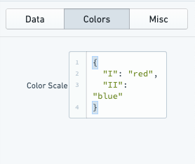
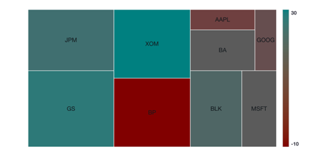
In the default example, the cell rectangles corresponds to the cell size. There are two categories, I and II. Notice that H has the largest size (45), and is therefore the biggest rectangle. H also has the smallest density (3), so it is the darkest color (the gradient can be flipped with a checkbox under color panels).

Color Configuration
There are different coloring configurations available based on if categories and/or densities are enabled.
Category enabled and density enabled
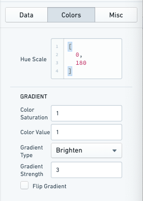
When both categories and densities are enabled, colors of cells are defined according to gradients in the Hue-Saturation-Value (HSV) ↗ color space. For each category a hue is defined. A list of hues (number between 0 and 360) or a dictionary mapping category names to hues can be provided. All categories' gradients then uses the same defined starting saturation and value. The gradient is defined using gradient type (brighten, darken, saturate, desaturate) and the strength of the gradient.
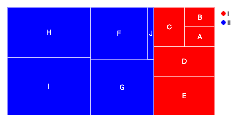
Only category enabled
With only categories enabled, you can specify a list of colors or a dictionary mapping category name to color for the categories.
The colors can be hex (#FF0000, #00FF00) or canonical (e.g. red, green).
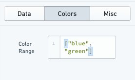
Only density Enabled
With only densities enabled, you can define a list of colors which will be applied as range with gradient. You must provide two colors at a minimum to define the color gradient, though more can be provided to more finely define this color gradient.
The colors can be hex (#FF0000, #00FF00) or canonical (e.g. red, green).
Category disabled and density disabled
With both categories and densities disabled, you can define a list of colors which is the color palette. It must be a list of colors of same length as number of data points.
The colors can be hex (#FF0000, #00FF00) or canonical (e.g. red, green).
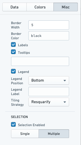
Miscellaneous Configuration
Optional miscellaneous configurations are possible:
- Cell styling
- Border width of each cell
- Border color
- Labels for the cell
-
Tooltips for the cell
-
Legends
- Legend position (top, bottom, left, right)
-
Legend label (for title of the legend)
-
Tiling strategy for how the cells are generated. Tiling strategies are defined by d3 ↗: Binary, Dice, Resquarify, Slice, Slice Dice, Squarify.
-
Selection (multiple or single)
Examples
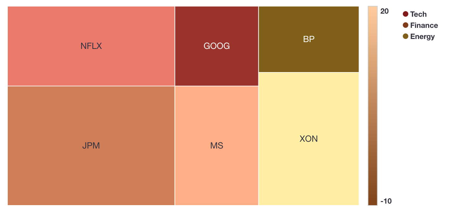
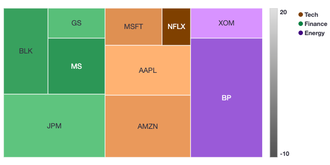
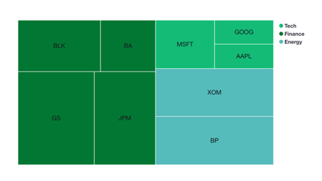
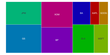
In these series of examples, an investor wants to visualize the holdings of their portfolio. The data has several dimensions: the name of the stock (label), the amount invested in each stock (size), the percentage change in the stock price (density), and the industry of the stock (category).
We load this data into the Tree Map chart widget:
labels: ["MSFT", "AAPL", "NFLX", "AMZN", "GS", "MS", "BLK", "JPM", "XOM", "BP"]

sizes: [10, 20, 5, 25, 8, 15, 18, 30, 10, 40]

densities: [8, 15, -10, 10, 3, -5, -3, 4, 20, 8]

categories: ["Tech", "Tech", "Tech", "Tech", "Finance", "Finance", "Finance", "Finance", "Energy", "Energy"]
Example 1 with category and density enabled

Example 2 with only density enabled
In this configuration the portfolio analyst can look at which equities have had the largest changes in price.

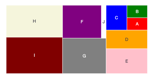
Example 3 with only category enabled
In this configuration the portfolio analyst can look at which industry is most represented with in the portfolio and which equities represent the largest holdings within those industries.
It is worth noting that you can use the configuration to offer a more granular representation of the data. For example, one could visualize the size of equities within the portfolio and color them according to Red, Amber, Green risk ratings.

Example 4 with category and density diabled
In this configuration, the portfolio analyst would simply see how large a share of the portfolio each equity represents. This is by default effectively the same as a pie chart.
It is worth noting that if a custom color strategy is required (beyond what is by default configurable), this configuration could be used by providing the color for each square individually.

Common CSS
Line charts
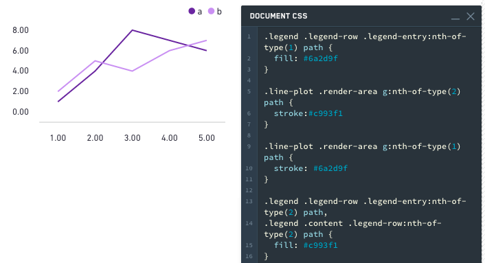
Series colors:
.line-plot .render-area g:nth-of-type(1) path {stroke: #6a2d9f;}.line-plot .render-area g:nth-of-type(2) path {stroke:#c993f1;}
Legend colors:
.legend .legend-row .legend-entry:nth-of-type(1) path {fill: #6a2d9f;}
Alternatively,
.legend .legend-row .legend-entry:nth-of-type(2) path,.legend .content .legend-row:nth-of-type(2) path {fill: #c993f1;}
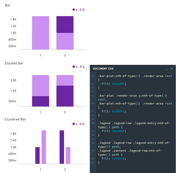
Bar charts
The following applies to stacked, clustered, and regular bar charts.
Bar colors:
.bar-plot .render-area g:nth-of-type(1) rect,.bar-plot:nth-of-type(1) .render-area rect {fill: #6a2d9f;}.bar-plot .render-area g:nth-of-type(2) rect,.bar-plot:nth-of-type(2) .render-area rect {fill: #c993f1;}
Legend colors:
.legend .legend-row .legend-entry:nth-of-type(1) path {
  fill: #6a2d9f;
}

.legend .legend-row .legend-entry:nth-of-type(2) path,
.legend .content .legend-row:nth-of-type(2) path {
  fill: #c993f1;
}
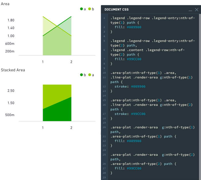
Area charts
The following applies to stacked and regular area charts.
Area colors:
.area-plot .render-area g:nth-of-type(1) path,.area-plot:nth-of-type(1) path {fill: #009900;}.area-plot .render-area g:nth-of-type(2) path,.area-plot:nth-of-type(2) path {fill: #99CC00;}
Line colors:
.area-plot:nth-of-type(1) .area,.line-plot .render-area g:nth-of-type(1) path {stroke: #009900;}.area-plot:nth-of-type(1) .area,.line-plot .render-area g:nth-of-type(2) path {stroke: #99CC00;}
Legend colors:
.legend .legend-row .legend-entry:nth-of-type(1) path {fill: #009900;}
Alternatively:
.legend .legend-row .legend-entry:nth-of-type(2) path,.legend .content .legend-row:nth-of-type(2) path {fill: #99CC00;}
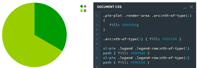
Pie charts
A slice can be selected by index or CSS classname (sanitized label name is used as CSS classname)
Styling by Index:
Pie slice colors:
.pie-plot .render-area .arc:nth-of-type(1) {fill: #009900;}
Alternatively:
.arc:nth-of-type(2) { fill: #99CC00; }
Legend colors:
sl-pie .legend .legend-row:nth-of-type(1) path { fill: #009900; }
sl-pie .legend .legend-row:nth-of-type(2) path { fill: #99CC00; }
Styling by Name:
Pie slice colors:
.pie-plot .render-area .arc._A {fill: #009900;}
Alternatively:
.arc._B { fill: #99CC00; }
Legend colors:
sl-pie .legend .legend-row ._A path { fill: #009900; }
sl-pie .legend .legend-row ._B path { fill: #99CC00; }
中文翻译
图表
图表(Chart)组件类别包含以下组件:
本页包含图表(Chart)组件可用的属性信息,以及组件示例和通用 CSS。
图表组件属性
下表提供了图表组件可用属性的使用详情。
| 属性 | 描述 | 类型 | 是否必需 | 修改方式 |
|---|---|---|---|---|
| dataSelectionEnabled | 指定用户是否可以选择柱子和散点。在"多选"模式下也可选择图例。选中的数据通过图表的 selection.data 属性暴露。(如果启用了平移/缩放,则禁用) | boolean | 是 | 直接编辑 |
| dataSelectionMode | 指定数据选择行为。"单选"模式仅允许单击交互。"多选"模式允许矩形框选和 cmd/ctrl+单击交互。(如果启用了平移/缩放,则禁用) | string | 否 | 直接编辑 |
| animate | 指定图表数据在加载、更改和刷新时是否播放动画。 | boolean | 是 | 直接编辑 |
| areaSelectionEnabled | 指定用户是否可以在图表上绘制区域选择。(如果轴类型为'类别'、数据选择为'多选'、存在多个轴或启用了平移/缩放,则禁用) | boolean | 是 | 直接编辑 |
| autorangePanZoomEnabled | 当为单个轴启用平移和缩放时,可以应用自动范围来动态缩放第二个轴以适应数据。 | boolean | 是 | 直接编辑 |
| datasets | 参见下方的 IDatasetModel 及其子类型。 | IDatasetModel[] | 是 | 直接编辑 |
| zeroBoundYAxisEnabled | 允许数据集不跨越 Y 值 0 的定量图表将 Y 轴绑定到 0。警告:禁用此选项可能导致视觉上误导性的图表。 | boolean | 是 | 直接编辑 |
| hover | 当 tooltipsEnabled = true 时,此属性确定您悬停的值。为了在其他地方链接到此变量,您必须首先通过模板声明它:"hover": { "xValue": null, "yValue": null }。更多信息请参见 IHover。注意 hover 适用于除 stackedArea 之外的所有图表。另请注意 hover 默认为 yValue。 | IHover | 否 | 用户交互 |
| labelsEnabled | 启用静态标签。仅适用于柱状图。选项包括 "start"、"middle"、"end" 或 "outside"。 | boolean | 是 | 直接编辑 |
| labelsPosition | 指定柱状图标签的位置。选项包括 "start"、"middle"、"end" 或 "outside"。 | string | 否 | 直接编辑 |
| legendEnabled | 启用显示图例。位置的可用选项包括 "top"、"bottom"、"left" 或 "right"。 | boolean | 是 | 直接编辑 |
| legendPosition | 图例的位置。可用选项包括 "top"、"bottom"、"left" 或 "right"。 | string | 否 | 直接编辑 |
| panZoomEnabled | 指定图表是否允许平移和缩放。仅适用于数值轴。禁用此选项将重置比例尺。比例尺在保存时不持久。(如果启用了数据选择、区域选择或所有轴类型均为'类别',则禁用) | boolean | 是 | 直接编辑 |
| panZoomAxes | 启用平移和缩放的轴。可用选项为 "X and Y"、"X Only" 或 "Y Only"。 | string | 否 | 直接编辑 |
| selection.area | 当前的区域选择。仅当启用了区域选择时才相关。参见下方的 IAreaSelection。 | IAreaSelection | 否 | 用户交互 |
| selection.data | 当前选中的图表数据。仅当启用了数据选择时才相关。参见下方的 IDataSelection。 | IDataSelection | 否 | 用户交互 |
| tooltipsEnabled | 指定是否启用工具提示。工具提示将显示由 hover 设置的数据值(默认显示 y 值)。 | boolean | 是 | 直接编辑 |
| tooltipText | 工具提示中显示的文本(tooltipsEnabled 必须为 true)。通常用于显示悬停值。如果 tooltipText 被省略或为空字符串,则工具提示将显示 yValue(水平柱状图除外,它将显示 xValue)。 | string | 否 | 直接编辑 |
| xAxes | x 轴数组。 | IAxis[] | 是 | 直接编辑 |
| yAxes | y 轴数组。 | IAxis[] | 是 | 直接编辑 |
| title | 图表的标题。 | string | 否 | 直接编辑 |
IAxis
| 属性 | 描述 | 类型 | 是否必需 | 修改方式 |
|---|---|---|---|---|
| formatter | 格式化轴刻度。格式字符串取决于轴的类型:对于线性/对数轴,请参见 Numeral.js 文档 ↗;对于时间序列轴,请参见 moment.js 文档 ↗;不适用于类别轴;小数精度限制为 20 位。 | string | 否 | 直接编辑 |
| gridlinesEnabled | 指定是否显示轴的网格线。目前仅适用于非类别轴。 | boolean | 是 | 直接编辑 |
| betweenTicks | 指定轴的网格线对齐方式是否在刻度之间,默认为 false 并在刻度上渲染网格线。 | boolean | 是 | 直接编辑 |
| name | 轴的名称,由 ISeries 中的 xAxisName 和 yAxisName 引用。 | string | 是 | 直接编辑 |
| position | 轴的位置。对于 x 轴,位置可以是顶部或底部。对于 y 轴,可以是左侧或右侧。 | string | 是 | 直接编辑 |
| label | 与轴关联的标签。 | string | 否 | 直接编辑 |
| scale | 轴类型。对于 y 轴(位置左和右),比例尺可以是 linear、modifiedlog 或 category。对于 x 轴(位置顶部和底部),比例尺也可以是 timeseries。注意:目前 timeseries 比例尺期望日期为表示自纪元以来毫秒数的整数。SQL 日期格式通常作为字符串到达 Slate,因此如果时间图表不工作,请尝试按如下方式转换为整数:MySQL:SELECT UNIX_TIMESTAMP(date_column)*1000 AS date_number 或 Postgres:SELECT EXTRACT(epoch FROM date_column)*1000 AS date_number。记得将 xValues 更新为上述示例中新创建的数字列,"{{query1.date_number}}"。 |
string | 否 | 直接编辑 |
| scaleMax | 轴的最大值(如果未指定,轴将自动调整范围)。 | number | 否 | 直接编辑 |
| scaleMin | 轴的最小值(如果未指定,轴将自动调整范围)。 | number | 否 | 直接编辑 |
| tickInterval | 刻度值之间的间隔。仅适用于线性比例尺的轴。 | number | 否 | 直接编辑 |
| tickLabelAngle | 旋转类别轴的刻度标签:90、0 和 90。仅适用于类别比例尺的轴。 | number | 否 | 直接编辑 |
| visible | 指定是否显示轴。 | boolean | 是 | 直接编辑 |
| maxZoomSpan | 缩小轴时显示的最大值跨度。超出此值无法再缩小。 | number | 否 | 直接编辑 |
| minZoomSpan | 放大轴时显示的最小值跨度。超出此值无法再放大。 | number | 否 | 直接编辑 |
IAreaSelection
| 属性 | 描述 | 类型 | 是否必需 | 修改方式 |
|---|---|---|---|---|
| selected | 是否选择了区域。 | boolean | 是 | 用户交互 |
| xMax | 区域选择的最大 x 值。 | number | 是 | 用户交互 |
| xMin | 区域选择的最小 x 值。 | number | 是 | 用户交互 |
| yMax | 区域选择的最大 y 值。 | number | 是 | 用户交互 |
| yMin | 区域选择的最小 y 值。 | number | 是 | 用户交互 |
IDatasetModel
| 属性 | 描述 | 类型 | 是否必需 | 修改方式 |
|---|---|---|---|---|
| name | 数据集的名称。如果未指定系列值,则用作图例标签。绘图视觉元素使用此名称作为 CSS 类名。 | string | 是 | 直接编辑 |
| renderer | 用于绘制数据集的渲染器。 | string | 是 | 直接编辑 |
| seriesColors | 一个颜色值数组,映射到"系列名称"字段中指定的系列名称数组。颜色可以指定为十六进制(例如 "#FF0000")或 CSS 颜色名称(例如 "red")。如果在"系列名称"数组中未指定系列名称,则颜色数组中的第一个颜色将为整个图表着色。如果未指定颜色值,图表将使用默认的 Blueprint 配色方案。 | string[] | 否 | 直接编辑 |
| seriesNames | 一个唯一的系列名称数组,"颜色"字段中指定的颜色数组映射到该数组。 | any[] | 否 | 直接编辑 |
| seriesValues | 一个标签(数字或字符串)数组,用于将数据分组为"系列"。一个 x = [1, 1], y = [1, 2], series = ["series1", "series2"] 的堆叠柱状图数据集将在 x=1 处生成一个堆叠,其中 "series2" 柱位于 "series1" 柱之上。一个具有多个系列的折线数据集将生成多条线。 | any[] | 否 | 直接编辑 |
ILabelsModel
| 属性 | 描述 | 类型 | 是否必需 | 修改方式 |
|---|---|---|---|---|
| labels | 一个标签数组,对应于图表值。 | any[] | 是 | 直接编辑 |
IRangeDatasetModel
| 属性 | 描述 | 类型 | 是否必需 | 修改方式 |
|---|---|---|---|---|
| endValues | 用于结束值的数据。 | any[] | 是 | 直接编辑 |
| startValues | 用于起始值的数据。 | any[] | 是 | 直接编辑 |
IXYDatasetModel
| 属性 | 描述 | 类型 | 是否必需 | 修改方式 |
|---|---|---|---|---|
| radiusValues | 对于散点渲染器,确定散点半径的数据。 | number[] | 否 | 直接编辑 |
| xAxisName | 与此系列关联的 x 轴名称。如果未指定,默认为第一个 x 轴。 | string | 否 | 直接编辑 |
| xValues | 用于 x 值的数据。 | any[] | 是 | 直接编辑 |
| yAxisName | 与此系列关联的 y 轴名称。如果未指定,默认为第一个 y 轴。 | string | 否 | 直接编辑 |
| yValues | 用于 y 值的数据。 | any[] | 是 | 直接编辑 |
| symbolValues | 对于散点渲染器,每个散点的形状。有效值为 "circle"、"square"、"diamond"、"cross"、"triangle"、"wye" 和 "star"。如果使用图例,系列的最后一个符号将用作图例的符号。如果最后一个符号无效或未定义,则图例默认为圆形。 | string[] | 否 | 直接编辑 |
IHover
| 属性 | 描述 | 类型 | 是否必需 | 修改方式 |
|---|---|---|---|---|
| index | 当前在图表中悬停的关联数据集中的索引。 | number | 是 | 用户交互 |
| xValue | 当前在图表中悬停的 x 值。 | any | 是 | 用户交互 |
| yValue | 当前在图表中悬停的 y 值。 | any | 是 | 用户交互 |
IDataSelection
| 属性 | 描述 | 类型 | 是否必需 | 修改方式 |
|---|---|---|---|---|
| indices | 在提供的数据中选择的值的索引。 | number[] | 是 | 用户交互 |
| xValues | 通过单击选择的离散 x 值。 | any[] | 是 | 用户交互 |
| yValues | 通过单击选择的离散 y 值。 | any[] | 是 | 用户交互 |
操作
| 操作名称 | 描述 |
|---|---|
| redraw | 触发此操作会导致图表重绘 |
图表组件示例
默认值
{
  "animate": true,
  "areaSelectionEnabled": false,
  "dataSelectionEnabled": false,
  "datasets": [
    {
      "name": "dataset1",
      "renderer": "line",
      "xValues": [],
      "yValues": []
    }
  ],
  "labelsEnabled": false,
  "panZoomEnabled": false,
  "tooltipsEnabled": false,
  "xAxes": [
    {
      "gridlinesEnabled": false,
      "name": "x1",
      "position": "bottom",
      "scale": "linear"
    }
  ],
  "yAxes": [
    {
      "gridlinesEnabled": false,
      "name": "y1",
      "scale": "linear",
      "position": "left"
    }
  ]
}
带图例的柱状图
{
  "animate": true,
  "areaSelectionEnabled": false,
  "dataSelectionEnabled": false,
  "datasets": [
    {
      "name": "dataset1",
      "renderer": "bar",
      "xValues": "{{query1.state}}",
      "yValues": "{{query1.avgIncome}}"
    }
  ],
  "labelsEnabled": false,
  "legendPosition": "top",
  "panZoomEnabled": false,
  "tooltipsEnabled": false,
  "xAxes": [
    {
      "gridlinesEnabled": false,
      "name": "x1",
      "position": "bottom",
      "label": "State",
      "scale": "category"
    }
  ],
  "yAxes": [
    {
      "gridlinesEnabled": false,
      "name": "y1",
      "formatter": "$0,0.00",
      "position": "left",
      "label": "Average Income ($)",
      "scale": "linear",
      "scaleMax": 1000000,
      "scaleMin": 10000
    }
  ]
}
堆叠柱状图
{
  "animate": true,
  "areaSelectionEnabled": false,
  "dataSelectionEnabled": false,
  "datasets": [
    {
      "name": "dataset1",
      "renderer": "stackedBar",
      "seriesValues": "{{query1.gender}}",
      "xValues": "{{query1.state}}",
      "yValues": "{{query1.avgIncome}}"
    }
  ],
  "labelsEnabled": false,
  "panZoomEnabled": false,
  "tooltipsEnabled": false,
  "xAxes": [
    {
      "gridlinesEnabled": false,
      "name": "x1",
      "position": "bottom",
      "label": "State",
      "scale": "category"
    }
  ],
  "yAxes": [
    {
      "gridlinesEnabled": false,
      "name": "y1",
      "formatter": "$0,0.00",
      "position": "left",
      "label": "Average Income ($)",
      "scale": "linear",
      "scaleMax": 1000000,
      "scaleMin": 10000
    }
  ]
}
水平柱状图
{
  "animate": true,
  "areaSelectionEnabled": false,
  "dataSelectionEnabled": false,
  "datasets": [
    {
      "name": "dataset1",
      "renderer": "horizontalBar",
      "xValues": "{{query1.avgIncome}}",
      "yValues": "{{query1.state}}"
    }
  ],
  "labelsEnabled": false,
  "panZoomEnabled": false,
  "tooltipsEnabled": false,
  "xAxes": [
    {
      "gridlinesEnabled": false,
      "name": "x1",
      "position": "bottom",
      "label": "Average Income ($)",
      "scale": "linear",
    }
  ],
  "yAxes": [
    {
      "gridlinesEnabled": false,
      "name": "y1",
      "position": "left",
      "label": "State",
      "scale": "category"
    }
  ]
}
多系列图
{
  "areaSelectionEnabled": false,
  "dataSelectionEnabled": false,
  "datasets": [
    {
      "name": "dataset1",
      "renderer": "line",
      "seriesValues": "{{query1.series}}",
      "xValues": "{{query1.key}}",
      "yValues": "{{query1.doc_count}}"
    }
  ],
  "labelsEnabled": false,
  "panZoomEnabled": false,
  "tooltipsEnabled": false,
  "xAxes": [
    {
      "gridlinesEnabled": false,
      "name": "x1",
      "position": "bottom",
      "scale": "linear"
    }
  ],
  "yAxes": [
    {
      "gridlinesEnabled": false,
      "name": "y1",
      "scale": "linear",
      "position": "left"
    }
  ]
}
散点图
{
  "animate": true,
  "areaSelectionEnabled": false,
  "dataSelectionEnabled": false,
  "datasets": [
    {
      "name": "dataset1",
      "radiusValues": "{{query1.pop}}",
      "renderer": "scatter",
      "xValues": "{{query1.gdp}}",
      "yValues": "{{query1.cpi}}"
    }
  ],
  "labelsEnabled": false,
  "panZoomEnabled": false,
  "tooltipsEnabled": false,
  "xAxes": [
    {
      "gridlinesEnabled": false,
      "name": "x1",
      "position": "bottom",
      "scale": "linear"
    }
  ],
  "yAxes": [
    {
      "gridlinesEnabled": false,
      "name": "y1",
      "scale": "linear",
      "position": "left"
    }
  ]
}
教程:添加散点图组件
假设您想创建一个散点图组件来显示路线指标,展示距离和时间值。选择左上角的组件按钮,然后选择图表 > 散点图,将散点图组件添加到您的应用程序中。它将预先填充一些示例数据,您可以在继续之前从右侧编辑面板中清除这些数据。
首先,将图表组件重命名为易于识别的名称,例如 w_routeMetrics。
我们想沿 x 轴绘制路线的平均距离。这意味着您必须将 X 值设置为 "{{q_routeMetrics.avg_distance}}"。
接下来,沿 y 轴绘制路线持续时间。在数据选项卡中将 Y 值设置为 "{{q_routeMetrics.avg_time}}"。
为了使散点图更易于阅读,请为您的轴添加标签。选择轴选项卡,将第一个 X 轴对象的名称从 x1 更改为 Distance,并添加一个标签,例如 Distance (miles) 来描述绘制的信息。您还可以打开网格线以帮助识别每个点在图表上的位置。
将您的 Y 轴命名为 Duration,并按如下方式配置:
最后,为您的点赋予不同的大小。我们希望点的大小根据路线的繁忙程度而变化。为此,请切换回数据选项卡,并将半径设置为 "{{q_routeMetrics.num_flights}}"。
再次检查图表。似乎有些问题,因为图表现在被填满了。这是因为半径值在提供的值和半径的像素数之间以 1:1 的比例绘制,而我们的一些路线有超过 150 个航班。您必须缩放您的半径值。您可以通过在查询中计算一个"显示"值来实现这一点。您可以硬编码这个值,但使用变量可以让您以后轻松进行更改,而无需编辑查询。
选择顶部栏的变量选项卡以打开变量窗口。在右下角创建一个新变量。将新变量命名为 v_routeCountDisplayScale 并设置值为 100。
返回到 q_routeMetrics 组件并添加一个新列:
COUNT(flight_id)/{{v_routeCountDisplayScale}} as num_flights_disp
同时,为每一行生成一个显示标签:
CONCAT(origin, ' -> ', dest) as route_name
您的整个查询现在看起来像:
SELECT
    origin,
    dest,
    AVG(distance) as avg_distance,
    AVG(actual_elapsed_time) as avg_time,
    COUNT(flight_id) as num_flights,
    COUNT(flight_id)/{{v_routeCountDisplayScale}} as num_flights_disp,
    CONCAT(origin, ' -> ', dest) as route_name
FROM "foundry_sync"."{{v_flightTable}}"
GROUP BY
    origin,
    dest
ORDER BY
    COUNT(flight_id) DESC
LIMIT 50
返回到 w_routeMetrics 组件,并将半径配置调整为引用 num_flights_disp 列而不是 num_flights。
为了完成图表,在 w_routeMetrics 配置面板顶部的标题输入框中添加标题 Route Metrics。
您最终应该得到一个如下所示的应用程序:
带 X 和 Y 范围的折线图
{
  "animate": true,
  "areaSelectionEnabled": false,
  "dataSelectionEnabled": false,
  "datasets": [
    {
      "name": "dataset1",
      "renderer": "line",
      "xValues": [1,2,3,4,5,6,7,8,9],
      "yValues": [3,4,1,4,5,4,2,4,1],
      "seriesValues": null,
      "xAxisName": "x1",
      "yAxisName": "y1"
    },
    {
      "endValues": [3],
      "name": "dataset2",
      "renderer": "yRange",
      "startValues": [2]
    },
    {
      "endValues": [3.5,8],
      "name": "dataset3",
      "renderer": "xRange",
      "startValues": [2.5,6],
      "seriesValues": ["Range A","Range B"]
    }
  ],
  "labelsEnabled": false,
  "panZoomEnabled": false,
  "tooltipsEnabled": false,
  "xAxes": [
    {
      "gridlinesEnabled": true,
      "name": "x1",
      "position": "bottom",
      "scale": "linear",
      "label": "",
      "formatter": "\"0\""
    }
  ],
  "yAxes": [
    {
      "gridlinesEnabled": false,
      "name": "y1",
      "position": "left",
      "scale": "linear",
      "formatter": "\"0\""
    }
  ]
}
甘特图
甘特图(Gantt chart)将基于时间的数据显示为沿分类 y 轴的水平条。您可以使用甘特图来可视化日程安排、项目时间线、事件持续时间以及任何项目跨越开始和结束时间的数据集。甘特图共享上面记录的图表组件属性。
属性
IGanttDatasetModel
甘特图数据集模型扩展了 IRangeDatasetModel 和 ILabelsModel。startValues、endValues 和 labels 属性记录在上面的 IRangeDatasetModel 和 ILabelsModel 表中。共享的 name、renderer、seriesColors、seriesNames 和 seriesValues 属性记录在 IDatasetModel 表中。
| 属性 | 描述 | 类型 | 是否必需 | 修改方式 |
|---|---|---|---|---|
| yValues | 一个分类值数组,确定每个条的 y 位置。每个值对应于 y 轴上的一个行。此数组的长度必须与 startValues 和 endValues 的长度匹配。 |
any[] | 是 | 直接编辑 |
x 轴必须使用 timeseries 比例尺,y 轴必须使用 category 比例尺,并且数据集 renderer 必须设置为 "gantt"。startValues、endValues 和 yValues 数组的长度必须相同。如果提供了 labels,其长度也必须与 yValues 匹配。
操作
| 操作名称 | 描述 |
|---|---|
| redraw | 触发此操作会导致图表重绘 |
默认值
{
  "animate": true,
  "areaSelectionEnabled": false,
  "autorangePanZoomEnabled": false,
  "dataSelectionEnabled": false,
  "datasets": [
    {
      "endValues": ["4/3/2015 9:00", "4/5/2015 9:00", "4/7/2015 9:00"],
      "labels": ["Label 1", "Label 2", "Label 3"],
      "name": "dataset1",
      "renderer": "gantt",
      "seriesValues": ["a", "b", "a"],
      "startValues": ["4/1/2015 9:00", "4/2/2015 9:00", "4/4/2015 9:00"],
      "yValues": ["Event 1", "Event 2", "Event 3"]
    }
  ],
  "labelsEnabled": false,
  "legendEnabled": false,
  "panZoomEnabled": false,
  "tooltipsEnabled": false,
  "xAxes": [
    {
      "betweenTicks": false,
      "gridlinesEnabled": false,
      "name": "x1",
      "position": "bottom",
      "scale": "timeseries",
      "visible": true
    }
  ],
  "yAxes": [
    {
      "betweenTicks": false,
      "gridlinesEnabled": false,
      "name": "y1",
      "position": "left",
      "scale": "category",
      "visible": true
    }
  ],
  "zeroBoundYAxisEnabled": true
}
示例
基本甘特图
{
  "animate": true,
  "areaSelectionEnabled": false,
  "dataSelectionEnabled": false,
  "datasets": [
    {
      "endValues": "{{query1.endDate}}",
      "labels": "{{query1.taskName}}",
      "name": "dataset1",
      "renderer": "gantt",
      "seriesValues": "{{query1.phase}}",
      "startValues": "{{query1.startDate}}",
      "yValues": "{{query1.taskName}}"
    }
  ],
  "labelsEnabled": false,
  "legendEnabled": true,
  "legendPosition": "top",
  "panZoomEnabled": false,
  "tooltipsEnabled": true,
  "tooltipText": "{{w_ganttChart.hover.yValue}}",
  "xAxes": [
    {
      "gridlinesEnabled": true,
      "name": "x1",
      "position": "bottom",
      "scale": "timeseries",
      "label": "Date"
    }
  ],
  "yAxes": [
    {
      "gridlinesEnabled": false,
      "name": "y1",
      "position": "left",
      "scale": "category",
      "label": "Task"
    }
  ]
}
带系列颜色的甘特图
{
  "animate": true,
  "areaSelectionEnabled": false,
  "dataSelectionEnabled": false,
  "datasets": [
    {
      "endValues": ["4/5/2015 9:00", "4/8/2015 9:00", "4/12/2015 9:00", "4/15/2015 9:00"],
      "labels": ["Design", "Develop", "Test", "Deploy"],
      "name": "dataset1",
      "renderer": "gantt",
      "seriesColors": ["#2965CC", "#29A634", "#D99E0B", "#D13913"],
      "seriesNames": ["Planning", "Engineering", "QA", "Operations"],
      "seriesValues": ["Planning", "Engineering", "QA", "Operations"],
      "startValues": ["4/1/2015 9:00", "4/4/2015 9:00", "4/8/2015 9:00", "4/11/2015 9:00"],
      "yValues": ["Design", "Develop", "Test", "Deploy"]
    }
  ],
  "labelsEnabled": false,
  "legendEnabled": true,
  "legendPosition": "right",
  "panZoomEnabled": false,
  "tooltipsEnabled": true,
  "tooltipText": "{{w_ganttChart.hover.yValue}}",
  "xAxes": [
    {
      "gridlinesEnabled": true,
      "name": "x1",
      "position": "bottom",
      "scale": "timeseries",
      "label": "Timeline"
    }
  ],
  "yAxes": [
    {
      "gridlinesEnabled": false,
      "name": "y1",
      "position": "left",
      "scale": "category",
      "label": "Phase"
    }
  ]
}
热力图
下表提供了热力图(Heat Grid)图表组件可用属性的使用详情。表后附有几个示例。
属性
IAxis
| 属性 | 描述 | 类型 | 是否必需 | 修改方式 |
|---|---|---|---|---|
| label | 与轴关联的标签。 | string | 否 | 直接编辑 |
| position | 轴的位置。对于 x 轴,位置可以是顶部或底部。对于 y 轴,可以是左侧或右侧。 | string | 是 | 直接编辑 |
| visible | 指定是否显示轴。 | boolean | 是 | 直接编辑 |
IHeatGridModel
| 属性 | 描述 | 类型 | 是否必需 | 修改方式 |
|---|---|---|---|---|
| cellValues | 用于确定每个单元格值的数据。 | number[] | 是 | 直接编辑 |
| colorScale | 一个包含两个或更多颜色的数组,用于创建线性渐变以对热力图单元格着色。示例:使用 cellValues = [0, 5, 10] 和颜色数组 ["red", "blue"],结果颜色将为:红色、紫色、蓝色。颜色可以指定为十六进制(例如 "#FF0000")或 CSS 颜色名称(例如 "red")。如果未指定或少于两种颜色,则使用的默认颜色范围是 Blueprint 的 @blue5 (#B9D7EA) 到 @blue1 (#1f6b9a) 的 50% 不透明度。 | string[] | 是 | 直接编辑 |
| labelFormat | 热力图单元格上的标签格式。使用 Numeral.js ↗ 格式字符串。例如,$0.00 将把 1000.23 格式化为 $1000.23。小数精度限制为 20 位。 | string | 否 | 直接编辑 |
| labelsEnabled | 启用静态标签,默认使用每个单元格的值作为文本。 | boolean | 是 | 直接编辑 |
| legendLabel | 图例标签中使用的文本。 | string | 否 | 直接编辑 |
| legendPosition | 图例的位置。可用选项包括 "top"、"bottom"、"left" 或 "right"。如果未指定,则不显示图例。 | string | 否 | 直接编辑 |
| selection | 选中的热力图单元格的值。仅当启用了选择并且用户进行了选择时才相关。参见下方的 IHeatGridSelection。 | IHeatGridSelection | 否 | 用户交互 |
| selectionEnabled | 指定用户是否可以选择热力图上的单元格。 | boolean | 是 | 直接编辑 |
| selectionMode | 指定选择行为。"单选"模式仅允许单击交互。"多选"模式允许 cmd/ctrl+单击交互。 | string | 否 | 直接编辑 |
| xAxis | 分类比例尺 x 轴(参见 IAxis)。 | IAxis | 是 | 直接编辑 |
| xValues | 与每个单元格的 x 坐标关联的数据。 | any[] | 是 | 直接编辑 |
| yAxis | 分类比例尺 y 轴(参见 IAxis)。 | IAxis | 是 | 直接编辑 |
| yValues | 与每个单元格的 y 坐标关联的数据。 | any[] | 是 | 直接编辑 |
| title | 图表的标题。 | string | 否 | 直接编辑 |
IHeatGridSelection
| 属性 | 描述 | 类型 | 是否必需 | 修改方式 |
|---|---|---|---|---|
| cellValues | 通过单击选择的离散 cellValues。 | number[] | 是 | 用户交互 |
| indices | 在提供的数据中选择的值的索引。 | number[] | 是 | 用户交互 |
| xValues | 通过单击选择的离散 x 值。 | any[] | 是 | 用户交互 |
| yValues | 通过单击选择的离散 y 值。 | any[] | 是 | 用户交互 |
操作
| 操作名称 | 描述 |
|---|---|
| redraw | 触发此操作会导致图表重绘 |
默认值
```json { "cellValues": [], "colorScale": ["#B9D7EA", "#1F6B9