Container(容器(Container))
The Container Widget category consist of the following widgets:
- Basic
- Dialog
- Flex
- Repeating
- Split horizontally
- Split vertically
- Tabbed
The following tables offer usage details about the properties available to Container widgets. Several examples follow the tables.
Properties
| Attribute | Description | Type | Required | Changed By |
|---|---|---|---|---|
| flex | Specifies whether the container should automatically align and distribute space among child widgets. | boolean | Yes | Direct Edit |
| flexOptions | The options to configure how child widgets should be aligned. | boolean | No | Direct Edit |
| lazyRenderingEnabled | Specifies whether only visible child widgets should be rendered. | boolean | Yes | Direct Edit |
| selectedTabIndex | The index of the currently shown tab. | number | Yes | Direct Edit |
| tabContents | An internal array storing the widgets in each tab. | {children: IWidgetModel[]}[] | Yes | User Interaction |
| tabTitles | The titles for each tab. | ITabTitle[] | Yes | Direct Edit |
| titlesEnabled | Specifies whether to show the clickable tab titles at the top of the container. | boolean | Yes | Direct Edit |
| scrollingEnabled | Specifies whether overflowing content may be scrolled. | boolean | Yes | Direct Edit |
| splitDirection | Specifies direction in which container is split. | number | Yes | Direct Edit |
| splitMovableInConsumerMode | Specifies whether split container is resizable in consumer mode | boolean | Yes | Direct Edit |
| splitPanel | An internal value that says whether a container is a panel in a split container. | boolean | Yes | User Interaction |
| repeat | Specifies number of times to repeat content | number | No | Direct Edit |
| repeating | Specifies whether container is a repeating container or not. | boolean | Yes | Direct Edit |
| previewRepeating | Specifies whether to preview repeating container or not. | boolean | No | Direct Edit |
ITabTitle
| Attribute | Description | Type | Required | Changed By |
|---|---|---|---|---|
| title | The title of this tab. | string | Yes | Direct Edit |
IFlexOptions
| Attribute | Description | Type | Required | Changed By |
|---|---|---|---|---|
| justifyContent | Specifies how child widgets should be laid out on the main-axis. Default value is Left for horizontally flexed containers and Top for vertically-flexed containers. | string | Yes | Direct Edit |
| flexDirection | Specifies the main-axis on which child widgets are aligned. Default value is Horizontally. | string | Yes | Direct Edit |
| flexWrap | Specifies whether child widgets can overflow onto multiple lines. Default value is unchecked. | string | Yes | Direct Edit |
Usage
Drag widgets into and out of containers to add and remove them from the currently selected tab. The tabContents property is unsupposed in the raw tab and should not be edited manually, nor will it respond to changes from user interaction.
Examples
Simple Container
{
  "selectedTabIndex": 0,
  "tabContents": [
    {
      "children": []
    }
  ],
  "tabTitles": [
    {
      "title": "Title"
    }
  ],
  "titlesEnabled": false
}
Tabbed Container
{
  "selectedTabIndex": 1,
  "tabContents": [
    {
      "children": []
    },
    {
      "children": []
    },
    {
      "children": []
    }
  ],
  "tabTitles": [
    {
      "title": "Title 1"
    },
    {
      "title": "Title 2"
    },
    {
      "title": "Title 3"
    }
  ],
  "titlesEnabled": true
}
Driving the selected tab from another widget
{
  "selectedTabIndex": "{{w8.selectedValue}}",
  "tabContents": [
    {
      "children": []
    },
    {
      "children": []
    },
    {
      "children": []
    }
  ],
  "tabTitles": [
    {
      "title": "Title 1"
    },
    {
      "title": "Title 2"
    },
    {
      "title": "Title 3"
    }
  ],
  "titlesEnabled": false
}
Defaults
{
  "selectedTabIndex": 0,
  "tabContents": [
    {
      "children": []
    }
  ],
  "tabTitles": [
    {
      "title": "Title"
    }
  ],
  "titlesEnabled": false
}
Dialog widget
The following tables offer usage details about the properties available to dialog widgets. Several examples follow the tables.
Properties
| Attribute | Description | Type | Required | Changed By |
|---|---|---|---|---|
| title | The title of the dialog. | string | No | Direct Edit |
| canEscapeKeyClose | Closes the dialog when the Escape key is used. | boolean | Yes | Direct Edit |
| canOutsideClickClose | Closes the dialog when the user clicks on the overlay backdrop. | boolean | Yes | Direct Edit |
Actions
| Action Name | Description |
|---|---|
| close | Triggering this action causes the dialog to close. |
| open | Triggering this action causes the dialog to open. |
Events
| Event Name | Description |
|---|---|
| closed | This event is fired when dialog has fully closed. |
| opened | This event is fired when dialog has fully opened. |
Common CSS
You can use the below CSS to set the background color and borders of a container:
sl-app-container {
  background: lightgrey;
  border-left:none;
  border-right:none;
}
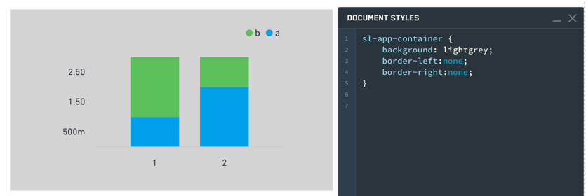
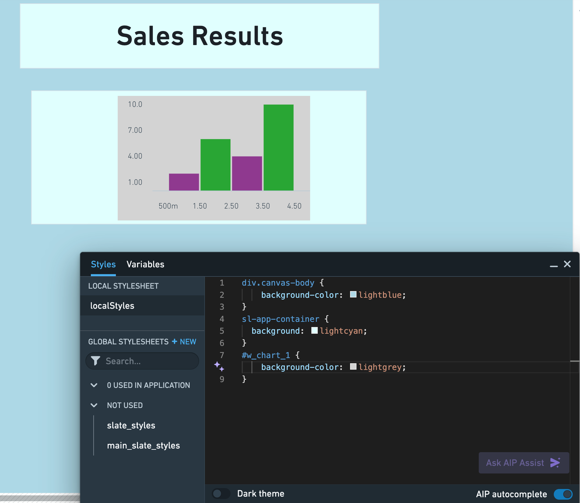
Though the sl-app-container selector and background property will correctly set the background color and borders of a container widget, use the div.canvas-body selector and background-color property in your local stylesheet to adjust the colors and borders of the Slate application canvas. In the example below, we customized the Slate canvas, container widget, and bar chart colors using the Styles editor:
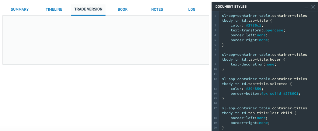
Tabbed containers
Tabs styling:
sl-app-container table.container-titles tbody tr td.tab-title {
  color: #2786c1;
  text-transform:uppercase;
  border-left:none;
  border-right:none;
}
Hover styling:
sl-app-container table.container-titles tbody tr td.tab-title:hover {text-decoration:none;}
Selection styling:
sl-app-container table.container-titles tbody tr td.tab-title.selected {
  color: #394B59;
  border-bottom:4px solid #2786C1;
}
Individual tab styling:
sl-app-container table.container-titles tbody tr td.tab-title:last-child {
  border-left:none;
  border-right:none;
}
中文翻译
容器(Container)
容器(Container)组件类别包含以下组件:
- 基础(Basic)
- 对话框(Dialog)
- 弹性布局(Flex)
- 重复(Repeating)
- 水平分割(Split horizontally)
- 垂直分割(Split vertically)
- 标签页(Tabbed)
下表提供了容器组件可用属性的详细用法说明。表格后附有若干示例。
属性(Properties)
| 属性(Attribute) | 描述(Description) | 类型(Type) | 必填(Required) | 修改方式(Changed By) |
|---|---|---|---|---|
| flex | 指定容器是否应自动对齐并分配子组件之间的空间。 | boolean | 是 | 直接编辑(Direct Edit) |
| flexOptions | 配置子组件对齐方式的选项。 | boolean | 否 | 直接编辑(Direct Edit) |
| lazyRenderingEnabled | 指定是否仅渲染可见的子组件。 | boolean | 是 | 直接编辑(Direct Edit) |
| selectedTabIndex | 当前显示标签页的索引。 | number | 是 | 直接编辑(Direct Edit) |
| tabContents | 存储每个标签页中组件的内部数组。 | {children: IWidgetModel[]}[] | 是 | 用户交互(User Interaction) |
| tabTitles | 每个标签页的标题。 | ITabTitle[] | 是 | 直接编辑(Direct Edit) |
| titlesEnabled | 指定是否在容器顶部显示可点击的标签页标题。 | boolean | 是 | 直接编辑(Direct Edit) |
| scrollingEnabled | 指定是否允许滚动溢出内容。 | boolean | 是 | 直接编辑(Direct Edit) |
| splitDirection | 指定容器的分割方向。 | number | 是 | 直接编辑(Direct Edit) |
| splitMovableInConsumerMode | 指定在消费者模式下分割容器是否可调整大小。 | boolean | 是 | 直接编辑(Direct Edit) |
| splitPanel | 内部值,指示容器是否为分割容器中的面板。 | boolean | 是 | 用户交互(User Interaction) |
| repeat | 指定内容重复的次数。 | number | 否 | 直接编辑(Direct Edit) |
| repeating | 指定容器是否为重复容器。 | boolean | 是 | 直接编辑(Direct Edit) |
| previewRepeating | 指定是否预览重复容器。 | boolean | 否 | 直接编辑(Direct Edit) |
ITabTitle
| 属性(Attribute) | 描述(Description) | 类型(Type) | 必填(Required) | 修改方式(Changed By) |
|---|---|---|---|---|
| title | 此标签页的标题。 | string | 是 | 直接编辑(Direct Edit) |
IFlexOptions
| 属性(Attribute) | 描述(Description) | 类型(Type) | 必填(Required) | 修改方式(Changed By) |
|---|---|---|---|---|
| justifyContent | 指定子组件在主轴上的布局方式。默认值:水平弹性容器为左对齐(Left),垂直弹性容器为顶部对齐(Top)。 | string | 是 | 直接编辑(Direct Edit) |
| flexDirection | 指定子组件对齐的主轴方向。默认值为水平(Horizontally)。 | string | 是 | 直接编辑(Direct Edit) |
| flexWrap | 指定子组件是否可换行显示。默认值为未选中。 | string | 是 | 直接编辑(Direct Edit) |
用法(Usage)
将组件拖入或拖出容器,即可在当前选中的标签页中添加或移除组件。tabContents 属性在原始标签页中不可见,请勿手动编辑,且该属性不会响应用户交互产生的变化。
示例(Examples)
简单容器(Simple Container)
{
  "selectedTabIndex": 0,
  "tabContents": [
    {
      "children": []
    }
  ],
  "tabTitles": [
    {
      "title": "Title"
    }
  ],
  "titlesEnabled": false
}
标签页容器(Tabbed Container)
{
  "selectedTabIndex": 1,
  "tabContents": [
    {
      "children": []
    },
    {
      "children": []
    },
    {
      "children": []
    }
  ],
  "tabTitles": [
    {
      "title": "Title 1"
    },
    {
      "title": "Title 2"
    },
    {
      "title": "Title 3"
    }
  ],
  "titlesEnabled": true
}
通过其他组件驱动选中标签页
{
  "selectedTabIndex": "{{w8.selectedValue}}",
  "tabContents": [
    {
      "children": []
    },
    {
      "children": []
    },
    {
      "children": []
    }
  ],
  "tabTitles": [
    {
      "title": "Title 1"
    },
    {
      "title": "Title 2"
    },
    {
      "title": "Title 3"
    }
  ],
  "titlesEnabled": false
}
默认值(Defaults)
{
  "selectedTabIndex": 0,
  "tabContents": [
    {
      "children": []
    }
  ],
  "tabTitles": [
    {
      "title": "Title"
    }
  ],
  "titlesEnabled": false
}
对话框组件(Dialog widget)
下表提供了对话框组件可用属性的详细用法说明。表格后附有若干示例。
属性(Properties)
| 属性(Attribute) | 描述(Description) | 类型(Type) | 必填(Required) | 修改方式(Changed By) |
|---|---|---|---|---|
| title | 对话框的标题。 | string | 否 | 直接编辑(Direct Edit) |
| canEscapeKeyClose | 按下 Escape 键时关闭对话框。 | boolean | 是 | 直接编辑(Direct Edit) |
| canOutsideClickClose | 用户点击覆盖背景时关闭对话框。 | boolean | 是 | 直接编辑(Direct Edit) |
操作(Actions)
| 操作名称(Action Name) | 描述(Description) |
|---|---|
| close | 触发此操作将关闭对话框。 |
| open | 触发此操作将打开对话框。 |
事件(Events)
| 事件名称(Event Name) | 描述(Description) |
|---|---|
| closed | 对话框完全关闭时触发此事件。 |
| opened | 对话框完全打开时触发此事件。 |
通用 CSS(Common CSS)
您可以使用以下 CSS 设置容器的背景颜色和边框:
sl-app-container {
  background: lightgrey;
  border-left:none;
  border-right:none;
}
虽然 sl-app-container 选择器和 background 属性可以正确设置容器组件的背景颜色和边框,但请使用本地样式表中的 div.canvas-body 选择器和 background-color 属性来调整 Slate 应用程序画布的颜色和边框。在以下示例中,我们使用样式编辑器(Styles editor)自定义了 Slate 画布、容器组件和柱状图的颜色:
标签页容器(Tabbed containers)
标签页样式:
sl-app-container table.container-titles tbody tr td.tab-title {
  color: #2786c1;
  text-transform:uppercase;
  border-left:none;
  border-right:none;
}
悬停样式:
sl-app-container table.container-titles tbody tr td.tab-title:hover {text-decoration:none;}
选中样式:
sl-app-container table.container-titles tbody tr td.tab-title.selected {
  color: #394B59;
  border-bottom:4px solid #2786C1;
}
单个标签页样式:
sl-app-container table.container-titles tbody tr td.tab-title:last-child {
  border-left:none;
  border-right:none;
}