Text(文本)
The Text Widget category consist of the following widgets:
Image widget
The Image widget is a simple extension of the Text widget. This widget uses the HTML image tag to create an image. You will need to upload the image to Foundry or host it in some other place that is accessible from Slate first, then set the image tag src property to be the image URL. For images hosted in Foundry, the image URL is https://<FOUNDRY_URL>/blobster/api/salt/<RID>. You can access this URL by opening the image in Foundry, right-clicking on the image, and then copying the image address. Follow the example below in your image widget configuration:
<img src="https://<FOUNDRY_URL>/blobster/api/salt/<RID>">
Card widget
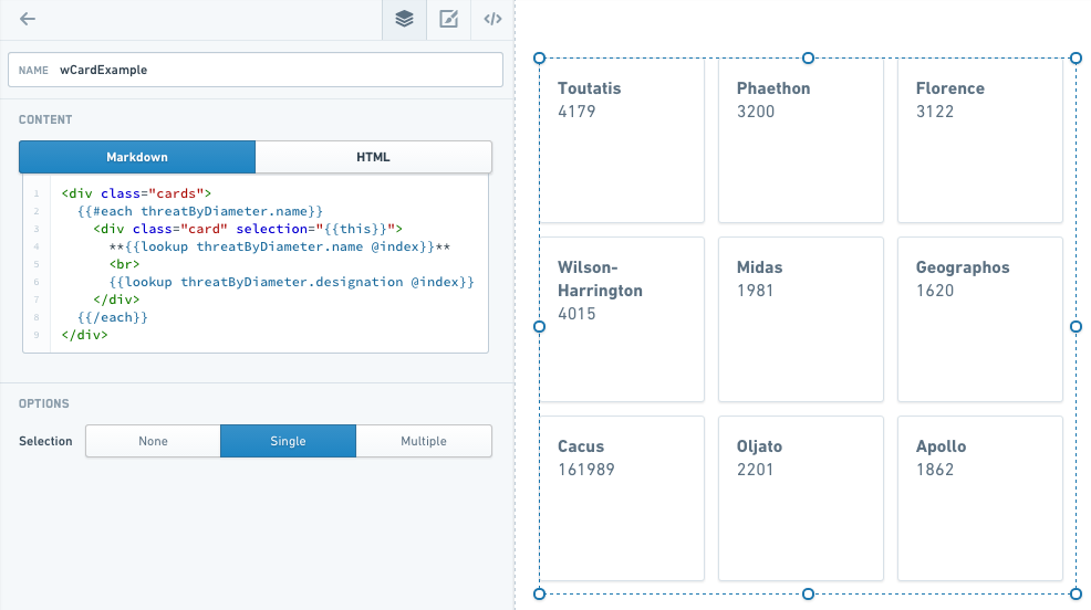
The Card widget is an extension of the Text widget. This widget uses HTML divs to create the cards, and an each statement to populate them. When you add a Card widget to your application, the widget comes prefilled with some skeleton code that you can replace to customize your cards.
- #each
: The collection is the list of objects to iterate through to create the number of cards. You will also need to uncomment the/eachat the end of the text. - item key: set to
thisin the double curly brackets to allow cards to be selected. - Header: This is the text that appears as the header for each card. To select items from a query, you can use the syntax
lookupquery.value@indexwithin the handlebars. - Content: This is the text following the header on each card. It can be pulled from a query like the header.
A completed Card widget might look like this:
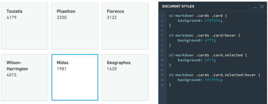
Common CSS
Below are common CSS overrides that can be applied to Card widgets.
Card color:
sl-text .cards .card {background: #f5f9fa;}
Selection color:
sl-text .cards .card.selected {background: #fff;}
Hover color:
sl-text .cards .card:hover {
   background: #fff;
}

sl-text .cards .card.selected:hover {
   background: #f5f9fa;
}
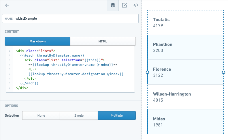
List widget
The List widget is very similar to Card, but uses divmclass=lists instead of div class=cards.
In the example below, note that with Selection set to Multiple, you can select multiple items in the list at once.
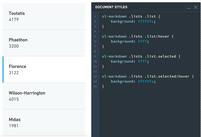
Common CSS
Below are common CSS overrides that can be applied to List widgets.
List color:
sl-text .lists .lists {background: #f5f9fa;}
Selection color:
sl-text .lists .lists.selected {background: #fff;}
Hover color:
sl-text .lists .lists:hover {
   background: #fff;
}

sl-text .lists .lists.selected:hover {
   background: #f5f9fa;
}
Text widget
The Text widget is among the most versatile Slate widgets. It is also the basis for many other widgets, such as HTML, Image, Card, and List. These widgets are simply Text widgets that start with some default code to give you the correct options.
The Text widget has two modes: Markdown mode and HTML mode. Markdown is a lightweight markup language that renders to HTML, so anything you can do in HTML mode, you can also do in Markdown mode. Markdown mode lets you take advantage of the simpler, very readable Markdown syntax. For example, to set some text as a heading (H1), simply add a # sign before it:
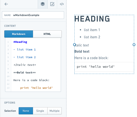
Refer to the Markdown documentation ↗ for other Markdown syntax.
Examples
Handlebars in a Text Widget
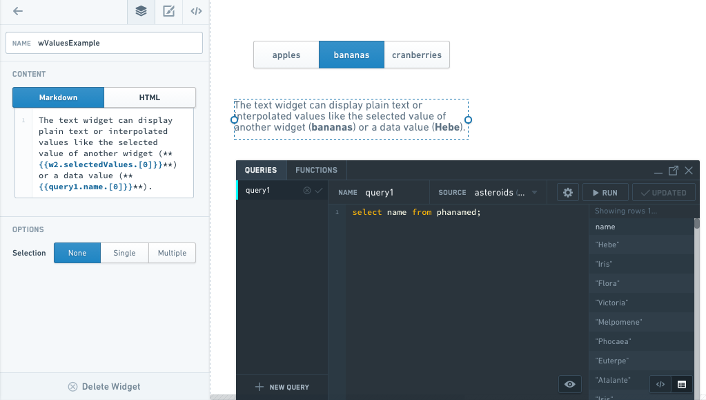
You can use Handlebars within a Text widget to display dynamic text (for example, something selected in another widget or a query).
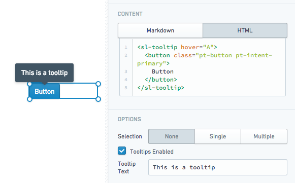
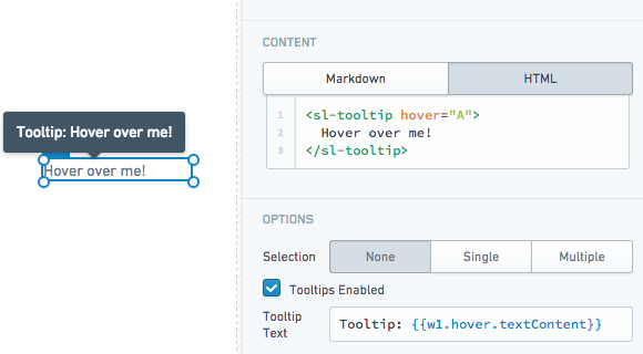
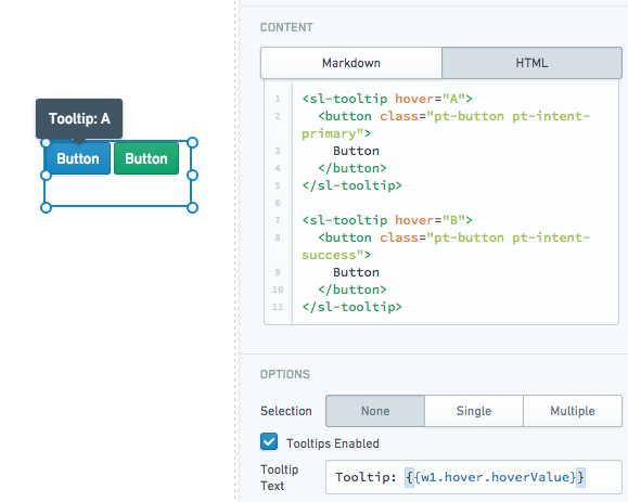
Tooltips
The Text widget supports user-defined tooltips. Tooltips will appear when users hover over sl-tooltip HTML elements within the widget content.
- Static tooltip:
- Tooltip using the inner text content of an
sl-tooltipelement:
- Multiple tooltips with custom values:
Properties
| Attribute | Description | Type | Required | Changed By |
|---|---|---|---|---|
| markupLanguage | Specifies the widget’s markup language, either Markdown ↗ or HTML. | string | Yes | Direct Edit |
| selectedValues | The selected values for all selected items if in selection mode | string[] | Yes | User Interaction |
| selectionType | Determines the type of selection - ‘none’, ‘single’ or ‘multiple’ | string | Yes | Direct Edit |
| selectionRequired | Specifies whether you can deselect all values. When enabled, this flag prevents the user from deselecting the final selected value in the widget. If the widget starts off with no values selected, prevents deselecting only after the user makes an initial selection. | boolean | Yes | Direct Edit |
| text | The content to render and display to the user | string | Yes | Direct Edit |
| tooltipText | The text displayed within the tooltips for \ |
string | Yes | Direct Edit |
| tooltipsEnabled | Specifies whether tooltips are enabled. Tooltips will be applied to the contents of a \ |
boolean | Yes | Direct Edit |
| clickEvents | A list of names of click events exposed by this text widget. | boolean | Yes | Direct Edit |
ITextHover
| Attribute | Description | Type | Required | Changed By |
|---|---|---|---|---|
| hoverValue | User defined value to be associated with the tooltip. This value is defined by adding a hover attribute to the tooltip tag. | string | Yes | User Interaction |
| textContent | Specifies the contents of the tooltip tag. | string | Yes | User Interaction |
中文翻译
文本
文本(Text)微件类别包含以下微件:
图片微件
图片(Image) 微件是文本微件的简单扩展。该微件使用 HTML 图片标签来创建图片。您需要先将图片上传至 Foundry,或托管在 Slate 可访问的其他位置,然后将图片标签的 src 属性设置为图片 URL。对于托管在 Foundry 中的图片,其 URL 格式为 https://<FOUNDRY_URL>/blobster/api/salt/<RID>。您可以通过在 Foundry 中打开图片,右键点击图片并复制图片地址来获取此 URL。请参考以下图片微件配置示例:
<img src="https://<FOUNDRY_URL>/blobster/api/salt/<RID>">
卡片微件
卡片(Card) 微件是文本微件的扩展。该微件使用 HTML div 来创建卡片,并通过 each 语句填充内容。当您向应用程序添加卡片微件时,微件会预填一些骨架代码,您可以替换这些代码来自定义卡片。
- #each <项目集合>: 集合是需要遍历的对象列表,用于创建相应数量的卡片。您还需要取消文本末尾
/each的注释。 - 项目键(item key): 在双花括号中设置为
this,以允许选择卡片。 - 标题(Header): 每张卡片上显示的标题文本。要从查询中选择项目,可以在 Handlebars 中使用
lookupquery.value@index语法。 - 内容(Content): 每张卡片上标题后的文本。可以像标题一样从查询中提取。
一个完整的卡片微件示例如下:
常用 CSS
以下是可应用于卡片微件的常用 CSS 覆盖样式。
卡片颜色:
sl-text .cards .card {background: #f5f9fa;}
选中颜色:
sl-text .cards .card.selected {background: #fff;}
悬停颜色:
sl-text .cards .card:hover {
   background: #fff;
}

sl-text .cards .card.selected:hover {
   background: #f5f9fa;
}
列表微件
列表(List) 微件与卡片非常相似,但使用 div class=lists 而非 div class=cards。
在以下示例中,请注意当选择模式(Selection) 设置为多选(Multiple) 时,您可以同时选择列表中的多个项目。
常用 CSS
以下是可应用于列表微件的常用 CSS 覆盖样式。
列表颜色:
sl-text .lists .lists {background: #f5f9fa;}
选中颜色:
sl-text .lists .lists.selected {background: #fff;}
悬停颜色:
sl-text .lists .lists:hover {
   background: #fff;
}

sl-text .lists .lists.selected:hover {
   background: #f5f9fa;
}
文本微件
文本(Text)微件是 Slate 中功能最丰富的微件之一,也是许多其他微件(如 HTML、图片、卡片和列表)的基础。这些微件本质上就是文本微件,只是预置了默认代码以提供正确的选项。
文本微件有两种模式:Markdown 模式和 HTML 模式。Markdown 是一种轻量级标记语言,可渲染为 HTML,因此您在 HTML 模式下能实现的功能,在 Markdown 模式下同样可以实现。Markdown 模式让您能够利用更简单、可读性更强的 Markdown 语法。例如,要将文本设置为标题(H1),只需在其前面添加 # 符号:
其他 Markdown 语法请参考 Markdown 文档 ↗。
示例
文本微件中的 Handlebars
您可以在文本微件中使用 Handlebars 来显示动态文本(例如,在其他微件或查询中选择的内容)。
工具提示
文本微件支持用户自定义的工具提示。当用户悬停在微件内容中的 sl-tooltip HTML 元素上时,工具提示将显示。
- 静态工具提示:
- 使用
sl-tooltip元素内部文本内容的工具提示:
- 带有自定义值的多个工具提示:
属性
| 属性 | 描述 | 类型 | 必填 | 变更方式 |
|---|---|---|---|---|
| markupLanguage | 指定微件的标记语言,可选 Markdown ↗ 或 HTML。 | string | 是 | 直接编辑 |
| selectedValues | 处于选择模式时,所有选中项目的选中值 | string[] | 是 | 用户交互 |
| selectionType | 确定选择类型 - 'none'(无)、'single'(单选)或 'multiple'(多选) | string | 是 | 直接编辑 |
| selectionRequired | 指定是否允许取消选择所有值。启用时,此标志可防止用户取消选择微件中最后一个选中的值。如果微件初始时未选择任何值,则仅在用户做出首次选择后才禁止取消选择。 | boolean | 是 | 直接编辑 |
| text | 要渲染并显示给用户的内容 | string | 是 | 直接编辑 |
| tooltipText | 在 \ |
string | 是 | 直接编辑 |
| tooltipsEnabled | 指定是否启用工具提示。工具提示将应用于 \ |
boolean | 是 | 直接编辑 |
| clickEvents | 此文本微件暴露的点击事件名称列表。 | boolean | 是 | 直接编辑 |
ITextHover
| 属性 | 描述 | 类型 | 必填 | 变更方式 |
|---|---|---|---|---|
| hoverValue | 用户定义的与工具提示关联的值。此值通过在工具提示标签中添加 hover 属性来定义。 | string | 是 | 用户交互 |
| textContent | 指定工具提示标签的内容。 | string | 是 | 用户交互 |