Visualization(可视化)
The Visualization Widget category consist of the following widgets:
Graph
The following tables offer usage details about the properties available to Graph widgets. Several examples follow the tables.
Properties
| Attribute | Description | Type | Required | Changed By |
|---|---|---|---|---|
| defaultEdgeIcon | Default image URL or Blueprint icon for edges. | string | No | Direct Edit |
| defaultNodeIcon | Default image URL or Blueprint icon for nodes. | string | No | Direct Edit |
| directedEdgesEnabled | Determines whether edges will have an arrow at the end pointing to the target node. | boolean | No | Direct Edit |
| edgeArrowSize | Size of the arrow in a directed edge in pixels. | boolean | No | Direct Edit |
| edgeIconOffset | Edge’s icon offset from the center of the edge. The direction of the offset depends on whether or not the edge labels are horizontal | number | No | Direct Edit |
| edgeIconSize | Width and height of the edge icon in pixels. | number | No | Direct Edit |
| edgeLabelHorizontal | Determines whether edge labels stay horizontal instead of being parallel to the edge. | boolean | No | Direct Edit |
| edgeLabelOffset | Edge’s label offset from the center of the edge. The direction of the offset depends on whether or not the edge labels are horizontal | number | No | Direct Edit |
| edgeLength | The edge length value supplied to Flow and Force Directed layouts. | number | No | Direct Edit |
| edges | Values for the edges displayed in the graph. | IEdges | No | Direct Edit |
| hideLabelsScale | The zoom level at which the labels are hidden. Use this to hide labels that are too small to read. | number | No | Direct Edit |
| nodeColorScaleRange | An array of two or more colors used to create a linear gradient to color the nodes. Example: with node.colorScaleValues = [0, 5, 10] and a color range array of [“red”, “blue”] the resulting colors will be: red, purple, blue. Colors can be specified either as hex (e.g. “#FF0000”) or as CSS color names (e.g. “red”). If unspecified or fewer than 2 colors, the default color range used is composed of Blueprint colors @green4, @gold4, and @red4 ([“#15B371”, “#F2B824”, “#F55656”]) | string[] | No | Direct Edit |
| nodeLabelPosition | The position of a label relative to the node circle. | string | No | Direct Edit |
| layout | Type of layout the graph will use to arrange the nodes. “Force Directed”: The graph is laid out using a method that spreads out the nodes.“Flow Up/Down/Left/Right”: The nodes are arranged so that the edges generally point in a given direction. “Manual” Allows the user to drag the nodes to new positions and persists the locations upon save. Dragged node positions in other layouts won’t be saved. | string | No | Direct Edit |
| nodeDiameter | The diameter of the node circle in pixels. | number | No | Direct Edit |
| nodeLabelOffset | The label’s offset from the center of the node. The direction of the offset is determined by Label Position | number | No | Direct Edit |
| nodeMargin | The minimum distance between nodes, used by Flow and Force Directed layouts. | number | No | Direct Edit |
| nodeIconSize | The width and height of the node icon. | number | No | Direct Edit |
| nodes | Values for the nodes displayed in the graph. | INodes | Yes | Direct Edit |
| nodeSelectorDiameter | The diameter of the circle indicating that the node is selected. | number | No | Direct Edit |
| selectedNodeIds | Unique identifiers for the current user selected nodes. | string[] | No | User Interaction |
| zoomScaleRange | Sets the allowed range of zoom of the graph. | number | No | Direct Edit |
IEdges
| Attribute | Description | Type | Required | Changed By |
|---|---|---|---|---|
| cssClasses | The CSS class names for edges used to apply CSS styles. | string[] | No | Direct Edit |
| icons | Image URLs or Blueprint icons for the edges. | string[] | No | Direct Edit |
| labels | Labels associated with the edges. | string[] | No | Direct Edit |
| sourceNodeIds | IDs of the source nodes needed to create the edges. | number[] | Yes | Direct Edit |
| targetNodeIds | IDs of the target nodes needed to create the edges. | number[] | Yes | Direct Edit |
INodes
| Attribute | Description | Type | Required | Changed By |
|---|---|---|---|---|
| colorScaleValues | The numeric value used to color a node, interpolated using colors in Color Scale Range | number[] | No | Direct Edit |
| cssClasses | The CSS class names for nodes used to apply CSS styles. | string[] | No | Direct Edit |
| icons | Image URLs or Blueprint icons for the nodes. | string[] | No | Direct Edit |
| ids | Unique identifiers for the nodes. | string[] | Yes | Direct Edit |
| labels | Labels associated with the nodes. | string[] | No | Direct Edit |
| xPositions | In Manual layout, this specifies the X positions of the nodes. Nodes with missing values will be arranged in a grid. | number[] | Yes | User Interaction |
| yPositions | In Manual layout, this specifies the Y positions of the nodes. Nodes with missing values will be arranged in a grid. | number[] | Yes | User Interaction |
Examples
Dynamic Graph
{
  "camera": {
    "ratio": null,
    "x": null,
    "y": null
  },
  "edges": {
    "sourceNodeIds": "{{graph.sourceNodeIds}}",
    "targetNodeIds": "{{graph.targetNodeIds}}"
  },
  "nodes": {
    "iconUrls": "{{graph.iconUrls}}",
    "ids": "{{graph.ids}}",
    "labels": "{{graph.ids}}",
    "xPositions": "{{graph.xPositions}}",
    "yPositions": "{{graph.yPositions}}"
  },
  "selectedNodeIds": [
    "n18"
  ]
}
Static Graph
{
  "camera": {
    "ratio": null,
    "x": null,
    "y": null
  },
  "defaultIconUrl": "resources/map-people.svg",
  "edges": {
    "ids": [
      "e1",
      "e2",
      "e3",
      "e4",
      "e5"
    ],
    "labels": [
      "e1",
      "e2",
      "e3",
      "e4",
      "e5"
    ],
    "sourceNodeIds": [
      "n1",
      "n2",
      "n3",
      "n4",
      "n5"
    ],
    "targetNodeIds": [
      "n2",
      "n3",
      "n4",
      "n5",
      "n1"
    ]
  },
  "layout": {
    "type": "layered"
  },
  "nodes": {
    "ids": [
      "n1",
      "n2",
      "n3",
      "n4",
      "n5"
    ],
    "labels": [
      "n1",
      "n2",
      "n3",
      "n4",
      "n5"
    ],
    "xPositions": [
      100,
      30.9,
      -80.9,
      -80.9,
      30.9
    ],
    "yPositions": [
      0,
      95.1,
      58.78,
      -58.78,
      -95.1
    ]
  },
  "selectedNodeIds": [
    "n1"
  ]
}
Defaults
{
  "camera": {
    "ratio": null,
    "x": null,
    "y": null
  },
  "edges": {
    "sourceNodeIds": [],
    "targetNodeIds": []
  },
  "nodes": {
    "ids": [],
    "xPositions": [],
    "yPositions": []
  },
  "selectedNodeIds": []
}
Image Gallery
The following tables offer usage details about the properties available to Image Gallery widgets.
Properties
| Attribute | Description | Type | Required | Changed By |
|---|---|---|---|---|
| imageUrls | The images for this gallery. | string[] | Yes | Direct Edit |
| captions | The captions for each image. | string[] | No | Direct Edit |
Map
Slate’s Map widget is backed by Leaflet ↗.
The Map is composed of layers: a base layer (also called a tile layer; this is the background map imagery), and some number of overlay layers (also called feature layers; this is the data you are interested in). The Map widget supports both raster and vector tiles for feature layers.
See the Mapbox documentation ↗ for a helpful introduction to web map technology. Slate uses Mapbox as the source for its base map imagery.
Terminology
- Map tile: the base layer of the Map widget, these tiles are simply images. They do not contain data. You can think of map tiles as the “background” of the map. Map tiles are configured in the Misc tab and apply to the entire Map widget, rather than just a single layer. Only one kind of map tile can be displayed at a time.
- Feature: a point or shape drawn on top of a map, associated with some kind of data.
- Vector: an alternative method of representing an image. A raster image describes the image pixel by pixel; essentially, as a grid of colored pixels. A vector image, by contrast, describes lines between points. This means that vector images can be displayed at different sizes cleanly.
- Vector tile: contains shape data as vectors.
- Tile server: dynamically serves shape data as tiles.
- Map tile source: serves base tiles for a map. It is technically also a tile server.
Layer types
Slate has the following types of overlay layers:
Location
Location layers simply contain points (Leaflet markers ↗), identified by latitude/longitude pairs. You can configure the Map widget to display these points as circles or icons.
Heat map and heat grid
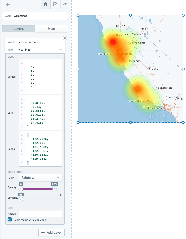
Heat map and heat grid layers also deal with point data, but rather than simply displaying the points on a map, they display an overlay with computations about the distribution of those points. Heat maps show the density of the points as a colored gradient, whereas heat grid groups points into buckets and displays the buckets as discrete color cells.
Shape
Instead of just individual points, shape and vector layers can also have data in the form of polygons — information stored as a series of points and the lines between them. Shape layers provide these polygons in GeoJSON ↗ format. GeoJSON files can be served directly from your Slate server.
GeoJSON features are stored as JSON and translated into SVG (image) files. These images are all loaded at once when the Map widget is first loaded.
Vector
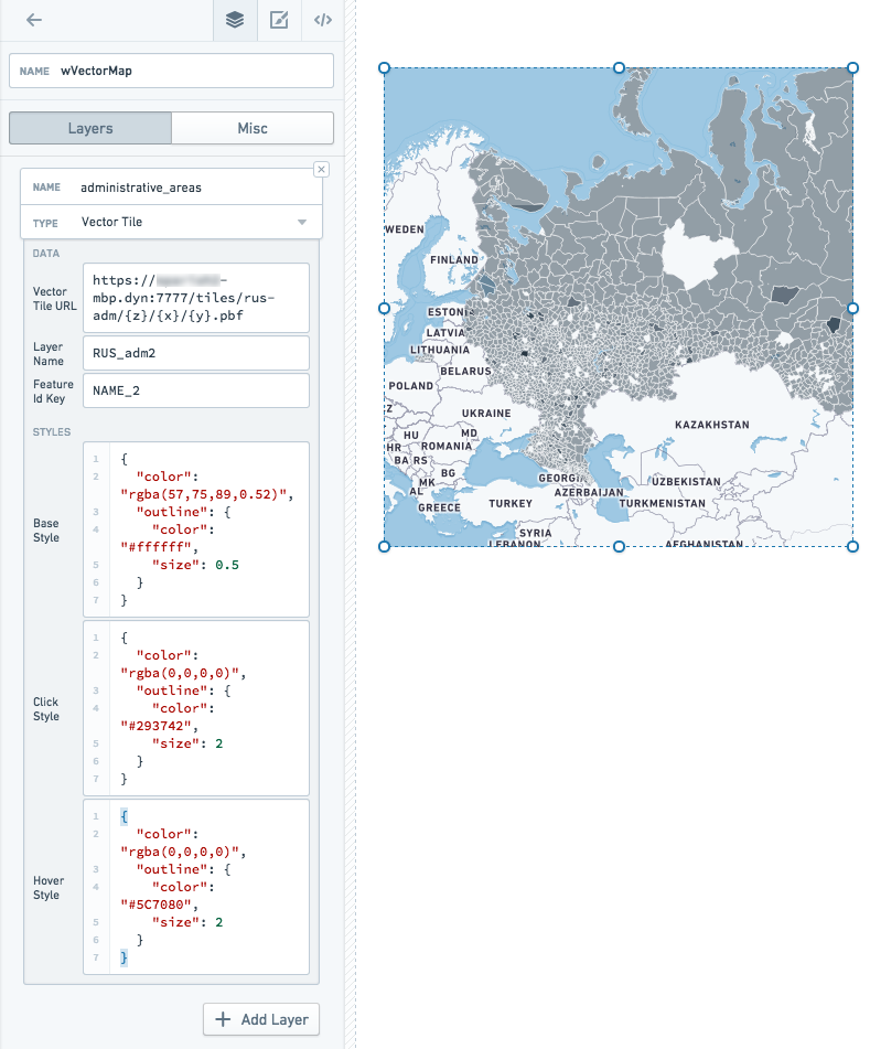
Vector layers provide shape data in vector tiles. You must have an external tile server running to serve vector tiles. Vector tiles are loaded dynamically (only as they come into view on the map). Vector tiles also draw features directly on the canvas, rather than rendering them as images, so a vector layer can have many more features than a shape layer
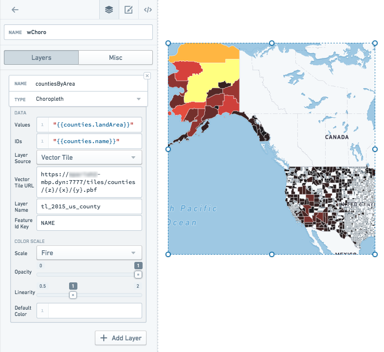
Choropleth
Choropleth layers also deal with polygon data, but they add an additional value to each feature, and project these values onto a color scale. Each feature, then, is displayed on the map with a color corresponding to that value. This serves as a visualization of some specific statistic.
For example, you might have a map with states colored by population density, or zip codes colored by social vulnerability index.
Raven
Contact your Palantir representative if you need to use a Raven map in your Slate applications.
Base tiles
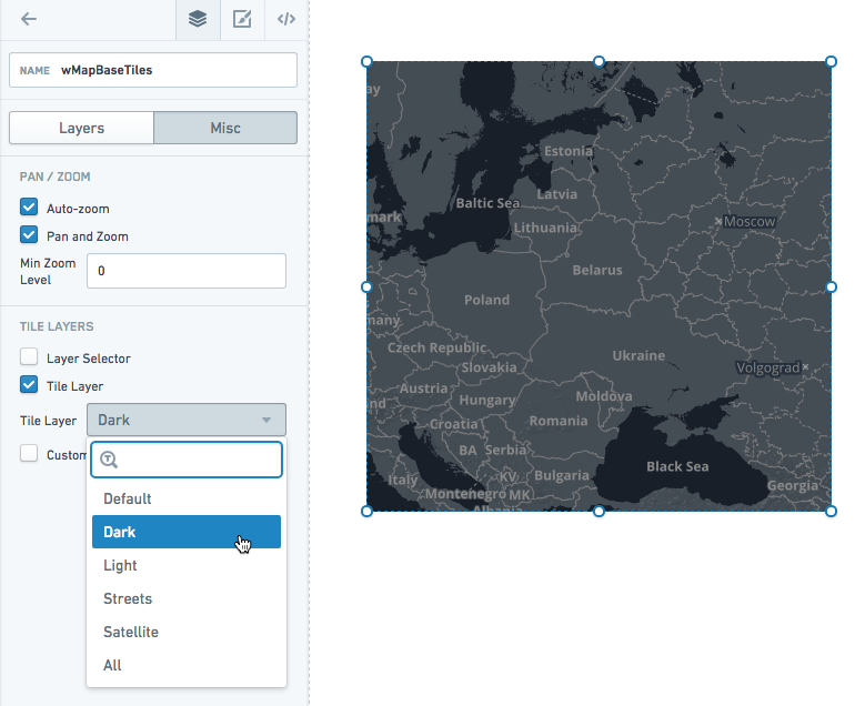
The Map widget comes with several options for the base tile layer. The options include a dark theme, a light theme, a satellite theme, a street map theme, and our default theme. There is also an All option, which lets you switch between themes on the map directly using the Layer Selector.
In the Misc tab of the Property Editor, choose from the Tile Layer dropdown:
Data scale on the map
Shape layers (GeoJSON) support the lowest data scale. At about 1,000 features, map performance slows down noticeably. For data larger than that, you should use vector layers instead. You may also try simplifying the geometry in your GeoJSON to increase performance.
Location layers slow down at about 5,000-10,000 points.
Disabling interactivity
You can disable panning and zooming if you want to display a static map in your application. You can also remove the base layer if you simply want to show feature data (and not the base map tiles).
Examples
Location map layer
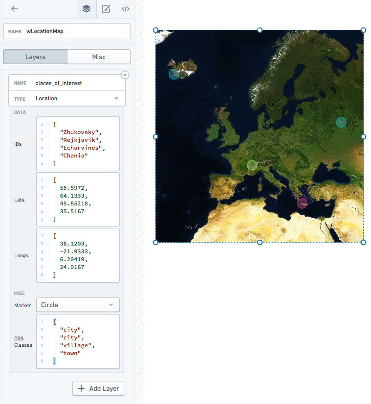
Includes custom styles:
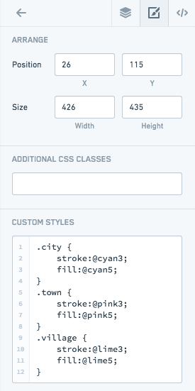
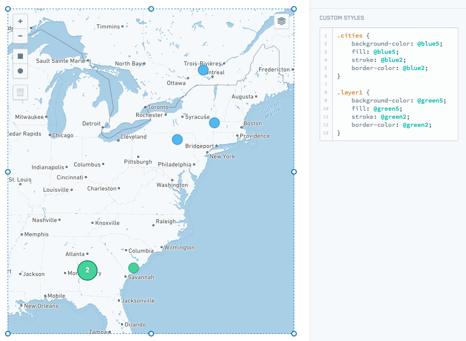
You can also style all markers/clusters in a layer using the layer name or .layer${layerIndex}. Only layer names that are valid CSS classes will be added:
Choropleth map layer
Vector map layer
Heat map layer
Properties
| Attribute | Description | Type | Required | Changed By |
|---|---|---|---|---|
| autoZoom | Specifies if the map will automatically zoom based on data in the map. | boolean | Yes | Direct Edit |
| bounds | Visible area based on users zooming and panning. See IBounds below. | IBounds | Yes | User Interaction or Direct Edit |
| crs | Coordinate reference system to use: EPSG3395 (Elliptical Mercator projection), EPSG3857 (Spherical Mercator projection) or EPSG4326 (Equirectangular projection). | string | No | Direct Edit |
| fixedBoundsEnabled | Specifies if the bounds of the map can be changed by zooming and dragging. | boolean | No | Direct Edit |
| zoomControlEnabled | Specifies whether the map will have a clickable zoom control displayed in the top left corner. | boolean | No | Direct Edit |
| layerSelectorEnabled | Specifies whether the map will have the layer control menu displayed in the top right corner. | boolean | No | Direct Edit |
| layers | See ILayerModel. | ILayerModel[] | No | Direct Edit |
| maxBounds | Maximum visible area based available to users when zooming/panning. | IBounds | No | Direct Edit |
| minMaxZoomLevel | Sets the allowed range of zoom of the map. Zoom levels range from 0, representing the entire earth, to 18, about the scale of individual houses. | number | No | Direct Edit |
| zoomLevel | The current zoom level of the map. | number | Yes | User Interaction |
| selection | The selection object, which contains the selection shapes and selected IDs. | IMapSelection | Yes | User Interaction |
| tileLayerEnabled | Specifies whether the tile layer (e.g. Street Map) is enabled. | boolean | Yes | Direct Edit |
| tileUrlsEnabled | Enables the use of custom tile URLs for the tile layer. You must input the tile layer URLs and, optionally, their labels below. You must enable tile layers (above) for any custom tile layer to show. If you enable the tile layer selector, the tile URLs will be added to the selector. | boolean | Yes | Direct Edit |
| tileLayer | The base tile layer(s). | string | Yes | Direct Edit |
| tileUrlLabels | A JSON array of names for each of your custom tile layer URLs. If you provide no labels, default names such as “Custom”, “Custom (1)”, etc. will be used. | string | No | Direct Edit |
| tileUrls | A JSON array of custom tile layer URLs. Tile layer URLs should be in the standard form of “http:/{s}.example.com/blah/{z}/{x}/{y}.png”. Where {s} is an optional subdomain, {z} is the zoom level, and {x} and {y} are tile coordinates. This template URL will be used by the map to look up each tile image. | string | No | Direct Edit |
| shapeSelectionEnabled | Enables drag selection controls on the map. Hold down CMD or CTRL to use additive selection.Drag selection supports two modes: Area selection will create a persistent shape and will be available on the template as an array named selection.areas. Data selection further allows the user to directly select location markers, updating the value of selection.ids. | boolean | Yes | Direct Edit |
| selectionType | The mode of selection. Area selection will create a persistent shape and will be available on the template as an array named selection.areas. Data selection further allows the user to directly select location markers, updating the value of selection.ids. | string | No | Direct Edit |
IBaseLayerOptions
| Attribute | Description | Type | Required | Changed By |
|---|---|---|---|---|
| name | The name of the layer to be displayed in the layer selector. Location and shape layers will default to CSS selectors if no name is provided. Raven layers provide their own names, so using this field will override all of the layer names provided by this Raven layer. | string | No | Direct Edit |
IBounds
| Attribute | Description | Type | Required | Changed By |
|---|---|---|---|---|
| northEast | The northeast point of a rectangle map area. | ILatLng | Yes | User Interaction or Direct Edit |
| southWest | The southwest point of a rectangle map area. | ILatLng | Yes | User Interaction or Direct Edit |
IChoroplethLayerOptions
| Attribute | Description | Type | Required | Changed By |
|---|---|---|---|---|
| colorScaleOptions | If present, will use the specified custom color scale to color the elements in the choropleth. | IColorScaleOptions | No | Direct Edit |
| ids | The data values that map back to the “ids” in the geoJson file. Also, the IDs returned by selection.ids based on user selection. | string[] | Yes | Direct Edit |
| layerSource | The type of data that will be used to render features. The source can be either a GeoJSON file or a server that serves vector tiles. | string | Yes | Direct Edit |
| shapeGeoJson | The raw GeoJSON for the layer. Recommended value is a templatized function or query that returns a valid GeoJSON ↗ object. This value should only be set when “Shape Source” is set to “Raw”. | any | No | Direct Edit |
| shapeSource | Indicates how the shape GeoJSON is retrieved. Use “Server Resource” to point to a static GeoJSON shapefileon the Slate server. Use “Raw” to specify the GeoJSON directly. Due to Slate application size limitations, large GeoJSONs should be retrieved as a “Server Resource” or from a query. | any | No | Direct Edit |
| shapeUrl | The URL for the shape file. Example: “resources/map/us-states.geojson”. This value should only be set when “Shape Source” is set to “Server Resource”. | string | No | Direct Edit |
| values | The values of the data points. | number[] | Yes | Direct Edit |
| vectorTileOptions | The options for configuring a vector tile layer. Only available if layerSource is set to “Vector Tile” | IVectorTileOptions | Yes | Direct Edit |
IColorScaleOptions
| Attribute | Description | Type | Required | Changed By |
|---|---|---|---|---|
| colorScaleTypes | Color scales represent the values of data using interpolated colors. | string | Yes | Direct Edit |
| colors | An array of two or more colors used to create a linear gradient to color the elements. For example, given elements with values [0, 25, 100] and a color array of [“red”, “yellow”, “green”], the resulting colors will be: red, orange, green. Colors can be specified both as hex (e.g. “#FF0000”) or CSS color names (e.g. “red”) | string | Yes | Direct Edit |
| defaultColor | The default color to be used for elements whose value is null. Can be a hex color (e.g. “#FF0000”) or a CSS color name (e.g. “red”) | string | Yes | Direct Edit |
| opacity | The range of opacity for the color scale. A value of 0 is completely transparent, and a value of 1 is completely opaque. | string | Yes | Direct Edit |
| linearity | Adjust the linearity of the color scale. A low “linearity” value will show more color differentiation in the lower end of the scale. A value of 1 is a perfectly linear scale. | string | Yes | Direct Edit |
IHeatgridLayerOptions
| Attribute | Description | Type | Required | Changed By |
|---|---|---|---|---|
| latitudes | The latitude values of the data points. | number[] | Yes | Direct Edit |
| longitudes | The longitude values of the data points. | number[] | Yes | Direct Edit |
| values | The values of the data points. | number[] | Yes | Direct Edit |
| feature | Specify how to draw each grid cell. | string | No | Direct Edit |
| colorScale | The color scale used to draw the cells of the heat grid. | number | No | Direct Edit |
| granularity | Size of the heatgrid cells. | number | No | Direct Edit |
| opacityRange | The minimum and maximum opacity of the color scale | number[] | No | Direct Edit |
| colorScaleLinearity | Determines how linear the color scale is. 1.0 is perfectly linear, 0.5 is square root. | number[] | No | Direct Edit |
| radiusScale | Determines the range of the radius of the circle features. Setting the min/max of the range to the same value means all circles will be the same size. | number[] | No | Direct Edit |
IHeatmapLayerOptions
| Attribute | Description | Type | Required | Changed By |
|---|---|---|---|---|
| latitudes | The latitude values of the data points. | number[] | Yes | Direct Edit |
| longitudes | The longitude values of the data points. | number[] | Yes | Direct Edit |
| radius | The radius of each data point. When radius is scaled with map zoom, radius is measured in the scale of the map (default value: 2); otherwise radius is measured in pixels (default value: 20). | number | No | Direct Edit |
| scaleRadiusEnabled | Specifies whether the radius of the data points should be scaled according to the zoom level of the map (default value: true). | boolean | No | Direct Edit |
| values | The values of the data points. | number[] | Yes | Direct Edit |
ILatLng
| Attribute | Description | Type | Required | Changed By |
|---|---|---|---|---|
| latitude | A latitude value of a point on the map. | number | Yes | User Interaction or Direct Edit |
| longitude | A longitude value of a point on the map. | number | Yes | User Interaction or Direct Edit |
ILayerModel
| Attribute | Description | Type | Required | Changed By |
|---|---|---|---|---|
| options | The options for a layer. See IChoroplethLayerOptions, IHeatmapLayerOptions, ILocationLayerOptions, IShapeLayerOptions and IRavenLayerOptions for details | IChoroplethLayerOptions | IHeatmapLayerOptions | ILocationLayerOptions |
| type | The type of the map layer: choropleth, location, heatmap, shape or raven. | string | Yes | Direct Edit |
ILocationLayerOptions
| Attribute | Description | Type | Required | Changed By |
|---|---|---|---|---|
| clustering | When enabled, will cluster the points on the map. | boolean | Yes | Direct Edit |
| cssClasses | The CSS class names for markers used to overwrite default marker settings via CSS editor. | string[] | No | Direct Edit |
| ids | The IDs returned by selection.ids based on user selection. | string[] | Yes | Direct Edit |
| latitudes | The latitude values of the data points. | number[] | Yes | Direct Edit |
| longitudes | The longitude values of the data points. | number[] | Yes | Direct Edit |
| weights | The weight of the data points, aggregated for the cluster label (default value: 1). | number[] | No | Direct Edit |
| markerType | The type of marker, “circle” or “icon”. | string | No | Direct Edit |
| markerRadius | The radius of the circle marker | number | No | Direct Edit |
IMapSelection
| Attribute | Description | Type | Required | Changed By |
|---|---|---|---|---|
| areas | This array contains the selection shapes that the user creates when drag selection is enabled. The supported shapes are ‘rectangle’ which has latitude/longitude bounds, and ‘circle’ which has a latitude/longitude center and radius (in meters) | Array\<IRectangleShape | ICircleShape> | No |
| ids | This array contains the IDs of location markers that are selected on the map. | string[] | Yes | User Interaction |
IRectangleShape
| Attribute | Description | Type | Required | Changed By |
|---|---|---|---|---|
| bounds | The latitude/longitude bounds of the shape. | IBounds | Yes | User Interaction |
| type | The string ‘rectangle’ | string | Yes | User Interaction |
ICircleShape
| Attribute | Description | Type | Required | Changed By |
|---|---|---|---|---|
| bounds | The latitude/longitude bounds of the shape. The bounds is defined as the smallest rectangle that entirely contains the circle. | IBounds | Yes | User Interaction |
| center | The latitude/longitude center of the circle. | ILatLng | Yes | User Interaction |
| radius | The radius (in meters) of the circle. | number | Yes | User Interaction |
| type | The string ‘circle’ | string | Yes | User Interaction |
IRavenLayerFilterOptions
| Attribute | Description | Type | Required | Changed By |
|---|---|---|---|---|
| propertyName | The name of a property to filter on. Example: “City” | string | Yes | Direct Edit |
| propertyValue | The value of a property to filter on. Example: “Medford” | string | Yes | Direct Edit |
IRavenLayerOptions
| Attribute | Description | Type | Required | Changed By |
|---|---|---|---|---|
| filter | If present, will filter the Raven features based on metadata in Raven | IRavenLayerFilterOptions | No | Direct Edit |
| serverUri | The URI to the Raven server. This domain must also be explicitly allowed in the content security policy for scripts and images in slate.yml. | string | Yes | Direct Edit |
IShapeLayerOptions
| Attribute | Description | Type | Required | Changed By |
|---|---|---|---|---|
| cssClasses | The CSS class names for geojson shapes and markers used to overwrite default settings via CSS editor. | string[] | No | Direct Edit |
| ids | The data values that map back to the “ids” in the geoJson file. These are mainly used to assign CSS classes to individual geoJson IDs. | string[] | Yes | Direct Edit |
| markerType | The type of marker, “circle” or “icon”. | string | No | Direct Edit |
| markerRadius | The radius of the circle marker | number | No | Direct Edit |
| shapeGeoJson | The raw GeoJSON for the layer. Recommended value is a templatized function or query that returns a valid GeoJSON ↗ object. This value should only be set when “Shape Source” is set to “Raw”. | any | No | Direct Edit |
| shapeSource | Indicates how the shape GeoJSON is retrieved. Use “Server Resource” to point to a static GeoJSON shapefileon the Slate server. Use “Raw” to specify the GeoJSON directly. Due to Slate application size limitations, large GeoJSONs should be retrieved as a “Server Resource” or from a query. | any | No | Direct Edit |
| shapeUrl | The URL for the shape file. Example: “resources/map/us-states.geojson”. This value should only be set when “Shape Source” is set to “Server Resource”. | string | No | Direct Edit |
IVectorTileLayerOptions
| Attribute | Description | Type | Required | Changed By |
|---|---|---|---|---|
| baseStyle | Options for styling the vector tile features. | IVectorTileStyleOptions | No | Direct Edit |
| clickStyle | Options for styling the vector tile features when selected. | IVectorTileStyleOptions | No | Direct Edit |
| hoverStyle | Options for styling the vector tile features when hovered. | IVectorTileStyleOptions | No | Direct Edit |
| vectorTileOptions | Options for configuring the vector tile server | IVectorTileOptions | Yes | Direct Edit |
IVectorTileOptions
| Attribute | Description | Type | Required | Changed By |
|---|---|---|---|---|
| featureIdKey | The name of property on the features to be used as the id. Must be unique. Defaults to the string “id”. | string | No | Direct Edit |
| layerName | String name of the layer returned by the server. Vector Tile Servers can serve many layers per tile, so this is used to pick which of those layers to render. | string | Yes | Direct Edit |
| vectorTileUrl | The URL for the vector tile server that serves the tiles to be displayed. Tile should be retrieved by their x, y, and zoom (z) coordinates, so urls should contain {x}, {y}, and {z} as part of their structure. | string | Yes | Direct Edit |
| featureIdWhitelist | List of strings or regular expressions for filtering tile features. If this is a non-empty array, features whose featureIdKey does not match any of the strings or regular expressions will not be shown. | string[] | No | Direct Edit |
IVectorTileStyleOptions
| Attribute | Description | Type | Required | Changed By |
|---|---|---|---|---|
| color | CSS string representing the color to style the feature. Works on all feature types. Also used for outline color in the “outline” object. | string | No | Direct Edit |
| outline | JSON object representing the styles for the outline of a polygon feature. Accepts “color” and “size” attributes | object | No | Direct Edit |
| radius | Size of the radius for point features. | number | No | Direct Edit |
| size | Line thickness of a line feature. Also used for outline thickness in the “outline” object. | number | No | Direct Edit |
Table
The following tables offer usage details about the properties available to Table widgets. Several examples follow the tables.
Properties
| Attribute | Description | Type | Required | Changed By |
|---|---|---|---|---|
| bodyTooltip | The text displayed in the table body tooltips. If bodyTooltip is omitted or null then no tooltip will be displayed. Supports HTML. | string | No | Direct Edit |
| columnData | Data to display in the table. This is commonly just the query associated with the table. See examples below. | {columnId: any[]} (Note: the columnId is a string) | Yes | Direct Edit |
| columnOptions | Options that will be applied to specific columns. See IColumnOption below. | {columnId: IColumnOption} (Note: the columnId is a string) | Yes | Direct Edit |
| columnOrder | Indicates the order and subset of columns to be displayed. This should be an array of “columnId”s from columnData. If left as a blank array, the order may be non-deterministic. | string[] | Yes | Direct Edit |
| gridOptions | See IGridOptions below. | IGridOptions | Yes | Direct Edit |
| selectedRowKeys | The selectedIdentityColumnId value for all user selected rows(s). | any[] | Yes | User Interaction |
| selectionIdentityColumnId | The columnId from columnData used to determine the unique identity, or key, of a row. For a given row, the value in the “selectionIdentityColumnId” column provides the unique key. When a row is selected, the unique key is placed in “selectedRowKeys”. | string | No | Direct Edit |
| serverEnabled | Enables server-side paging and sorting. This is set to false by default. If left as false, table sorting and paging is performed client-side, resulting in fewer calls to the server and faster performance. However, because this requires all data to be loaded upfront, tables with client-side sorting require more memory. If set to true, the query must use the paging and/or sorting options to modify the returned query results. For example, if pageSize is 10, at most 10 rows can be returned. | boolean | Yes | Direct Edit |
| tooltipPosition | Specifies the position where tooltips will be rendered. | Blueprint.Position | No | Direct Edit |
| tooltipsEnabled | Specifies whether tooltips are enabled or not. | boolean | Yes | Direct Edit |
| headerTooltip | The text displayed in the column header tooltips. If headerTooltip is omitted or null then no tooltip will be displayed. Supports HTML. | string | No | Direct Edit |
| transpose | Indicates if the table’s rows and columns should be transposed. | boolean | No | Direct Edit |
| clickEvents | A list of names of click events exposed by this table widget. | boolean | Yes | Direct Edit |
IColumnOption
| Attribute | Description | Type | Required | Changed By |
|---|---|---|---|---|
| horizontalAlignment | Horizontal alignment for the row: left, center, or right. | string | No | Direct Edit |
| name | The display name for the column. | string | No | Direct Edit |
| width | Override for the column width. | number | No | Direct Edit |
IGridOptions
| Attribute | Description | Type | Required | Changed By |
|---|---|---|---|---|
| enableSelection | Indicates if the user can select rows on the table. | boolean | No | Direct Edit |
| enableSorting | Indicates if the user can sort the data in the table. (Values for sortOptions should also be set.) | boolean | No | Direct Edit |
| pagingOptions | See ITablePagingOptions below. | ITablePagingOptions | No | Direct Edit |
| selectionOptions | See ISelectionOptions below (enableSelection must also be set to true). | ISelectionOptions | No | Direct Edit |
| sortOptions | See ISortOptions below (enableSorting must also be set to true). | ISortOptions | No | User Interaction |
ISelectionOptions
| Attribute | Description | Type | Required | Changed By |
|---|---|---|---|---|
| checkbox | Indicates if a checkbox column should be displayed as a visual cue for row selection. | boolean | No | Direct Edit |
| multiSelect | Indicates if multiple rows can be selected. | boolean | No | Direct Edit |
| selectionRequired | Specifies whether you can deselect all values. When enabled, this flag prevents the user from deselecting the final selected value in the widget. If the widget starts off with no values selected, prevents deselecting only after the user makes an initial selection. | boolean | No | Direct Edit |
ISortOptions
| Attribute | Description | Type | Required | Changed By |
|---|---|---|---|---|
| columnId | The data field by which the table is currently sorted. | string | Yes | User Interaction |
| isAscending | The direction of the current sort. | boolean | Yes | User Interaction |
ITableHover
| Attribute | Description | Type | Required | Changed By |
|---|---|---|---|---|
| columnIndex | The column number of the hovered cell. Enumeration begins at 0. | number | Yes | User Interaction |
| displayValue | The display value of the hovered cell. | string | Yes | User Interaction |
| isHeader | Specifies whether the current cell is a header or not. | string | Yes | User Interaction |
ITablePagingOptions
| Attribute | Description | Type | Required | Changed By |
|---|---|---|---|---|
| currentOffset | Current visible page (indexed from 0). | number | Yes | User Interaction |
| pageSize | Results displayed per page. | number | Yes | Direct Edit |
| totalServerItems | Total number of results available (used to calculate number of pages necessary). | number | No | Direct Edit |
Examples
Dynamic Table
{
  "columnData": "{{query1}}",
  "columnOptions": {
    "id": {
      "name": "ID",
      "width": 50
    },
    "name": {
      "name": "Full Name"
    },
    "address": {
      "name": "Home Address"
    },
    "phone_number": {
      "name": "Phone Number"
    },
    "score": {
      "name": "Score",
      "horizontalAlignment": "right"
    }
  },
  "columnOrder": [
    "id",
    "name",
    "address",
    "phone_number",
    "score"
  ],
  "gridOptions": {
    "enableSelection": true,
    "enableSorting": true,
    "pagingOptions": {
      "currentOffset": 0,
      "pageSize": 10,
      "totalServerItems": 100
    },
    "selectionOptions": {
      "checkbox": false,
      "multiSelect": true
    },
    "sortOptions": {
      "columnId": "score",
      "isAscending": false
    }
  },
  "selectedRowKeys": [],
  "selectionIdentityColumnId": "id",
  "serverEnabled": true,
  "tooltipsEnabled": false
}
Static Table
{
  "columnData": {
    "staticOptions": [
      "option1",
      "option2",
      "option3"
    ]
  },
  "columnOptions": {},
  "columnOrder": [],
  "gridOptions": {
    "enableSelection": true,
    "selectionOptions": {
      "checkbox": true,
      "multiSelect": false
    }
  },
  "selectedRowKeys": [],
  "selectionIdentityColumnId": "staticOptions",
  "serverEnabled": false,
  "tooltipsEnabled": false
}
Defaults
{
  "columnOptions": {},
  "columnOrder": [],
  "gridOptions": {},
  "selectedRowKeys": [],
  "selectionIdentityColumnId": "Metric",
  "serverEnabled": false,
  "tooltipsEnabled": false
}
Tutorial: Add a table widget
Say that you want to add a Table widget to display flight data. Select the Widget button in the upper left corner, then choose Visualization > Table to add a Table widget to your Slate application.
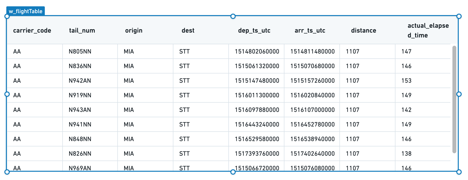
Rename the Table widget to something easier to identify. Select the name of the widget in the property editor and change it to w_flightTable.
Configure the table to use a q_allFlights query by entering "{{q_allFlights}}" in the Data field. You should see the table populate with data.
Note that "{{q_allFlights}}" is not pure JSON syntax. The brackets are Handlebars syntax, where each expression is represented as {{expression}}. See Handlebars to learn more about its use in Slate.)
Your table now has the correct data, but the formatting could be improved. Select Add all columns to view formatting options for each column in the underlying data.
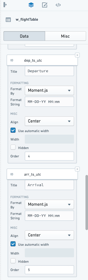
Since the flight_id column is not a human-readable column, hide that column for now. However, we will keep it in the table to refer to later when configuring the ability to select one or more rows.
For the rest of the columns, choose a display name as Title and add a format string to clean up the timestamps using formatting strings from MomentJS ↗.
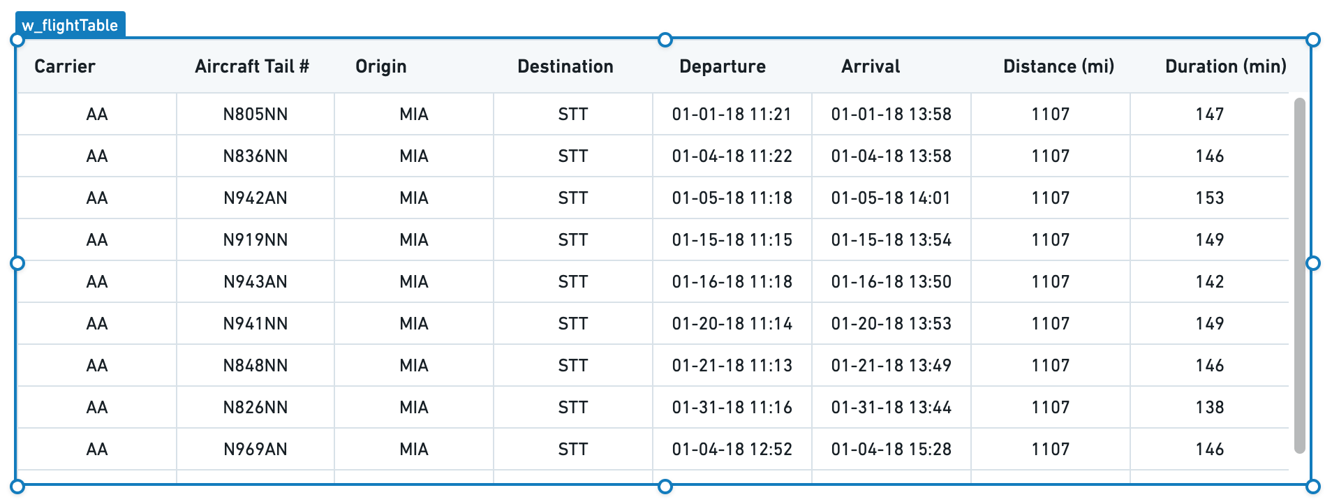
We now have a table that cleanly displays all of the data:
Next, set how a user can interact with the table through selection and sorting.
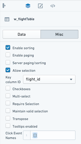
Switch to the Misc tab in the property editor, and check Allow Selection and Enable Sorting. A user can now select columns directly to see the table sorted in different ways and can click a specific row to select it.
Finally, decide what to use as the unique identifier for a given row in your table. In this case, use the name of the flight. In the dropdown labeled Key column ID, select flight_id.
:::callout{theme="neutral"} If the Server Paging/Sorting option is unchecked, the table will only sort and page the data that already loaded, which in our example so far is only the first 10 rows of the table. In Slate, you can reliably load 5-10k rows into browser memory, but this will be constrained by the resources available to the browser tab for your user.
In most situations, it is best practice to configure server-side paging and sorting. Since there are approximately 75k flights in the last-mile-flights table and several million flights in the underlying flights table, it is not feasible to return all the results client-side at the same time.
:::
Configure paging and sorting
Check the box for Enable Paging and Server Paging/Sorting. Choose a number for Page Size to set the number of rows to display to the user at a single time.
With these options enabled, your table will now keep track of the current page; we can use this information in our query to bring back just the relevant rows to display.
Open the query editor and return to q_allFlights. We will now update the LIMIT statement to reflect the page size configured in the table and add an OFFSET statement to ask Postgres to give us the correct page of results.
Use the same Handlebars syntax that we used to include data from our query into the Table widget to reference the Table widget state from inside our query:
SELECT
    flight_id,
    carrier_code,
    tail_num,
    origin,
    dest,
    dep_ts_utc,
    arr_ts_utc,
    distance,
    actual_elapsed_time
FROM "foundry_sync"."{{v_flightTable}}"
LIMIT {{w_flightTable.gridOptions.pagingOptions.pageSize}}
OFFSET {{w_flightTable.gridOptions.pagingOptions.currentOffset}}
Now, your table displays 20 rows at a time and you can select the next buttons or jump to a specific page. Now, let the table widget know the total number of rows so it can correctly display the "total entries".
To do this, create a new query called q_flightCount and count the number of rows:
SELECT
    COUNT(flight_id) as num_flights
FROM "foundry_sync"."{{v_flightTable}}"
Select Update to save the query and return to the table widget Misc tab. In the Server Total input, use Handlebars to reference the count in our query:
{{q_flightCount.num_flights.[0]}}
Now, our table knows that we are showing a particular set of rows out of the total entries (either 4.2M for the flights dataset or 73,946 for last-mile-flights).
This takes care of the paging and will let us iterate through large datasets without weighing down user browsers or timing out our queries. We still must turn on the server-side sorting so that our query responds to the user's interaction with the table.
Return to q_allFlights and add an ORDER BY clause to our query. Just as you referred to the pagingOptions.pageSize and pagingOptions.currentOffset, refer to the .sortOptions.columnId and .sortOptions.isAscending to create the right SQL statement:
ORDER BY {{w_flightTable.gridOptions.sortOptions.columnId}}
    {{#if w_flightTable.gridOptions.sortOptions.isAscending}}
        ASC
    {{else}}
        DESC
    {{/if}}
You should see a newly available conditional Handlebars block statement. This statement allows you to inject logic into text interpolation. In this case, we can choose either ASC or DESC based on the user's selection in the table.
:::callout{theme="warning"} Though Handlebars are easy to use to inject simple logic into your Slate application, we generally recommend using functions to add more compelx logic to large applications. :::
Now, your full query should look like this:
SELECT
    flight_id,
    carrier_code,
    tail_num,
    origin,
    dest,
    dep_ts_utc,
    arr_ts_utc,
    distance,
    actual_elapsed_time
FROM "foundry_sync"."{{v_flightTable}}"
ORDER BY {{w_flightTable.gridOptions.sortOptions.columnId}}
    {{#if w_flightTable.gridOptions.sortOptions.isAscending}}
        ASC
    {{else}}
        DESC
    {{/if}}
LIMIT {{w_flightTable.gridOptions.pagingOptions.pageSize}}
OFFSET {{w_flightTable.gridOptions.pagingOptions.currentOffset}}
Give the table a title that explains the information it displays at a glance.
Select the Widget button, select a plain Text widget from the options.
Fill in the Text widget with the title of the table: All Flights or Last Mile Flights as appropriate.
Move the Text widget to sit at the top left corner of the table, using the gridlines to ensure everything is aligned.
Now, properly line up the table beneath the title and subtitle. Select both the table and its title by holding the Cmd key and selecting (or drag-selecting) both widgets, then move both widgets so they are properly aligned under the application title.
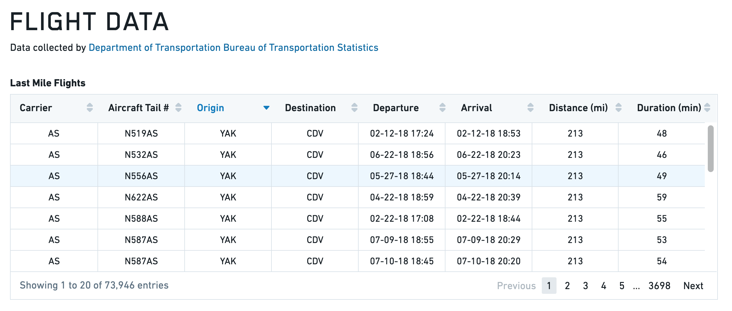
Your application should now look like the following, with the finished Table widget. Notice that you can now select a row and sort the table.
Toast
The following tables offer usage details about the properties available to Toast widgets. Several examples follow the tables.
Properties
| Attribute | Description | Type | Required | Changed By |
|---|---|---|---|---|
| actionText | The text to display in action button | string | Yes | Direct Edit |
| hasAction | Specifies whether the toast has an action button. | boolean | Yes | Direct Edit |
| intent | Visual intent color of the toast. | string | Yes | Direct Edit |
| message | The message of the toast. | string | Yes | Direct Edit |
| timeout | Milliseconds to wait before toast is automatically dismissed. Providing a value <= 0 will disable the timeout. | number | Yes | Direct Edit |
Actions
| Action Name | Description |
|---|---|
| close | Triggering this action causes toast to close. |
| open | Triggering this action causes toast to open. |
Events
| Event Name | Description |
|---|---|
| didClose | This event is fired when toast has fully closed. |
| didOpen | This event is fired when toast has fully opened. |
| click | This event is fired when toast action button is clicked. |
Examples
Toast
{
  "actionText": "Toast Example",
  "hasAction": false,
  "intent": -1,
  "message": "Toast Message",
  "timeout": 600
}
Defaults
{
  "actionText": "Action!",
  "hasAction": false,
  "intent": -1,
  "message": "Message",
  "timeout": 3000
}
Tree
The following tables offer usage details about the properties available to Tree widgets.
Properties
| Attribute | Description | Type | Required | Changed By |
|---|---|---|---|---|
| contents | Contains the hierarchy of the data in JSON, using the structure from Blueprint’s ITreeNode component. |
json | Yes | Direct Edit |
| selected | The IDs of the nodes that are selected | json | Yes | Direct Edit |
| selectionType | Determines the type of selection - ‘none,’ ‘single’ or ‘multiple.’ | string | Yes | Direct Edit |
Defaults
{
  "contents": [
                {
                  "childNodes": [
                      {id: 3, label: "bar 1"},
                      {id: 4, label: "bar 2"}
                  ],
                  "iconName": "folder-close",
                  "id": 1,
                  "label": "bars",
                },
                {
                  "id": 2,
                  "label": "foo"
                }
              ],
  "searchText": "",
  "selectedNodes": [],
  "selectionType": SelectionType.SINGLE
}
中文翻译
可视化
可视化(Visualization)微件类别包含以下微件:
图形(Graph)
下表提供了图形微件可用属性的使用详情。表格后附有若干示例。
属性(Properties)
| 属性 | 描述 | 类型 | 是否必需 | 变更方式 |
|---|---|---|---|---|
| defaultEdgeIcon | 边的默认图片URL或Blueprint图标。 | string | 否 | 直接编辑 |
| defaultNodeIcon | 节点的默认图片URL或Blueprint图标。 | string | 否 | 直接编辑 |
| directedEdgesEnabled | 确定边的末端是否带有指向目标节点的箭头。 | boolean | 否 | 直接编辑 |
| edgeArrowSize | 有向边中箭头的大小(像素)。 | boolean | 否 | 直接编辑 |
| edgeIconOffset | 边图标偏离边中心的偏移量。偏移方向取决于边标签是否为水平。 | number | 否 | 直接编辑 |
| edgeIconSize | 边图标的宽度和高度(像素)。 | number | 否 | 直接编辑 |
| edgeLabelHorizontal | 确定边标签是否保持水平而非与边平行。 | boolean | 否 | 直接编辑 |
| edgeLabelOffset | 边标签偏离边中心的偏移量。偏移方向取决于边标签是否为水平。 | number | 否 | 直接编辑 |
| edgeLength | 提供给流式布局(Flow)和力导向布局(Force Directed)的边长度值。 | number | 否 | 直接编辑 |
| edges | 图形中显示的边的值。 | IEdges | 否 | 直接编辑 |
| hideLabelsScale | 隐藏标签的缩放级别。用于隐藏因过小而无法阅读的标签。 | number | 否 | 直接编辑 |
| nodeColorScaleRange | 用于创建线性渐变为节点着色的两个或更多颜色的数组。示例:使用 node.colorScaleValues = [0, 5, 10] 和颜色范围数组 [“red”, “blue”],生成的颜色依次为:红色、紫色、蓝色。颜色可以指定为十六进制(如“#FF0000”)或CSS颜色名称(如“red”)。如果未指定或颜色少于2种,则默认颜色范围由Blueprint颜色 @green4、@gold4 和 @red4 组成([“#15B371”, “#F2B824”, “#F55656”]) | string[] | 否 | 直接编辑 |
| nodeLabelPosition | 标签相对于节点圆的位置。 | string | 否 | 直接编辑 |
| layout | 图形用于排列节点的布局类型。“Force Directed”(力导向):使用一种分散节点的方法进行布局。“Flow Up/Down/Left/Right”(流式上/下/左/右):节点排列使得边大致指向给定方向。“Manual”(手动):允许用户将节点拖拽到新位置,并在保存时保留位置。在其他布局中拖拽的节点位置不会被保存。 | string | 否 | 直接编辑 |
| nodeDiameter | 节点圆的直径(像素)。 | number | 否 | 直接编辑 |
| nodeLabelOffset | 标签偏离节点中心的偏移量。偏移方向由标签位置(Label Position)决定。 | number | 否 | 直接编辑 |
| nodeMargin | 节点之间的最小距离,由流式布局和力导向布局使用。 | number | 否 | 直接编辑 |
| nodeIconSize | 节点图标的宽度和高度。 | number | 否 | 直接编辑 |
| nodes | 图形中显示的节点的值。 | INodes | 是 | 直接编辑 |
| nodeSelectorDiameter | 指示节点被选中的圆的直径。 | number | 否 | 直接编辑 |
| selectedNodeIds | 当前用户选中节点的唯一标识符。 | string[] | 否 | 用户交互 |
| zoomScaleRange | 设置图形允许的缩放范围。 | number | 否 | 直接编辑 |
IEdges
| 属性 | 描述 | 类型 | 是否必需 | 变更方式 |
|---|---|---|---|---|
| cssClasses | 用于应用CSS样式的边的CSS类名。 | string[] | 否 | 直接编辑 |
| icons | 边的图片URL或Blueprint图标。 | string[] | 否 | 直接编辑 |
| labels | 与边关联的标签。 | string[] | 否 | 直接编辑 |
| sourceNodeIds | 创建边所需的源节点ID。 | number[] | 是 | 直接编辑 |
| targetNodeIds | 创建边所需的目标节点ID。 | number[] | 是 | 直接编辑 |
INodes
| 属性 | 描述 | 类型 | 是否必需 | 变更方式 |
|---|---|---|---|---|
| colorScaleValues | 用于为节点着色的数值,使用颜色缩放范围(Color Scale Range)中的颜色进行插值。 | number[] | 否 | 直接编辑 |
| cssClasses | 用于应用CSS样式的节点的CSS类名。 | string[] | 否 | 直接编辑 |
| icons | 节点的图片URL或Blueprint图标。 | string[] | 否 | 直接编辑 |
| ids | 节点的唯一标识符。 | string[] | 是 | 直接编辑 |
| labels | 与节点关联的标签。 | string[] | 否 | 直接编辑 |
| xPositions | 在手动布局中,指定节点的X位置。缺少值的节点将以网格形式排列。 | number[] | 是 | 用户交互 |
| yPositions | 在手动布局中,指定节点的Y位置。缺少值的节点将以网格形式排列。 | number[] | 是 | 用户交互 |
示例(Examples)
动态图形(Dynamic Graph)
{
  "camera": {
    "ratio": null,
    "x": null,
    "y": null
  },
  "edges": {
    "sourceNodeIds": "{{graph.sourceNodeIds}}",
    "targetNodeIds": "{{graph.targetNodeIds}}"
  },
  "nodes": {
    "iconUrls": "{{graph.iconUrls}}",
    "ids": "{{graph.ids}}",
    "labels": "{{graph.ids}}",
    "xPositions": "{{graph.xPositions}}",
    "yPositions": "{{graph.yPositions}}"
  },
  "selectedNodeIds": [
    "n18"
  ]
}
静态图形(Static Graph)
{
  "camera": {
    "ratio": null,
    "x": null,
    "y": null
  },
  "defaultIconUrl": "resources/map-people.svg",
  "edges": {
    "ids": [
      "e1",
      "e2",
      "e3",
      "e4",
      "e5"
    ],
    "labels": [
      "e1",
      "e2",
      "e3",
      "e4",
      "e5"
    ],
    "sourceNodeIds": [
      "n1",
      "n2",
      "n3",
      "n4",
      "n5"
    ],
    "targetNodeIds": [
      "n2",
      "n3",
      "n4",
      "n5",
      "n1"
    ]
  },
  "layout": {
    "type": "layered"
  },
  "nodes": {
    "ids": [
      "n1",
      "n2",
      "n3",
      "n4",
      "n5"
    ],
    "labels": [
      "n1",
      "n2",
      "n3",
      "n4",
      "n5"
    ],
    "xPositions": [
      100,
      30.9,
      -80.9,
      -80.9,
      30.9
    ],
    "yPositions": [
      0,
      95.1,
      58.78,
      -58.78,
      -95.1
    ]
  },
  "selectedNodeIds": [
    "n1"
  ]
}
默认值(Defaults)
{
  "camera": {
    "ratio": null,
    "x": null,
    "y": null
  },
  "edges": {
    "sourceNodeIds": [],
    "targetNodeIds": []
  },
  "nodes": {
    "ids": [],
    "xPositions": [],
    "yPositions": []
  },
  "selectedNodeIds": []
}
图片库(Image Gallery)
下表提供了图片库微件可用属性的使用详情。
属性(Properties)
| 属性 | 描述 | 类型 | 是否必需 | 变更方式 |
|---|---|---|---|---|
| imageUrls | 此图片库的图片。 | string[] | 是 | 直接编辑 |
| captions | 每张图片的说明文字。 | string[] | 否 | 直接编辑 |
地图(Map)
Slate的地图微件基于 Leaflet ↗ 构建。
地图由图层组成:一个基础图层(也称为瓦片图层(tile layer),即背景地图图像)和若干叠加图层(也称为要素图层(feature layer),即您感兴趣的数据)。地图微件支持要素图层的栅格(raster)和矢量(vector)瓦片。
请参阅 Mapbox文档 ↗ 以了解网络地图技术的入门介绍。Slate使用Mapbox作为其基础地图图像的来源。
术语(Terminology)
- 地图瓦片(Map tile): 地图微件的基础图层,这些瓦片只是图像,不包含数据。您可以将地图瓦片视为地图的“背景”。地图瓦片在 杂项(Misc) 选项卡中配置,并应用于整个地图微件,而非单个图层。一次只能显示一种地图瓦片。
- 要素(Feature): 绘制在地图上的点或形状,与某种数据相关联。
- 矢量(Vector): 表示图像的另一种方法。栅格(raster) 图像逐像素描述图像,本质上是一个彩色像素网格。相比之下,矢量(vector) 图像描述点之间的线条。这意味着矢量图像可以以不同尺寸清晰显示。
- 矢量瓦片(Vector tile): 以矢量形式包含形状数据。
- 瓦片服务器(Tile server): 动态提供形状数据作为瓦片。
- 地图瓦片源(Map tile source): 为地图提供基础瓦片。从技术上讲,它也是一个瓦片服务器。
图层类型(Layer types)
Slate具有以下类型的叠加图层:
位置(Location)
位置图层仅包含点(Leaflet 标记 ↗),由纬度/经度对标识。您可以配置地图微件将这些点显示为圆形或图标。
热力图和热力网格(Heat map and heat grid)
热力图和热力网格图层也处理点数据,但它们不是简单地在地图上显示点,而是显示一个叠加层,计算这些点的分布。热力图以彩色渐变显示点的密度,而热力网格则将点分组到桶中,并将桶显示为离散的彩色单元格。
形状(Shape)
与仅处理单个点不同,形状图层和矢量图层还可以包含多边形形式的数据——信息存储为一系列点及其之间的连线。形状图层以 GeoJSON ↗ 格式提供这些多边形。GeoJSON文件可以直接从您的Slate服务器提供。
GeoJSON要素存储为JSON并转换为SVG(图像)文件。这些图像在地图微件首次加载时一次性全部加载。
矢量(Vector)
矢量图层以矢量瓦片形式提供形状数据。您必须运行外部瓦片服务器来提供矢量瓦片。 矢量瓦片是动态加载的(仅当它们进入地图视野时)。矢量瓦片还直接在画布上绘制要素,而不是将其渲染为图像,因此矢量图层可以比形状图层拥有更多的要素。
分级统计图(Choropleth)
分级统计图图层也处理多边形数据,但它们为每个要素添加一个额外的值,并将这些值投影到颜色比例上。然后,每个要素在地图上以与该值对应的颜色显示。这用作某些特定统计数据的可视化。
例如,您可能有一个按人口密度着色的州地图,或按社会脆弱性指数着色的邮政编码地图。
Raven
如果您需要在Slate应用程序中使用Raven地图,请联系您的Palantir代表。
基础瓦片(Base tiles)
地图微件为基础瓦片图层提供了多个选项。选项包括深色主题、浅色主题、卫星主题、街道地图主题以及我们的默认主题。还有一个全部(All)选项,允许您直接在地图上使用图层选择器(Layer Selector)在主题之间切换。
在属性编辑器(Property Editor)的杂项(Misc)选项卡中,从瓦片图层(Tile Layer)下拉菜单中选择:
地图上的数据规模(Data scale on the map)
形状图层(GeoJSON)支持最低的数据规模。大约在1,000个要素时,地图性能会明显下降。对于更大的数据,您应该改用矢量图层。您也可以尝试简化GeoJSON中的几何图形以提高性能。
位置图层在大约5,000-10,000个点时性能开始下降。
禁用交互性(Disabling interactivity)
如果您想在应用程序中显示静态地图,可以禁用平移和缩放。如果您只想显示要素数据(而不显示基础地图瓦片),也可以移除基础图层。
示例(Examples)
位置地图图层(Location map layer)
包含自定义样式:
您还可以使用图层名称或 .layer${layerIndex} 来设置图层中所有标记/簇的样式。只有有效的CSS类名的图层名称才会被添加:
分级统计图图层(Choropleth map layer)
矢量地图图层(Vector map layer)
热力图图层(Heat map layer)
属性(Properties)
| 属性 | 描述 | 类型 | 是否必需 | 变更方式 |
|---|---|---|---|---|
| autoZoom | 指定地图是否根据地图中的数据自动缩放。 | boolean | 是 | 直接编辑 |
| bounds | 基于用户缩放和平移的可见区域。参见下面的IBounds。 | IBounds | 是 | 用户交互或直接编辑 |
| crs | 使用的坐标参考系统:EPSG3395(椭圆墨卡托投影)、EPSG3857(球面墨卡托投影)或EPSG4326(等距圆柱投影)。 | string | 否 | 直接编辑 |
| fixedBoundsEnabled | 指定是否可以通过缩放和拖拽更改地图的边界。 | boolean | 否 | 直接编辑 |
| zoomControlEnabled | 指定地图是否在左上角显示可点击的缩放控件。 | boolean | 否 | 直接编辑 |
| layerSelectorEnabled | 指定地图是否在右上角显示图层控制菜单。 | boolean | 否 | 直接编辑 |
| layers | 参见ILayerModel。 | ILayerModel[] | 否 | 直接编辑 |
| maxBounds | 用户在缩放/平移时可用的最大可见区域。 | IBounds | 否 | 直接编辑 |
| minMaxZoomLevel | 设置地图允许的缩放范围。缩放级别从0(代表整个地球)到18(大约单个房屋的尺度)。 | number | 否 | 直接编辑 |
| zoomLevel | 地图当前的缩放级别。 | number | 是 | 用户交互 |
| selection | 选择对象,包含选择形状和选中的ID。 | IMapSelection | 是 | 用户交互 |
| tileLayerEnabled | 指定是否启用瓦片图层(例如街道地图)。 | boolean | 是 | 直接编辑 |
| tileUrlsEnabled | 启用为瓦片图层使用自定义瓦片URL。您必须在下方输入瓦片图层URL,并可选择输入其标签。您必须启用瓦片图层(上方)才能使任何自定义瓦片图层显示。如果您启用了瓦片图层选择器,瓦片URL将被添加到选择器中。 | boolean | 是 | 直接编辑 |
| tileLayer | 基础瓦片图层。 | string | 是 | 直接编辑 |
| tileUrlLabels | 一个JSON数组,包含每个自定义瓦片图层URL的名称。如果您不提供标签,将使用默认名称,如“Custom”、“Custom (1)”等。 | string | 否 | 直接编辑 |
| tileUrls | 一个JSON数组,包含自定义瓦片图层URL。瓦片图层URL应采用标准形式:“http:/{s}.example.com/blah/{z}/{x}/{y}.png”。其中{s}是可选的子域,{z}是缩放级别,{x}和{y}是瓦片坐标。地图将使用此模板URL来查找每个瓦片图像。 | string | 否 | 直接编辑 |
| shapeSelectionEnabled | 在地图上启用拖拽选择控件。按住CMD或CTRL键进行累加选择。拖拽选择支持两种模式:区域选择(Area selection)将创建一个持久形状,并在模板上以名为selection.areas的数组形式提供。数据选择(Data selection)进一步允许用户直接选择位置标记,更新selection.ids的值。 | boolean | 是 | 直接编辑 |
| selectionType | 选择的模式。区域选择(Area selection)将创建一个持久形状,并在模板上以名为selection.areas的数组形式提供。数据选择(Data selection)进一步允许用户直接选择位置标记,更新selection.ids的值。 | string | 否 | 直接编辑 |
IBaseLayerOptions
| 属性 | 描述 | 类型 | 是否必需 | 变更方式 |
|---|---|---|---|---|
| name | 在图层选择器中显示的图层名称。如果未提供名称,位置图层和形状图层将默认为CSS选择器。Raven图层提供自己的名称,因此使用此字段将覆盖此Raven图层提供的所有图层名称。 | string | 否 | 直接编辑 |
IBounds
| 属性 | 描述 | 类型 | 是否必需 | 变更方式 |
|---|---|---|---|---|
| northEast | 矩形地图区域的东北点。 | ILatLng | 是 | 用户交互或直接编辑 |
| southWest | 矩形地图区域的西南点。 | ILatLng | 是 | 用户交互或直接编辑 |
IChoroplethLayerOptions
| 属性 | 描述 | 类型 | 是否必需 | 变更方式 |
|---|---|---|---|---|
| colorScaleOptions | 如果存在,将使用指定的自定义颜色比例来为分级统计图中的元素着色。 | IColorScaleOptions | 否 | 直接编辑 |
| ids | 映射回geoJson文件中“ids”的数据值。同时,也是基于用户选择由selection.ids返回的ID。 | string[] | 是 | 直接编辑 |
| layerSource | 将用于渲染要素的数据类型。源可以是GeoJSON文件或提供矢量瓦片的服务器。 | string | 是 | 直接编辑 |
| shapeGeoJson | 图层的原始GeoJSON。推荐值是返回有效 GeoJSON ↗ 对象的模板化函数或查询。仅当“形状源(Shape Source)”设置为“原始(Raw)”时才应设置此值。 | any | 否 | 直接编辑 |
| shapeSource | 指示如何检索形状GeoJSON。使用“服务器资源(Server Resource)”指向Slate服务器上的静态GeoJSON形状文件。使用“原始(Raw)”直接指定GeoJSON。由于Slate应用程序大小限制,大型GeoJSON应作为“服务器资源”或从查询中检索。 | any | 否 | 直接编辑 |
| shapeUrl | 形状文件的URL。示例:“resources/map/us-states.geojson”。仅当“形状源(Shape Source)”设置为“服务器资源(Server Resource)”时才应设置此值。 | string | 否 | 直接编辑 |
| values | 数据点的值。 | number[] | 是 | 直接编辑 |
| vectorTileOptions | 用于配置矢量瓦片图层的选项。仅当layerSource设置为“Vector Tile”时可用。 | IVectorTileOptions | 是 | 直接编辑 |
IColorScaleOptions
| 属性 | 描述 | 类型 | 是否必需 | 变更方式 |
|---|---|---|---|---|
| colorScaleTypes | 颜色比例使用插值颜色表示数据的值。 | string | 是 | 直接编辑 |
| colors | 用于创建线性渐变为元素着色的两个或更多颜色的数组。例如,给定元素值 [0, 25, 100] 和颜色数组 [“red”, “yellow”, “green”],生成的颜色依次为:红色、橙色、绿色。颜色可以指定为十六进制(如“#FF0000”)或CSS颜色名称(如“red”) | string | 是 | 直接编辑 |
| defaultColor | 用于值为null的元素的默认颜色。可以是十六进制颜色(如“#FF0000”)或CSS颜色名称(如“red”) | string | 是 | 直接编辑 |
| opacity | 颜色比例的不透明度范围。值为0表示完全透明,值为1表示完全不透明。 | string | 是 | 直接编辑 |
| linearity | 调整颜色比例的线性度。较低的“linearity”值将在比例的低端显示更多颜色差异。值为1表示完全线性比例。 | string | 是 | 直接编辑 |
IHeatgridLayerOptions
| 属性 | 描述 | 类型 | 是否必需 | 变更方式 |
|---|---|---|---|---|
| latitudes | 数据点的纬度值。 | number[] | 是 | 直接编辑 |
| longitudes | 数据点的经度值。 | number[] | 是 | 直接编辑 |
| values | 数据点的值。 | number[] | 是 | 直接编辑 |
| feature | 指定如何绘制每个网格单元格。 | string | 否 | 直接编辑 |
| colorScale | 用于绘制热力网格单元格的颜色比例。 | number | 否 | 直接编辑 |
| granularity | 热力网格单元格的大小。 | number | 否 | 直接编辑 |
| opacityRange | 颜色比例的最小和最大不透明度。 | number[] | 否 | 直接编辑 |
| colorScaleLinearity | 确定颜色比例的线性度。1.0为完全线性,0.5为平方根。 | number[] | 否 | 直接编辑 |
| radiusScale | 确定圆形要素的半径范围。将范围的最小/最大值设置为相同值意味着所有圆形大小相同。 | number[] | 否 | 直接编辑 |
IHeatmapLayerOptions
| 属性 | 描述 | 类型 | 是否必需 | 变更方式 |
|---|---|---|---|---|
| latitudes | 数据点的纬度值。 | number[] | 是 | 直接编辑 |
| longitudes | 数据点的经度值。 | number[] | 是 | 直接编辑 |
| radius | 每个数据点的半径。当半径随地图缩放而缩放时,半径以地图比例尺为单位(默认值:2);否则半径以像素为单位(默认值:20)。 | number | 否 | 直接编辑 |
| scaleRadiusEnabled | 指定数据点的半径是否应根据地图的缩放级别进行缩放(默认值:true)。 | boolean | 否 | 直接编辑 |
| values | 数据点的值。 | number[] | 是 | 直接编辑 |
ILatLng
| 属性 | 描述 | 类型 | 是否必需 | 变更方式 |
|---|---|---|---|---|
| latitude | 地图上某点的纬度值。 | number | 是 | 用户交互或直接编辑 |
| longitude | 地图上某点的经度值。 | number | 是 | 用户交互或直接编辑 |
ILayerModel
| 属性 | 描述 | 类型 | 是否必需 | 变更方式 |
|---|---|---|---|---|
| options | 图层的选项。详情参见IChoroplethLayerOptions、IHeatmapLayerOptions、ILocationLayerOptions、IShapeLayerOptions和IRavenLayerOptions。 | IChoroplethLayerOptions | IHeatmapLayerOptions | ILocationLayerOptions | IShapeLayerOptions | 是 | 直接编辑 |
| type | 地图图层的类型:choropleth、location、heatmap、shape或raven。 | string | 是 | 直接编辑 |
ILocationLayerOptions
| 属性 | 描述 | 类型 | 是否必需 | 变更方式 |
|---|---|---|---|---|
| clustering | 启用后,将在地图上对点进行聚类。 | boolean | 是 | 直接编辑 |
| cssClasses | 用于通过CSS编辑器覆盖默认标记设置的标记的CSS类名。 | string[] | 否 | 直接编辑 |
| ids | 基于用户选择由selection.ids返回的ID。 | string[] | 是 | 直接编辑 |
| latitudes | 数据点的纬度值。 | number[] | 是 | 直接编辑 |
| longitudes | 数据点的经度值。 | number[] | 是 | 直接编辑 |
| weights | 数据点的权重,为聚类标签聚合(默认值:1)。 | number[] | 否 | 直接编辑 |
| markerType | 标记的类型,“circle”或“icon”。 | string | 否 | 直接编辑 |
| markerRadius | 圆形标记的半径。 | number | 否 | 直接编辑 |
IMapSelection
| 属性 | 描述 | 类型 | 是否必需 | 变更方式 |
|---|---|---|---|---|
| areas | 此数组包含用户在启用拖拽选择时创建的选择形状。支持的形状是‘rectangle’(具有纬度/经度边界)和‘circle’(具有纬度/经度中心和半径(以米为单位)) | Array\ |
否 | 用户交互 |
| ids | 此数组包含在地图上选中的位置标记的ID。 | string[] | 是 | 用户交互 |
IRectangleShape
| 属性 | 描述 | 类型 | 是否必需 | 变更方式 |
|---|---|---|---|---|
| bounds | 形状的纬度/经度边界。 | IBounds | 是 | 用户交互 |
| type | 字符串‘rectangle’ | string | 是 | 用户交互 |
ICircleShape
| 属性 | 描述 | 类型 | 是否必需 | 变更方式 |
|---|---|---|---|---|
| bounds | 形状的纬度/经度边界。边界定义为完全包含该圆的最小矩形。 | IBounds | 是 | 用户交互 |
| center | 圆的纬度/经度中心。 | ILatLng | 是 | 用户交互 |
| radius | 圆的半径(以米为单位)。 | number | 是 | 用户交互 |
| type | 字符串‘circle’ | string | 是 | 用户交互 |
IRavenLayerFilterOptions
| 属性 | 描述 | 类型 | 是否必需 | 变更方式 |
|---|---|---|---|---|
| propertyName | 要过滤的属性的名称。示例:“City” | string | 是 | 直接编辑 |
| propertyValue | 要过滤的属性的值。示例:“Medford” | string | 是 | 直接编辑 |
IRavenLayerOptions
| 属性 | 描述 | 类型 | 是否必需 | 变更方式 |
|---|---|---|---|---|
| filter | 如果存在,将根据Raven中的元数据过滤Raven要素。 | IRavenLayerFilterOptions | 否 | 直接编辑 |
| serverUri | Raven服务器的URI。此域还必须在slate.yml的内容安全策略中明确允许用于脚本和图像。 | string | 是 | 直接编辑 |
IShapeLayerOptions
| 属性 | 描述 | 类型 | 是否必需 | 变更方式 |
|---|---|---|---|---|
| cssClasses | 用于通过CSS编辑器覆盖默认设置的geojson形状和标记的CSS类名。 | string[] | 否 | 直接编辑 |
| ids | 映射回geoJson文件中“ids”的数据值。这些主要用于为单个geoJson ID分配CSS类。 | string[] | 是 | 直接编辑 |
| markerType | 标记的类型,“circle”或“icon”。 | string | 否 | 直接编辑 |
| markerRadius | 圆形标记的半径。 | number | 否 | 直接编辑 |
| shapeGeoJson | 图层的原始GeoJSON。推荐值是返回有效 GeoJSON ↗ 对象的模板化函数或查询。仅当“形状源(Shape Source)”设置为“原始(Raw)”时才应设置此值。 | any | 否 | 直接编辑 |
| shapeSource | 指示如何检索形状GeoJSON。使用“服务器资源(Server Resource)”指向Slate服务器上的静态GeoJSON形状文件。使用“原始(Raw)”直接指定GeoJSON。由于Slate应用程序大小限制,大型GeoJSON应作为“服务器资源”或从查询中检索。 | any | 否 | 直接编辑 |
| shapeUrl | 形状文件的URL。示例:“resources/map/us-states.geojson”。仅当“形状源(Shape Source)”设置为“服务器资源(Server Resource)”时才应设置此值。 | string | 否 | 直接编辑 |
IVectorTileLayerOptions
| 属性 | 描述 | 类型 | 是否必需 | 变更方式 |
|---|---|---|---|---|
| baseStyle | 用于设置矢量瓦片要素样式的选项。 | IVectorTileStyleOptions | 否 | 直接编辑 |
| clickStyle | 用于设置选中时矢量瓦片要素样式的选项。 | IVectorTileStyleOptions | 否 | 直接编辑 |
| hoverStyle | 用于设置悬停时矢量瓦片要素样式的选项。 | IVectorTileStyleOptions | 否 | 直接编辑 |
| vectorTileOptions | 用于配置矢量瓦片服务器的选项。 | IVectorTileOptions | 是 | 直接编辑 |
IVectorTileOptions
| 属性 | 描述 | 类型 | 是否必需 | 变更方式 |
|---|---|---|---|---|
| featureIdKey | 要素上用作id的属性名称。必须唯一。默认为字符串“id”。 | string | 否 | 直接编辑 |
| layerName | 服务器返回的图层的字符串名称。矢量瓦片服务器可以为每个瓦片提供多个图层,因此使用此选项来选择要渲染的图层。 | string | 是 | 直接编辑 |
| vectorTileUrl | 提供要显示的瓦片的矢量瓦片服务器的URL。瓦片应通过其x、y和缩放级别(z)坐标检索,因此URL应在其结构中包含{x}、{y}和{z}。 | string | 是 | 直接编辑 |
| featureIdWhitelist | 用于过滤瓦片要素的字符串或正则表达式列表。如果这是一个非空数组,则featureIdKey不匹配任何字符串或正则表达式的要素将不会显示。 | string[] | 否 | 直接编辑 |
IVectorTileStyleOptions
| 属性 | 描述 | 类型 | 是否必需 | 变更方式 |
|---|---|---|---|---|
| color | 表示要素样式的颜色的CSS字符串。适用于所有要素类型。也用于“outline”对象中的轮廓颜色。 | string | 否 | 直接编辑 |
| outline | 表示多边形要素轮廓样式的JSON对象。接受“color”和“size”属性。 | object | 否 | 直接编辑 |
| radius | 点要素的半径大小。 | number | 否 | 直接编辑 |
| size | 线要素的线宽。也用于“outline”对象中的轮廓粗细。 | number | 否 | 直接编辑 |
表格(Table)
下表提供了表格微件可用属性的使用详情。表格后附有若干示例。
属性(Properties)
| 属性 | 描述 | 类型 | 是否必需 | 变更方式 |
|---|---|---|---|---|
| bodyTooltip | 表格正文工具提示中显示的文本。如果省略bodyTooltip或为null,则不显示工具提示。支持HTML。 | string | 否 | 直接编辑 |
| columnData | 要在表格中显示的数据。这通常只是与表格关联的查询。参见下面的示例。 | {columnId: any[]}(注意:columnId是字符串) | 是 | 直接编辑 |
| columnOptions | 将应用于特定列的选项。参见下面的IColumnOption。 | {columnId: IColumnOption}(注意:columnId是字符串) | 是 | 直接编辑 |
| columnOrder | 指示要显示的列的顺序和子集。这应该是来自columnData的“columnId”数组。如果留空数组,顺序可能是不确定的。 | string[] | 是 | 直接编辑 |
| gridOptions | 参见下面的IGridOptions。 | IGridOptions | 是 | 直接编辑 |
| selectedRowKeys | 所有用户选中行的selectedIdentityColumnId值。 | any[] | 是 | 用户交互 |
| selectionIdentityColumnId | 来自columnData的columnId,用于确定行的唯一标识或键。对于给定行,“selectionIdentityColumnId”列中的值提供唯一键。当选中一行时,该唯一键被放入“selectedRowKeys”中。 | string | 否 | 直接 |