Design guidelines(设计指南)
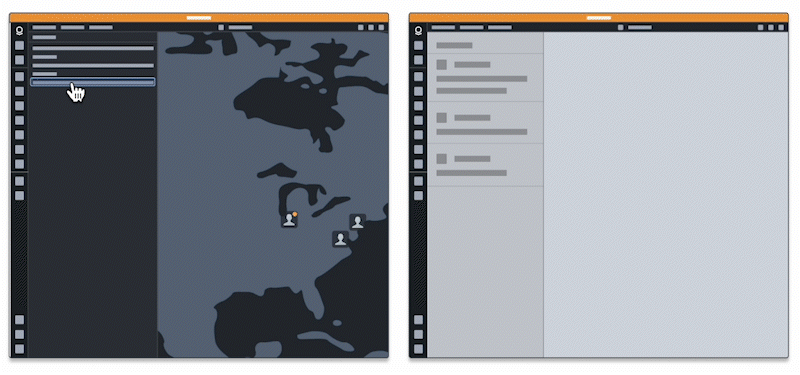
Adding appropriate styling to your drop zones is crucial for making them usable and discoverable to users. By styling your drop zones in a consistent manner, you make clear which elements in your application are valid drop zones. In the example below, users would not be aware of this workflow if the drop zones did not provide visual feedback by "lighting up".
Following the recommended styling ensures that users will have a cohesive experience when dragging data between your application and the Palantir platform. This will clarify and improve the user experience, as applying custom styling might add confusion to the different drop zone states and end behaviors.
We provide design standards for the following concepts:
- Drop zones: Show users where to drop their drag payload.
- Toasts: Provide feedback on drop success or failure.
- Dialogs: Provide options for user decisions on where to send dropped data.
Drop zones
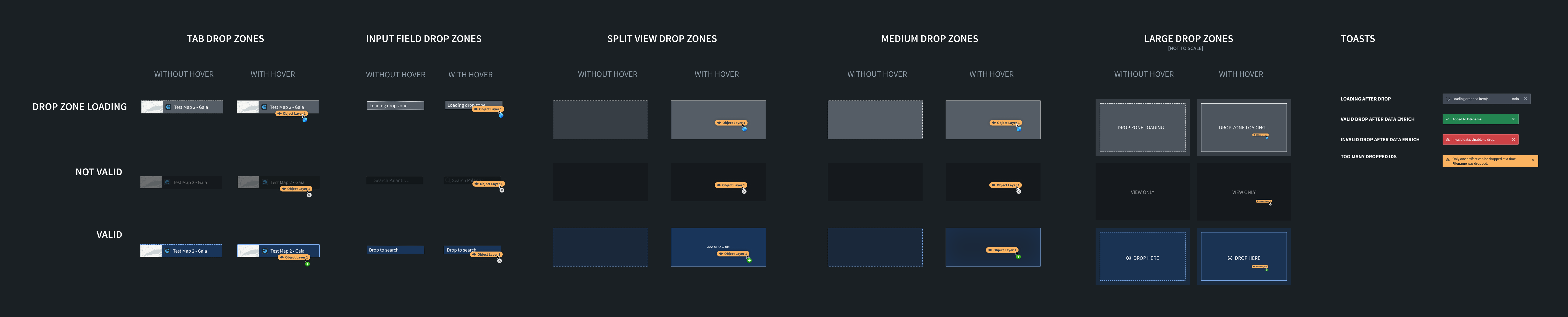
We recommend applying styling for three different states: valid drop, invalid drop, and loading. For all of these states, we recommend applying different styles when the drag payload hovers over the drop zone.
Drop zone states
Valid drop
This style should be applied when your drop zone accepts the current drag payload. For example, if the drop zone accepts the Gotham object media type and the user starts dragging a Gotham object, the "valid drop" styling should be applied to the drop zone.
Invalid drop
This style should be applied when your drop zone does not accept the current drag payload. This lets users know that they cannot drop their current drag payload onto a given drop zone because it does not contain a valid media type. For example, if the drop zone only accepts the Gotham object media type and the drag payload contains the text/html media type, the "invalid drop" styling should be applied to the drop zone.
Loading
This style should be applied if the drop zone has to perform asynchronous work in order to determine whether it accepts the current drag payload. On the Palantir platform, loading styles are applied while data is being enriched.
See below for an overview of our drop zone styles and see the Blueprint documentation ↗ for recommended colors.
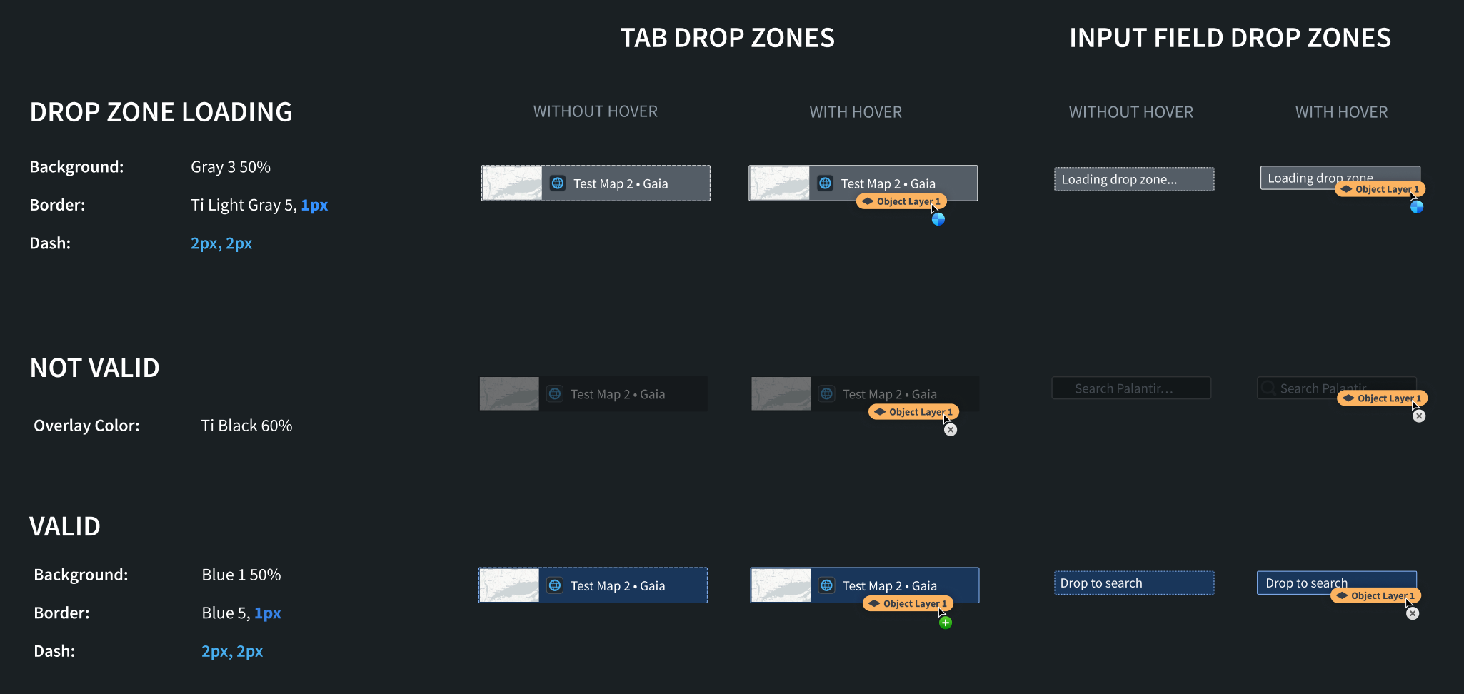
Small drop zones
These styles should be applied to smaller drop zones in your application, such as drop zones in the tab bar or in form input fields.
CSS Snippets
#### Loading
.loading-small {
    background: rgba(143, 153, 168, 0.5); // gray3 50%
    border: 1px dashed #F6F7F9; // light-gray5
}

.loading-small-drag-hover {
    border: 1px solid #F6F7F9; // light-gray5
}
.not-valid-small {
    background: rgba(18, 21, 24, 0.6); // black 60%
}
.valid-small {
    background: rgba(24, 74, 144, 0.5); // blue1 50%
    border: 2px dashed #8ABBFF; // blue5
}

.valid-small-drag-hover {
    border: 2px solid #8ABBFF; // blue5
}
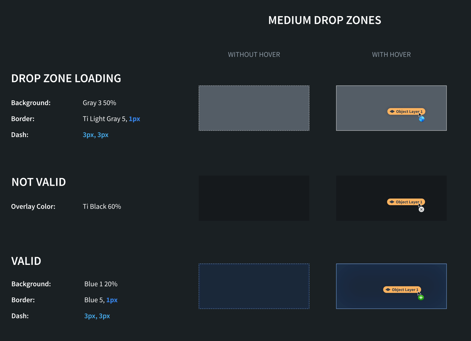
Medium drop zones
These styles should be applied to medium drop zones in your application, such as object cards.
CSS Snippets
#### Loading
.loading-medium {
    background: rgba(143, 153, 168, 0.5); // gray3 50%
    border: 1px dashed #F6F7F9; // light-gray5
}

.loading-medium-drag-hover {
    border: 1px solid #F6F7F9; // light-gray5
}
.not-valid-medium {
    background: rgba(18, 21, 24, 0.6); // black 60%
}
.valid-medium {
    background: rgba(24, 74, 144, 0.2); // blue1 20%
    border: 2px dashed #8ABBFF; // blue5
}

.valid-medium-drag-hover {
    border: 2px solid #8ABBFF; // blue5
}
Large drop zones
These styles should be applied to large drop zones in your application, such as an entire map.
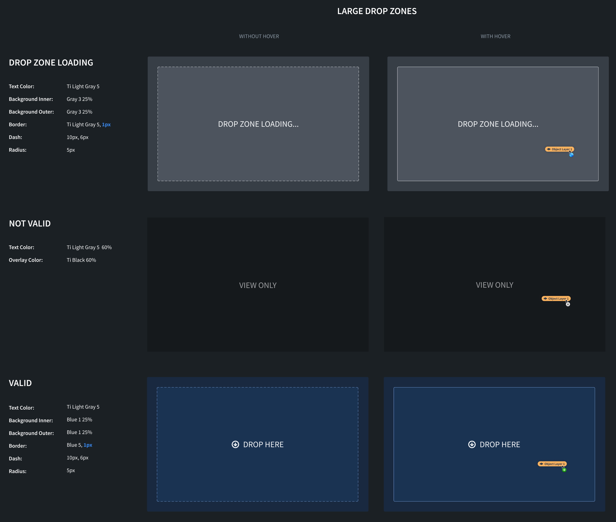
CSS Snippets
For large drop zone styles, we apply different inner and outer styles. #### Loading
.loading-inner-large {
    background: rgba(143, 153, 168, 0.25); // gray3 25%
    border: 3px dashed #F6F8F9; // light-gray5
    border-radius: 5px;
    color: #F6F8F9; light-gray5
}

.loading-inner-large-drag-hover {
    border: 3px solid #F6F8F9; // light-gray5
}

.loading-outer-large {
    background: rgba(143, 153, 168, 0.25); // gray 25%
    border-radius: 5px;
}
.not-valid-large {
    background: rgba(18, 21, 24, 0.6); // black 60%
    color: rgba(246, 248, 249, 0.6); // light-gray5 60%
}
.valid-inner-large {
    background: rgba(24, 74, 144, 0.25); // blue1 25%
    border: 3px dashed #8ABBFF; // blue5
    border-radius: 5px;
    color: #F6F7F9; // light-gray5
}

.valid-inner-large-drag-hover {
    border: 3px solid #8ABBFF; // blue5
}

.valid-outer-large {
    background: rgba(24, 74, 144, 0.25); // blue1 25%
    border-radius: 5px;
}
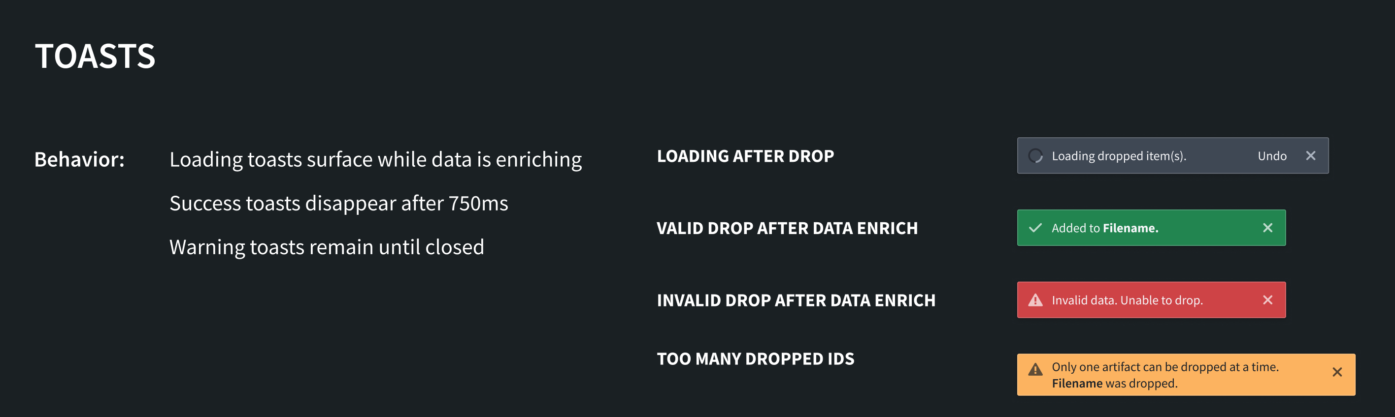
Toasts
We recommend using the following toasts to communicate information about the status of dropped data. You can implement these toasts using the Blueprint toast component ↗.
Loading after drop
Display this toast if additional processing of dropped data must happen before the application is updated with the transferred data. This may happen if the drop zone needs to enrich the data before something can be done with it. Loading toasts should surface while data is enriching.
Valid drop after data enrichment
Display this toast if the drop was valid and the application was able to make use of the dropped data. Success toasts should disappear after 750 milliseconds.
Invalid drop after data enrichment
Display this toast if the drop zone initially accepted the drag payload but was unable to use the data after it was dropped. This toast should remain until closed by the user.
Too many dropped IDs
Display this toast if the drop zone can only handle one instance of the dropped media type. The application will then only use the first item from the dropped data. This toast should remain until closed by the user.
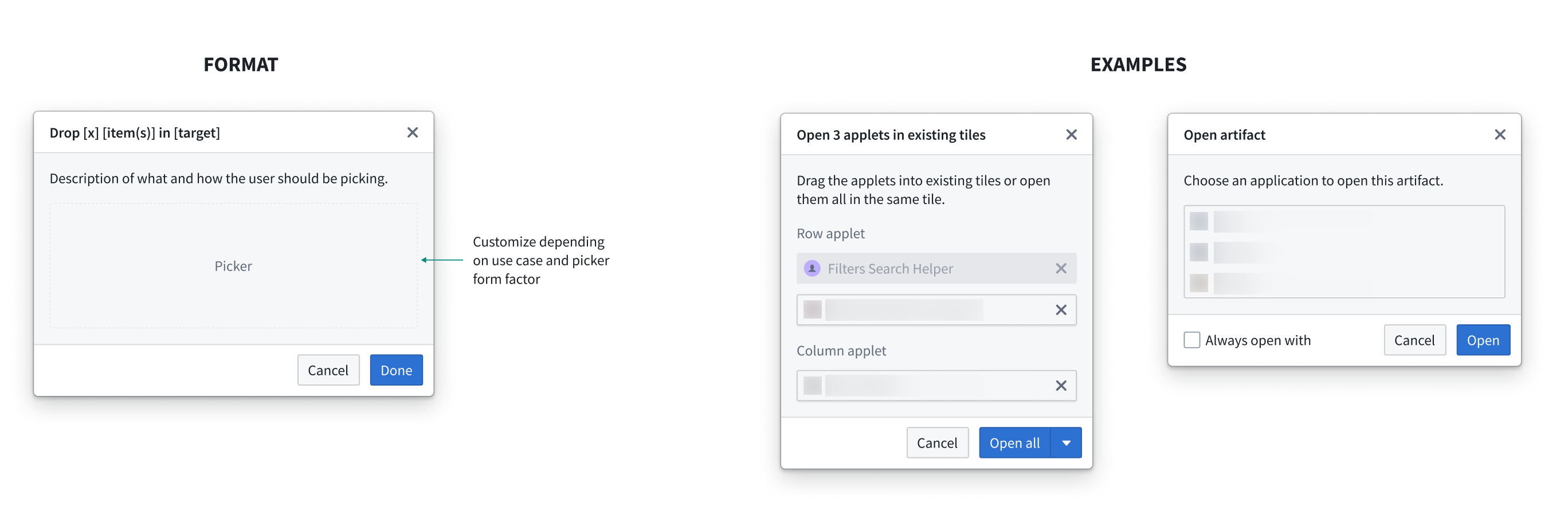
Dialogs
For cases where dropped item(s) require further user decisions and have more than one option, use a dialog prompt with a description of how the user should take action. Customize the dialog body based on the use case and intended interaction. Examples of this are shown below:
中文翻译
设计指南
为拖放区域(drop zone)添加适当的样式,对于让用户能够发现并使用这些区域至关重要。通过以一致的方式设计拖放区域样式,可以明确告知用户应用中哪些元素是有效的拖放区域。在下面的示例中,如果拖放区域没有通过"高亮"提供视觉反馈,用户将完全无法感知这一工作流程。
遵循推荐的样式设计,可以确保用户在应用与 Palantir 平台之间拖拽数据时获得一致的体验。这有助于明确并改善用户体验,因为自定义样式可能会给不同的拖放区域状态和最终行为带来困惑。
我们针对以下概念提供了设计标准:
- 拖放区域: 向用户显示可将拖拽内容放置到何处。
- 提示条(Toast): 提供拖放成功或失败的反馈。
- 对话框(Dialog): 为用户决定将拖放数据发送到何处提供选项。
拖放区域
我们建议为三种不同状态应用样式:有效拖放(valid drop)、无效拖放(invalid drop)和加载中(loading)。对于所有这些状态,我们建议在拖拽内容悬停在拖放区域上方时应用不同的样式。
拖放区域状态
有效拖放
当拖放区域接受当前拖拽内容时,应应用此样式。例如,如果拖放区域接受 Gotham 对象媒体类型,并且用户开始拖拽一个 Gotham 对象,则应对拖放区域应用"有效拖放"样式。
无效拖放
当拖放区域不接受当前拖拽内容时,应应用此样式。这可以让用户知道,他们无法将当前拖拽内容放置到该拖放区域上,因为该区域不包含有效的媒体类型。例如,如果拖放区域只接受 Gotham 对象媒体类型,而拖拽内容包含 text/html 媒体类型,则应对拖放区域应用"无效拖放"样式。
加载中
如果拖放区域需要执行异步工作以确定是否接受当前拖拽内容,则应应用此样式。在 Palantir 平台上,当数据正在被丰富(enrich)时,会应用加载中样式。
以下是拖放区域样式概览,推荐的颜色请参考 Blueprint 文档 ↗。
小型拖放区域
这些样式应应用于应用中的小型拖放区域,例如标签栏或表单输入字段中的拖放区域。
CSS 代码片段
#### 加载中
.loading-small {
    background: rgba(143, 153, 168, 0.5); // gray3 50%
    border: 1px dashed #F6F7F9; // light-gray5
}

.loading-small-drag-hover {
    border: 1px solid #F6F7F9; // light-gray5
}
.not-valid-small {
    background: rgba(18, 21, 24, 0.6); // black 60%
}
.valid-small {
    background: rgba(24, 74, 144, 0.5); // blue1 50%
    border: 2px dashed #8ABBFF; // blue5
}

.valid-small-drag-hover {
    border: 2px solid #8ABBFF; // blue5
}
中型拖放区域
这些样式应应用于应用中的中型拖放区域,例如对象卡片。
CSS 代码片段
#### 加载中
.loading-medium {
    background: rgba(143, 153, 168, 0.5); // gray3 50%
    border: 1px dashed #F6F7F9; // light-gray5
}

.loading-medium-drag-hover {
    border: 1px solid #F6F7F9; // light-gray5
}
.not-valid-medium {
    background: rgba(18, 21, 24, 0.6); // black 60%
}
.valid-medium {
    background: rgba(24, 74, 144, 0.2); // blue1 20%
    border: 2px dashed #8ABBFF; // blue5
}

.valid-medium-drag-hover {
    border: 2px solid #8ABBFF; // blue5
}
大型拖放区域
这些样式应应用于应用中的大型拖放区域,例如整个地图。
CSS 代码片段
对于大型拖放区域样式,我们应用不同的内部和外部样式。 #### 加载中
.loading-inner-large {
    background: rgba(143, 153, 168, 0.25); // gray3 25%
    border: 3px dashed #F6F8F9; // light-gray5
    border-radius: 5px;
    color: #F6F8F9; light-gray5
}

.loading-inner-large-drag-hover {
    border: 3px solid #F6F8F9; // light-gray5
}

.loading-outer-large {
    background: rgba(143, 153, 168, 0.25); // gray 25%
    border-radius: 5px;
}
.not-valid-large {
    background: rgba(18, 21, 24, 0.6); // black 60%
    color: rgba(246, 248, 249, 0.6); // light-gray5 60%
}
.valid-inner-large {
    background: rgba(24, 74, 144, 0.25); // blue1 25%
    border: 3px dashed #8ABBFF; // blue5
    border-radius: 5px;
    color: #F6F7F9; // light-gray5
}

.valid-inner-large-drag-hover {
    border: 3px solid #8ABBFF; // blue5
}

.valid-outer-large {
    background: rgba(24, 74, 144, 0.25); // blue1 25%
    border-radius: 5px;
}
提示条
我们建议使用以下提示条来传达关于拖放数据状态的信息。您可以使用 Blueprint 提示条组件 ↗ 来实现这些提示条。
拖放后加载中
如果在应用使用传输的数据更新之前,需要对拖放的数据进行额外处理,则显示此提示条。当拖放区域需要先丰富数据才能对其进行操作时,可能会发生这种情况。在数据丰富过程中,应显示加载中提示条。
数据丰富后有效拖放
如果拖放有效,并且应用能够使用拖放的数据,则显示此提示条。成功提示条应在 750 毫秒后消失。
数据丰富后无效拖放
如果拖放区域最初接受了拖拽内容,但在数据被放置后无法使用该数据,则显示此提示条。此提示条应保持显示,直到用户关闭它。
拖放 ID 过多
如果拖放区域只能处理一个拖放媒体类型的实例,则显示此提示条。应用将仅使用拖放数据中的第一个项目。此提示条应保持显示,直到用户关闭它。
对话框
对于拖放项目需要用户进一步决策且有多个选项的情况,请使用带有操作说明描述的对话框提示。根据用例和预期的交互方式自定义对话框主体。示例如下: