Board descriptions(面板描述)
Exploration and analysis in Contour are performed through the use of boards in series. Some boards create charts or perform calculations, while others are used to manipulate your dataset by filtering, removing columns, and so on.
Use the links in this summary table to navigate between board types on this page.
| Board | Description | Visualize | Filter Rows | Aggregate | Manipulate Columns | Remove Duplicates |
|---|---|---|---|---|---|---|
| Summary | Reports the row count for your table. | Yes | No | No | No | No |
| Filter | Filter your dataset by numeric, text, or date and time values. | No | Yes | No | No | Yes |
| Expression | Use the expression language to derive new columns or perform complex filtering. | No | Yes | No | Yes | No |
| Table | View a portion of raw data, explore schemas and calculate data coverage metrics. | Yes | No | No | No | No |
| Histogram | Create a histogram of your data and filter to specific groups. | Yes | Yes | Yes | Yes, via the Pivot option | No |
| Distribution | Create a distribution plot of your data. | Yes | Yes | No | No | No |
| Time series | Create a chart with date/time on the x-axis and filter to specific groups. | Yes | Yes | No | No | No |
| Edit columns | Combine, duplicate, remove, rename, or split columns. | No | No | No | Yes | No |
| Transform data | Obfuscate data, find and replace values, or parse dates. | No | No | No | Yes | No |
| Chart | Create customizable, multi-layered charts. | Yes | Yes | Yes | No | No |
| Grid | Create a matrix of two categorical columns. Cells can be filtered and are displayed as a heatmap. | Yes | Yes | No | No | No |
| Heatmap | View a heatmap based on coordinate data. | Yes | Yes | No | No | No |
| Pivot table | Create a pivot table for one or more metrics. | Yes | Yes | Yes | Yes, via the Pivot option | No |
| Column editor | Derive new columns or remove unnecessary columns. | No | No | No | Yes | Yes |
| Multi-column editor | Rename, remove, reorder columns, or remove duplicate rows in the data. | No | No | No | No | No |
| Enrich | Enrich data with another dataset and return columns from both datasets. | No | No | No | Yes | Yes |
| Link | Join to another dataset and return the matching records of that dataset. | No | No | No | Yes | Yes |
| Set math | Keep, add, or remove rows based on external dataset. | No | Yes | No | No | No |
| Join | Perform curated joins. | No | Yes | No | No | No |
| Export | Export your final filtered set of observations to CSV or XLS. | No | No | No | No | No |
| Reorder columns | Reorder the columns in your table. | No | No | No | No | No |
| Macro | Apply templatized transformations to your path. | No | No | No | No | No |
| Sort | Sort the rows of data based on one or more columns. | No | No | No | No | No |
| Calculation | Display multiple aggregate calculations. | Yes | No | Yes | No | No |
| Unpivot | Reshape your data by turning some columns into rows. | No | No | No | Yes | No |
Summary
The summary board displays the number of rows and columns in your table at the current location in the path.
If you have not filtered data down at all, then this is the number of rows in your starting set. If you have applied filters (for example, by adding a histogram and selecting certain bars), this is the number of rows remaining after the filter.
Filter
The purpose of the filter board is to apply customizable filters on your dataset. Although you can also apply filters in other boards (distribution, histogram), the filter board allows for building in one place more complex filters involving multiple variables.
Using a list in the filter board is akin to a WHERE IN (x,y,z) clause in SQL. Contour can handle lists of thousands of items in the filter board. However, large lists will tax the browser, and lists that are too large will likely cause browser failure. In these cases, the list should be imported into Contour as a separate set, and the filter should be implemented using a link or set math board. Learn how to use the link or set math boards.
Configuration
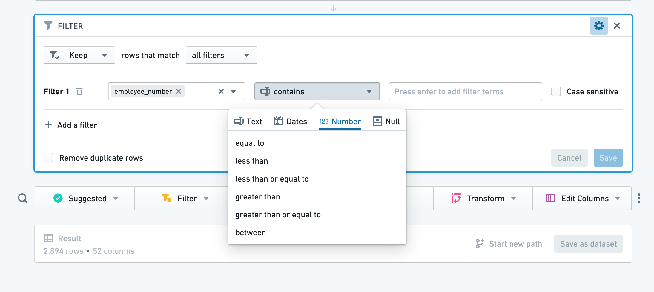
Click Add filter, choose a column to filter, then choose a filter type from the dropdown. Based on the column you selected, Contour will select an appropriate category of filter (for example, number for columns of numeric values).
:::callout{theme="success" title="Tip"}
In some text filters, you can use wildcards: * can be replaced by multiple characters, and ? can be replaced by a single character.
In a "matches" (regular expression) text filter, you can input your regular expression directly (no quotes or string indicators necessary). :::
To add another filter, simply click Add filter again. You can choose to match all filters or any filter. To remove a filter, click the trash button next to the filter. Click Save to apply your filters.
Text filter details
The text filter currently offers the following options:
- contains: This returns rows that contain any of your search terms. Your search terms should only contain text. For example, a term of “hello” would match a row that contains “hihellohi”.
- contains (with wildcards): This returns any rows that contain any of your search terms. Your search terms can contain
?to indicate a single character wildcard, or * to indicate a multi-character wildcard. For example, a term ofh?l*owill match “hi hello hi” or “hi halqqqqqo hi”. - is: This returns any rows that are equal to any of your search terms. Your search terms should only contain text. For example, a term of
hellowould match “hello”, but NOT “hi hello hi”. - is (with wildcards): This returns any rows that are equal to any of your search terms. Your search terms can contain ? to indicate a single character wildcard, or * to indicate a multi-character wildcard. For example, a term of
h?l*owill match “hello” or “halqqqqqo”. - matches: This returns any rows that match any of the terms, where a term is a regular expression. This option uses Java Pattern ↗ to evaluate regular expressions.
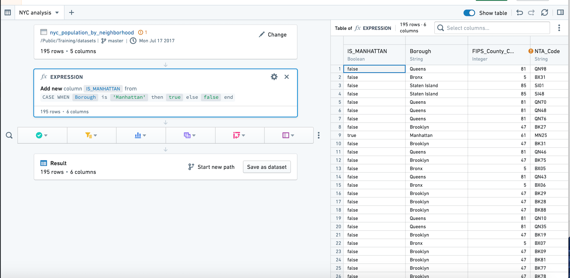
Expression
In addition to its visual tools like the histogram and chart, Contour also offers an expression board that lets you work with Contour’s rich expression language to derive new columns from your data, perform complex filtering, or perform complex aggregations.
- When using the expression editor, click the ? icon for a quick reference of the expression language.
- As you type, suggested functions appear in a dropdown. Click or use the Enter key to select the function you want.
:::callout{theme="neutral"}
Column names are case-sensitive. Additionally, when selecting a column, you may write the column name with or without double quotes. For example, year("birthdate_col") is equivalent to year(birthdate_col). For consistency, column names in this documentation are written with double quotes.
:::
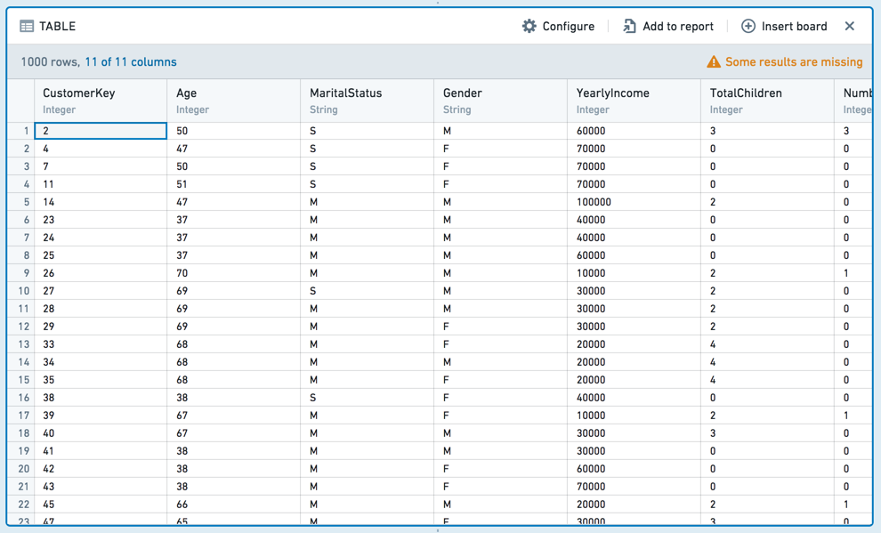
Table
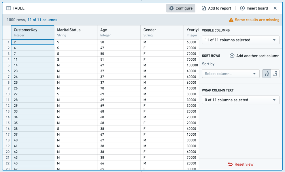
The table board shows a snapshot of your dataset in tabular format. Note that only the first limit (default: 1,000) rows in the dataset are displayed. This limit exists to prevent browser performance issues and is generally not configurable.
The table board is useful for spot-checking your data to make sure it looks as you expect. You can interact with the table: drag-and-drop the columns to reorder them or choose from the dropdown on each column. These formatting changes to the table do not change the underlying data (if you view only a subset of the columns, all columns still exist in the underlying data).

To move multiple columns at once, select the columns while holding down the Shift key. You can also use the Configure panel to modify multiple columns at once.
Conditional formatting
You can add conditional formatting to the table board by clicking the column dropdown.
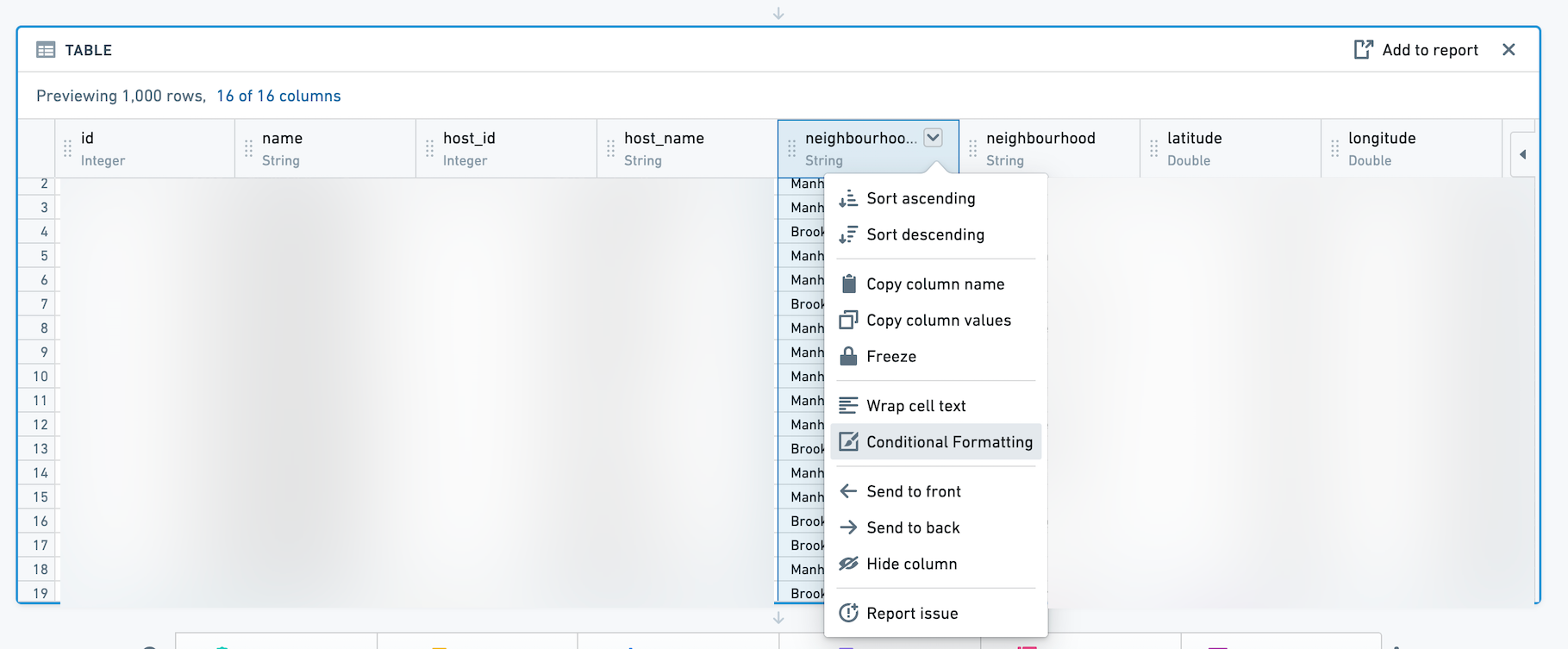
Then, use the dialog to add rules for a given column. Conditionally formatted cells will appear with text and background of the selected color. Rules are not supported for Date columns.
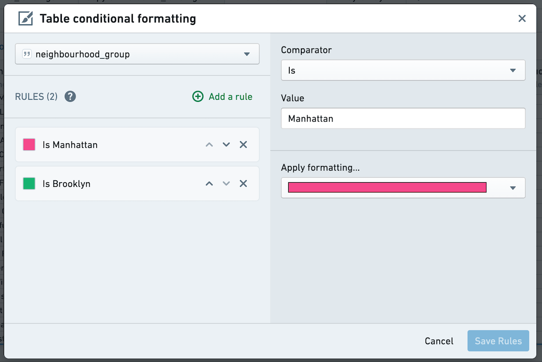
Table board vs. table panel
You can add the table board at any point in your path to get a quick preview of the data at that moment, or you can switch from path view to the table panel.
The table panel makes the table (not boards) the focus, so you can see how the data changes as you add each board. This can be especially helpful when writing expressions.
You can switch to the table panel by clicking Table in the upper right. Click the button again or click Hide table to return to path view.
The table panel does not support conditional formatting.
Histogram
The histogram board aggregates the distinct values in a given column and displays the results as a bar chart.
For example, the following histogram calculates the average length of a taxi ride by which New York neighborhood it began in.
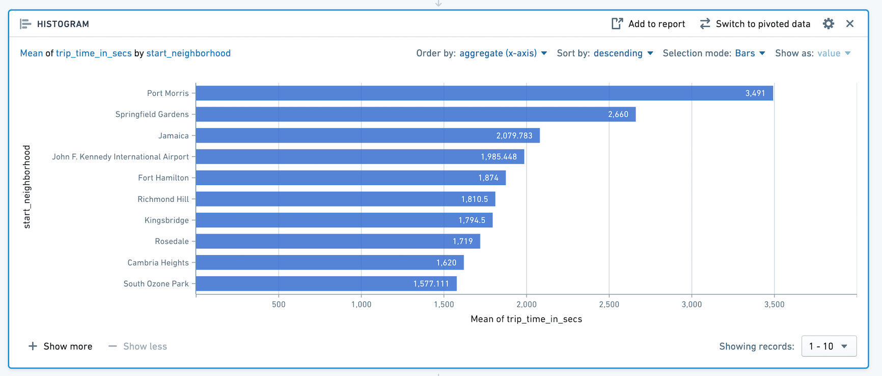
Note that only the top ten bars are displayed. To display more bars, click + Show More. You can display up to 50 values at once. If there are more than 50 values, use the dropdown to navigate to other parts of the range.
SQL Equivalent
The histogram board is a visualization of a SQL GROUP BY clause.
The above example histogram is equivalent to the following SQL query:
SELECT start_neighborhood, mean(trip_time_in_secs)
FROM <table name>
GROUP BY start_neighborhood
Configuration
- Y-Axis
- Choose a column to group the data by. The data is grouped based on the discrete values of this column, and then the aggregate is calculated.
- X-Axis
- Choose an aggregate to compute, and if the aggregate is not Count, choose the column to apply it to.
- Aggregates
- The available aggregate metrics are: Count (number of records), Unique Count, Min, Max, Sum, Mean, Approx. median, Standard Deviation, and Variance.
- Except for Count, you must specify which column the aggregate applies to. For Unique Count, you can select any column.
- Min, Max, Sum, Mean, Approx. Median, Standard Deviation, and Variance only apply to numerical columns.
- Aggregates are computed for each distinct value in the column selected as the Y-Axis.
:::callout{theme="neutral" title="Approximate median"} The Approx. Median aggregate is approximate. Contour calls the percentile_approx ↗ function with percentage value 0.5 and the default accuracy. :::
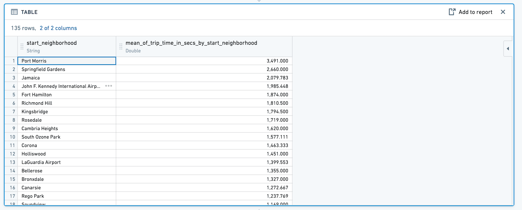
Switch to Pivoted Data
When you click Switch to Pivoted Data, any boards you add after the histogram will use the aggregated data computed in the table, rather than the original dataset.
The new dataset will include the column you selected for Y-Axis in the original histogram configuration, as well as a column for the aggregate. For example:
Sorting
The histogram defaults to sorting by the aggregate in descending order. For very large histograms, sorting is performed on the 1,000 highest values of the aggregate.
You can use the dropdowns to change to sort by the Y-Axis column values instead, or to change the sort direction.
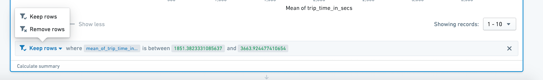
Filtering
Select data on the histogram to filter the dataset for future boards.
Selection modes:
-
Choose Bar to filter by one or multiple distinct values of the column you selected as the Y-Axis.

-
Choose Range to filter by aggregate value. For example, you might use Range selection to select only categories that have values above a certain threshold.

Then choose Keep to filter to only the selected values, or Remove to keep only the non-selected values.
Distribution
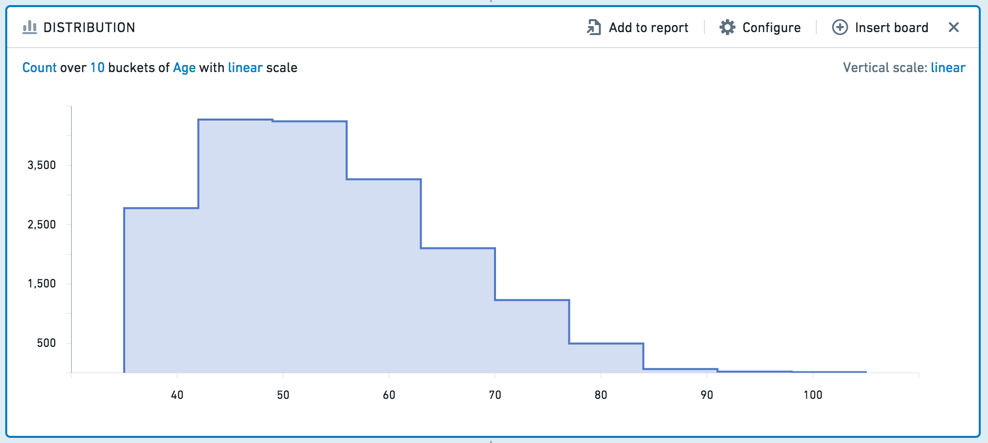
The distribution board displays the distribution of a numerical variable for an aggregate metric.
The distribution board is similar to the histogram, but it displays aggregated data based on ranges of values, rather than specific values. For example, the following distribution displays data about customers’ ages. Ages are divided into ten ranges (or “buckets”).
SQL Equivalent
In calculating the distribution board, we first find the minimum and maximum of the X-Axis and create a function to calculate the buckets. The SQL equivalent of the distribution is then approximately equivalent to the following:
SELECT X_AXIS_BUCKET_FUNCTION([x-axis-column]), <AGGREGATE_METRIC>([aggregate-column])
FROM <PARENT_BOARD>
GROUP BY X_AXIS_BUCKET_FUNCTION([x-axis-column])
Configuration
- X-Axis
- Choose a column of numeric values. The values in this column are grouped in equal-width ranges (in other words, your data is divided equally into ten, 100, or 1000 “buckets”), and then the aggregate is applied. You can also configure the scale of this axis (linear or logarithmic).
- Y-Axis
- Choose an aggregate metric to calculate on each range.
- The available aggregate metrics are: Count (number of records), Unique Count, Min, Max, Sum, Mean, Approx. Median, Standard Deviation, and Variance. Except for Count, you must specify which column the aggregate applies to.
- You can configure the scale of the Y-Axis as well (linear or logarithmic).
:::callout{theme="neutral" title="Approximate median"} The Approx. Median aggregate is approximate. Contour calls the percentile_approx ↗ function with percentage value 0.5 and the default accuracy. :::
Filtering
To select a range to filter by, click-and-drag your desired interval on the chart.
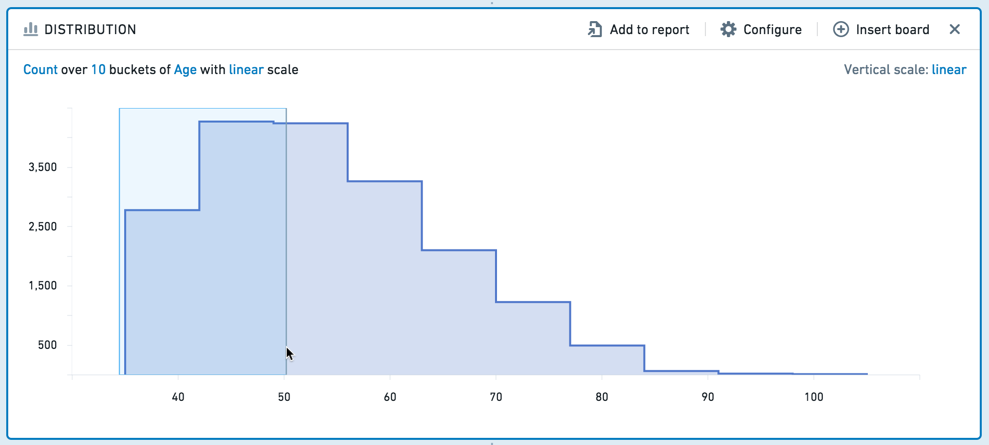
You can then adjust the interval more finely in the editable board footer.
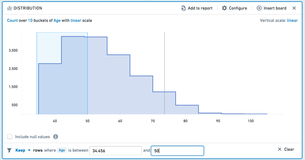
You can choose to Keep the values in the selected interval, or Remove those values, keeping only non-selected values. To clear your selection, click the Clear button (x).
Time series
The time series board allows you to group data by time intervals and calculate aggregate metrics on that data.
For example, given a dataset with personal information about customers, the following time series board computes the number of people born in each year.

You can further specify a column to use as the series. For the above example, you could choose to use gender as the series. The time series board will then divide into one line for each value in the series column: in this case, F (female) or M (male).

Note that the time series performs its aggregates over the entire dataset, and reduces the output to the first 1000 values upon displaying it.
Configuration
- X-Axis
- Choose a DateTime column to group the data temporally. Then choose a unit of time – the data will be grouped by intervals of that length. The available units are: Second, Minute, Hour, Day, Week, Month, and Year.
- Aggregates
- Define the aggregates to be applied to each time interval.
- The available aggregate metrics are: Count (number of records), Unique Count, Min, Max, Sum, Mean, Standard Deviation, and Variance.
- Except for Count, you must specify which column the aggregate applies to. For Unique Count, you can select any column.
- Min, Max, Sum, Mean, Approx. Median, Standard Deviation, and Variance only apply to numerical columns.
- Series
- Choose a column to divide the data into series. There will be one series (represented as a line in the chart) for each discrete value in the column.
:::callout{theme="neutral" title="Approximate median"} The Approx. Median aggregate is approximate. Contour calls the percentile_approx ↗ function with percentage value 0.5 and the default accuracy. :::
Filtering
You can select a date range on the time series to filter the dataset for future boards. Click  , then click-and-drag your desired interval. (You can adjust the interval more finely in the editable board footer.) To clear your selection, click the
  icon.
icon.
Choose Keep from the dropdown to filter to only the selected values, or choose Remove to keep only the non-selected values.

Edit columns
You can edit columns in Contour with the following boards:
- Combine two or more columns.
- Duplicate a column (for example, to try out operations on that column without affecting the original data.)
- Remove a column from the table.
- Rename a column.
- Split a column on some delimiting character.
Transform data
You can transform data in a column using the following boards:
Obfuscate
- Hashing cell values (for example, to obscure sensitive data such as names). Each value in the column is replaced with a hashed representation of the value, using the SHA-1 ↗ hash function.
:::callout{theme="warning"} The SHA-1 hash can be decrypted and is not considered fully secure. Therefore, it should NOT be used for data compliance purposes. :::
- Masking some number of characters in the value (for example, mask all but the last 2 digits in a phone number).
- K-anonymizing columns of data as a privacy technique that seeks to set a threshold value (
k) to apply to a dataset, ensuring at leastknumber of instances with the same set of sensitive information to reduce the risk of re-identification (even if there is no personally identifiable information). This process is done by “suppressing” specific fields that would potentially help with the re-identification of the data.
:::callout{theme="neutral"} The appropriate k-value for your use case is determined by context. Organizations typically set their own policies for setting k-values based on the context of the analysis and statistical risk of re-identification. Some example policies include National Center for Education Statistics ↗ and the U.S Department of Health & Human Services ↗. At a minimum, the k-value should always be greater than 1 and less than the total number of rows in the dataset. :::
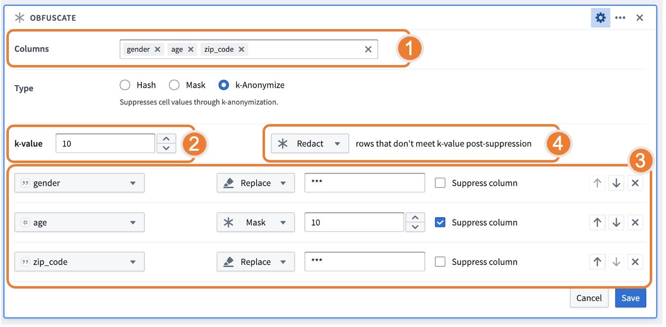
Using the k-anonymize function, the board asks for the columns to k-anonymize, k-value target, strategies for suppression, and what to do with rows that do not meet the k-value post-suppression.
- Columns: Represents “quasi-identifiers” or attributes that can be linked with external data to uniquely identify an individual.
- k-value: Represents the threshold value
kwhere there are at leastknumber of instances with the same set of sensitive information. - Strategies: Represents how data should be suppressed and in what order. You can set the given order of operations to reach the indicated k-value. For each column listed, you can choose amongst different strategies that would be applied to data to meet the k-value:
- Bucket: Replaces integers with a rangee; only available when a numeric type column is selected.
- Mask: Replaces the last n characters with a
*. - Replace: Replaces the entire value with a string. The default behavior suggests
***as the replacement value, but this can be replaced with a user-provided value. - The columns with the Suppress Column flag checked will apply the strategy for all values, regardless of meeting the k-value. This behavior is particularly relevant for cases such as bucketing ages where it is useful to have a consistent bucketing strategy for all values.
- Rows that do not meet the k-value post-suppression: If some rows do not meet the k-value threshold and cannot be suppressed to meet a count greater than
k, the following options are available: - Keep: Keep the rows so the data is not lost. Note that if you keep these rows, the dataset will not be k-anonymized; this is often a useful step for reviewing the results of the k-anonymization.
- Drop: Remove all rows that do not meet the k-value. When choosing to drop, be sure to calculate the number of rows before and after the obfuscation to understand the number of dropped rows.
- Redact: Obfuscate all values in the table with
***. This option is particularly relevant if you want to retain the same count of rows.
Find and replace
Find and replace text within a column, or find empty or null cells. This board supports properties that are String or Numeric types.
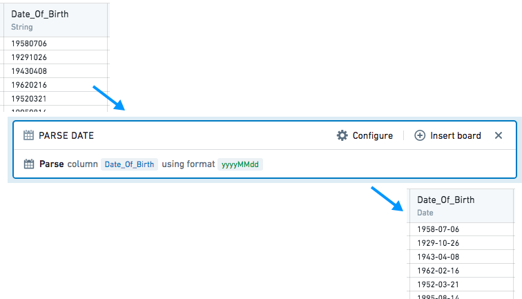
Parse dates
Dates are parsed from strings by interpreting the strings against a user-provided date format, symbol by symbol.
In the provided format, unquoted letters are treated as patterns, representing specific date or time components. String symbols matched with patterns are interpreted as the date or time components according to the following rules:
| Letter | Date or time component | Example |
|---|---|---|
| y | year | 1996; 96 |
| M | month of year | July; Jul; 07 |
| d | day of month | 10 |
| a | AM/PM marker | AM; PM |
| h | hour in am/pm (1-12) | 12 |
| H | hour in day (0-23) | 13 |
| m | minute of hour | 30 |
| s | second of minute | 55 |
| S | fraction of second | 978 |
| z | General timezone | Pacific Standard Time; PST; GMT-08:00 |
| Z | time zone offset | -0800; -08:00 |
- Formats containing other letters are not supported. Unsupported letters are still treated as patterns, but using them may result in unexpected parsing results.
- Use the expression board if your desired format is unsupported.
- If your strings contain letters that should not be interpreted, enclose them in single quotes
' 'so they are treated as plain text instead of patterns. - Non-letter or quoted symbols are treated as plain text. They must be strictly matched with the corresponding symbols in the input string during parsing.
After matching and interpreting the date and time components, the output date is constructed based on these interpreted components.
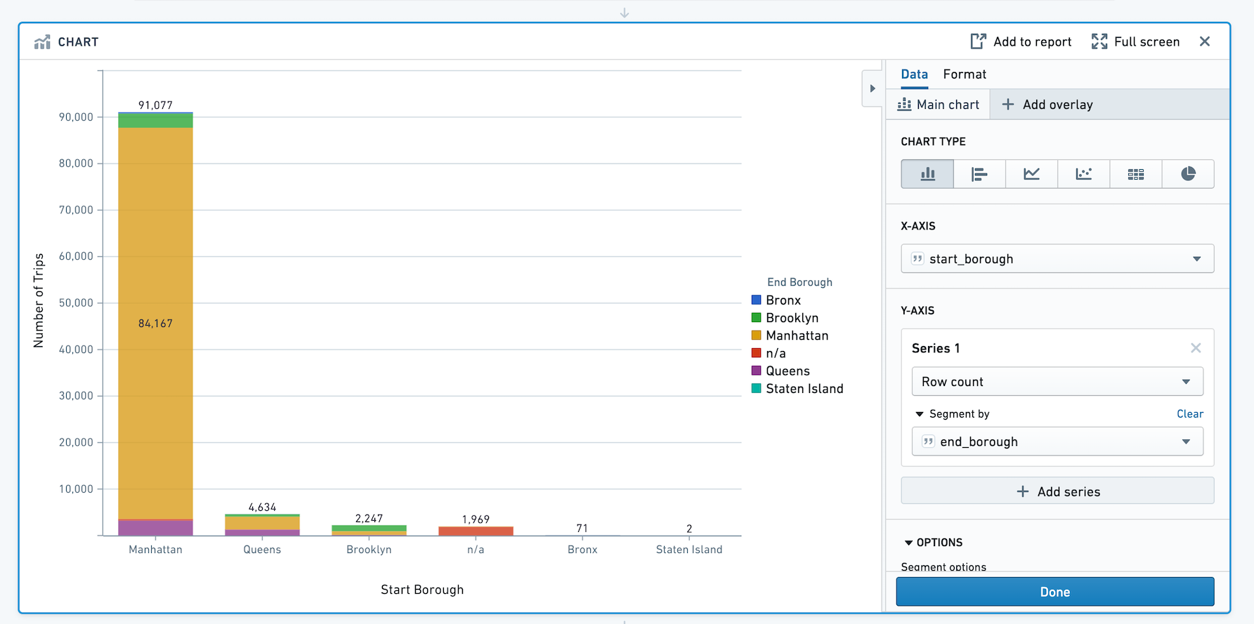
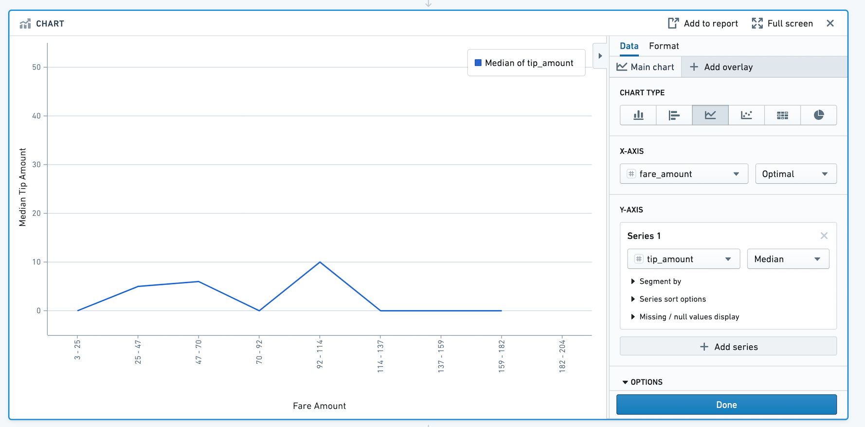
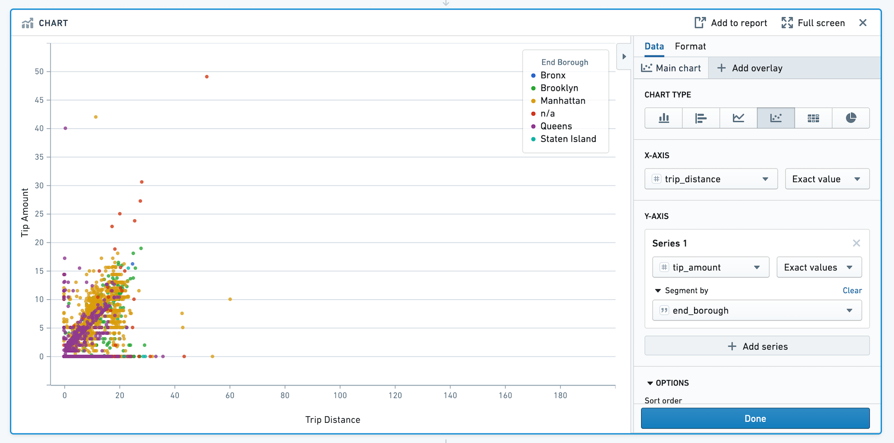
Chart
The Contour Chart board allows you to build custom charts for analyzing your data.
Configuration
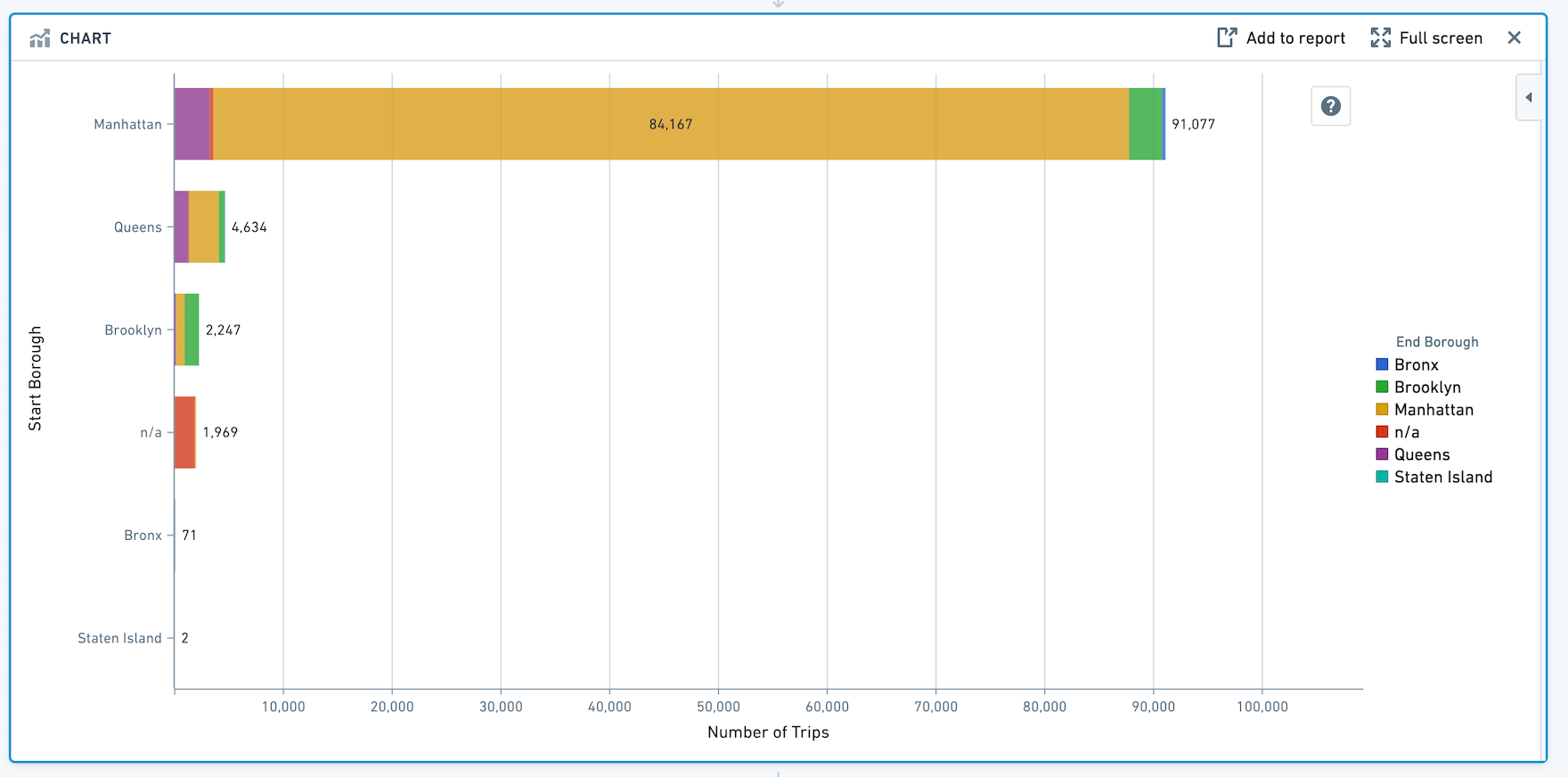
Choose a chart type for the main chart layer, then configure the x and y axes. Currently the Chart board offers the following types of charts:
Bar
Horizontal Bar
Line
Scatter
Heat Grid
Pie

Segment by
For chart types other than heat grid and pie, you can also choose to segment the data into series.
Sorting
Expand the Options section to change how your chart data is sorted. You may order chart data by values in the main layers:
- X values
- Y values
- A custom column value. This sort value may be any column in the dataset (even ones that are not plotted on the chart).
The following example sorts a bar chart by the number of gold medals received by a country in the Olympics:
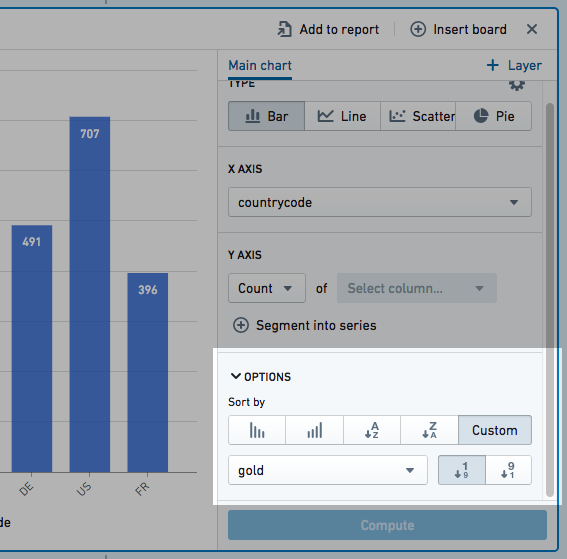
Data can be sorted in ascending or descending order. Overlay plot values cannot be used to order chart data.
Formatting
Use the Format tab to configure the chart. You can change the X- and Y-axis titles, formatting of the axes, legend positioning, series sorting, and series colors.
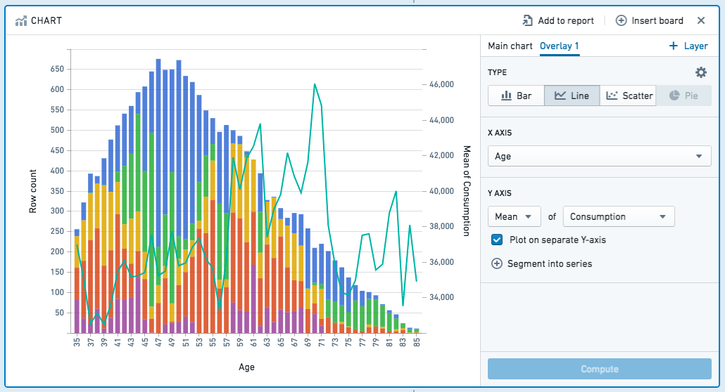
Adding Overlays
You can add overlay plots by clicking + Add Overlay. For example, you might want to overlay a line chart on top of a bar chart.
When you add an overlay, you can choose whether the chart should use the data in the current path or from a different dataset.
:::callout{theme="neutral"} Plotting data from a different dataset does not join that dataset with the working set. To join datasets, you should use the Join board. :::
Note that only the main chart layer is part of the data path. The other layers are solely for presentation purposes. In other words, making a selection or otherwise manipulating the data on an overlay layer will not affect the data downstream in your path.
You can plot your chart layers on separate y axes if the values of the individual layers are not related, or if the data range or plot scale is significantly different.
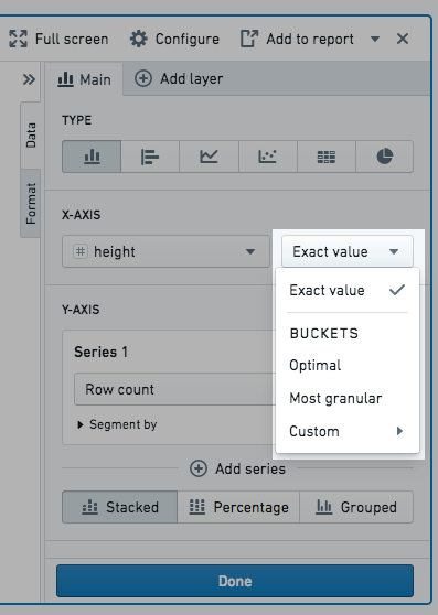
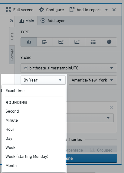
Bucket selection
You can choose how to bucket data points when configuring Group by columns (e.g. on the x-axis) and Segment by columns. Only numeric, date, or time columns can be bucketed. For example, if you create a bar chart and select a date column for the x-axis Group by column and choose bucket type Year, the resulting chart will have a bar for every year. The available bucket types are listed below.
Numeric column bucket types:
- Exact value: the data is not bucketed and exact values are shown.
- Optimal: the number of buckets is equal to the square root of points in the underlying data range. The data range is the difference between the maximum and minimum values of the column.
- Most granular: the chart uses the maximum number of buckets that can fit within the Result limit. Exact values are used when possible.
- Custom: the number of buckets can be manually selected. Note, the number of buckets cannot be greater than the Result limit.
Date and time column bucket types:
- Exact time: the data is not bucketed and exact values are shown.
- Rounding: the data is bucketed to the nearest Second, Minute, Hour, Day, Week, Month, or Year, depending on the selection. For example, if bucketing by Year, a data point with date June 15th, 2018 is bucketed into the 2018 bucket.
- Ordinals: the data is bucketed into ordinal dates. For example, if Day of week is selected, the data is bucketed into seven buckets, one for each day of the week.
:::callout{theme="neutral"} If the bucket selection does not fit within the result limit, the most granular option that does fit will be applied so that data is not dropped. Read Result limit for more information. :::
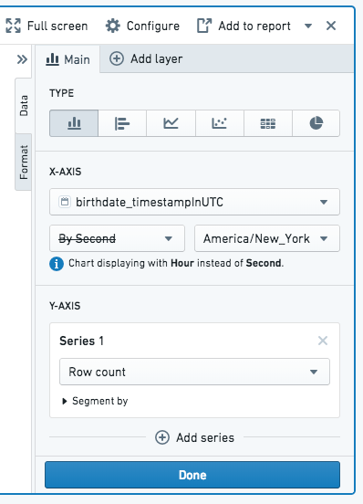
Result limit
Contour limits the number of data points it displays on the browser. Practically speaking, Contour cannot display more data points than there are pixels in the screen. In order to produce accurate charts and not drop any data, the Chart board will rebucket the chart configuration to the most granular bucket selection possible that fits under the result limit.
The result limit is set by your Palantir administrator and defaults to 1000 points. Rebucketing will occur for numeric, date, or time columns.
To illustrate rebucketing, consider the following example:
- A Chart board is created on a dataset that includes birth dates.
- The board is configured to be a bar chart with the x-axis set as the birthdate column. For example, to count the number of people with the same birthdate.
- The birth date column specifies the date down to the second, so the Second bucket type is selected.
- In this dataset, the number of unique birthdates per second exceeds the result limit.
- Therefore, upon computation the Chart board automatically buckets the data by Hour instead of by Second, as Hour is the most granular bucket size that fits the result limit for this particular dataset.
Filtering
Select data on the chart to filter the dataset for future boards. Use Ctrl+Click or Cmd+Click for multi-select.
You can pan and zoom on charts to more easily see the data. Hovering over a bar or point on the chart also displays a tooltip highlighting what you’re looking at.
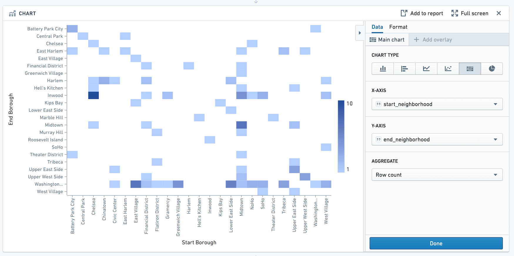
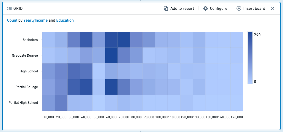
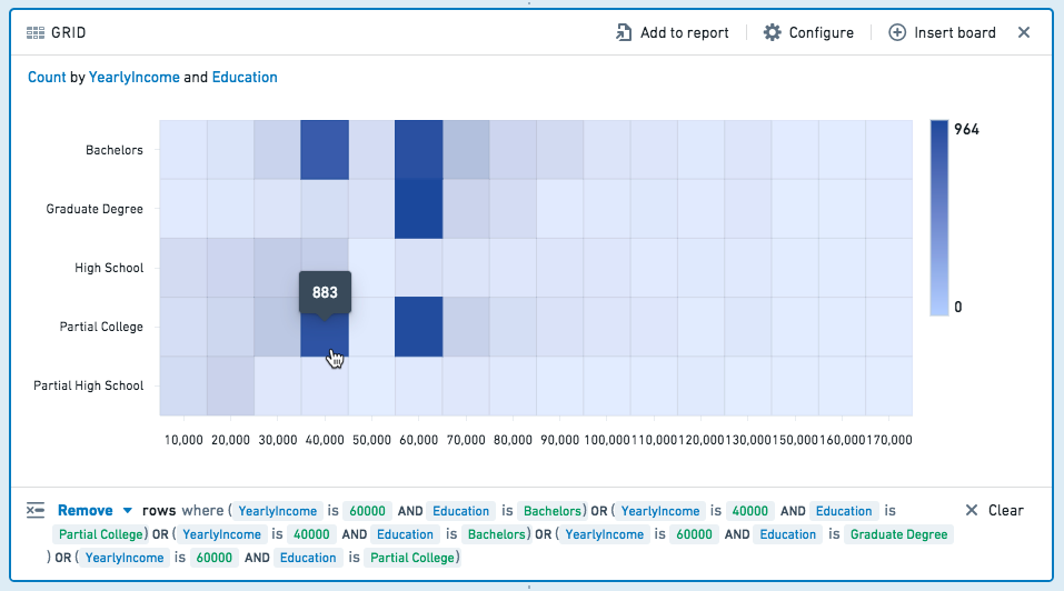
Grid
The grid board is similar to the histogram, but the grid board aggregates data by two columns rather than one, displaying a heat grid chart of the results. (For more than two columns, you can use a pivot table.) For example, the following grid compares education level to yearly income:
SQL Equivalent
The grid board is a visualization of an aggregate query, similar to the histogram and pivot table boards. A grid is approximately equivalent to the following SQL query:
SELECT [x-axis-column], [y-axis-column], <AGGREGATE_METRIC>([aggregate-column])
FROM <PARENT_BOARD>
GROUP BY [x-axis-column], [y-axis-column]
Configuration
- X-Axis and Y-Axis
- Choose two columns – each combination of unique values in those columns will form a cell in the grid.
- Aggregate
- Choose an aggregate metric to calculate for each cell in the grid. The result of the aggregate will determine the cell’s color.
- The available aggregate metrics are: Count (number of records), Unique Count, Min, Max, Sum, Mean, Approx. Median, Standard Deviation, and Variance.
- Except for Count, you must specify which column the aggregate applies to. For Unique Count, you can select any column.
- Min, Max, Sum, Mean, Approx. Median, Standard Deviation, and Variance only apply to numerical columns.
:::callout{theme="neutral" title="Approximate median"} The Approx. Median aggregate is approximate. Contour calls the percentile_approx ↗ function with percentage value 0.5 and the default accuracy. :::
Filtering
Select one or more cells on the grid to filter the dataset for future boards. Click a cell again to deselect it.
Choose Keep to filter to only the selected values, or choose Remove to keep only the non-selected values.
Heatmap
The heatmap board displays geocoded data on a map, color-coded to represent the values.
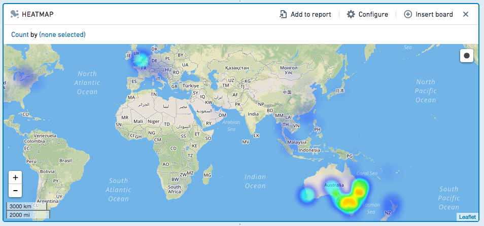
Configuration
- Specify which columns have latitude/longitude data.
- Optionally, specify a geohash column.
- Then, choose an aggregate metric to calculate.
- The available aggregate metrics are: Count (number of records), Unique Count, Min, Max, Sum, Mean, Approx. Median, Standard Deviation, and Variance.
- Except for Count, you must specify which column the aggregate applies to. For Unique Count, you can select any column.
- Min, Max, Sum, Mean, Approx. Median, Standard Deviation, and Variance only apply to numerical columns.
:::callout{theme="neutral" title="Approximate median"} The Approx. Median aggregate is approximate. Contour calls the percentile_approx ↗ function with percentage value 0.5 and the default accuracy. :::
Filtering
You can draw a radius on the Heatmap to select all rows containing geo data that lies within within that radius.
Click  , then click-and-drag to draw a circle on the map.

Choose to Keep the values in the selected radius, or Remove those values, keeping only non-selected values.
To clear your selection and remove the filter, click outside of the circle on the map.
Pivot table
The pivot table board allows you to quickly compute multiple aggregate values of your data across multiple dimensions. The result of this computation is sampled and therefore what is displayed in the table may be incomplete. This sampling is described in further detail below.
Given a dataset with demographic information about customers, the following pivot table computes how many customers (by age) are married females, married males, single females or single males.
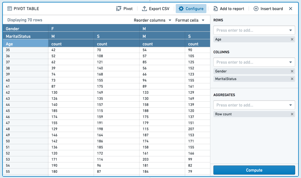
Important note on sampling
To prevent slow front-end and back-end performance, the number of rows to calculate is limited. The limit is 1,000 rows in most environments and is generally not configurable.
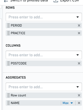
Let's assume that as in the above screenshot, you have Pivot Table row aggregates of PERIOD and PRACTICE, and a column aggregate of POSTCODE. For each combination, you want to get the row count and the max value of the column NAME. If the limit in your environment is the default value of 1,000, you will only calculate 1,000 complete rows. Each row is guaranteed to be complete, but some rows may not be present.
When you sort a column in your pivot table, sorting is performed on the preview, rather than the entire dataset. To sort your entire dataset, use the Sort Board. See Sort for more information.
In order to interact with the entirety of pivoted data, use the Switch to pivoted data option on the board, which will transition your Contour analysis to the fully-computed pivoted data for all boards beneath the pivot table board. Alternatively, you can attempt to avoid the cell limit by further filtering your data upstream of the pivot table.
Configuration
:::callout{theme="success" title="Tip"} When specifying a column aggregate, the values in the column must be case-insensitively unique. For example, if column "Borough" contains values "Brooklyn" and "brooklyn", and you specify "Borough" as a column aggregate, the pivot table calculation will fail. Consider casting all values to a consistent case to avoid this issue. :::
- Columns
- Choose one or more columns to perform aggregates on – each combination of values across the selected columns in the original dataset will form a column in the pivot table.
- Rows
- Choose one or more columns from the original dataset to define the rows in the pivot table – each combination of values across the selected columns in the original dataset will form a row in the pivot table.
- Aggregates
- The available aggregate metrics are: Count (number of records), Unique Count, Min, Max, Sum, Mean, Approx. Median, Standard Deviation, and Variance.
- Except for Count, you must specify which column the aggregate applies to. For Unique Count, you can select any column.
- Min, Max, Sum, Mean, Approx. Median, Standard Deviation, and Variance only apply to numerical columns.
:::callout{theme="neutral" title="Approximate median"} The Approx. Median aggregate is approximate. Contour calls the percentile_approx ↗ function with percentage value 0.5 and the default accuracy. :::
You can drag and drop between Columns, Rows and Aggregates.
You can specify multiple aggregates in a single pivot table. Each aggregate will be calculated for each combination of rows and columns you select.
Grand totals can also be calculated for rows, columns, or both. Grand totals are calculated by performing the aggregate over the entire dataset (in other words, the grand total of Unique Count is the total number of unique counts over the dataset, the grand total of Mean is the mean of the entire dataset).
Pivot (switch to aggregated data)
When you click Pivot (switch to aggregated data), any boards you add after the histogram will use the aggregated data computed in the table, rather than the original dataset.
The new dataset will include the column you selected for Y-Axis in the original histogram configuration, as well as a column for the aggregate. For example:
Column editor
The column editor board allows you to easily remove columns from your dataset and derive new columns. Subsequent boards will consume the set of columns you choose to keep.
Add new column
You can perform binary operations on existing columns in your dataset to create new derived columns, or parse columns of strings into number- or date-formatted columns.
SQL Equivalent
Derived columns are equivalent to using operators in SQL or Spark. For example, the following derives a column for Income per person:
SELECT
    [Household Members],
    [Marital Status],
    [Income Column] / [Household Members] AS [Income per person]
FROM [Table Name]
Existing columns
To remove columns, select Show existing columns and select the name of any column you want to remove. You can add back a column by selecting it again. If you want to delete many columns, you can also select Remove All and then select any columns you want to retain.
Remove duplicate rows
You can remove duplicate rows using the Remove duplicate rows option in the column editor board.

SQL Equivalent
Removing columns via the column editor board is equivalent to selecting column names in SQL. For example, given a table that has 5 columns, A-E, the following removes columns D and E:
SELECT columnA, columnB, columnC
FROM <tableName>
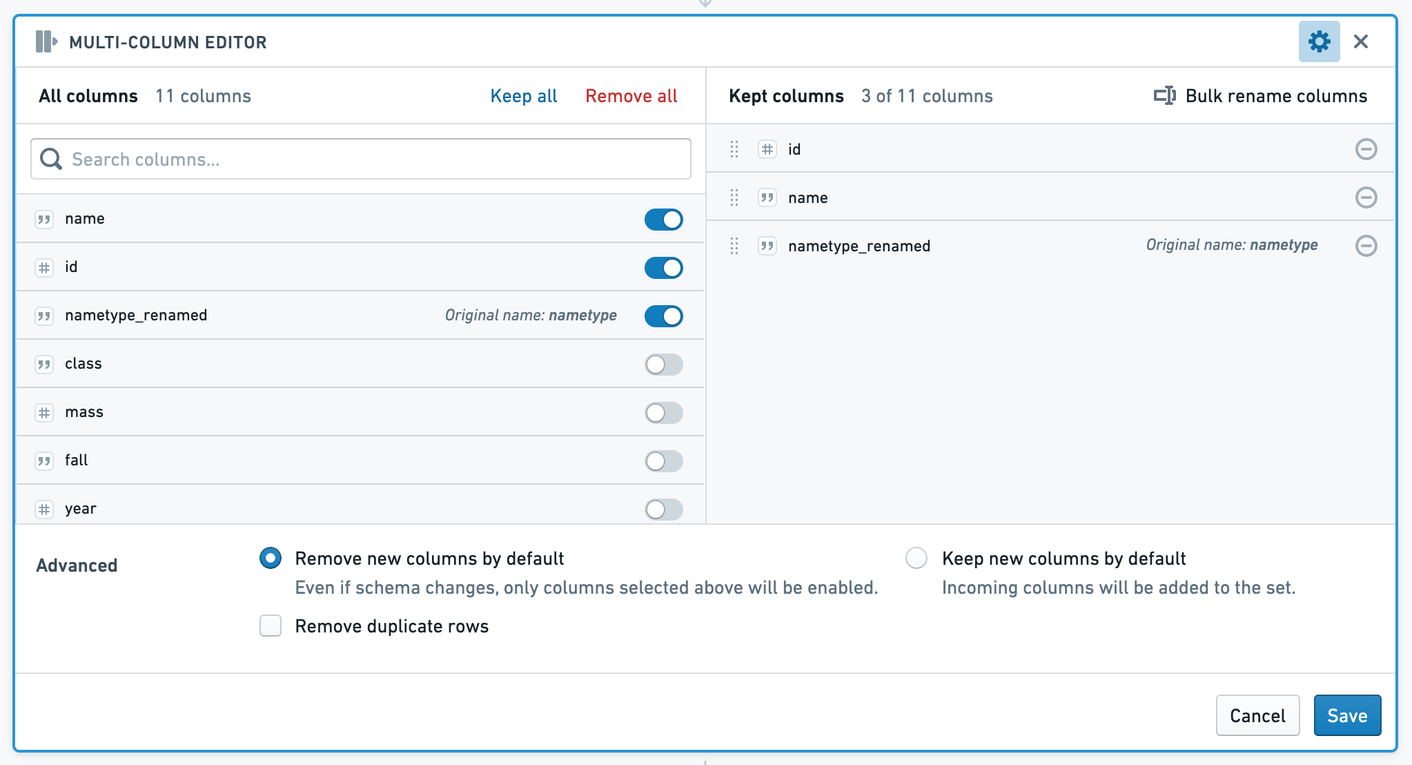
Multi-column editor
The multi-column editor board allows you to reorder, rename and remove columns from your data, and remove duplicate rows. Subsequent boards will consume the set of columns you choose to keep.
The left side of the board shows All Columns, while the right side shows Kept Columns. In the Kept Columns section, you can choose to rename or reorder the kept columns, or use the bulk rename functionality.
SQL Equivalent
Reordering, renaming, and removing columns is equivalent to selecting column names in SQL. For example, given a table that has 5 columns, A-E, the following code removes columns D and E, and renames A to A_1:
SELECT columnA as columnA_1, columnB, columnC
FROM <tableName>
Enrich
The enrich board lets you join your current working dataset to another dataset, and merge the matching results into your data.
Learn how to use the enrich board.
Link
The link board lets you join to another dataset and return the matching records of that dataset. This differs from the set math keep only operation in that it returns columns from the linked (right) table only.
Learn how to use the link board.
Set math
The set math board lets you alter your current dataset based on another set. You can filter the dataset to keep only data that exists in the other dataset (keep only); append data from another dataset (add); or remove data based on the results of another dataset (remove).
Learn how to use the set math board..
Join
The join board presents you with suggested join templates curated by your Palantir administrator. If you would like to add or modify suggested joins, contact your administrator.
Learn how to use the join board..
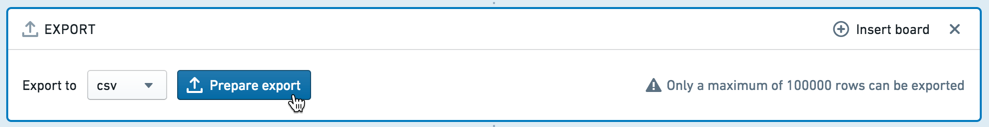
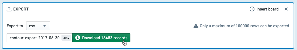
Export
The export board allows you to download your analytical set as a CSV or XLS file.
Choose csv or xls from the dropdown, then click Export. After the board finishes its operations on the server, you are given the option to customize the filename. Then click Download <#> records to download the file.
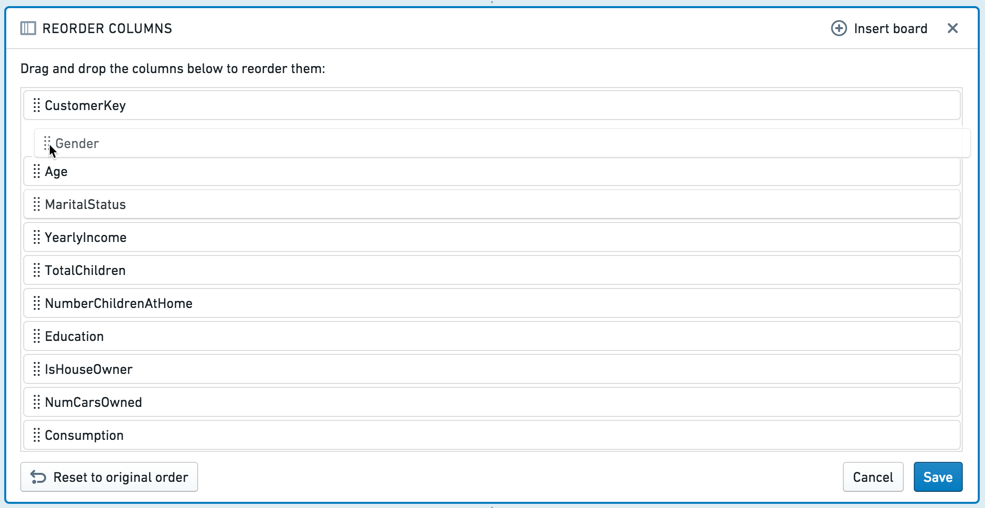
Reorder columns
The reorder columns board lets you drag and drop the columns in your table into a different order.
Macro
The macro board lets you apply a previously created macro to your path.
Sort
The sort board lets you sort all of the data in the dataset. Note that this sort is limited to the analysis and doesn't persist to the saved dataset. The sort may be lost by any downstream aggregations (e.g. a join or removing duplicate rows), so it is recommended to do such aggregations prior to the sort.
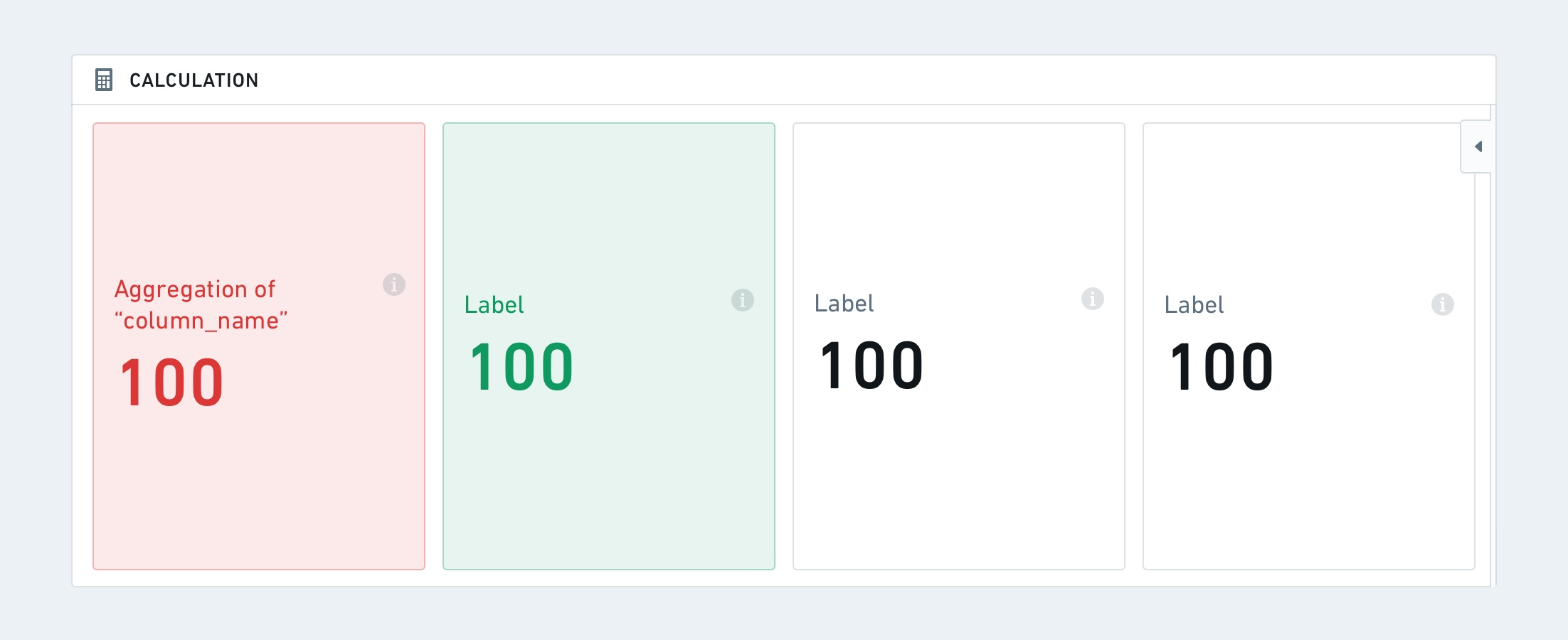
Calculation
The calculation board lets you display multiple aggregate calculation on your data in the form of cards or lists. The available aggregate metrics are: Unique Count, Min, Max, Sum, Mean, Median, Standard Deviation, and Variance.
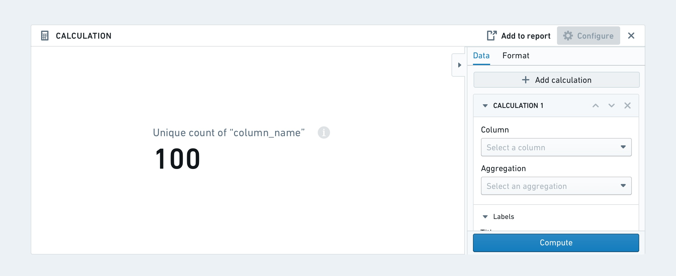
The calculation board can either be formatted as a card or as a list.
The card format has additional formatting options for horizontal or vertical direction and metric sizes.

Lastly, each calculation can have conditional formatting based on a set of specified rules (conditions). This means that font color and background color can change based on whether a condition is met.
Unpivot
The unpivot board allows you to reshape your data by turning some columns into rows. The columns that you select will be reformatted into two new columns: a header column (containing the original column names) and a value column (containing the original data values.)
中文翻译
面板描述
在 Contour 中进行探索和分析是通过串联使用多个面板(board)来实现的。有些面板用于创建图表或执行计算,而另一些则用于通过筛选、删除列等操作来操控数据集。
请使用本摘要表格中的链接在本页面上的不同面板类型之间导航。
| 面板 | 描述 | 可视化 | 筛选行 | 聚合 | 操作列 | 删除重复项 |
|---|---|---|---|---|---|---|
| 摘要 | 报告表格的行数。 | 是 | 否 | 否 | 否 | 否 |
| 筛选 | 按数值、文本或日期时间值筛选数据集。 | 否 | 是 | 否 | 否 | 是 |
| 表达式 | 使用表达式语言派生新列或执行复杂筛选。 | 否 | 是 | 否 | 是 | 否 |
| 表格 | 查看原始数据的一部分,探索模式并计算数据覆盖率指标。 | 是 | 否 | 否 | 否 | 否 |
| 直方图 | 创建数据的直方图并筛选特定组。 | 是 | 是 | 是 | 是,通过透视选项 | 否 |
| 分布 | 创建数据的分布图。 | 是 | 是 | 否 | 否 | 否 |
| 时间序列 | 创建 x 轴为日期/时间的图表并筛选特定组。 | 是 | 是 | 否 | 否 | 否 |
| 编辑列 | 合并、复制、删除、重命名或拆分列。 | 否 | 否 | 否 | 是 | 否 |
| 转换数据 | 混淆数据、查找并替换值或解析日期。 | 否 | 否 | 否 | 是 | 否 |
| 图表 | 创建可自定义的多层图表。 | 是 | 是 | 是 | 否 | 否 |
| 网格 | 创建两个分类列的矩阵。单元格可被筛选并以热力图形式显示。 | 是 | 是 | 否 | 否 | 否 |
| 热力图 | 基于坐标数据查看热力图。 | 是 | 是 | 否 | 否 | 否 |
| 数据透视表 | 为一个或多个指标创建数据透视表。 | 是 | 是 | 是 | 是,通过透视选项 | 否 |
| 列编辑器 | 派生新列或删除不必要的列。 | 否 | 否 | 否 | 是 | 是 |
| 多列编辑器 | 重命名、删除、重新排序列或删除数据中的重复行。 | 否 | 否 | 否 | 否 | 否 |
| 丰富 | 使用另一个数据集丰富数据,并返回两个数据集中的列。 | 否 | 否 | 否 | 是 | 是 |
| 链接 | 连接到另一个数据集并返回该数据集的匹配记录。 | 否 | 否 | 否 | 是 | 是 |
| 集合运算 | 基于外部数据集保留、添加或删除行。 | 否 | 是 | 否 | 否 | 否 |
| 连接 | 执行策划连接。 | 否 | 是 | 否 | 否 | 否 |
| 导出 | 将最终筛选后的观测值集导出为 CSV 或 XLS 格式。 | 否 | 否 | 否 | 否 | 否 |
| 重排列 | 重新排列表格中的列。 | 否 | 否 | 否 | 否 | 否 |
| 宏 | 将模板化转换应用于您的路径。 | 否 | 否 | 否 | 否 | 否 |
| 排序 | 基于一个或多个列对数据行进行排序。 | 否 | 否 | 否 | 否 | 否 |
| 计算 | 显示多个聚合计算。 | 是 | 否 | 是 | 否 | 否 |
| 逆透视 | 通过将某些列转换为行来重塑数据。 | 否 | 否 | 否 | 是 | 否 |
摘要
摘要面板(summary board)显示路径当前位置表格中的行数和列数。
如果您尚未对数据进行任何筛选,则显示的是起始数据集的行数。如果您已应用筛选(例如,通过添加直方图并选择某些条形),则显示的是筛选后剩余的行数。
筛选
筛选面板(filter board)的目的是对数据集应用可自定义的筛选。虽然您也可以在其他面板(分布、直方图)中应用筛选,但筛选面板允许在一个地方构建涉及多个变量的更复杂筛选。
在筛选面板中使用列表类似于 SQL 中的 WHERE IN (x,y,z) 子句。Contour 可以在筛选面板中处理包含数千个项目的列表。但是,大型列表会给浏览器带来负担,过大的列表可能会导致浏览器故障。在这种情况下,应将列表作为单独的数据集导入 Contour,并使用链接或集合运算面板来实现筛选。了解如何使用链接或集合运算面板。
配置
点击 添加筛选,选择要筛选的列,然后从下拉菜单中选择筛选类型。根据您选择的列,Contour 将选择合适的筛选类别(例如,数值列对应数字筛选)。
:::callout{theme="success" title="提示"}
在某些文本筛选中,您可以使用通配符:* 可替代多个字符,? 可替代单个字符。
在"匹配"(正则表达式)文本筛选中,您可以直接输入正则表达式(无需引号或字符串指示符)。 :::
要添加另一个筛选,只需再次点击 添加筛选。您可以选择匹配 所有筛选 或 任一筛选。要删除筛选,请点击筛选旁边的垃圾桶按钮。 点击 保存 以应用您的筛选。
文本筛选详情
文本筛选目前提供以下选项:
- 包含: 返回包含任何搜索词的行。您的搜索词应仅包含文本。例如,搜索词 "hello" 将匹配包含 "hihellohi" 的行。
- 包含(带通配符): 返回包含任何搜索词的行。您的搜索词可以包含
?表示单个字符通配符,或 * 表示多字符通配符。例如,搜索词h?l*o将匹配 "hi hello hi" 或 "hi halqqqqqo hi"。 - 等于: 返回等于任何搜索词的行。您的搜索词应仅包含文本。例如,搜索词
hello将匹配 "hello",但不会匹配 "hi hello hi"。 - 等于(带通配符): 返回等于任何搜索词的行。您的搜索词可以包含 ? 表示单个字符通配符,或 * 表示多字符通配符。例如,搜索词
h?l*o将匹配 "hello" 或 "halqqqqqo"。 - 匹配: 返回匹配任何词条的行,其中词条是正则表达式。此选项使用 Java Pattern ↗ 来评估正则表达式。
表达式
除了直方图和图表等可视化工具外,Contour 还提供了一个表达式面板(expression board),让您可以使用 Contour 丰富的表达式语言从数据中派生新列、执行复杂筛选或执行复杂聚合。
- 使用表达式编辑器时,点击 ? 图标可快速参考表达式语言。
- 当您输入时,建议的函数会出现在下拉菜单中。点击或使用 Enter 键选择您想要的函数。
:::callout{theme="neutral"}
列名区分大小写。此外,选择列时,您可以带或不带双引号编写列名。例如,year("birthdate_col") 等同于 year(birthdate_col)。为保持一致,本文档中的列名均使用双引号编写。
:::
表格
表格面板(table board)以表格格式显示数据集的快照。请注意,仅显示数据集中的前 limit(默认值:1,000)行。此限制旨在防止浏览器性能问题,通常不可配置。
表格面板对于抽查数据以确保其符合预期非常有用。您可以与表格交互:拖放列以重新排序,或从每列的下拉菜单中选择。这些对表格的格式更改不会更改底层数据(如果您只查看列的子集,所有列仍存在于底层数据中)。
要一次移动多列,请在按住 Shift 键的同时选择列。 您还可以使用 配置 面板一次修改多列。
条件格式
您可以通过点击列下拉菜单向表格面板添加条件格式。
然后,使用对话框为给定列添加规则。条件格式化的单元格将显示所选颜色的文本和背景。日期列不支持规则。
表格面板与表格视图
您可以在路径中的任何位置添加表格面板,以快速预览该时刻的数据,或者您可以从路径视图切换到 表格视图。
表格视图将表格(而非面板)作为焦点,因此您可以查看添加每个面板时数据的变化。这在编写表达式时尤其有用。
您可以通过点击右上角的 表格 切换到表格视图。再次点击该按钮或点击 隐藏表格 返回路径视图。
表格视图不支持条件格式。
直方图
直方图面板(histogram board)聚合给定列中的不同值,并将结果显示为条形图。
例如,以下直方图计算了出租车行程的平均时长,按行程起始的纽约社区分组。
请注意,仅显示前十个条形。要显示更多条形,请点击 + 显示更多。您可以一次显示最多 50 个值。如果值超过 50 个,请使用下拉菜单导航到范围的其他部分。
SQL 等效
直方图面板是 SQL GROUP BY 子句的可视化。
上述直方图示例等效于以下 SQL 查询:
SELECT start_neighborhood, mean(trip_time_in_secs)
FROM <table name>
GROUP BY start_neighborhood
配置
- Y 轴
- 选择一列来对数据进行分组。数据基于此列的离散值进行分组,然后计算聚合。
- X 轴
- 选择要计算的聚合,如果聚合不是 计数,则选择要应用聚合的列。
- 聚合
- 可用的聚合指标有:计数(记录数)、唯一计数、最小值、最大值、总和、平均值、近似中位数、标准差 和 方差。
- 除 计数 外,您必须指定聚合应用于哪一列。对于 唯一计数,您可以选择任何列。
- 最小值、最大值、总和、平均值、近似中位数、标准差 和 方差 仅适用于数值列。
- 为 Y 轴选择的列中的每个不同值计算聚合。
:::callout{theme="neutral" title="近似中位数"} 近似中位数 聚合是近似值。Contour 调用 percentile_approx ↗ 函数,百分比值为 0.5,使用默认精度。 :::
切换到透视数据
当您点击 切换到透视数据 时,您在直方图之后添加的任何面板都将使用在表格中计算的聚合数据,而不是原始数据集。
新数据集将包括您在原始直方图配置中为 Y 轴选择的列,以及一个用于聚合的列。例如:
排序
直方图默认按聚合值降序排序。对于非常大的直方图,排序是在聚合值最高的前 1,000 个值上执行的。
您可以使用下拉菜单改为按 Y 轴列值排序,或更改排序方向。
筛选
在直方图上选择数据以筛选数据集,供后续面板使用。
选择模式:
-
选择 条形 以按您选择作为 Y 轴的列的一个或多个不同值进行筛选。
-
选择 范围 以按聚合值进行筛选。例如,您可以使用范围选择仅选择值高于某个阈值的类别。
然后选择 保留 以筛选为 仅 选定的值,或选择 移除 以仅保留未选定的值。
分布
分布面板(distribution board)显示聚合指标的数值变量分布。
分布面板类似于直方图,但它显示的是基于值 范围 的聚合数据,而不是特定值。例如,以下分布显示了客户年龄的数据。年龄被分为十个范围(或"桶")。
SQL 等效
在计算分布面板时,我们首先找到 X 轴的最小值和最大值,并创建一个函数来计算桶。分布的 SQL 等效大致如下:
SELECT X_AXIS_BUCKET_FUNCTION([x-axis-column]), <AGGREGATE_METRIC>([aggregate-column])
FROM <PARENT_BOARD>
GROUP BY X_AXIS_BUCKET_FUNCTION([x-axis-column])
配置
- X 轴
- 选择一列数值。此列中的值被分组为等宽范围(换句话说,您的数据被平均分成十个、100 个或 1000 个"桶"),然后应用聚合。您还可以配置此轴的刻度(线性或对数)。
- Y 轴
- 选择要计算每个范围的聚合指标。
- 可用的聚合指标有:计数(记录数)、唯一计数、最小值、最大值、总和、平均值、近似中位数、标准差 和 方差。除 计数 外,您必须指定聚合应用于哪一列。
- 您也可以配置 Y 轴的刻度(线性或对数)。
:::callout{theme="neutral" title="近似中位数"} 近似中位数 聚合是近似值。Contour 调用 percentile_approx ↗ 函数,百分比值为 0.5,使用默认精度。 :::
筛选
要选择筛选范围,请在图表上点击并拖动您想要的区间。
然后,您可以在可编辑的面板页脚中更精细地调整区间。
您可以选择 保留 选定区间内的值,或 移除 这些值,仅保留未选定的值。要清除选择,请点击 清除 按钮(x)。
时间序列
时间序列面板(time series board)允许您按时间间隔对数据进行分组,并计算该数据的聚合指标。
例如,给定一个包含客户个人信息的数据集,以下时间序列面板计算了每年出生的人数。
您可以进一步指定一个列作为 系列。对于上述示例,您可以选择将性别作为系列。然后,时间序列面板将为系列列中的每个值划分出一条线:在本例中,为 F(女性)或 M(男性)。
请注意,时间序列对 整个 数据集执行聚合,并在显示时将输出减少到前 1000 个值。
配置
- X 轴
- 选择一个 DateTime 列以按时间对数据进行分组。然后选择一个时间单位——数据将按该长度的间隔进行分组。可用的单位有:秒、分钟、小时、天、周、月 和 年。
- 聚合
- 定义要应用于每个时间间隔的聚合。
- 可用的聚合指标有:计数(记录数)、唯一计数、最小值、最大值、总和、平均值、标准差 和 方差。
- 除 计数 外,您必须指定聚合应用于哪一列。对于 唯一计数,您可以选择任何列。
- 最小值、最大值、总和、平均值、近似中位数、标准差 和 方差 仅适用于数值列。
- 系列
- 选择一列将数据划分为系列。列中的每个离散值将对应一个系列(在图表中表示为一条线)。
:::callout{theme="neutral" title="近似中位数"} 近似中位数 聚合是近似值。Contour 调用 percentile_approx ↗ 函数,百分比值为 0.5,使用默认精度。 :::
筛选
您可以在时间序列上选择一个日期范围来筛选数据集,供后续面板使用。点击 ,然后点击并拖动您想要的区间。(您可以在可编辑的面板页脚中更精细地调整区间。)要清除选择,请点击 图标。
从下拉菜单中选择 保留 以筛选为 仅 选定的值,或选择 移除 以仅保留未选定的值。
编辑列
您可以使用以下面板在 Contour 中编辑列:
- 合并 两个或多个列。
- 复制 一个列(例如,尝试对该列进行操作而不影响原始数据)。
- 删除 表格中的一列。
- 重命名 一列。
- 拆分 基于某个分隔符的列。
转换数据
您可以使用以下面板转换列中的数据:
混淆
- 哈希 单元格值(例如,用于隐藏姓名等敏感数据)。列中的每个值都使用 SHA-1 ↗ 哈希函数替换为该值的哈希表示。
:::callout{theme="warning"} SHA-1 哈希可以被解密,因此不被认为是完全安全的。因此,它不应用于数据合规目的。 :::
- 掩码 值中的一定数量的字符(例如,掩码电话号码中除最后 2 位以外的所有数字)。
- K-匿名化 数据列作为一种隐私技术,旨在为数据集设置一个阈值 (
k),确保至少有k个实例具有相同的敏感信息集,以降低重新识别的风险(即使没有个人身份信息)。此过程通过"抑制"可能有助于重新识别数据的特定字段来完成。
:::callout{theme="neutral"} 适用于您用例的适当 k 值由上下文决定。组织通常根据分析背景和重新识别的统计风险来制定自己的 k 值设置策略。一些示例策略包括 国家教育统计中心 ↗ 和 美国卫生与公众服务部 ↗。k 值至少应始终大于 1 且小于数据集中的总行数。 :::
使用 k-匿名化功能,面板会要求提供要 k-匿名化的列、k 值目标、抑制策略,以及如何处理抑制后不满足 k 值的行。
- 列: 代表"准标识符"或可以与外部数据关联以唯一识别个人的属性。
- k 值: 代表阈值
k,其中至少有k个实例具有相同的敏感信息集。 - 策略: 代表数据应如何抑制以及按什么顺序抑制。您可以设置给定的操作顺序以达到指定的 k 值。对于列出的每一列,您可以选择不同的策略应用于数据以满足 k 值:
- 分桶: 将整数替换为一个范围;仅在选择了数值类型列时可用。
- 掩码: 将最后 n 个字符替换为
*。 - 替换: 将整个值替换为一个字符串。默认行为建议使用
***作为替换值,但这可以替换为用户提供的值。 - 选中 抑制列 标志的列将对所有值应用该策略,无论是否满足 k 值。此行为对于诸如年龄分桶等情况特别相关,在这种情况下,对所有值使用一致的分桶策略是有用的。
- 抑制后不满足 k 值的行: 如果某些行不满足 k 值阈值,并且无法通过抑制使其计数大于
k,则有以下选项可用: - 保留: 保留这些行,以免数据丢失。请注意,如果您保留这些行,数据集将不会被 k-匿名化;这通常是审查 k-匿名化结果的有用步骤。
- 删除: 删除所有不满足 k 值的行。选择删除时,请务必计算混淆前后的行数,以了解删除的行数。
- 编辑: 用
***混淆表中的所有值。如果您希望保留相同的行数,此选项特别相关。
查找和替换
在列中查找和替换文本,或查找空单元格或 null 单元格。此面板支持字符串或数值类型的属性。
解析日期
日期通过根据用户提供的日期格式逐个符号地解释字符串来从字符串中解析。
在提供的格式中,未加引号的字母被视为模式,代表特定的日期或时间组件。与模式匹配的字符串符号根据以下规则被解释为日期或时间组件:
| 字母 | 日期或时间组件 | 示例 |
|---|---|---|
| y | 年 | 1996; 96 |
| M | 月 | July; Jul; 07 |
| d | 日 | 10 |
| a | 上午/下午标记 | AM; PM |
| h | 上午/下午的小时 (1-12) | 12 |
| H | 一天中的小时 (0-23) | 13 |
| m | 分钟 | 30 |
| s | 秒 | 55 |
| S | 秒的小数部分 | 978 |
| z | 通用时区 | Pacific Standard Time; PST; GMT-08:00 |
| Z | 时区偏移 | -0800; -08:00 |
- 包含其他字母的格式不受支持。不受支持的字母仍被视为模式,但使用它们可能会导致意外的解析结果。
- 如果您想要的格式不受支持,请使用表达式面板。
- 如果您的字符串包含不应被解释的字母,请将它们括在单引号
' '中,以便它们被视为纯文本而不是模式。 - 非字母或带引号的符号被视为纯文本。在解析过程中,它们必须与输入字符串中的相应符号严格匹配。
在匹配和解释日期和时间组件后,输出日期基于这些解释的组件构建。
图表
Contour 图表面板(Chart board)允许您构建自定义图表来分析数据。
配置
为主图表层选择图表类型,然后配置 x 轴和 y 轴。目前图表面板提供以下图表类型:
条形图
水平条形图
折线图
散点图
热网格图
饼图
按...分段
对于热网格图和饼图以外的图表类型,您还可以选择 将数据分段为系列。
排序
展开 选项 部分以更改图表数据的排序方式。 您可以按主图层中的值对图表数据进行排序:
- X 值
- Y 值
- 自定义列值。此排序值可以是数据集中的 任何 列(甚至是未绘制在图表上的列)。
以下示例按一个国家在奥运会中获得的金牌数对条形图进行排序:
数据可以按升序或降序排序。叠加图值不能用于对图表数据进行排序。
格式化
使用格式选项卡配置图表。您可以更改 X 轴和 Y 轴标题、轴格式、图例位置、系列排序和系列颜色。
添加叠加图
您可以通过点击 + 添加叠加图 来添加叠加图。例如,您可能想要在条形图之上叠加一个折线图。
添加叠加图时,您可以选择图表是使用当前路径中的数据还是来自不同数据集的数据。
:::callout{theme="neutral"} 绘制来自不同数据集的数据 不会 将该数据集与工作集连接。要连接数据集,您应该使用 连接面板。 :::
请注意,只有主图表层是数据路径的一部分。其他图层仅用于展示目的。换句话说,在叠加图层上进行选择或以其他方式操作数据将 不会 影响路径下游的数据。
如果各个图层的值不相关,或者数据范围或绘图比例差异很大,您可以将图表图层绘制在单独的 y 轴上。
分桶选择
在配置 分组依据 列(例如,在 x 轴上)和 分段依据 列时,您可以选择如何对数据点进行分桶。只有数值、日期或时间列可以进行分桶。例如,如果您创建一个条形图并为 x 轴 分组依据 列选择一个日期列,并选择分桶类型 年,则生成的图表将每年有一个条形。可用的分桶类型如下所列。
数值列分桶类型:
- 精确值: 数据不分桶,显示精确值。
- 最优: 桶的数量等于底层数据范围内点数的平方根。数据范围是列的最大值和最小值之间的差值。
- 最精细: 图表使用适合 结果限制 的最大桶数。尽可能使用精确值。
- 自定义: 可以手动选择桶的数量。请注意,桶的数量不能超过 结果限制。
日期和时间列分桶类型:
- 精确时间: 数据不分桶,显示精确值。
- 舍入: 数据被分桶到最近的 秒、分钟、小时、天、周、月 或 年,具体取决于选择。例如,如果按 年 分桶,日期为 2018 年 6 月 15 日的数据点将被分桶到 2018 年桶中。
- 序数: 数据被分桶为序数日期。例如,如果选择了 星期几,则数据被分桶为七个桶,一周中的每一天对应一个桶。
:::callout{theme="neutral"} 如果分桶选择不适合结果限制,则将应用适合的最精细选项,以便不丢弃数据。阅读 结果限制 了解更多信息。 :::
结果限制
Contour 限制其在浏览器上显示的数据点数量。实际上,Contour 无法显示比屏幕像素更多的数据点。为了生成准确的图表并且不丢弃任何数据,图表面板将图表配置重新分桶为适合结果限制的最精细分桶选择。
结果限制由您的 Palantir 管理员设置,默认为 1000 个点。重新分桶将针对数值、日期或时间列进行。
为了说明重新分桶,请考虑以下示例:
- 在一个包含出生日期的数据集上创建了一个图表面板。
- 该面板被配置为条形图,x 轴设置为出生日期列。例如,计算具有相同出生日期的人数。
- 出生日期列指定了精确到秒的日期,因此选择了秒分桶类型。
- 在此数据集中,每秒的唯一出生日期数超过了结果限制。
- 因此,在计算时,图表面板会自动将数据按小时而不是按秒分桶,因为小时是适合此特定数据集结果限制的最精细桶大小。
筛选
在图表上选择数据以筛选数据集,供后续面板使用。使用 Ctrl+Click 或 Cmd+Click 进行多选。
您可以平移和缩放图表以更轻松地查看数据。将鼠标悬停在图表上的条形或点上时,还会显示一个工具提示,突出显示您正在查看的内容。
网格
网格面板(grid board)类似于直方图,但网格面板按两列而不是一列聚合数据,显示结果的热网格图。(对于超过两列的情况,您可以使用数据透视表。)例如,以下网格比较了教育水平与年收入:
SQL 等效
网格面板是聚合查询的可视化,类似于直方图和数据透视表面板。 网格大致等效于以下 SQL 查询:
SELECT [x-axis-column], [y-axis-column], <AGGREGATE_METRIC>([aggregate-column])
FROM <PARENT_BOARD>
GROUP BY [x-axis-column], [y-axis-column]
配置
- X 轴 和 Y 轴
- 选择两列——这些列中唯一值的每种组合将在网格中形成一个单元格。
- 聚合
- 选择要为网格中每个单元格计算的聚合指标。聚合的结果将决定单元格的颜色。
- 可用的聚合指标有:计数(记录数)、唯一计数、最小值、最大值、总和、平均值、近似中位数、标准差 和 方差。
- 除 计数 外,您必须指定聚合应用于哪一列。对于 唯一计数,您可以选择任何列。
- 最小值、最大值、总和、平均值、近似中位数、标准差 和 方差 仅适用于数值列。
:::callout{theme="neutral" title="近似中位数"} 近似中位数 聚合是近似值。Contour 调用 percentile_approx ↗ 函数,百分比值为 0.5,使用默认精度。 :::
筛选
在网格上选择一个或多个单元格以筛选数据集,供后续面板使用。再次点击单元格可取消选择。
选择 保留 以筛选为 仅 选定的值,或选择 移除 以仅保留未选定的值。
热力图
热力图面板(heatmap board)在地图上显示地理编码数据,并使用颜色编码来表示值。
配置
- 指定哪些列包含纬度/经度数据。
- 可选地,指定一个 geohash 列。
- 然后,选择要计算的聚合指标。
- 可用的聚合指标有:计数(记录数)、唯一计数、最小值、最大值、总和、平均值、近似中位数、标准差 和 方差。
- 除 计数 外,您必须指定聚合应用于哪一列。对于 唯一计数,您可以选择任何列。
- 最小值、最大值、总和、平均值、近似中位数、标准差 和 方差 仅适用于数值列。
:::callout{theme="neutral" title="近似中位数"} 近似中位数 聚合是近似值。Contour 调用 percentile_approx ↗ 函数,百分比值为 0.5,使用默认精度。 :::
筛选
您可以在热力图上绘制一个半径,以选择所有包含该半径内地理数据的行。
点击 ,然后在地图上点击并拖动以绘制一个圆形。
选择 保留 选定半径内的值,或 移除 这些值,仅保留未选定的值。
要清除选择并移除筛选,请在地图上圆形外部点击。
数据透视表
数据透视表面板(pivot table board)允许您快速计算数据在多个维度上的多个聚合值。此计算的结果是经过采样的,因此表中显示的内容可能不完整。下文将进一步详细描述此采样。
给定一个包含客户人口统计信息的数据集,以下数据透视表计算了(按年龄)已婚女性、已婚男性、单身女性或单身男性的客户数量。
关于采样的重要说明
为防止前端和后端性能下降,要计算的行数是有限制的。在大多数环境中,限制为 1,000 行,通常不可配置。
假设如上图所示,您的数据透视表行聚合为 PERIOD 和 PRACTICE,列聚合为 POSTCODE。对于每种组合,您希望获得行计数和列 NAME 的最大值。如果您环境中的限制是默认值 1,000,您将只计算 1,000 个完整的行。每一行都保证是完整的,但某些行可能不存在。
当您在数据透视表中对列进行排序时,排序是在预览上