Map board(地图面板(Map board))
The Contour map board allows you to visualize and interact with your geospatial data.
These map visualizations are comprised of two types of layers:
- A base layer (also called a tile layer), which provides the background map imagery, and
- Overlay layers, which represent data as points or shapes on top of the base layer.
The map board supports map rendering with MapboxGL ↗. If WebGL is not supported in a user’s browser, the map board will render with Leaflet ↗.
:::callout{theme="neutral"} Check whether or not your browser supports WebGL by visiting the WebGL website ↗. :::
The map board uses Mapbox as the primary source for its base map imagery. To learn more about web map technology, see the Mapbox documentation ↗.
Overlay layer types
In the map board, overlay layers (referred to as “layers” in the interface) represent data as points or shapes on top of a map’s base layer. The map board contains the following types of overlay layers:
Currently, static layers (which are commonly used in Workshop maps) are not supported in the map board.
Point
Point layers use points or markers to represent individual objects on a map, plotted by a latitude/longitude pair. The color, icon type, and size of the points can be styled.
For configuration information, see the configure point layers section below.
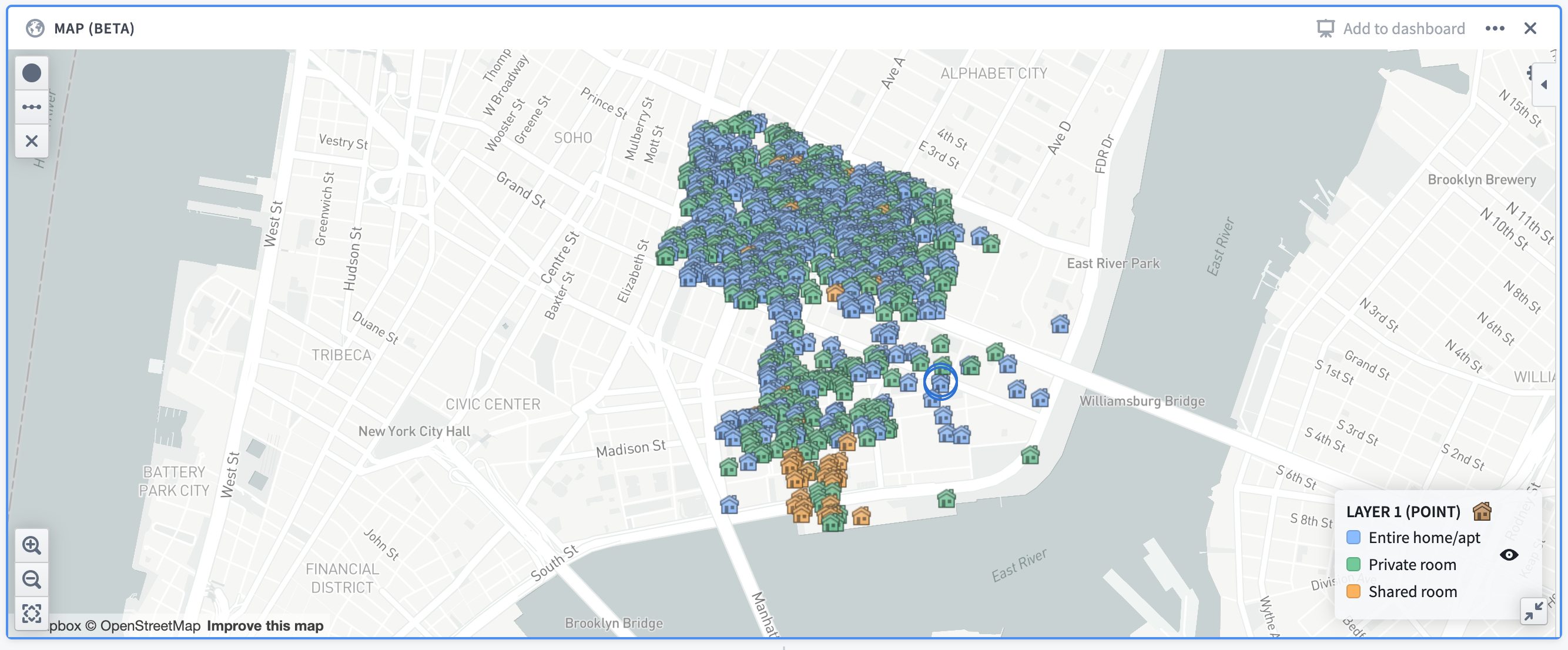
Example: A map showing Airbnb locations in the Lower East Side neighborhood of Manhattan, colored by the room type. The map uses open source data from Inside Airbnb ↗.
Cluster
Cluster layers are ideal for large sets of data containing latitude/longitude pairings. Clusters are similar to points, but instead of plotting a single marker per object, the objects being plotted are aggregated based on their geographic proximity into clusters. The size and/or color of the cluster is configurable to represent the number of data points within a given area.
In addition to the number of data points (which is a count aggregation), the cluster layer supports a number of different aggregation functions, such as the sum or average of a different column in the dataset.
For configuration information, see the configure cluster layers section below.
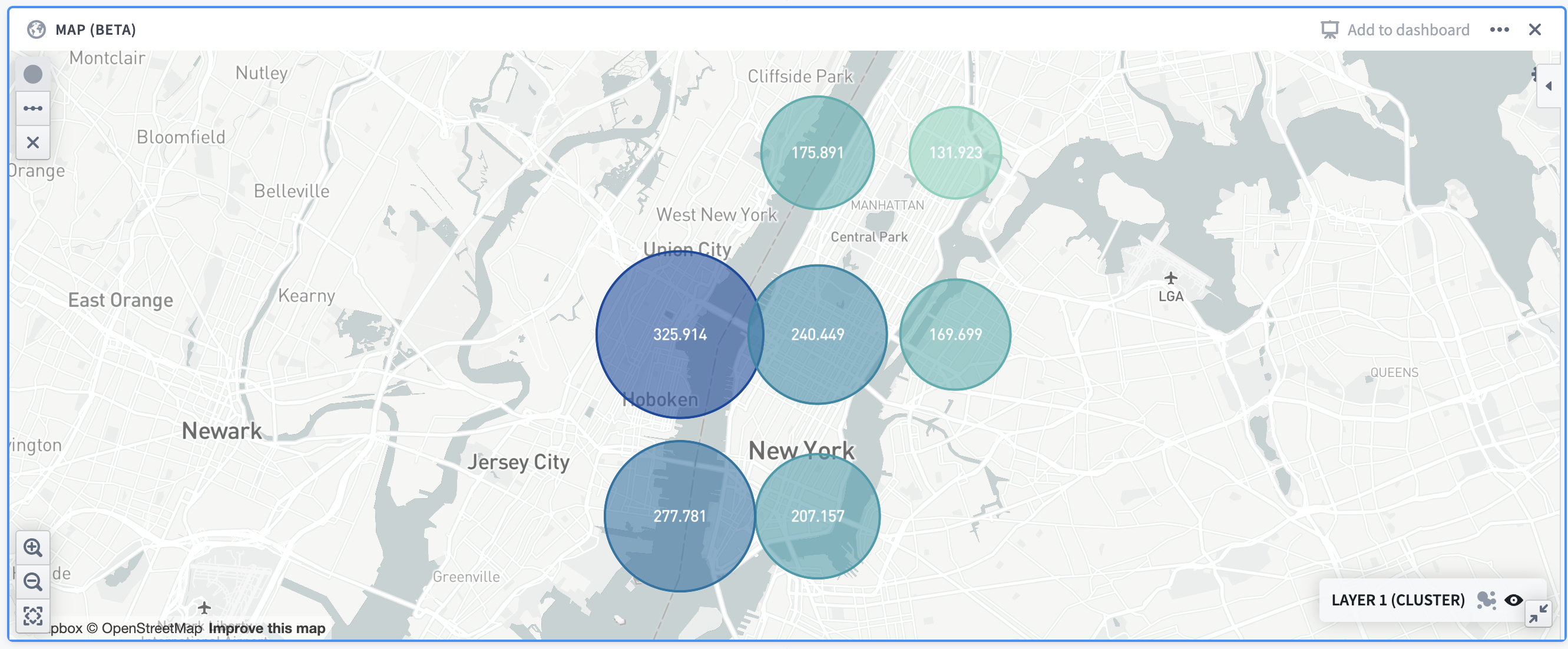
Example: A map showing the distribution of Airbnb prices in Manhattan. Cluster size/colors are based off of the average price in the given area.
Choropleth
The choropleth layer displays regions (such as countries or provinces) that are colored based on some column value or aggregation over column values of rows represented by that region. This provides a way to visualize variation or patterns across different regions, with the option of seeing how those values change over time.
For configuration information, see the configure choropleth layers section below.
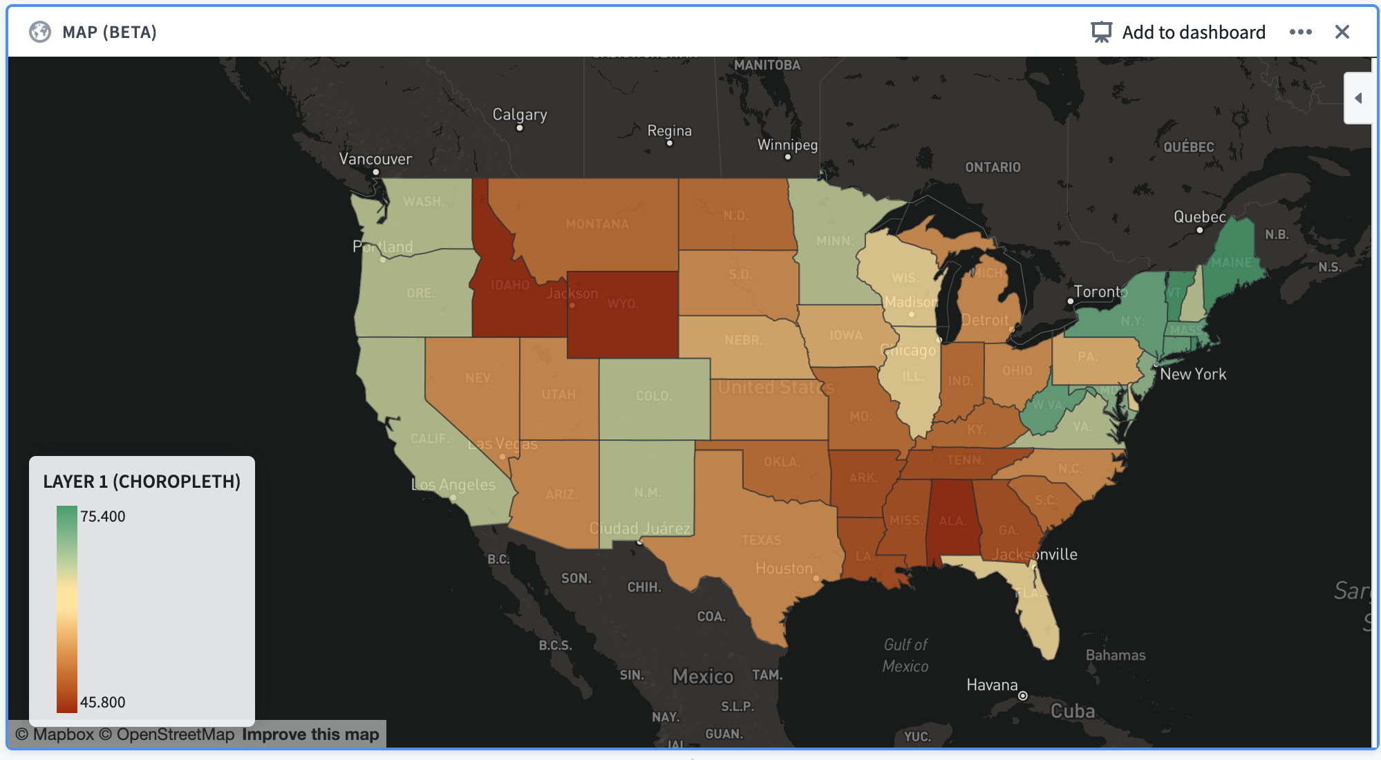
Example: A map of the continental United States, with each state colored according to the percentage of its total population that is fully vaccinated as of December 13, 2021.
Line segment
Line segment layers plot individual rows as a line segment connecting two points. Points are defined by a latitude/longitude pair.
For configuration information, see the configure line segment layers below.
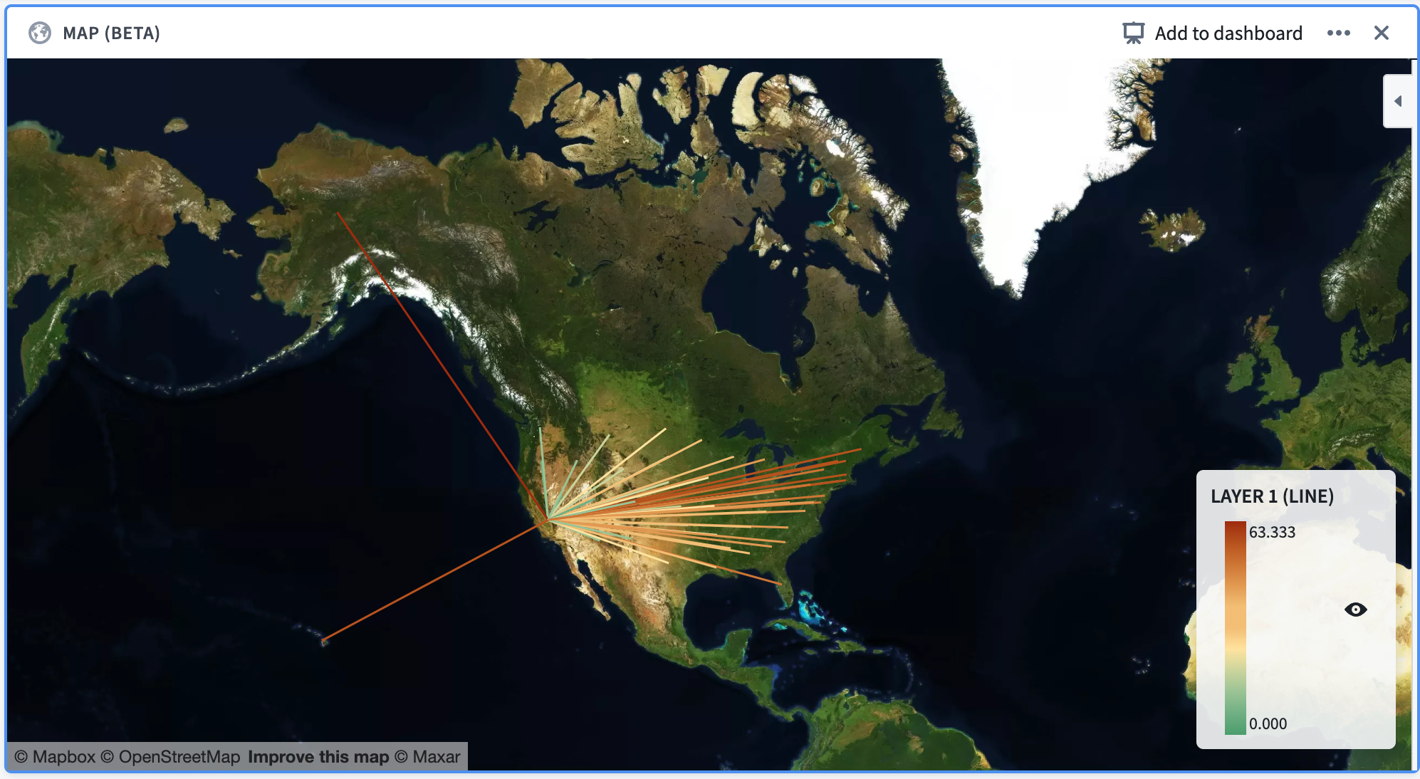
Example: A map of the United States, with line segments that start in the center of each state and end in California. The line segments are colored according to their distance from California.
Configuration
Below is an image of a newly added and not yet configured map board. By default, a point layer with its data source set as the Current set will be added to the board.

At the top of the configuration panel are a set of tabs: Data and Format.
- The Data tab allows you to add and configure the overlay layers of the map, which are described in the previous section.
- The Format tab allows you to configure the base layer of the map, along with other general formatting options for the map (for example, the position of the legend in the map).
Data tab
The data tab contains an Add layer button at the top and a collapsible section for each overlay layer that is shown on the map.
Clicking the Add layer button at the top of the section will add a new layer (defaulting to a point layer) to the map and will collapse all other sections.
The Data source represents the dataset or Contour path that the layer will use to display data and compute aggregations. By default, the Current set is selected for this option which will use data from the current Contour path.
Other options for the data source include other paths in the same analysis, or a different Foundry dataset.
The Map Type can be changed to configure a different type of layer. The different options for these layers are point, cluster, choropleth, and line segment, as described above.

Configure point layers
For the point layer, the main configuration options are as follows:
- Location: Allows selecting latitude and longitude columns, indicating the location of each row in the data source.
- Point styling: Allows configuring the icon type, color, and size for each point:
- Icon type: A dropdown selector of the available icon types which can be filtered with a text search.
- Color: A selection between “Single color” and “Color by value”.
- Single color: Provides a dropdown selector of a color that will be used to uniformly color all points of the layer.
- Color by value: Provides a column selector. Each point will be assigned a color based on the value contained in the selected column.
- Size: A dropdown selector of the available sizings: small, medium, large, and extra large.
- Tooltip: A column selector allowing users to add a column containing tooltip labels. These labels will be displayed in a tooltip when hovering over points in the map.
Configure cluster layers
For the cluster layer, the main configuration options are as follows:
- Location: Allows selecting latitude and longitude columns, indicating the location of each row in the data source.
- Aggregation: Allows selecting a column containing values and an aggregation type based on that column. The result of this aggregation will be used in determining the size/color of the clusters.
- Cluster styling: Allows configuring the size scaling, color, and opacity of the clusters:
- Size scaling: Describes how the clusters in the map should scale according to the result of the aggregation. Options are linear, log, and square root.
- Color: A selection between “Single color” and “Scaled color”:
- Single color: Provides a dropdown selector of a color that will be used to uniformly color all clusters of the layer.
- Scaled color: Provides selectors for a “color scale” and a “scale type”. The color scale and scale type will be used to color the clusters on a gradient according to the value of each cluster.
- Opacity: A slider that allows configuration of the fill opacity of the clusters on the layer, from a scale of 0 (fully transparent) to 1 (fully opaque).
:::callout{theme="neutral"} For additive aggregations (count or sum, for example), the map board will supercluster existing clusters. This means that clusters will automatically adjust as you zoom in and out of the map so that an appropriate level of cluster granularity will be shown for the current zoom level. :::
Configure choropleth layers
To configure a choropleth layer, you must first specify the Choropleth type. This corresponds to the source for the boundaries that will define the regions that are shown. Currently, the map board supports the following choropleth types:
- Mapbox: This is the easiest method of configuring a choropleth, assuming that you are interested in displaying generic regions around the world (countries, states, or counties, for example). This option leverages the use of Mapbox enterprise boundary sets ↗. First, install Mapbox boundary datasets on your Foundry instance.
- GeoJSON: This option is useful if you have simple, custom regions defined via GeoJSON, or do not have access to the Mapbox APIs from your environment (due to network restrictions, for instance). This option leverages data in GeoJSON ↗ format.
The configuration options for the layer itself differ based on the choropleth type selected:
- Mapbox:
- Choropleth region type: Allows selecting boundary types and data levels ↗. Mapbox Boundaries data are categorized into five broad types based on the functions the boundaries serve: admin, legislative, locality, postal and stats. Within each boundary type, features are organized into a hierarchy of different numbered levels. Typically, larger-numbered levels will nest under smaller-numbered levels. For example, in the United States, counties (admin level 2) are subdivisions of states (admin level 1), which are subdivisions of the country (admin level 0).
- The region ID column for the layer must match the required Mapbox feature IDs for whatever boundary level you select. The mappings for these feature ID values are available through an imported dataset that should already exist on the platform. If you are unaware of how to locate these mappings, contact support.
- Worldview: This feature ↗ renders map boundaries for different audiences when multiple versions of boundaries exist; currently, the available options are the United States, Japan, India, and China.
- Aggregation: Allows selecting a column containing values and an aggregation type based on that column. The result of this aggregation will be displayed in a tooltip that is visible when hovering over a choropleth region. Additionally, it will be used when using the Color scale coloring option.
- GeoJSON:
- GeoJSON geometry column: Allows the selection of a column that contains data in a GeoJSON format. The shapes specified by the data will be displayed on the map for each layer. This allows for custom shapes that may not be supported by Mapbox but does not allow for aggregation or selections.
Additionally, choropleth layers support different types of color configurations:
- Single color: Provides a dropdown selector of a color that will be used to uniformly color all shapes on the layer.
- Scaled color: Provides selectors for a “color scale” and a “scale type”. The color scale and scale type will be used to color the regions on a gradient according to the value of each region.
- For Mapbox choropleths, the value for each region is determined by the result of the aggregation.
- For GeoJSON choropleths, the value for each region is determined by a column that the user must provide when selecting this option.
- Color by value: Provides a column selector. Each region will be assigned a color based on the value contained in the selected column.
- This option is only available for GeoJSON choropleth layers.
- Custom buckets: Provides a form for assigning colors based on value ranges. To configure a custom bucket, select a color, a label (optional), and a minimum value. Each bucket encompasses any choropleth region whose aggregated value falls between the bucket's minimum value and the minimum value of the adjacent bucket.
- This option is only available for Mapbox choropleth layers.
Configure line segment layers
To configure a line segment layer, you must first specify the Line segment type. This will specify how lines should be drawn on the line layer. Currently, the following options are supported by the map board:
- Point to point: For each row in the input dataset, this draws a straight line between the provided start and end points.
- When selecting this option, users must provide four columns:
- Start latitude,
- Start longitude,
- End latitude, and
- End longitude
- GeoJSON source: For each row in the input dataset, this draws the line provided by the GeoJSON shape contained in the specified column. This option allows for more complex lines to be drawn on a map, but selections will not be available for such layers.
- When selecting this option, users must provide a column corresponding to the GeoJSON feature column, which is the column containing the GeoJSON shapes.
Additionally, line segment layers support different types of color configurations:
- Single color: Provides a dropdown selector of a color that will be used to uniformly color all lines on the layer.
- Scaled color: Provides selectors for a “Value column”, “color scale”, and a “scale type”. The color scale and scale type will be used to color the lines on a gradient according to the value of each line, which is determined using the value column that the user provides.
- Color by value: Provides a column selector. Each line will be assigned a color based on the value contained in the selected column.
Format tab
The format tab contains general formatting information for the map.

Map theme: Corresponds to the style of the base layer of the map. These options are provided by Mapbox. The default map theme is the light theme ↗. Other options include the following:
- Dark
- Satellite
- Basic
- Bright
- Outdoor
- Satellite streets
- Street
Viewport: Specifies the viewport of the map when initially loading the map, or when updates are made that cause the map to re-render points.
- Zoom to fit: The map viewport will automatically zoom to fit the current data on the map.
- Initial viewport: Allows for manually configuring the latitude, longitude, and zoom levels. There is also an option to automatically set these values to the current viewport of the map.
Legend: specifies options for the map legend.

- Position: Where the legend should appear on the map.
- Orientation: Specifies whether the legend should expand horizontally or vertically.
- Show legend: Toggling this option will show/hide the legend from users
- Allow toggling layer visibility: When enabled, will show each layer on the legend with an eye icon. Clicking this icon will allow users to temporarily hide individual layers.
Map filtering and drawings
Filtering
The map board supports many filtering options which differ by layer. Note that filtering is only enabled when the Data source option is set to the Current set. Multiple filters on the map will be unioned together (OR filters) rather than intersected.
Point layer filtering
- Clicking on individual points will add filter(s) corresponding to the latitude and longitude of the selected point(s). The filter(s) will apply to the latitude and longitude columns selected in the configuration. There is a maximum of 30 selections allowed per layer.
- Drawing a radial filter (see the map drawings section) will create a radial filter corresponding to the latitude and longitude columns selected in the configuration.
- Similarly, drawing a polygon filter will create a polygon filter corresponding to the latitude and longitude columns selected in the configuration.
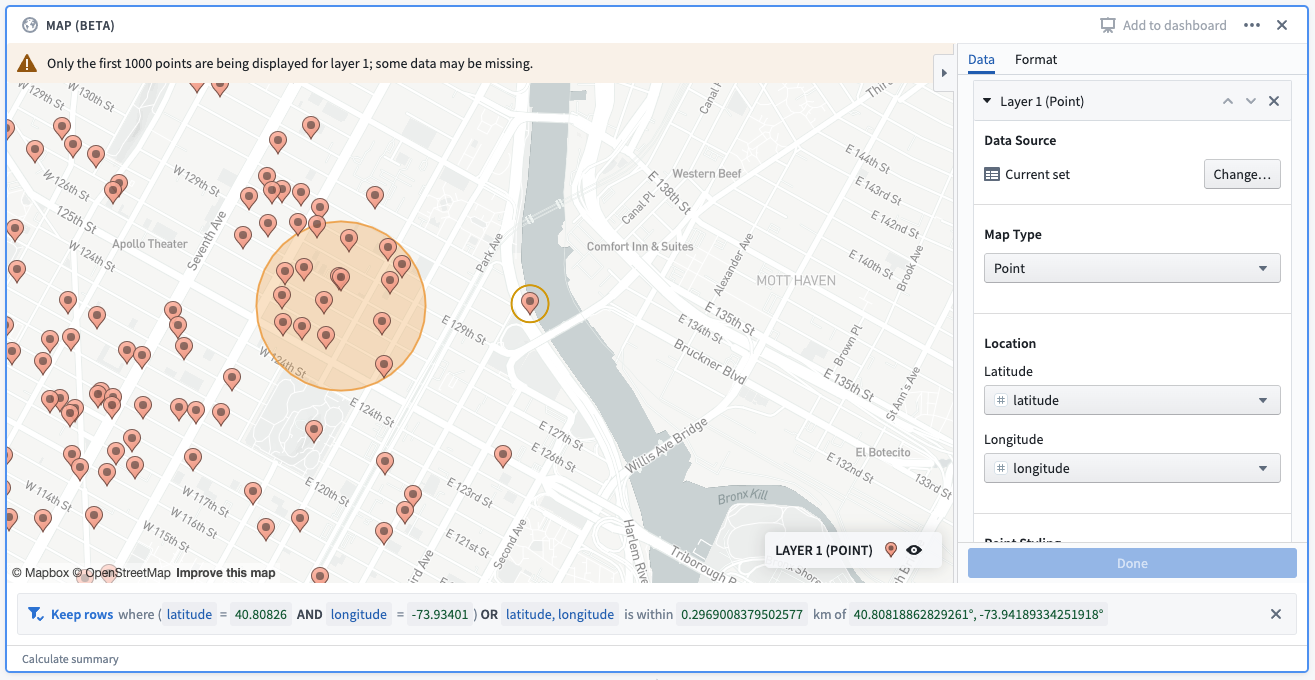
Example: A point selection and a radial filter drawn on a map. The corresponding filter reads: “keep rows where (latitude = 40.80826 and longitude = -73.93401) OR latitude, longitude is within 0.2969 km of 40.8081, -73.94189)”. The first filter corresponds to the point selection, and the second filter corresponds to the radial filter.
Cluster layer filtering
Filtering is not currently supported on the cluster layer.
Choropleth layer filtering
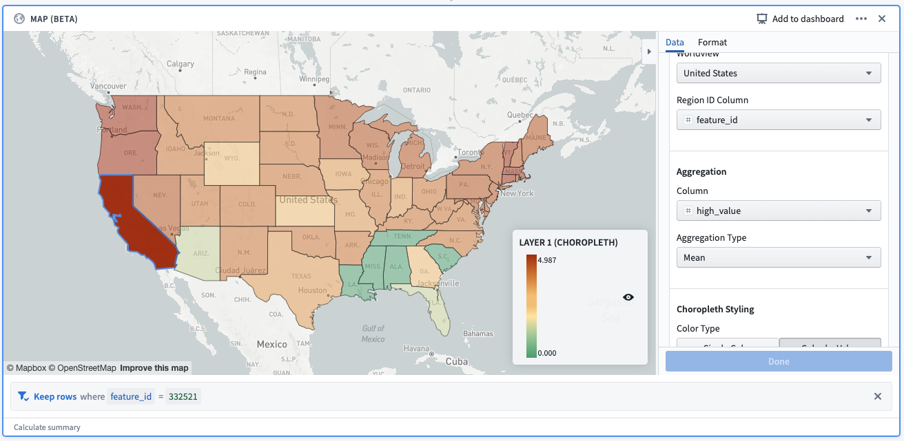
- Mapbox: Clicking on a region will create a filter on the Region ID column based on the value of the selected region. There is a maximum of 30 selected regions allowed per layer.
- GeoJSON: Filtering is not currently supported for GeoJSON choropleths.
 .
.
Example: A selection made on a Mapbox choropleth layer. The selection creates a filter, which reads: “Keep rows where feature_id = 332521”. feature_id is the column provided as the “Region ID column”, and 332521 is the Mapbox feature id corresponding to the selected shape (California).
Line segment layer filtering
- Point to point: Clicking on a line will create a filter on the start latitude, start longitude, end latitude, and end longitude columns. There is a maximum of 30 selected lines per layer.
- GeoJSON: Filtering is not currently supported for GeoJSON line segment layers.
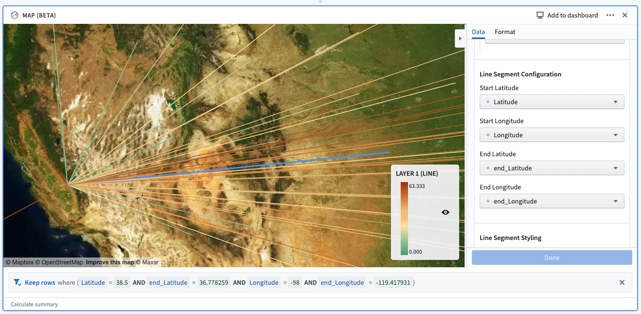
Example: A selection made on a line segment layer. The selection creates a filter, which reads: “Keep rows where (Latitude = 38.5 AND end_Latitude = 36.778259 AND Longitude = -98 AND end_Longitude = -119.417931).”
Map drawings
The map board supports the drawing of shapes on the map. These can be accessed by the buttons in the top left corner of the map, which are visible when hovering the cursor over the map:
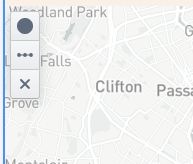
The following options are supported for drawings:
- Add circular filter: Allows the drawing of a circle on the map, which will create a radial filter on all point layers in the board with the Data source set to current set. Follow these steps to draw the filter:
- Click on the button.
- Then, click anywhere on the map to specify the center of the circle. Dragging your cursor away/towards the center point will increase/decrease the radius of the circle.
- Finally, click on the map again to finish drawing the circle.
:::callout{theme="neutral"} For filtering purposes, the circular filter uses the Great Circle projection, which generally gives distances between points on the surface of the Earth correct to about 0.5%. However, better accuracy is possible (and generally expected) when applying the projection to a small area. Learn more about the Great Circle projection. ↗ :::
- Add polygon filter: Allows the drawing of a polygon on the map, which will create a polygon filter on all point layers in the board with the Data source set to current set. Follow these steps to draw the filter:
- Click on the button.
- Then, click anywhere on the map to specify the first vertex of the polygon. Subsequent clicks on the map will specify other vertices of the polygon, in order.
- Finally, click on the first point to finish drawing the polygon.
:::callout{theme="neutral"} You may notice that your drawn polygon creates two filters instead of one. This will occur for polygons that are intersected by the antimeridian ↗; for filtering purposes, the polygon will be split across the antimeridian. :::
- Draw line: Allows the drawing of a line on the map. Lines are for display purposes only and will not create a filter on the map. Follow these steps to draw a line:
- Click on the button.
- Then, click anywhere on the map to specify the beginning of the line. Subsequent clicks will create additional line segments
-
Finally, click the most recently added segment again to complete the drawing.
-
Remove drawn shapes: Allows users to remove the drawn shapes on the map. If removing a circle, the corresponding filter(s) will be removed. Follow these steps to remove shapes:
- Click on the button with the x icon.
- Hover over the shape that you would like to remove. The shape should turn red.
- Click the hovered shape to remove it.
- Finally, click the button again to finish removing shapes.
中文翻译
地图面板(Map board)
Contour 的地图面板允许您可视化并交互地理空间数据。
这些地图可视化由两种类型的图层组成:
- 底图图层(base layer)(也称为瓦片图层(tile layer)),提供背景地图影像;
- 叠加图层(overlay layer),在底图之上以点或形状的形式呈现数据。
地图面板支持使用 MapboxGL ↗ 进行地图渲染。如果用户的浏览器不支持 WebGL,地图面板将使用 Leaflet ↗ 进行渲染。
:::callout{theme="neutral"} 请访问 WebGL 网站 ↗ 检查您的浏览器是否支持 WebGL。 :::
地图面板使用 Mapbox 作为其底图影像的主要来源。要了解更多关于网络地图技术的信息,请参阅 Mapbox 文档 ↗。
叠加图层类型(Overlay layer types)
在地图面板中,叠加图层(在界面中称为“图层”)以点或形状的形式在地图的底图之上呈现数据。地图面板包含以下类型的叠加图层:
目前,地图面板不支持 Workshop 地图中常用的静态图层(static layer)。
点图层(Point)
点图层使用点或标记来表示地图上的单个对象,通过纬度/经度对进行绘制。点的颜色、图标类型和大小都可以进行样式设置。
有关配置信息,请参阅下方的配置点图层部分。
示例:地图显示曼哈顿下东城社区的 Airbnb 位置,按房间类型着色。该地图使用了来自 Inside Airbnb ↗ 的开源数据。
聚合图层(Cluster)
聚合图层非常适合包含纬度/经度对的大量数据集。聚合与点类似,但不是为每个对象绘制单个标记,而是根据地理邻近性将绘制的对象聚合成簇(cluster)。簇的大小和/或颜色可配置,以表示给定区域内的数据点数量。
除了数据点数量(即计数聚合(count aggregation))之外,聚合图层还支持多种不同的聚合函数,例如数据集中另一列的总和或平均值。
有关配置信息,请参阅下方的配置聚合图层部分。
示例:地图显示曼哈顿 Airbnb 价格的分布情况。簇的大小/颜色基于给定区域的平均价格。
分区统计图图层(Choropleth)
分区统计图图层显示区域(例如国家或省份),这些区域根据某个列的值或该区域所代表行的列值的聚合结果进行着色。这提供了一种可视化不同区域间变化或模式的方法,并且可以选择查看这些值随时间的变化情况。
有关配置信息,请参阅下方的配置分区统计图图层部分。
示例:美国本土地图,每个州根据截至 2021 年 12 月 13 日完全接种疫苗的人口百分比着色。
线段图层(Line segment)
线段图层将单个行绘制为连接两点的线段。点由纬度/经度对定义。
有关配置信息,请参阅下方的配置线段图层部分。
示例:美国地图,线段从每个州的中心开始,到加利福尼亚州结束。线段根据与加利福尼亚州的距离着色。
配置(Configuration)
下图是一个新添加但尚未配置的地图面板。默认情况下,会向面板添加一个数据源设置为当前集合(Current set) 的点图层。
配置面板顶部有一组选项卡:数据(Data) 和格式(Format)。
- 数据选项卡允许您添加和配置地图的叠加图层,这些图层已在上一节中描述。
- 格式选项卡允许您配置地图的底图图层,以及地图的其他通用格式选项(例如,图例在地图中的位置)。
数据选项卡(Data tab)
数据选项卡顶部有一个添加图层(Add layer) 按钮,以及地图上显示的每个叠加图层的可折叠部分。
单击该部分顶部的添加图层按钮将向地图添加一个新图层(默认为点图层),并折叠所有其他部分。
数据源(Data source) 表示图层将用于显示数据和计算聚合的数据集或 Contour 路径。默认情况下,此选项选择当前集合,这将使用当前 Contour 路径中的数据。
数据源的其他选项包括同一分析中的其他路径,或不同的 Foundry 数据集。
地图类型(Map Type) 可以更改以配置不同类型的图层。这些图层的不同选项包括点、聚合、分区统计图和线段,如上所述。
配置点图层(Configure point layers)
对于点图层,主要配置选项如下:
- 位置(Location): 允许选择纬度和经度列,指示数据源中每行的位置。
- 点样式(Point styling): 允许配置每个点的图标类型、颜色和大小:
- 图标类型(Icon type): 可用图标类型的下拉选择器,可通过文本搜索进行筛选。
- 颜色(Color): 在“单一颜色(Single color)”和“按值着色(Color by value)”之间选择。
- 单一颜色: 提供一个颜色下拉选择器,用于统一为图层的所有点着色。
- 按值着色: 提供一个列选择器。每个点将根据所选列中包含的值分配颜色。
- 大小(Size): 可用尺寸的下拉选择器:小、中、大和超大。
- 工具提示(Tooltip): 一个列选择器,允许用户添加包含工具提示标签的列。当鼠标悬停在地图上的点时,这些标签将显示在工具提示中。
配置聚合图层(Configure cluster layers)
对于聚合图层,主要配置选项如下:
- 位置(Location): 允许选择纬度和经度列,指示数据源中每行的位置。
- 聚合(Aggregation): 允许选择包含值的列以及基于该列的聚合类型。此聚合的结果将用于确定簇的大小/颜色。
- 簇样式(Cluster styling): 允许配置簇的大小缩放、颜色和不透明度:
- 大小缩放(Size scaling): 描述地图中的簇应如何根据聚合结果进行缩放。选项包括线性、对数和平方根。
- 颜色(Color): 在“单一颜色”和“缩放颜色(Scaled color)”之间选择:
- 单一颜色: 提供一个颜色下拉选择器,用于统一为图层的所有簇着色。
- 缩放颜色: 提供“色阶(color scale)”和“缩放类型(scale type)”的选择器。色阶和缩放类型将用于根据每个簇的值以渐变方式为簇着色。
- 不透明度(Opacity): 一个滑块,允许配置图层上簇的填充不透明度,范围从 0(完全透明)到 1(完全不透明)。
:::callout{theme="neutral"} 对于加法聚合(例如计数或求和),地图面板将对现有簇进行超级聚合(supercluster)。这意味着当您放大和缩小地图时,簇将自动调整,以便为当前缩放级别显示适当的簇粒度。 :::
配置分区统计图图层(Configure choropleth layers)
要配置分区统计图图层,您必须首先指定分区统计图类型(Choropleth type)。这对应于定义所显示区域边界的来源。目前,地图面板支持以下分区统计图类型:
- Mapbox: 这是配置分区统计图最简单的方法,假设您有兴趣显示世界各地的通用区域(例如国家、州或县)。此选项利用 Mapbox 企业边界集 ↗。首先,在您的 Foundry 实例上安装 Mapbox 边界数据集。
- GeoJSON: 如果您有通过 GeoJSON 定义的简单自定义区域,或者由于网络限制等原因无法从您的环境访问 Mapbox API,此选项非常有用。此选项利用 GeoJSON ↗ 格式的数据。
图层本身的配置选项根据所选的分区统计图类型而有所不同:
- Mapbox:
- 分区统计图区域类型(Choropleth region type): 允许选择边界类型和数据级别 ↗。Mapbox 边界数据根据边界所服务的功能分为五大类:行政、立法、地点、邮政和统计。在每个边界类型中,要素被组织成不同编号级别的层次结构。通常,编号较大的级别将嵌套在编号较小的级别之下。例如,在美国,县(行政级别 2)是州(行政级别 1)的细分,而州又是国家(行政级别 0)的细分。
- 图层的区域 ID 列(region ID column) 必须与您选择的任何边界级别所需的 Mapbox 要素 ID 匹配。这些要素 ID 值的映射可通过平台上应已存在的导入数据集获得。如果您不知道如何找到这些映射,请联系支持人员。
- 世界观(Worldview): 当存在多个版本的边界时,此功能 ↗ 为不同的受众渲染地图边界;目前,可用的选项包括美国、日本、印度和中国。
- 聚合(Aggregation): 允许选择包含值的列以及基于该列的聚合类型。此聚合的结果将显示在鼠标悬停在分区统计图区域时可见的工具提示中。此外,在使用色阶着色选项时也会用到它。
- GeoJSON:
- GeoJSON 几何列(GeoJSON geometry column): 允许选择包含 GeoJSON 格式数据的列。数据指定的形状将显示在地图上,每个图层一个。这允许使用 Mapbox 可能不支持的自定义形状,但不允许进行聚合或选择。
此外,分区统计图图层支持不同类型的颜色配置:
- 单一颜色: 提供一个颜色下拉选择器,用于统一为图层上的所有形状着色。
- 缩放颜色: 提供“色阶”和“缩放类型”的选择器。色阶和缩放类型将用于根据每个区域的值以渐变方式为区域着色。
- 对于 Mapbox 分区统计图,每个区域的值由聚合结果确定。
- 对于 GeoJSON 分区统计图,每个区域的值由用户在选择此选项时必须提供的列确定。
- 按值着色: 提供一个列选择器。每个区域将根据所选列中包含的值分配颜色。
- 此选项仅适用于 GeoJSON 分区统计图图层。
- 自定义桶(Custom buckets): 提供一个表单,用于根据值范围分配颜色。要配置自定义桶,请选择颜色、标签(可选)和最小值。每个桶包含其聚合值介于该桶的最小值和相邻桶的最小值之间的任何分区统计图区域。
- 此选项仅适用于 Mapbox 分区统计图图层。
配置线段图层(Configure line segment layers)
要配置线段图层,您必须首先指定线段类型(Line segment type)。这将指定如何在线段图层上绘制线条。目前,地图面板支持以下选项:
- 点到点(Point to point): 对于输入数据集中的每一行,在提供的起点和终点之间绘制一条直线。
- 选择此选项时,用户必须提供四列:
- 起点纬度,
- 起点经度,
- 终点纬度,以及
- 终点经度
- GeoJSON 源(GeoJSON source): 对于输入数据集中的每一行,绘制由指定列中包含的 GeoJSON 形状提供的线条。此选项允许在地图上绘制更复杂的线条,但此类图层将无法进行选择。
- 选择此选项时,用户必须提供与 GeoJSON 要素列(GeoJSON feature column) 对应的列,该列是包含 GeoJSON 形状的列。
此外,线段图层支持不同类型的颜色配置:
- 单一颜色: 提供一个颜色下拉选择器,用于统一为图层上的所有线条着色。
- 缩放颜色: 提供“值列(Value column)”、“色阶”和“缩放类型”的选择器。色阶和缩放类型将用于根据每条线的值以渐变方式为线条着色,该值由用户提供的值列确定。
- 按值着色: 提供一个列选择器。每条线将根据所选列中包含的值分配颜色。
格式选项卡(Format tab)
格式选项卡包含地图的通用格式信息。
地图主题(Map theme): 对应于地图底图图层的样式。这些选项由 Mapbox 提供。默认地图主题是浅色主题 ↗。其他选项包括:
- 深色(Dark)
- 卫星(Satellite)
- 基本(Basic)
- 明亮(Bright)
- 户外(Outdoor)
- 卫星街道(Satellite streets)
- 街道(Street)
视口(Viewport): 指定初始加载地图时,或进行导致地图重新渲染点的更新时的地图视口。
- 缩放至适配(Zoom to fit): 地图视口将自动缩放以适配地图上的当前数据。
- 初始视口(Initial viewport): 允许手动配置纬度、经度和缩放级别。还有一个选项可以自动将这些值设置为地图的当前视口。
图例(Legend): 指定地图图例的选项。
- 位置(Position): 图例应在地图上出现的位置。
- 方向(Orientation): 指定图例应水平还是垂直展开。
- 显示图例(Show legend): 切换此选项将向用户显示/隐藏图例。
- 允许切换图层可见性(Allow toggling layer visibility): 启用后,将在图例上显示每个图层,并带有一个眼睛图标。单击此图标将允许用户临时隐藏单个图层。
地图筛选与绘制(Map filtering and drawings)
筛选(Filtering)
地图面板支持许多筛选选项,这些选项因图层而异。请注意,仅当数据源选项设置为当前集合时,筛选才启用。地图上的多个筛选器将进行并集(OR 筛选)而非交集。
点图层筛选
- 单击单个点将添加与所选点的纬度和经度对应的筛选器。筛选器将应用于配置中选择的纬度和经度列。每个图层最多允许 30 个选择。
- 绘制径向筛选器(请参阅地图绘制部分)将创建一个与配置中选择的纬度和经度列对应的径向筛选器。
- 类似地,绘制多边形筛选器将创建一个与配置中选择的纬度和经度列对应的多边形筛选器。
示例:地图上的点选择和径向筛选器。相应的筛选器显示为:“保留满足以下条件的行:(latitude = 40.80826 AND longitude = -73.93401) OR latitude, longitude 在 40.8081, -73.94189 周围 0.2969 km 范围内”。第一个筛选器对应于点选择,第二个筛选器对应于径向筛选器。
聚合图层筛选
聚合图层目前不支持筛选。
分区统计图图层筛选
- Mapbox: 单击一个区域将根据所选区域的值在区域 ID 列上创建一个筛选器。每个图层最多允许 30 个选定区域。
- GeoJSON: GeoJSON 分区统计图目前不支持筛选。
示例:在 Mapbox 分区统计图图层上进行的筛选。该选择创建一个筛选器,显示为:“保留满足以下条件的行:feature_id = 332521”。feature_id 是作为“区域 ID 列”提供的列,332521 是对应于所选形状(加利福尼亚州)的 Mapbox 要素 ID。
线段图层筛选
- 点到点: 单击一条线将在起点纬度、起点经度、终点纬度和终点经度列上创建一个筛选器。每个图层最多允许 30 条选定线段。
- GeoJSON: GeoJSON 线段图层目前不支持筛选。
示例:在线段图层上进行的筛选。该选择创建一个筛选器,显示为:“保留满足以下条件的行:(Latitude = 38.5 AND end_Latitude = 36.778259 AND Longitude = -98 AND end_Longitude = -119.417931)”。
地图绘制(Map drawings)
地图面板支持在地图上绘制形状。这些功能可通过地图左上角的按钮访问,当鼠标悬停在地图上时这些按钮可见:
绘制支持以下选项:
- 添加圆形筛选器(Add circular filter): 允许在地图上绘制一个圆形,这将在面板中所有数据源设置为当前集合的点图层上创建一个径向筛选器。按照以下步骤绘制筛选器:
- 单击该按钮。
- 然后,在地图上的任意位置单击以指定圆的中心。将光标远离/朝向中心点拖动将增加/减少圆的半径。
- 最后,再次单击地图以完成圆的绘制。
:::callout{theme="neutral"} 出于筛选目的,圆形筛选器使用大圆(Great Circle) 投影,该投影通常能给出地球表面点之间的距离,精度约为 0.5%。但是,当将投影应用于小区域时,可以实现(并且通常期望)更好的精度。了解有关大圆投影的更多信息。 ↗ :::
- 添加多边形筛选器(Add polygon filter): 允许在地图上绘制一个多边形,这将在面板中所有数据源设置为当前集合的点图层上创建一个多边形筛选器。按照以下步骤绘制筛选器:
- 单击该按钮。
- 然后,在地图上的任意位置单击以指定多边形的第一个顶点。随后在地图上的单击将按顺序指定多边形的其他顶点。
- 最后,单击第一个点以完成多边形的绘制。
:::callout{theme="neutral"} 您可能会注意到绘制的多边形创建了两个筛选器而不是一个。对于被对跖线(antimeridian) ↗ 穿过的多边形,会发生这种情况;出于筛选目的,多边形将沿对跖线分割。 :::
- 绘制线条(Draw line): 允许在地图上绘制一条线。线条仅用于显示目的,不会在地图上创建筛选器。按照以下步骤绘制线条:
- 单击该按钮。
- 然后,在地图上的任意位置单击以指定线条的起点。后续单击将创建额外的线段。
-
最后,再次单击最近添加的线段以完成绘制。
-
移除绘制的形状(Remove drawn shapes): 允许用户移除地图上绘制的形状。如果移除圆形,相应的筛选器也将被移除。按照以下步骤移除形状:
- 单击带有 x 图标的按钮。
- 将鼠标悬停在您想要移除的形状上。该形状应变为红色。
- 单击悬停的形状以将其移除。
- 最后,再次单击该按钮以完成形状的移除。