Getting started(入门指南)
This tutorial walks through how you can use Contour to go from a spreadsheet of raw data to charts that reveal insights into the data.
About the dataset
This tutorial uses data about neighborhoods in New York City from the 2010 U.S. Census ↗. Follow along with this sample dataset: Download nyc_population_by_neighborhood dataset
Each row in the dataset is a neighborhood in New York City, with information about its Borough, Population, NTA_Name (neighborhood name), and FIPS_County_Code (county code).
After downloading this dataset, drag and drop it into Foundry to create a dataset. Then, click Analyze to start a Contour analysis.
Building a chart
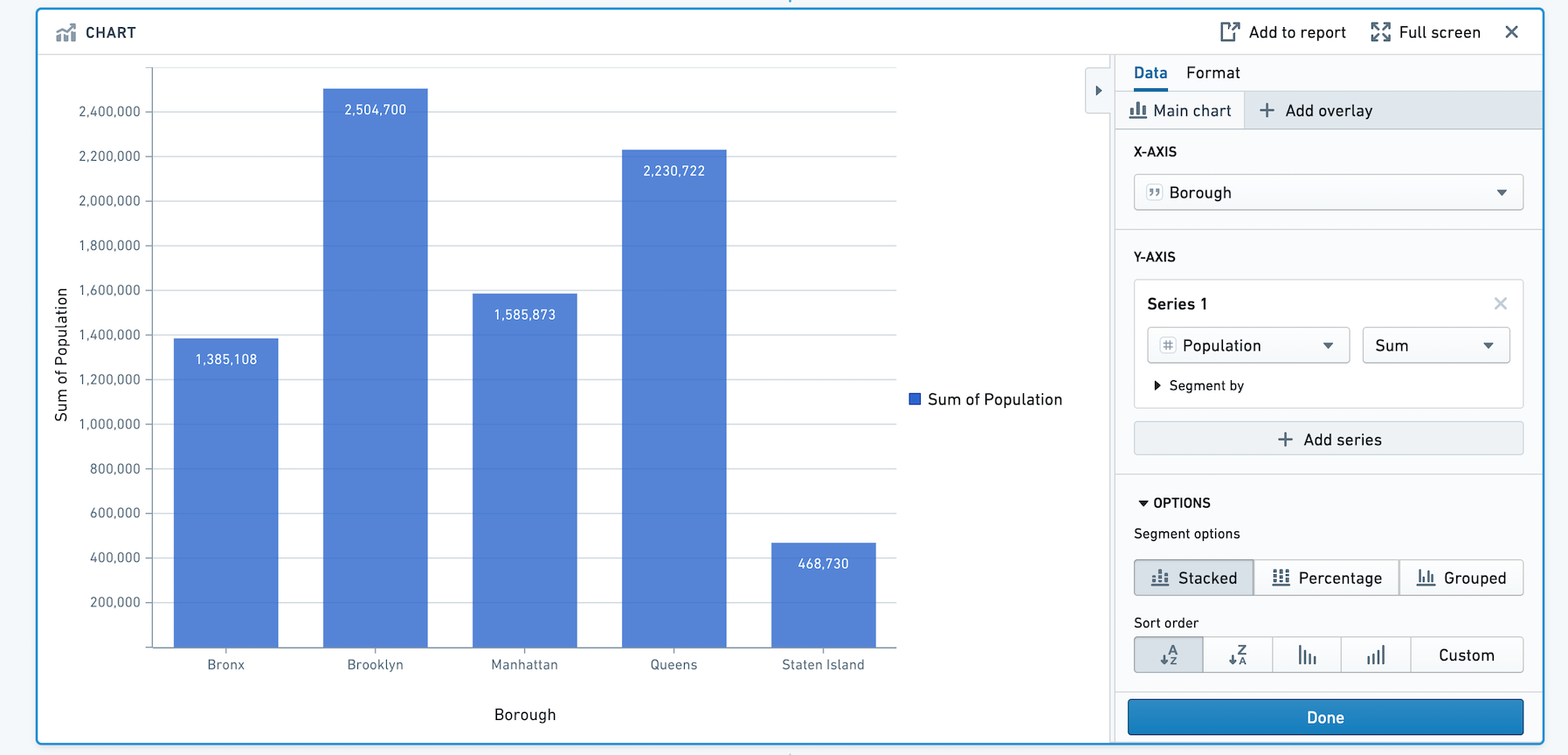
First, we will visualize the population in each borough of New York City. We can do this by adding a bar chart with X-axis Borough, and Y-axis the sum of Population.
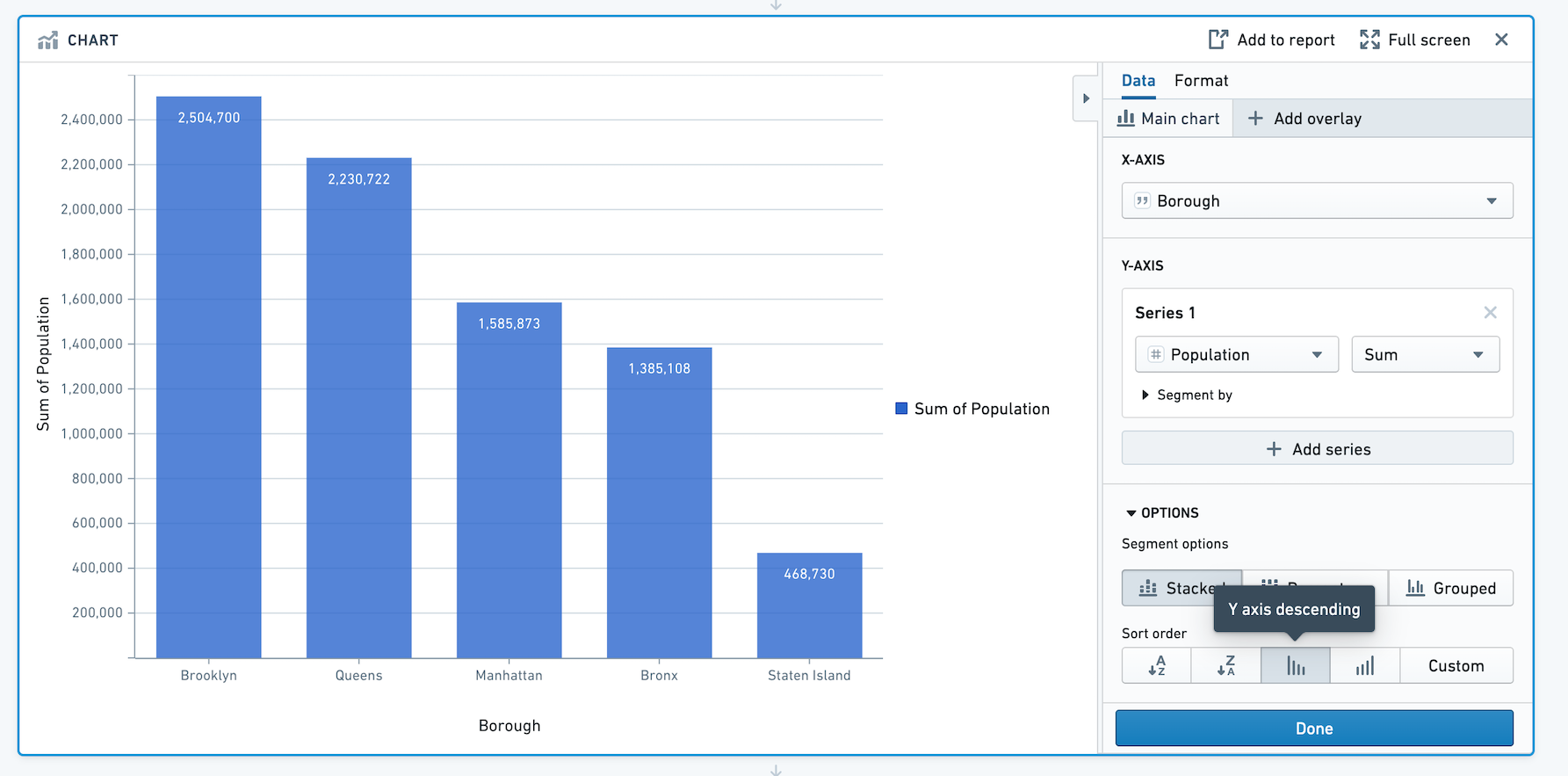
To sort the bars in descending order of population, scroll to Options and choose Y axis descending for Sort Order.
Adding an overlay
In addition to information about total population of the borough, we'd like to overlay the average population in each neighborhood as a line. This will allow us to get a sense of population density in the boroughs.
Let's add an overlay by clicking + Add overlay and selecting a line chart. We can plot this line chart on a new axis.
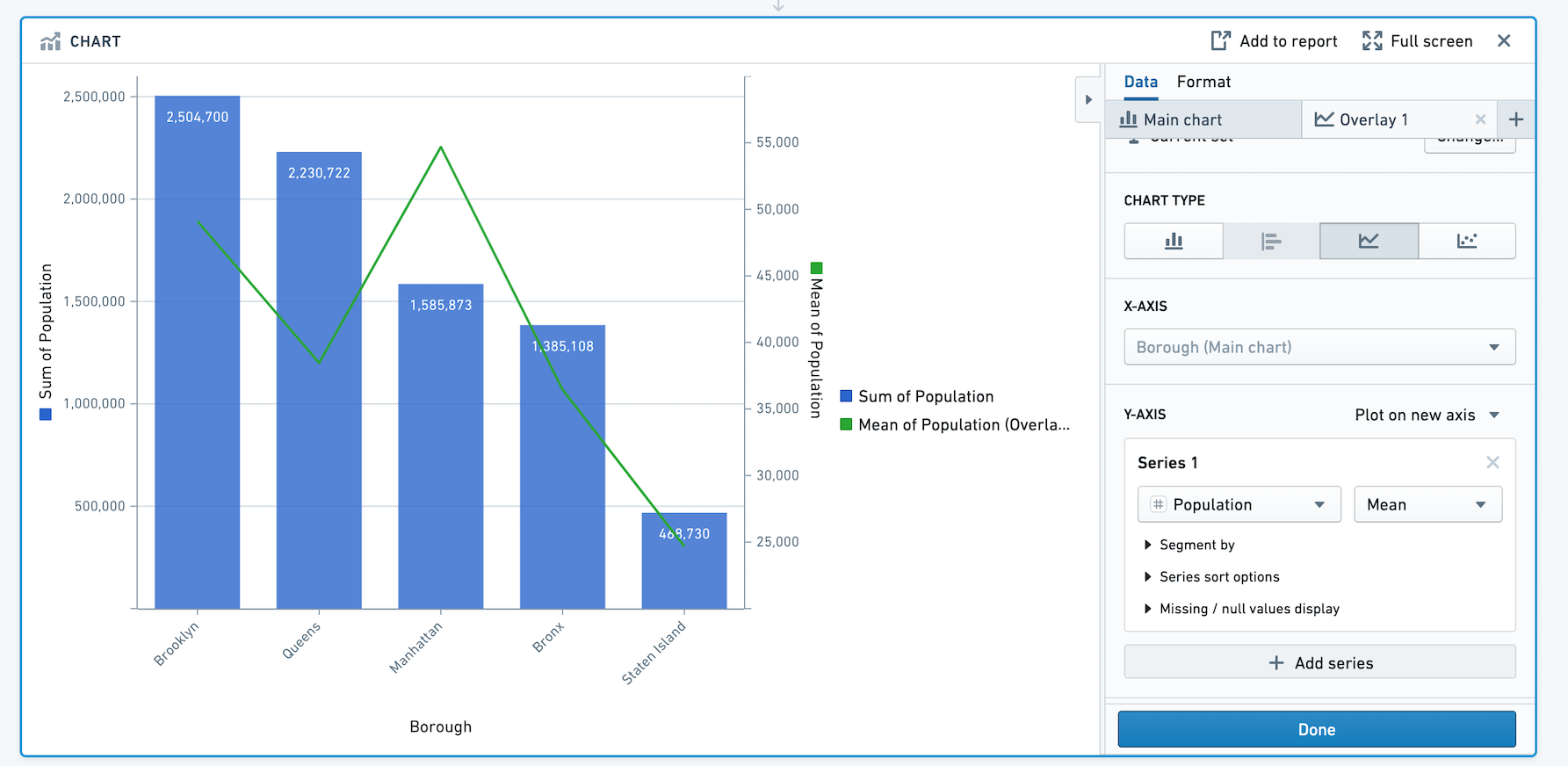
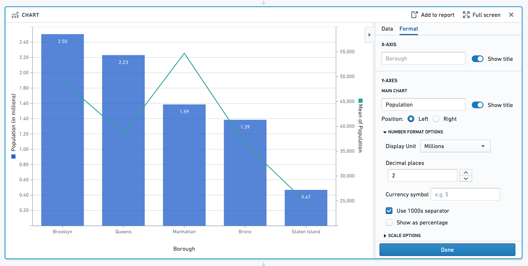
Based on this chart we can see that although Manhattan has the third highest population out of the five boroughs, the mean population per neighborhood in Manhattan is about 55,000 people per neighborhood which is more than any other borough.
Formatting the chart
Now that we have created the chart, we can change the titles, colors, and number formatting.
Click on the Format tab. Let's change the left Y-axis title from Sum of Population to Population, and the right Y-axis title from Mean of Population to Mean of Population per Neighborhood. Then, toggle off the legend. In this section, you can also choose Number Format options and Scale options.
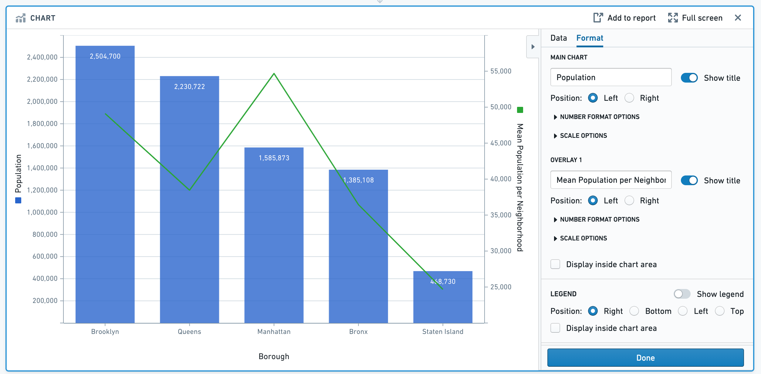
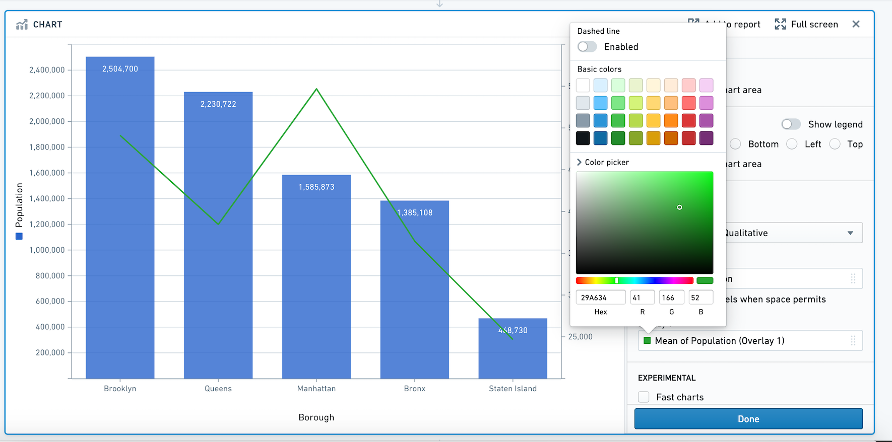
Next, let's use the color picker to choose a different color for the overlay line. Click on the green square below the label Overlay 1, and expand the color picker section. In this popover, you can also choose to make the line dashed.
Next, let's change the Display Units on the Y-axis. We'd like to view the population per Borough in millions. In the format tab under Number Format Options, change the Display Unit to Millions and specify 2 decimal places. After recomputing, note that the Y-axis title is now "Population (in millions)". This is only a formatting change: all underlying data remains the same.
Segmenting your data
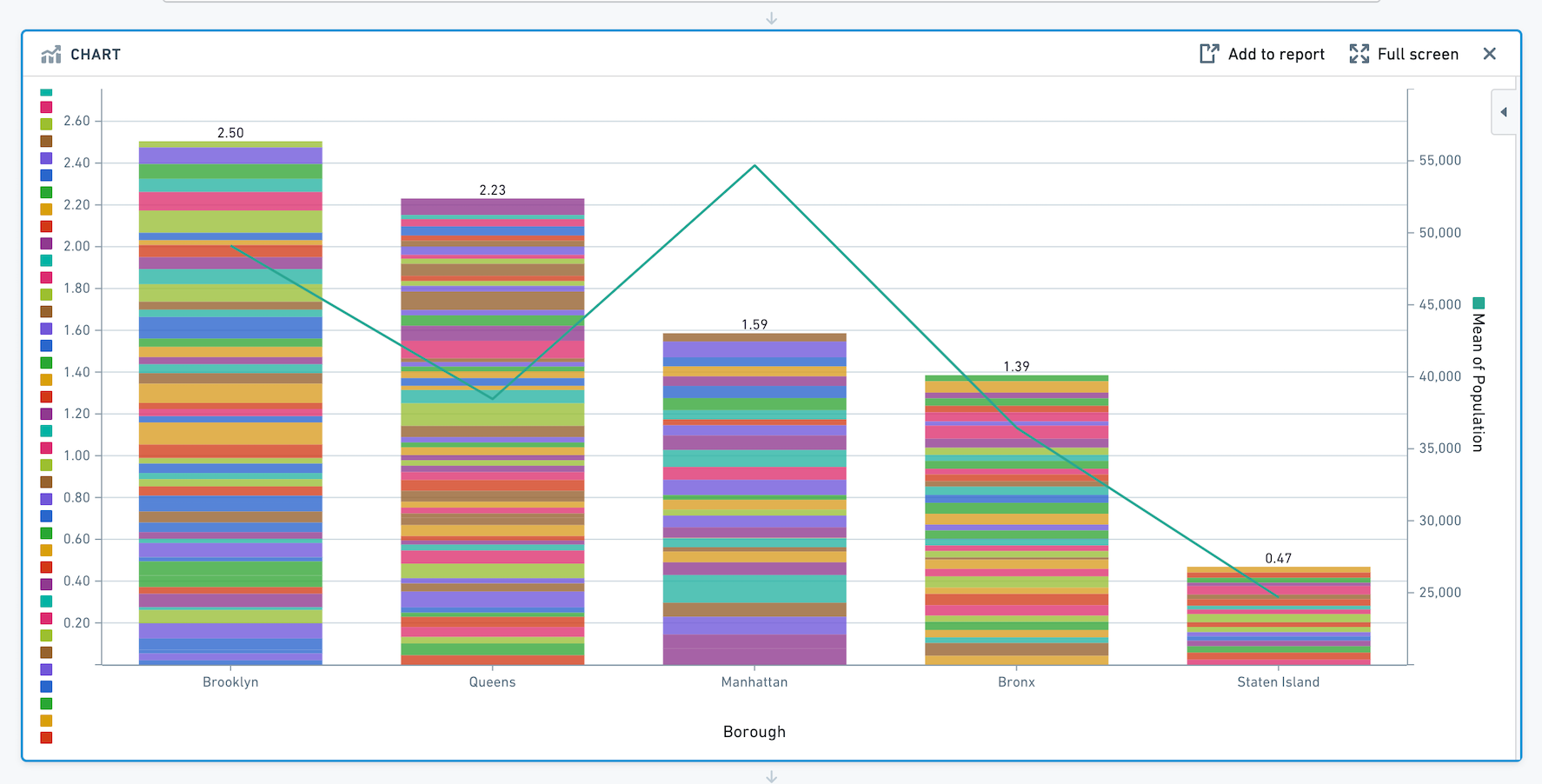
We want to investigate the specific neighborhoods that make up each borough's population. To view the population for each neighborhood and see how it contributes toward the sum for its borough, let's add the neighborhood as a segment in the Main Chart tab. Your chart will now look like this:
Congratulations - you've successfully made a chart using Contour.
Other tips for working with charts
Overlays
Note that only the main chart layer is part of the data path. The other layers are solely for presentation purposes. In other words, making a selection or otherwise manipulating the data on an overlay layer will not affect the data downstream in your path.
Sorting the segments in your series
When you have segmented your series, you can reorder the segments in the series in the Format tab. Scroll down and click on the Format Series popover. You can choose to sort the segments in ascending or descending order, or a custom sort based on another column. Or, use the drag handles next to each segment name to manually reorder them.
In the below image, we are visualizing the average trip distance for taxi trips between the start_borough of a taxi trip, and the end_borough. In the example, we've sorted my segments (end_borough) by the average of trip distance so that the end_borough with the highest average trip distance appears to the left.

Advanced: Line chart series sort
You may want to control the order in which points in your line chart are plotted. For example, imagine we want to plot the temperature and wind speed at a location over time. Our data looks as below:
| day | temperature | wind_speed |
|---|---|---|
| 1 | 50 | 0 |
| 2 | 36 | 10 |
| 3 | 70 | 25 |
Let's make a line chart with temperature on the X-axis and wind speed on the Y-axis.
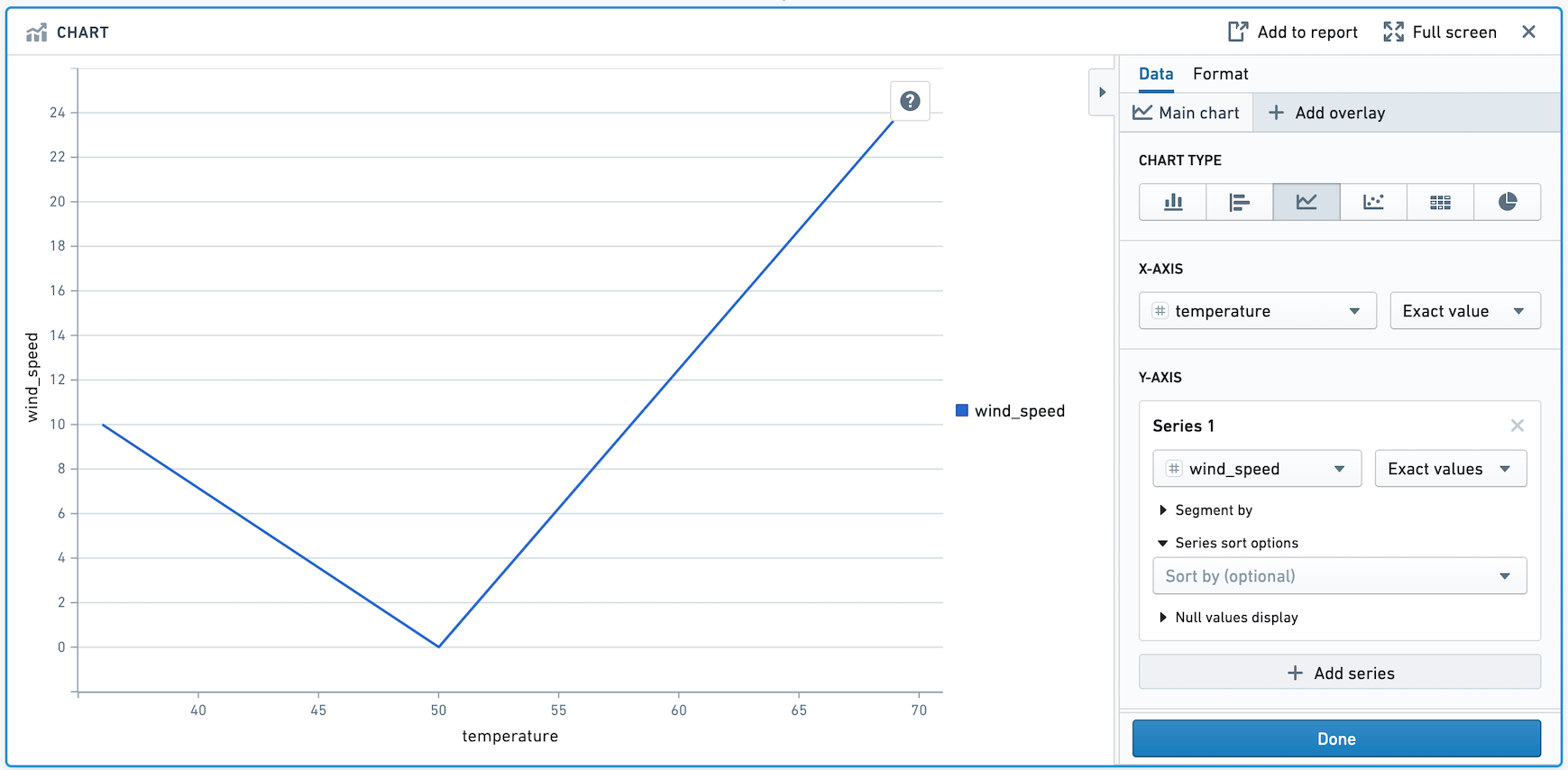
Above, the points are drawn from left to right. We want the points to be drawn in chronological order. To do that, add day in the Series Sort Options.
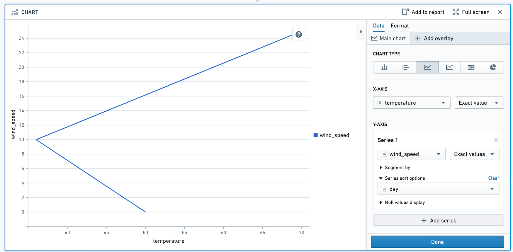
The points in this chart are now drawn in order of day.
中文翻译
入门指南
本教程将引导您如何使用 Contour,从原始数据的电子表格出发,创建能够揭示数据洞察的图表。
关于数据集
本教程使用来自 2010 年美国人口普查 ↗ 的纽约市 neighborhoods(社区)数据。请跟随此示例数据集进行操作:下载 nyc_population_by_neighborhood 数据集
数据集中的每一行代表纽约市的一个社区,包含其 Borough(行政区)、Population(人口)、NTA_Name(社区名称)和 FIPS_County_Code(县代码)等信息。
下载此数据集后,将其拖放到 Foundry 中以创建一个 dataset(数据集)。然后,点击 Analyze(分析) 启动 Contour 分析。
构建图表
首先,我们将可视化纽约市每个行政区的人口。我们可以通过添加一个柱状图来实现,X 轴设为 Borough(行政区),Y 轴设为 Population(人口)的总和。
要按人口降序排列柱状图,请滚动到 Options(选项),并在 Sort Order(排序顺序)中选择 Y axis descending(Y 轴降序)。
添加叠加层
除了了解各行政区的总人口信息外,我们还希望以折线图的形式叠加显示每个社区的平均人口。这将有助于我们了解各行政区的人口密度。
点击 + Add overlay(添加叠加层) 并选择折线图来添加叠加层。我们可以将此折线图绘制在新的坐标轴上。
根据此图表,我们可以看到,尽管曼哈顿在五个行政区中人口排名第三,但其每个社区的平均人口约为 55,000 人,高于其他任何行政区。
格式化图表
创建图表后,我们可以更改标题、颜色和数字格式。
点击 Format(格式) 选项卡。将左侧 Y 轴标题从 Sum of Population(人口总和) 改为 Population(人口),将右侧 Y 轴标题从 Mean of Population(人口平均值) 改为 Mean of Population per Neighborhood(每个社区的平均人口)。然后,关闭图例。在此部分,您还可以选择 Number Format(数字格式)选项和 Scale(缩放)选项。
接下来,使用颜色选择器为叠加折线选择不同的颜色。点击标签 Overlay 1(叠加层 1) 下方的绿色方块,展开颜色选择器部分。在此弹出窗口中,您还可以选择将折线设置为虚线。
接着,更改 Y 轴上的 Display Units(显示单位)。我们希望以百万为单位查看每个行政区的人口。在 Number Format Options(数字格式选项) 下的格式选项卡中,将 Display Unit(显示单位) 更改为 Millions(百万),并指定 2 位小数。重新计算后,请注意 Y 轴标题现在变为 "Population (in millions)"(人口(百万))。这仅是格式更改:所有底层数据保持不变。
数据分段
我们想要研究构成每个行政区人口的具体社区。要查看每个社区的人口及其对所在行政区总和的贡献,请在 Main Chart(主图表) 选项卡中将社区添加为 segment(分段)。您的图表现在将如下所示:
恭喜 - 您已成功使用 Contour 创建了一个图表。
使用图表的其他技巧
叠加层
请注意,只有主图表层属于数据路径的一部分。其他层仅用于展示目的。换句话说,在叠加层上进行选择或以其他方式操作数据,不会影响路径下游的数据。
对系列中的分段进行排序
当您对系列进行分段后,可以在 Format(格式) 选项卡中重新排列系列中的分段顺序。向下滚动并点击 Format Series(格式化系列) 弹出窗口。您可以选择按升序或降序对分段进行排序,或者根据另一列进行自定义排序。或者,使用每个分段名称旁边的拖动手柄手动重新排序。
在下图中,我们可视化了出租车行程中 start_borough(起始行政区)与 end_borough(终点行政区)之间的平均行程距离。在此示例中,我们按平均行程距离对分段(end_borough)进行了排序,使得平均行程距离最高的 end_borough 显示在最左侧。
高级:折线图系列排序
您可能希望控制折线图中数据点的绘制顺序。例如,假设我们想要绘制某个地点随时间变化的温度和风速。我们的数据如下所示:
| day(天) | temperature(温度) | wind_speed(风速) |
|---|---|---|
| 1 | 50 | 0 |
| 2 | 36 | 10 |
| 3 | 70 | 25 |
让我们创建一个折线图,X 轴为温度,Y 轴为风速。
如上图所示,数据点从左到右绘制。我们希望数据点按时间顺序绘制。为此,请在 Series Sort Options(系列排序选项) 中添加 day(天)。
此图表中的数据点现在按天顺序绘制。