Transform tables(转换表(Transform tables))
Transform tables are a container to operate batch analysis of objects or of tabular data derived from objects. A transform table allows users to derive columns based on the properties of input objects (including time series) and provides joining and grouping functionality for object data.
Due to the computational intensity of these operations, a maximum of 50,000 rows are allowed in a transform table.
Transform tables allow you to:
- Join and aggregate objects;
- Derive new columns from object properties;
- Enrich data by creating or editing values;
- Perform transformations on time series columns in batch; and
- Plot the outputs of your operations in a variety of ways.
Add a transformation
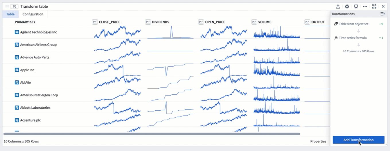
The transform table search window, accessible in a transform table through the Add Transformation button, shows all available transformations grouped by transform action type, such as edit columns, filter, time series operations, or null/error handling. While most transformations will add new columns of their respective type, some will change the shape of the table (for example, when joining other object types or grouping the table into categories to aggregate the rows).

Transform tables transforms can also be added directly from the next actions menu by selecting the Transform category and a transform. This action will add a transform table card to the analysis with the selected transform applied to the table.

Transforms can also be applied on a single supported input outside of a transform table, operating once on that value only rather than as a batch operation in a table.
To add a transform card to the analysis, simply search for it using the search window available at the top menu bar.
Transform table inputs
A transform table can take in various types of inputs, including object sets, categorical charts, time series charts, time series plots, materializations, pivot tables, and other transform tables. Users can also manually input data to construct a transform table.
To add a transform table to your analysis, select Transform table in the top Tables menu. This will open the editor panel, where you can select existing inputs that are eligible for your analysis.

Input: Object sets
Object sets are the most common input to a transform table.
You can create a transform table from any object set in your analysis from the Next Actions menu by selecting Convert > Transform table.
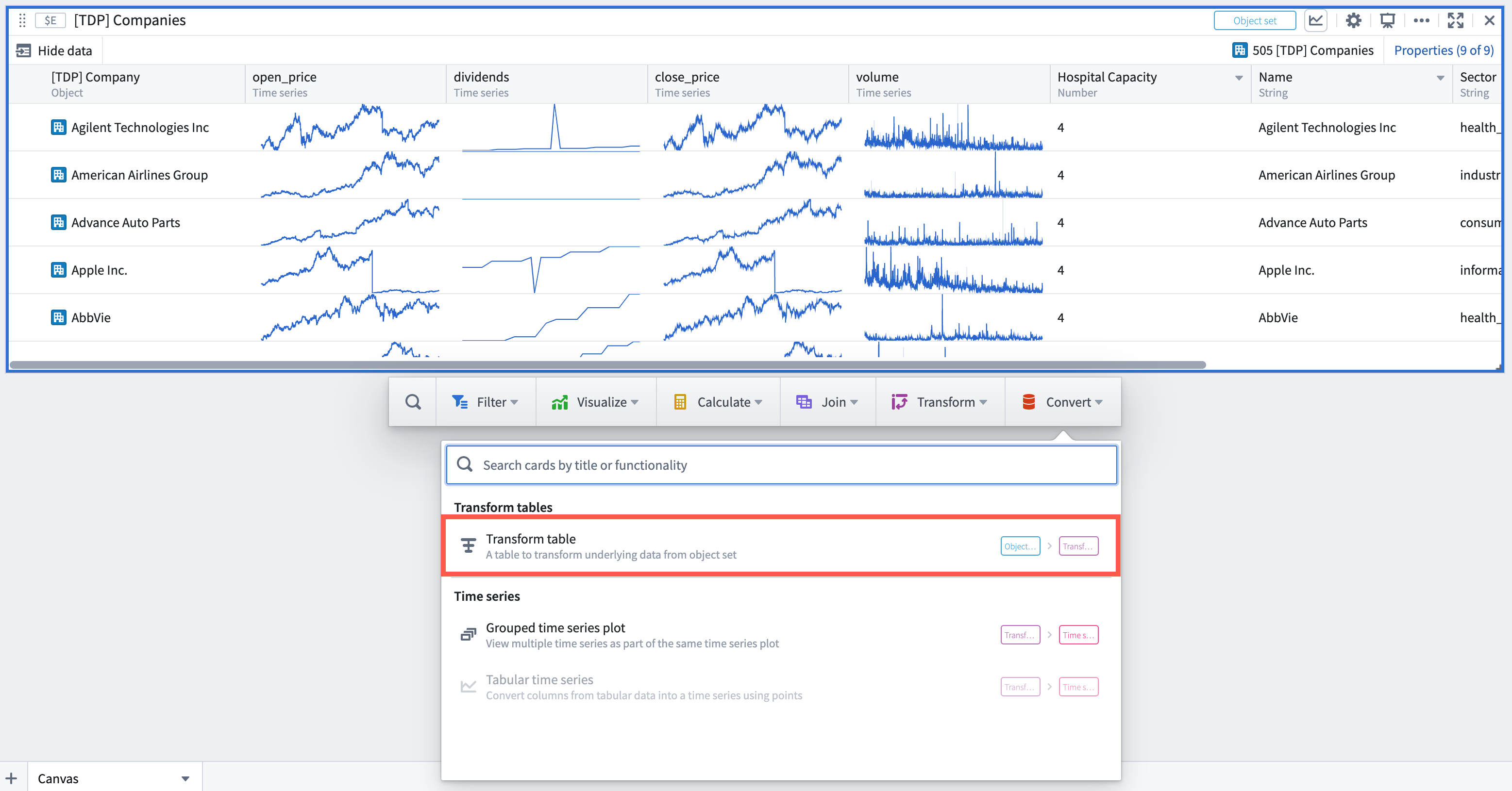
Note that there is a limit of 50,000 rows per transform table (whether from starting or from joining), so you will only be able to create transform tables with fewer than 50,000 objects.
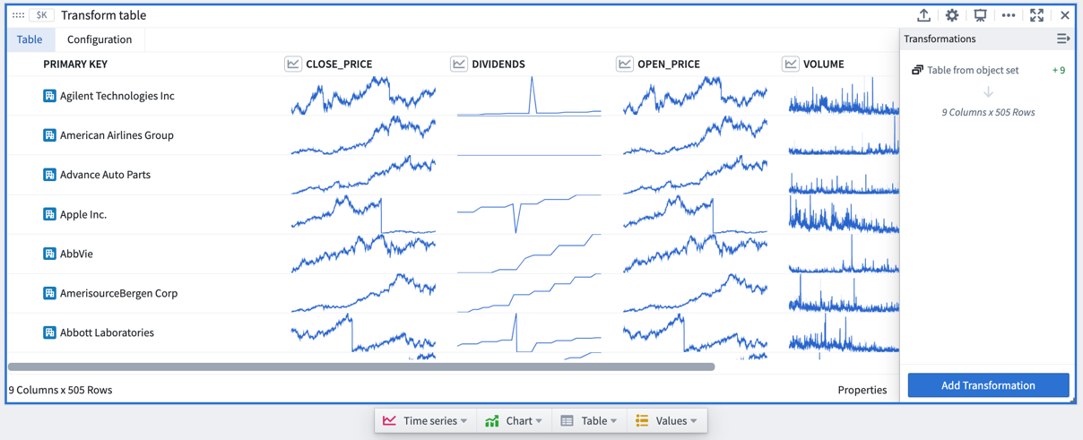
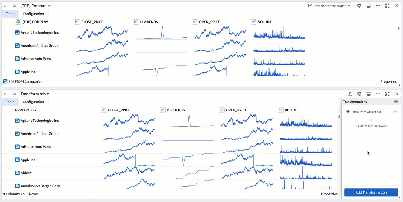
When a transform table is created from an object set, it will have one row per object in the set, a Primary Key column representing each object’s unique ID, and columns for each of the prominent properties of the object (as defined in the Ontology), or, if there are no prominent properties, the first properties on the object (up to 20).
Add or remove property columns, as well as any linked sensor objects to the object set, by clicking the Properties button on the bottom right corner of the table. Drag the columns to reorder them in the table.
You can set different column configurations for each transformation step of the transform table. Learn more about formatting a transform table in the section below.

Input: Categorical charts
Bar, line, and scatter plots can all be inputs to a transform table. Using these inputs will show the categories and values on your chart and will not pull in the underlying data. To pull in underlying data, you should use the object set from which you created the chart. You can create a transform table from a categorical chart by selecting the chart, clicking the Next Actions menu, then selecting Table > Transform table.
Input: Time series plots
Time series plots can be an input to the table, converting the time series data into tabular format where it can be manipulated, edited, or enriched.
To create a transform table from a time series plot, select a specific time series plot from the chart. Then, select Table > Transform table in the Next Actions menu at the bottom of the time series chart.

Then, select from the available Range Options in the transform editor panel:
- Use the full time range of the input time series (default).
- Specify a time range to import, which could be done by either manually entering the start and end timestamps or by referencing a range parameter.
Transform tables are limited to 50,000 rows for performance reasons; the transform table pulls data into the frontend for operation, rather than pushing data to a backend service. Therefore, the time series data may need to be sampled (bucketed) to fit.
You can select how to convert the time series data into tabular format in the Data Options:
- In the 'Sampled' setting, the table will show for each bucket the boundary timestamps and values (earliest and latest, and smallest and largest), the mean value, and point count. You can adjust the number of sampling buckets.
- In the 'Unsampled' setting, the table will show the raw unsampled data ('tick data') and have three columns: primary key, timestamp, and value.

The timestamp series data will show in UTC by default. The timestamp timezone can be changed to the user's timezone or a different static timezone in the column setting of the transform table editor.

Input: Time series charts
Time series charts can be an input to the table, opening each time series plot in the chart as one row in the table.
To create a transform table from a time series chart, select the time series chart (rather than a specific time series plot). Then, select Table > Table from chart's time series in the Next Actions menu at the bottom of the time series chart.

Input: Pivot Tables and other transform tables
Pivoted data can be an input to the transform table, enabling you to use formulas to operate on pivot table columns. As with charts, creating a transform table from a pivot table will not bring in its input data, but rather the pivoted data itself. A transform table can also be an input for a transform table. This is useful in cases where you want to split transformation logic into "blocks" of logic steps, or to separate data transformation and data formatting. You can create a transform table from another table by selecting Table in the Next Actions menu at the bottom of the table card.
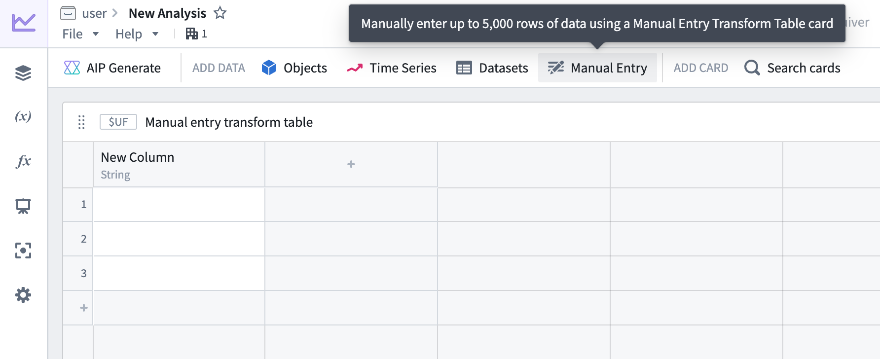
Input: Manual entry transform tables
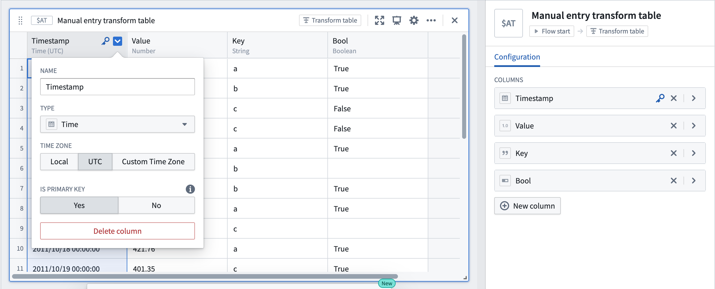
Users can manually enter up to 5,000 rows of data to create a new transform table. The manual entry transform table card has a spreadsheet-like user interface and supports five data types: string, number, boolean, time, and time series. Users can interact with and apply operations on manual entry transform tables the same way as other transform tables.
To add a new manual entry transform table to a Quiver canvas, select Manual Entry in the analysis header or search for the table in the Search cards dialog.
Example manual entry table workflows
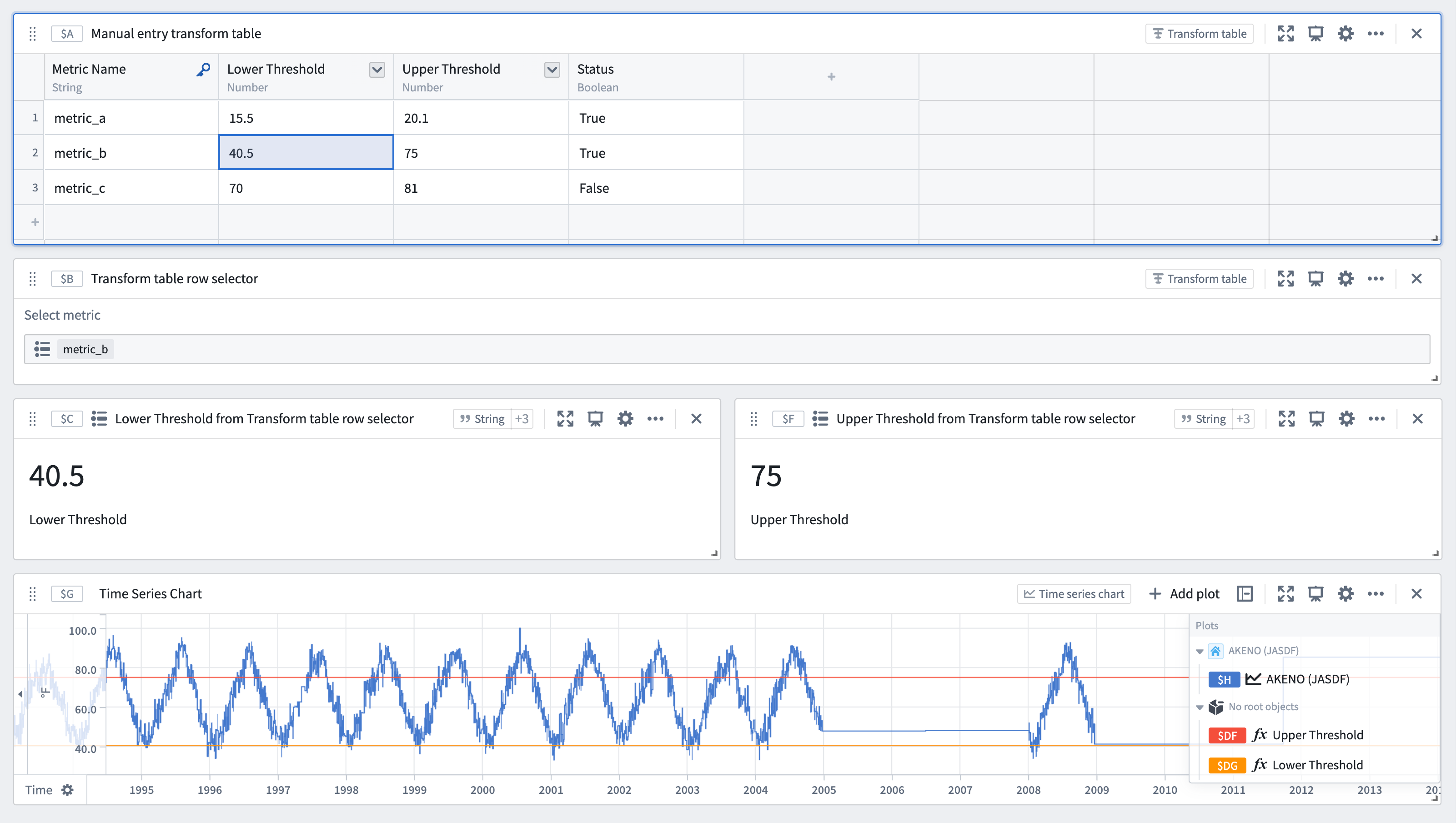
- Use table values to parameterize an analysis: Use a manual entry transform table in conjunction with row and column selectors to switch between rows. The values in the table's selected rows can be used as dynamic parameters in downstream analyses.
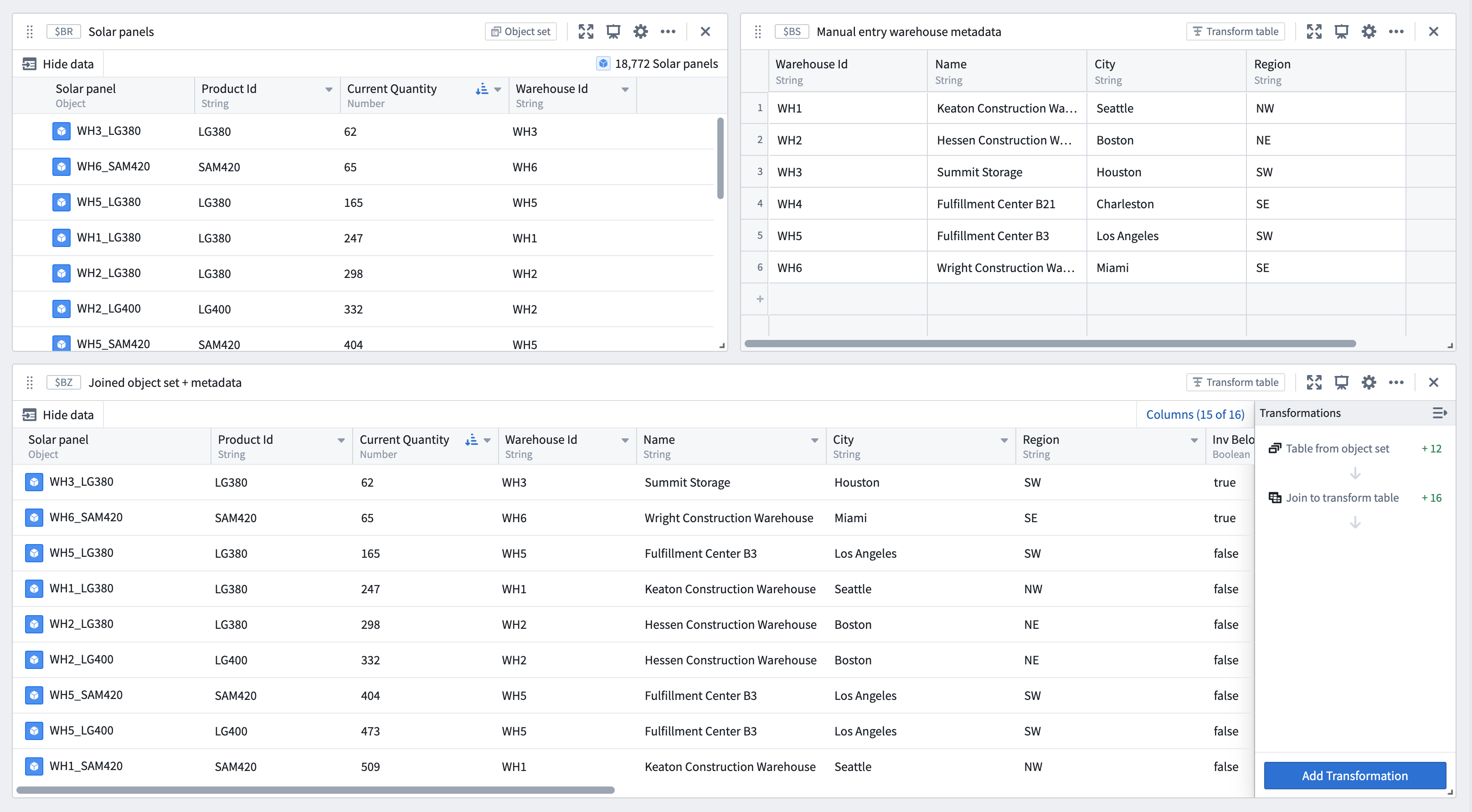
- Ingest small sets of data from external sources to supplement an analysis and the Ontology: Users can copy and paste metadata from spreadsheets into a new table to join to an existing object set by searching for Join to transform table in the next actions menu beneath the object set.
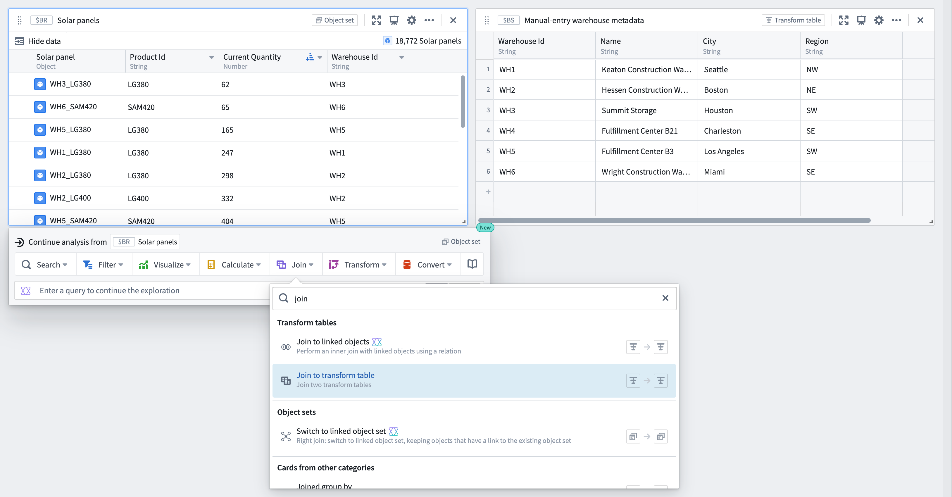
From the joined object set and manual entry transform table, configure the Join to transform table transform to specify the join conditions.
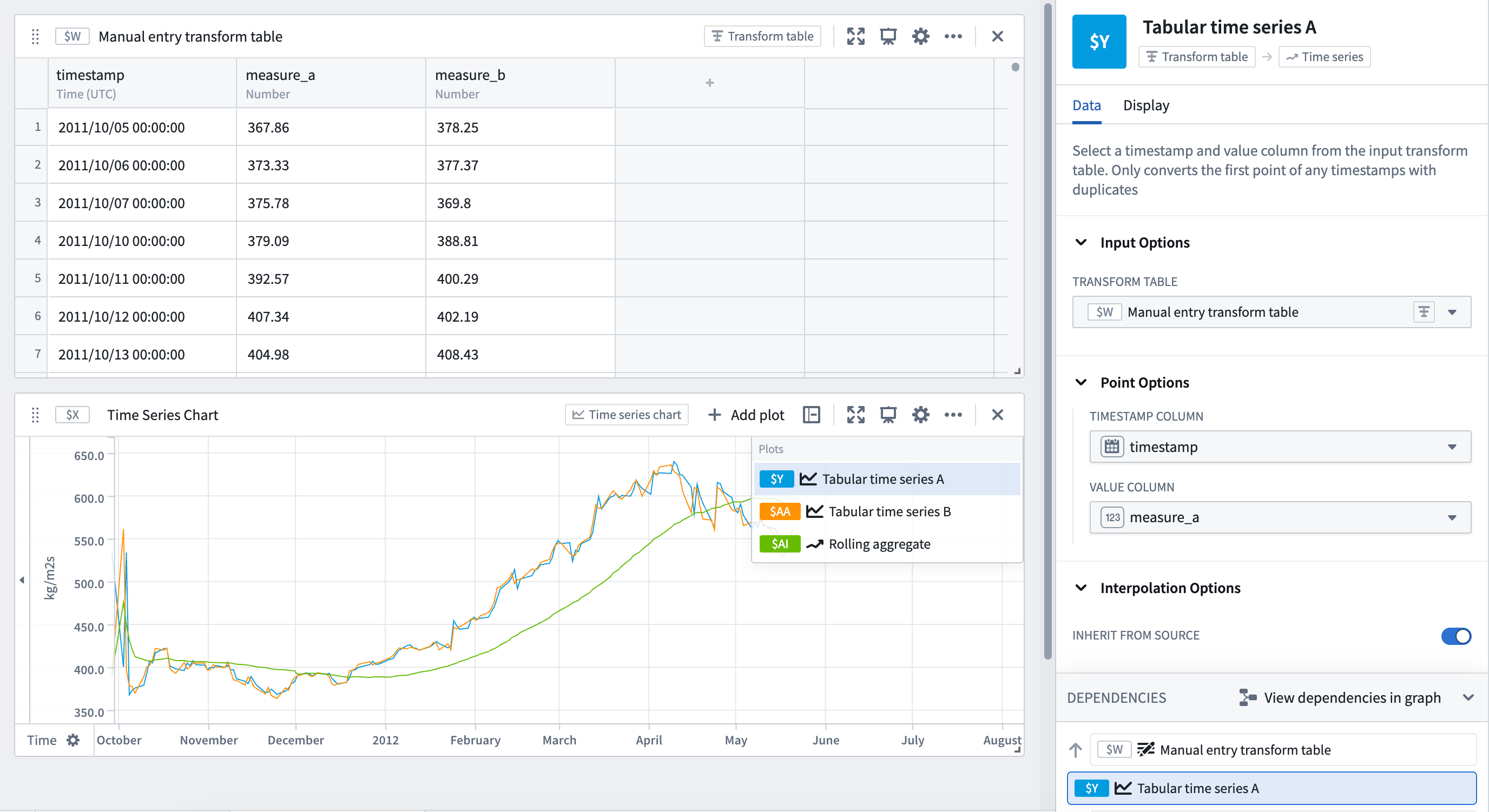
- Analyze small sets of time series data without setting up a time series sync: Copy and paste tabular time series data and convert the table into a time series plot using a Tabular time series card to continue analysis with the full range of Quiver's time series operations.
By default, manual entry transform tables generate a random unique primary key for each row, but users can choose to set a column as the table's primary key. Primary keys propagate downstream and are made available as unique identifiers in other cards, such as transform table row selectors.
:::callout{theme="neutral"} For time series data larger than 5,000 rows, or to reuse time series data across Foundry, set up a time series sync for improved performance and reusability. :::
Input: Ontology SQL
Ontology SQL results can be used as an input to a transform table, converting the SQL query results into a tabular format where they can be further manipulated, enriched, or visualized.
To create a transform table from an Ontology SQL card, select the Ontology SQL card, then select Convert > Transform tables in the Next Actions menu at the bottom of the card.
When an Ontology SQL card is converted to a transform table, the columns correspond to the columns returned by the SQL query. You can then apply any transform table operations such as filtering, grouping, deriving new columns, or charting on the resulting data.
Transform table outputs
There are four primary categories of outputs from a transform table: time series, charts, tables, and values. Transform table outputs can be added via the Next Actions menu at the bottom of the table.

Output: Time series
There are several ways to output time series data from a transform table:
- When hovering over a time series table cell, a 'pop out' button will appear. Click on it to plot the time series in a new time series chart.

- Plot a time series column on a single time series chart by selecting Time series > Grouped time series plot in the Next Actions menu at the bottom of the table. Select the input column from the table and the page size to configure how many time series to overlay.


- Convert time series data in tabular format (timestamp and value) to a time series plot to use the entire range of time series visualizations and transformations available in Quiver. Select Time series > Tabular times series in the Next Actions menu at the bottom of the table. Select the timestamp (date/time) and value (number) columns from the transform table and optionally set the units. Note that if the tabular data contains more than one value point per timestamp, only the first point for that timestamp will be plotted.


Output: Charts
You can create line charts, categorical scatter plots, bar charts, or Vega plots from transform table data. These charts can be used in Quiver for any functionality that takes a chart as input, such as a categorical formula plot or an overlay chart.
Output: Table
You can start a New transform table off of an existing transform table to provide a view that can be formatted and organized separately from the underlying data.
Output: Pivot Transform Table
You can create a pivot transform table from a transform table to display aggregated data.
Output: Values
You can aggregate columns of the transform table and output these as numbers or arrays on metric cards. These metrics can be used in Quiver for any functionality that takes numbers or arrays as inputs.
Compute new columns
To add a computed column, select Add Transformation, then select the tab that corresponds to the type of data you want to create: numeric, date/time, string, Boolean, array, or time series.
For the full list of transformations available to create columns, refer to the index of transform table transformations.
Joining
Join to Linked Objects
When a transform table has an object set as its input, you can use the Ontology to join linked objects into the table. This transformation is called Join to Linked Objects and can be found under the Tables tab in the transformations menu.

When you join an object set to other linked objects, you will be prompted to select the link type, which is the connection between your starting objects and the incoming objects. The resulting table will have a new joined primary key; this is a combination of the primary key of your starting set and the primary key of the incoming set. The new joined primary key will add the properties of your incoming objects onto each existing row, increasing the number of columns.

If your starting objects only connect to one incoming object (that is, either a “one-to-one" or "many-to-one" link type), the number of rows will not increase. If there are many incoming objects for each starting object (in other words, a "one-to-many” link type), the number of rows in your table will increase.
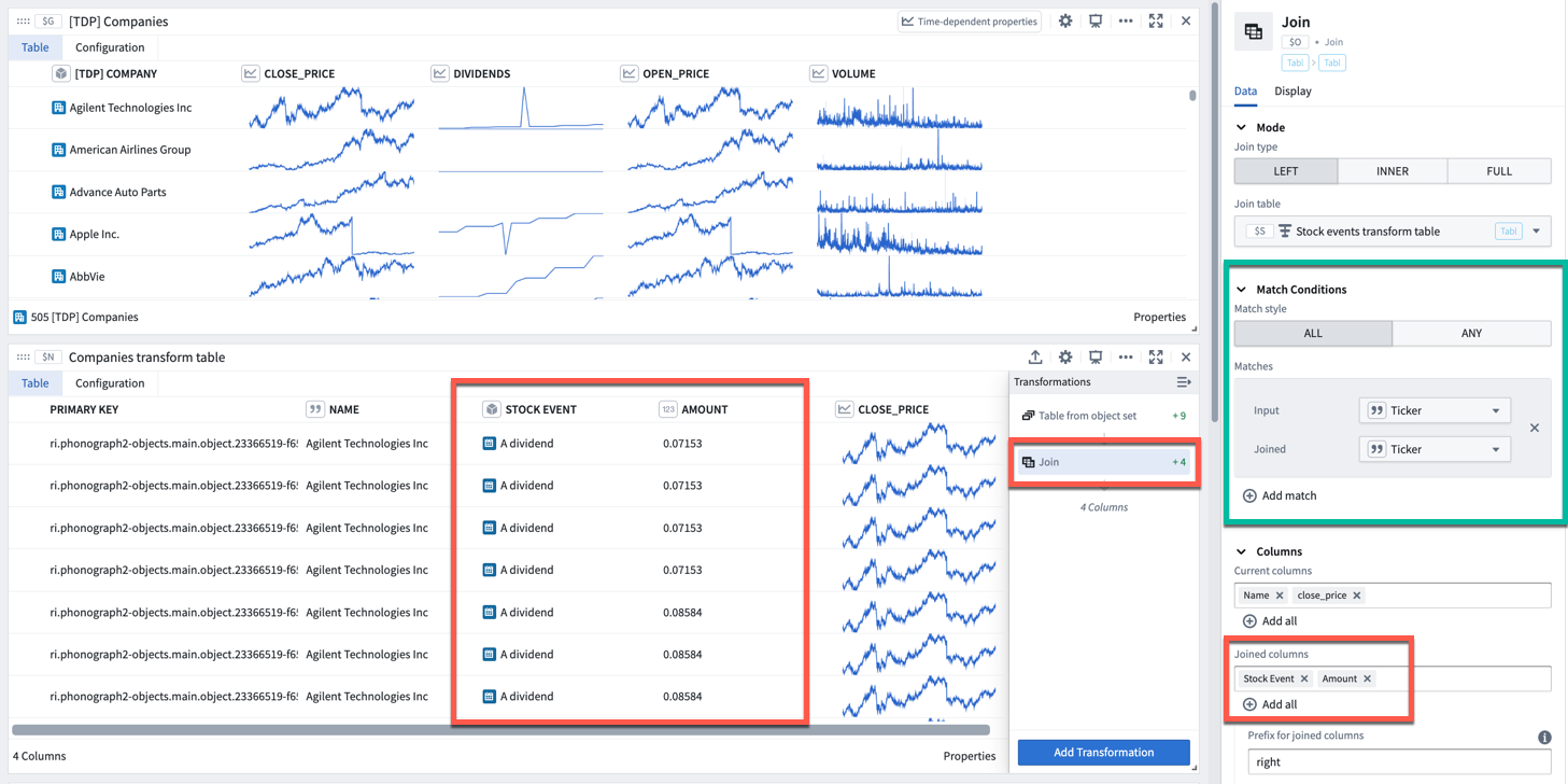
In the example below, we start a transform table from an object set of Companies. Initially this table has 505 rows (1 per object). We then add a Join to Linked Objects transform, to add linked Stock Event objects. Now, the table has 11,149 rows, the primary key is the combination of both objects’ primary keys, and columns from the Stock Event objects have been added.
Join
The Join transform can be found under the Tables tab in the transformations menu. Similar to a SQL join operation, it allows you to combine two transform tables while specifying the match condition (indicated by the green box in the image below).
To perform a join:
- Select which table to join to.
- Set the join type (left, inner, or full).
- Configure the match conditions: matching style (all, any) and one or more pairs of columns from the input and joined table for comparison.
- Select which columns from the input table to retain.
- Select which columns from the joined table to add to the input table. If the input table already contains a column with the same name as one of the columns being added, then the Prefix for joined columns will be added.
Cross join
The Cross Join transform allows you to combine two transform tables by performing a Cartesian ↗ join. A cross join generates a row for every paired combination of a row from the first table and a row from the second table. It does not join based on a specific column.
Grouping
Grouping is the action of aggregating a collection of values over some pre-defined window or bucket. There are two ways you can do this in the Transform Table:
Group By
In a Group By, you create one category for each property in your Group By column. For each category, all of the associated time-based, numeric, and time series columns become arrays of values (also called groups). Array transformations and aggregations can be performed over these arrays (groups).
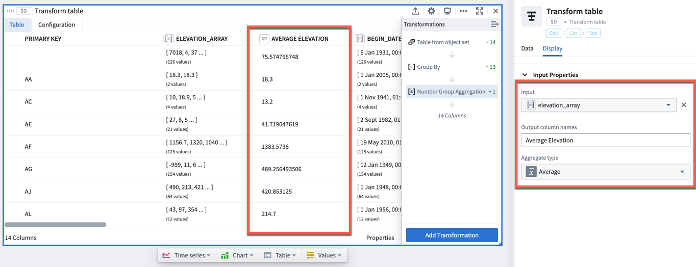
For example, the transform table below shows a set of worldwide weather stations with different elevation values. We can group these stations by the country they are located in to create arrays of the elevation values per country.
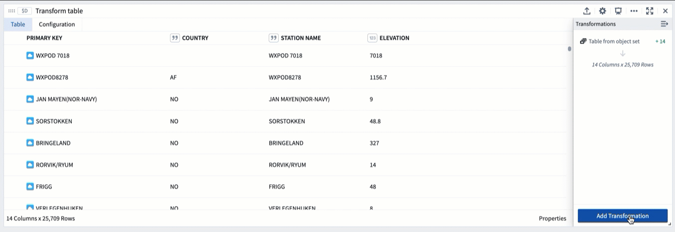
If we want to do an aggregate over these elevation values, for example calculating the average elevation for each country, we can use the Numeric Group Aggregation transformation, which will add a column to the table returning the average of the input column we select (here, elevation_array).
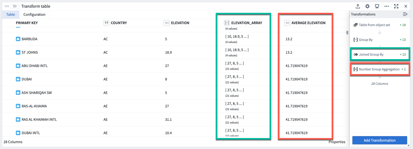
Joined Group By
Joined Group By is useful when you want to calculate some windowed and aggregated quantity (e.g. the average roof height per category, above), but want to keep the same number of rows in your table (one per building) while adding a new column for the aggregate metric.
Performing a Joined Group By transform will add an array of values column for each property that is not part of the group by category the object belongs to (indicated by the green boxes in the image below). You will then need to add an aggregation transformation to compute values on these arrays (indicated by the red boxes in the image below).
Time series
The transform table is designed to enable batch analysis of time series. This means that transformations such as filters, derivatives, or cumulative aggregates can now be applied to more than one time series at a time. For a comprehensive guide on batch time series analysis, see batch analyze time series.
For more information on the individual time series transformations included, refer to the index of transform table transforms.
There are three methods for adding time series column to a transform table, depending on the category of data to be transformed; these methods are:
- Showing a time series line plot (sparkline) from an object set of time series objects
- Adding a sensor object from a root object
- Creating a time series from a group of timestamps and values
Showing a time series line plot (sparkline) from an object set of time series objects
By default (and for performance reasons), sparklines of time series data are not shown unless you explicitly add them. If you have created a transform table that includes time series or sensor objects, you can include them by adding a Time Series Object transform, and selecting the primary key of the time series object.
Adding a sensor object from a root object
Objects that have been marked as root objects and have time series objects connected to them in the Ontology can have their linked series displayed purely by adding a Linked Sensor column. To do this, select Linked Time Series Sensor and select the primary key of the parent object.
Creating a time series from a group of timestamps and values
The transform table enables a group of dates or times to be turned into a time series, just as a bar or line chart of objects can be turned into a time series outside of the transform table. To do this, first select Group by to create groups of dates and groups of numeric values. Then, select Group to Time Series and select the date/time group as the date group property and the number/value group as the numeric group property.
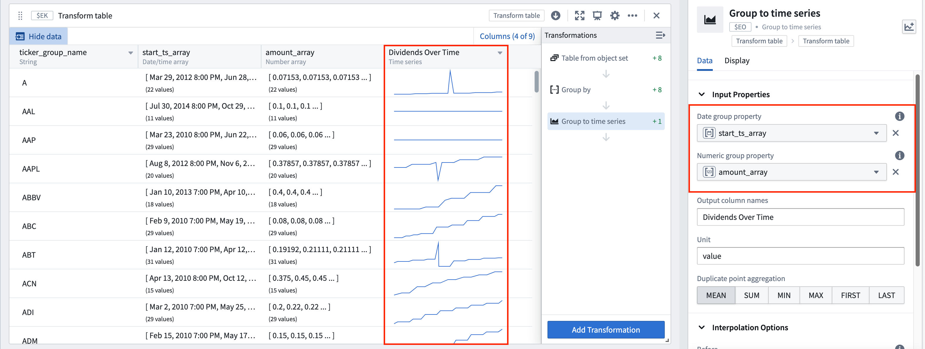
For example, the transform table below shows a set of stock dividend events with different dividend values. If we want to create a time series using these dividend values, we can do the following:
- First, group these events by the ticker to which they correspond to create arrays of the dividend value per event and arrays of the date each event occurred.
- Then, use the Group to Time Series transformation to add a column to the table showing a time series plot with the numeric group property (
amount_arrayin this case), plotted over the date group property (start_ts_array).
Formatting a transform table
The columns of a transform table can be formatted with customizable widths and heights, as can the individual values themselves. All formatting occurs in the Display tab of a Transform Table.
Column formatting
All columns, numeric or otherwise, contain formatting options for statically setting column widths and minimum heights.


Columns can be renamed by adding a Rename columns transformation from the transformations menu.

Conditional formatting of values
In addition, numeric columns have value and conditional formatting options, with the following controls:
- D3/visual format: These number formatting options are similar to those used to format metric cards or other numeric data in Quiver. Learn more about D3 formatting. ↗
- Alignment: These options control the placement of the numbers within a cell; left, central, and right alignment settings are available.
- Conditional coloring: These options enable conditional coloring of values based on thresholds. The thresholds can either be set statically or can be configured to pull in any other numeric value on your Quiver analysis. You can choose to color either the text or the background of the cell.


Formatting time series columns
Time series columns in transform tables render sparklines of the associated time series property. By default, sparklines show the full extent of data in the series. This can be changed from the Display tab of the editor:
- Select the down caret icon in the column header for the time series column of interest. This will open a menu of column actions.
- Select the Configure display settings option. This is a quick action that will open the transform table editor to the relevant configuration section in the Display tab.
- Change the View range of the sparkline by selecting an option from the menu.
You can follow the same steps to configure the view range for sparklines in object set tables.
View range options
There are four ways to set the view range for sparklines:
- Full data range: The default option. Shows all data in the time series. This may negatively impact performance for large time series.
- Fixed range: Sets the view range to a static start and end date, for example,
2025-5-21to2025-06-04. - Relative range: Sets the view range to a range relative to today. For example, from
2 weeks agotoNow. By default, the range's end date is set toNow, but a specific time can be input by selecting the Set to relative time toggle on the top right. - Initial default time axis range: set the view range to the range used to initialize the default time axis. This value is controlled by the Global settings menu.
FAQ
Can I use a transform table to create group-by time series?
Yes. Group-by time series (the ability to create a time series from a bar plot, and then segment it into several time series) are available with a transform Table. You can create a group-by time series using the Group to Time Series function with a group of dates or times, and a group of values.
See time series in transform tables for more information.
Can I format a transform table?
Yes, you can use parameters or manually input values in order to format the cells of the Table according to user-defined logic rules.
See the documentation on formatting a transform table for more information.
What are the scale limits of the transform table?
The transform table has a limit of 50,000 rows for performance reasons, since the transform table pulls data into the frontend for operation, rather than pushing data to a backend service.
Can I plot the values in a transform table?
Yes. There are four outputs from the transform table: time series, tables, charts, and values (metric cards). See the documentation on transform table outputs for more information.
Are object sets the only allowed inputs to a transform table?
No. Though it is common to use objects in a transform table, you can also use a transform table to operate on time series data, chart data, or tables such as pivot tables or other transform tables. Note that when working with chart data or pivot tables, the rows will lose their connection to the underlying objects and you will be able to operate on the aggregates, but not link back to the underlying data. This opens up the ability to perform column-wise operations on a pivot table, as well as the ability to create and operate on plot data in tabular form.
See the documentation on transform table inputs for more information.
中文翻译
转换表(Transform tables)
转换表(Transform tables) 是一个容器,用于对对象或从对象派生的表格数据进行批量分析。转换表允许用户基于输入对象(包括时间序列)的属性派生列,并为对象数据提供连接和分组功能。
由于这些操作的计算密集性,转换表最多允许 50,000 行数据。
转换表允许您:
- 连接和聚合对象;
- 从对象属性派生新列;
- 通过创建或编辑值来丰富数据;
- 批量对时间序列列执行转换;以及
- 以多种方式绘制操作结果。
添加转换(Add a transformation)
转换表搜索窗口可通过转换表中的添加转换(Add Transformation)按钮访问,显示所有可用的转换,并按转换操作类型分组,例如编辑列、筛选、时间序列操作或空值/错误处理。虽然大多数转换会添加各自类型的新列,但有些会改变表的形状(例如,连接其他对象类型或将表分组以聚合行时)。
转换表的转换也可以直接从下一步操作菜单(next actions menu)添加,方法是选择转换(Transform)类别和一个转换。此操作将向分析中添加一个转换表卡片,并将所选转换应用于该表。
转换也可以应用于转换表之外的单个支持的输入(supported input),仅对该值执行一次操作,而不是作为表中的批量操作。
要向分析中添加转换卡片,只需使用顶部菜单栏中的搜索窗口(search window)进行搜索。
转换表输入(Transform table inputs)
转换表可以接受多种类型的输入,包括对象集、分类图表、时间序列图表、时间序列图、物化表、数据透视表和其他转换表。用户也可以手动输入数据来构建转换表。
要向分析中添加转换表,请选择顶部表(Tables)菜单中的转换表(Transform table)。这将打开编辑器面板,您可以在其中选择适合您分析的现有输入。
输入:对象集(Object sets)
对象集是转换表最常见的输入。
您可以从分析中的任何对象集创建转换表,方法是从下一步操作(Next Actions)菜单中选择转换(Convert) > 转换表(Transform table)。
请注意,每个转换表有 50,000 行的限制(无论是从起始还是从连接),因此您只能创建少于 50,000 个对象的转换表。
当从对象集创建转换表时,它将为集合中的每个对象生成一行,一个表示每个对象唯一 ID 的主键列,以及对象的每个突出(prominent)属性(在本体论(Ontology)中定义)的列,或者,如果没有突出属性,则为对象的前几个属性(最多 20 个)。
通过单击表右下角的属性(Properties)按钮,可以添加或删除属性列以及对象集的任何链接传感器对象。拖动列可以重新排列它们在表中的顺序。
您可以为转换表的每个转换步骤设置不同的列配置。在下一节中了解更多关于格式化转换表的信息。
输入:分类图表(Categorical charts)
条形图、折线图和散点图都可以作为转换表的输入。使用这些输入将显示图表上的类别和值,而不会引入底层数据。要引入底层数据,您应该使用创建图表所用的对象集。您可以通过选择图表,单击下一步操作(Next Actions)菜单,然后选择表(Table) > 转换表(Transform table)来从分类图表创建转换表。
输入:时间序列图(Time series plots)
时间序列图可以作为表的输入,将时间序列数据转换为表格格式,以便进行操作、编辑或丰富。
要从时间序列图创建转换表,请从图表中选择特定的时间序列图。然后,在时间序列图底部的下一步操作(Next Actions)菜单中选择表(Table) > 转换表(Transform table)。
然后,在转换编辑器面板中选择可用的范围选项(Range Options):
- 使用输入时间序列的完整时间范围(默认)。
- 指定要导入的时间范围,可以通过手动输入开始和结束时间戳,或通过引用范围参数来实现。
出于性能原因,转换表限制为 50,000 行;转换表将数据拉取到前端进行操作,而不是将数据推送到后端服务。因此,时间序列数据可能需要进行采样(分桶)以适应限制。
您可以在数据选项(Data Options)中选择如何将时间序列数据转换为表格格式:
- 在"采样(Sampled)"设置中,表将为每个桶显示边界时间戳和值(最早和最晚,以及最小和最大)、平均值和点数。您可以调整采样桶的数量。
- 在"未采样(Unsampled)"设置中,表将显示原始未采样数据('tick 数据'),并有三列:主键、时间戳和值。
时间戳系列数据默认以 UTC 显示。可以在转换表编辑器的列设置中将时间戳时区更改为用户的时区或不同的静态时区。
输入:时间序列图表(Time series charts)
时间序列图表可以作为表的输入,将图表中的每个时间序列图作为表中的一行打开。
要从时间序列图表创建转换表,请选择时间序列图表(而不是特定的时间序列图)。然后,在时间序列图表底部的下一步操作(Next Actions)菜单中选择表(Table) > 从图表的时间序列创建表(Table from chart's time series)。
输入:数据透视表(Pivot Tables)和其他转换表
透视数据可以作为转换表的输入,使您能够使用公式对数据透视表列进行操作。与图表一样,从数据透视表创建转换表不会引入其输入数据,而是引入透视数据本身。 转换表也可以作为另一个转换表的输入。这在您希望将转换逻辑拆分为"块"逻辑步骤,或分离数据转换和数据格式化时非常有用。 您可以通过选择表卡片底部的下一步操作(Next Actions)菜单中的表(Table)来从另一个表创建转换表。
输入:手动输入转换表(Manual entry transform tables)
用户可以手动输入最多 5,000 行数据来创建新的转换表。手动输入转换表卡片具有类似电子表格的用户界面,并支持五种数据类型:字符串、数字、布尔值、时间和时间序列(time series)。用户可以像处理其他转换表一样与手动输入转换表进行交互并应用操作。
要向 Quiver 画布添加新的手动输入转换表,请选择分析标题中的手动输入(Manual Entry)或在搜索卡片(Search cards)对话框中搜索该表。
手动输入表示例工作流
- 使用表值参数化分析: 将手动输入转换表与行和列选择器结合使用,以在行之间切换。表中选定行的值可以用作下游分析中的动态参数。
- 从外部来源摄取小数据集以补充分析和本体论(Ontology): 用户可以将电子表格中的元数据复制并粘贴到新表中,以连接到现有对象集,方法是在对象集下方的下一步操作菜单(next actions menu)中搜索连接到转换表(Join to transform table)。
从连接的对象集和手动输入转换表中,配置连接到转换表(Join to transform table)转换以指定连接条件。
- 分析小规模时间序列数据而无需设置时间序列同步: 复制并粘贴表格形式的时间序列数据,并使用表格时间序列(Tabular time series)卡片将表转换为时间序列图,以继续使用 Quiver 全套时间序列操作(time series operations)进行分析。
默认情况下,手动输入转换表会为每行生成一个随机的唯一主键,但用户可以选择将某一列设置为表的主键。主键会向下游传播,并在其他卡片(如转换表行选择器)中作为唯一标识符提供。
:::callout{theme="neutral"} 对于超过 5,000 行的时间序列数据,或者要在 Foundry 中重用时间序列数据,请设置时间序列同步(time series sync)以获得更好的性能和可重用性。 :::
输入:本体论 SQL(Ontology SQL)
本体论 SQL(Ontology SQL)结果可以用作转换表的输入,将 SQL 查询结果转换为表格格式,以便进一步操作、丰富或可视化。
要从本体论 SQL 卡片创建转换表,请选择本体论 SQL 卡片,然后选择卡片底部的下一步操作(Next Actions)菜单中的转换(Convert) > 转换表(Transform tables)。
当本体论 SQL 卡片转换为转换表时,列对应于 SQL 查询返回的列。然后,您可以对结果数据应用任何转换表操作,例如筛选、分组、派生新列或绘制图表。
转换表输出(Transform table outputs)
转换表有四种主要输出类别:时间序列、图表、表和值。 转换表输出可以通过表底部的下一步操作(Next Actions)菜单添加。
输出:时间序列(Time series)
有几种方法可以从转换表输出时间序列数据:
- 当悬停在时间序列表单元格上时,会出现一个"弹出"按钮。单击它以在新的时间序列图表中绘制时间序列。
- 通过选择表底部下一步操作(Next Actions)菜单中的时间序列(Time series) > 分组时间序列图(Grouped time series plot),在单个时间序列图表上绘制时间序列列。选择表中的输入列和页面大小以配置要叠加的时间序列数量。
- 将表格格式的时间序列数据(时间戳和值)转换为时间序列图,以使用 Quiver 中可用的全套时间序列可视化和转换。选择表底部下一步操作(Next Actions)菜单中的时间序列(Time series) > 表格时间序列(Tabular times series)。从转换表中选择时间戳(日期/时间)和值(数字)列,并可选择设置单位。请注意,如果表格数据在每个时间戳包含多个值点,则只会绘制该时间戳的第一个点。
输出:图表(Charts)
您可以从转换表数据创建折线图、分类散点图、条形图或 Vega 图。这些图表可以在 Quiver 中用于任何接受图表作为输入的功能,例如分类公式图或叠加图。
输出:表(Table)
您可以从现有转换表启动新转换表(New transform table),以提供可以与底层数据分开格式化和组织的视图。
输出:数据透视转换表(Pivot Transform Table)
您可以从转换表创建数据透视转换表(pivot transform table)以显示聚合数据。
输出:值(Values)
您可以聚合转换表的列,并将它们作为数字或数组输出到指标卡上。这些指标可以在 Quiver 中用于任何接受数字或数组作为输入的功能。
计算新列(Compute new columns)
要添加计算列,请选择添加转换(Add Transformation),然后选择与您要创建的数据类型对应的选项卡:数字、日期/时间、字符串、布尔值、数组或时间序列。
有关可用于创建列的完整转换列表,请参阅转换表转换索引(index of transform table transformations)。
连接(Joining)
连接到链接对象(Join to Linked Objects)
当转换表以对象集作为输入时,您可以使用本体论(Ontology)将链接对象连接到表中。此转换称为连接到链接对象(Join to Linked Objects),可以在转换菜单的表(Tables)选项卡下找到。
当您将对象集连接到其他链接对象时,系统会提示您选择链接类型(link type),即起始对象和传入对象之间的连接。结果表将有一个新的连接主键;这是起始集主键和传入集主键的组合。新的连接主键会将传入对象的属性添加到每个现有行上,从而增加列数。
如果您的起始对象只连接到一个传入对象(即"一对一"或"多对一"链接类型(link type)),则行数不会增加。如果每个起始对象有多个传入对象(即"一对多"链接类型(link type)),则表中的行数会增加。
在下面的示例中,我们从公司对象集开始创建转换表。最初,该表有 505 行(每个对象一行)。然后,我们添加一个连接到链接对象转换,以添加链接的股票事件对象。现在,该表有 11,149 行,主键是两个对象主键的组合,并且已添加股票事件对象的列。
连接(Join)
连接(Join)转换可以在转换菜单的表(Tables)选项卡下找到。类似于 SQL 连接操作,它允许您组合两个转换表,同时指定匹配条件(由下图中的绿色框指示)。
要执行连接:
- 选择要连接到的表。
- 设置连接类型(左连接、内连接或全连接)。
- 配置匹配条件:匹配样式(全部、任意)以及来自输入表和连接表的一对或多对列用于比较。
- 选择要从输入表中保留的列。
- 选择要从连接表中添加到输入表的列。如果输入表已包含与要添加的列同名的列,则会添加连接列的前缀(Prefix for joined columns)。
交叉连接(Cross join)
交叉连接(Cross Join)转换允许您通过执行笛卡尔积(Cartesian) ↗连接来组合两个转换表。交叉连接为第一个表中的每一行和第二个表中的每一行的每一对组合生成一行。它不基于特定列进行连接。
分组(Grouping)
分组是在某个预定义的窗口或桶上聚合一组值的操作。在转换表中有两种方法可以做到这一点:
分组依据(Group By)
在分组依据(Group By)中,您为分组依据列中的每个属性创建一个类别。对于每个类别,所有相关的时间型、数字和时间序列列都成为值数组(也称为组)。可以对这些数组(组)执行数组转换和聚合。
例如,下面的转换表显示了一组具有不同海拔值的全球气象站。我们可以按这些气象站所在的国家对它们进行分组,以创建每个国家海拔值的数组。
如果我们想对这些海拔值执行聚合,例如计算每个国家的平均海拔,我们可以使用数字组聚合(Numeric Group Aggregation)转换,它将向表中添加一列,返回我们选择的输入列(此处为 elevation_array)的平均值。
连接分组依据(Joined Group By)
连接分组依据(Joined Group By)在您想要计算某些窗口化和聚合量(例如,上面每个类别的平均屋顶高度),但希望保持表中相同的行数(每个建筑物一行)同时为聚合指标添加新列时非常有用。
执行连接分组依据(Joined Group By)转换将为每个不属于对象所属分组依据类别的属性添加一个值数组列(由下图中的绿色框指示)。然后,您需要添加一个聚合转换来计算这些数组上的值(由下图中的红色框指示)。
时间序列(Time series)
转换表旨在支持时间序列的批量分析。这意味着诸如筛选、导数或累积聚合之类的转换现在可以一次应用于多个时间序列。有关批量时间序列分析的全面指南,请参阅批量分析时间序列(batch analyze time series)。
有关包含的各个时间序列转换的更多信息,请参阅转换表转换索引(index of transform table transforms)。
根据要转换的数据类别,有三种方法可以向转换表添加时间序列列;这些方法是:
从时间序列对象集显示时间序列折线图(迷你图)(Showing a time series line plot (sparkline) from an object set of time series objects)
默认情况下(出于性能原因),除非您明确添加,否则不会显示时间序列数据的迷你图。如果您创建了包含时间序列或传感器对象的转换表,您可以通过添加时间序列对象转换并选择时间序列对象的主键来包含它们。
从根对象添加传感器对象(Adding a sensor object from a root object)
在本体论(Ontology)中被标记为根对象并且具有连接到它们的时间序列对象的对象,可以通过添加链接传感器(Linked Sensor)列来显示其链接的系列。为此,请选择链接时间序列传感器(Linked Time Series Sensor)并选择父对象的主键。
从一组时间戳和值创建时间序列(Creating a time series from a group of timestamps and values)
转换表可以将一组日期或时间转换为时间序列,就像在转换表之外可以将对象的条形图或折线图转换为时间序列一样。为此,首先选择分组依据(Group by)以创建日期组和数值组。然后,选择组到时间序列(Group to Time Series)并选择日期/时间组作为日期组属性(date group property),选择数字/值组作为数字组属性(numeric group property)。
例如,下面的转换表显示了一组具有不同股息值的股票股息事件。如果我们想使用这些股息值创建时间序列,我们可以执行以下操作:
- 首先,按这些事件对应的股票代码对它们进行分组,以创建每个事件的股息值数组和每个事件发生日期的数组。
- 然后,使用组到时间序列(Group to Time Series)转换向表中添加一列,显示一个时间序列图,其中数字组属性(此处为
amount_array)绘制在日期组属性(start_ts_array)上。
格式化转换表(Formatting a transform table)
转换表的列可以格式化为可自定义的宽度和高度,单个值本身也可以格式化。所有格式化都在转换表的显示(Display)选项卡中进行。
列格式化(Column formatting)
所有列,无论是数字列还是其他类型,都包含用于静态设置列宽度和最小高度的格式化选项。
![]()
可以通过从转换菜单添加重命名列(Rename columns)转换来重命名列。
![]()
值的条件格式化(Conditional formatting of values)
此外,数字列具有值和条件格式化选项,具有以下控件:
- D3/视觉格式(D3/visual format): 这些数字格式化选项类似于用于格式化 Quiver 中指标卡或其他数字数据的选项。了解更多关于 D3 格式化的信息。 ↗
- 对齐(Alignment): 这些选项控制数字在单元格内的位置;提供左对齐、居中对齐和右对齐设置。
- 条件着色(Conditional coloring): 这些选项允许基于阈值对值进行条件着色。阈值可以静态设置,也可以配置为拉取 Quiver 分析中的任何其他数值。您可以选择为单元格的文本或背景着色。
![]()
格式化时间序列列(Formatting time series columns)
转换表中的时间序列列会渲染相关时间序列属性的迷你图。默认情况下,迷你图显示系列中数据的全部范围。这可以在编辑器的显示(Display)选项卡中更改:
- 选择感兴趣的时间序列列的列标题中的向下插入符图标。这将打开一个列操作菜单。
- 选择配置显示设置(Configure display settings)选项。这是一个快速操作,将打开转换表编辑器到显示(Display)选项卡中的相关配置部分。
- 通过从菜单中选择一个选项来更改迷你图的视图范围(View range)。
您可以按照相同的步骤为对象集表中的迷你图配置视图范围。
视图范围选项(View range options)
有四种设置迷你图视图范围的方法:
- 完整数据范围(Full data range): 默认选项。显示时间序列中的所有数据。对于大型时间序列,这可能会对性能产生负面影响。
- 固定范围(Fixed range): 将视图范围设置为静态的开始和结束日期,例如
2025-5-21到2025-06-04。 - 相对范围(Relative range): 将视图范围设置为相对于今天的范围。例如,从
2 周前到现在。默认情况下,范围的结束日期设置为现在,但可以通过选择右上角的设置为相对时间(Set to relative time)切换开关来输入特定时间。 - 初始默认时间轴范围(Initial default time axis range): 将视图范围设置为用于初始化默认时间轴的范围。此值由全局设置(Global settings)菜单控制。
常见问题解答(FAQ)
我可以使用转换表创建分组依据时间序列吗?
可以。分组依据时间序列(从条形图创建时间序列,然后将其分割成多个时间序列的能力)在转换表中可用。您可以使用组到时间序列功能,配合一组日期或时间以及一组值来创建分组依据时间序列。
有关更多信息,请参阅转换表中的时间序列。
我可以格式化转换表吗?
可以,您可以使用参数或手动输入值,根据用户定义的逻辑规则来格式化表的单元格。
有关更多信息,请参阅格式化转换表的文档。
转换表的规模限制是什么?
出于性能原因,转换表有 50,000 行的限制,因为转换表将数据拉取到前端进行操作,而不是将数据推送到后端服务。
我可以绘制转换表中的值吗?
可以。转换表有四种输出:时间序列、表、图表和值(指标卡)。 有关更多信息,请参阅转换表输出的文档。
对象集是转换表唯一允许的输入吗?
不是。虽然在转换表中使用对象很常见,但您也可以使用转换表对时间序列数据、图表数据或表(如数据透视表或其他转换表)进行操作。 请注意,在处理图表数据或数据透视表时,行将失去与底层对象的连接,您将能够对聚合进行操作,但无法链接回底层数据。这开启了在数据透视表上执行列操作的能力,以及以表格形式创建和操作绘图数据的能力。
有关更多信息,请参阅转换表输入的文档。