Create a dashboard(创建仪表盘(Dashboard))
Getting started
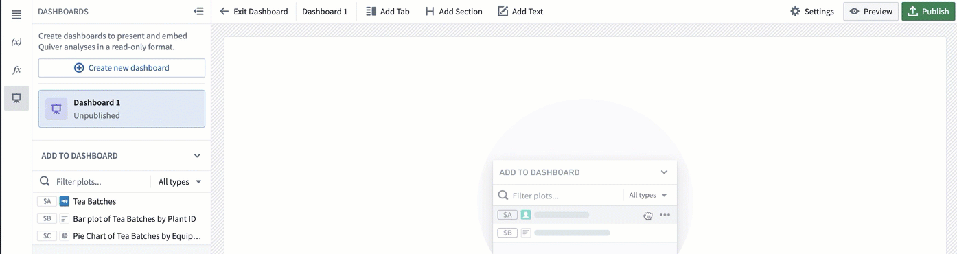
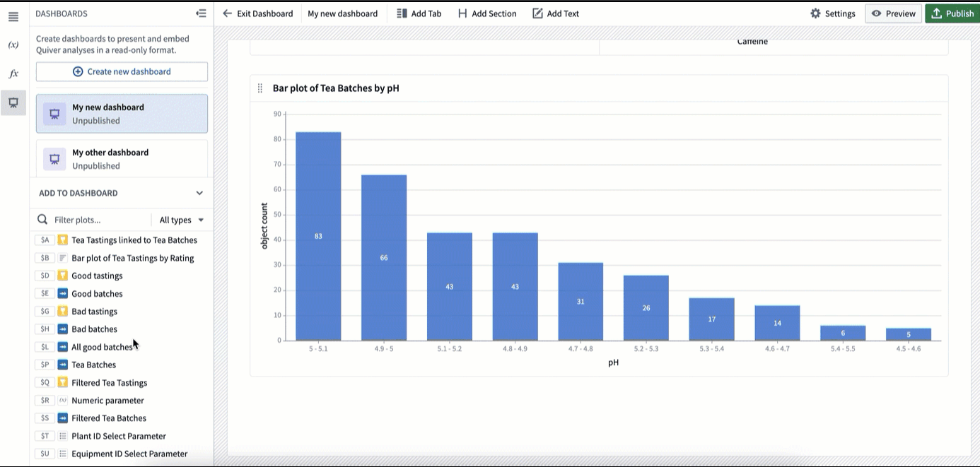
To create a dashboard, select the dashboard icon on the left side toolbar (as shown below). This will open the Dashboards panel.
If you do not have a dashboard in this analysis yet, select Create new dashboard. This will create a new, unpublished dashboard.

Rename your dashboard
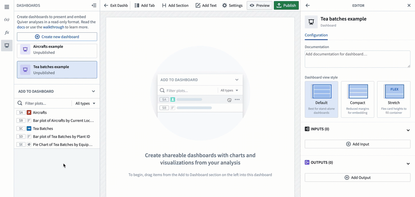
To rename your dashboard, click on its name in the top toolbar, and type the new name. The new name will be saved once you leave the name input box. You will see the new name reflected on the left side panel.
You can also rename the dashboard form the editor panel by clicking on the name at the top.

To open and close the editor panel, select the Settings button in the top toolbar.

Add documentation
To provide more context to your dashboard, you can add a description in the editor panel's Documentation text box.

Add content to your dashboard
Add cards to dashboard with drag-and-drop
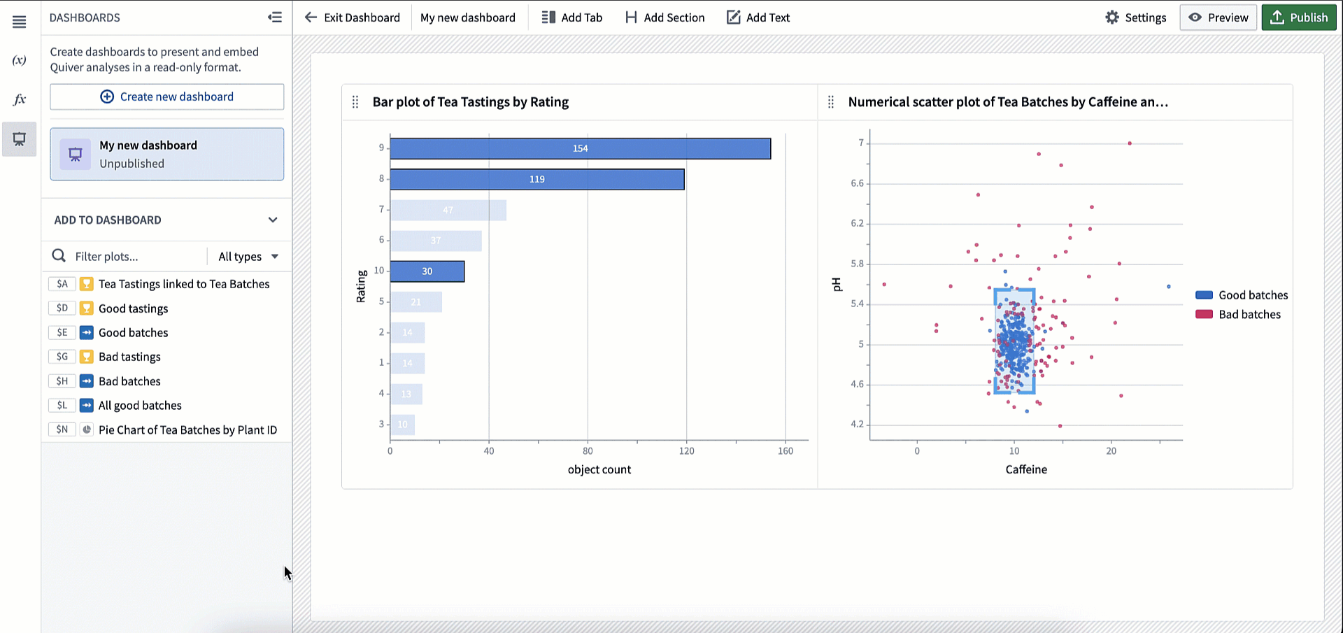
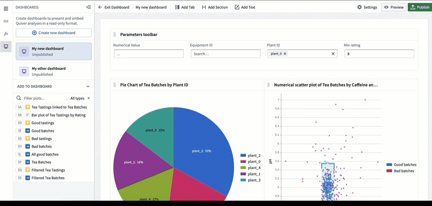
To add content to your dashboard, click on a card in the Add to dashboard section in the left panel, and drag it into the dashboard.
As you drag the card into the dashboard, you will see several drop zones highlighted, indicating where you can drop the card.
If there are already cards in your analysis, you will have the option to drag your selected card next to it on the same row. The cards will automatically align and resize to be the same width and height. You can then adjust the row height using the sizing handle. You can add up to three cards side-by-side on the same row.
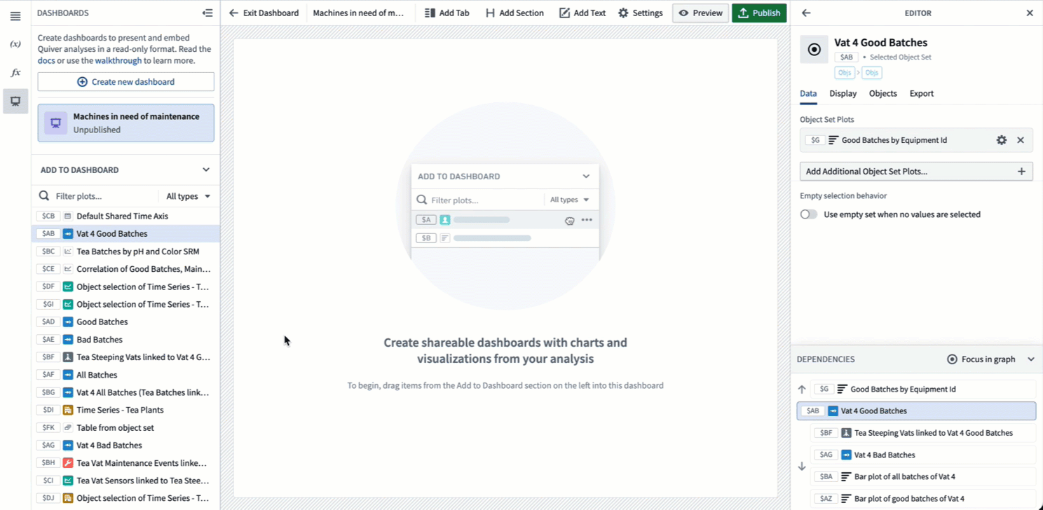
You can use the drag handle in the top left corner of a card or cell to change its position on the dashboard.

To remove a card, use the "trash" icon in the top right corner of a card as shown below. Once removed from the dashboard, the card will become available in the Add to dashboard panel and can be added again. Note that removing a card from a dashboard does not delete the card from the analysis.

Filtering cards by name or output type
In large analyses, you can quickly end up with a lot of cards to search through. To make it easier to find the content you need in your dashboard, you can filter content by name or card output type. You will also see a preview of the card when hovering over it.
Add content to dashboard from analysis mode
While building your analysis, you can add cards to a dashboard directly without opening the dashboard. To do this, click the dashboard icon in the top right corner of the card. You can either add to an existing dashboard or to a new dashboard. The card will be added at the bottom of the chosen dashboard in a new row.

Edit layout and annotate your dashboard
Create parameters and metrics cells
Once you’ve added a parameter or metric card to the dashboard, you can add more cards of the same type to the same cell. You can then reposition them on your dashboard at the same time. To do this, drop the cards on the blue drop zone inside the cell. One benefit of adding multiple parameters or metrics to the same cell is that there is no limit on how many you can add side-by-side. On regular cards, you would be limited to three in the same row.
Attach sidebars
A common pattern for using parameters (or metrics) cells is to attach them to one side of the dashboard so they are always visible when scrolling. This can be useful to highlight key metrics (such as KPIs) or to create a parameters sidebar that the user can easily access. Though these use cases are the most common, you can attach any type of card to the sides of the dashboard.
Add tabs
There are two level of tabs you can create in your dashboard: top-level tabs and card-level tabs.
Top-level tabs
Top-level tabs are added to the very top of your dashboard and allow you to create multiple “pages”. To add a top-level tab, select Add Tab in the top toolbar as shown below.

Select the down arrow next to a tab to access a dropdown menu of actions to rename, move right or left, or delete the tab. You can also rename a tab by double-clicking on the tab name.

Card-level tabs
Card-level tabs allow users to toggle between different charts. Note that you cannot add sections or text within card-level tabs.
To add a tab on a card, select the Add tab icon in the top right corner as shown below.

Select the down arrow next to a tab to access a dropdown menu of actions to rename, move right or left, or delete the tab. You can also rename a tab by double-clicking on the tab name.

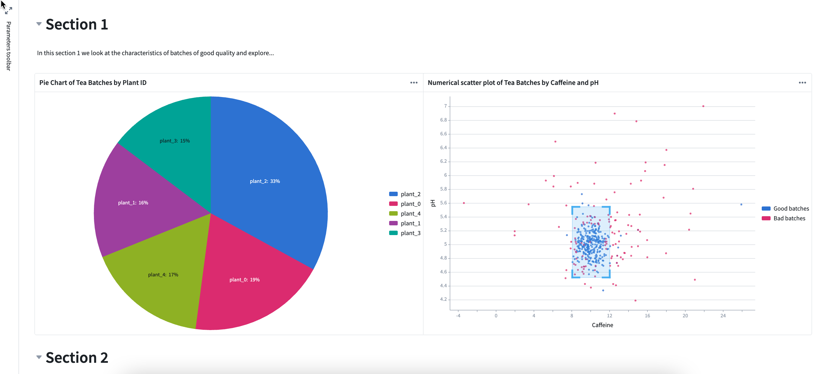
Add sections
A section is defined from the header to the following header, or to the bottom of the dashboard if there are no other headers. To create a section, select Add Section in the top toolbar.
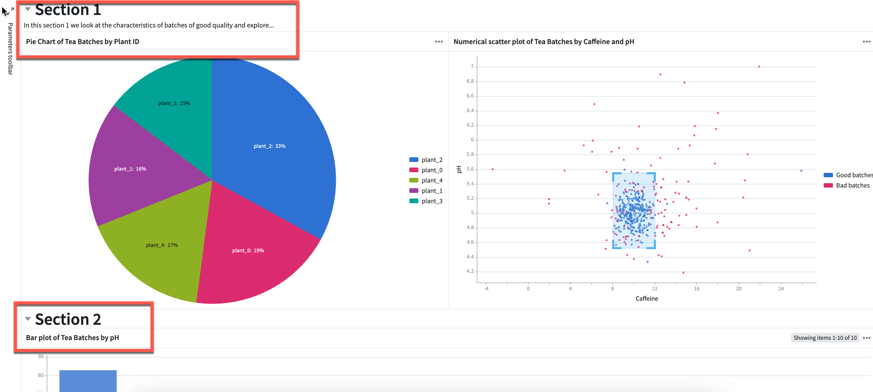
Sections can be repositioned using the drag handle on the left.
Sections are automatically collapsible. To collapse a section, click on the arrow on the left side of the section as shown below.

Add text
You can add text in your dashboard using the rich text editor provided.
To add a text component, select Add Text in the top toolbar. The text component will be added at the very bottom of the dashboard.

You can add text to a specific place in the dashboard by clicking the — + — line in-between rows, as shown below.
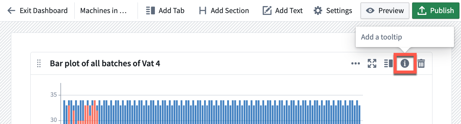
Add tooltips
On each cell in the dashboard, you can add a tooltip that will be visible to end users. Click on the (i) (information) icon in the top right corner to add a tooltip.
(Advanced) Add containers
Containers are not recommended for standard dashboard designs. However, some cases may require more complex or customized layouts for which containers can be helpful. Containers allow you to add multiple cards to a single cell within a specific configuration, such as tabs or a list. Once created in analysis mode, containers can be added as a single cell to your dashboard.
Containers can be added from the Display menu in your analysis.

Add the container to your analysis, then drag cards from the Analysis contents panel into the container. You can configure containers using the card editor on the right side.
Once the container has been configured in analysis mode, you can add it to your dashboard like a regular card. To add the container, select the Add to dashboard button in the top right corner of the card, or drag it into the dashboard from the Add to dashboard section.
Choose your dashboard view style
To choose your dashboard view style, open the dashboard editor with the Settings button in the top toolbar.
You will have the option to choose between three view styles: default, compact, and stretch.

Default
The default dashboard view is a report-style view. This view is designed with more whitespace for ease of reading, including large margins on the sides and between rows. This style is best for standalone dashboard consumption.
Compact
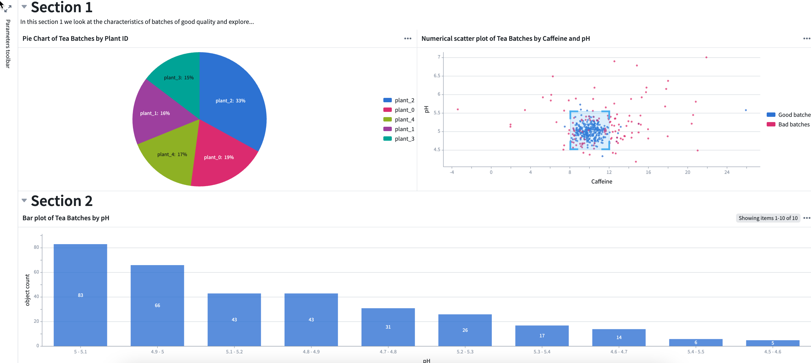
In the compact dashboard view, rows are stretched horizontally, margins to the sides and between rows are removed, and row heights are unchanged. The compact view is a good option when embedding a dashboard in another application, as the dashboard may fit better without added margins. In the example below, the title whitespace in cards (marked in red) is compacted pushing section 2 up into view.
Stretch
In the stretch dashboard view, rows are stretched both horizontally and vertically so all contents of the dashboard fit in the size of the window. This prevents the user from having to scroll when embedding the dashboard in another application. In the example below, both sections are compacted to remove whitespace and chart sizes are adjusted to fit in one window.
Define your dashboard inputs and outputs
The main purpose of inputs and outputs is to pass data to and from an application where the dashboard is embedded. For example, charts in the embedded dashboard can update based on an object set selection in the application, or a Workshop metric card can highlight a value computed in the embedded dashboard.
You can define multiple inputs and outputs to your dashboard. Follow the steps below to add inputs or outputs to your dashboard:
- Open the dashboard editor with the Settings button.

- Select Add input or Add output.

- Choose the data (e.g object set, object, time series, variable, etc.) from the dropdown list to be used as an input or output.

- Optionally, set the current data value as the default value for the input, which is the value the parameter will have if no input is passed in.

- Optionally, give a meaningful title to the input or output by selecting the default title and typing in a new one. This title will be visible in the application where the dashboard is embedded when mapping inputs and outputs.

中文翻译
创建仪表盘(Dashboard)
入门指南
要创建仪表盘(Dashboard),请选择左侧工具栏中的仪表盘图标(如下图所示)。这将打开仪表盘(Dashboards)面板。
如果当前分析中还没有仪表盘,请选择创建新仪表盘(Create new dashboard)。这将创建一个新的未发布仪表盘。
重命名仪表盘
要重命名仪表盘,请点击顶部工具栏中的名称,然后输入新名称。离开名称输入框后,新名称将自动保存。您可以在左侧面板中看到更新后的名称。
您也可以从编辑器面板(Editor panel)中点击顶部的名称来重命名仪表盘。
要打开或关闭编辑器面板,请选择顶部工具栏中的设置(Settings)按钮。
添加文档说明
为了给仪表盘提供更多上下文信息,您可以在编辑器面板的文档说明(Documentation)文本框中添加描述。
向仪表盘添加内容
通过拖放向仪表盘添加卡片
要向仪表盘添加内容,请点击左侧面板中添加到仪表盘(Add to dashboard)部分的卡片,然后将其拖入仪表盘。
当您将卡片拖入仪表盘时,会看到多个高亮显示的放置区域,指示您可以放置卡片的位置。
如果分析中已有其他卡片,您可以选择将所选卡片拖到同一行的相邻位置。卡片会自动对齐并调整为相同的宽度和高度。然后您可以使用尺寸调整手柄调整行高。同一行最多可以并排放置三张卡片。
您可以使用卡片或单元格左上角的拖动手柄来更改其在仪表盘上的位置。
要移除卡片,请使用卡片右上角的"垃圾桶"图标,如下所示。从仪表盘移除后,该卡片将出现在添加到仪表盘(Add to dashboard)面板中,可以再次添加。请注意,从仪表盘移除卡片并不会从分析中删除该卡片。
按名称或输出类型筛选卡片
在大型分析中,您可能会很快积累大量需要搜索的卡片。为了更轻松地找到仪表盘中所需的内容,您可以按名称或卡片输出类型进行筛选。将鼠标悬停在卡片上时,还会看到卡片的预览。
从分析模式向仪表盘添加内容
在构建分析时,您可以直接向仪表盘添加卡片,而无需打开仪表盘。为此,请点击卡片右上角的仪表盘图标。您可以选择添加到现有仪表盘或新仪表盘。该卡片将以新行的形式添加到所选仪表盘的底部。
编辑布局并添加注释
创建参数(Parameters)和指标(Metrics)单元格
将参数或指标卡片添加到仪表盘后,您可以将更多同类型的卡片添加到同一单元格中。然后您可以同时调整它们在仪表盘上的位置。为此,请将卡片拖放到单元格内的蓝色放置区域。 将多个参数或指标添加到同一单元格的一个好处是,并排放置的数量没有限制。而普通卡片在同一行中最多只能放置三张。
附加侧边栏
使用参数(或指标)单元格的一个常见模式是将它们附加到仪表盘的一侧,以便在滚动时始终可见。这对于突出显示关键指标(如KPI)或创建用户可以轻松访问的参数侧边栏非常有用。虽然这些是最常见的用例,但您可以将任何类型的卡片附加到仪表盘的两侧。
添加标签页(Tabs)
您可以在仪表盘中创建两个层级的标签页:顶层标签页(Top-level tabs)和卡片级标签页(Card-level tabs)。
顶层标签页
顶层标签页添加到仪表盘的最顶部,允许您创建多个"页面"。要添加顶层标签页,请选择顶部工具栏中的添加标签页(Add Tab),如下所示。
选择标签页旁边的向下箭头,可以访问操作下拉菜单,进行重命名、向左或向右移动或删除标签页。您也可以双击标签页名称进行重命名。
卡片级标签页
卡片级标签页允许用户在不同图表之间切换。请注意,在卡片级标签页内无法添加分区(Sections)或文本(Text)。
要在卡片上添加标签页,请选择右上角的添加标签页(Add tab)图标,如下所示。
选择标签页旁边的向下箭头,可以访问操作下拉菜单,进行重命名、向左或向右移动或删除标签页。您也可以双击标签页名称进行重命名。
添加分区(Sections)
分区定义为从一个标题到下一个标题之间的区域,如果没有其他标题,则到仪表盘底部。要创建分区,请选择顶部工具栏中的添加分区(Add Section)。
可以使用左侧的拖动手柄重新定位分区。
分区默认是可折叠的。要折叠分区,请点击分区左侧的箭头,如下所示。
添加文本(Text)
您可以使用提供的富文本编辑器在仪表盘中添加文本。
要添加文本组件,请选择顶部工具栏中的添加文本(Add Text)。文本组件将添加到仪表盘的最底部。
您可以通过点击行之间的— + —线条,将文本添加到仪表盘的特定位置,如下所示。
添加工具提示(Tooltips)
在仪表盘的每个单元格上,您可以添加对最终用户可见的工具提示。点击右上角的(i)(信息)图标来添加工具提示。
(高级)添加容器(Containers)
不建议在标准仪表盘设计中使用容器。然而,某些情况可能需要更复杂或自定义的布局,这时容器会很有帮助。容器允许您将多张卡片添加到单个单元格中,并采用特定配置,如标签页或列表。在分析模式下创建后,容器可以作为单个单元格添加到仪表盘中。
可以从分析的显示(Display)菜单中添加容器。
将容器添加到分析中,然后将卡片从分析内容(Analysis contents)面板拖入容器。您可以使用右侧的卡片编辑器配置容器。
在分析模式下配置好容器后,您可以像普通卡片一样将其添加到仪表盘中。要添加容器,请选择卡片右上角的添加到仪表盘(Add to dashboard)按钮,或从添加到仪表盘(Add to dashboard)部分将其拖入仪表盘。
选择仪表盘视图样式
要选择仪表盘视图样式,请使用顶部工具栏中的设置(Settings)按钮打开仪表盘编辑器。
您可以在三种视图样式中选择:默认(Default)、紧凑(Compact)和拉伸(Stretch)。
默认(Default)
默认仪表盘视图是一种报告式视图。这种设计具有更多的空白区域,便于阅读,包括两侧和行之间的大边距。这种样式最适合独立的仪表盘使用。
紧凑(Compact)
在紧凑仪表盘视图中,行水平拉伸,两侧和行之间的边距被移除,行高保持不变。当将仪表盘嵌入到其他应用程序中时,紧凑视图是一个不错的选择,因为仪表盘在没有额外边距的情况下可能更合适。在下面的示例中,卡片中的标题空白区域(用红色标出)被压缩,将第2部分推入视野。
拉伸(Stretch)
在拉伸仪表盘视图中,行在水平和垂直方向上都进行拉伸,使仪表盘的所有内容都适合窗口大小。这可以防止用户在将仪表盘嵌入其他应用程序时需要滚动。在下面的示例中,两个部分都被压缩以去除空白区域,图表大小也进行了调整以适应一个窗口。
定义仪表盘的输入和输出
输入和输出的主要目的是在仪表盘嵌入的应用程序之间传递数据。例如,嵌入仪表盘中的图表可以根据应用程序中的对象集选择进行更新,或者Workshop指标卡片可以突出显示在嵌入仪表盘中计算的值。
您可以为仪表盘定义多个输入和输出。 按照以下步骤向仪表盘添加输入或输出:
- 使用设置(Settings)按钮打开仪表盘编辑器。
- 选择添加输入(Add input)或添加输出(Add output)。
- 从下拉列表中选择要用作输入或输出的数据(例如对象集、对象、时间序列、变量等)。
- (可选)将当前数据值设置为输入的默认值,即如果没有传入输入时参数将具有的值。
- (可选)通过选择默认标题并输入新标题,为输入或输出赋予有意义的标题。在映射输入和输出时,此标题将在嵌入仪表盘的应用程序中可见。