Getting started(入门指南)
The following tutorial explains how you can use Quiver to analyze objects and time series data from the Ontology.
Create a Quiver analysis
To create a new Quiver analysis, expand the Foundry sidebar to the left, then select View all in the Applications section. You will find Quiver under the Analytics & Operations section.
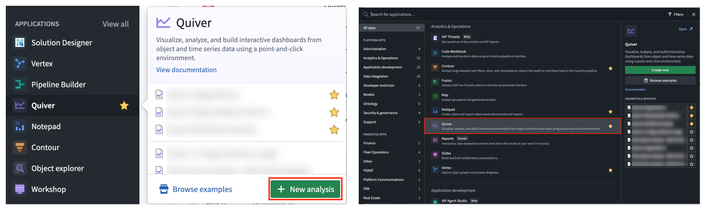
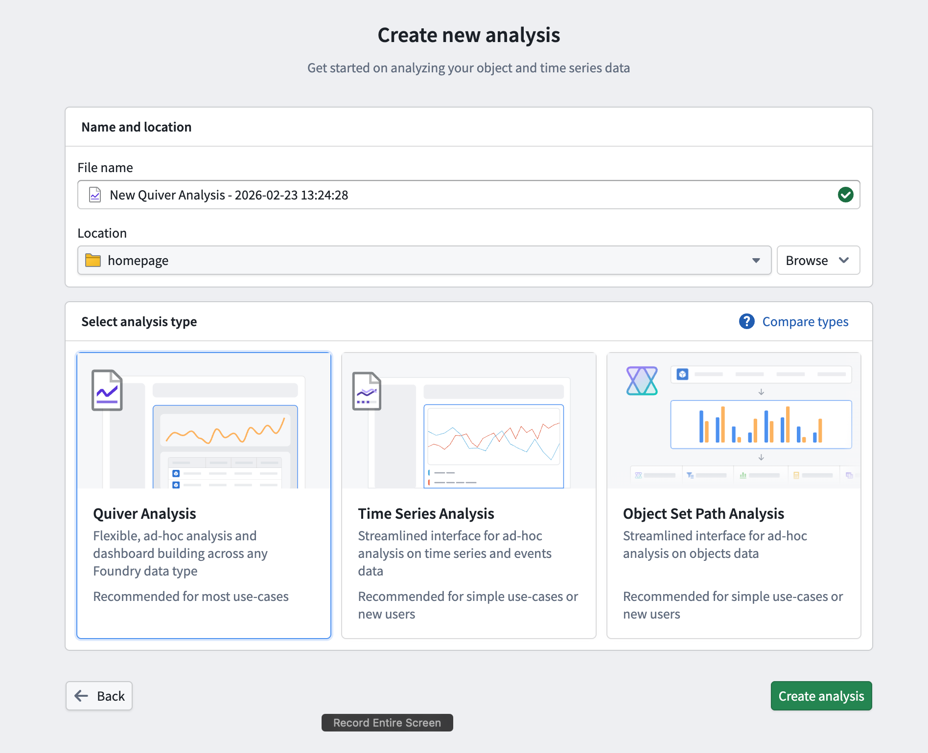
From there, start a new analysis by selecting +New Analysis, then choose a folder for the new analysis and select Save. You can also open an existing analysis or create a different analysis type.
:::callout{theme="success" title="Palantir Learning portal"} Jump into data analysis in Quiver immediately by taking the relevant course on learn.palantir.com ↗. :::
Add objects data
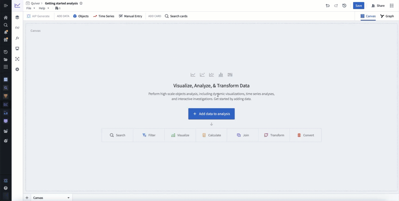
Once you have created a new analysis, you can start adding some objects data. Add initial data by selecting +Add data to analysis in the center of the screen. You can add additional data at any time from the Add data section of the analysis top bar.
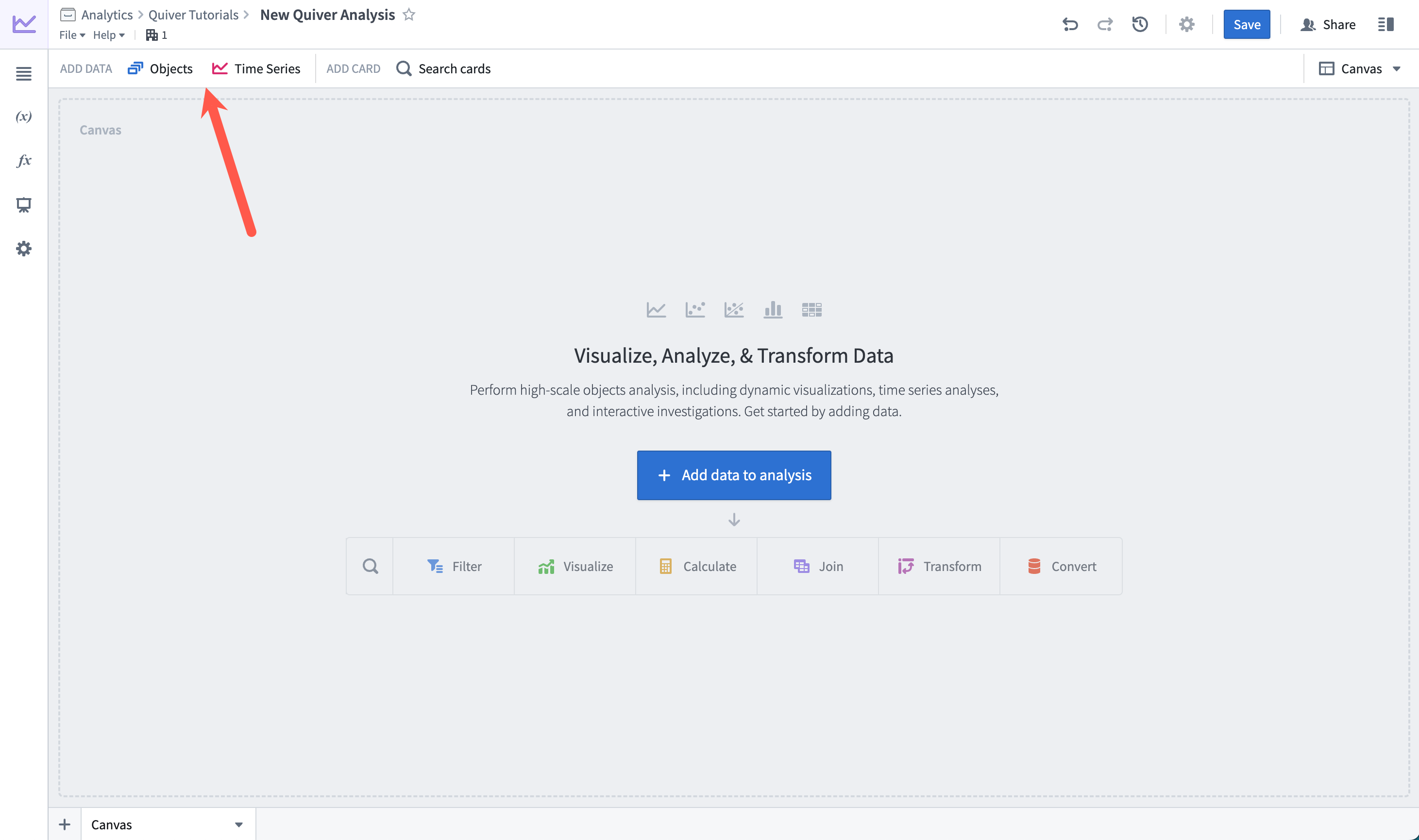
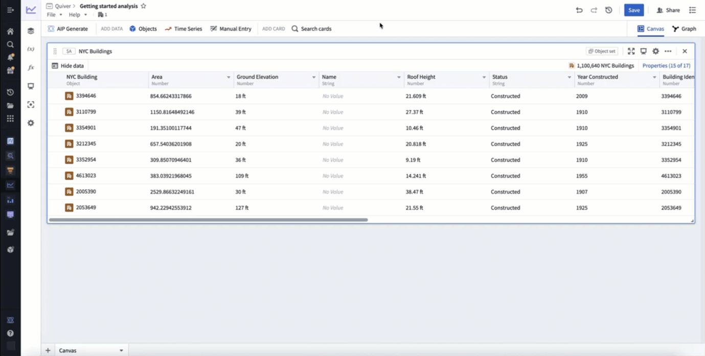
Selecting +Add data to analysis will open Quiver's search bar to explore the Ontology for object types. Select an object type to add it to your analysis. After adding your object type, select X in the top right corner to close the search bar. You should now have an object set card in your analysis, which shows a table preview of the objects inside of the set and a count of all objects in the top right.
In the example below, we search for objects related to "nyc" and add the NYC Buildings object type.
Filter objects
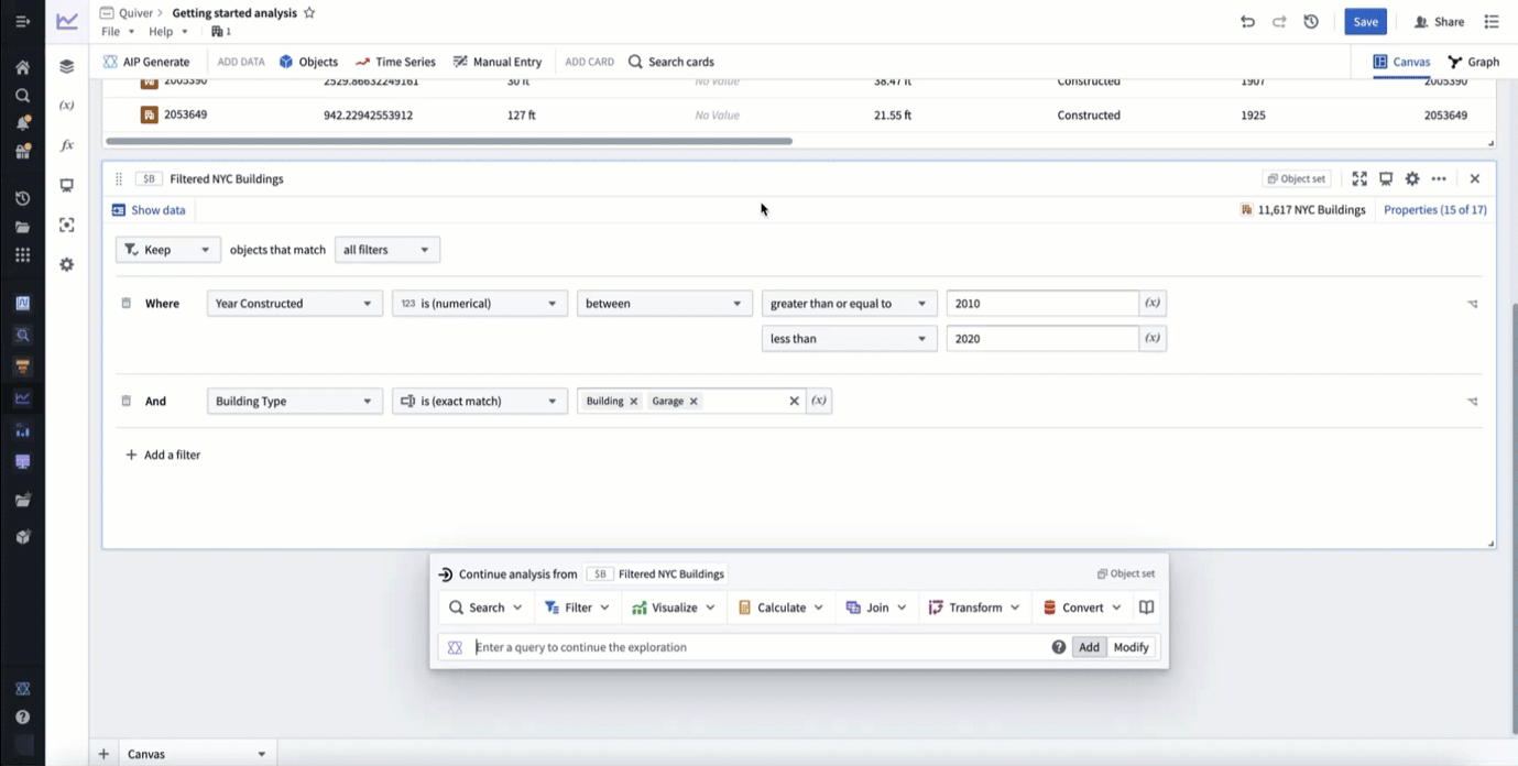
Next, filter the objects using object properties with a filter object set card. Hover over the object set card added in the previous step to display the next actions menu below the card. Then, select Filter > Filter object set to add the new card.
In the example below, we filter to only include buildings constructed between 2010 and 2020 that are of type building or garage.
Build a chart
Next, visualize your filtered objects by creating a bar chart. Hover over your filter object set card to display the next actions menu below the card. Then, select Visualize > Bar chart to create a bar chart. Configure the bar chart using the editor panel on the right. Specify a Group by configuration to define the bar chart categories, then configure additional settings such as the data series metric or segmentation. You can also edit various display options from the Display tab.
In the example below, we create a bar chart showing the average roof height grouped by Building Type. We then segment this by the Year Constructed. Lastly, we format the chart, changing the orientation to Vertical and the segmentation display to Grouped. In our new chart, we can see that from the years 2010 to 2020 the average roof height for buildings in New York steadily increased, while the average roof height for garages slowly trended down.
You now have a complete analysis with filtered objects and a customized chart.
Add time series data
In Foundry, time series are stored as time series properties in the Ontology. You can add time series properties to your Quiver analysis by selecting Time Series in the Add data section of the analysis top bar. This will open a time series search bar, allowing you to browse objects with time series and add their time series properties to your analysis.
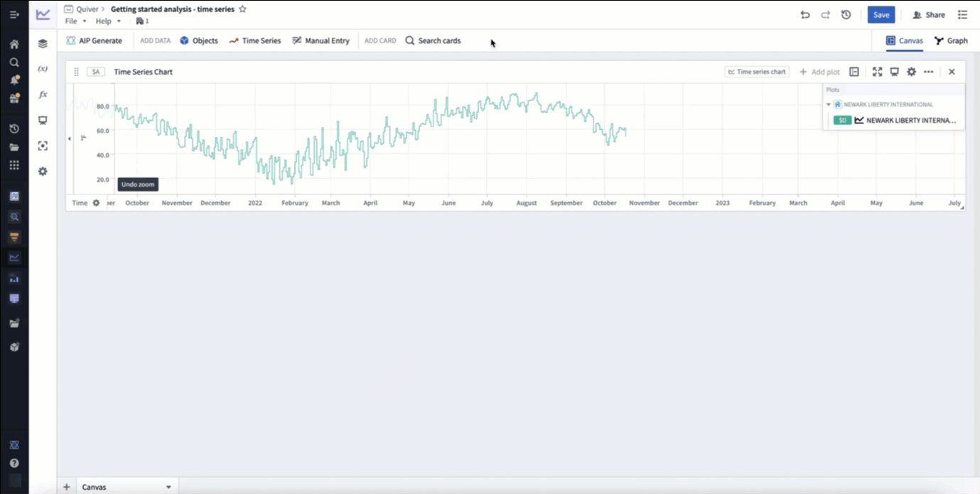
In the example below, we search the Weather stations object type for "newark", then add the Temperature time series property for Newark Liberty International airport. After closing the search bar, this data was added in a time series chart with the temperature plot. Finally, we click and drag on the time series chart to make a time range selection, then select Zoom to selection to navigate to the most recent time range of data.
Derive time series
You can derive a new time series from your original time series by applying a time series transformation. First, hover over your time series chart to display the next actions menu below. Select Add plot to browse the list of possible transformations. Choose a transform to add a new time series plot to your chart. You can then configure this plot using the editor panel on the right.
In the example below, we transform our input temperature time series by using the Rolling aggregate plot to derive a 30 day rolling average.
Format time series
Now, you can visually distinguish your derived plot from your original plot by adding formatting configurations from the Display tab in the editor panel. Time series plots have various display options such as color, line width, gradient shading, and point style. After adding display configuration, you can move the derived plot to its own chart. Move plots between charts by dragging their legend items or by using the Move plot section in the next actions menu.
In the example below, we make the rolling average's plot line thicker, show a gradient, and change the color to purple. We then move it to its own chart by dragging its legend item out onto the analysis canvas.

You now have a complete time series analysis with transformed and formatted time series. Next, look for anomalies in your time series using the time series search card, or create a dashboard to share your analysis.
中文翻译
入门指南
以下教程将介绍如何使用 Quiver 分析本体(Ontology)中的对象和时间序列数据。
创建 Quiver 分析
要创建新的 Quiver 分析,请展开左侧的 Foundry 侧边栏,然后在"应用程序(Applications)"部分选择查看全部(View all)。您将在"分析与运营(Analytics & Operations)"部分找到 Quiver。
接下来,选择 +新分析(+New Analysis) 开始新的分析,然后为新分析选择一个文件夹并选择保存(Save)。您也可以打开现有分析或创建不同类型的分析(different analysis type)。
:::callout{theme="success" title="Palantir 学习门户"} 立即通过 learn.palantir.com ↗ 上的相关课程,快速上手 Quiver 数据分析。 :::
添加对象数据
创建新分析后,您可以开始添加一些对象数据。通过选择屏幕中央的 +向分析添加数据(+Add data to analysis) 来添加初始数据。您也可以随时从分析顶部工具栏(analysis top bar)的"添加数据(Add data)"部分添加更多数据。
选择 +向分析添加数据(+Add data to analysis) 将打开 Quiver 的搜索栏(search bar),以便浏览本体中的对象类型(object types)。选择一个对象类型将其添加到分析中。添加对象类型后,选择右上角的 X 关闭搜索栏。现在,您的分析中应该出现一个对象集卡片(object set card),其中显示了该集合内对象的表格预览,以及右上角的所有对象总数。
在下面的示例中,我们搜索与"nyc"相关的对象,并添加了NYC Buildings对象类型。
筛选对象
接下来,使用筛选对象集(filter object set)卡片,通过对象属性(object properties)来筛选对象。将鼠标悬停在上一步添加的对象集卡片上,以显示卡片下方的下一步操作菜单(next actions menu)。然后,选择筛选(Filter)> 筛选对象集(Filter object set) 来添加新卡片。
在下面的示例中,我们筛选出仅包含建于 2010 年至 2020 年之间,且类型为building或garage的建筑。
构建图表
接下来,通过创建柱状图(bar chart)来可视化筛选后的对象。将鼠标悬停在筛选对象集卡片上,以显示卡片下方的下一步操作菜单。然后,选择可视化(Visualize)> 柱状图(Bar chart) 来创建柱状图。使用右侧的编辑面板配置柱状图。指定分组依据(Group by) 配置来定义柱状图的类别,然后配置其他设置,如数据系列指标或分段。您还可以从显示(Display) 选项卡编辑各种显示选项。
在下面的示例中,我们创建了一个柱状图,显示按建筑类型(Building Type)分组的平均屋顶高度。然后,我们按建造年份(Year Constructed)进行分段。最后,我们格式化图表,将方向改为垂直(Vertical),并将分段显示改为分组(Grouped)。在新图表中,我们可以看到从 2010 年到 2020 年,纽约建筑的平均屋顶高度稳步上升,而车库的平均屋顶高度则缓慢下降。
现在,您已经拥有一个包含筛选对象和自定义图表的完整分析。
添加时间序列数据
在 Foundry 中,时间序列(time series)作为时间序列属性(time series properties)存储在本体中。您可以通过在分析顶部工具栏(analysis top bar)的"添加数据(Add data)"部分选择时间序列(Time Series),将时间序列属性添加到 Quiver 分析中。这将打开一个时间序列搜索栏,允许您浏览包含时间序列的对象,并将其时间序列属性添加到分析中。
在下面的示例中,我们在气象站(Weather stations)对象类型中搜索"newark",然后添加了纽瓦克自由国际(Newark Liberty International)机场的温度(Temperature)时间序列属性。关闭搜索栏后,该数据以时间序列图表(time series chart)的形式添加,并显示了温度曲线。最后,我们在时间序列图表上点击并拖动以选择时间范围,然后选择缩放到选定范围(Zoom to selection) 以导航到最近的数据时间范围。
衍生时间序列
您可以通过应用时间序列转换(time series transformation),从原始时间序列中衍生出新的时间序列。首先,将鼠标悬停在时间序列图表上,以显示下方的下一步操作菜单。选择添加曲线(Add plot) 来浏览可能的转换列表。选择一个转换,为图表添加一个新的时间序列曲线。然后,您可以使用右侧的编辑面板配置该曲线。
在下面的示例中,我们使用滚动聚合(Rolling aggregate) 曲线对输入的原始温度时间序列进行转换,以衍生出 30 天滚动平均值。
格式化时间序列
现在,您可以通过编辑面板中的显示(Display) 选项卡添加格式配置,从而在视觉上区分衍生曲线和原始曲线。时间序列曲线具有多种显示选项,例如颜色、线宽、渐变阴影和点样式。添加显示配置后,您可以将衍生曲线移动到其自己的图表中。通过拖动图例项或使用下一步操作菜单中的移动曲线(Move plot) 部分,可以在图表之间移动曲线。
在下面的示例中,我们将滚动平均曲线的线宽加粗,显示渐变,并将颜色更改为紫色。然后,我们通过将其图例项拖放到分析画布上,将其移动到单独的图表中。
现在,您已经拥有一个包含转换和格式化时间序列的完整时间序列分析。接下来,使用时间序列搜索(time series search)卡片查找时间序列中的异常(look for anomalies),或创建一个仪表板(dashboard)来分享您的分析。