Visualize objects with charts(使用图表可视化对象)
Quiver supports various cards for visualizing object data. These cards take an object set as input, and return a chart or visualization. In some cases, charts can be used as a filter to drill down to selected objects. In other cases, the aggregated data from the chart (also referred to as a categorical chart) can be used as input to subsequent charts.
The most common charts for simple object set visualization include:
- Bar chart
- Line chart
- Pie chart
- Categorical scatter plot
- Numerical scatter plot
- Pivot table
- Heat grid
- Waterfall plot
Add and configure a chart
Object set charts can be found in the next actions menu under the Visualize section when hovering over an object set card. Each chart will have slightly different configuration options depending on its type. In general, you can use the editor panel on charts to do the following:
- Configure data in the Data tab.
- Change the input object set(s).
- Define aggregations: Group by properties, x-axis/y-axis properties, aggregation metrics, and so on.
- Supported aggregation metrics: Min, max, sum, average, count, unique count, percentile, standard deviation, and variance.
- Percentile, standard deviation, and variance metrics are not supported for object types backed by Object Storage V1 (Phonograph).
- Define segments (optional).
- Define the sorting order.
- Configure the display in the Display tab.
- Change the orientation of the chart, for example, changing the orientation of bars in a bar chart.
- Override the color and label of segments and metrics.
- Configure axes titles, formats and positions.
- Choose to display labels or not.
- Configure the legend: Showing the legend or not, and its position.
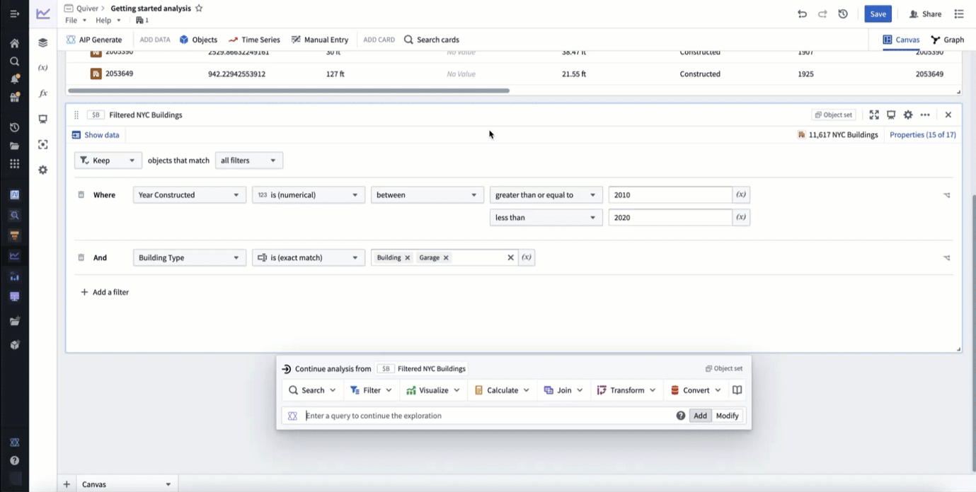
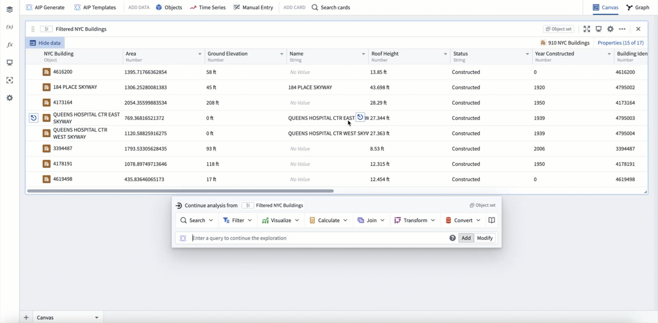
In the example below, we create a bar chart showing the average roof height grouped by Building Type. We then segment this by the Year Constructed. Lastly, we format the chart, changing the orientation to Vertical and the segmentation display to Grouped.
Accuracy limitations
The following object set chart aggregations have small accuracy limitations:
| Aggregation | Accuracy Limitation |
|---|---|
| Unique count | You have the option of computing approximate or exact results. Exact results are not supported for object types backed by Object Storage V1 (Phonograph) and may degrade performance for result counts exceeding 10,000. |
| Percentile | The result of this metric is always approximate. Either the relative or absolute error is satisfied; by default, the maximum relative error is 0.1%, and the absolute error is 0.001%. |
| Standard deviation | The result of this metric is always approximate due to floating point arithmetic error accumulation. Cases where a very high mean is coupled with a very low standard deviation could produce inaccurate results. |
| Variance | The result of this metric is always approximate due to floating point arithmetic error accumulation. Cases where a very high mean is coupled with a very low standard deviation could produce inaccurate results. |
Note that these limits do not apply to charts built on transform tables or materializations.
Filter with chart selections
Most charts in Quiver that take object sets as input are interactive, and the underlying data behind each chart can be explored quickly and intuitively through drill-downs. The most straightforward way to perform a drill-down in Quiver is by selecting data on a chart or visualization and selecting the Drill down option in the card footer. This will create a Selection Object Set, a new object set defined by the selection of the plot. To select multiple categories in a chart, either click and drag to select a range, or hold Cmd (macOS) or Ctrl (Windows) when selecting a category.
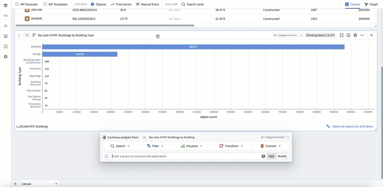
In the example below, we select the garage category and then select Drill down to create a Selection Object Set. We can see that the object set has 218,785 objects, matching the size of the bar. We then go back to the chart and use multi select to select the building category. Our filter updates to include all building objects where the type is building OR garage. Finally, we click and drag to select a range of categories that are too small to select individually.
Cross filtering
In some cases, you may want to combine multiple chart selections such that they not only filter the downstream object set, but also filter the other subscribed charts. This offers a more horizontal and interactive experience for users, especially consumers of dashboards.
These workflows can be configured with the cross filter card.
Combine charts with the overlay chart
For certain chart visualizations, you may want to overlay two charts on top of each other. For example, to show both a bar and scatter plot on the same chart, or to show data from different object types on the same chart. This can be accomplished with the overlay chart. You can add an overlay chart from the next actions menu of a categorical chart card by selecting Visualize > Overlay chart. The overlay chart will inherit any display options used by the input charts.
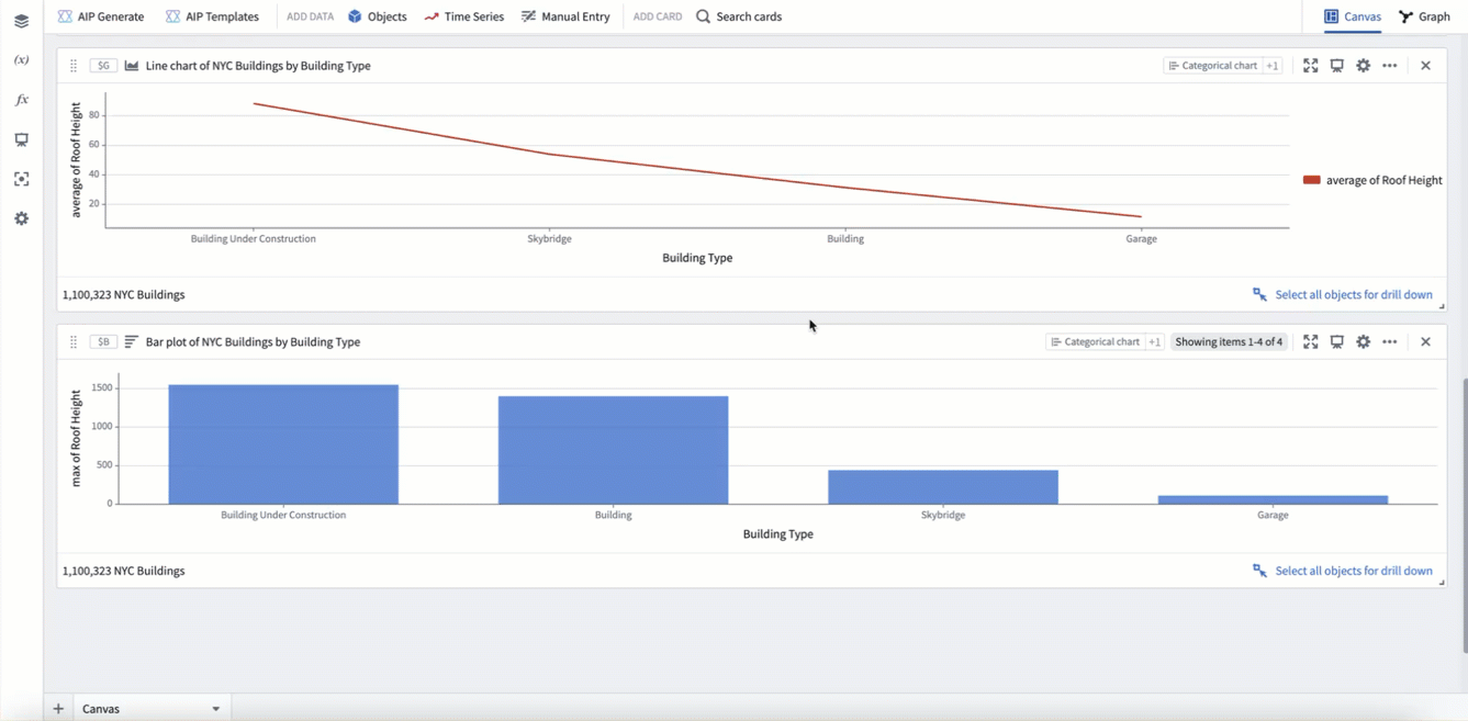
In the example below, we use an overlay chart to combine a bar chart plotting max roof height with a line chart plotting average roof height.
Use chart formulas
Native Quiver formulas can be a useful tool for charting more complicated aggregations. This can be accessed from the Metric configuration in the Data tab of many categorical charts. Select Switch to formula metric to begin writing a formula. This allows you to specify several aggregations to compute, and then combine them with a formula. The formula will be applied for each data segment in the series.
In the example below, we create a bar chart by building type. We then use a formula metric to compute a "range" aggregation, by subtracting the min roof height ($M1) from the max roof height ($M0), per category.
You can also use formulas in categorical charts with the categorical formula plot. This card supports using a formula to combine data from numeric values, unsegmented categorical charts (2D), and segmented categorical charts (3D). In the formula, other cards can be reference with global identifier notation (For example, $A).
Use the following reference when combining data in the formula:
- Numerics are applied to all segments of data
- Unsegmented data (2D) is combined with other unsegmented data only if the group-by values are the same.
- Unsegmented data (2D) is combined with all segments of segmented data (3D) where the group-by values are the same.
- Segmented data (3D) is combined with other segmented data only if both the group-by and segment-by values are the same.
In the example below, we first create a count aggregation of all buildings ($S). Then we create a bar chart of count grouped by building type ($T). Lastly, we use a categorical formula plot to divide the bar chart counts by the total count ($T / $S). This results in a bar chart showing count per category as a percentage of the total (as opposed to absolute count).
Use advanced aggregations in categorical charts
In some cases, you may have a categorical chart visualization that requires a more complex aggregation that is not supported by the above charting methods. In these cases, Quiver offers several options for advanced aggregations such as:
- Charting across properties on linked object types.
- Deriving a new pre-aggregation property, then aggregating on it.
- Performing aggregations that are not natively supported.
Code function categorical plot
The code function categorical plot supports using code functions to create a categorical plot. Configuring a code function categorical plot requires writing a function that returns either a TwoDimensionalAggregation or ThreeDimensionalAggregation. The function should be the same as the one needed for a function-backed workshop chart layer.
Transform tables
The transform table is a powerful tool in Quiver for deriving new properties and joining to linked objects. Any columns present in your transform table can be visualized with the categorical plot from transform table card.
Materializations
Materializations are another method of scalable data transformation in Quiver. In particular, the expression card can be useful for deriving new pre-aggregation columns at scale using the powerful expression language. The join materialization card can be used to perform a left, inner, or right join between objects to support charting across links. Any columns present in a materialization can be visualized with the categorical plot from materialization card.
Vega charts
For cases when you want a custom visualization outside of what is natively supported in Foundry, Quiver also supports using Vega ↗ and Vega-Lite ↗ to create visualizations with the vega plot card. With this card, you can write a JSON spec to define a custom chart while referencing Quiver transform tables, arrays, and scalar values using global identifiers (For example $A and $A.columnname).
Learn more about using vega plots in Quiver.
中文翻译
使用图表可视化对象
Quiver 支持多种卡片来可视化对象数据。这些卡片以对象集(object set)作为输入,并返回图表或可视化结果。在某些情况下,图表可用作筛选器,以便向下钻取到选定的对象。在其他情况下,图表中的聚合数据(也称为分类图表)可作为后续图表的输入。
用于简单对象集可视化的最常见图表包括:
添加和配置图表
将鼠标悬停在对象集卡片上时,可以在可视化部分下的下一步操作菜单中找到对象集图表。每种图表根据其类型会有略微不同的配置选项。通常,您可以使用图表上的编辑面板执行以下操作:
- 在数据选项卡中配置数据。
- 更改输入对象集。
- 定义聚合:按属性分组、X轴/Y轴属性、聚合指标等。
- 支持的聚合指标:最小值、最大值、总和、平均值、计数、唯一计数、百分位数、标准差和方差。
- 对于由对象存储 V1 (Phonograph) 支持的对象类型,不支持百分位数、标准差和方差指标。
- 定义分段(可选)。
- 定义排序顺序。
- 在显示选项卡中配置显示。
- 更改图表的方向,例如更改柱状图中柱子的方向。
- 覆盖分段和指标的颜色和标签。
- 配置轴标题、格式和位置。
- 选择是否显示标签。
- 配置图例:是否显示图例及其位置。
在下面的示例中,我们创建了一个柱状图,显示按建筑类型分组的平均屋顶高度。然后我们按建造年份进行分段。最后,我们格式化图表,将方向更改为垂直,并将分段显示更改为分组。
精度限制
以下对象集图表聚合存在较小的精度限制:
| 聚合 | 精度限制 |
|---|---|
| 唯一计数 | 您可以选择计算近似结果或精确结果。对于由对象存储 V1 (Phonograph) 支持的对象类型,不支持精确结果,并且当结果计数超过 10,000 时可能会降低性能。 |
| 百分位数 | 此指标的结果始终是近似的。满足相对误差或绝对误差之一;默认情况下,最大相对误差为 0.1%,绝对误差为 0.001%。 |
| 标准差 | 由于浮点运算误差累积,此指标的结果始终是近似的。当均值非常高而标准差非常低时,可能会产生不准确的结果。 |
| 方差 | 由于浮点运算误差累积,此指标的结果始终是近似的。当均值非常高而标准差非常低时,可能会产生不准确的结果。 |
请注意,这些限制不适用于基于转换表(transform tables)或物化(materializations)构建的图表。
使用图表选择进行筛选
Quiver 中大多数以对象集作为输入的图表都是交互式的,可以通过向下钻取快速直观地探索每个图表背后的数据。在 Quiver 中执行向下钻取最直接的方法是选择图表或可视化上的数据,然后选择卡片页脚中的向下钻取选项。这将创建一个选择对象集,即由图表选择定义的新对象集。要在图表中选择多个类别,可以单击并拖动以选择范围,或者在选择类别时按住 Cmd(macOS)或 Ctrl(Windows)。
在下面的示例中,我们选择车库类别,然后选择向下钻取来创建一个选择对象集。我们可以看到该对象集包含 218,785 个对象,与柱状图的大小匹配。然后我们返回图表,使用多选选择建筑类别。我们的筛选器会更新,以包含所有类型为建筑 OR 车库的建筑对象。最后,我们单击并拖动以选择一系列太小而无法单独选择的类别。
交叉筛选
在某些情况下,您可能希望组合多个图表选择,使它们不仅筛选下游的对象集,还筛选其他订阅的图表。这为用户(尤其是仪表板消费者)提供了更横向和交互式的体验。
这些工作流可以通过交叉筛选卡片进行配置。
使用叠加图表组合图表
对于某些图表可视化,您可能希望将两个图表叠加在一起。例如,在同一图表上同时显示柱状图和散点图,或者在同一图表上显示来自不同对象类型的数据。这可以通过叠加图表实现。您可以从分类图表卡片的下一步操作菜单中选择可视化 > 叠加图表来添加叠加图表。叠加图表将继承输入图表使用的任何显示选项。
在下面的示例中,我们使用叠加图表将绘制最大屋顶高度的柱状图与绘制平均屋顶高度的折线图组合在一起。
使用图表公式
原生 Quiver 公式 是绘制更复杂聚合的有用工具。在许多分类图表的数据选项卡中的指标配置中可以访问此功能。选择切换到公式指标开始编写公式。这允许您指定要计算的多个聚合,然后使用公式将它们组合。该公式将应用于系列中的每个数据分段。
在下面的示例中,我们按建筑类型创建了一个柱状图。然后我们使用公式指标计算一个"范围"聚合,即从最大屋顶高度 ($M0) 中减去最小屋顶高度 ($M1),按类别计算。
您还可以在分类图表中使用公式,通过分类公式图实现。此卡片支持使用公式组合来自数值、未分段分类图表(2D)和分段分类图表(3D)的数据。在公式中,可以使用全局标识符表示法(例如 $A)引用其他卡片。
在公式中组合数据时,请参考以下内容:
- 数值应用于所有数据分段。
- 未分段数据(2D)仅在与分组依据值相同时才与其他未分段数据组合。
- 未分段数据(2D)与分段数据(3D)中分组依据值相同的所有分段组合。
- 分段数据(3D)仅在与分组依据和分段依据值都相同时才与其他分段数据组合。
在下面的示例中,我们首先创建所有建筑的计数聚合 ($S)。然后我们创建一个按建筑类型分组的计数柱状图 ($T)。最后,我们使用分类公式图将柱状图计数除以总计数 ($T / $S)。这产生了一个柱状图,显示每个类别的计数占总数的百分比(而不是绝对计数)。
在分类图表中使用高级聚合
在某些情况下,您可能有一个分类图表可视化,需要更复杂的聚合,而上述图表方法不支持。在这些情况下,Quiver 提供了几种高级聚合选项,例如:
- 跨链接对象类型的属性进行图表绘制。
- 派生新的预聚合属性,然后对其进行聚合。
- 执行原生不支持的聚合。
代码函数分类图
代码函数分类图支持使用代码函数创建分类图。配置代码函数分类图需要编写一个返回 TwoDimensionalAggregation 或 ThreeDimensionalAggregation 的函数。该函数应与函数支持的 Workshop 图表图层所需的函数相同。
转换表
转换表是 Quiver 中用于派生新属性和链接到链接对象的强大工具。转换表中的任何列都可以使用来自转换表的分类图卡片进行可视化。
物化
物化是 Quiver 中另一种可扩展的数据转换方法。特别是,表达式卡片可用于使用强大的表达式语言大规模派生新的预聚合列。连接物化卡片可用于在对象之间执行左连接、内连接或右连接,以支持跨链接的图表绘制。物化中的任何列都可以使用来自物化的分类图卡片进行可视化。
Vega 图表
对于需要自定义可视化但 Foundry 原生不支持的情况,Quiver 还支持使用 Vega ↗ 和 Vega-Lite ↗ 通过 vega 图卡片创建可视化。使用此卡片,您可以编写 JSON 规范来定义自定义图表,同时使用全局标识符(例如 $A 和 $A.columnname)引用 Quiver 转换表、数组和标量值。