Add time series(添加时间序列)
Time series data are a series of measurements taken over time, usually at a regular interval. Some examples are measurement of sales volumes per year, total flights per day, production outputs per hour, or high frequency temperature readings at sub-second resolution.
Quiver has first-class support for time series analysis. Time series are primarily added to Quiver through time series properties; however, time series syncs can also be viewed directly. Quiver provides an extensive library of transformations and visualizations for time series data. The first step in working with time series in Quiver is to add a time series to your analysis.
Below, we will walk through several different ways of adding time series data to a Quiver analysis. Once you are comfortable adding time series, you can learn more about visualizing and transforming time series.
Learn more about how to set up time series in Foundry.
Adding a time series property
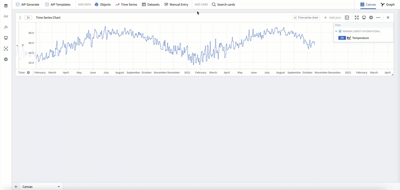
The most common way to add time series to a Quiver analysis is through time series properties in the Ontology. You can add time series properties to your Quiver analysis by selecting Time Series in the Add data section of the analysis top bar. This will open a time series search bar, allowing you to browse objects with time series and add their time series properties to your analysis.
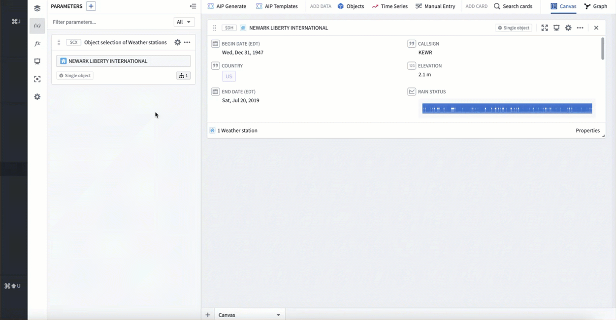
For example, to enable analysis of data about the temperature over time at Newark EWR airport, you might search the Weather stations object type for "newark", then add the Temperature time series property for Newark Liberty International airport. After closing the search bar, the data will be added in a time series chart with the temperature plot. The following animation displays this workflow.
Adding from a chart
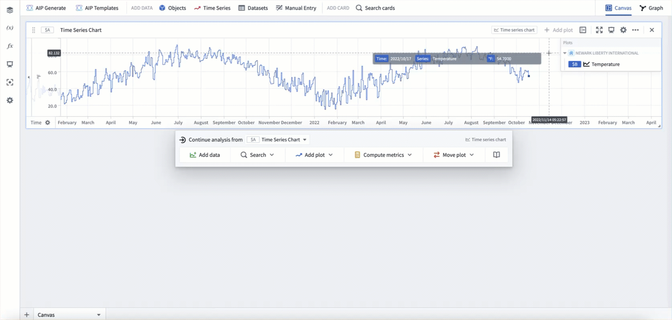
Once a time series chart is in your analysis, you can also open the time series search bar from the next actions menu when hovering over a time series chart, as shown below.
You can also add related time series data from the legend of a time series chart. In the legend, time series will be grouped by the object they are associated with. You can hover over this object and select the + button to add other time series associated with the object.
For example, say you want to add wind speed to an existing analysis of Newark EWR temperature to form a more detailed picture of the weather. Start by opening a chart that already has the Temperature series for Newark Liberty International airport added, as was created above. You can then use the chart legend to add the Wind Speed series for Newark Liberty International airport.
Adding from an object set card
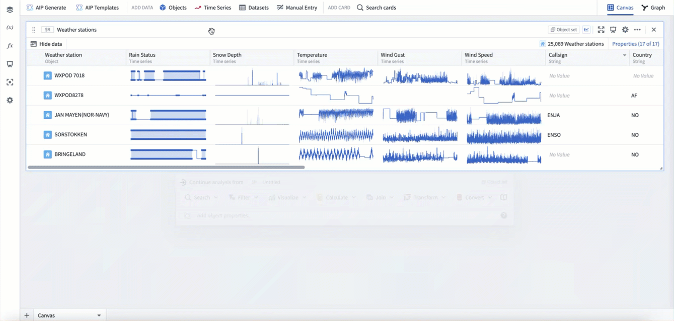
Time series can also be "popped out" from an object set card. In the table view of an object set card, hovering over a time series cell will show the button Pop out property. Selecting this button will open the underlying time series property as a new time series plot in your analysis. The pop out button will also add an object selector parameter for the object that the property is popped out from.
In the example below, you can see pop-outs for the Rain status, Snow depth, and Temperature series from station WXPOD 7018. This adds all three series as time series plots to a new time series chart. You can then use the object selector to switch the plots to instead use station CHITRAL.
Adding from a single object
Time series can also be added from a single object in your analysis, such as the object selector. Hover over the single object card to open the next actions menu and select Visualize > Time series property. You can then configure the selected time series property from the plot's editor.
In the example below, we add a time series property from our object selector, which currently has Newark Liberty International selected. This adds the default time series property, which in this case is Temperature. We then switch the time series property to be Wind speed.
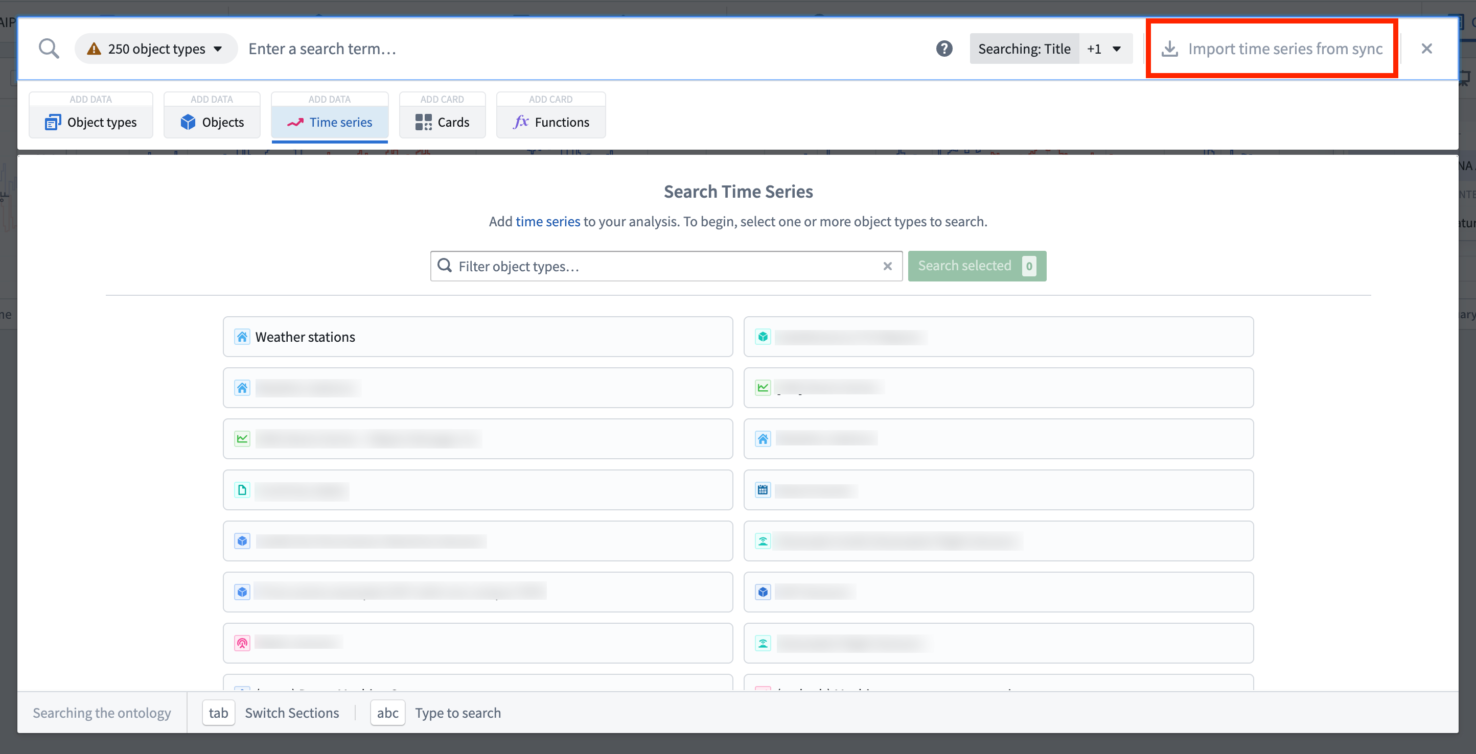
Adding a time series sync
If you have synced your time series as a time series sync, but have not integrated it as a time series property in the Ontology yet, you can still analyze the time series in Quiver. To do this, in the top right of the time series search menu select Import time series from sync. This will open the file selector and allow you to select a time series sync to add to your analysis.
Adding from tabular objects data
If your data has not been synced as a time series, but the data exists as objects with a timestamp property and a value property, your data can still be visualized and transformed in Quiver as time series. This will be subject to scale and performance limitations, however can be useful for exploration.
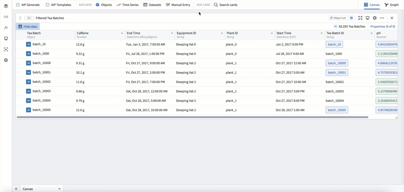
Time series derived from an object set are tied to that object set, and so will dynamically update based on changes to the object set. For example, if you filter the input object set, the time series will change to only reflect the objects in that filtered object set. This allows for workflows where time series can be generated dynamically based on various user inputs.
Tabular time series
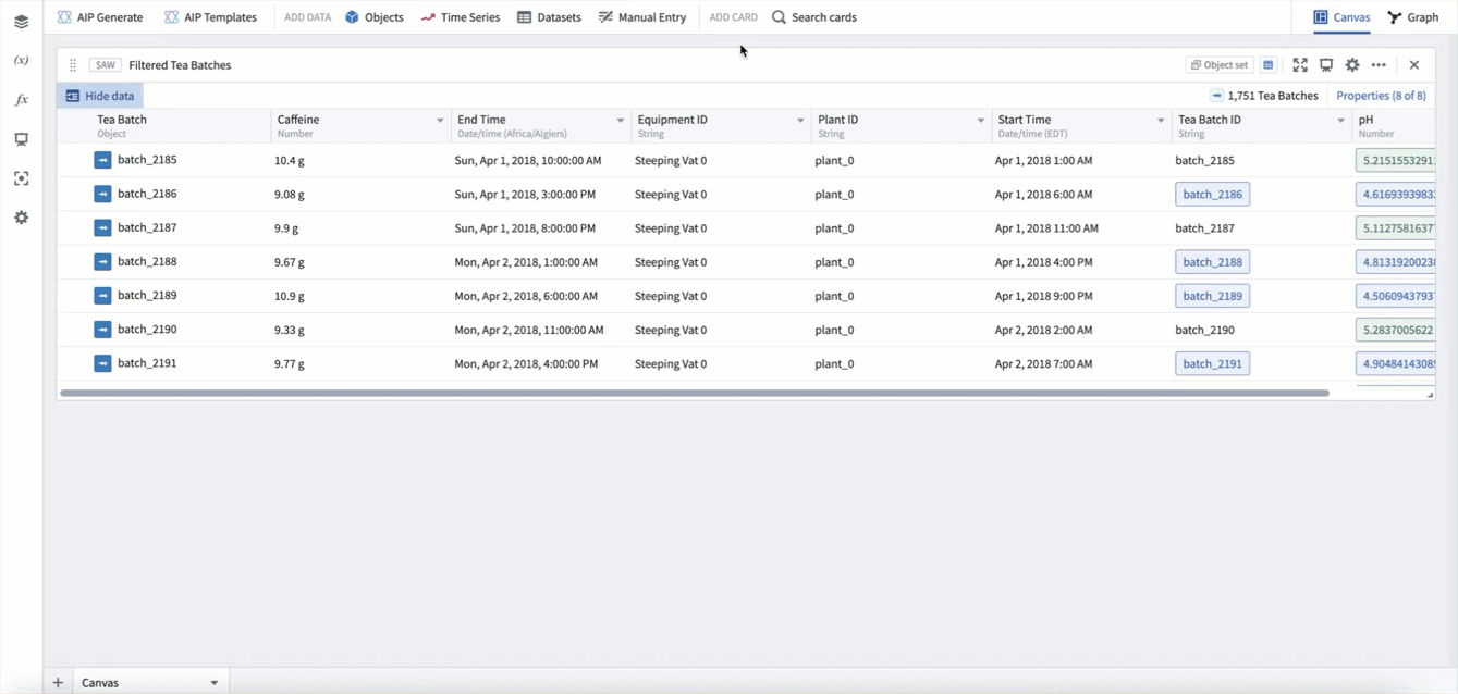
From an object set or transform table card, you can use the tabular time series plot to convert tabular data to time series data. To do this, hover over the card and use the next actions menu to select Convert > Tabular time series. Then configure the plot with which column to use for each point's timestamp and value.
In example below, we use the tabular time series plot to convert our Tea Batch object set to a time series, using the start time property as the timestamp, and the caffeine property as the value.
Categorical time series
You can also convert any categorical objects chart grouped by a time property to a time series using the categorical time series plot. In these cases, the categorical chart acts as a "downsampling" method, allowing you to group by week, month, year, etc, and scalably compute a value for each time period before converting to a time series.
In the example below, starting from our Tea batch object set, we first create a bar chart grouped by start time, bucketed by week, computing the average caffeine per week. We then add a categorical time series plot to convert this chart to time series.
中文翻译
添加时间序列
时间序列数据是指随时间测量的一系列数据点,通常以固定时间间隔采集。例如:年销售额、每日航班总数、每小时产量,或亚秒级分辨率的高频温度读数。
Quiver 为时间序列分析提供了一流支持。时间序列主要通过时间序列属性添加到 Quiver 中;但时间序列同步也可直接查看。Quiver 为时间序列数据提供了丰富的转换和可视化库。在 Quiver 中处理时间序列的第一步,是将时间序列添加到您的分析中。
下面,我们将介绍几种将时间序列数据添加到 Quiver 分析中的不同方法。当您熟悉了添加时间序列后,可以进一步了解如何可视化和转换时间序列。
添加时间序列属性
将时间序列添加到 Quiver 分析中最常见的方式是通过本体(Ontology)中的时间序列属性。您可以通过在分析顶栏的添加数据部分选择时间序列,将时间序列属性添加到 Quiver 分析中。这将打开一个时间序列搜索栏,允许您浏览包含时间序列的对象,并将其时间序列属性添加到分析中。
例如,要分析纽瓦克 EWR 机场随时间变化的温度数据,您可以搜索 Weather stations 对象类型中的 "newark",然后为 Newark Liberty International 机场添加 Temperature 时间序列属性。关闭搜索栏后,数据将以包含温度图表的时间序列图表形式添加。以下动画展示了这一工作流程。
从图表中添加
一旦分析中包含了时间序列图表,您还可以在鼠标悬停于时间序列图表上时,通过"下一步操作"菜单打开时间序列搜索栏,如下所示。
您还可以从时间序列图表的图例中添加相关的时间序列数据。在图例中,时间序列将按其关联的对象进行分组。您可以悬停在该对象上,选择 + 按钮来添加与该对象关联的其他时间序列。
例如,假设您想将风速添加到已有的纽瓦克 EWR 温度分析中,以形成更详细的天气情况。首先打开一个已添加了 Newark Liberty International 机场 Temperature 序列的图表(如上文创建的那样)。然后,您可以使用图表图例来添加 Newark Liberty International 机场的 Wind Speed 序列。
从对象集卡片中添加
时间序列也可以从对象集卡片中"弹出"。在对象集卡片的表格视图中,悬停在时间序列单元格上会显示弹出属性按钮。选择此按钮将在您的分析中以新的时间序列图形式打开底层的时间序列属性。弹出按钮还会为弹出属性所对应的对象添加一个对象选择器参数。
在下面的示例中,您可以看到从站点 WXPOD 7018 弹出的 Rain status、Snow depth 和 Temperature 序列。这将所有三个序列作为时间序列图添加到一个新的时间序列图表中。然后,您可以使用对象选择器将图表切换为使用站点 CHITRAL 的数据。
从单个对象中添加
时间序列也可以从分析中的单个对象(例如对象选择器)添加。悬停在单个对象卡片上以打开"下一步操作"菜单,然后选择可视化 > 时间序列属性。然后,您可以通过图的编辑器配置所选的时间序列属性。
在下面的示例中,我们从当前选中了 Newark Liberty International 的对象选择器中添加一个时间序列属性。这将添加默认的时间序列属性,在本例中为 Temperature。然后,我们将时间序列属性切换为 Wind speed。
添加时间序列同步
如果您已将时间序列同步为时间序列同步,但尚未将其作为时间序列属性集成到本体中,您仍然可以在 Quiver 中分析该时间序列。为此,请在时间序列搜索菜单的右上角选择从同步导入时间序列。这将打开文件选择器,允许您选择一个时间序列同步添加到分析中。
从表格对象数据中添加
如果您的数据尚未同步为时间序列,但数据以包含时间戳属性和值属性的对象形式存在,则这些数据仍然可以在 Quiver 中作为时间序列进行可视化和转换。这可能会受到规模和性能的限制,但对于探索性分析非常有用。
从对象集派生的时间序列与该对象集绑定,因此会根据对象集的变化动态更新。例如,如果您过滤了输入对象集,时间序列将随之变化,仅反映该过滤后对象集中的对象。这使得可以根据各种用户输入动态生成时间序列的工作流程成为可能。
表格时间序列
从对象集或转换表卡片中,您可以使用表格时间序列图将表格数据转换为时间序列数据。为此,请悬停在卡片上,使用"下一步操作"菜单选择转换 > 表格时间序列。然后配置图表,指定使用哪一列作为每个点的时间戳和值。
在下面的示例中,我们使用表格时间序列图将 Tea Batch 对象集转换为时间序列,使用开始时间属性作为时间戳,使用咖啡因属性作为值。
分类时间序列
您还可以使用分类时间序列图,将任何按时间属性分组的分类对象图表转换为时间序列。在这种情况下,分类图表充当了一种"降采样"方法,允许您按周、月、年等进行分组,并在转换为时间序列之前,为每个时间段可扩展地计算一个值。
在下面的示例中,从我们的 Tea batch 对象集开始,我们首先创建一个按开始时间分组、按周分桶的条形图,计算每周的平均咖啡因含量。然后,我们添加一个分类时间序列图,将此图表转换为时间序列。