Parameterize and pivot time series(参数化与透视时间序列)
Time series data can be easily swapped or “pivoted” using object selection parameters in Quiver, saving time and simplifying comparison workflows. This can be especially useful for analyzing sensors across multiple root objects without reconfiguring individual cards. By changing a single parameter, an entire analysis can update to reflect the data of a different object, making it easier to explore patterns.
Quiver offers several ways achieve this, accommodating different Ontology configurations.
Grouping plots by data
For ontologies with time series properties or sensor object types, Quiver automatically displays time series plots grouped by the associated root object. Data groups are shown in both the time series chart configuration editor panel and legend, and can be controlled from either location.
The following grouping options are available in the time series chart configuration editor panel:
- On: Plots will appear under a heading with information and actions related to the root object, ordered alphabetically by global identifier.
- Off: Plots will appear ungrouped and ordered alphabetically by global identifier by default. The plot order can be customized when plots are ungrouped.
- Use default: Plots will be shown according to the Group plots by data setting in the Time Series axes and legends section of the settings panel. This setting controls whether or not plots are initially grouped when creating a new time series chart.
Grouping can be toggled from the legend by selecting Group plots by data (![]() ) or Ungroup plots (
) or Ungroup plots (![]() ).
).
When plots are grouped by data, the following options are available in the plot group header:
- Add series from the root object (
 ) to the chart. This button opens a menu of time series properties on the root object and sensor objects that are linked to the root object.
 - Control with object selection parameter (
 ) to update the object references of the plots in the group from a direct object reference to an object selection parameter reference. If there is already an existing parameter with the root object selected, that parameter will be reused. Otherwise, a new parameter will be created with the root object as the selected value. This button is available when the root object is not already an object selection parameter.
 - View object selection parameter (
 ) to open the parameters panel and highlight the parameter that controls the plots in the group. From there, you can change the parameter’s selected object to update the plots in that group. This button is available when the root object is an object selection parameter.
Example workflow: Weather station analytics
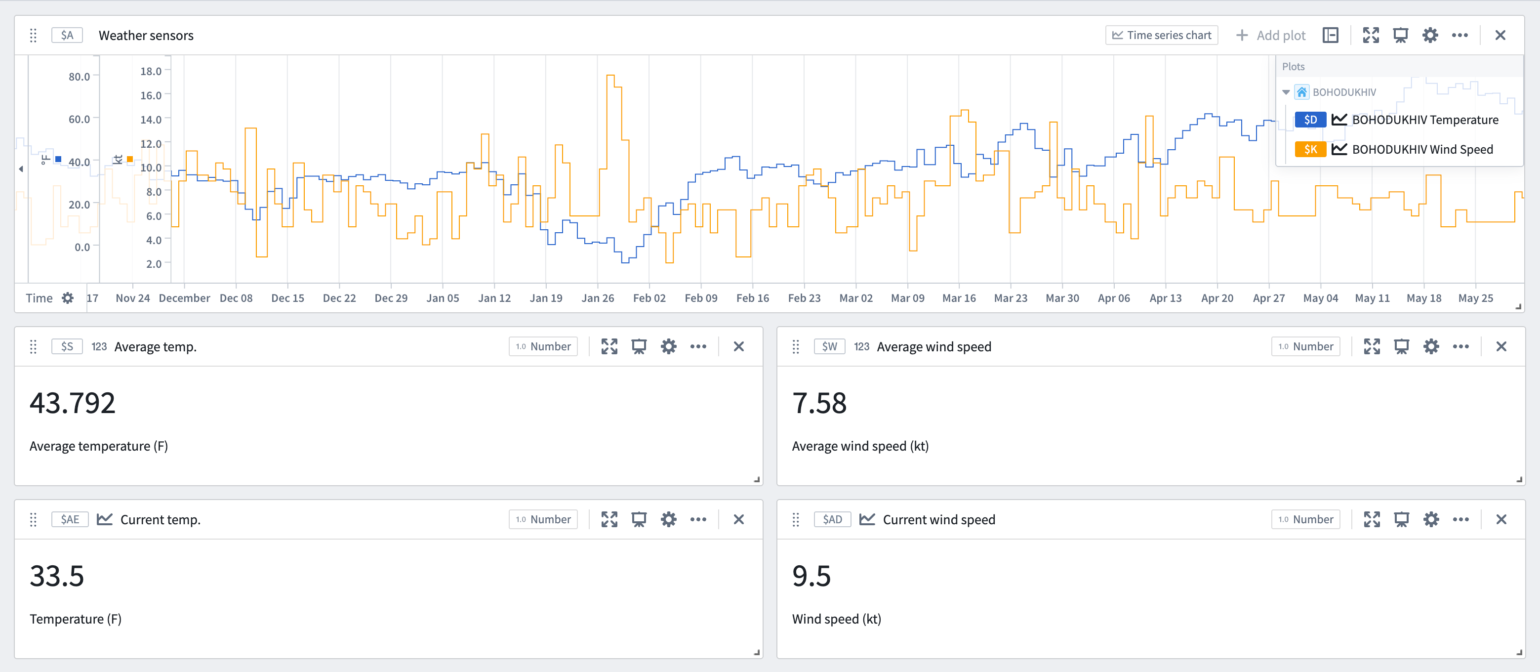
This example shows how to parameterize a time series analysis that is based around a single object, allowing the same analysis to be applied to any object of the same type. The analysis below monitors temperature and wind conditions around the BOHODUKHIV weather station to detect potential winter weather events.
To parameterize an existing analysis, perform the following steps for each time series chart:
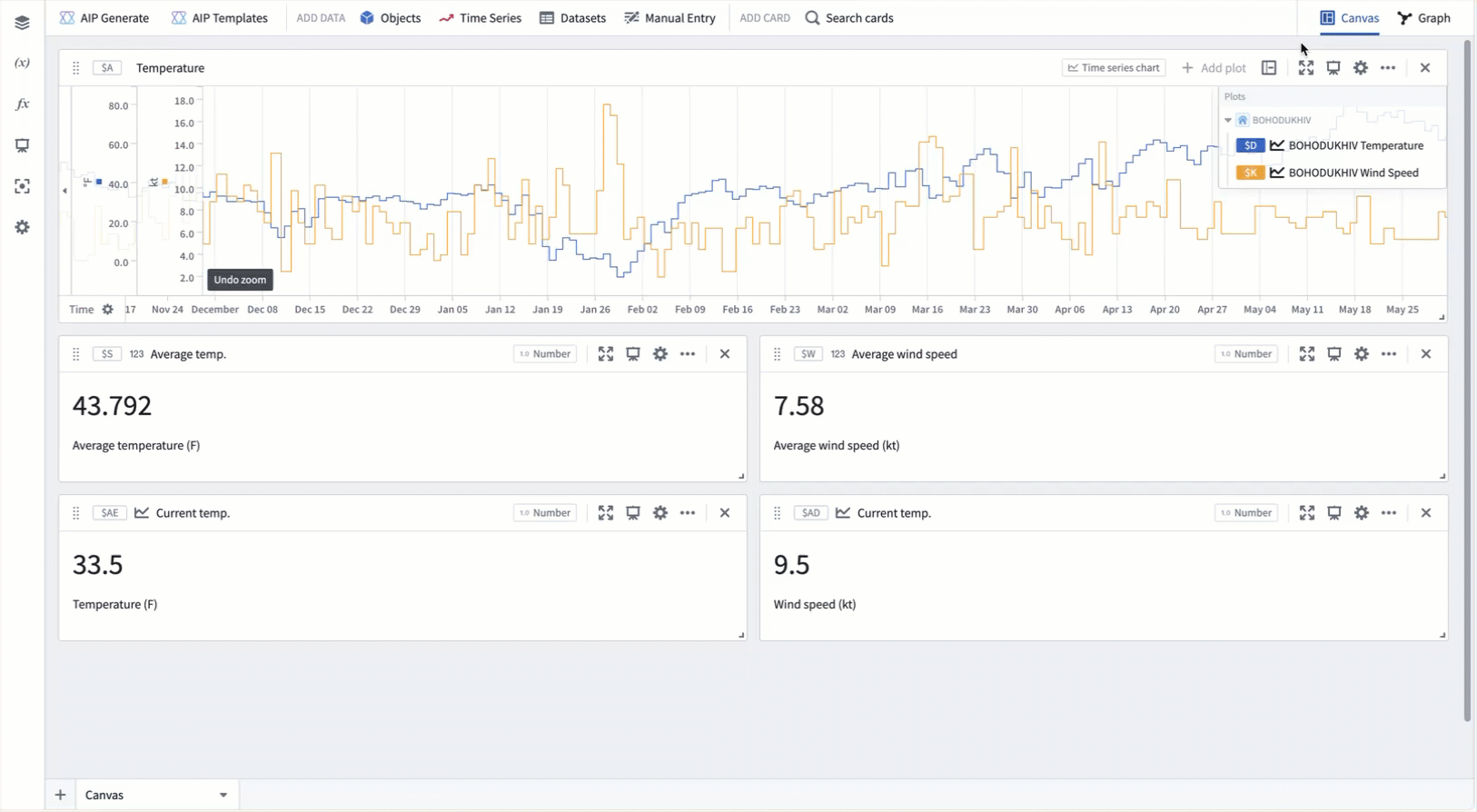
- Open the chart configuration editor by selecting the gear icon in the top right of the card.
- Select the Control with object selection parameter button for the object to pivot.
- A single object selection parameter will be created to control all series on the chart that share the same root object, along with downstream cards.
Once the series are parameterized, simply update the object selection parameter to see the same analysis steps using the data of a different weather station.
Pivoting values with the manual entry transform table
For custom pivoting use cases, such as when series do not share a common object type or when ontology relations are incomplete, a manual entry transform table can be used in conjunction with row and column selectors to dynamically update values throughout the analysis.
Example workflow: Temperature thresholds
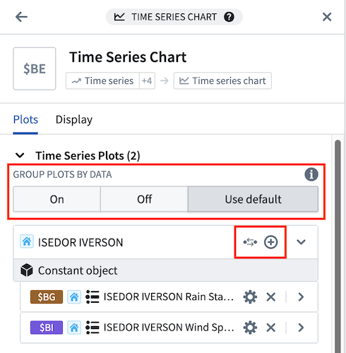
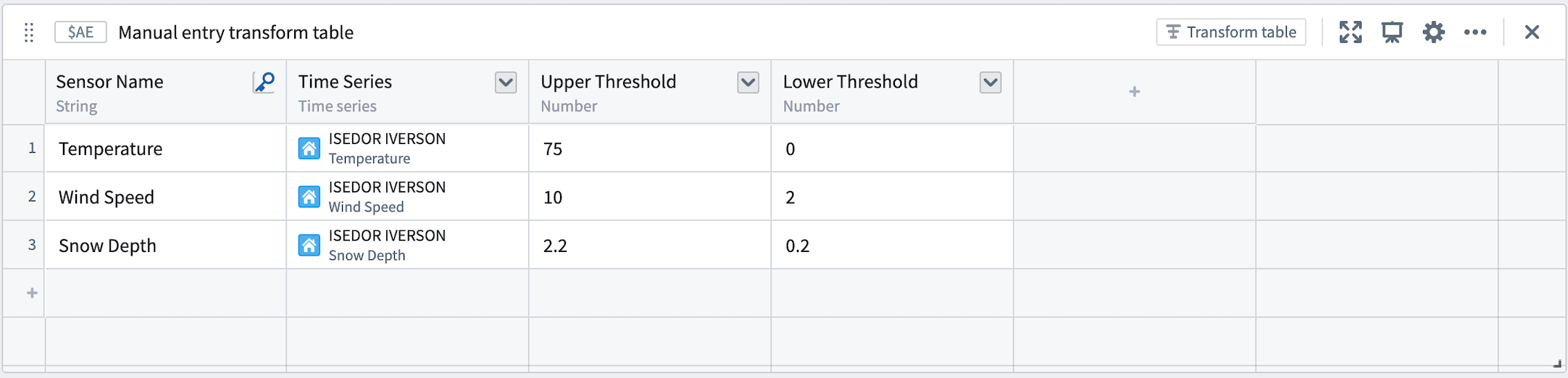
This example shows how to visualize manually set thresholds for each sensor at the ISEDOR IVERSON weather station using a manual entry table. The first step is to set up the manual entry table and row selector parameter:
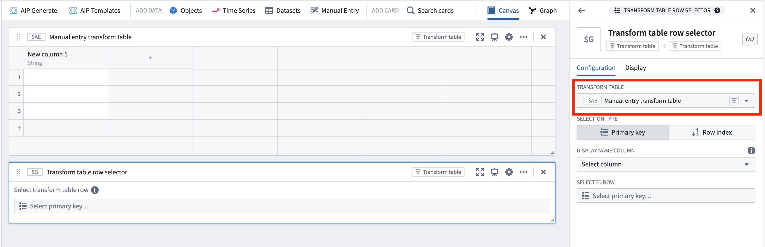
- Add a manual entry transform table using the Manual entry or Search cards buttons in the analysis header.
- Add a transform table row selector parameter through the Search cards button in the analysis header or the parameters panel.
- In the row selector's configuration editor, select the new manual entry table under Input transform table.
Next, add the desired values to the manual entry table:
- Create a primary key column by opening the column options menu (next to the column name) and selecting Yes for the Is primary key option. This label will appear in the row selector parameter, so ensure it is descriptive and unique.
- Create a new time series column by clicking the column header to the right of the primary key column and selecting Time series. Click within the column's cells to open a modal for adding time series data. Choose the desired series for each row. In this example, a few sensors from the ISEDOR IVERSON weather station are selected.
- Create numeric columns in the same manner and manually input values for the upper and lower thresholds.
- Select Apply edits at the bottom right of the manual entry table to save the changes.
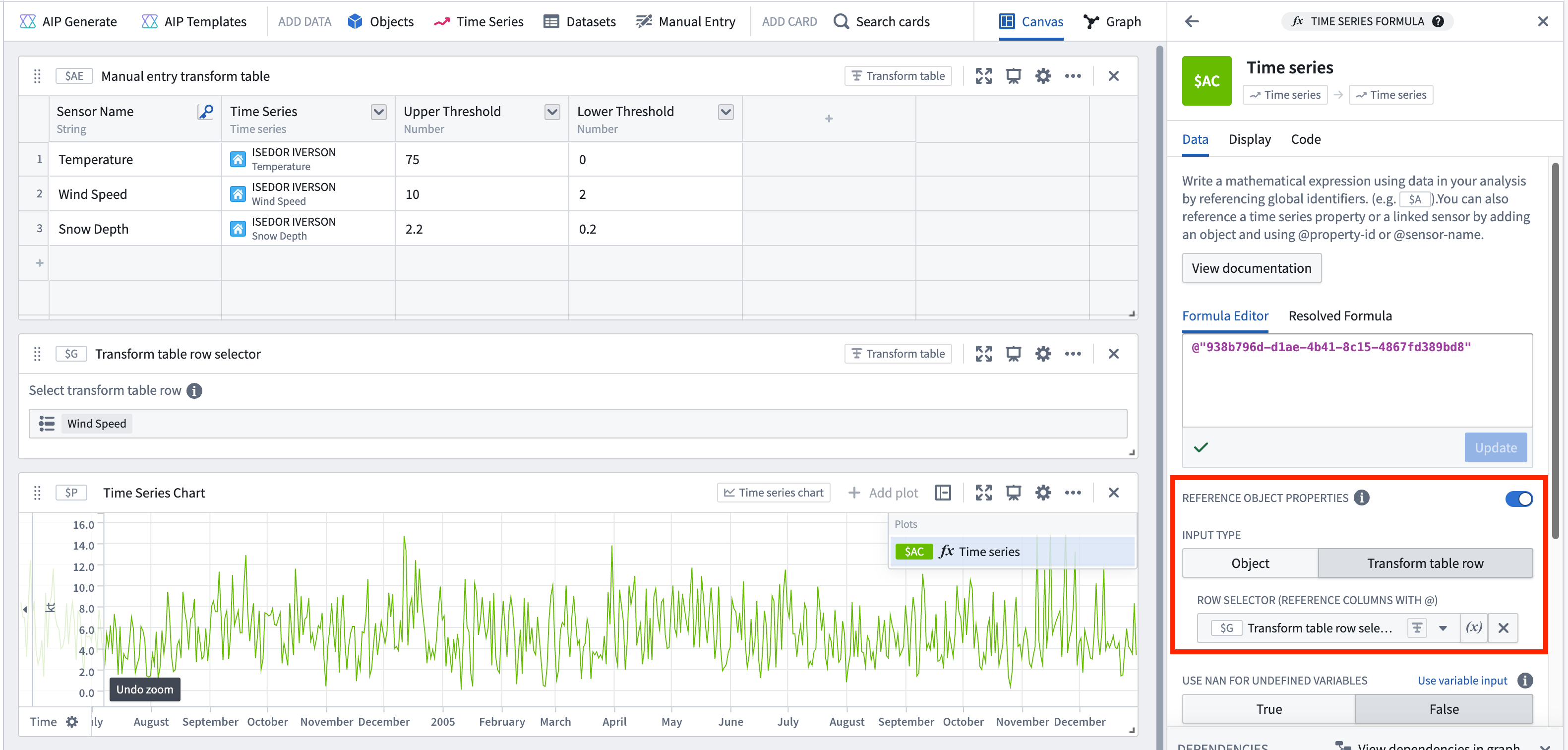
Now, use the values from each column to create custom visualizations for each sensor in the station:
- Add a Time series formula card using the Search cards button at the top of the analysis.
- Enable the Reference object properties toggle within the card editor.
- Select Transform table row for the Input type and choose the transform table row selector from the Select... dropdown.
- Reference series and numeric values in formula inputs using the @ symbol.
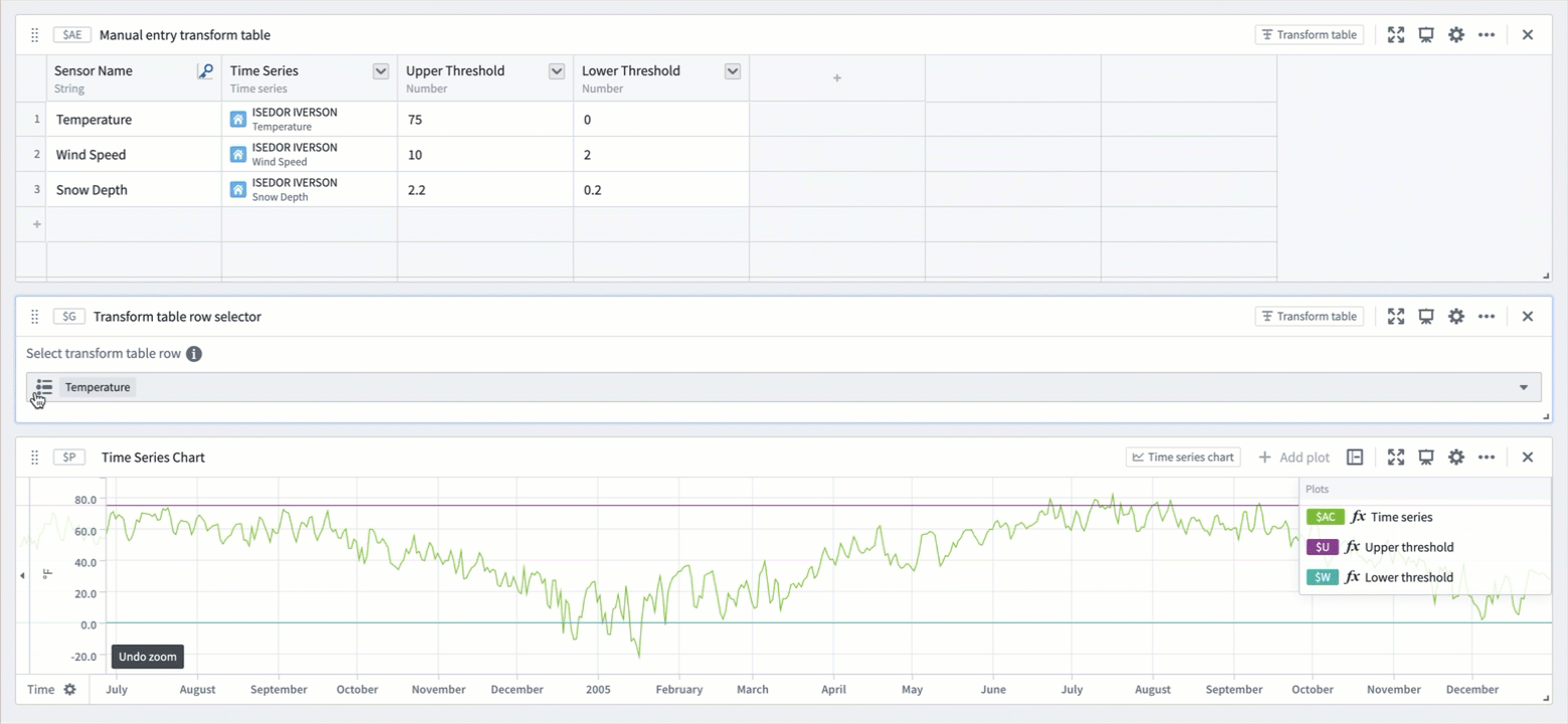
To complete the example, create a time series formula plot for each of the three columns in the manual entry table. Quickly create several formula plots by opening the ... menu to the right of the plot in the chart legend and selecting Duplicate. Then, change the property referenced in the formula editor.
Finally, pivot the sensor and values by selecting a new value from the transform table row selector. This will update the plots to show the next sensor's measurements in relation to its manually specified thresholds.
中文翻译
参数化与透视时间序列
利用 Quiver 中的对象选择参数,可以轻松交换或"透视"时间序列数据,从而节省时间并简化对比工作流程。这对于分析跨多个根对象(Root Object)的传感器尤其有用,无需重新配置单个卡片。通过更改单个参数,整个分析可以更新以反映不同对象的数据,从而更轻松地探索模式。
Quiver 提供了多种实现方式,以适应不同的本体论(Ontology)配置。
按数据分组图表
对于具有时间序列属性或传感器对象类型的本体论,Quiver 会自动按关联的根对象对时间序列图表进行分组。数据组会同时显示在时间序列图表配置编辑器面板和图例中,并可从任一位置进行控制。
时间序列图表配置编辑器面板中提供以下分组选项:
- 开启: 图表将显示在包含根对象相关信息和操作的标题下,按全局标识符(Global Identifier)的字母顺序排列。
- 关闭: 图表将默认不分组显示,按全局标识符的字母顺序排列。当图表不分组时,可以自定义图表顺序。
- 使用默认值: 图表将根据设置面板中时间序列轴和图例部分的按数据分组图表设置进行显示。此设置控制创建新时间序列图表时是否默认对图表进行分组。
可以通过在图例中选择按数据分组图表(![]() )或取消分组图表(
)或取消分组图表(![]() )来切换分组。
)来切换分组。
当图表按数据分组时,图表组标题中提供以下选项:
- 从根对象添加序列()到图表。此按钮会打开一个菜单,其中包含根对象上的时间序列属性以及链接到根对象的传感器对象。
- 使用对象选择参数控制(),将组内图表的对象引用从直接对象引用更新为对象选择参数引用。如果已存在选中该根对象的参数,则会重用该参数。否则,将创建一个以该根对象为选中值的新参数。当根对象还不是对象选择参数时,此按钮可用。
- 查看对象选择参数(),打开参数面板并高亮控制该组图表的参数。在此处,您可以更改参数的选中对象,以更新该组中的图表。当根对象是对象选择参数时,此按钮可用。
示例工作流:气象站分析
此示例展示了如何参数化基于单个对象的时间序列分析,使相同的分析能够应用于同一类型的任何对象。以下分析监测 BOHODUKHIV 气象站周围的温度和风力状况,以检测潜在的冬季天气事件。
要参数化现有分析,请对每个时间序列图表执行以下步骤:
- 选择卡片右上角的齿轮图标,打开图表配置编辑器。
- 为要透视的对象选择使用对象选择参数控制按钮。
- 将创建一个单一的对象选择参数,用于控制图表上共享同一根对象的所有序列以及下游卡片。
序列参数化后,只需更新对象选择参数,即可使用不同气象站的数据查看相同的分析步骤。
使用手动输入转换表透视值
对于自定义透视用例,例如序列不共享公共对象类型或本体论关系不完整时,可以结合使用手动输入转换表与行和列选择器,动态更新整个分析中的值。
示例工作流:温度阈值
此示例展示了如何使用手动输入表为 ISEDOR IVERSON 气象站的每个传感器可视化手动设置的阈值。第一步是设置手动输入表和行选择器参数:
- 使用分析标题中的手动输入或搜索卡片按钮,添加一个手动输入转换表。
- 通过分析标题中的搜索卡片按钮或参数面板,添加一个转换表行选择器参数。
- 在行选择器的配置编辑器中,在输入转换表下选择新创建的手动输入表。
接下来,向手动输入表中添加所需的值:
- 创建一个主键列:打开列选项菜单(位于列名旁边),为是主键选项选择是。此标签将显示在行选择器参数中,因此请确保其描述性强且唯一。
- 创建一个新的时间序列列:点击主键列右侧的列标题,然后选择时间序列。点击列内的单元格,打开一个用于添加时间序列数据的模态框。为每一行选择所需的序列。在此示例中,选择了 ISEDOR IVERSON 气象站中的几个传感器。
- 以相同方式创建数值列,并手动输入上限和下限阈值。
- 选择手动输入表右下角的应用编辑以保存更改。
现在,使用每列中的值为站内的每个传感器创建自定义可视化:
- 使用分析顶部的搜索卡片按钮,添加一个时间序列公式卡片。
- 在卡片编辑器中启用引用对象属性开关。
- 为输入类型选择转换表行,然后从选择...下拉菜单中选择转换表行选择器。
- 使用 @ 符号在公式输入中引用序列和数值。
为完成此示例,为手动输入表中的三列各创建一个时间序列公式图表。通过打开图表图例中图表右侧的 ... 菜单并选择复制,可以快速创建多个公式图表。然后,更改公式编辑器中引用的属性。
最后,通过从转换表行选择器中选择一个新值来透视传感器和值。这将更新图表,以显示下一个传感器的测量值与其手动指定的阈值之间的关系。