Time and value ranges(时间范围与数值范围)
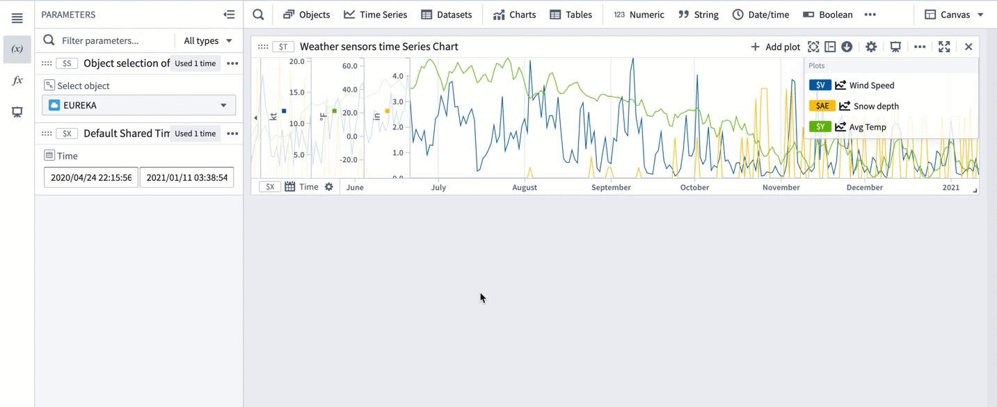
Time and value ranges are commonly used when analyzing real-world phenomenons using time series data, such as in manufacturing optimization or financial markets analysis. Ranges can be used to highlight and drill down on anomalies in the data, such as specific time periods when an issue was observed or the temperature range when equipment was operating in optimal capacity. Ranges can also be used to enrich the time series data by capturing context on specific time periods or value ranges, such as periods when equipment maintenance took place.
- Save a new range
- Control a range using parameters
- Use the same range with multiple charts
- Contextualize ranges
- Use a range to compute range statistics
- Use ranges to compare series over multiple periods of time
Save a new range
To save a new range from a time series chart:
- Move the cursor over the chart and select a range by dragging the cursor over the chart. You can select a vertical, horizontal, or box range.
- The selected range will be highlighted in blue and the selection menu will automatically pop up. If the selection menu is collapsed, select ... to see the menu options.
- Select Save new range from the selection menu to create a new range. This action has the following consequences:
- A range parameter will be added to the Parameters side panel and configured as a range parameter for the chart. The type of the range parameter added (Time range or Value range) depends on the axis on which the range selection was made (time axis or value axis). When the selected range is a box selection, two range parameters will be added and configured for the chart.
- The selected range color will change from blue to a different color, signifying that this range was persisted as a range parameter. You can change the range color by selecting the variable name in the Parameters panel or the card editor.
- The range parameter will take the selected range boundaries as the start and end timestamps/values. Changing the start or end values of the range parameter will update the range highlighted on the chart.
Control a range using parameters
Time and numerical ranges in Quiver are controlled by distinct parameter types:
- A time range parameter is defined by a start and an end timestamp.
- A numerical range parameter is defined by a start and an end value.
Learn more about how to parameterize an analysis.
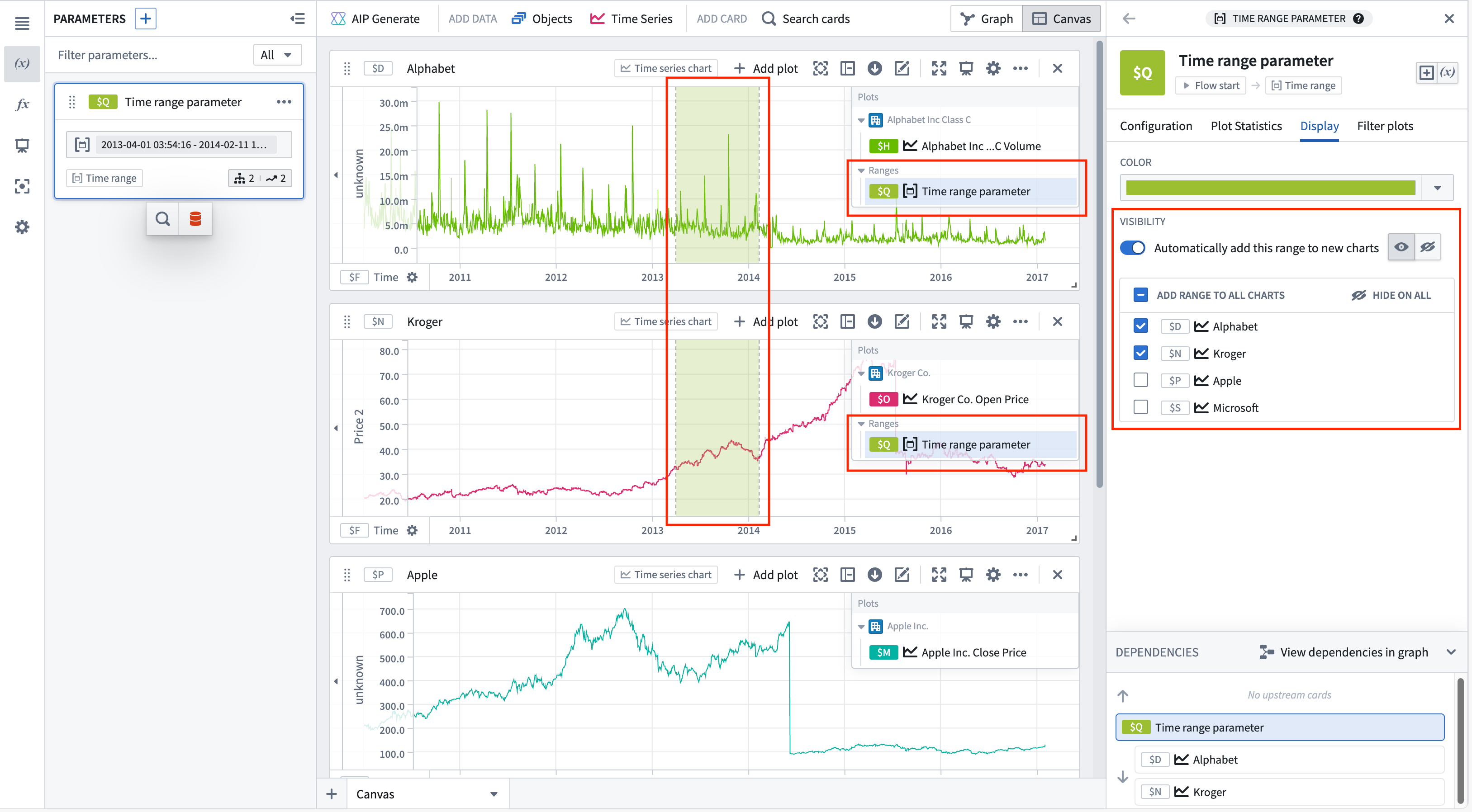
Use the same range with multiple charts
You can add a range parameter to multiple charts from the time range parameter editor or the chart editor.
To add a time range from the time range parameter editor, select the range from the Parameters side panel, and then navigate to the Display tab. The Visibility section contains all compatible charts that the range can be added to. Select the checkbox next to a chart to add the range. Hovering over a chart in the list will show options to navigate to the chart's editor or hide the range on that chart (if the range has been added). Bulk actions are available in the list's header, allowing the range to quickly be added or hidden on all charts.
To automatically add the range to new charts, toggle Automatically add this range to new charts. Once toggled on, the default visibility can be customized.
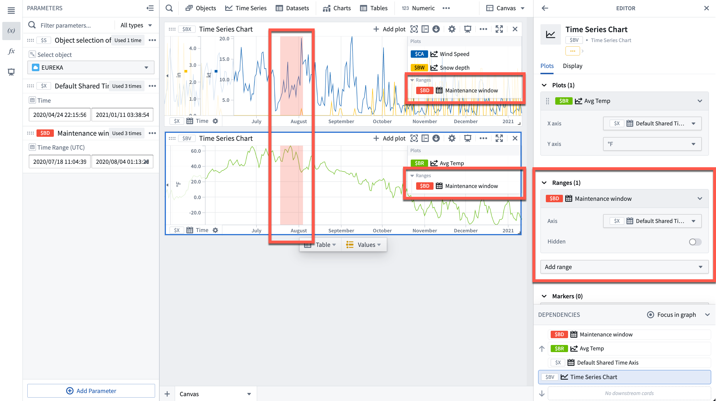
To add a range from the chart editor, open the editor panel for the desired chart and select Add range under the Ranges section.
Contextualize ranges
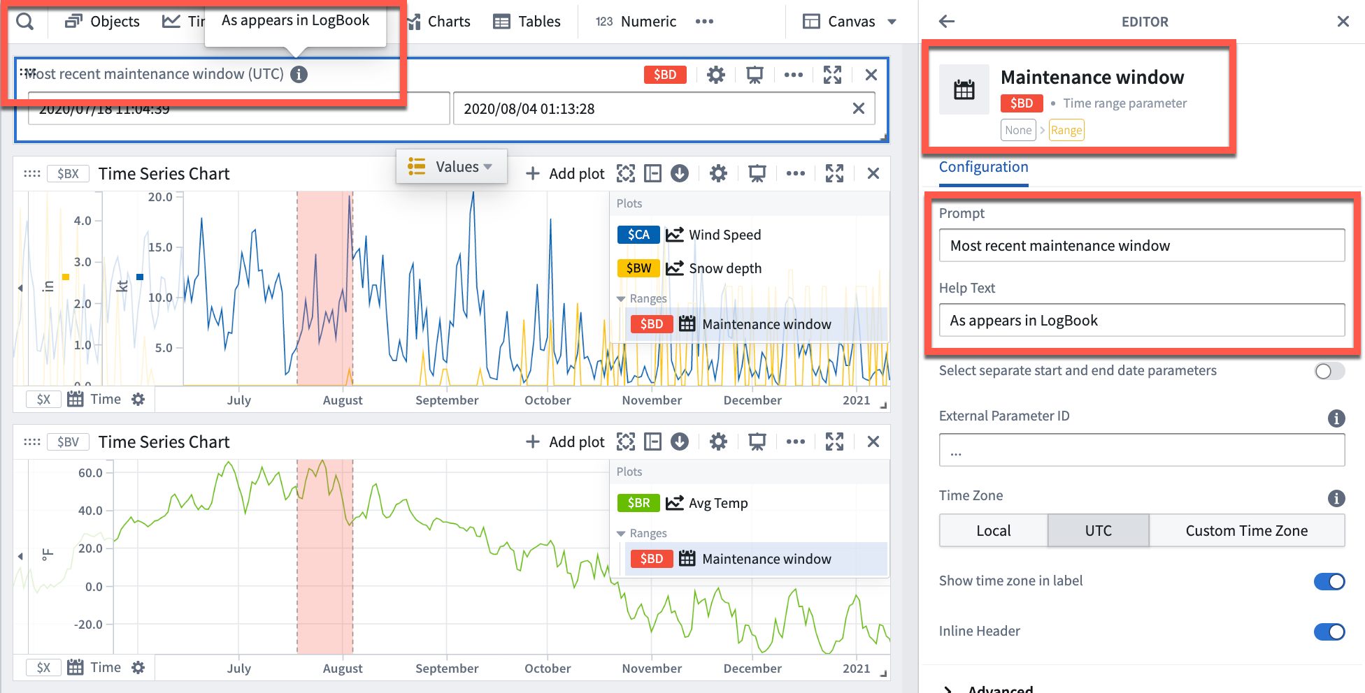
By default, Quiver names new time ranges and numerical ranges as "Time range parameter" and "Numerical range parameter" respectively. Consider giving meaningful names to ranges to help keep track of what each range represents (for example, "Maintenance window" or "Optimal output").
To rename a range, open the Parameters side panel and select the parameter name. Edit the name, then select Enter to save the change.
Additionally, consider configuring the Prompt and Help text of a range parameter which are visible when adding range parameters to dashboards.
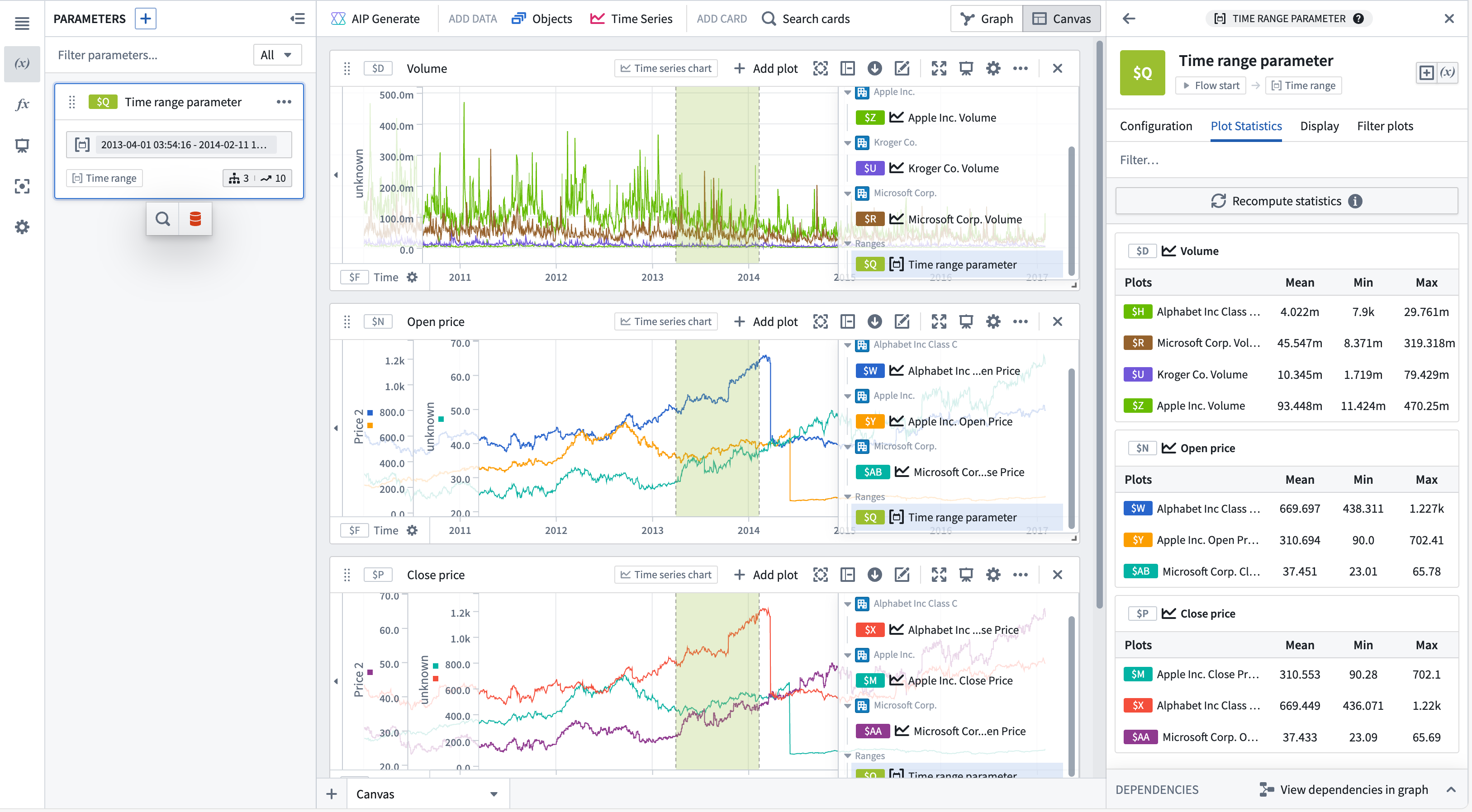
Use a range to compute range statistics
You can view range statistics (min, max, and average) in the Plot statistics tab of the time range parameter editor. After selecting Compute statistics, metrics will be shown for plots on time series charts with this range. Statistics are only computed for plots with one time axis and one numeric axis, incompatible plots will not be shown. Hovering over a plot or chart will show the option to navigate to the respective editor.
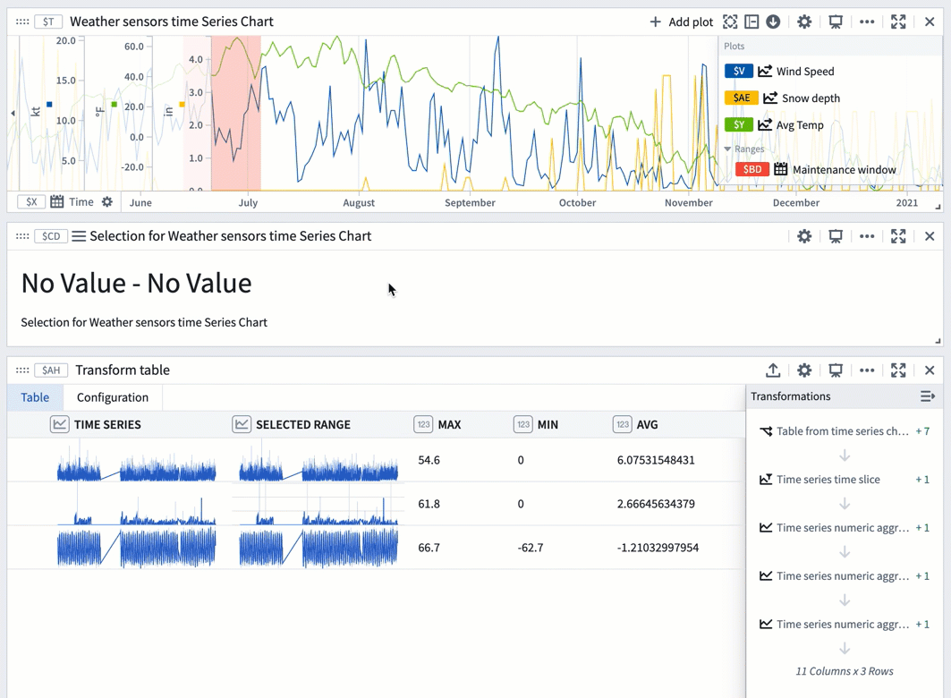
You can also use a range selection or a saved range with a transform table to compute range statistics like max, min, and average. Range selections, as opposed to saved ranges, are not persisted; they offer an interactive way to quickly view statistics for different ranges.
The example below shows a transform table with one row for each time series plot from the chart above it. Learn more about using time series charts as inputs to transform tables.
To use a chart range selection within the transform table:
- Select a range on the chart, then choose 'Save X axis selection' or 'Save Y axis selection'.
- Select Add Transformation to add a Filter to time range transform.
- Set Input time series to the
Time seriescolumn and the Time range to the chart range selection. - Click Add Transformation to add a
Time series numeric aggregationfor each of the metrics you wish to compute. - Select a different range on the chart to see the computed stats for that range.
Use ranges to compare series over multiple periods of time
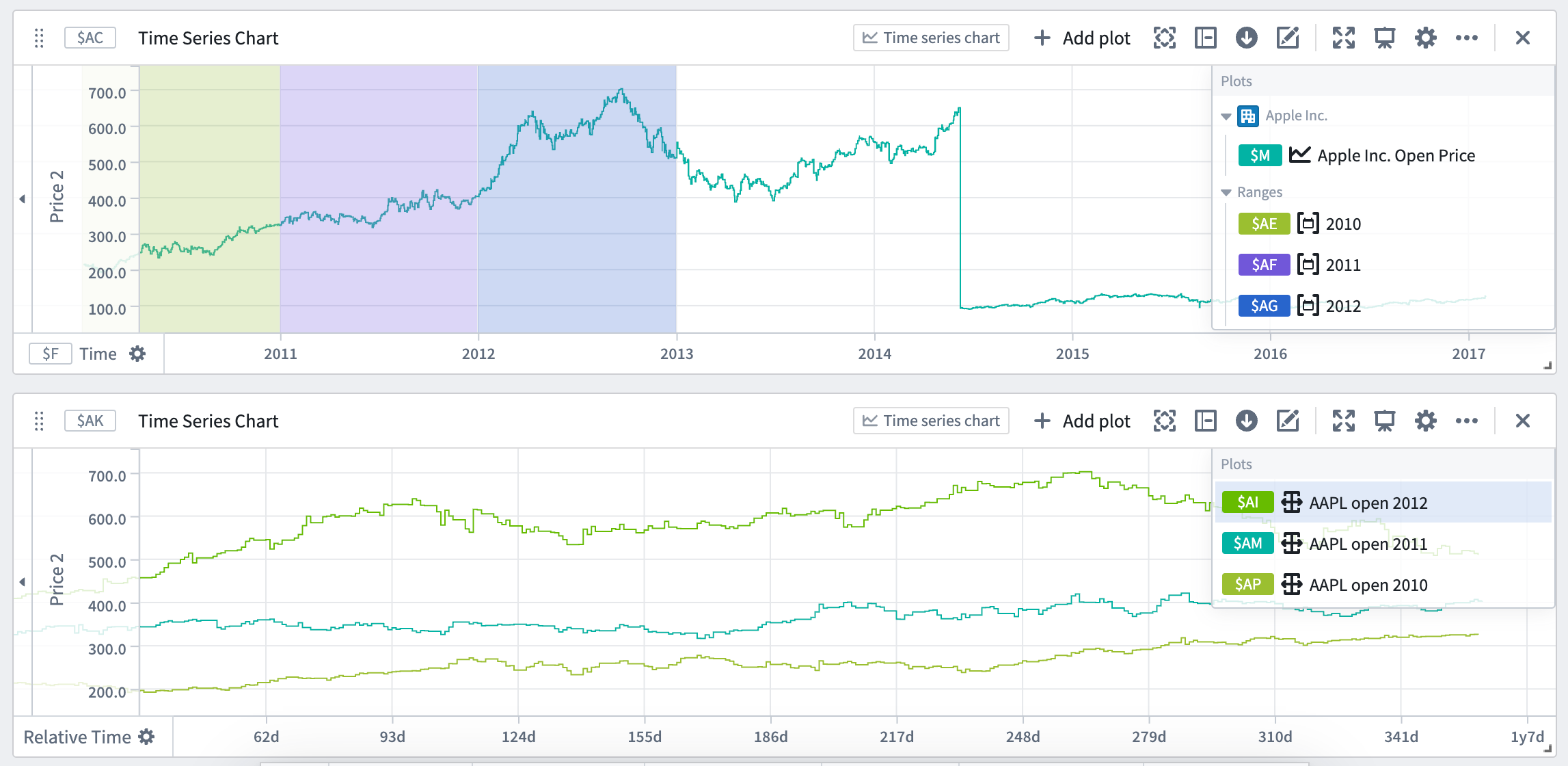
You can use time ranges to compare a series (or multiple series) over different periods of time. This is achieved by using the ranges to create filter time series plots and relative time series plots. Creating a filter plot isolates the series data over the range, while a relative time plot visually aligns the series across multiple periods of time. The picture below shows the result of using filter and relative time plots to visualize the open price of AAPL stock over multiple years.
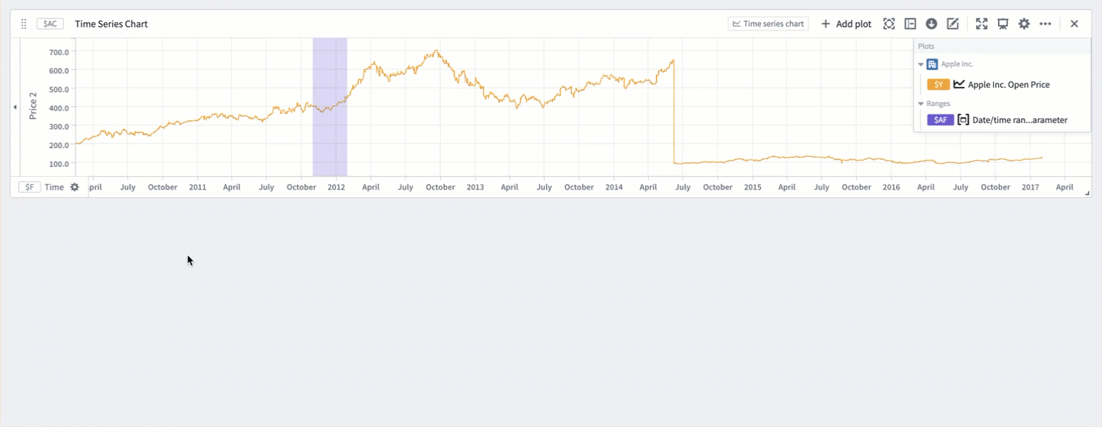
Relative comparison views like the one above can be created directly from the desired time ranges. To create a relative time plot from a range, select the range from the Parameters side panel and navigate to the Filter plots tab. Select the desired plot from the Create filtered plots dropdown, and then select Relative time series plot. A filter plot will be created using the range and selected plot, and then used as the input to a new relative time plot. Repeat this process for all of the series and time ranges you want to compare. You can also choose to only create the filter plot by using the same dropdown and selecting Filter time series plot after choosing a source plot. All filter and relative plots created using the range are displayed in the Current filtered plots section of the tab.
A more focused version of this workflow is available from the Filter plots button found by hovering over the range display on a chart. The source plot selection menu here is filtered to only contain plots on the selected chart.
中文翻译
时间范围与数值范围
在使用时间序列数据分析现实世界现象时(例如制造业优化或金融市场分析),时间范围与数值范围(Time and value ranges)是常用的工具。范围可用于突出显示并深入分析数据中的异常,例如观察到问题的特定时间段,或设备在最佳容量下运行的温度范围。范围还可用于通过捕获特定时间段或数值范围的上下文信息(例如设备维护期间)来丰富时间序列数据。
保存新范围
要从时间序列图表保存新范围:
- 将光标移至图表上,然后通过拖动光标在图表上选择一个范围。您可以选择垂直、水平或框选范围。
- 所选范围将高亮显示为蓝色,选择菜单(selection menu) 将自动弹出。如果选择菜单已折叠,请选择 ... 查看菜单选项。
- 从选择菜单中选择 保存新范围(Save new range) 以创建新范围。此操作会产生以下结果:
- 一个 范围参数(range parameter) 将被添加到 参数(Parameters) 侧面板,并配置为图表的范围参数。添加的范围参数类型(时间范围(Time range) 或 数值范围(Value range))取决于进行范围选择时所依据的坐标轴(时间轴或数值轴)。当所选范围为框选时,将添加两个范围参数并配置到图表中。
- 所选范围的颜色将从蓝色变为另一种颜色,表示此范围已持久化为范围参数。您可以通过在参数面板或卡片编辑器中选择变量名称来更改范围颜色。
- 范围参数将采用所选范围的边界作为起始和结束时间戳/数值。更改范围参数的起始或结束值将更新图表上高亮显示的范围。
使用参数控制范围
Quiver 中的时间和数值范围由不同的参数类型控制:
- 时间范围参数(time range parameter) 由起始和结束时间戳定义。
- 数值范围参数(numerical range parameter) 由起始和结束数值定义。
了解更多关于如何 参数化分析(parameterize an analysis) 的信息。
在多个图表中使用同一范围
您可以通过时间范围参数编辑器或图表编辑器将范围参数添加到多个图表中。
要从时间范围参数编辑器添加时间范围,请从 参数(Parameters) 侧面板中选择该范围,然后导航至 显示(Display) 选项卡。可见性(Visibility) 部分包含所有可以添加该范围的兼容图表。选中图表旁边的复选框即可添加该范围。将鼠标悬停在列表中的图表上,将显示导航至图表编辑器或隐藏该图表上范围的选项(如果已添加该范围)。列表的标题中提供了批量操作,可以快速在所有图表上添加或隐藏该范围。
要自动将范围添加到新图表,请切换 自动将此范围添加到新图表(Automatically add this range to new charts)。开启后,可以自定义默认可见性。
要从图表编辑器添加范围,请打开所需图表的编辑器面板,然后在 范围(Ranges) 部分下选择 添加范围(Add range)。
为范围添加上下文
默认情况下,Quiver 将新的时间范围和数值范围分别命名为"时间范围参数"和"数值范围参数"。建议为范围赋予有意义的名称,以便跟踪每个范围所代表的内容(例如"维护窗口"或"最佳输出")。
要重命名范围,请打开 参数(Parameters) 侧面板并选择参数名称。编辑名称,然后选择 Enter 保存更改。
此外,还可以考虑配置范围参数的 提示(Prompt) 和 帮助文本(Help text),这些内容在将范围参数添加到仪表板时可见。
使用范围计算范围统计量
您可以在时间范围参数编辑器的 绘图统计量(Plot statistics) 选项卡中查看范围统计量(最小值、最大值和平均值)。选择 计算统计量(Compute statistics) 后,将显示具有此范围的时间序列图表上绘图的指标。统计量仅针对具有一个时间轴和一个数值轴的绘图进行计算,不兼容的绘图将不会显示。将鼠标悬停在绘图或图表上,将显示导航至相应编辑器的选项。
您还可以使用范围选择或 已保存的范围 配合转换表(transform table)来计算范围统计量,如最大值、最小值和平均值。与已保存的范围不同,范围选择不会被持久化;它们提供了一种交互式方式,可以快速查看不同范围的统计量。
下面的示例展示了一个 转换表(transform table),其中每一行对应上方图表中的每个时间序列绘图。了解更多关于 使用时间序列图表作为转换表的输入 的信息。
要在转换表中使用图表范围选择:
- 在图表上选择一个范围,然后选择"保存 X 轴选择"或"保存 Y 轴选择"。
- 选择 添加转换(Add Transformation) 以添加 过滤到时间范围(Filter to time range) 转换。
- 将 输入时间序列(Input time series) 设置为
时间序列列,将 时间范围(Time range) 设置为图表范围选择。 - 点击 添加转换(Add Transformation),为您希望计算的每个指标添加一个
时间序列数值聚合(Time series numeric aggregation)。 - 在图表上选择不同的范围,以查看该范围的计算统计量。
使用范围比较多个时间段内的序列
您可以使用时间范围来比较一个序列(或多个序列)在不同时间段内的表现。这通过使用范围创建 过滤时间序列图(filter time series plots) 和 相对时间序列图(relative time series plots) 来实现。创建过滤图可以隔离该范围内的序列数据,而相对时间图则可以在视觉上对齐多个时间段内的序列。下图展示了使用过滤图和相对时间图来可视化 AAPL 股票多年开盘价的结果。
像上面这样的相对比较视图可以直接从所需的时间范围创建。要从范围创建相对时间图,请从 参数(Parameters) 侧面板中选择该范围,然后导航至 过滤图(Filter plots) 选项卡。从 创建过滤图(Create filtered plots) 下拉菜单中选择所需的绘图,然后选择 相对时间序列图(Relative time series plot)。将使用该范围和所选绘图创建一个过滤图,然后将其用作新相对时间图的输入。对您想要比较的所有序列和时间范围重复此过程。您也可以选择仅创建过滤图,方法是在选择源绘图后使用相同的下拉菜单并选择 过滤时间序列图(Filter time series plot)。使用该范围创建的所有过滤图和相对图都显示在选项卡的 当前过滤图(Current filtered plots) 部分中。
此工作流程的更精简版本可通过将鼠标悬停在图表上的范围显示时出现的 过滤图(Filter plots) 按钮获得。此处的源绘图选择菜单仅包含所选图表上的绘图。