Compare time series in relative time(在相对时间中比较时间序列)
Quiver’s time series charts have two types of time axes:
| Type | Description | Example |
|---|---|---|
| Absolute time | Plots time series values at a real-world date/time | 2025/01/01 12:00:00 UTC |
| Relative time | Plots time series values at a duration from a start time (also called an "alignment timestamp") | 2 hours, 5 minutes |
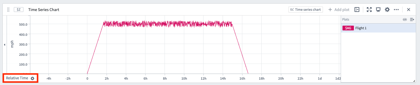
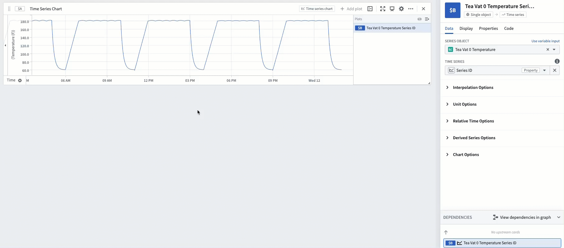
When a time series is in relative time, its x-axis will have a Relative Time label, as shown below.
Some examples where analyzing time series in relative time is useful include:
- Aligning series to a comparable interval: Two flights take off and land at different real-world times. You want to compare the altitude sensor of each flight against each other, aligned to the start of the flight. Analyzing in relative time can tell you, for example, how quickly each flight ascended 10 minutes after takeoff.
- Analyzing trends during a period of interest: A manufacturing vat has a temperature sensor. Sometimes the vat is producing, sometimes it is idle. If you want to measure trends in the vat's temperature sensor while the vat is producing, you can analyze the data in relative time aligned to the start of the production process.
- Investigating behavior during a key event: An equipment outage causes a spike in some sensor readings. You want to view the sensor readings aligned to the start of the outage; this can be accomplished by analyzing in relative time.
How to display time series in relative time
There are a few different ways to change a time series to be plotted on a relative time axis.
Relative time toggle
Most plots have a Relative time options section in the editor. Turn on the toggle and the plot will be converted into relative time. The relative time can be aligned to the start of the series, the end of the series, or a fixed timestamp.
Relative time plot
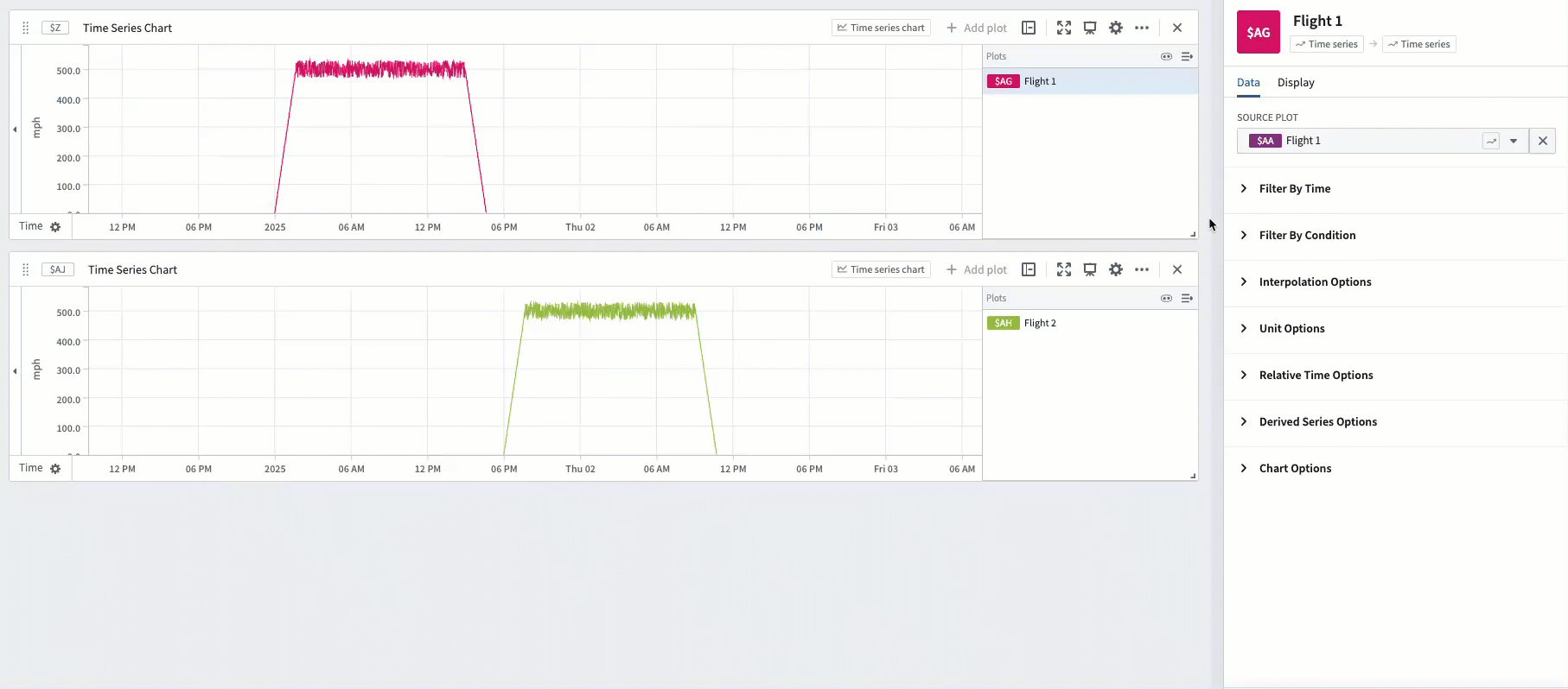
Use the Relative time series plot card to add a new plot that converts an existing plot into relative time. This transform behaves the same way as the relative time toggle.
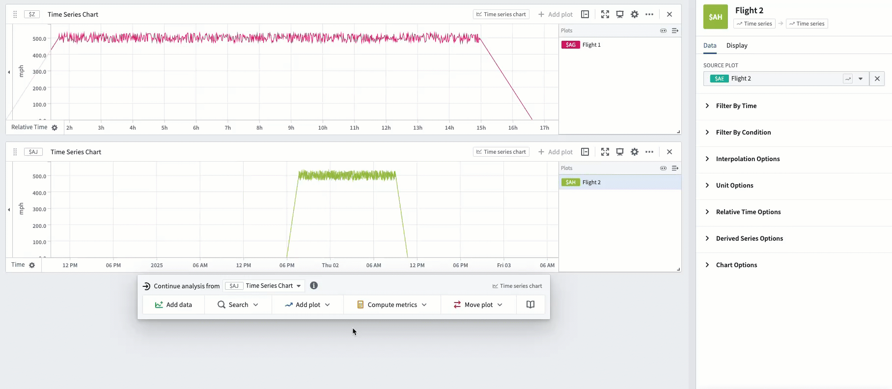
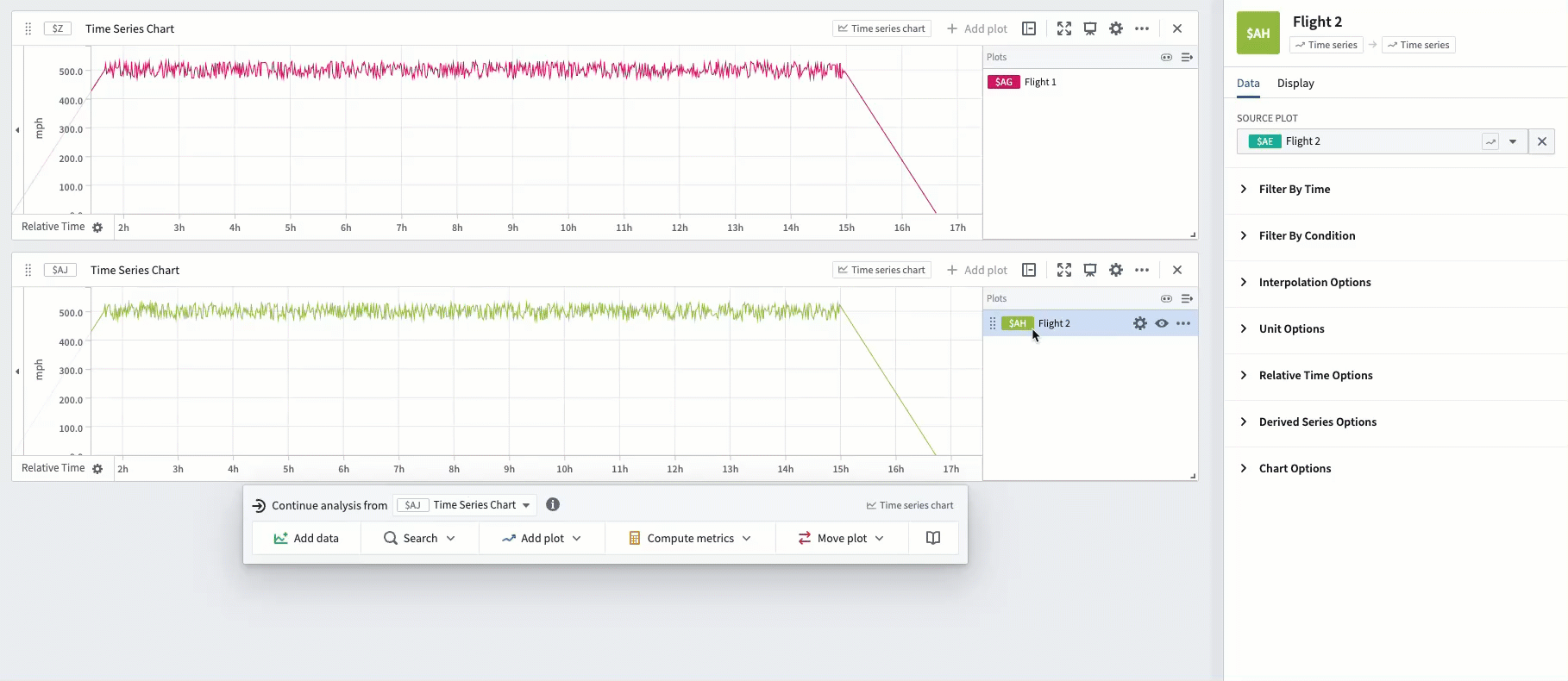
After two series are aligned in relative time, drag them on the same chart in order to evaluate trends. In the example below, Flight 1 and Flight 2 are both aligned to the start of the flight, enabling analysis of differences in their speedometers throughout the course of their flights.
Time range filter
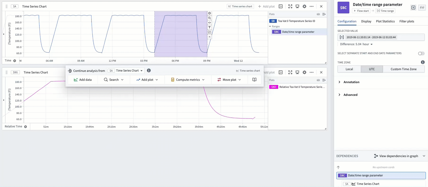
You may want to isolate a particular time range of a series, and view this specific range in relative time. For example, you can filter a manufacturing vat's sensor to a particular time range during which the vat was producing and view it aligned to the start of the range.
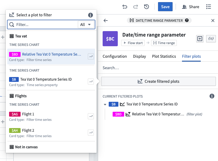
One way to achieve this in Quiver is using a time range. Highlight a section of the chart and select Save new range to create a range, then hover over the created range and select the Filter plots button. Select the plot you want to analyze and choose the Filter time series in relative time option.
The highlighted range of that plot will now be extracted and aligned in relative time (to the start of the range).
This method allows you to easily change the analyzed range by dragging the endpoints of the highlight. In the example below, you can see how dragging the endpoints to remove the ramp-up and cool-down periods of the production process enables you to analyze the specific period during which the vat was producing at full utilization.
These filtered relative plots can also be created from the editor of the time range. Read more about using time ranges.
Event comparison plot
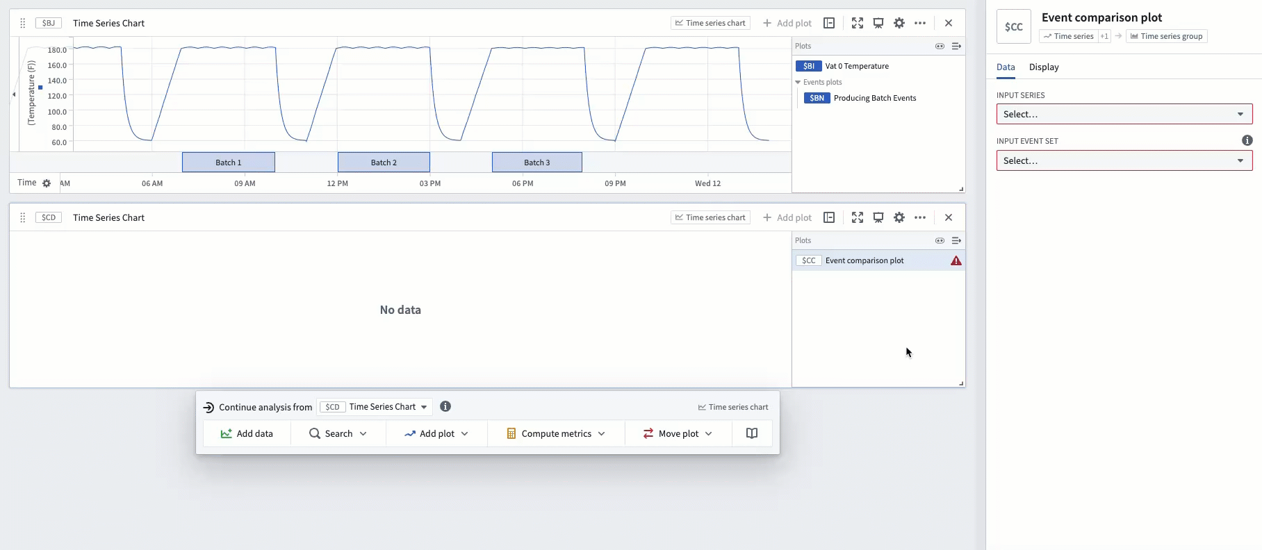
The time range filter method described above is flexible and easy to use, but can require a lot of manual effort if there are many timeframes to compare, since each timeframe would require creating a new range. Event sets reduce this manual effort. If you have an event set containing the start and end of each production process, you can use the Event comparison plot card to streamline the workflow of comparing sensor readings during these events.
The example below shows an event set consisting of three events, which represent the three timeframes during which a vat was producing tea. Using the event comparison plot will display a grouped plot with three subplots - one subplot for each event - and align each subplot in relative time to the start of its respective event.
Advanced: Using a transform table
For advanced use cases, relative time plots are supported in transform tables.
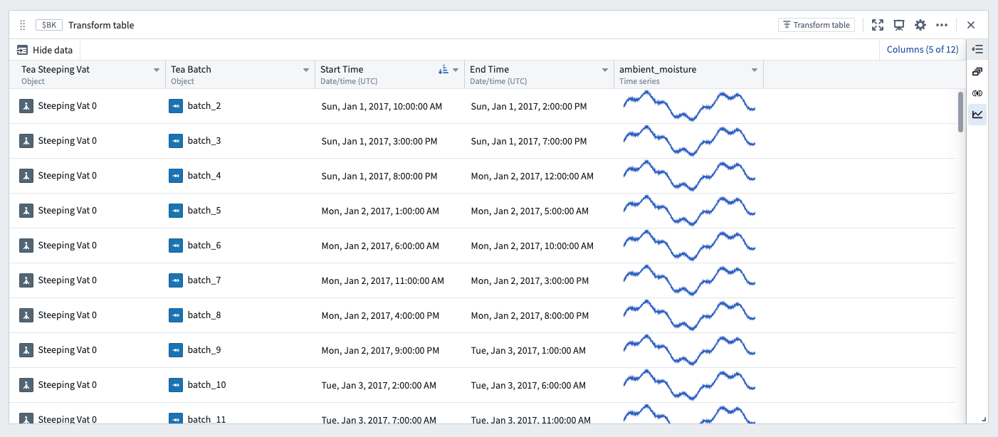
For example, an equivalent to the Event comparison plot can be constructed through a series of transform table steps. To begin, start with a transform table containing an event start time, an event end time, and a linked time series sensor.
The screenshot below shows an analysis of a single vat with an ambient moisture sensor. Each row of the table represents a "batch" event, during which the vat is producing. Each batch event has a defined start and end time.
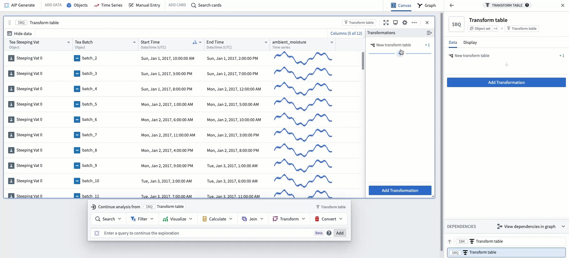
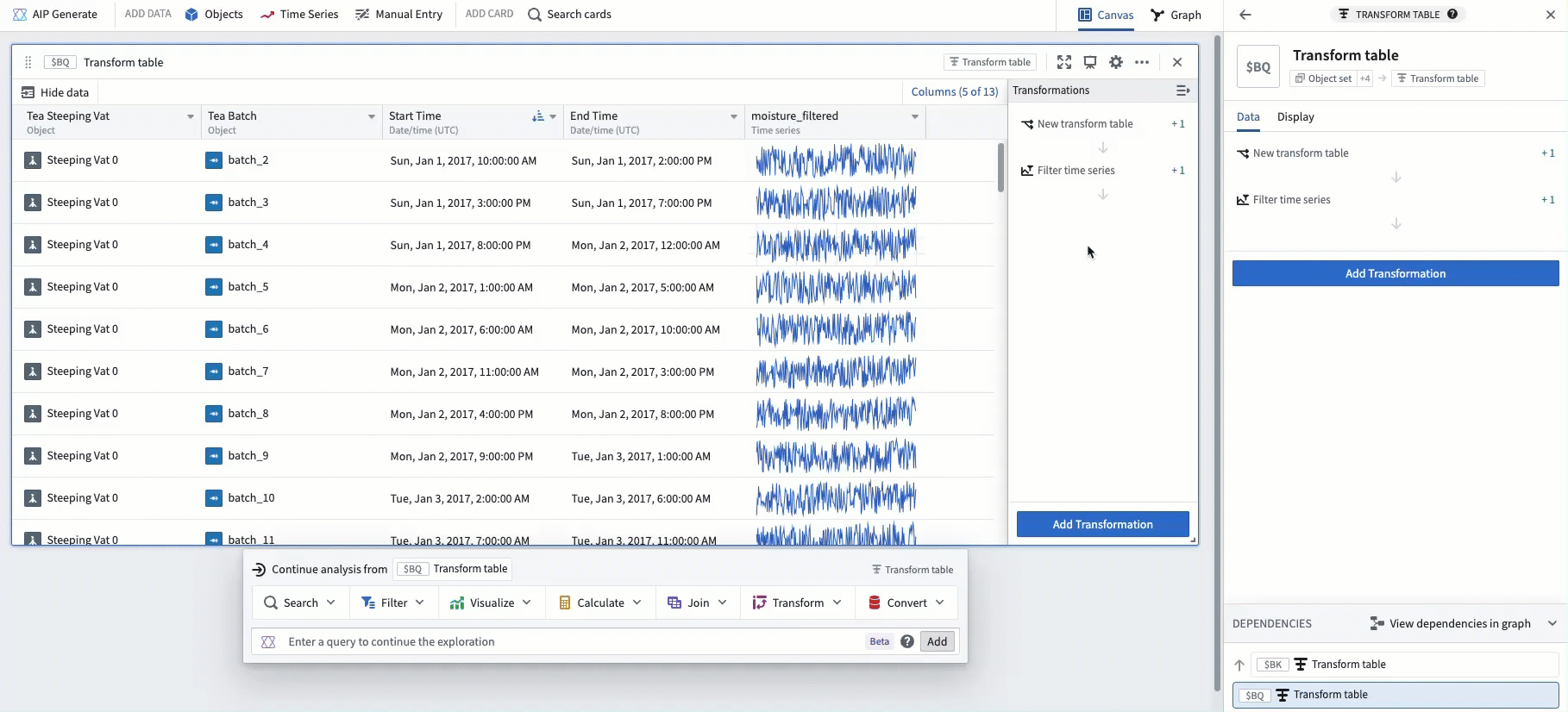
The next step is to add a Filter time series transform in order to filter the linked sensor to the event start and end date. In the example below, this creates a new column filtering ambient moisture to timeframes while the vat is producing.
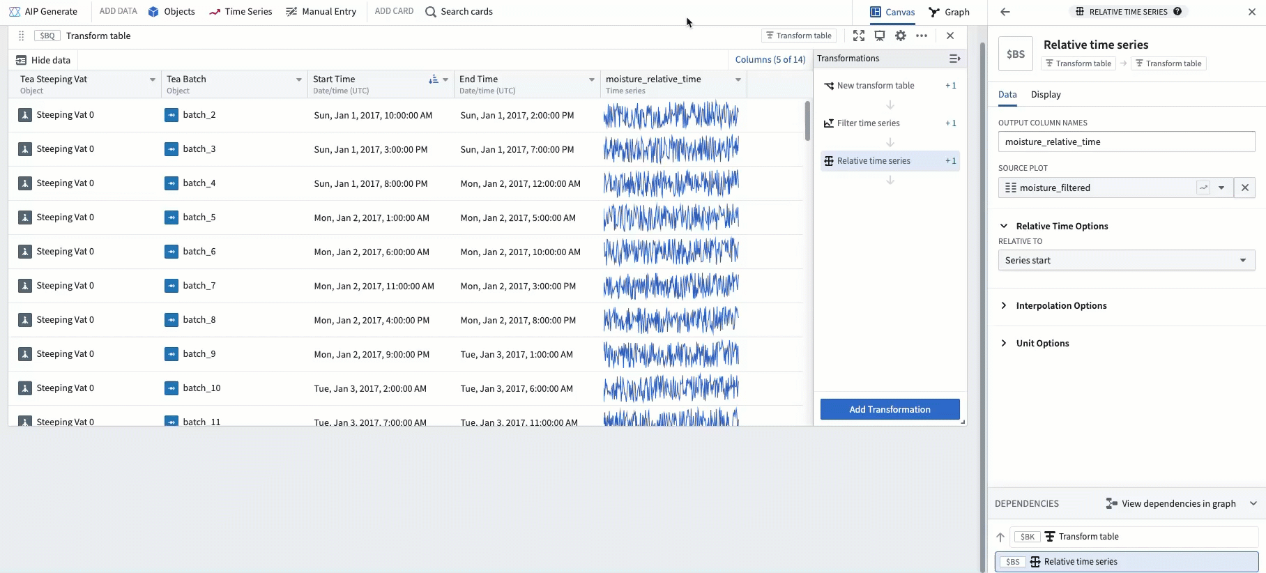
To align each time series in relative time, add a Relative time series transform. After doing this, the example below shows ambient moisture over the start and end of each batch event, aligned in relative time to the start of the batch.
Finally, popping out the column as a grouped plot results in a similar visualization as the Event comparison plot.
Following these steps, the example below shows one subplot for each batch event, with each subplot aligned in relative time to the start of its respective batch.
中文翻译
在相对时间中比较时间序列
Quiver 的时间序列图表有两种时间轴类型:
| 类型 | 描述 | 示例 |
|---|---|---|
| 绝对时间 (Absolute time) | 以真实世界日期/时间绘制时间序列值 | 2025/01/01 12:00:00 UTC |
| 相对时间 (Relative time) | 以距起始时间(也称为"对齐时间戳")的时长绘制时间序列值 | 2小时,5分钟 |
当时间序列处于相对时间时,其 x 轴会显示相对时间 (Relative Time) 标签,如下图所示。
以下是一些在相对时间中分析时间序列的实用场景:
- 将序列对齐到可比较的时间间隔: 两架航班在真实世界中的起飞和降落时间不同。您希望比较每架航班的高度传感器数据,并将其对齐到航班起始时间。通过相对时间分析,您可以了解,例如,每架航班在起飞后10分钟的爬升速度。
- 分析特定时段内的趋势: 一个制造罐装有温度传感器。有时罐体在生产,有时处于闲置状态。如果您想测量罐体在生产期间温度传感器的趋势,可以将数据对齐到生产过程的起始时间进行相对时间分析。
- 调查关键事件期间的行为: 设备故障导致某些传感器读数出现峰值。您希望查看对齐到故障起始时间的传感器读数;这可以通过相对时间分析来实现。
如何以相对时间显示时间序列
有几种不同的方法可以将时间序列更改为在相对时间轴上绘制。
相对时间切换开关
大多数图表在编辑器中都有相对时间选项 (Relative time options) 部分。打开切换开关,图表将转换为相对时间。相对时间可以对齐到序列的起始时间、结束时间或固定的时间戳。
相对时间图
使用相对时间序列图 (Relative time series plot) 卡片添加一个新图,将现有图表转换为相对时间。此转换的行为与相对时间切换开关相同。
将两个序列在相对时间中对齐后,将它们拖到同一图表上以评估趋势。在下面的示例中,航班1和航班2都对齐到各自的航班起始时间,从而可以分析它们在飞行过程中速度计的差异。
时间范围筛选器
您可能希望隔离序列的特定时间范围,并以相对时间查看此特定范围。例如,您可以将制造罐的传感器筛选到罐体正在生产的特定时间范围,并查看对齐到该范围起始时间的数据。
在 Quiver 中实现此目的的一种方法是使用时间范围 (time range)。高亮图表的一部分并选择保存新范围 (Save new range) 以创建一个范围,然后将鼠标悬停在创建的范围上并选择筛选图表 (Filter plots) 按钮。选择您要分析的图表,然后选择在相对时间中筛选时间序列 (Filter time series in relative time) 选项。
该图表的高亮范围现在将被提取出来,并在相对时间中对齐(到范围的起始时间)。
此方法允许您通过拖动高亮区域的端点来轻松更改分析范围。在下面的示例中,您可以看到如何通过拖动端点来移除生产过程的启动和冷却阶段,从而分析罐体满负荷生产的具体时段。
这些筛选后的相对图也可以从时间范围的编辑器中创建。了解更多关于使用时间范围的信息。
事件比较图
上述时间范围筛选器方法灵活且易于使用,但如果需要比较多个时间范围,则可能需要大量手动操作,因为每个时间范围都需要创建一个新范围。事件集 (Event sets) 可以减少这种手动操作。如果您有一个包含每个生产过程开始和结束时间的事件集,则可以使用事件比较图 (Event comparison plot) 卡片来简化比较这些事件期间传感器读数的工作流程。
下面的示例显示了一个由三个事件组成的事件集,这三个事件代表罐体生产茶叶的三个时间段。使用事件比较图将显示一个包含三个子图的分组图 (grouped plot)——每个事件对应一个子图——并将每个子图在相对时间中对齐到各自事件的起始时间。
高级:使用转换表
对于高级用例,转换表 (transform tables) 支持相对时间图。
例如,可以通过一系列转换表步骤构建与事件比较图等效的功能。首先,从一个包含事件开始时间、事件结束时间和链接的时间序列传感器的转换表开始。
下面的截图显示了对一个带有环境湿度传感器的单个罐体的分析。表中的每一行代表一个"批次"事件,在此期间罐体正在生产。每个批次事件都有定义的开始和结束时间。
下一步是添加一个筛选时间序列 (Filter time series) 转换,以便将链接的传感器筛选到事件的开始和结束日期。在下面的示例中,这创建了一个新列,将环境湿度筛选到罐体生产的时间段。
为了将每个时间序列在相对时间中对齐,添加一个相对时间序列 (Relative time series) 转换。完成此操作后,下面的示例显示了每个批次事件开始和结束期间的环境湿度,并在相对时间中对齐到批次的起始时间。
最后,将该列弹出为分组图 (grouped plot),结果会得到与事件比较图类似的可视化效果。
按照这些步骤,下面的示例显示了每个批次事件的一个子图,每个子图在相对时间中对齐到各自批次的起始时间。