Visualize time series(可视化时间序列)
Quiver provides a wide range of capabilities for visualizing time series.
When discussing time series visualization in Quiver, we use the following terminology:
| Term | Description |
|---|---|
| Chart | A time series chart is a card on the Quiver canvas that serves as a container for viewing time series. Time series charts are automatically created when you add time series data to your analysis. Charts can have multiple time series plots on them. They also contain one or more x and y axes. |
| Plot | The visual representation of a single time series. A plot can only be viewed on a single chart at a time. |
| Axis | An x or y axis that defines the view range on a chart. Axes can be of type time, relative time, numeric, or ordinal. Axes can be shared across multiple charts. |
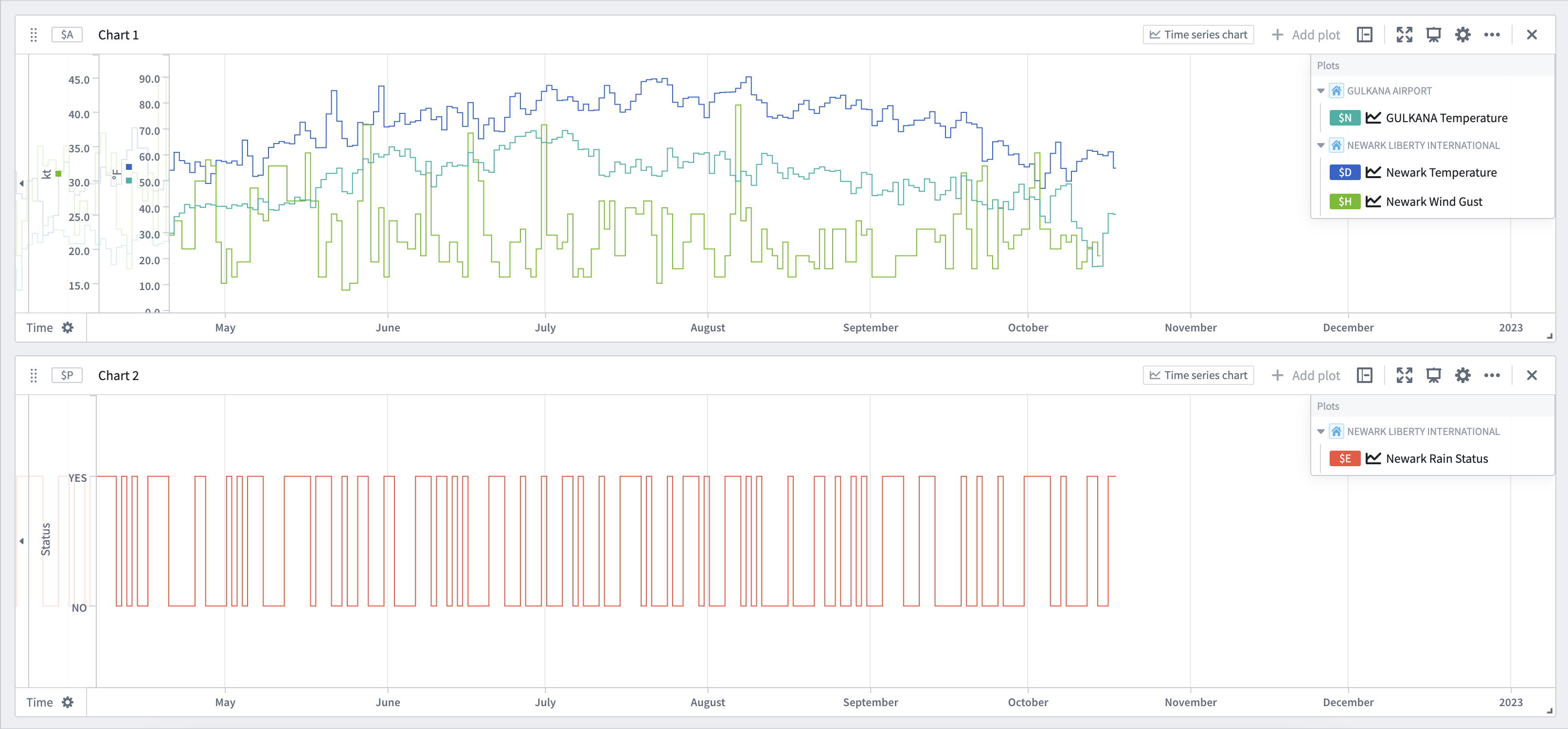
For example, in the image below, we have two time series charts. The first chart, Chart 1, has three time series plots on it: Gulkana Temperature, Newark Temperature, and Newark Wind Gust. This chart also has two, numerical, y-axes: kt and °F. The two temperature plots use the °F axis, and the wind gust plot uses the kt axis. The second chart, Chart 2, has a single, categorical time series plot on it: Newark Rain Status. This uses the ordinal y-axis: Status. Both charts share the same x-axis: Time.
Panning and zooming
Time series charts are interactive, allowing you to pan and zoom. Hovering over an axis will show buttons to pan, zoom in, and zoom out. Axis can additionally be panned by dragging them directly, and zoomed in or out by holding Cmd (macOS) or Ctrl (Windows) while scrolling up or down on the axis. You can also zoom to a specific part of the chart by clicking and dragging on the main chart area to select a range, and then selecting Zoom to selection.
After panning and zooming, you can select the Fit to extent button on an axis. This will snap the axis to show the full data range.
Quiver automatically links all time axes across time series charts. As a result, when you pan or zoom one chart's time axes, the zoom range of other time series charts in the canvas will update synchronously.
Moving plots between charts
There are several ways to organize your plots by moving them between charts.
First, you can move plots by dragging them from the chart legend. Dragging a plot onto another chart will move it to that chart. Dragging a plot onto the canvas will create a new chart. If grouping by a root object, you can similarly drag that object to move all plots using that object to a different chart.
Second, you can move plots using the Move plot section of a chart's next actions menu. This allows moving plots in the current chart to other charts, and also supports bringing in plots from other charts into the current chart.
Lastly, you can use the analysis contents panel to drag and drop plots between charts.
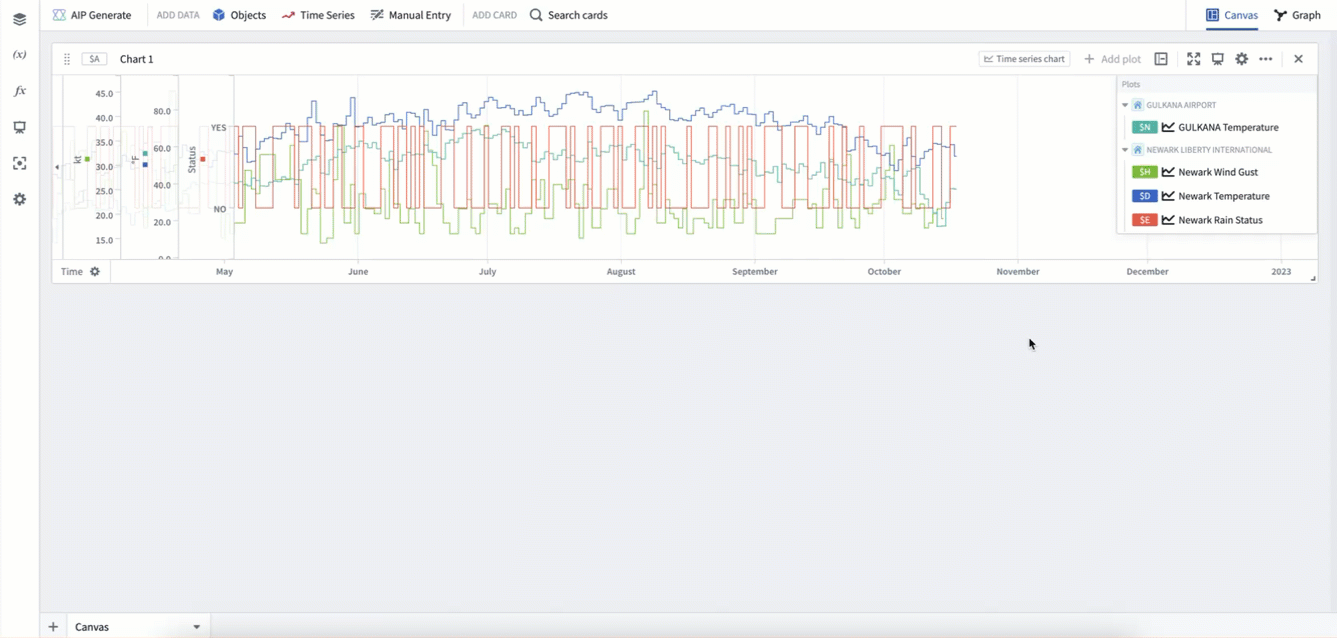
In the example below, we first drag the plot Newark Rain Statis from the legend onto the canvas to move it to a new chart. Then, we drag the root object NEWARK LIBERTY INTERNATIONAL from the legend onto the new chart, which moves the plots Newark Wind Gust and Newark Temperature onto the new chart. Lastly, we use the Move plot section of the next actions menu to move some of these plots back into the original chart.
Formatting plots
Plots have many different display options for visualization. To view the full configuration options for an individual plot, select the Configure plot (![]() ) icon in the chart legend, then open the Display tab in the editor panel.
) icon in the chart legend, then open the Display tab in the editor panel.
Common plot display options include:
- Display as lines or points
- Line width
- Showing a subtle gradient below time series lines
- Showing points and configuring point size, shape, and fill options
- Rendering as a dashed or solid line
- Line color
Configuring a plot's interpolation can also be used to update the shape of the time series line between any two points.
In the example below, we first select Configure plot in the legend to open the plot's editor panel. Then, we rename the plot. Next, we update its internal intpolation to Previous. Lastly, we select the Display tab and update the line width, gradient, and color.
Formatting charts
Charts have their own set of display options. Both the y-axes and the legend can be moved through drag and drop. Additionally, configuring a chart and selecting the Display tab in the editor panel will give additional display options such as showing global identifiers, legend style, and axis style.
A chart caption can also be toggled on or off through the More actions menu in the chart card's header. The More actions menu also contains other chart actions such as downloading the data as a CSV, duplicating the chart, and deleting it.
In the example below, we drag the legend to the right-hand side, and the y-axis to the left-hand side. Then we select the chart's Configure button and open the Display tab to update the legend style to Side and the overlay y-axis setting to False. These two display settings can be useful if you do not want your axes or legends to cover any plot data.
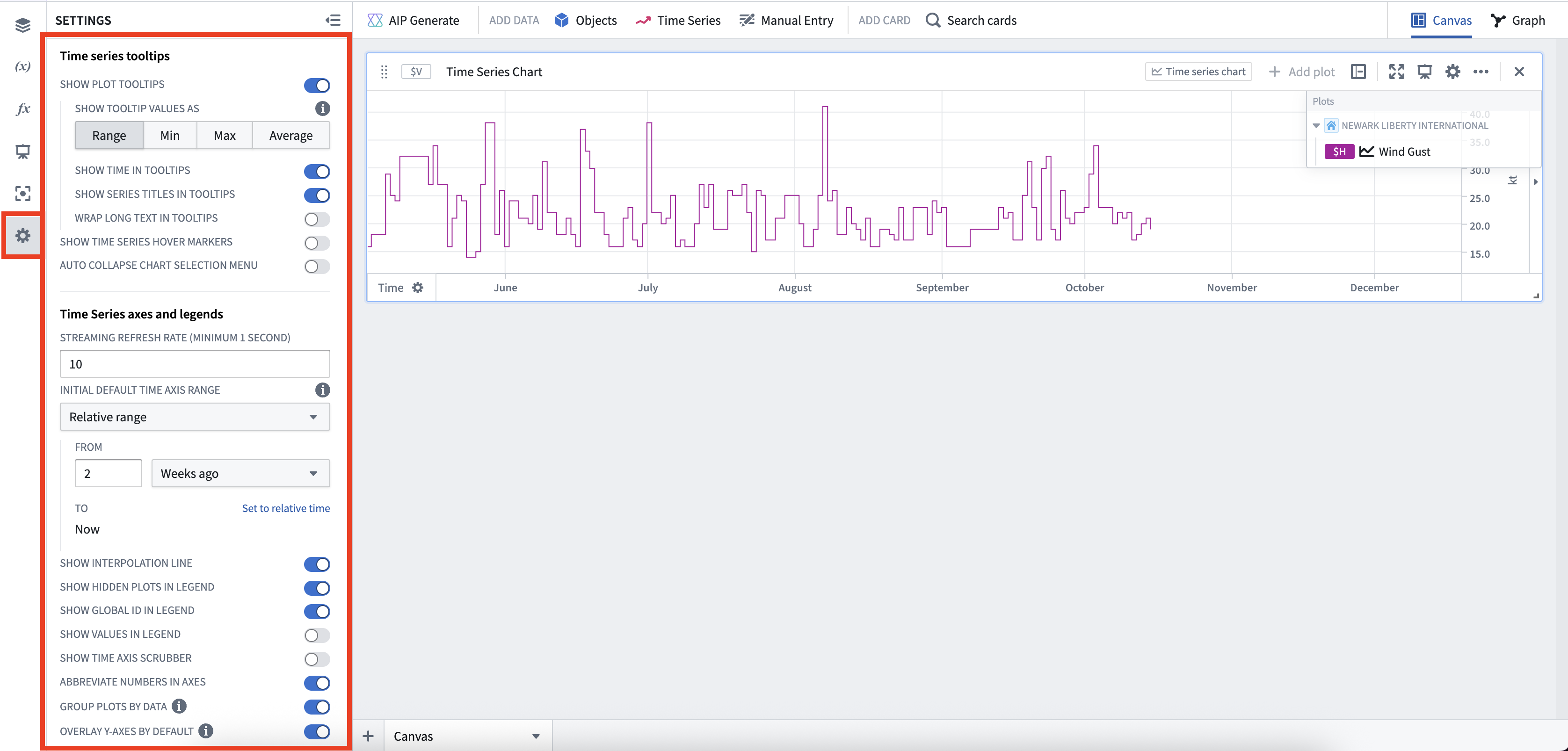
Analysis time series settings
Along with plot and chart specific display options, Quiver supports a large number of additional time series display options at the analysis level in the settings panel. Here, you can configure time series tooltips, time series axes and legends, and time series date/number formatting.
View the full list of configurable settings.
Configuring axes
Select an axis label to open its configuration window.
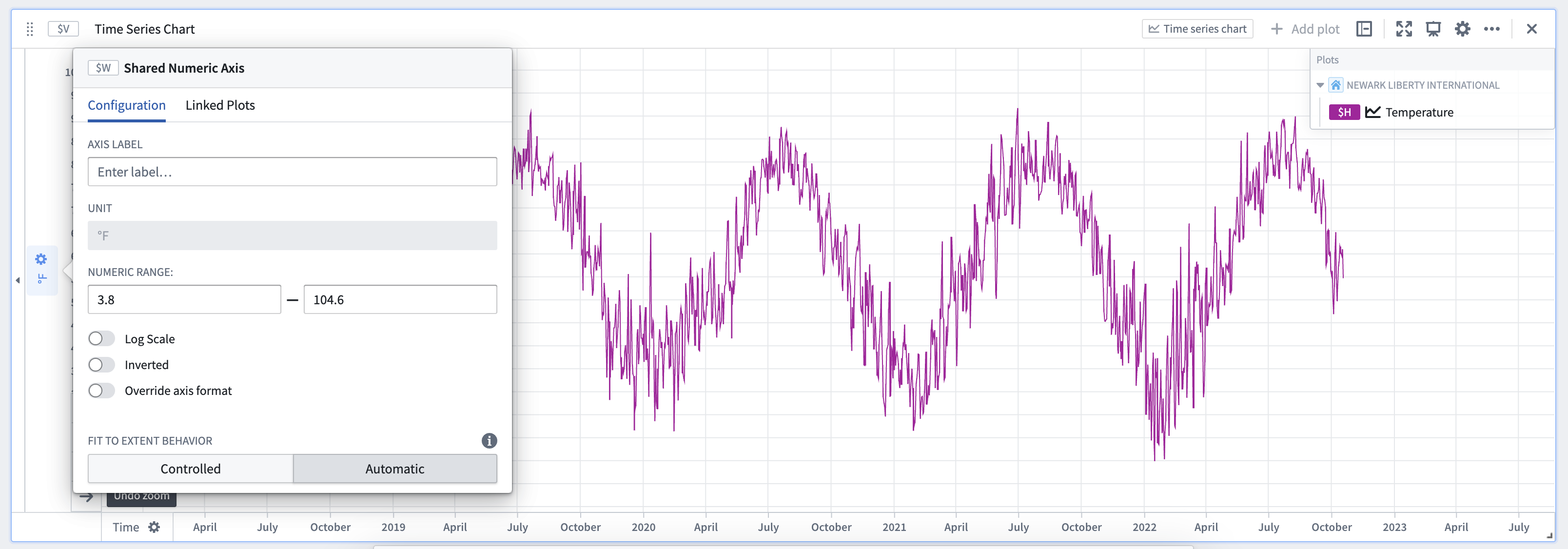
Value axis (y-axis) configuration
From the value axis (y-axis) configuration window, you can:
- Customize the axis label (by default, Quiver uses the unit of an axis as the axis label).
- Manually set the default display range.
- Choose logarithmic scale display.
- Invert the scale (change scale to increase from top to bottom).
- Change the axis format (for example, choosing percentage or currency format, adding a suffix or prefix, choosing scientific notation, displaying negative numbers in parentheses, and more).
Y-axes can also be collapsed on one or both sides of the chart to maximize the chart display area. To do this, select the small triangle icon next to the axis.
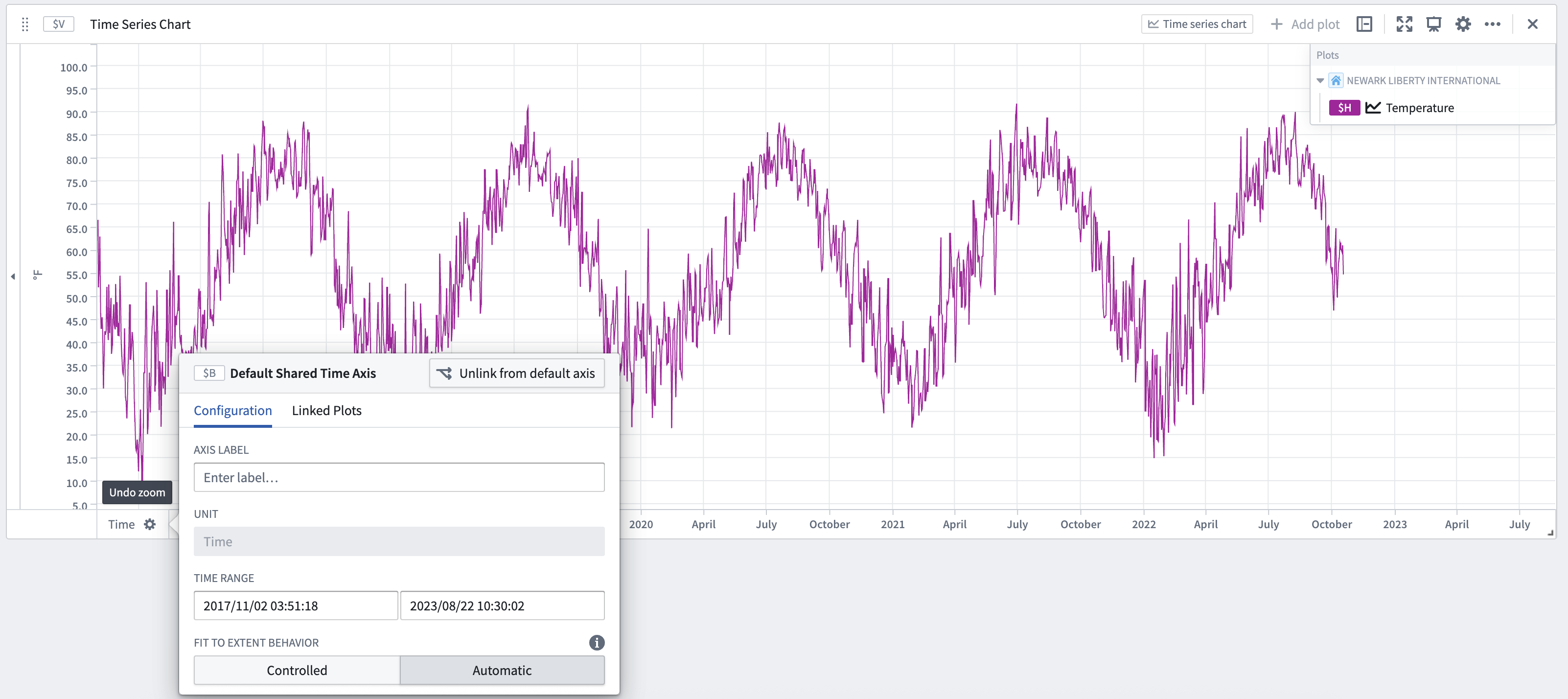
Time axis (x-axis) configuration
From the time axis (x-axis) configuration window, you can:
- Customize the axis label (by default, Quiver uses the unit of an axis as the axis label).
- Manually set the default display range.
- Configure the fit to extent behavior
- Control the behavior of the Stream button
The time axis (x-axis) supports two modes of fit to extent behavior:
-
Automatic: Find the earliest and latest points for all plots using the axis. This is the default mode for all time series charts.
-
Controlled: Allows controlling the endpoints directly or from a time-range source such as a time range parameter. If the Re-enable fit to extent on updates toggle is turned on, the fit to extent configuration will switch back to Automatic mode when any of the plots data updates.
By default, activating the Stream button enables analysis-wide streaming. This behavior can be configured to only stream the selected axis by enabling the Stream individual axis setting in the configuration window. If streaming is turned on for a time axis, you can also configure the streaming axis behavior by selecting one of the following options:
- Rolling A fixed-size window that rolls forward as new data points are streamed
- Growing A view range with a fixed start time, and a dynamic range end that will grow with streaming updates
- Fixed A fixed view range that will not change with streaming updates
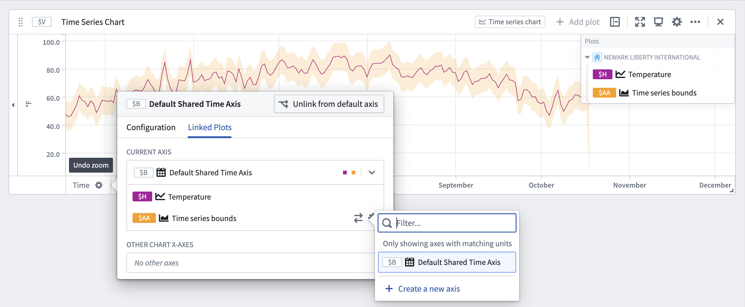
Linking and sharing axes
By default, Quiver automatically links all time axes across time series charts. As a result, when you pan or zoom one chart's time axes, the zoom range of other time series charts in the canvas will update synchronously.
For value axes, by default, axes are unlinked across charts. When on the same chart, plots use the same y-axis if they share the same units. If you would like to force two plots to be on the same axis, you can configure a plot's Unit options to override its unit. Y-axes in the same chart can also be dragged and dropped ontop of each other to merge them.
While Quiver defaults axes to the settings above, you can also manually link and unlink axes, and configure which plots are connected to which axes. To do this, after opening an axis's configuration window, select the Linked Plots tab. From here you can individually move plots between axes, regardless of which chart they are on.
Time and values ranges
Time and value ranges can be used to highlight and drill down on anomalies in the data, such as specific time periods when an issue was observed or the temperature range when equipment was operating in optimal capacity. Ranges can also be used to enrich the time series data by capturing context on specific time periods or value ranges, such as periods when equipment maintenance took place.
Learn how to configure and use time and value ranges.
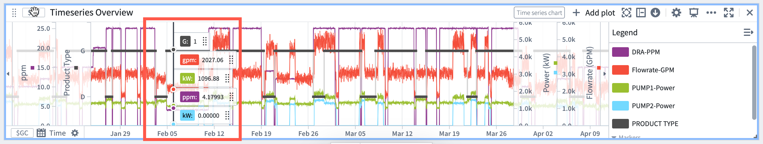
Date markers
Date markers are visual symbols (vertical lines) that help identify and distinguish individual data points in the plotted time series. The data points from time series plots that intersect with the date marker are shown in labels on the chart for each plot.
Date markers are controlled by date/time parameters. When adding a marker to a time series chart, a date/time parameter will automatically be added and used as input to the date marker.
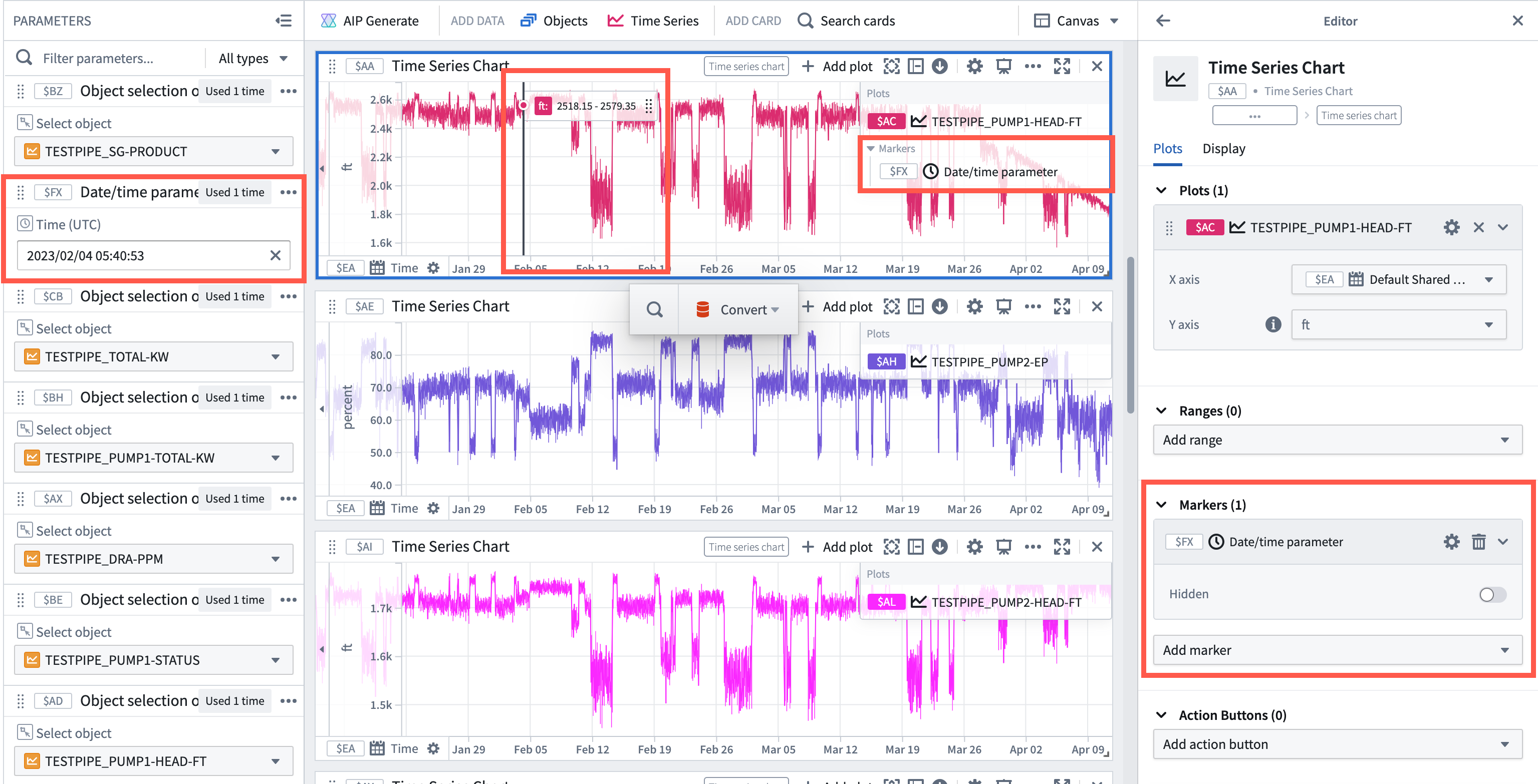
Add a marker
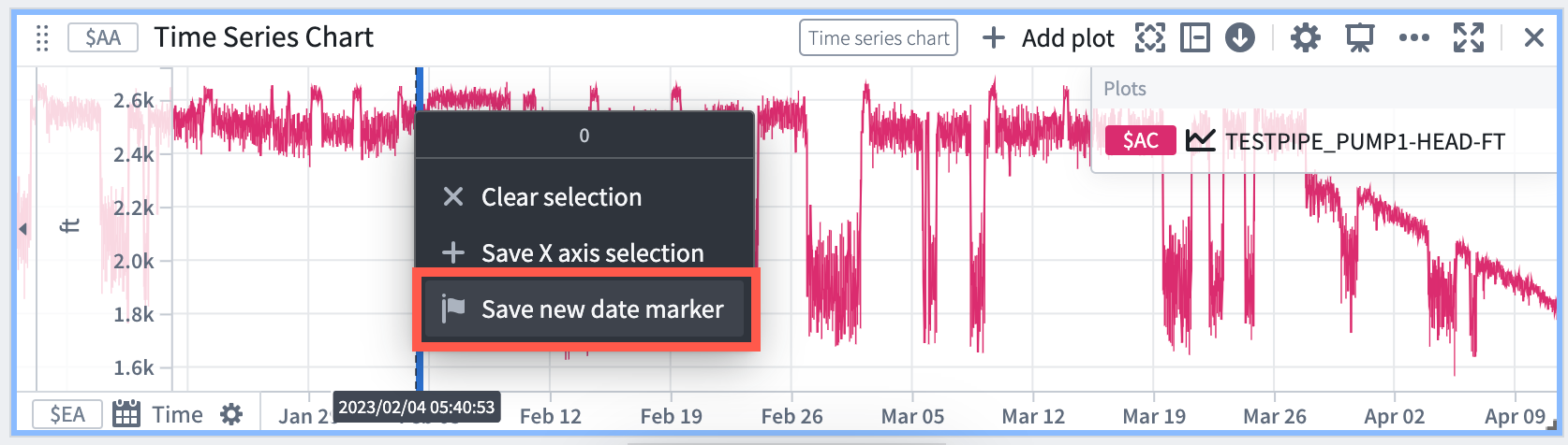
To add a marker to a time series chart:
- Move the cursor over the chart to the desired time and select the chart.
- Select Save new date marker.
Delete a marker
To delete a marker from a time series chart, hover over the marker in the time series chart and select the trash icon.
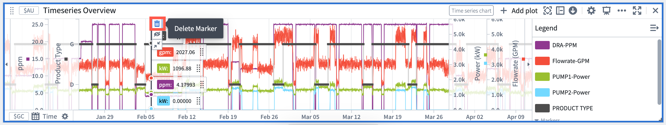
Alternatively, open the time series chart editor, navigate to the Markers section and select the trash icon next to the desired marker. 
Annotate ranges with action buttons
Action buttons can be added to a time series chart to allow users to write data back to the Ontology. For example, users can create objects, update properties on existing objects, or modify object links.
Learn how to expose Ontology Action buttons directly from the selection menu of a time series chart.
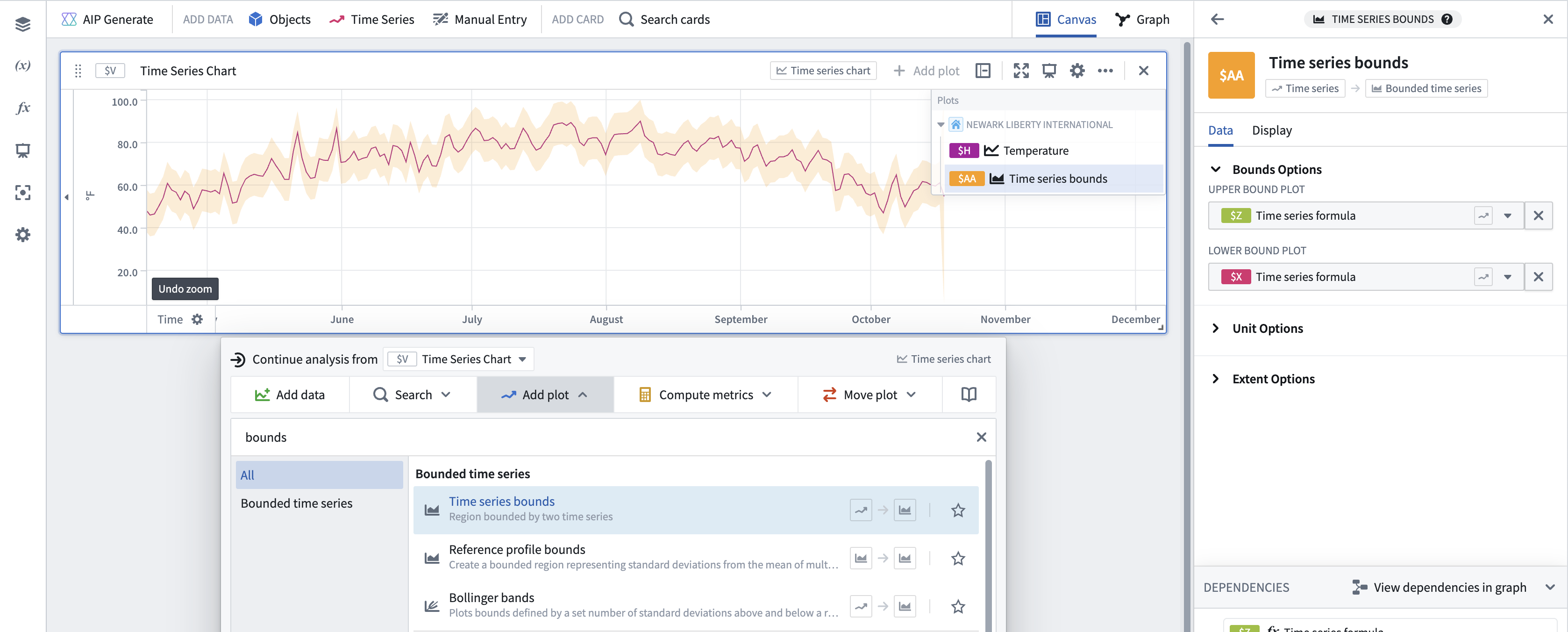
Shade areas with bounded time series
You can use bounded time series to shade areas of a time series chart. Bounded time series consist of an upper-bound series and a lower-bound series, and shades the area in between them.
Common bounded time series plots include:
- Bollinger bands: Plotting Bollinger bands over a rolling time window.
- Time series bounds: Plots the region bounded by two time series.
中文翻译
可视化时间序列
Quiver 提供了丰富的功能来可视化时间序列。
在讨论 Quiver 中的时间序列可视化时,我们使用以下术语:
| 术语 | 描述 |
|---|---|
| 图表(Chart) | 时间序列图表是 Quiver 画布上的一张卡片,作为查看时间序列的容器。当您将时间序列数据添加到分析中时,会自动创建时间序列图表。图表上可以包含多个时间序列图(Plot)。它们还包含一个或多个 x 轴和 y 轴。 |
| 图(Plot) | 单个时间序列的视觉表示。一个图一次只能在一个图表上查看。 |
| 轴(Axis) | 定义图表上视图范围的 x 轴或 y 轴。轴的类型可以是时间、相对时间、数值或序数。轴可以在多个图表之间共享。 |
例如,在下图中,我们有两个时间序列图表。第一个图表,图表 1,上有三个时间序列图:Gulkana Temperature、Newark Temperature 和 Newark Wind Gust。该图表还有两个数值 y 轴:kt 和 °F。两个温度图使用 °F 轴,而阵风图使用 kt 轴。第二个图表,图表 2,上有一个分类时间序列图:Newark Rain Status。它使用序数 y 轴:Status。两个图表共享同一个 x 轴:Time。
平移和缩放
时间序列图表是可交互的,允许您平移和缩放。将鼠标悬停在轴上会显示平移、放大和缩小的按钮。您还可以通过直接拖动轴来进行平移,或者按住 Cmd (macOS) 或 Ctrl (Windows) 并在轴上向上或向下滚动来进行放大或缩小。您还可以通过在主图表区域单击并拖动以选择范围,然后选择 缩放至选定区域(Zoom to selection) 来缩放到图表的特定部分。
平移和缩放后,您可以选择轴上的 适应范围(Fit to extent) 按钮。这将使轴自动调整以显示完整的数据范围。
Quiver 会自动链接所有时间序列图表上的时间轴。因此,当您平移或缩放一个图表的时间轴时,画布上其他时间序列图表的缩放范围将同步更新。
在图表之间移动图
有几种方法可以通过在图表之间移动图来组织您的图。
首先,您可以通过从图表图例中拖动图来移动它们。将图拖到另一个图表上会将其移动到该图表。将图拖到画布上会创建一个新图表。如果按根对象分组,您可以类似地拖动该对象,以将所有使用该对象的图移动到不同的图表。
其次,您可以使用图表的下一个操作菜单中的 移动图(Move plot) 部分来移动图。这允许将当前图表中的图移动到其他图表,也支持将其他图表中的图引入当前图表。
最后,您可以使用分析内容面板在图表之间拖放图。
在下面的示例中,我们首先将图 Newark Rain Status 从图例拖到画布上,将其移动到一个新图表。然后,我们将根对象 NEWARK LIBERTY INTERNATIONAL 从图例拖到新图表上,这将把图 Newark Wind Gust 和 Newark Temperature 移动到新图表上。最后,我们使用下一个操作菜单中的 移动图(Move plot) 部分将其中一些图移回原始图表。
格式化图
图有许多不同的显示选项用于可视化。要查看单个图的完整配置选项,请选择图表图例中的 配置图(Configure plot) (![]() ) 图标,然后在编辑器面板中打开 显示(Display) 选项卡。
) 图标,然后在编辑器面板中打开 显示(Display) 选项卡。
常见的图显示选项包括:
- 显示为线条或点
- 线宽
- 在时间序列线下方显示微妙的渐变
- 显示点并配置点的大小、形状和填充选项
- 渲染为虚线或实线
- 线条颜色
配置图的插值(interpolation) 也可用于更新任意两点之间时间序列线的形状。
在下面的示例中,我们首先在图例中选择 配置图(Configure plot) 以打开图的编辑器面板。然后,我们重命名该图。接下来,我们将其内部插值更新为 Previous。最后,我们选择 显示(Display) 选项卡并更新线宽、渐变和颜色。
格式化图表
图表有自己的一套显示选项。y 轴和图例都可以通过拖放来移动。此外,配置图表并在编辑器面板中选择 显示(Display) 选项卡将提供额外的显示选项,例如显示全局标识符、图例样式和轴样式。
图表标题也可以通过图表卡片标题中的 更多操作(More actions) 菜单来打开或关闭。更多操作(More actions) 菜单还包含其他图表操作,例如将数据下载为 CSV、复制图表和删除图表。
在下面的示例中,我们将图例拖到右侧,将 y 轴拖到左侧。然后,我们选择图表的 配置(Configure) 按钮并打开 显示(Display) 选项卡,将图例样式更新为 Side,并将覆盖 y 轴设置更新为 False。如果您不希望轴或图例覆盖任何图数据,这两个显示设置会很有用。
分析时间序列设置
除了图和图表特定的显示选项外,Quiver 还在[设置面板(s