Time series X/Y plots(时间序列 X/Y 图(Time series X/Y plots))
Quiver contains several cards for finding trends by comparing time series values between series or analyzing the frequency of values within the same series.
Quiver supports the following features:
- Creating time series scatter plots by plotting one time series against another.
- Performing linear regression on a time series scatter plot to detect trends.
- Adding numeric formulas based on object properties to scatter plot charts.
- Creating an empirical distribution of time series values over a given time period.
- Creating an empirical distribution of two time series using a heat grid.
Example workflow: Exploring trends in stock data
In this example, we will compare trends in prices between the CMG and AAL stocks. We start by adding both series to our analysis.
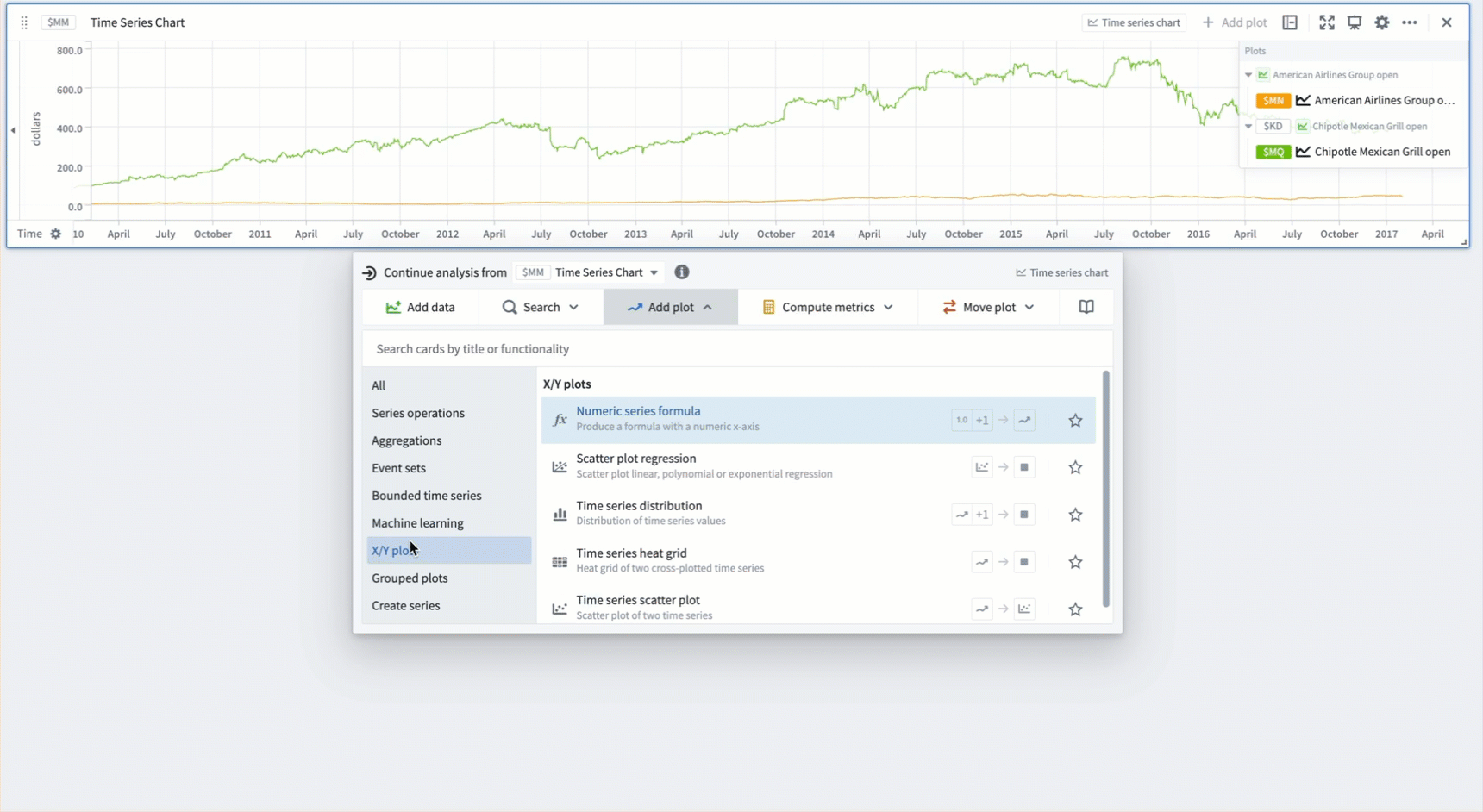
Adding a scatter plot
We would like to investigate whether these stock prices are correlated. To test this, we create a scatter plot. For each bucketed timestamp, Quiver generates a point representing the prices of CMG and AAL:
- Hover over the chart to open the next actions menu.
- Select Add plot > X/Y plots > Time series scatter plot.
- Input the AAL time series as the
Source X Plotand the CMG time series as theSource Y plot. - Creating a scatter plot may be quite expensive for larger time series. Toggle on the Bucketing option and decrease the number of buckets if needed. This will result in fewer points being generated which can improve performance.
Plotting a scatter plot regression
There appears to be a positive correlation between the prices of these two stocks. To quantify this, we can run a scatter plot regression:
- Hover over the chart to open the next actions menu.
- Change the card next to Continue analysis from in the menu header from
Time Series Chartto the scatter plot from the previous section. - Select Visualize > Scatter plot regression.
While we choose to use linear regression for this example, you can also perform exponential and polynomial regression.
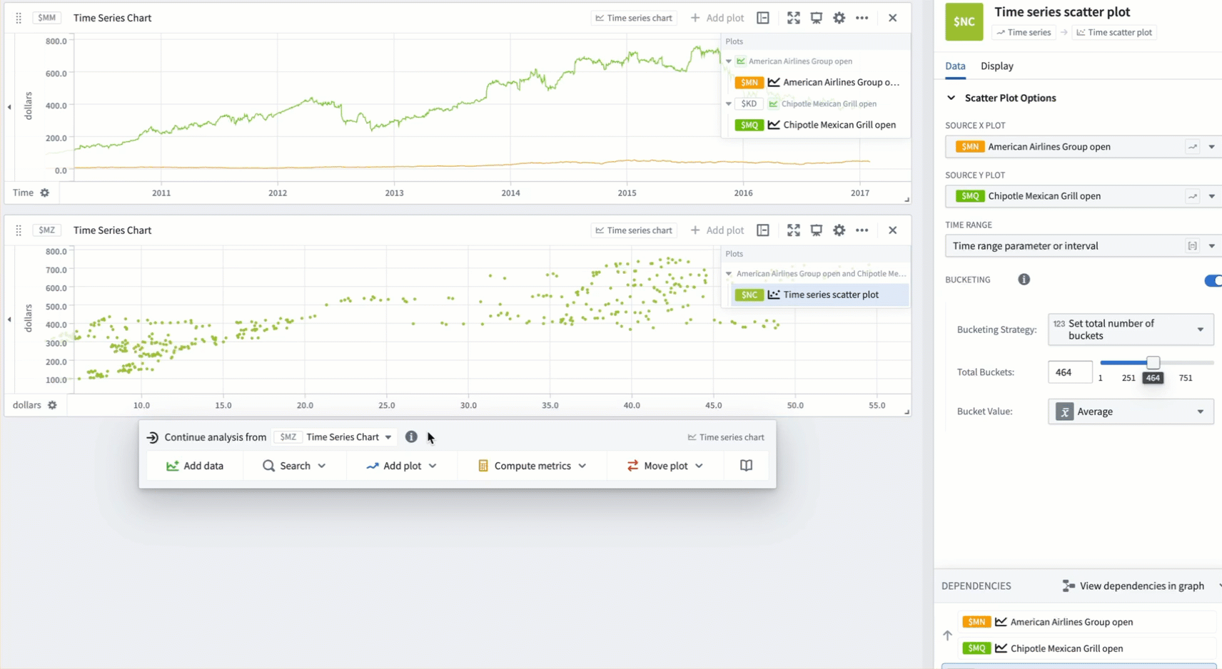
We would now like to see whether time plays a role in this trend. For this, we can toggle on the Color points by time option in the Display tab of the scatter plot. Toggling on Show color time legend allows us to see at a glance what time ranges correspond to different colors.
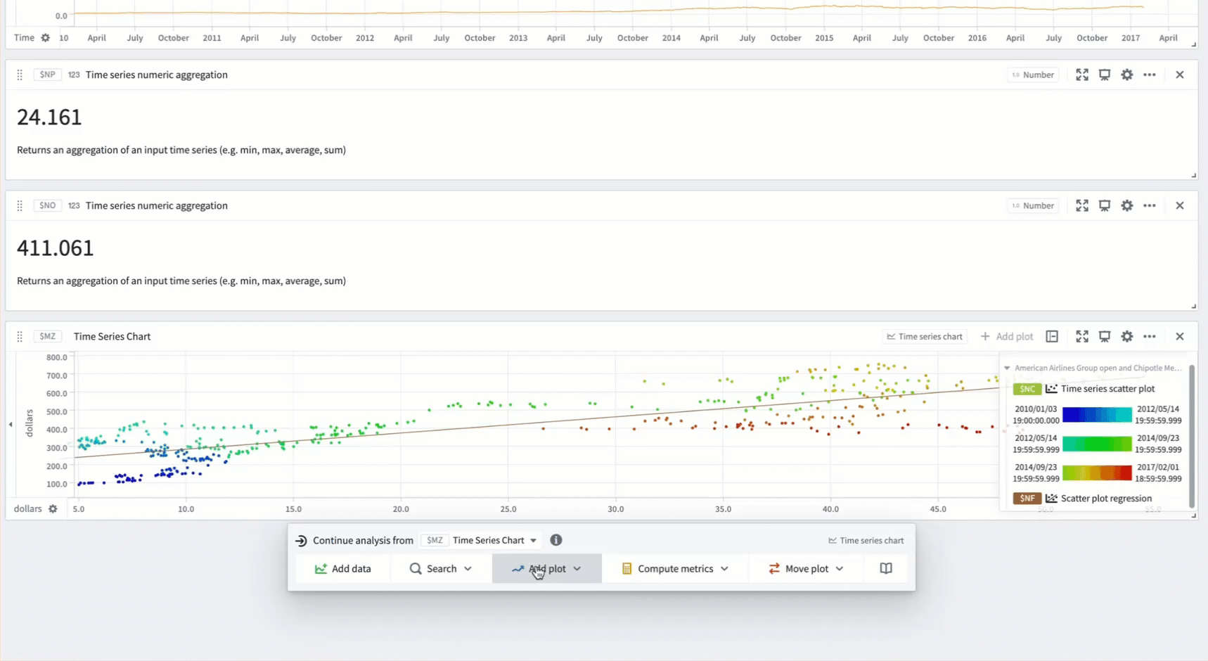
Marking plot averages
Finally, we would like to mark the average prices of CMG and AAL on the chart. To do this, we first use the time series numeric aggregation card to compute the averages. We can use the numeric series formula to draw a horizontal line depicting the average price of CMG:
- Hover over the chart to open the next actions menu.
- Select Add plot > X/Y plots > Numeric series formula.
- Reference the metric card with the average stock price for CMG in the formula.
- Change the
X Unit Labeland theY Unit Labelto dollars to match the labels on the scatter plot chart. - Drag the numeric series formula plot into the chart with the scatter plot and drag its x-axis into the existing chart x-axis to combine them.
Finally, we add a numeric marker on the chart to draw a vertical line depicting average price of AAL:
- Select the gear icon in the chart header.
- Scroll down to the Markers section and select Add marker. Input the metric card with the average stock price for AAL.
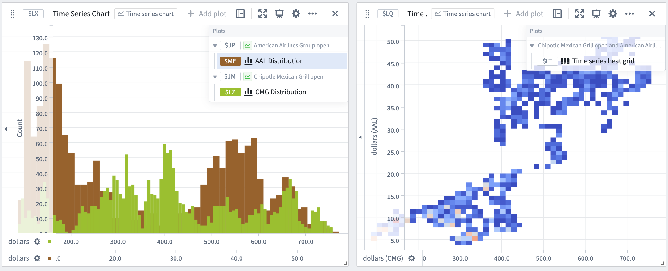
Distributions and heat grids
Now, we would like to compare the distributions of the CMG and AAL stocks. We can do this using the time series heat grid and time series distribution cards. To configure the time series heat grid:
- Hover over the chart to open the next actions menu.
- Select Add plot > X/Y plots > Time series heat grid.
- Input the AAL time series as the
Source X Plotand the CMG time series as theSource Y plot.
By configuring the number of bins, we can adjust the granularity of the distributions. We can also change the color scheme of the heat grid from the Display tab.
To configure the time series distribution:
- Hover over the chart to open the next actions menu.
- Select Add plot > X/Y plots > Time series distribution.
- Select the AAL time series as the
Source plot. - Repeat steps 1 - 3 for the CMG time series.
- To display the two distributions on the same chart, drag one distribution plot into the chart containing the other plot.
中文翻译
时间序列 X/Y 图(Time series X/Y plots)
Quiver 提供了多种卡片,用于通过比较不同序列间的时间序列值或分析同一序列内值的频率来发现趋势。
Quiver 支持以下功能:
- 通过将一个时间序列与另一个时间序列进行对比,创建时间序列散点图。
- 在时间序列散点图上执行线性回归以检测趋势。
- 在散点图中添加基于对象属性的数值公式。
- 创建给定时间段内时间序列值的经验分布图。
- 使用热力图网格(heat grid)创建两个时间序列的经验分布图。
示例工作流:探索股票数据中的趋势
在本示例中,我们将比较 CMG 和 AAL 股票价格之间的趋势。首先,我们将添加这两个序列到分析中。
添加散点图
我们想要研究这些股票价格是否具有相关性。为了验证这一点,我们创建一个散点图。对于每个分桶时间戳,Quiver 会生成一个代表 CMG 和 AAL 价格的数据点:
- 将鼠标悬停在图表上以打开下一步操作菜单。
- 选择 添加图表(Add plot) > X/Y 图(X/Y plots) > 时间序列散点图(Time series scatter plot)。
- 将 AAL 时间序列输入为
X 轴源(Source X Plot),将 CMG 时间序列输入为Y 轴源(Source Y plot)。 - 对于较大的时间序列,创建散点图可能相当耗费资源。根据需要开启分桶(Bucketing)选项并减少桶的数量。这将减少生成的数据点数量,从而提升性能。
绘制散点图回归
这两只股票的价格之间似乎存在正相关关系。为了量化这种关系,我们可以运行散点图回归:
- 将鼠标悬停在图表上以打开下一步操作菜单。
- 将菜单标题中从以下继续分析(Continue analysis from)旁边的卡片从
时间序列图表(Time Series Chart)更改为上一节中的散点图。 - 选择可视化(Visualize) > 散点图回归(Scatter plot regression)。
虽然本示例选择使用线性回归,但您也可以执行指数回归和多项式回归。
现在,我们想要了解时间是否在这一趋势中起作用。为此,我们可以在散点图的显示(Display)选项卡中开启按时间着色数据点(Color points by time)选项。开启显示颜色时间图例(Show color time legend)可以让我们一目了然地看到不同颜色对应的时间范围。
标记图表平均值
最后,我们希望在图表上标记 CMG 和 AAL 的平均价格。为此,我们首先使用时间序列数值聚合卡片来计算平均值。然后,我们可以使用数值序列公式来绘制一条表示 CMG 平均价格的水平线:
- 将鼠标悬停在图表上以打开下一步操作菜单。
- 选择添加图表(Add plot) > X/Y 图(X/Y plots) > 数值序列公式(Numeric series formula)。
- 在公式中引用包含 CMG 平均股票价格的指标卡片。
- 将
X 轴单位标签(X Unit Label)和Y 轴单位标签(Y Unit Label)更改为美元,以匹配散点图上的标签。 - 将数值序列公式图表拖入包含散点图的图表中,并将其 x 轴拖入现有图表的 x 轴以进行合并。
最后,我们在图表上添加一个数值标记,绘制一条表示 AAL 平均价格的垂直线:
- 选择图表标题中的齿轮图标。
- 向下滚动到标记(Markers)部分,然后选择添加标记(Add marker)。输入包含 AAL 平均股票价格的指标卡片。
分布图和热力图网格
现在,我们想要比较 CMG 和 AAL 股票的分布情况。我们可以使用时间序列热力图网格和时间序列分布图卡片来实现。配置时间序列热力图网格:
- 将鼠标悬停在图表上以打开下一步操作菜单。
- 选择添加图表(Add plot) > X/Y 图(X/Y plots) > 时间序列热力图网格(Time series heat grid)。
- 将 AAL 时间序列输入为
X 轴源(Source X Plot),将 CMG 时间序列输入为Y 轴源(Source Y plot)。
通过配置分箱数量,我们可以调整分布的粒度。我们还可以从显示(Display)选项卡更改热力图网格的颜色方案。
配置时间序列分布图:
- 将鼠标悬停在图表上以打开下一步操作菜单。
- 选择添加图表(Add plot) > X/Y 图(X/Y plots) > 时间序列分布图(Time series distribution)。
- 选择 AAL 时间序列作为
源图表(Source plot)。 - 对 CMG 时间序列重复步骤 1 - 3。
- 要将两个分布图显示在同一图表上,将一个分布图拖入包含另一个分布图的图表中。