Visualize Ontology data(可视化本体数据)
A map's primary capability is to enable visualization and analysis on geospatial data from your Ontology. Once you have added objects to your map, you can configure styling configuration to represent various properties of your objects. At a high level, an object layer contains multiple displays (for example, icons, lines, polygons) that represent the objects on the map. Each display can be styled to represent different properties of the objects, such as color, size, and opacity.
Edit layer styling
To edit the style of a layer, select a layer entry from the Layers panel. The layer details panel will open with multiple sections as tabs:
- Style: Configure the appearance of individual displays, or define default settings that can be applied to multiple displays.
- Legend: Control how the style information for this layer is displayed in the Legend panel.


Layer style
The Style section allows you to configure Shared Defaults that apply to all displays in a layer. The default color and opacity can be linked to specific displays to share consistent styling. See the Value based styling and Opacity styling sections for more information on how to configure the color and opacity.
Displays
An object layer can contain many displays, each of which is a different way of representing the layer's objects on the map or in the timeline. By combining multiple displays, you can create complex visualizations to represent multiple properties at once and provide a more detailed view as you zoom in. The various display types available are:
- Icons and circles: Placed according to a geopoint property.
- Lines and polygons: Based on a geoshape property or multiple geopoint properties.
- Track lines, breadcrumbs, and heatmaps: Helps visualize objects that move over time.
You can add a new display using the Add display option below the Style section.
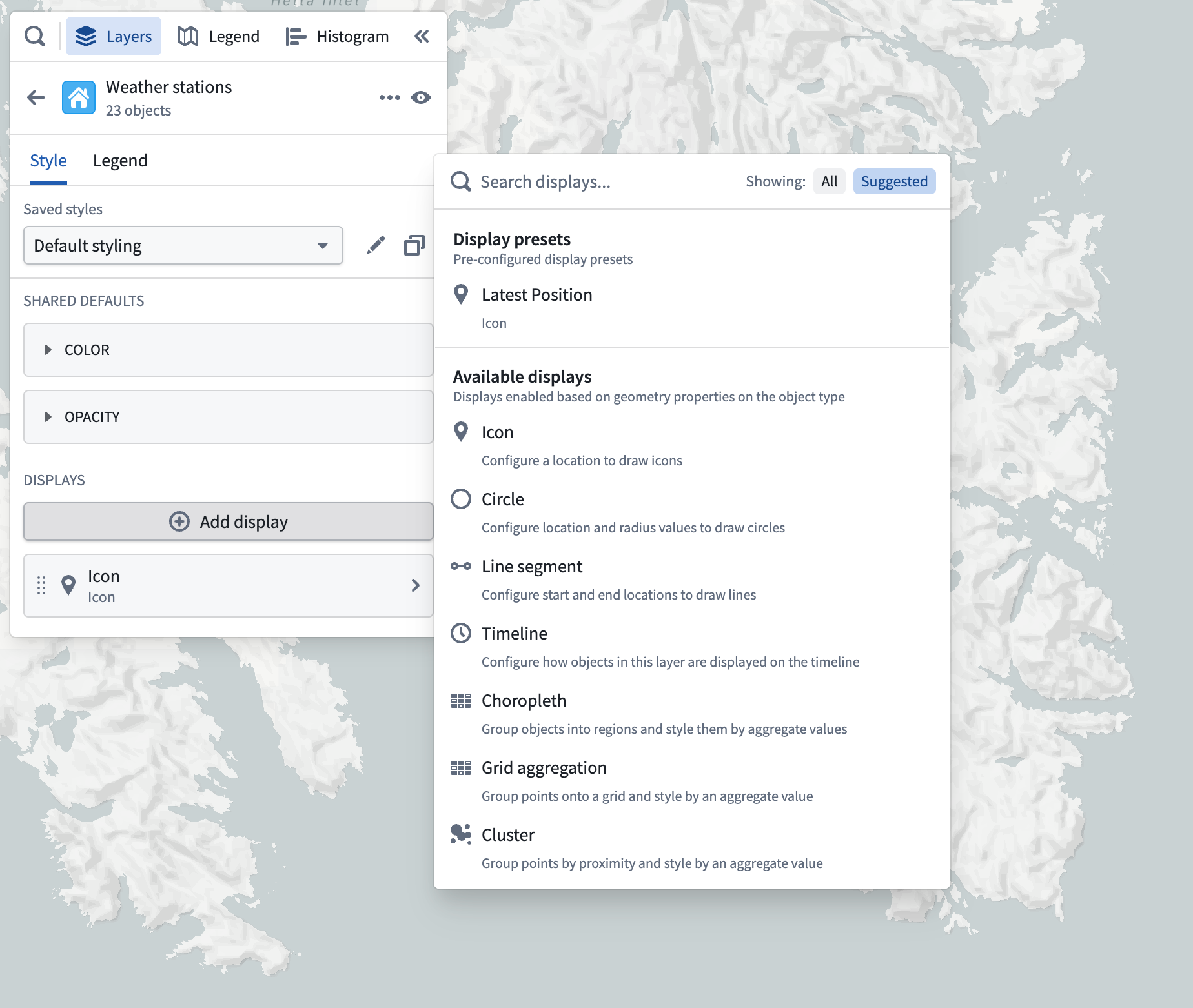
The add display menu has two sections:
- Display presets: Choose a property available on the object type for the layer, and add a display configured to use that property to the map.
- Available displays: Select from all the various display types that can be rendered by the Map. Only those displays which can be fully configured for the layer's object type are enabled.
Each display contains many customizable attributes which are covered in detail on each display's respective page. Most attributes on displays follow the value-based styling paradigm described in the following section.
Value-based styling
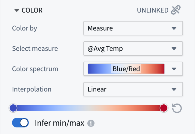
Use Value-based styling to control the appearance of a display rendered for an object by a value associated with that object. For example, you can configure the color of an icon to represent the temperature of a weather station, or the size of a circle to represent the number of employees at a company. The most common types of attributes that use value-based styling are colors and numeric attributes (for example, line width, icon size, circle radius, etc.).
The idea is that for each object being rendered, you specify a value source, which determines the a value to use for styling from each object being rendered. Then, specify some way of converting a value into the style attribute (for example, color, size, opacity). The value sources typically available for each stylable attribute are:
- Fixed: Explicitly select a single style value that will be applied uniformly to all objects in the layer.
- Property: Style each object according to a property on the object.
- Function: Style each object according to a value computed by a function.
- Measure: Style each object according to a time series measure.
Once you have selected the value you wish to use, the configuration for converting it into a style value (a color, line width, circle radius, and so on) depends on the type of attribute you are styling.
Color styling
The following sections describe the color-styling options available for each type of attribute.
Fixed
When using a fixed color style, select a single color that will be applied uniformly to all objects in the layer, by using the color picker.
Value-based
When coloring by a function, property, or time series that has numeric values, use the gradient editor to map values to output colors. The colors used in the gradients can be edited by selecting points the gradient bar. The numerical range (min/max) for the color gradient is automatically inferred, but this can be toggled off to set the range manually.
When coloring by a function, property, or time series that has string values, the Color mapping dropdown menu contains methods for mapping values to colors:
- Manual: Explicitly specify colors to use per-value.
- Automatic: Assign colors from a color scheme automatically to differentiate between different values without having to configure specific values.
- None: Attempt to apply each value directly as a hex color.
Numeric styling
The following sections describe the numeric-styling options available for each type of attribute.
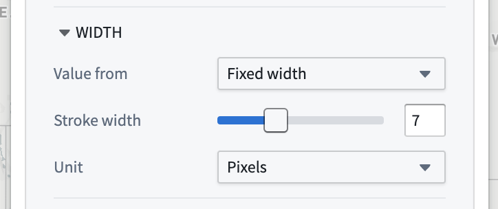
Fixed
When using a fixed numeric style, specify the numeric value by using the slider or entering an exact number in the input field.
Value-based
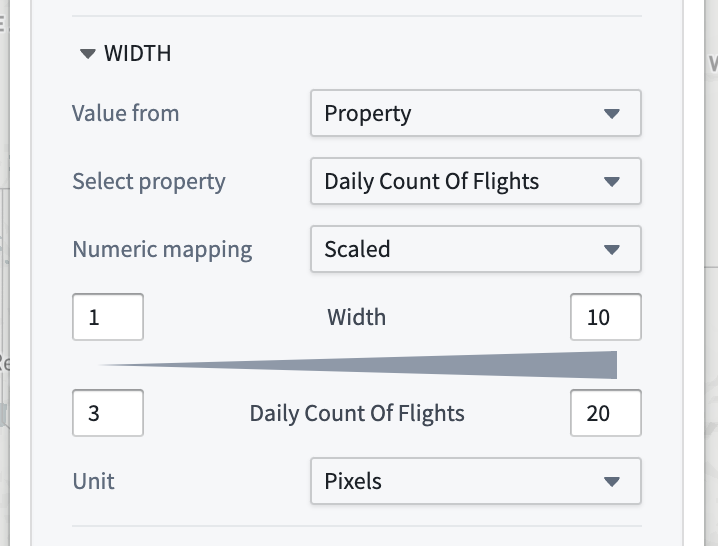
When styling a numeric attribute (for example, line width or icon size), only properties that have numeric values can be used as a value source. Configure a mapping from your selected value source to the style attribute by selecting a Numeric mapping option:
-
Scaled: Define a linear scale to convert a value from the object to the number used for styling.
-
The top row controls the minimum and maximum values for the styling attribute, while the bottom row determines the range of values that will correspond to those min/max values.
- In this example, the line width will be
1pixel for an object that has a "Departing Flights" property value of20, and10pixels when the property value is500. - None: The value of the property will be used directly as the style attribute, without any scaling or transformation.
Opacity styling
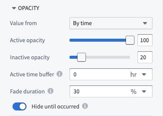
Use the Opacity section to control the transparency for objects in the layer.
The Value from dropdown menu contains the various ways in which you can specify opacity:
- Fixed: Select a single opacity that uniformly applies to all objects in the layer.
-
By time: When rendering tracks or objects that are events, control their opacity based on the global time selection.
-
Active opacity: Sets the opacity when the object or point is considered active.
- Inactive opacity: Sets the opacity when the object or point is not considered active.
- Active time buffer: Sets how temporally close an event or track point's timestamp must be to the current time cursor for it to be considered active.
- Fade duration: Sets the time period over which an object's opacity fades from the active to inactive opacity, once it becomes inactive.
- Hide until occurred: If enabled, an object will be fully hidden until the time cursor has passed the start of the event or a track point's timestamp.
:::callout{theme="neutral"} The Value from dropdown and By time opacity options will only appear when styling tracks or objects with event data. Otherwise, the opacity section will only display the fixed opacity option. :::
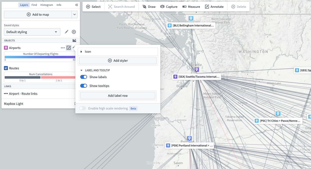
Labels
Define custom labels to showcase important information as text on the map. Use the following attributes to control how labels appear for each display:
- Visibility: Configure when labels are shown on the map.
- Always visible: Labels are shown for every object represented by the parent display.
- Only on hover: Labels are shown as a cursor pop-up when a user hovers over one or more objects.
- Hidden: No label information is shown.
- Style: For always-visible labels, control the appearance of the label content with the following options.
- Card: Labels are shown on a solid background to ensure high contrast and readability.
- Minimal: Label content is displayed only as text for a cleaner, less obtrusive appearance.
- Enable Header: Display the first label row item with bold text and a more opaque background, making key information immediately recognizable.
- Show Missing Data: Include row entries with null or empty values in the label.
:::callout{theme="neutral"} Note that labels and additional tooltip contents are not supported for layers using tile-based loading methods. If you need labels or custom tooltip contents, ensure you are using the "Object" loading method. :::
Label content for object layers
For object-backed layers, labels may contain the following:
- Properties (including time-series properties)
- Functions
- Series
- Linked object counts
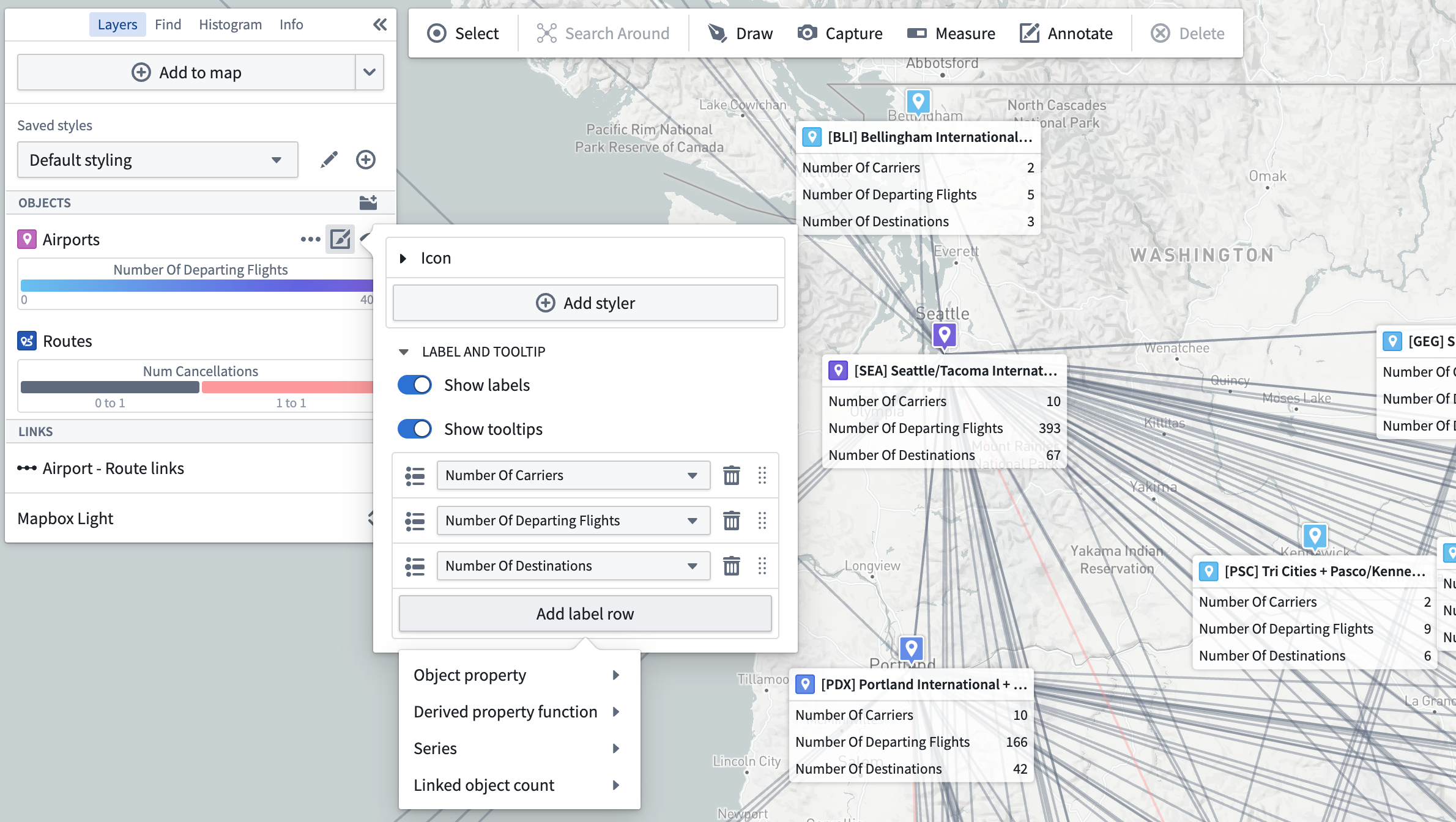
Once added, individual label rows also support the following operations:
- Drag to reorder
- Edit display name
- Show/hide row title
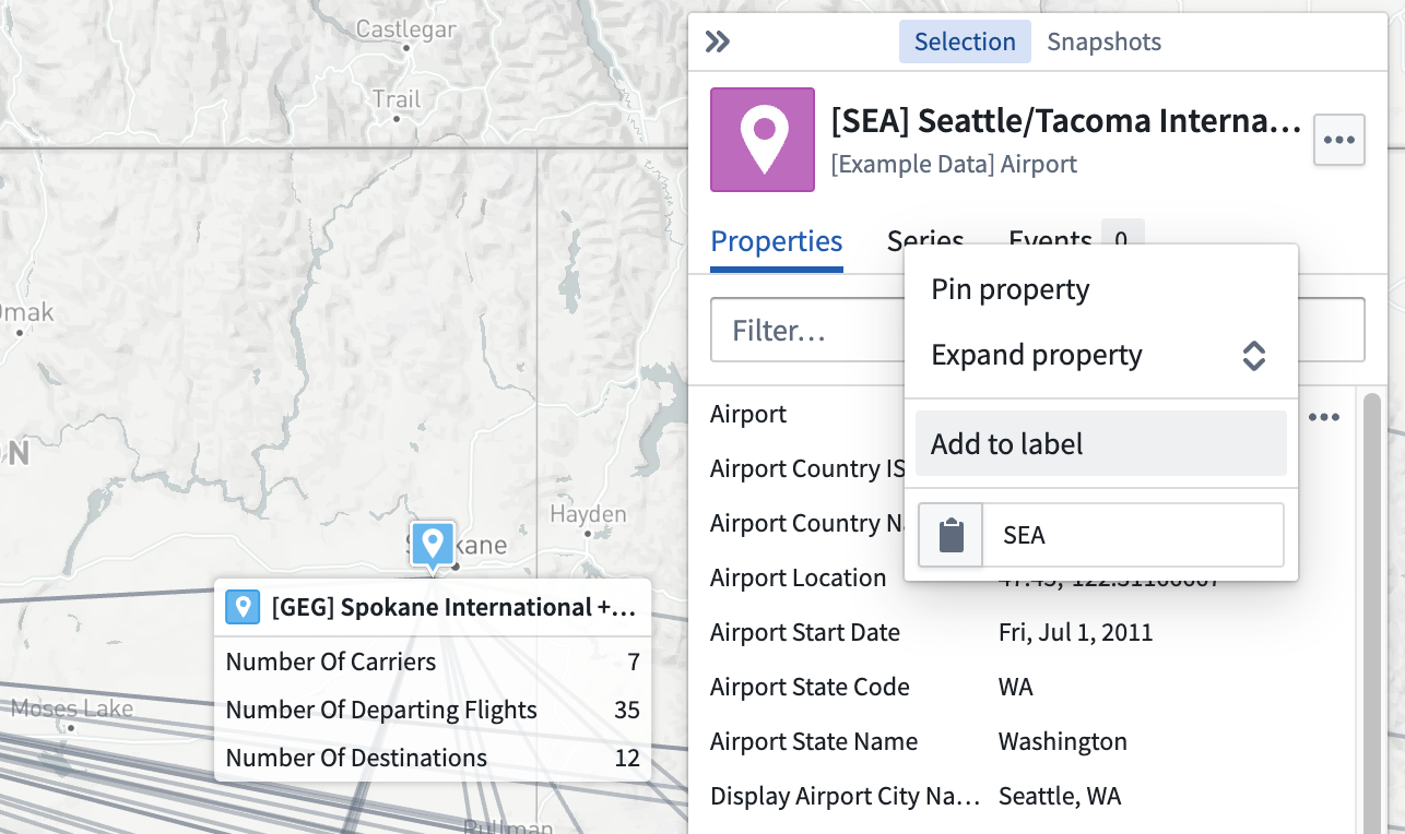
Properties or series can also be added from the selection panel using the … menu that appears when hovering on a property or series, as pictured below.
Display visibility by zoom level
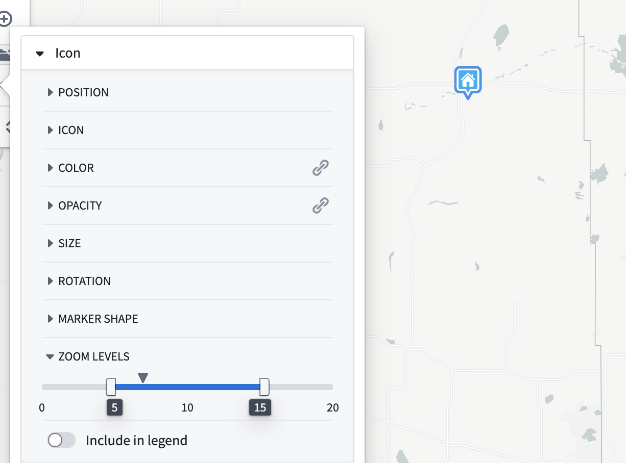
Use the Zoom levels section to control the visibility range of the objects in the layer. The caret symbol indicates your current zoom level.
When the viewport is at a zoom level within the active range, the corresponding display will be rendered on the map. When outside the range, the corresponding display will be hidden.
The zoom level configuration only applies to layers that are toggled to be visible.
Legend
From the Layers details panel, use the Legend tab to preview and control how the layer will be represented. Style information from the layer's displays are included by default in this tab. The title switch determines whether this layer and its associated displays will appear in the Legend panel. Toggle the checkboxes at the row level to hide or show individual entries.

中文翻译
可视化本体数据
地图的核心功能是支持对本体(Ontology)中的地理空间数据进行可视化和分析。将对象添加到地图后,您可以配置样式设置,以呈现对象的各类属性。概括而言,对象图层包含多个显示元素(例如图标、线条、多边形),这些元素在地图上代表对象。每个显示元素都可以通过样式设置来呈现对象的不同属性,如颜色、大小和不透明度。
编辑图层样式
要编辑图层的样式,请从"图层"面板中选择一个图层条目。图层详情面板将打开,并以选项卡形式显示多个分区:
- 样式(Style): 配置单个显示元素的外观,或定义可应用于多个显示元素的默认设置。
- 图例(Legend): 控制该图层的样式信息在图例面板中的显示方式。
图层样式
样式(Style) 部分允许您配置共享默认值(Shared Defaults),这些默认值将应用于图层中的所有显示元素。默认颜色和不透明度可以关联到特定的显示元素,以保持样式一致。有关如何配置颜色和不透明度的更多信息,请参阅基于值的样式和不透明度样式部分。
显示元素
一个对象图层可以包含多个显示元素(displays),每个显示元素都是在地图或时间轴上表示图层对象的不同方式。通过组合多个显示元素,您可以创建复杂的可视化效果,同时呈现多个属性,并在放大时提供更详细的视图。可用的显示类型包括:
- 图标和圆形: 根据地理点属性放置。
- 线条和多边形: 基于地理形状属性或多个地理点属性。
- 轨迹线、面包屑导航和热力图: 帮助可视化随时间移动的对象。
您可以使用样式(Style) 部分下方的添加显示元素(Add display) 选项来添加新的显示元素。
添加显示元素菜单包含两个部分:
- 显示预设(Display presets): 选择图层对象类型上可用的属性,并添加一个配置为使用该属性的显示元素到地图。
- 可用显示元素(Available displays): 从地图可以渲染的所有显示类型中进行选择。只有那些可以为图层对象类型完全配置的显示元素才会被启用。
每个显示元素都包含许多可自定义的属性,这些属性在各自显示元素的页面上有详细介绍。显示元素上的大多数属性都遵循以下部分描述的基于值的样式范式。
基于值的样式
使用基于值的样式(Value-based styling),通过对象关联的值来控制该对象在显示元素中的呈现外观。例如,您可以配置图标的颜色来表示气象站的温度,或配置圆形的大小来表示公司的员工数量。使用基于值样式的最常见属性类型是颜色和数值属性(例如,线宽、图标大小、圆形半径等)。
其核心思想是,对于每个要渲染的对象,您需要指定一个值来源(value source),该来源决定从每个要渲染的对象中获取用于样式的值。然后,指定一种将值转换为样式属性(例如,颜色、大小、不透明度)的方法。每个可样式化属性通常可用的值来源包括:
- 固定值(Fixed): 明确选择一个单一的样式值,该值将统一应用于图层中的所有对象。
- 属性(Property): 根据对象的某个属性为每个对象设置样式。
- 函数(Function): 根据函数计算出的值为每个对象设置样式。
- 度量(Measure): 根据时间序列度量为每个对象设置样式。
选择好要使用的值后,将其转换为样式值(颜色、线宽、圆形半径等)的配置方式取决于您正在设置样式的属性类型。
颜色样式
以下部分描述了每种属性类型可用的颜色样式选项。
固定值
使用固定颜色样式时,通过颜色选择器选择一个单一颜色,该颜色将统一应用于图层中的所有对象。
基于值
当根据具有数值的函数、属性或时间序列进行着色时,使用渐变编辑器将值映射到输出颜色。可以通过选择渐变条上的点来编辑渐变中使用的颜色。颜色渐变的数值范围(最小值/最大值)会自动推断,但可以关闭此功能以手动设置范围。
当根据具有字符串值的函数、属性或时间序列进行着色时,颜色映射(Color mapping) 下拉菜单包含将值映射到颜色的方法:
- 手动(Manual): 明确指定每个值要使用的颜色。
- 自动(Automatic): 自动从配色方案中分配颜色,以区分不同的值,无需配置特定值。
- 无(None): 尝试直接将每个值作为十六进制颜色应用。
数值样式
以下部分描述了每种属性类型可用的数值样式选项。
固定值
使用固定数值样式时,通过使用滑块或在输入字段中输入精确数字来指定数值。
基于值
当为数值属性(例如,线宽或图标大小)设置样式时,只有具有数值的属性才能用作值来源。通过选择数值映射(Numeric mapping) 选项,配置从所选值来源到样式属性的映射:
-
缩放(Scaled): 定义一个线性比例,将对象的值转换为用于样式的数值。
-
顶行控制样式属性的最小值和最大值,而底行确定将对应这些最小/最大值的值范围。
- 在此示例中,对于"离港航班"属性值为
20的对象,线宽将为1像素;当属性值为500时,线宽为10像素。 - 无(None): 属性的值将直接用作样式属性,不进行任何缩放或转换。
不透明度样式
使用不透明度(Opacity) 部分来控制图层中对象的透明度。
值来源(Value from) 下拉菜单包含指定不透明度的各种方式:
- 固定值(Fixed): 选择一个单一不透明度,统一应用于图层中的所有对象。
-
活动不透明度(Active opacity): 设置对象或点被视为活动时的不透明度。
- 非活动不透明度(Inactive opacity): 设置对象或点不被视为活动时的不透明度。
- 活动时间缓冲(Active time buffer): 设置事件或轨迹点的时间戳必须与当前时间光标多近,才能被视为活动。
- 淡出持续时间(Fade duration): 设置对象从不活动到活动不透明度淡出的时间段,一旦其变为非活动状态。
- 发生前隐藏(Hide until occurred): 如果启用,对象将完全隐藏,直到时间光标经过事件开始或轨迹点的时间戳。
:::callout{theme="neutral"} 值来源(Value from) 下拉菜单和按时间(By time) 不透明度选项仅在设置轨迹或具有事件数据的对象的样式时出现。否则,不透明度部分将仅显示固定不透明度选项。 :::
标签
定义自定义标签,以文本形式在地图上展示重要信息。使用以下属性来控制每个显示元素的标签显示方式:
- 可见性(Visibility): 配置标签在地图上的显示时机。
- 始终可见(Always visible): 为父显示元素表示的每个对象显示标签。
- 仅悬停时(Only on hover): 当用户悬停在一个或多个对象上时,标签显示为光标弹出窗口。
- 隐藏(Hidden): 不显示任何标签信息。
- 样式(Style): 对于始终可见的标签,使用以下选项控制标签内容的外观。
- 卡片(Card): 标签显示在纯色背景上,以确保高对比度和可读性。
- 极简(Minimal): 标签内容仅以文本形式显示,外观更简洁、不显眼。
- 启用标题(Enable Header): 将第一个标签行项目以粗体文本和更不透明的背景显示,使关键信息一目了然。
- 显示缺失数据(Show Missing Data): 在标签中包含具有空值或缺失值的行条目。
:::callout{theme="neutral"} 请注意,使用基于瓦片的加载方法的图层不支持标签和额外的工具提示内容。如果您需要标签或自定义工具提示内容,请确保使用的是"对象(Object)"加载方法。 :::
对象图层的标签内容
对于基于对象的图层,标签可以包含以下内容:
添加后,单个标签行还支持以下操作:
- 拖拽重新排序
- 编辑显示名称
- 显示/隐藏行标题
属性或序列也可以从选择面板中,通过悬停在属性或序列上时出现的 … 菜单添加,如下图所示。
按缩放级别控制显示可见性
使用缩放级别(Zoom levels) 部分来控制图层中对象的可见范围。插入符号指示您当前的缩放级别。
当视口处于活动范围内的缩放级别时,相应的显示元素将在地图上渲染。当超出范围时,相应的显示元素将被隐藏。
缩放级别配置仅适用于已切换为可见的图层。
图例
在图层(Layers) 详情面板中,使用图例(Legend) 选项卡来预览和控制图层的表示方式。默认情况下,来自图层显示元素的样式信息会包含在此选项卡中。标题开关决定此图层及其关联的显示元素是否出现在图例(Legend) 面板中。切换行级别的复选框以隐藏或显示单个条目。