Home configuration(主页配置)
Switch to the Home configuration tab to configure the home page of your workspace. In the Home configuration tab (shown below), you can configure the logo, subtitle, and featured items for a workspace.

Logo
By default, your workspace will have a Palantir logo featured in the top-middle of the Carbon home page. You can display a custom logo that has been uploaded to Foundry by navigating to the Logo section and clicking on Select logo.
Continue by selecting your image file in a Project. This image file will now replace the default logo in your Carbon workspace.
To adjust the size of the logo, expand the Dimensions section, where you can set a maximum width and/or height.

To remove a custom logo, you can hover over the logo preview and select the x icon.
Subtitle
In the Subtitle section, you can add a subtitle to be displayed under the logo on the home page. For instance, you could provide a welcome message or description of the workspace.

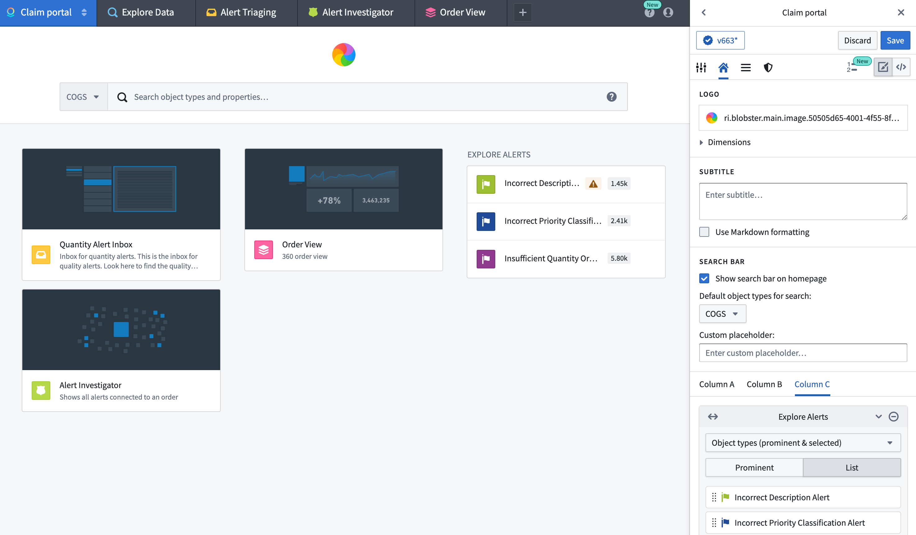
Featured items
The Carbon workspace can prominently display three columns (labeled A, B, and C) that can contain Featured items. There are various types of Featured items that can be displayed, including objects, object types, saved explorations, and more. We recommend curating the home page to ensure that the workspace features the most useful resources for a user’s work.
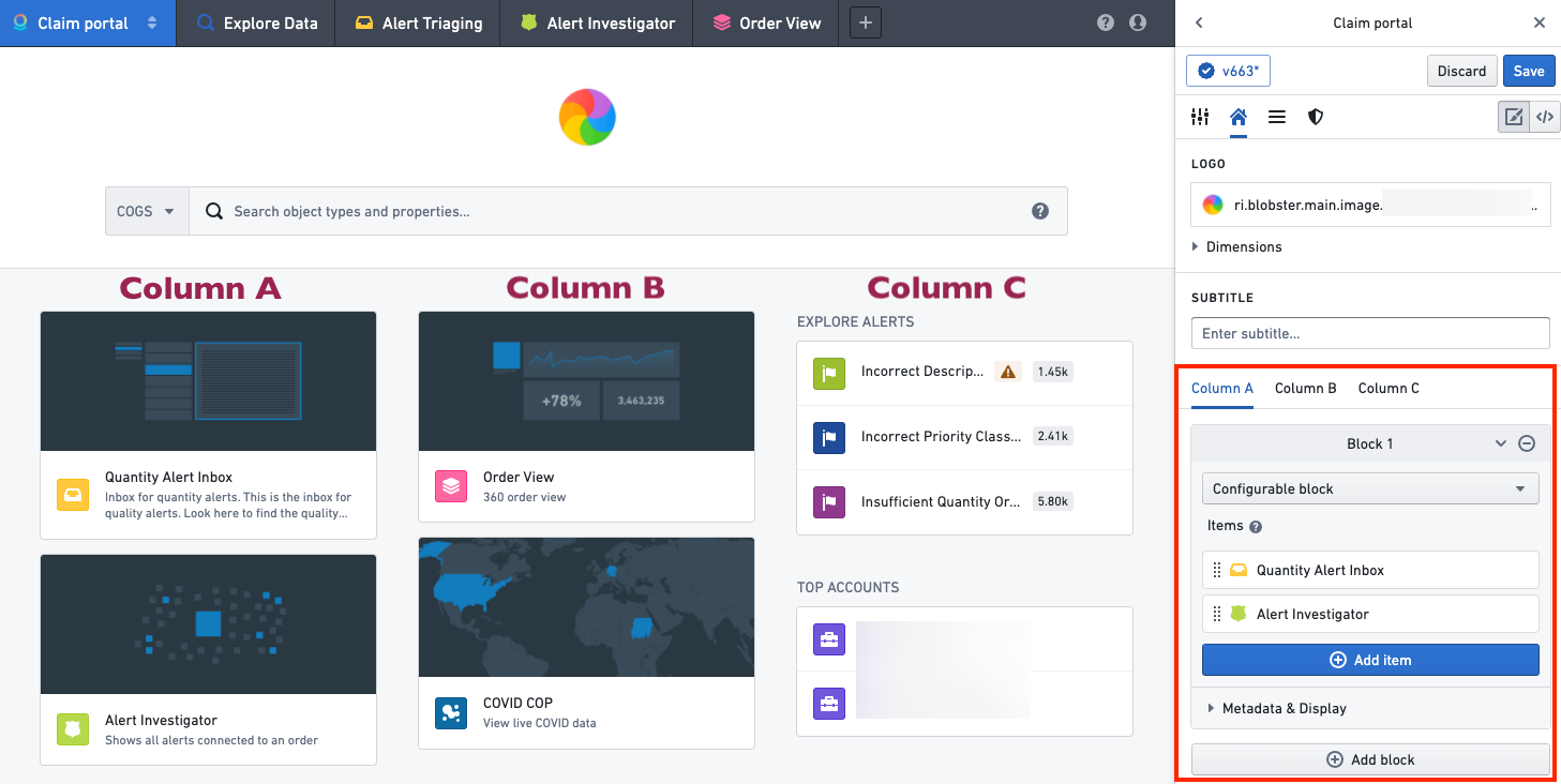
Optionally, columns A, B, and C can contain widgets that group resources together. A widget can be custom configured, or you can select from a list of default options, such as a user's favorite objects or saved explorations.

In a custom configurable widget, each item's appearance can be customized by hovering over the item and selecting the edit icon, which will open an edit dialog.

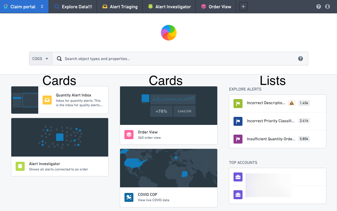
A widget's display can be further configured by adding a title and description and by choosing whether to display the items as a list or as cards. A List display is compact and shows the resource icons along with the name for each element. A Cards display is larger and can include a custom thumbnail image for each element. Cards are generally more useful when there are a small number of items. These options can be configured by expanding the Metadata & Display section in the widget editor.

In the following example, columns A and B each contain one widget displayed as cards, and column C contains two widgets each displayed as a list.
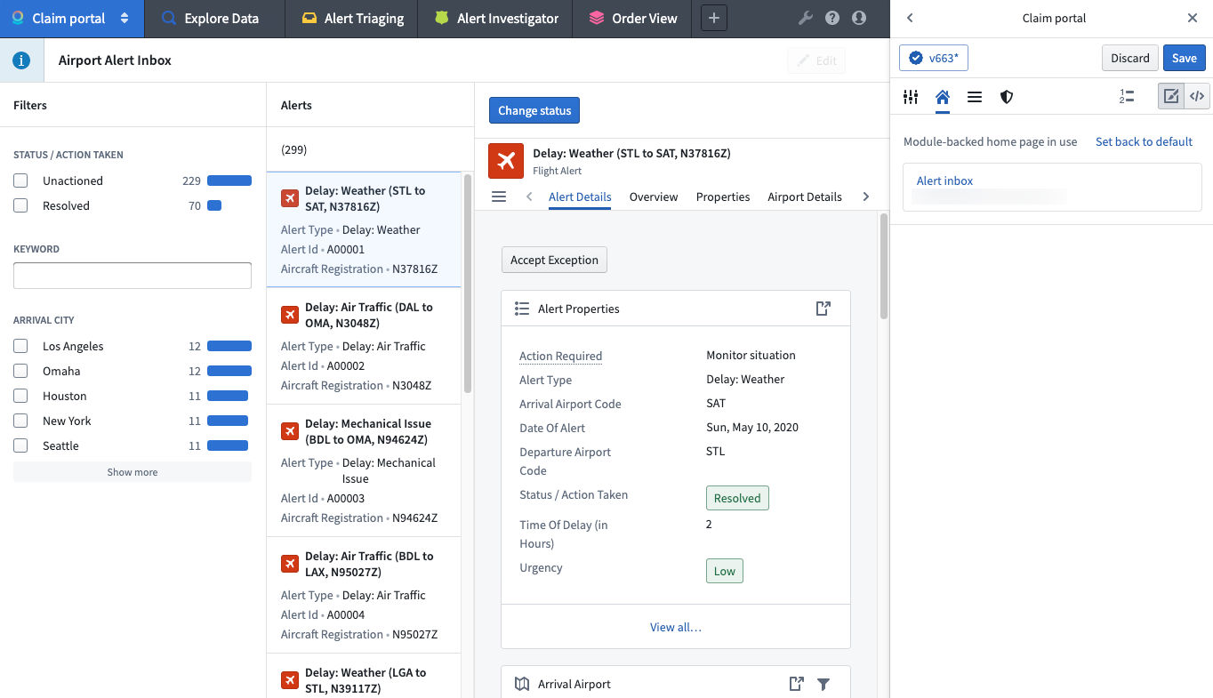
Module-backed home pages
Builders can also configure a module to act as the home page for a workspace. Selecting Replace Home with Compass Resource on the home configuration tab will open a dialog to allow the selection of a module and parameters.
If a module is in use for the home page, builders can reset the workspace to the last configured default home page.
中文翻译
主页配置
切换到 主页 配置选项卡,即可配置工作空间的主页。在 主页 配置选项卡(如下图所示)中,您可以配置工作空间的徽标、副标题和精选项目。
徽标
默认情况下,工作空间会在 Carbon 主页的中上方显示 Palantir 徽标。您可以导航至 徽标 部分并点击 选择徽标,来显示已上传至 Foundry 的自定义徽标。
接着,在 Project 中选择您的图片文件。该图片文件将替换 Carbon 工作空间中的默认徽标。
如需调整徽标大小,请展开 尺寸 部分,您可以在其中设置最大宽度和/或高度。
如需移除自定义徽标,可将鼠标悬停在徽标预览上,然后选择 x 图标。
副标题
在 副标题 部分,您可以添加一个副标题,显示在主页的徽标下方。例如,您可以提供欢迎信息或工作空间描述。
精选项目
Carbon 工作空间可以突出显示三列(标记为 A、B 和 C),其中可包含 精选项目。可显示的 精选项目 类型多种多样,包括对象、对象类型、已保存的探索等。我们建议精心策划主页,确保工作空间突出显示对用户工作最有用的资源。
可选地,A、B 和 C 列可以包含将资源分组在一起的小组件(widget)。小组件可以自定义配置,也可以从默认选项列表中选择,例如用户的收藏对象或已保存的探索。
在自定义可配置的小组件中,每个项目的外观可以通过将鼠标悬停在该项目上并选择编辑图标来自定义,这将打开一个编辑对话框。
小组件的显示可以进一步配置,通过添加标题和描述,并选择将项目显示为列表还是卡片。列表 显示方式较为紧凑,显示资源图标以及每个元素的名称。卡片 显示方式较大,可以为每个元素包含自定义缩略图。当项目数量较少时,卡片通常更有用。这些选项可以通过展开小组件编辑器中的 元数据与显示 部分进行配置。
在以下示例中,A 列和 B 列各包含一个以卡片形式显示的小组件,而 C 列包含两个以列表形式显示的小组件。
基于模块的主页
构建者还可以配置一个模块(module)作为工作空间的主页。在主页配置选项卡上选择 用 Compass 资源替换主页,将打开一个对话框,允许选择模块和参数。
如果主页正在使用模块,构建者可以将工作空间重置为上次配置的默认主页。